Mark Dominus (陶敏修)
mjd@pobox.com

Archive:
| 2026: | JFM |
| 2025: | JFMAMJ |
| JASOND | |
| 2024: | JFMAMJ |
| JASOND | |
| 2023: | JFMAMJ |
| JASOND | |
| 2022: | JFMAMJ |
| JASOND | |
| 2021: | JFMAMJ |
| JASOND | |
| 2020: | JFMAMJ |
| JASOND | |
| 2019: | JFMAMJ |
| JASOND | |
| 2018: | JFMAMJ |
| JASOND | |
| 2017: | JFMAMJ |
| JASOND | |
| 2016: | JFMAMJ |
| JASOND | |
| 2015: | JFMAMJ |
| JASOND | |
| 2014: | JFMAMJ |
| JASOND | |
| 2013: | JFMAMJ |
| JASOND | |
| 2012: | JFMAMJ |
| JASOND | |
| 2011: | JFMAMJ |
| JASOND | |
| 2010: | JFMAMJ |
| JASOND | |
| 2009: | JFMAMJ |
| JASOND | |
| 2008: | JFMAMJ |
| JASOND | |
| 2007: | JFMAMJ |
| JASOND | |
| 2006: | JFMAMJ |
| JASOND | |
| 2005: | OND |
In this section:
Subtopics:
| Mathematics | 248 |
| Programming | 100 |
| Language | 95 |
| Miscellaneous | 75 |
| Book | 50 |
| Tech | 49 |
| Etymology | 36 |
| Haskell | 33 |
| Oops | 30 |
| Unix | 27 |
| Cosmic Call | 25 |
| Math SE | 25 |
| Law | 23 |
| Physics | 21 |
| Perl | 17 |
| Biology | 16 |
| Brain | 15 |
| Calendar | 15 |
| Food | 15 |


Comments disabled
Sun, 31 Dec 2006
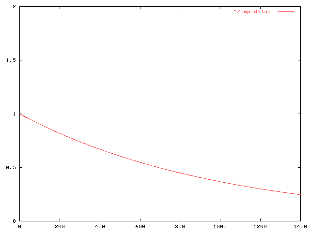
Daylight chart
My wife is always sad this time of the year because the days are so
short and dark. I made a chart like this one a couple of years ago
so that she could see the daily progress from dark to light as the
winter wore on to spring and then summer.
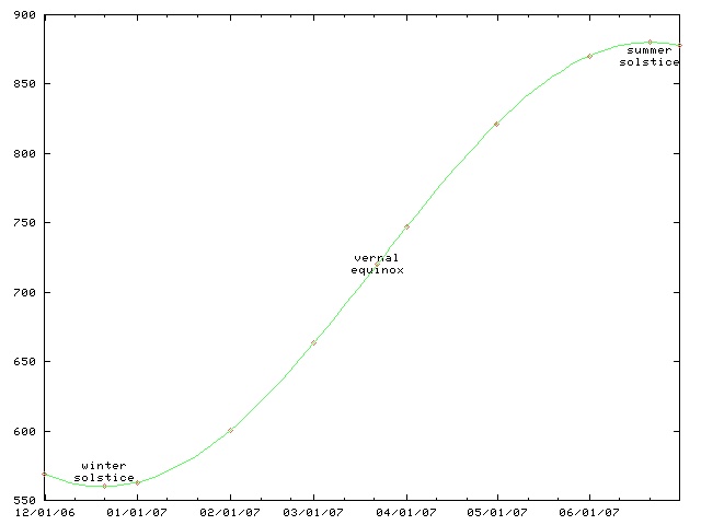
This chart only works for Philadelphia and other places at the same latitude, such as Boulder, Colorado. For higher latitutdes, the y axis must be stretched. For lower latitudes, it must be squished. In the southern hemisphere, the whole chart must be flipped upside-down.
(The chart will work for places inside the Arctic or Antarctic circles, if you use the correct interpretations for y values greater than 1440 minutes and less than 0 minutes.)
This time of year, the length of the day is only increasing by about thirty seconds per day. (Decreasing, if you are in the southern hemishphere.) On the equinox, the change is fastest, about 165 seconds per day. (At latitudes 40°N and 40°S.) After that, the rate of increase slows, until it reaches zero on the summer solstice; then the days start getting shorter again.
As with all articles in the physics section of my blog, readers are cautioned that I do not know what I am talking about, although I can spin a plausible-sounding line of bullshit. For this article, readers are additionally cautioned that I failed observational astronomy twice in college.
[Other articles in category /physics] permanent link
Sat, 30 Dec 2006
Notes on Neal Stephenson's Baroque novels
Earlier this year I was reading books by Robert Hooke, John Wilkins,
Sir Thomas Browne, and other Baroque authors; people kept writing to
me to advise me to read Neal Stephenson's "Baroque cycle", in which
Hooke and Wilkins appear as characters.
I ignored this advice for a while, because those books are really fat, and because I hadn't really liked the other novels of Stephenson's that I'd read.
But I do like Stephenson's non-fiction. His long, long article about undersea telecommunications cables was one of my favorite reads of 1996, and I still remember it years later and reread it every once in a while. I find his interminable meandering pointless and annoying in his fiction, where I'm not sure why I should care about all the stuff he's describing. When the stuff is real, it's a lot easier to put up with it.
My problems with Stephenson's earlier novels, The Diamond Age and Snow Crash, will probably sound familiar: they're too long; they're disorganized; they don't have endings; too many cannons get rolled onstage and never fired.
Often "too long" is a pinheaded criticism, and when I see it I'm immediately wary. How long is "too long"? It calls to mind the asinine complaint from Joseph II that Mozart's music had "too many notes". A lot of people who complain that some book is "too long" just mean that they were too lazy to commit the required energy. When I say that Stephenson's earlier novels were "too long", I mean that he had more good ideas than he could use, and put a lot of them into the books even when they didn't serve the plot or the setting or the characters. A book is like a house. It requires a plan, and its logic dictates portions of the plan. You don't put in eleven bathtubs just because you happen to have them lying around, and you don't stick Ionic columns on the roof just because Home Depot had a sale on Ionic columns the week you were building it.
So the first thing about Stephenson's Baroque Trilogy is that it's not actually a trilogy. Like The Lord of the Rings, it was published in three volumes because of physical and commercial constraints. But the division into three volumes is essentially arbitrary.

The work totals about 2,700 pages. Considered as a trilogy, this is three very long books. Stephenson says in the introduction that it is actually eight novels, not three. He wants you to believe that he has actually written eight middle-sized books. But he hasn't; he is lying, perhaps in an attempt to shut up the pinheads who complain that his books are "too long". This is not eight middle-sized books. It is one extremely long book.
The narrative of the Baroque cycle is continuous, following the same characters from about 1650 up through about 1715. There is a framing story, introduced in the first chapters, which is followed by a flashback that lasts about 1,600 pages. Events don't catch up to the frame story until the third volume. If you consider Quicksilver to be a novel, the opening chapters are entirely irrelevant. If you consider it to be three novels, the opening chapters of the first novel are entirely irrelevant. It starts nowhere and ends nowhere, a vermiform appendix. But as a part of a single novel, it's not vestigial at all; it's a foreshadowing of later developments, which are delivered in volume III, or book 6, depending on how you count.
Another example: The middle volume, titled The Confusion, alternates chapters from two of the eight "novels" that make up the cycle. Events in these two intermingled ("con-fused") novels take place concurrently. Stephenson claims that they are independent, but they aren't.
So from now on I'm going to drop the pretense that this is a trilogy or a "cycle", and I'm just going to call this novel the "Baroque novel".
This was quite a surprise to me. The world is full of incoherent ramblers, and most of them, if you really take the time to listen to them carefully, and at length, turn out to be completely full of shit. You get nothing but more incoherence.
Stephenson at 600 pages is a semi-coherent rambler; to really get what he is saying, you have to turn him up to 2,700 pages. Most people would have been 4.5 times as incoherent; Stephenson is at least 4.5 times as lucid. His ideas are great; he just didn't have enough space to explain them before! The Baroque novel has a single overarching theme, which is the invention of the modern world. One of the strands of this theme is the invention of science, and the modern conception of science; another is the invention of money, and the modern conception of money.
I've written before about what I find so interesting about the Baroque thinkers. Medieval, and even Renaissance thought seems very alien to me. In the baroque writers, I have the first sense of real understanding, of people grappling with the same sorts of problems that I do, in the same sorts of ways. For example, I've written before about John Wilkins' attempt to manufacture a universal language of thought. People are still working on this. Many of the particular features of Wilkins' attempt come off today as crackpottery, but to the extent that they do, it's only because we know now that these approaches won't work. And the reason we know that today is that Wilkins tried those approaches in 1668 and it didn't work.

I find that almost all of Stephenson's annoying habits are much less annoying in the context of historical fiction. For example, many plot threads are left untied at the end. Daniel Waterhouse (fictional) becomes involved with Thomas Newcomen (real) and his Society for the Raising of Water by Fire. (That is, using steam engines to pump water out of mines.) This society figures in the plot of the last third of the novel, but what becomes of it? Stephenson drops it; we don't find out. In a novel, this would be annoying. But in a work of historical fiction, it's no problem, because we know what became of Newcomen and his steam engines: They worked well enough for pumping out coal mines, where a lot of coal was handy to fire them, and well enough to prove the concept, which really took off around 1775 when a Scot named James Watt made some major improvements. Sometime later, there were locomotives and nuclear generating plants. You can read all about it in the encyclopedia.
Another way in which Stephenson's style works better in historical fiction than in speculative fiction is in his long descriptions of technologies and processes. When they're fictitious technologies and imaginary processes, it's just wankery, a powerful exercise of imagination for no real purpose. Well, maybe the idea will work, and maybe it won't, and it is necessarily too vague to really give you a clear idea of what is going on. But when the technologies are real ones, the descriptions are illuminating and instructive. You know that the idea will work. The description isn't vague, because Stephnson had real source material to draw on, and even if you don't get a clear idea, you can go look up the details yourself, if you want. And Stephenson is a great explainer. As I said before, I love his nonfiction articles.
A lot of people complain that his novels don't have good endings. He's gotten better at wrapping things up, and to the extent that he hasn't, that's all right, because, again, the book is a historical novel, and history doesn't wrap up. The Baroque novel deals extensively with the Hanoverian succession to the English throne. Want to know what happened next? Well, you probably do know: a series of Georges, Queen Victoria, et cetera, and here we are. And again, if you want, the details are in the encyclopedia.
So I really enjoyed this novel, even though I hadn't liked Stephenson's earlier novels. As I was reading it, I kept thinking how glad I was that Stephenson had finally found a form that suits his talents and his interests.
[ Addendum 20170728: I revisited some of these thoughts in connection with Stephenson's 2016 novel Seveneves. ]
[ Addendum 20191216: I revived an article I wrote in 2002 about Stephenson's first novel The Big U. ]
[Other articles in category /book] permanent link
Wed, 27 Dec 2006
Linogram development: 20061227 Update
Defective constraints (see yesterday's article)
are now handled. So the example from yesterday's
article has now improved to:
        define regular_polygon[N] closed {
          param number radius, rotation=0;
          point vertex[N], center;
          line  edge[N];
          constraints {
            vertex[i] = center + radius * cis(rotation + 360*i/N);
            edge[i].start = vertex[i];
            edge[i].end   = vertex[i+1];
          }
        }
[Other articles in category /linogram] permanent link
Tue, 26 Dec 2006
Linogram development: 20061226 Update
I have made significant progress on the "arrays" feature. I
recognized that it was actually three features; I have two of them
implemented now. Taking the example from further down the page:
        define regular_polygon[N] closed {
          param number radius, rotation=0;
          point vertex[N], center;
          line  edge[N];
          constraints {
            vertex[i] = center + radius * cis(rotation + 360*i/N);
            edge[i].start = vertex[i];
            edge[i].end   =  vertex[i+1];
          }
        }
The stuff in green is working just right; the stuff in red is not.The following example works just fine:
        number p[3];
        number q[3];
        constraints {
          p[i] = q[i];
          q[i] = i*2;
        }
What's still missing? Well, if you write
        number p[3];
        number q[3];
        constraints {
          p[i] = q[i+1];
        }
This should imply three constraints on elements of p and
q:
p0 = q1
p1 = q2
p2 = q3
The third of these is defective, because there is no q3. If the figure is "closed" (which is the default) the subscripts should wrap around, turning the defective constraint into p2 = q0 instead. If the figure is declared "open", the defective constraint should simply be discarded.
The syntax for parameterized definitions (define regular_polygon[N] { ... }) is still a bit up in the air; I am now leaning toward a syntax that looks more like define regular_polygon { param index N; ... } instead.
The current work on the "arrays" feature is in the CVS repository on the branch arrays; get the version tagged tests-pass to get the most recent working version. Most of the interesting work has been on the files lib/Chunk.pm and lib/Expression.pm.
[Other articles in category /linogram] permanent link
Wed, 20 Dec 2006
Reader's disease
Reader's disease is an occupational hazard of editors and literary
critics. Critics are always looking for the hidden meaning, the
clever symbol, and, since they are always looking for it, they always
find it, whether it was there or not. (Discordians will recognize
this as a special case of the law of fives.) Sometimes the
critics are brilliant, and find hidden meanings that are undoubtedly
there even though the author was unaware of them; more often, they are
less fortunate, and sometimes they even make fools of themselves.
The idea of reader's disease was introduced to me by professor David Porush, who illustrated it with the following anecdote. Nathaniel Hawthorne's The Scarlet Letter is prefaced by an introduction called The Custom-House, in which the narrator claims to have found documentation of Hester Prynne's story in the custom house where he works. The story itself is Hawthorne's fantasy, but the custom house is not; Hawthorne did indeed work in a custom house for many years.
Porush's anecdote concerned Mary Rudge, the daughter of Ezra Pound. Rudge, reading the preface of The Scarlet Letter, had a brilliant insight: the custom house, like so many other buildings of the era, was a frame house and was built in the shape of the letter "A". It therefore stands as a physical example of the eponymous letter.
Rudge was visiting Porush in the United States, and told him about her discovery.
"That's a great theory," said Porush, "But it doesn't look anything like a letter 'A'."
Rudge argued the point.
"Mary," said Porush, "I've seen it. It's a box."
Rudge would not be persuaded, so together they got in Porush's car and drove to Salem, Massachusetts, where the custom house itself still stands.
But Rudge, so enamored of her theory that she could not abandon it, concluded that some alternative explanation must be true: the old custom house had burnt down and been rebuilt, or the one in the book was not based on the real one that Hawthorne had worked in, or Porush had led her to the wrong building.
But anyway, all that is just to introduce my real point, which is to relate one of the most astounding examples of reader's disease I have ever encountered personally. The Mary Rudge story is secondhand; for all I know Porush made it up, or exaggerated, or I got the details wrong. But this example I am about to show you is in print, and is widely available.
I have a nice book called The Treasury of the Encyclopædia Britannica, which is a large and delightful collection of excerpts from past editions of the Britannica, edited by Clifton Fadiman. This is out of print now, but it was published in 1992 and is easy to come by.
Each extract is accompanied by some introductory remarks by Fadiman and sometimes by one of the contributing editors. One long section in the book concerns early articles about human flight; in the Second Edition (published 1778-1783) there was an article on "Flying" by then editor James Tytler. Contributing editor Bruce L. Felknor's remarks include the following puzzled query:
What did Tytler mean by his interjection of "Fa" after Friar Bacon's famous and fanciful claim that man had already succeeded in flying? It hardly seems a credulous endorsement, an attitude sometimes attributed to Tytler.
Fadiman adds his own comment on this:
As for Tytler's "Fa": Could it have been an earlier version of our "Faugh!"? In any case we suddenly hear an unashamed human voice.
Gosh, what could Tytler have meant by this curious interjection? A credulous endorsement? An exclamation of disgust? An unedited utterance of the unashamed human voice? Let's have a look:
The secret consisted in a couple of large thin hollow copper-globes exhausted of air; which being much lighter than air, would sustain a chair, whereon a person might sit. Fa. Francisco Lana, in his Prodromo, proposes the same thing...
Felknor and Fadiman have mistaken "Fa" for a complete sentence. But it is apparently an abbreviation of Father Francisco Lana's ecclesiastical title.
Oops.
[Other articles in category /book] permanent link
Tue, 12 Dec 2006
ssh-agent
When you do a remote login with ssh, the program needs to use your
secret key to respond to the remote system's challenge. The secret
key is itself kept scrambled on the disk, to protect it from being
stolen, and requires a passphrase to be unscrambled. So the remote
login process prompts you for the passphrase, unscrambles the secret
key from the disk, and then responds to the challenge.
Typing the passphrase every time you want to do a remote login or run a remote process is a nuisance, so the ssh suite comes with a utility program called "ssh-agent". ssh-agent unscrambles the secret key and remembers it; it then provides the key to any process that can contact it through a certain network socket.
The process for login is now:
        plover% eval `ssh-agent`
        Agent pid 23918
        plover% ssh-add
        Need passphrase for /home/mjd/.ssh/identity
        Enter passphrase for mjd@plover: (supply passphrase here)
        plover% ssh remote-system-1
        (no input required here)
        ...
        plover% ssh remote-system-2
        (no input required here either)
        ...
The important thing here is that once ssh-agent is started up and
supplied with the passphrase, which need be done only once, ssh itself
can contact the agent through the socket and get the key as many times
as needed.How does ssh know where to contact the agent process? ssh-agent prints an output something like this one:
        SSH_AUTH_SOCK=/tmp/ssh-GdT23917/agent.23917; export SSH_AUTH_SOCK;
        SSH_AGENT_PID=23918; export SSH_AGENT_PID;
        echo Agent pid 23918;
The eval `...` command tells the shell to execute this output
as code; this installs two variables into the shell's environment,
whence they are inherited by programs run from the shell, such as ssh.
When ssh runs, it looks for the SSH_AUTH_SOCK variable. Finding it, it
connects to the specified socket, in
/tmp/ssh-GdT23917/agent.23917, and asks the agent for the
required private key.Now, suppose I log in to my home machine, say from work. The new login shell does not have any environment settings pertaining to ssh-agent. I can, of course, run a new agent for the new login shell. But there is probably an agent process running somewhere on the machine already. If I run another every time I log in, the agent processes will proliferate. Also, running a new agent requires that the new agent be supplied with the private key, which would require that I type the passphrase, which is long.
Clearly, it would be more convenient if I could tell the new shell to contact the existing agent, which is already running. I can write a command which finds an existing agent and manufactures the appropriate environment settings for contacting that agent. Or, if it fails to find an already-running agent, it can just run a new one, just as if ssh-agent had been invoked directly. The program is called ssh-findagent.
I put a surprising amount of work into this program. My first idea was that it can look through /tmp for the sockets. For each socket, it can try to connect to the socket; if it fails, the agent that used to be listening on the other end is dead, and ssh-findagent should try a different socket. If none of the sockets are live, ssh-findagent should run the real ssh-agent. But if there is an agent listening on the other end, ssh-findagent can print out the appropriate environment settings. The socket's filename has the form /tmp/ssh-XXXPID/agent.PID; this is the appropriate value for the SSH_AUTH_SOCK variable.
The SSH_AGENT_PID variable turned out to be harder. I thought I would just get it from the SSH_AUTH_SOCK value with a pattern match. Wrong. The PID in the SSH_AUTH_SOCK value and in the filename is not actually the pid of the agent process. It is the pid of the parent of the agent process, which is typically, but not always, 1 less than the true pid. There is no reliable way to calculate the agent's pid from the SSH_AUTH_SOCK filename. (The mismatch seems unavoidable to me, and the reasons why seem interesting, but I think I'll save them for another blog article.)
After that I had the idea of having ssh-findagent scan the process table looking for agents. But this has exactly the reverse problem: You can find the agent processes in the process table, but you can't find out which socket files they are attached to.
My next thought was that maybe linux supports the getpeerpid system call, which takes an open file descriptor and returns the pid of the peer process on other end of the descriptor. Maybe it does, but probably not, because support for this system call is very rare, considering that I just made it up. And anyway, even if it were supported, it would be highly nonportable.
I had a brief hope that from a pid P, I could have ssh-findagent look in /proc/P/fd/* and examine the process file descriptor table for useful information about which process held open which file. Nope. The information is there, but it is not useful. Here is a listing of /proc/31656/fd, where process 31656 is an agent process:
lrwx------ 1 mjd users 64 Dec 12 23:34 3 -> socket:[711505562]
File descriptors 0, 1, and 2 are missing. This is to be expected; it
means that the agent process has closed stdin, stdout, and stderr.
All that remains is descriptor 3, clearly connected to the socket.
Which file represents the socket in the filesystem? No telling. All
we have here is 711595562, which is an index into some table of
sockets inside the kernel. The kernel probably doesn't know the
filename either. Filenames appear in directories, where they are
associated with file ID numbers (called "i-numbers" in Unix jargon.)
The file ID numbers can be looked up in the kernel "inode" table to
find out what kind of files they are, and, in this case, what socket
the file represents. So the kernel can follow the pointers from the
filesystem to the inode table to the open socket table, or from the
process's open file table to the open socket table, but not from the
process to the filesystem.Not easily, anyway; there is a program called lsof which grovels over the kernel data structures and can associate a process with the names of the files it has open, or a filename with the ID numbers of the processes that have it open. My last attempt at getting ssh-findagent to work was to have it run lsof over the possible socket files, getting a listing of all processes that had any of the socket files open, and, for each process, which file. When it found a process-file pair in the output of lsof, it could emit the appropriate environment settings.
The final code was quite simple, since lsof did all the heavy lifting. Here it is:
        #!/usr/bin/perl

        open LSOF, "lsof /tmp/ssh-*/agent.* |"
            or die "couldn't run lsof: $!\n";
        <LSOF>;  # discard header
        my $line = <LSOF>;
        if ($line) {
          my ($pid, $file) = (split /\s+/, $line)[1,-1];
          print "SSH_AUTH_SOCK=$file; export SSH_AUTH_SOCK;
        SSH_AGENT_PID=$pid; export SSH_AGENT_PID;
        echo Agent pid $pid;
        ";
          exit 0;
        } else {
          print "echo starting new agent\n";
          exec "ssh-agent";
          die "Couldn't run new ssh-agent: $!\n";
        }
I complained about the mismatch between the agent's pid and the pid in
the socket filename on IRC, and someone there mentioned offhandedly
how they solve the same problem. It's hard to figure out what the settings should be. So instead of trying to figure them out, one should save them to a file when they're first generated, then load them from the file as required.
Oh, yeah. A file. Duh.
It looks like this: Instead of loading the environment settings from ssh-agent directly into the shell, with eval `ssh-agent`, you should save the settings into a file:
plover% ssh-agent > ~/.ssh/agent-env
Then tell the shell to load the
settings from the file:
        plover% . ~/.ssh/agent-env
        Agent pid 23918
        plover% ssh remote-system-1
        (no input required here)
The . command reads the file and acquires the settings. And
whenever I start a fresh login shell, it has no settings, but I can
easily acquire them again with . ~/.ssh/agent-env,
without running another agent process.
I wonder why I didn't think of this before I started screwing around
with sockets and getpeerpid and /proc/*/fd and
lsof and all that rigmarole.Oh well, I'm not yet a perfect sage.
[ Addendum 20070105: I have revisited this subject and the reader's responses. ]
[Other articles in category /oops] permanent link
Wed, 06 Dec 2006
Serendipitous web searches
In yesterday's article about a
paper of Robert French, I mentioned that I had run across it while
looking for something entirely unrelated. The unrelated thing is
pretty interesting itself.
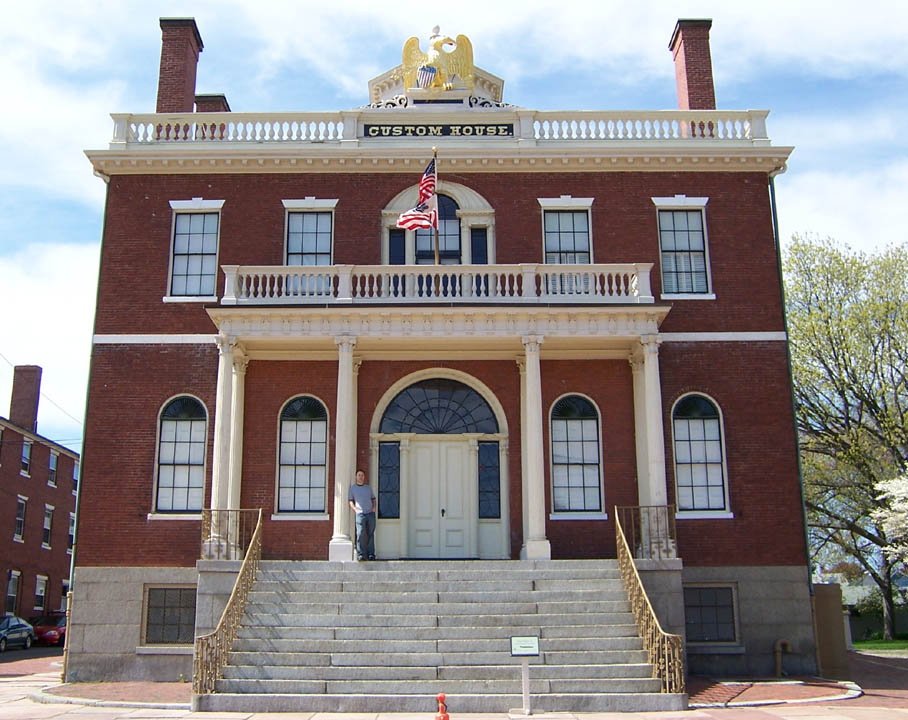
 Back in the 1950's
and 1960's, James V. McConnell at the University of Michigan was
doing some really interesting work on learning and memory in planaria
flatworms, shown at right. They used to publish their papers in their
own private journal of flatworm science, The Journal of
Biological Psychology. They didn't have enough material for a
full journal, so when you were done reading the Journal,
you could flip it over and read the back half, which was a
planaria-themed humor magazine called The Worm-Runner's
Digest. I swear I'm not making this up.
Back in the 1950's
and 1960's, James V. McConnell at the University of Michigan was
doing some really interesting work on learning and memory in planaria
flatworms, shown at right. They used to publish their papers in their
own private journal of flatworm science, The Journal of
Biological Psychology. They didn't have enough material for a
full journal, so when you were done reading the Journal,
you could flip it over and read the back half, which was a
planaria-themed humor magazine called The Worm-Runner's
Digest. I swear I'm not making this up.
(I think it's time to revive the planaria-themed humor magazine. Planaria are funny even when they aren't doing anything in particular. Look at those googly eyes!)
(For some reason I've always found planaria fascinating, and I've known about them from an early age. We would occasionally visit my cousin in Oradell, who had a stuffed toy which was probably intended to be a snake, but which I invariably identified as a flatworm. "We're going to visit your Uncle Ronnie," my parents would say, and I would reply. "Can I play with Susan's flatworm?")
Anyway, to get on with the point of this article, McConnell made the astonishing discovery that memory has an identifiable chemical basis. He trained flatworms to run mazes, and noted how long it took to do so. (The mazes were extremely simple T shapes. The planarian goes in the bottom foot of the T. Food goes in one of the top arms, always the same one. Untrained planaria swim up the T and then turn one way or the other at random; trained planaria know to head toward the arm where the food always is. Pretty impressive, for a worm.)
Then McConnell took the trained worms and ground them up and fed them to untrained worms. The untrained worms learned to run the maze a lot faster than the original worms had, apparently demonstrating that there was some sort of information in the trained worms that survived being ground up and ingested. The hypothesis was that the information was somehow encoded in RNA molecules, and could be physically transferred from one individual to another. Isn't that a wonderful dream?
You can still see echoes of this in the science fiction of the era. For example, a recurring theme in Larry Niven's early work is "memory RNA", people getting learning injections, and pills that impart knowledge when you swallow them. See World Out of Time and The Fourth Profession, for example. And I once had a dream that I taught a giant planarian to speak Chinese, then fried it in cornmeal and ate it, after which I was able to speak Chinese. So when I say it's a wonderful dream, I'm speaking both figuratively and literally.
Unfortunately, later scientists were not able to reproduce McConnell's findings, and the "memory RNA" theory has been discredited. How to explain the cannibal flatworms' improved learning times, then? It seems to have been sloppy experimental technique. The original flatworms left some sort of chemical trail in the mazes, that remained after they had been ground up. McConnell's team didn't wash the mazes in between tests, and the cannibal flatworms were able to follow the trails later; it had nothing to do with their diet. Bummer.
So a couple of years ago I was poking around, looking for more information about this, and in particular for a copy of McConnell's famous paper Memory transfer through cannibalism in planarium, which I didn't find. But I did find the totally unrelated Robert French paper. It mentions McConnell, as an example of another cool-sounding and widely-reported theory that took a long time to dislodge, because it's hard to produce clear evidence that cannibal flatworms aren't in fact learning from their lunch meat, and because the theory that they aren't learning is so much less interesting-sounding than the theory that they are. News outlets reported a lot about the memory RNA breakthrough, and much less about the later discrediting of the theory.
French's paper, you will recall, refutes the interesting-sounding hypothesis that infants resemble their fathers more strongly then they do their mothers, and has many of the same difficulties.
There are counterexamples. Everyone seems to have heard that the Fleischmann and Pons tabletop cold fusion experiment was an error. And the Hwang Woo-Suk stem cell fraud is all over the news these days.
[Other articles in category /bio] permanent link
Tue, 05 Dec 2006
Do infants resemble their fathers more than their mothers?
Back in 1995, Christenfeld and Hill published a paper claimed to have
found evidence that infants tended to resemble their fathers more than
they resembled their mothers. The evolutionary explanation for this,
it was claimed, is that children who resemble their fathers are less
likely to be abandoned by them, because their paternity would be less
likely to be doubted. The pop science press got hold of
it—several years later, as they often do—and it was widely
reported for a while. Perhaps you heard about it.
A couple years ago, while looking for something entirely unrelated, I ran across the paper of French et al. titled The Resemblance of One-year-old Infants to Their Fathers: Refuting Christenfeld & Hill. French and his colleagues had tried to reproduce Christenfeld and Hill's results, with little success; they suggested that the conclusion was false, and offered a number of arguments as to why the purported resemblance should not exist. Of course, the pop science press was totally uninterested.
At the time, I thought, "Wow, I wish I had a way to get a lot of people to read this paper." Then last month I realized that my widely-read blog is just the place to do this.
Before I go on, here is the paper. I recommend it; it's good reading, and only six pages long. Here's the abstract:
In 1995 Christenfeld and Hill published a paper that purported to show at one year of age, infants resemble their fathers more than their mothers. Evolution, they argued, would have produced this result since it would ensure male parental resources, since the paternity of the infant would no longer be in doubt. We believe this result is false. We present the results of two experiments (and mention a third) which are very far from replicating Christenfeld and Hill's data. In addition, we provide an evolutionary explanation as to why evolution would not have favored the result reported by Christenfeld and Hill.Other related material is available from Robert French's web site.
In the first study done by French, participants were presented with a 1-, 3-, or 5-year-old child's face, and the faces of either the father and two unrelated men, or the mother and two unrelated women. The participants were invited to identify the child's parent. They did indeed succeed in identifying the children's parents somewhat more often than would have been obtained by chance alone. But the participants did not identify fathers more reliably than they identified mothers.
The second study was similar, but used only 1-year-old infants. (The Christenfeld and Hill claim is that one year is the age at which children most resemble their fathers.)
French points out that although the argument from evolutionary considerations is initially attractive, it starts to disintegrate when looked at more closely. The idea is that if a child resembles its father, the father is less likely to doubt his paternity, and so is less likely to withhold resources from the child. So there might be a selection pressure in favor of resembling one's father.
But now turn this around: if a father can be sure of paternity because the children look like him, then he can also be sure when the children aren't his because they don't resemble him. This will create a very strong selection pressure in favor of children resembling their fathers. And the tendency to resemble one's father will create a positive feedback loop: the more likely kids are to look like their fathers, the more likely that children who don't resemble their fathers will be abandoned, neglected, abused, or killed. So if there is a tendency for infants to resemble their fathers more than their mothers, one would expect it to be magnified over time, and to be fairly large by now. But none of the studies (including the original Christenfeld and Hill one) found a strong tendency for children to resemble their fathers.
But, as French notes, it's hard to get people to pay attention to a negative result, to a paper that says that something interesting isn't happening.
[ Addendum 20061206: Here's the original Christenfeld and Hill paper. ]
[ Addendum 20171101: A recent web search refutes my claim that “the pop science press was totally uninterested”. Results include this article from Scientific American and a mention in the book Bumpology: The Myth-Busting Pregnancy Book for Curious Parents-To-Be. ]
[ Addendum 20171101: A more extensive study in 2004 confirmed French's results. ]
[Other articles in category /bio] permanent link
Mon, 04 Dec 2006
Clockwise
A couple of weeks ago I was over at a friend's house, and was trying
to explain to her two-year-old daughter which way to turn the knob on
her Etch-a-Sketch. But I couldn't tell her to turn it clockwise,
because she can't tell time yet, and has no idea which way is
clockwise.
It occurs to me now that I may not be giving her enough credit; she may know very well which way the clock hands go, even though she can't tell time yet. Two-year-olds are a lot smarter than most people give them credit for.
Anyway, I then began wonder what "clockwise" and "counterclockwise" were called before there were clocks with hands that went around clockwise. But I knew the answer to that one: "widdershins" is counterclockwise; "deasil" is clockwise.
Or so I thought. This turns out not to be the answer. "Deasil" is only cited by the big dictionary back to 1771, which postdates clocks by several centuries. "Widdershins" is cited back to 1545. "Clockwise" and "counter-clockwise" are only cited back to 1888! And a full-text search for "clockwise" in the big dictionary turns up nothing else. So the question of what word people used in 1500 is still a mystery to me.
That got me thinking about how asymmetric the two words "deasil" and "widdershins" are; they have nothing to do with each other. You'd expect a matched set, like "clockwise" and "counterclockwise", or maybe something based on "left" and "right" or some other pair like that. But no. "Widdershins" means "the away direction". I thought "deasil" had something to do with the sun, or the day, but apparently not; the "dea" part is akin to dexter, the right hand, and the "sil" part is obscure. Whereas the "shins" part of "widdershins" does have something to do with the sun, at least by association. That is, it is not related historically to the sun, except that some of the people using the word "widdershins" were apparently thinking it was actually "widdersun". What a mess. And the words have nothing to do with each other anyway, as you can see from the histories above; "widdershins" is 250 years older than "deasil".
The OED also lists "sunways", but the earliest citation is the same as the one for deasil.
Anyway, I did not know any of this at the time, and imagined that "deasil" meant "in the direction of the sun's motion". Which it is; the sun goes clockwise through the sky, coming up on the left, rising to its twelve-o'-clock apex, and then descending on the right, the way the hands of a clock do. (Perhaps that's why the early clockmakers decided to make the hands of the clock go that way in the first place. Or perhaps it's because of the (closely related) reason that that's the direction that the shadow on a sundial moves.)
And then it hit me that in the southern hemisphere, the sun goes the other way: instead of coming up on the left, and going down on the right, the way clock hands do, it comes up on the right and goes down on the left. Wowzers! How bizarre.
I'm a bit sad that I figured this out before actually visiting the southern hemisphere and seeing it for myself, because I think I would have been totally freaked out on that first morning in New Zealand (or wherever). But now I'm forewarned that the sun goes the wrong way down there and it won't seem so bizarre when I do see it for the first time.
[Other articles in category /lang] permanent link
Thu, 30 Nov 2006
Trivial calculations
Back in September, I wrote about how I
tend to plunge ahead with straightforward calculations whenever
possible, grinding through the algebra, ignoring the clever shortcut.
I'll go back and look for the shortcut, but only if the
hog-slaughtering approach doesn't get me what I want. This is often
an advantage in computer programming, and often a disadvantage in
mathematics.
This occasionally puts me in the position of feeling like a complete ass, because I will grind through some big calculation to reach a simple answer which, in hindsight, is completely obvious.
One early instance of this that I remember occurred more than twenty years ago when a friend of mine asked me how many spins of a slot machine would be required before you could expect to hit the jackpot; assume that the machine has three wheels, each of which displays one of twenty symbols, so the chance of hitting the jackpot on any particular spin is 1/8,000. The easy argument goes like this: since the expected number of jackpots per spin is 1/8,000, and expectations are additive, 8,000 spins are required to get the expected number of jackpots to 1, and this is in fact the answer.
But as a young teenager, I did the calculation the long way. The chance of getting a jackpot in one spin is 1/8000. The chance of getting one in exactly two spins is (1 - 1/8000)·(1/8000). The chance of getting one in exactly three spins is (1 - 1/8000)2·(1/8000). And so on; so you sum the infinite series:
$$\sum_{i=1}^\infty {i{\left({k-1\over k}\right)^{i-1}} {1\over k}}$$
And if you do it right, you do indeed get exactly k. Well, I was young, and I didn't know any better.I'd like to be able say I never forgot this. I wish it were true. I did remember it a lot of the time. But I can think of a couple of times when I forgot, and then felt like an ass when I did the problem the long way.
One time was in 1996. There is a statistic in baseball called the on-base percentage or "OBP"—please don't all go to sleep at once. This statistic measures, for each player, the fraction of his plate appearances in which he is safe on base, typically by getting a hit, or by being walked. It is typically around 1/3; exceptional players have an OBP as high as 2/5 or even higher. You can also talk about the OBP of a team as a whole.
A high OBP is a very important determiner of the number of runs a baseball team will score, and therefore of how many games it will win. Players with a higher OBP are more likely to reach base, and when a batter reaches base, another batter comes to the plate. Teams with a high overall OBP therefore tend to bring more batters to the plate and so have more chances to score runs, and so do tend to score runs, than teams with a low overall OBP.
I wanted to calculate the relationship between team OBP and the expected number of batters coming to the plate each inning. I made the simplifying assumption that every batter on the team had an OBP of p, and calculated the expected number of batters per inning. After a lot of algebra, I had the answer: 3/(1-p). Which makes perfect sense: There are only two possible outcomes for a batter in each plate appearance: he can reach base, or he can be put out; these are exclusive. A batter who reaches base p of the time is put out 1-p of the time, consuming, on average, 1-p of an out. A team gets three outs in an inning; the three outs are therefore consumed after 3/(1-p) batters. Duh.
This isn't the only baseball-related mistake I've made. I once took a whole season's statistics and wrote a program to calculate the average number of innings each pitcher pitched. Okay, no problem yet. But then I realized that the average was being depressed by short relievers; I really wanted the average only for starting pitchers. But how to distinguish starting pitchers from relievers? Simple: the statistics record the number of starts for each pitcher, and relievers never start games. But then I got too clever. I decided to weight each pitcher's contribution to the average by his number of starts. Since relievers never start, this ignores relievers; it allows pitchers who do start a lot of games to influence the result more than those who only pitched a few times. I reworked the program to calculate the average number of innings pitched per start.
The answer was 9. (Not exactly, but very close.)
It was obviously 9. There was no other possible answer. There is exactly one start per game, and there are 9 innings per game,1 and some pitcher pitches in every inning, so the number of innings pitched per start is 9. Duh.
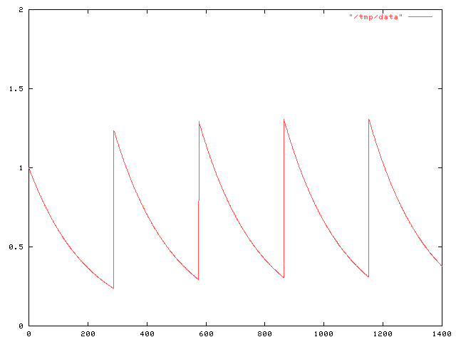
Anyway, the real point of this article is to describe a more sophisticated mistake of the same general sort that I made a couple of weeks ago. I was tinkering around with a problem in pharmacology. Suppose Joe has some snakeoleum pills, and is supposed to take one capsule every day. He would like to increase the dosage to 1.5 pills every day, but he cannot divide the capsules. On what schedule should he take the pills to get an effect as close as possible to the effect of 1.5 pills daily?
I assumed that we could model the amount of snakeoleum in Joe's body as a function f(t), which normally decayed exponentially, following f(t) = ae-kt for some constant k that expresses the rate at which Joe's body metabolizes and excretes the snakeoleum. Every so often, Joe takes a pill, and at these times d0, d1, etc., the function f is discontinuous, jumping up by 1. The value a here is the amount of snakeoleum in Joe's body at time t=0. If Joe takes one pill every day, the (maximum) amount of snakeoleum in his body will tend toward 1/(1-e-k) over time, as in the graph below:
I wanted to compare this with what happens when Joe takes the pill on various other schedules. For some reason I decided it would be a good idea to add up the total amount of pill-minutes for a particular dosage schedule, by integrating f. That is, I was calculating !!\int_a^b f(t) dt!! for various a and b; for want of better values, I calculated the total amount !!\int_0^\infty f(t) dt!!.
Doing this for the case in which Joe takes a single pill at time 0 is simple; it's just !!\int_0^\infty e^{-kt} dt!!, which is simply 1/k.
But then I wanted to calculate what happens when Joe takes a second pill, say at time M. At time M, the amount of snakeoleum left in Joe's body from the first pill is e-kM, so the function f has f(t) = e-kt for 0 ≤ t ≤ M and f(t) = (e-kM+1)e-k(t-M) for M ≤ t < ∞. The graph looks like this:
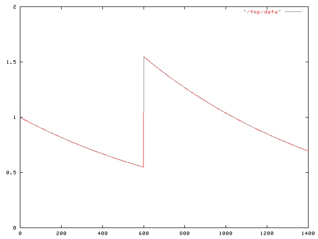
$$\halign{ \hfil$#$ & $= # \hfil $ & $+ #\hfil$ \cr \int_0^\infty f(t) dt & \int_0^M f(t) dt & \int_M^\infty f(t) dt \cr & \int_0^M e^{-kt} dt & \int_M^\infty (e^{-kM} + 1)e^{-k(t-M)} dt \cr & {1 \over k }(1-e^{-kM}) & {1\over k}(e^{-kM} + 1)\cr & \ldots & \omit \cr }$$.
Well, you get the idea. The answer was 2/k.In retrospect, this is completely obvious.
This is because of the way I modeled the pills. When the decay of f(t) is exponential, as it is here, that means that the rate at which the snakeoleum is metabolized is proportional to the amount: twice as much snakeoleum means that the decay is twice as fast. or, looked at another way, each pill decays independently of the rest. Put two pills in, and an hour later you'll find that you have twice as much left as if you had only put one pill in.
Since the two pills are acting independently, you can calculate their effect independently. That is, f(t) can be decomposed into f1(t) + f2(t), where f1 is the contribution from the first pill:
Anyway, I think what I really want is to find !!\int_0^\infty {\left(f_1(t) - f_{1.5}(t, d)\right)}^2 dt!!, where f1 is the function that describes the amount of snakeoleum when Joe takes one pill a day, and f1.5 is the function that describes the amount when Joe takes 1.5 pills every d days. But if there's one thing I think you should learn from a dumbass mistake like this, it's that it's time to step back and try to consider the larger picture for a while, so I've decided to do that before I go on.
1[ Addendum 20070124: There is a brief explanation of why the average baseball game has almost exactly 9 innings. ]
[Other articles in category /oops] permanent link
Wed, 29 Nov 2006
Legal status of corpses in 1911 England
As you might expect from someone who browses at random in the library
stacks, I own several encyclopedias, which I also browse in from time
to time. You never know what you are going to find when you do
this.
I got rid of one recently. It was a 1962 Grolier's. Obviously, it was out of date, but I was using it for general reference anyway, conscious of its shortcomings. But one day I picked it up to read its article on Thurgood Marshall. It said that Marshall was an up-and-coming young lawyer, definitely someone to watch in the future. That was too much, and I gave it away.
But anyway, my main point is to talk about the legal status of corpses. One of the encyclopedias I have is a Twelfth Edition Encyclopaedia Britannica. This contains the complete text of the famous 1911 Eleventh Edition, plus three fat supplementary volumes that were released in 1920. The Britannica folks had originally planned the Twelfth Edition for around 1930, but so much big stuff happened between 1911 and 1920 that they had to do a new edition much earlier.
The Britannica is not as much fun as I hoped it would be. But there are still happy finds. Here is one such:
CORPSE (Lat. corpus, the body), a dead human body. By the common law of England a corpse is not the subject of property nor capable of holding property. It is not therefore larceny to steal a corpse, but any removal of the coffin or grave-cloths is otherwise, such remaining the property of the persons who buried the body. It is a misdemeanour to expose a naked corpse to public view. . .
(The complete article is available online.)
[ Addendum 20191213: it is a felony in California to sexually penetrate or to have sexual contact with human remains, except as authorized by law. ]
[Other articles in category /law] permanent link
Tue, 28 Nov 2006
favicon.ico Results
A couple of days ago I asked for
suggestions for a favicon icon to represent the blog in
people's shortcut menus. There were only two responses, but they were
both very helpful, and solved the problem.
My first thought was, of course, to use an octopus, but I immediately
rejected this idea since I didn't think I would be able to draw a
recognizable octopus in 16×16 pixels. Neil Kandalgaonkar was
braver than I was:  .
.
However, the concept I decided to go with was suggested by David
Eppstein, who provided this attractive interpretation:
 . To explain this, I need to
explain my domain name, which I haven't done here before.
. To explain this, I need to
explain my domain name, which I haven't done here before.
For nine years I was an independent consultant, working under the name Plover Systems. Why Plover? Many people assume that it is an abbreviation for "Perl lover"; this is not the case. The plover domain predates my involvement with Perl. (Some people have also interpreted it as "piss lover", a veiled statement of a fetishistic attraction to urination. It is not.)
A plover is a small bird. Typically, they make their nests on the seashore. The Egyptian plover is the little bird that is reputed to snatch food scraps from between the teeth of the crocodile. The American golden plover migrates all the way from Alaska to South America, and sometimes across the ocean to Europe.
Immediately prior to my becoming an independent consultant and setting up Plover Systems and the plover.com domain, I was employed as the senior systems engineer for Pathfinder, the Time Warner web site. I did not like this job very much. After I quit, I joked that my company had grown too big, so I downsized most of the management and employees, divested the magazine business, and cut the organization's mission back to core competences. Time Warner, the subsidiary I spun off to publish the magazines, was very large. I named my new, lean, trim company "Plover" because the plover is small and agile.
There is another reason for "Plover". For about thirty years, I have been a devoted fan of the old computer game Adventure. When time came to choose a domain name, I wanted to choose something with an Adventure connection. Here the obvious choices are xyzzy, which was already taken, and plugh, which is ugly. Both of these are magic words which, uttered at the correct spot, will teleport the player to another location. The game has a third such magic word, which is "plover"; from the right place, it transports the player to the "Plover room":
You're in a small chamber lit by an eerie green light. An extremely narrow tunnel exits to the west. A dark corridor leads NE.This room, with its green light and narrow tunnel, is depicted in David Eppstein's icon.
The Plover room is so-called because it contains "an emerald the size of a plover's egg". A plover's egg is not very big, as eggs go, because the plover is not a very large bird, as birds go. But an emerald the size of a plover's egg is enormous, as emeralds go. The description is a reference to an off-color joke that was current in the early 1970's when Adventure was written: a teenage girl, upon hearing that the human testicle is the size of a plover's egg, remarks "Oh, so that's how big a plover's egg is." I think this was somewhat more risqué in 1974 than it is today.
For his contribution, M. Eppstein has won a free two-year subscription to The Universe of Discourse. Neil Kandalgaonkar gets the runner-up prize of two free six-month subscriptions, to run concurrently. Thank you both!
[Other articles in category /meta] permanent link
Mon, 27 Nov 2006
Baseball team nicknames, again
Some addenda to my recent
article about baseball team nicknames.
Several people wrote to complain that I mismatched the cities and the nicknames in this sentence:
The American League [has] the Boston Royals, the Kansas City Tigers, the Detroit Indians, the Oakland Orioles...
My apologies for the error. It should have been the Boston Tigers, the Kansas City Indians, the Detroit Orioles, and the Oakland Royals.
Phil Varner reminded me that the Chicago Bulls are in fact a "local color" name; they are named in honor of the Chicago stockyards.
This raises a larger point, brought up by Dave Vasilevsky: My classification of names into two categories conflates some issues. Some names are purely generic, like the Boston Red Sox, and can be transplanted anywhere. Other names are immovable, like the Philadelphia Phillies. In between, we have a category of names, like the Bulls, which, although easily transportable, are in fact local references.
The Milwaukee Brewers are a good baseball example. The Brewers were named in honor of the local German culture and after Milwaukee's renown as a world center of brewing. Nobody would deny that this is a "local color" type name. But the fact remains that many cities have breweries, and the name "Brewers" would work well in many places. The Philadelphia Brewers wouldn't be a silly name, for example. The only place in the U.S. that I can think of offhand that fails as a home for the Brewers is Utah; the Utah Brewers would be a bad joke. (This brings us full circle to the observation about the Utah Jazz that inspired the original article.)
The Baltimore Orioles are another example. I cited them as an example of a generic and easily transportable name. But the Baltimore Oriole is in fact a "local color" type name; the Baltimore Oriole is named after Lord Baltimore, and is the state bird of Maryland. (Thanks again to Dave Vasilevsky and to Phil Gregory for pointing this out.)
 Or consider the Seattle Mariners. The name is supposed to suggest the
great port of Seattle, and was apparently chosen for that reason. (I
have confirmed that the earlier Seattle team, the Seattle Pilots, was
so-called for the same reason.) But the name is transportable to many
other places: it's easy to imagine alternate universes with the New
York Mariners, the Brooklyn Mariners, the San Francisco Mariners, or
the Boston Mariners. Or even all five.
Or consider the Seattle Mariners. The name is supposed to suggest the
great port of Seattle, and was apparently chosen for that reason. (I
have confirmed that the earlier Seattle team, the Seattle Pilots, was
so-called for the same reason.) But the name is transportable to many
other places: it's easy to imagine alternate universes with the New
York Mariners, the Brooklyn Mariners, the San Francisco Mariners, or
the Boston Mariners. Or even all five.
And similarly, although in the previous article I classed the New York
Yankees with the "local color" names, based on the absurdity of the
Selma or the Charleston Yankees, the truth is that the Boston Yankees
only sounds strange because it didn't actually happen that way.
I thought about getting into a tremendous cross-check of all 870 name-city combinations, but decided it was too much work. Then I thought about just classing the names into three groups, and decided that the issue is too complex to do that. For example, consider the Florida Marlins. Local color, certainly. But immovable? Well, almost. The Toronto Marlins or the Kansas City Marlins would be jokes, but the Tampa Bay Marlins certainly wouldn't be. And how far afield should I look? I want to class the Braves as completely generic, but consideration of the well-known class AA Bavarian League Munich Braves makes it clear that "Braves" is not completely generic.
So in ranking by genericity, I think I'd separate the names into the following tiers:
- Pirates, Cubs, Reds, Cardinals, Giants, Red Sox, Blue Jays, White Sox, Tigers, Royals, Athletics
- Braves, Mets, Dodgers, Orioles, Yankees, Indians, Angels, Mariners, Nationals, Brewers
- Marlins, Astros, Diamondbacks, Rockies, Padres, Devil Rays, Twins
- Phillies, Rangers
 Readers shouldn't take this classification as an endorsement of the
Phillies' nickname, which I think is silly. I would have preferred
the Philadelphia Brewers. Or even the Philadelphia Cheese Steaks.
Maybe they didn't need the extra fat, but wouldn't it have been great
if the 1993 Phillies had been the 1993 Cheese Steaks instead? Doesn't
John Kruk belong on a team called the Cheese Steaks?
Readers shouldn't take this classification as an endorsement of the
Phillies' nickname, which I think is silly. I would have preferred
the Philadelphia Brewers. Or even the Philadelphia Cheese Steaks.
Maybe they didn't need the extra fat, but wouldn't it have been great
if the 1993 Phillies had been the 1993 Cheese Steaks instead? Doesn't
John Kruk belong on a team called the Cheese Steaks?
Another oddity, although not from baseball: In a certain sense, the
Montreal Canadiens have an extremely generic name. And yet it's
clearly not generic at all!
[Other articles in category /lang] permanent link
Fri, 24 Nov 2006
Etymological oddity
Sometimes you find words that seem like they must be related, and then
it turns out to be a complete coincidence.
Consider pen and pencil.
Pen is from French penne, a long feather or quill pen, akin to Italian penne (the hollow, ribbed pasta), and ultimately to the word feather itself.
Pencil is from French pincel, a paintbrush, from Latin peniculus, also a brush, from penis, a tail, which is also the source of the English word penis.
A couple of weeks ago someone edited the Wikipedia article on "false cognates" to point out that day and diary are not cognate. "No way," I said, "it's some dumbass putting dumbassery into Wikipedia again." But when I checked the big dictionary, I found that it was true. They are totally unrelated. Diary is akin to Spanish dia, Latin dies, and other similar words, as one would expect. Day, however, is "In no way related to L. dies..." and is akin to Sanskrit dah = "to burn", Lithuania sagas = "hot season", and so forth.
[Other articles in category /lang/etym] permanent link
Thu, 23 Nov 2006
Linogram: The EaS as a component
In an earlier article, I
discussed the definition of an Etch-a-Sketch picture as a component in the linogram
drawing system. I then digressed for a day to rant
about the differences between specification-based and WYSIWYG
systems. I now return to the main topic.
Having defined the EAS component, I can use it in several diagrams. The typical diagram looks like this:
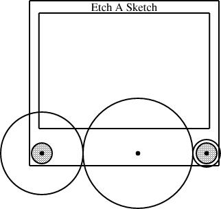
        require "eas";

        number WIDTH = 2;

        EAS the_eas(w = WIDTH);

        gear3 gears(width=WIDTH, r1=1/4, r3=1/12);

        constraints {
            the_eas.left = gears.g1.c;
            the_eas.right = gears.g3.c;
        }
The eas.lino file defines the EAS component and also
the gear3 component, which describes what the three gears
should look like. The diagram itself just chooses a global width and
communicates it to the EAS component and the gear3
component. It also communicates two of the three selected gear sizes
to the gear3, which generates the three gears and their
axles. Finally, the specification constrains the left
reference point of the Etch-a-Sketch to lie at the center of gear 1, and the
right reference point to lie at the center of gear 3.This sort of thing was exactly what I was hoping for when I started designing linogram. I wanted it to be easy to define a new component type, like EAS or gear3, and to use it as if it were a built-in type. (Indeed, as noted before, even linogram's "built-in" types are not actually built in! Everything from point on up is defined by a .lino file just like the one above, and if the user wants to redefine point or line, they are free to do so.)
(It may not be clear redefining point or line is actually a useful thing to do. But it could be. Consider, for example, what would happen if you were to change the definition of point to contain a z coordinate, in addition to the x and y coordinates it normally has. The line and box definitions would inherit this change, and become three-dimensional objects. If provided with a suitably enhanced rendering component, linogram would then become a three-dimensional diagram-drawing program. Eventually I will add this enhancement to linogram.)
I am a long-time user of the AT&T Unix tool pic, which wants to allow you to define and use compound objects in this way, but gets it badly wrong, so that it's painful and impractical. Every time I suffered through pic's ineptitude, I would think about how it might be done properly. I think linogram gets it right; pic was a major inspiration.
Slanty lines
Partway through drawing the Etch-a-Sketch diagrams, I had a happy idea. Since I was describing Etch-a-Sketch configurations that would draw lines with various slopes, why not include examples?
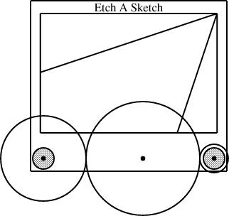
line L(slope=..., start=..., ...);
In general, though, this is too hard to handle. The resulting equations are quadratic, or worse, trigonometric, and linogram does not know how to solve those kinds of equations.
But if the slope is required to be constant, then the quadratic equations become linear, and there is no problem. And in this case, I only needed constant slopes. Once I realized this, it was easy to define a constant-slope line type:
        require "line";

        define sline extends line {
          param number slope;
          constraints {
            end.y - start.y = slope * (end.x - start.x);
          }
        }
An sline is just like a line, but it has an
additional parameter, slope (which must be constant, and
specified at compile time, not inferred from other values) and one
extra constraint that uses it. Normally, all four of start.x,
end.x, start.y, and end.y are independent.
The constraint removes some of the independence, so that any three,
plus the slope, are sufficient to determine the fourth.The diagram above was generated from this specification:
        require "eas";
        require "sline";

        number WIDTH = 2;

        EAS the_eas(w = WIDTH);

        gear3 gears(width=WIDTH, r1=1/4, r3=1/12);
        sline L1(slope=1/3, start=the_eas.screen.ne);
        sline L2(slope=3, start=the_eas.screen.ne);

        constraints {
            the_eas.left = gears.g1.c;
            the_eas.right = gears.g3.c;
            L1.end.x = the_eas.screen.w.x;
            L2.end.y = the_eas.screen.s.y;
        }
The additions here are the sline items, named L1 and L2. Both lines start at the northeast corner of the screen. Line L1 has slope 1/3, and its other endpoint is constrained to lie somewhere on the west edge of the screen. The y-coordinate of that endpoint is not specified, but is implicitly determined by the other constraints. To locate it, linogram must solve some linear equations. The complete set of constraints no the line is:
| L1.start.x = the_eas.screen.ne.x |
| L1.start.y = the_eas.screen.ne.y |
| L1.end.x = the_eas.screen.w.x |
| L1.end.y - L1.start.y = L1.slope × (L1.end.x - L1.start.x); |
| L1.end.y - L1.start.y = 1/3 × (L1.end.x - L1.start.x); |
The other line, L2, with slope 3, is handled similarly; its endpoint is constrained to lie somewhere on the south side of the screen.
Surprise features
When I first planned linogram, I was hardly thinking of slopes at all, except to dismiss them as being intractable, along with a bunch of other things like angles and lengths. But it turned out that they are a little bit tractable, enough that linogram can get a bit of a handle on them, thanks to the param feature that allows them to be excluded from the linear equation solving.One of the signs that you have designed a system well is that it comes out to be more powerful than you expected when you designed it, and lends itself to unexpected uses. The slines are an example of that. When it occurred to me to try doing them, my first thought was "but that won't work, will it?" But it does work.
Here's another technique I hadn't specifically planned for, that is already be supported by linogram. Suppose Fred Flooney wants to use the eas library, but doesn't like the names of the reference points in the EAS component. Fred is quite free to define his own replacement, with whatever names for whatever reference points he likes
        require "eas";

        define freds_EAS {
          EAS it;
          point middle = it.screen.c;
          point bernard = (it.body.e + 2*it.body.se)/3;
          line diag(start=it.body.nw, end=it.body.se);
          draw { it; }
        }
The freds_EAS component is essentially the same as the
EAS component defined by eas.lino. It contains a
single Etch-a-Sketch, called it, and a few extra items that Fred is
interested in. If E is a freds_EAS, then
E.middle refers to the point at the center of E's
screen; E.bernard is a point two-thirds of the way between
the middle and the bottom corner of its outer edge, and
E.diag is an invisible line running diagonally across the
entire body, equipped with the usual E.diag.start,
E.diag.center, and the like. All the standard items are
still available, as E.it.vknob,
E.it.screen.left.center, and so on.
The draw section tells linogram that only the component named it—that is, the Etch-a-Sketch itself—should be drawn; this suppresses the diag line. which would otherwise have been rendered also.
If Fred inherits some other diagram or component that includes an Etch-a-Sketch, he can still use his own aliases to refer to the parts of the Etch-a-Sketch, without modifying the diagram he inherited. For example, suppose Fred gets handed my specification for the diagram above, and wants to augment it or incorporate it in a larger diagram. The diagram above is defined by a file called "eas4-3-12.lino", which in turn requires EAS.lino. Fred does not need to modify eas4-3-12.lino; he can do:
        require "eas4-3-12.lino";
        require "freds_eas";

        freds_EAS freds_eas(it = the_eas);

        constraints {
          freds_eas.middle = ...;
          freds_eas.bernard = ...;
        }
        ...
Fred has created one of his extended Etch-a-Sketch components, and identified
the Etch-a-Sketch part of it with the_eas, which is the Etch-a-Sketch part of my
original diagram. Fred can then apply constraints to the
middle and bernard sub-parts of his
freds_eas, and these constraints will be propagated to the
corresponding parts the the_eas in my original diagram. Fred
can now specify relations in terms of his own peronal middle
and bernard items, and they will automatically be related to
the appropriate parts of my diagram, even though I have never heard of
Fred and have no idea what bernard is supposed to represent.Why Fred wants these names for these components, I don't know; it's just a contrived example. But the important point is that if he does want them, he can have them, with no trouble.
What next?
There are still a few things missing from linogram. The last major missing feature is arrays. The gear3 construction I used above is clumsy. It contains a series of constraints that look like:
  g1.e = g2.w;
  g2.e = g3.w;
The same file also has an analogous gear2 definition, for diagrams with only two gears. Having both gear2 and gear3, almost the same, is silly and wasteful. What I really want is to be able to write:
  define gears[n] open {
    gear[n] g;
    constraints {
      g[i].e = g[i+1].w;
    }
  }
and this would automatically imply components like gear2 and
gear3, with 2 and 3 gears, but denoted gear[2] and gear[3],
respectively; it would also imply gear[17] and
gear[253] with the analogous constraints.For gear[3], two constraints are generated: g[0].e = g[1].w, and g[1].e = g[2].w. Normally, arrays are cyclic, and a third constraint, g[2].e = g[0].w, would be generated as well. The open keyword suppresses this additional constraint.
This feature is under development now. I originally planned it to support splines, which can have any number of control points. But once again, I found that the array feature was going to be useful for many other purposes.
When the array feature is finished, the next step will be to create a spline type: spline[4] will be a spline with 4 control points; spline[7] will be a spline with 7 control points, and so on. PostScript will take care of drawing the splines for me, so that will be easy. I will also define a regular polygon type at that time:
        define polygon[n] closed {
          param number rotation = 0;
          number radius;
          point v[n], center;
          line  e[n];
          constraints {
            v[i] = center + radius * cis(rotation + i * 360/n);
            e[i].start = v[i];
            e[i].end   = v[i+1];
          }
        }
polygon[3] will then be a rightward-pointing equilateral
triangle; constraining any two of its vertices will determine the
position of the third, which will be positioned automatically. Note
the closed keyword, which tells linogram to include the constraint
e[2].end =
v[0], which would have been omitted had open been
used instead. More complete information about linogram is available in Chapter 9 of Higher-Order Perl; complete source code is available from the linogram web site.

[Other articles in category /linogram] permanent link
Damning with faint praise
If you have used evaporated milk, you may have noticed that the label
says something like:
By adding one part water to one part of the contents of this can, a resulting milk product will be obtained which will not be below the legal standard for whole milk.
This sounds ghastly, doesn't it? "Will not be below the legal standard...". Shudder.
The purpose of this note is to let you know that:
- I have done this,
- more than once, and
- it not only wasn't as ghastly as it sounds,
- it wasn't ghastly at all.
From the warning on the label, you would expect maybe a 30% resemblance to milk; in truth, the resemblance is more like 85%. That's close enough to drink plain, if you're not too fussy, and it's certainly close enough to pour over your cereal without noticing the difference.
The wording of the label scares people off, but it works quite well, well enough that it is probably worth keeping a couple of cans in the closet for emergencies, like when you run out of milk for your cereal at 2 AM after the store is closed.
This has been a public service announcement of the Universe of Discourse. Happy Thanksgiving, everyone!
[Other articles in category /food] permanent link
Wed, 22 Nov 2006
Baseball team nicknames
Lorrie and I were in the car, and she noticed another car with a
Detroit Pistons sticker. She remarked that "Pistons" was a good name
for a basketball team, and particularly for one from Detroit. I
agreed. But then she mentioned the Utah Jazz, a terrible mismatch,
and asked me how that happened to be. Even if you don't know, you can
probably guess: They used to be the New Orleans Jazz, and the team
moved to Utah. They should have changed the name to the Teetotalers
or the Salt Flats or something, but they didn't, so now we have the
Utah Jazz. I hear that next month they're playing the Miami Fightin'
Irish.
That got us thinking about how some sports team names travel, and others don't. Jazz didn't. The Miami Heat could trade cities or names with the Phoenix Suns and nobody would notice. But consider the Chicago Bulls. They could pick up and move anywhere, anywhere at all, and the name would still be fine, just fine. Kansas City Bulls? Fine. Honolulu Bulls? Fine. Marsaxlokk Bulls? Fine.
We can distinguish two categories of names: the "generic" names, like "Bulls", and the "local color" names, like "Pistons". But I know more about baseball, so I spent more time thinking about baseball team names.
In the National League, we have the generic Braves, Cardinals, Cubs, Giants, Pirates, and Reds, who could be based anywhere, and in some cases were. The Braves moved from Boston to Milwaukee to Atlanta, although to escape from Boston they first had to change their name from the Beaneaters. The New York Giants didn't need to change their name when they moved to San Francisco, and they won't need to change their name when they move to Jyväskylä next year. (I hear that the Jyväskylä city council offered them a domed stadium and they couldn't bear to say no.)
On the other hand, the Florida Marlins, Arizona Diamondbacks, and Colorado Rockies are clearly named after features of local importance. If the Marlins were to move to Wyoming, or the Rockies to Nebraska, they would have to change their names, or turn into bad jokes. Then again, the Jazz didn't change their name when they moved to Utah.
The New York Mets are actually the "Metropolitans", so that has at least an attempt at a local connection. The Washington Nationals ditto, although the old name of the Washington Senators was better. At least in that one way. Who could root for a team called the Washington Senators? (From what I gather, not many people could.)
The Nationals replaced the hapless Montreal Expos, whose name wasn't very good, but was locally related: they were named for the 1967 Montreal World's Fair. Advice: If you're naming a baseball team, don't choose an event that will close after a year, and especially don't choose one that has already closed.
The Houston Astros, and their Astrodome filled with Astroturf, are named to recall the NASA manned space center, which opened there in 1961. The Philadelphia club is called the Phillies, which is not very clever, but is completely immovable. Boston Phillies, anyone? Pittsburgh Phillies? New York Phillies? No? I didn't think so.
I don't know why the San Diego Padres are named that, but there is plenty of Spanish religious history in the San Diego area, so I am confident in putting them in the "local color" column. Milwaukee is indeed full of Brewers; there are a lot of Germans up there, brewing up lager. (Are they back in the National League again? They seem to switch leagues every thirty years.)
That leaves just the Los Angeles Dodgers, who are a bit of an odd case. The team, as you know, was originally the Brooklyn Dodgers. The "Dodgers" nickname, as you probably didn't know, is short for "Trolley Dodgers". The Los Angeles Trolley Dodgers is almost as bad a joke as the Nebraska Rockies. Fortunately, the "Trolley" part was lost a long time ago, and we can now imagine that the team is the Los Angeles Traffic Dodgers. So much for the National League; we have six generic names out of 16, counting the Traffic Dodgers in the "local color" group, and ignoring the defunct Expos.
The American League does not do so well. They have the Boston Royals, the Kansas City Tigers, the Detroit Indians, the Oakland Orioles, and three teams that are named after sox: the Red, the White, and the Athletics.
Then there are the Blue Jays. They were originally owned by Labatt, a Canadian brewer of beer, and were so-named to remind visitors to the park of their flagship brand, Labatt's Blue. I might have a harder time deciding which group to put them in, if it weren't for the (1944-1945) Philadelphia Blue Jays. If the name is generic enough to be transplanted from Toronto to Philadelphia, it is generic. I have no idea what name the Toronto club could choose if they wanted to avail themselves of the "local color" option rather than the "generic" option; it's tempting to make a cruel joke and suggest that the name most evocative of Toronto would be the Toronto Generics. But no, that's unfair. They could always call their baseball club the Toronto Hockey Fans.
Anyway, moving on, we have the New York Yankees, which is not the least generic possible name, but clearly qualifies as "local color" once you pause to think about the Charleston Yankees, the Shreveport Yankees, and the Selma Yankees. The Tampa Bay Devil Rays are clearly "local color". The Minnesota Twins play in the Twin Cities of Minneapolis and St. Paul. The California, Anaheim, or Los Angeles Angels, whatever they're called this week, are evidently named for the city of Los Angeles. I would ridicule the Los Angeles Angels for having a redundant name, but as an adherent of the Philadelphia Phillies, I am living in a glass house.
The Texas Rangers are named for the famous Texas Rangers. I don't know exactly why the Seattle club is named Mariners; I wouldn't have considered Seattle to be an unusually maritime city, but their previous team was the Seattle Pilots, so the folks in Seattle must think of themselves so, and I'm willing to go along with it.
The tally for the American League is therefore eight generic, six local color. The total for Major League Baseball as a whole is 14 generic names out of 30.
This is a lot better than the Japanese Baseball League, which has a bunch of teams with names like the Lions, Tigers, Dragons, Giants, and Fighters. They make up for this somewhat in the names of the teams' corporate sponsors, so, for example, the Nippon Ham Fighters. They are sponsored by Nippon Ham, which does not make it any less funny. And the Yakult Swallows, which, if you interpret it as a noun phrase, sounds just a little bit like a gay porn flick set in Uzbekistan.
Incidentally, my favorite team name is the Wilmington Blue Rocks. The Blue Rocks' mascot is, alas, not a rock but a moose. Sometimes I dream of a team from Lansing, Michigan, called the Lansing Boils, but I know it will remain an unfulfilled fantasy.
[ Warning for non-Americans: Almost, but not quite everything in this article is the truth. Marsaxlokk does not actually have a Major League baseball club yet; however, they do have a class-A affiliate in the Mediterranean league, called the Marsaxlokk Moghzaskops. Also, the Giants are not scheduled to move to Jyväskylä until after the 2008 season. ]
[ Addendum 20061127: There is a followup article to this one. ]
[ Addendum 20230425: I can't believe it took me this long to realize it, but the Los Angeles Lakers is just as strange a mismatch as the Utah Jazz. There are no lakes near Los Angeles. That name itself tells you what happened: the team was originally located in Minneapolis. ]
[Other articles in category /lang] permanent link
Linogram: Declarative drawing
As we saw in yesterday's
article, The definition of the EAS component is twenty
lines of strange, mostly mathematical notation. I could have drawn
the Etch-a-Sketch in a WYSIWYG diagram-drawing system like xfig. It might have
been less trouble. Many people will prefer this. Why invent linogram?
Some of the arguments should be familiar to you. The world is full of operating systems with GUIs. Why use the Unix command line? The world is full of WYSIWYG word processors. Why use TeX?
Text descriptions of processes can be automatically generated, copied, and automatically modified. Common parts can be abstracted out. This is a powerful paradigm.
Collectively, the diagrams contained 19 "gears". Partway through, I decided that the black dot that represented the gear axle was too small, and made it bigger. Had I been using a WYSIWYG system, I would have had the pleasure of editing 19 black dots in 10 separate files. Then, if I didn't like the result, I would have had the pleasure of putting them back the way they were. With linogram, all that was required was to change the 0.02 to an 0.05 in eas.lino:
        define axle {
          param number r = 0.05;
          circle a(fill=1, r=r);
        }
The Etch-a-Sketch article contained seven similar diagrams with slight differences. Each one contained a require "eas"; directive to obtain the same definition of the EAS component. Partway through the process, I decided to alter the aspect ratio of the Etch-a-Sketch body. Had I been drawing these with a WYSIWYG system, that would have meant editing each of the seven diagrams in the same way. With linogram, it meant making a single trivial change to eas.lino.
A linogram diagram has a structure: it is made up of component parts with well-defined relationships. A line in a WYSIWYG diagram might be 4.6 inches long. A line in a linogram diagram might also be 4.6 inches long, but that is probably not all there is to it. The south edge of the body box in my diagrams is 4.6 inches long, but only because it has been inferred (from other relationships) to be 1.15 w, and because w was specified to be 4 inches. Change w, and everything else changes automatically to match. Each part moves appropriately, to maintain the specified relationships. The distance from the knob centers to the edge remains 3/40 of the distance between the knobs. The screen remains 70% as tall as the body. A WYSIWYG system might be able to scale everything down by 50%, but all it can do is to scale down everything by 50%; it doesn't know enough about the relationships between the elements to do any better. What will happen if I reduce the width but not the height by 50%? The gears are circles; will the WYSIWYG system keep them as circles? Will they shrink appropriately? Will their widths be adjusted to fit between the two knobs? Maybe, or maybe not. In linogram, the required relationships are all explicit. For example, I specified the size of the black axle dots in absolute numbers, so they do not grow or shrink when the rest of the diagram is scaled.
Finally, because the diagrams are mathematically specified, I can leave the definitions of some of the components implicit in the mathematics, and let linogram figure them out for me. For example, consider this diagram:

gear3 gears(width=WIDTH, r1=1/4, r3=1/12);
I specified r1, the radius of the left gear, and r3, the radius of the right gear. Where is the middle gear? It's implicit in the definition of the gear3 type. The definition knows that the three gears must all touch, so it calculates the radius of the middle gear accordingly:
define gear3 {
  ...
  number r2 = (1 - r1 - r3) / 2;
  ...
}
linogram gives me the option of omitting r2 and having it be calculated for me from this formula, or of specifying r2 anyway, in which case linogram will check it against this formula and raise an error if the values don't match.
Tomorrow: The Etch-a-Sketch as a component.
More complete information about linogram is available in Chapter 9 of Higher-Order Perl; complete source code is available from the linogram web site.
[Other articles in category /linogram] permanent link
Tue, 21 Nov 2006
Linogram: The EaS component
In yesterday's article I
talked about the basic facilities provided by linogram. What about the
Etch-a-Sketch diagrams?
The core of these diagrams was a specification I wrote for an Etch-a-Sketch itself, in a file called eas.lino. The specification is complicated, because an Etch-a-Sketch has many parts, but it is conceptually just like the definitions above: it defines a diagram component called an EAS that looks like an Etch-a-Sketch:
        define EAS {
          param number w;
          number knobrad = w * 1/16;
          circle hknob(r=knobrad, fill=0.25), vknob(r=knobrad, fill=0.25);
          point left = hknob.c, right = vknob.c;
          number margin = 3/40 * w;
          box body(sw = left + (-margin, -margin), se = right + (margin,  -margin),
                   ht = w * 1);
          box screen(wd = body.wd * 0.9,
                     n = body.n + (0, -margin),
                     ht = body.ht * 0.7);

          number nudge = body.ht * 0.025;
          label Brand(text="Etch A Sketch") = (body.n + screen.n)/2 + (0, -nudge);

          constraints { left + (w, 0) = right;
                        left.y = right.y = 0;
                        left.x = 0;
                      }
        }
I didn't, of course, write this all in one fell swoop. I built it up a bit at a time. Each time I changed the definition in the eas.lino file, the changes were inherited by all the files that contained require "eas".
The two main parts of the Etch-a-Sketch are the body (large outer rectangle) and screen (smaller inner rectangle), which are defined to be boxes:
        box body(...);
        box screen(...);
But most of the positions are ultimately referred to the centers of the two knobs. The knobs themselves are hknob and vknob, and their centers, hknob.c and vknob.c, are given the convenience names left and right:
point left = hknob.c, right = vknob.c;
Down in the constraints section is a crucial constraint:
left + (w, 0) = right;
This constrains the right point (and, by extension, vknob.c and the circle vknob of which it is the center, and, by further extension, anything else that depends on vknob) to lie exactly w units east and 0 units south of the left point. The number w ("width") is declared as a "param", and is special: it must be specified by the calling context, to tell the Etch-a-Sketch component how wide it is to be; if it is omitted, compilation of the diagram fails. By varying w, we can have linogram draw Etch-a-Sketch components in different sizes. The diagram above had w=4; this one has w=2:

number knobrad = w * 1/16;
So if you make w twice as big, the knobs get twice as big also.
The quantity margin is the amount of space between knobs and the edge of the body box, defined to be 3/40 of w:
number margin = 3/40 * w;
Since the margin is 0.075 w, and the knobs have size 0.0625 w, there is a bit of extra space between the knobs and the edge of the body. Had I wanted to state this explicitly, I could have defined margin = knobrad * 1.15 or something of the sort.
The southwest and southeast corners of the body box are defined as offsets from the left and right reference points, which are at the centers of the knobs:
          box body(sw = left + (-margin, -margin),
                   se = right + (margin, -margin),
                   ht = w * 1);
(The body(sw = ..., se = ..., ht = ...) notation is
equivalent to just including body.sw = ...; body.se =
...; body.ht = ... in the constraints section.)This implicitly specifies the width of the body box, since linogram can deduce it from the positions of the two bottom corners. The height of the body box is defined as being equal to w, making the height of the body equal to the distance between the to knobs. This is not realistic, since a real Etch-a-Sketch is not so nearly a square, but I liked the way it looked. Earlier drafts of the diagram had ht = w * 2/3, to make the Etch-a-Sketch more rectangular. Changing this one number causes linogram to adjust everything else in the entire diagram correspondingly; everything else moves around to match.
The smaller box, the screen, is defined in terms of the larger box, the body:
          box screen(wd = body.wd * 0.9,
                     n = body.n + (0, -margin),
                     ht = body.ht * 0.7);
It is 9/10 as wide as the body and 7/10 as tall. Its "north" point
(the middle of the top side) is due south of the north point of the
body, by a distance equal to margin, the distance between the
center of a knob and the bottom edge of the body. This is enough
information for linogram to figure out everything it needs to know about the
screen.The only other features are the label and the fill property of the knobs. A label is defined by linogram's standard library. It is like a point, but with an associated string:
        require "point";

        define label extends point {
                param string text;
                draw { &put_string; }
        }
Unlike an ordinary point, which is not drawn at all, a
label is drawn by placing the specified string at the
x and y coordinates of the point.
All the magic here is in the put_string() function, which is
responsible for generating the required PostScript output.
          number nudge = body.ht * 0.025;
          label Brand(text="Etch A Sketch") =
                (body.n + screen.n)/2 + (0, -nudge);
The text="..." supplies the text parameter, which is handed off directly to put_string(). The rest of the constraint says that the text should be positioned halfway between the north points of the body and the screen boxes, but nudged southwards a bit. The nudge value is a fudge factor that I put in because I haven't yet gotten the PostScript drawing component to position the text at the exact right location. Indeed, I'm not entirely sure about the best way to specify text positioning, so I left that part of the program to do later, when I have more experience with text.
The fill parameter of the knobs is handled similarly to the text parameter of a label: it's an opaque piece of information that is passed to the drawing component for handling:
circle hknob(r=knobrad, fill=0.25), vknob(r=knobrad, fill=0.25);
The PostScript drawing component then uses this when drawing the circles, eventually generating something like gsave 0.75 setgray fill grestore. The default value is 0, indicating white fill; here we use 0.25, which is light gray. (The PostScript drawing component turns this into 0.75, which is PostScript for light gray. PostScript has white=1 and black=0, but linogram has white=0 and black=1. I may reverse this before the final release, or make it a per-diagram configuration option.)
Tomorrow: Advantages of declarative drawing.
More complete information about linogram is available in Chapter 9 of Higher-Order Perl; complete source code is available from the linogram web site.
[Other articles in category /linogram] permanent link
Mon, 20 Nov 2006
favicon.ico
I'm getting hundreds of failed requests for favicon.ico. I
need to come up with a good-looking icon for the blog. Since the blog
isn't about Higher-Order
Perl, I don't want to use the HOP cover or the HOP quilt
block icon  .
.
I have not had any good ideas. So I am asking LazyNet.
The best suggestion will win a free one-year subscription to The Universe of Discourse blog. If the winner supplies an icon that I can actually use, the prize will be increased to a free two-year subscription.
Any suggestions?
[ Addendum 20061120: David Eppstein responded immediately with  , which I will explain in a future article that
summarizes the suggestions. M. Eppstein's suggestion is good
enough that I am comfortable installing it right away. But don't let
that stop you from coming up with your own suggestion. ]
, which I will explain in a future article that
summarizes the suggestions. M. Eppstein's suggestion is good
enough that I am comfortable installing it right away. But don't let
that stop you from coming up with your own suggestion. ]
[ Addendum 20061120: Neil Kandalgaonkar has contributed
 . Thank you, Neil! ]
[Other articles in category /meta] permanent link
Sun, 19 Nov 2006
A series of articles about Linogram
Every six months or so I do a little work on linogram, which for about
18 months now has been about one week of hard work short of version
1.0. Every time I try to use it, I am surprised by how pleased I am
with it, how easy I find it to use, and how flexible the (rather
spare) basic feature set is—all properties of a well-designed
system.
I was planning to write a short note about this, but, as always happens when I write about linogram, it turned into a very long note that included a tutorial about how linogram works, a rant about why it is a good idea, and a lot of technical examples. So I decided to break the 4,000-word article into smaller pieces, which I will serialize.
Most recently I used linogram to do schematic diagrams of an Etch-a-Sketch for some recent blog articles ([1] [2]). In case you have forgotten, here is an example:

Basic ideas of linogram
There are two basic concepts that provide the underpinnings of linogram. One is that most interesting features of a line drawing can be described by giving a series of linear equations that relate the positions of the components. For example, to say that line B starts at the same place that line A ends, one provides the two extremely simple linear equations:
        B.start.x = A.end.x;
        B.start.y = A.end.y;
which one can (and normally would) abbreviate to:
B.start = A.end;
The computer is very good at solving systems of linear equations, and can figure out all the things the equations imply. For example, consider two boxes, X and Y:
        X.ht = 2;     # height of box X
        Y.ht = 3;     # height of box Y
        X.s = Y.n;    # 's' is 'south'; 'n' is 'north'
From this, the program can deduce that the south edge of box Y
is 5 units south of the north edge of box X, even though
neither was mentioned explicitly.These simple examples are not very impressive, but please bear with me.
The other fundamental idea in linogram is the idea of elements of a diagram as components that can be composed into more complicated elements. The linogram libraries have a definition for a box, but it is not a primitive. In fact, linogram has one, and only one primitive type of element: the number. A point is composed of two numbers, called x and y, and is defined by the point.lino file in the library:
        define point {
          number x, y;
        }
A line can then be defined as an object that contains two points, the
start and end points:
        require "point";

        define line {
          point start, end;
        }
Actually the real definition of line is somewhat more
complicated, because the center point is defined as well, for the
user's convenience:
        require "point";

        define line {
          point start, end, center;
          constraints {
            center = (start + end) / 2;
          }
        }
The equation
center = (start + end) / 2 is actually shorthand
for two equations, one involving x and the other involving
y:
| center.x = (start.x + end.x) / 2 |
| center.y = (start.y + end.y) / 2 |
From the specification above, the program can deduce the location of the center point given the two endpoints. But it can also deduce the location of either endpoint given the locations of the center and the other endpoint. The treatment of equations is completely symmetrical. In fact, the line is really, at the bottom, an agglomeration of six numbers (start.x, center.y, and so forth) and from any specification of two x coordinates and two y coordinates, the program can deduce the missing values.
The linogram standard library defines hline and vline as being like ordinary lines, but constrained to be horizontal and vertical, and the then box.lino defines a box as being two hlines and two vlines, constrained so that they line up in a box shape:
        require "hline";
        require "vline";

        define box {
          vline left, right;
          hline top, bottom;
          constraints {
            left.start  = top.start;
            right.start = top.end;
            left.end    = bottom.start;
            right.end   = bottom.end;
          }
        }
I have abridged this definition for easy reading; the actual definition in the file has more to it. Here it is, complete:
        require "hline";
        require "vline";
        require "point";

        define box {
          vline left, right;
          hline top, bottom;
          point nw, n, ne, e, se, s, sw, w, c;
          number ht, wd;
          constraints {
            nw = left.start  = top.start;
            ne = right.start = top.end;
            sw = left.end    = bottom.start;
            se = right.end   = bottom.end;

            n = (nw + ne)/2;
            s = (sw + se)/2;
            w = (nw + sw)/2;
            e = (ne + se)/2;

            c = (n + s)/2;

            ht = left.length;
            wd = top.length;
          }
        }
The additional components, like sw, make it easy to refer to the corners and edges of the box; you can refer to the southwest corner of a box B as B.sw. Even without this convenience, it would not have been too hard: B.bottom.start and B.left.end are names for the same place, as you can see in the constraints section.
Tomorrow: The Etch-a-Sketch component.
More complete information about linogram is available in Chapter 9 of Higher-Order Perl; complete source code is available from the linogram web site.
[Other articles in category /linogram] permanent link
Thu, 16 Nov 2006
Etch-a-Sketch blue-skying, corrected
In my last article I
discussed a scheme for improving the Etch-a-Sketch which contained a serious
mechanical error. I was discussing attaching gears to the two knobs
of the Etch-a-Sketch to force them to turn at the exact same rate. Supposing
that the distance between the knobs is 1 unit, I said, then we can
gear the two knobs together by attaching a gear of radius 1/2 to each
knob; the two gears will mesh, and the knobs will then turn at the same
rate, in opposite directions. This was fine.
Then I went astray, and suggested adding an axle peg midway between the two knobs, and putting gears of radius 1/3 on the peg and on the two knobs. This won't work.
The one person who wrote to me to ask about the problem is a very bright person, but been seriously confused about how I was planning to set up the gears, so I evidently I didn't explain it very well. It needed a picture. So this time I'm going to try to get it right, with pictures. Here is an Etch-a-Sketch:

Here are some gears, which happen to have radii 1/3, 1/4, and 1/6:
Here's a picture of an Etch-a-Sketch with a radius-1/2 gear mounted on each knob:
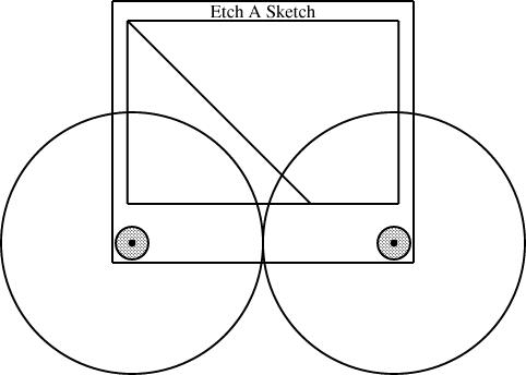
Here the knobs have been fitted with different-sized gears, one with radius 1/3 and the other with radius 2/3:
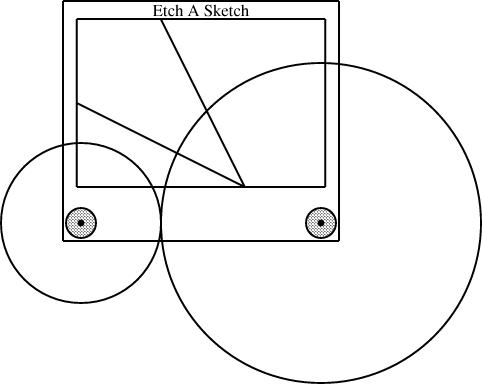
Then I suggested that you could drill a little hole in between the two knobs, and use it to mount a third axle and a third gear. If all three gears are the same size, the two knobs are forced to turn at the same rate, this time in the same direction, and you get a line with slope 1, from southeast to northwest:
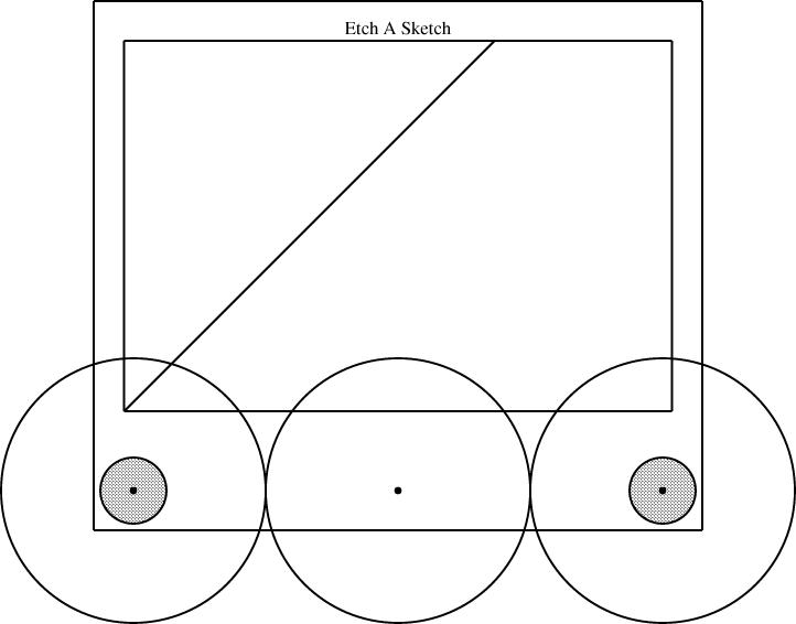
This wrecks the rest of the details of my other article. Since we were already including gears of size 1/2 and 1/3, I reasoned, we can throw in a gear of size 1/6 and get some new behaviors from the 1/2 + 1/3 + 1/6 combination. The corresponding combination for 1/2 and 1/4 is 1/8:
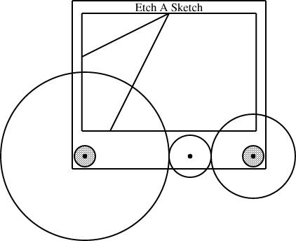
So what next? The calculations are a bit less obvious than they were back in the happy days when I thought that installing two gears of size p and q left space for one of size 1-(p+q). It's tempting to consider a radius-1/3 gear next, since it's the simplest size I haven't yet installed. But to mount it on the knobs along with a size-1/2 gear, we need to include a size-1/12 gear to go in between:
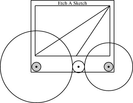
Once we have the size-1/12 gear, we can mount it with the size-1/4 and size-1/3 that we already had:

[Other articles in category /games] permanent link
Sun, 12 Nov 2006
Etch-a-Sketch
I've always felt that the Etch-a-Sketch is a superb example of a toy
that doesn't do as much as it could.
An Etch-a-Sketch is a drawing toy invented in 1959 by Arthur Granjean and marketed by the Ohio Art company since shortly afterward. It looks superficially like a flat-screen television with two knobs.
It is very easy to draw horizontal and vertical lines, but very difficult to draw diagonal lines. (Wikipedia says "Creating a straight diagonal line or smoothly curved line with an Etch A Sketch is notoriously difficult and a true test of coordination.") So although extremely complex drawings can be made with an Etch-a-Sketch:
(Etch-a-Sketch drawing of
Albert Einstein by Nicole
Falzone)
But it needn't be so. The most frustrating thing about the Etch-a-Sketch, I think, is that its potential has not yet begun to be unlocked.
Consider a forty-five degree line. To draw such a line, one must turn both the horizontal and the vertical knobs at the same time, at exactly the same rate. Suppose, for concreteness, that we're drawing a line from the upper left to the lower right. If you turn the horizontal knob a little too quickly, the diagonal line will bend rightward; if you turn it a little too slowly the diagonal line will bend downward. So in contrast to the mathematically exact vertical and horizontal lines that are easy to draw, it's next to impossible to draw a diagonal line that doesn't wiggle. And when you screw up, you can't fix the mistake without erasing the whole thing and starting over.
But the solution is obvious: If you can link the two knobs somehow, so that they can only turn simultaneously, you can easily draw a diagonal line. As a child, I experimented with rubber bands, trying to get one knob to drive the other. This wasn't successful. Clearly, a better solution is to use gears.
There are plenty of examples of toys that have good-quality cast-plastic gears. (Spirograph is one such.) The knobs on the Etch-a-Sketch could be geared together. If the gears are the same size, the knobs will rotate at the same rate, and the result will be a perfect 45° line.
If you gear the two knobs together directly, they will rotate in opposite directions, so that you can only draw lines with slope -1 (northwest to southeast), not with slope 1 (northeast to southwest). To fix this problem, we need to introduce more gears. There can be an axle peg sticking up from the case of the Etch-a-Sketch, in between the two knobs. Mounting three equal-sized gears on the two knobs and the axle peg gears will force the knobs to rotate in the same direction, at the same rate.
[ The remainder of this article contains a number of very dumb arithmetic errors. For example, you cannot fit three gears of size 1/3 on the knobs and pegs; you need to use three gears of size 1/4 instead. I will correct this on Monday, and provide an illustration to make it clearer what I mean. —MJD ]
[ Addendum 20061116: I have posted the correction, with illustrations. ]
Let's say that the distance between the centers of the two knobs is 1. We can get a line of slope -1 by mounting two gears, each with radius 1/2, on the two knobs; we can get a line of slope +1 by mounting three gears, each with radius 1/3, on the two knobs and on the axle peg. If we want to do both, we had better make the axle peg removable, or else it will interfere with the size-1/2 gears. This is no problem. It can mount into a socket on the front of the Etch-a-Sketch, and be pulled out when not needed.
But why have only one socket? We're including five gears already (two of size 1/2 and three of size 1/3) so we may as well put them to some more use. Throw in a size 1/6 gear, and add another socket for the axle peg, this time 1/3 of the way between the two knobs. Now you can mount a size 1/2 gear on the left knob, a size 1/6 gear on the axle peg, and a size 1/3 gear on the right knob. If the left knob turns at rate r, the middle gear turns at rate -3r and the right knob turns at rate 3r/2. This produces a line with slope 3/2, which is about a 56-degree angle.
Or put in another socket for the axle peg, 1/6 of the way between the knobs, and then mount size 1/2, size 1/3, and size 1/6 gears, in that order. The knobs are now producing a line with slope 3, a 72-degree angle. If you want a line with slope 1/3 (18°) instead, just reverse the order of the gears. (That is, exchange the large and the small ones.)
At this point adding a few more gears expands the repertoire significantly. Add a radius-2/3 gear and another radius-1/6 gear and you can mount [2/3, 1/3] to get lines with slope -1/2, [1/3, 2/3] to get slope -2, [2/3, 1/6, 1/6] to get slope 4, [1/6, 1/6, /23] to get slope 1/4.
Clearly, you can carry this onwards, limited only by the space for the axle holes and the expense of adding in more gears. Spirograph used to deliver fifteen or twenty plastic gears for a reasonable price, so it's clearly not implausible that Ohio Art could have done something like this.
Sometimes I even dare to think that they might have provided cams or elliptical gears. Properly designed cams could gear together the knobs to produce mathematically exact curved lines, squiggles, maybe even circles.
But no, as far as I can tell, it's never been done. Why not?
[Other articles in category /games] permanent link
Thu, 19 Oct 2006
Boring answers to Powell's questions
A while back I answered some questions for Powell's City of Books web site. I
didn't know they had posted the answers until it was brought to my
attention by John Gabriele. Thank you, John.
They sent fifteen questions and asked me to pick at least five. I had a lot of trouble finding five of their questions that I wanted to answer. Most of the questions were not productive of interesting answers; I had to work hard to keep my answers from being super-dull.
The non-super-dull answers are on Powell's site. Here are the questions I didn't answer, with their super-dull answers:
- Have you ever taken the Geek Test? How did you rate?
Hardly anyone seems to answer this question, and really, who cares? Except that Sir Roger Penrose said something like "There's a Geek Test?".
I did take it once, but I forget how I scored. But if you read this blog, you can probably extrapolate: high on math, science, and programming. But really, who cares? Telling someone else about your geek test score is even more boring than telling them about your dreams.
- What do you do for relaxation?
I didn't answer this one because my answer seemed so uninteresting. I program. I read a lot; unlike most people who read a lot, I read a lot of different things. Sometimes I watch TV. I go for walks and drive the car.
One thing I used to do when I was younger was the "coffee trick". I'd go to an all-night diner with pens and a pad of paper and sit there drinking coffee all night and writing down whatever came out of my caffeine-addled brain. I'm too old for that now; it would make me sick.
- What's your favorite blog right now?
I answered this one for Powell's, and cited my own blog and Maciej Ceglowski's. But if I were answering the question today I would probably mention What Jeff Killed. Whenever a new What Jeff Killed post shows up in the aggregator, I get really excited. "Oh, boy!" I say. "I can't wait to see What Jeff Killed today!".
It occurs to me that just that one paragraph could probably give plenty of people a very clear idea of what I'm like, at least to the point that they would be able to decide they didn't want to know me.
- Douglas Adams or Scott Adams?
I think they're both boring. But I wasn't going to say so in my Powell's interview.
- What was your favorite book as a kid?
This should have been easy to answer, but none of the books I thought of seemed particularly revealing. When I was in sixth grade my favorite book was "The Hero from Otherwhere," by Jay Williams. (He also wrote the Danny Dunn books.) A few years back Andrew Plotkin posted on rec.arts.sf.written that he had recently read this, and that it occurred to him that it might have been his favorite book, had he read it in sixth grade, and had anyone had that experience. I wasn't the only one who had.
I reread it a few years ago and it wasn't that good anymore.
Robertson Davies writes about the awful juvenile-fiction magazines that he loved when he was a juvenile. Yes, they were terrible, but they fed something in him that needed to be fed. I think a lot of the books we love as children are like that.
- What new technology do you think may actually have the potential
for making people's lives better?
I couldn't think of any way to answer this question that wouldn't be really boring. That probably says a lot more about me than about the question. I thought about gene therapy, land mine detection, water purification. But I don't personally have anything to do with those things, so it would just be a rehash of what I read in some magazine. And what's the point of reading an interview with an author who says, "Well, I read in Newsweek..."?
- If you could be reincarnated for one day to live the life of any
scientist or writer, who would you choose and why?
This seems like it could have been interesting, but I couldn't figure out what to do with it. I might like to be Galileo, or to know what it's like to be Einstein, but that's not what the question says; it says that I'm me, living the life of Galileo or Einstein. But why would I want to do that? If I'm living the life of Einstein, that means I get to get up in the morning, go to an office in Zurich or Princeton, and sit behind a desk for eight hours, wishing I was smart enough to do Einstein's job.
Some writers and scientists had exciting lives. I could be reincarnated as Evariste Galois, who was shot to death in a duel. That's not my idea of a good time.
I once knew a guy who said he'd like to be David Lee Roth for one day, so that he could have sex with a groupie. Even if I wanted to have sex with a groupie, the question ("scientist or writer") pretty much rules out that form of entertainment. I suppose there's someone in the world who would want to be Pierre Curie, so that he know what it was like to fuck Marie Curie. That person isn't me.
- What are some of the things you'd like your computer to do that it
cannot now do?
I came really close to answering this question. I had an answer all written. I wrote that I wanted the computer to be able to manufacture pornography on demand to the user's specification: if they asked for a kneecap fetish movie featuring Celine Dion and an overalls-wearing midget, it should be able to do that.
Then I came to my senses and I realized I didn't want that answer to appear on my interview on the Powell's web site.
But it'll happen, you wait and see.
I also said I'd settle for having the computer discard spam messages before I saw them. I think the porn thing is a lot more likely.
- By the end of your life, where do you think humankind will be in
terms of new science and technological advancement?
First I was stumped on this one because I don't know when the end of my life will be. I could be crushed in a revolving door next week, right?
And assuming that I'll live another thirty years seems risky too. I'm hoping for a medical breakthrough that will prolong my life indefinitely. I expect it'll be along sooner or later. So my goal is to stay alive and healthy long enough to be able to take advantage of it when it arrives.
Some people tell me they don't want to be immortal, that they think they would get bored. I believe them. People are bored because they're boring. Let them die; I won't miss them. I know exactly what I would do with immortality: I would read every book in the library.
A few months ago I was visiting my mother, and she said that as a child I had always wanted to learn everything, and that it took me a long time to realize that you couldn't learn everything.
I got really angry, and I shouted "I'm not done yet!"
Well, even assuming that I live another thirty years, I don't think I can answer the question. When I was a kid my parents would go to the bank to cash a check. We got seven channels on the TV, and that was more than anyone else; we lived in New York. Nobody owned a computer; few people even owned typewriters. Big companies stored records on microfiche. The only way to find out what the law was was to go to the library and pore over some giant dusty book for hours until you found what you wanted.
And sixty years ago presidential campains weren't yet advertising on television. Harry Truman campaigned by going from town to town on the back of a train (a train!) making speeches and shaking hands with people.
Thirty years from now the world will be at least that different from the way things are now. How could I know what it'll be like?
- Which country do you believe currently leads the world in science
and technology? In ten years?
In case you hadn't noticed, I hate trying to predict the future; I don't think I'm good at it and I don't think anyone else is. Most people who try don't seem to revisit their old predictions to see if they were correct, or to learn from their past errors, and the people who listen to them never do this.
Technology prognosticators remind me of the psychics in the National Enquirer who make a hundred predictions for 2007: Jennifer Aniston will get pregnant with twins; space aliens will visit George Bush in the White House. Everyone can flap their mouth about what will happen next year, but it's not clear that anyone has any useful source of information about it, or is any better than anyone else at predicting.
I read a book a few years back called The Year 2000: A Framework for Speculation on the Next Thirty Years, by Kahn and Weiner. It has a bunch of very carefully-done predictions about the year 2000, and was written in 1967. The predictions about computers are surprisingly accurate, if you ignore the fact that they completely failed to predict the PC. The geopolitical predictions are also surprisingly accurate, if you ignore the fact that they completely failed to predict the fall of the Soviet Union.
But hardly anyone predicted the PC or the fall of the Soviet Union. And even now it's not clear whether the people who did predict those things did so because they were good at predicting or if it was just lucky guesses, like a stopped clock getting the time right twice a day.
Sometimes I have to have dinner with predictors. It never goes well. Two years ago at OSCON I was invited to dinner with Google. I ended up sitting at a whole table of those people. Last year I was invited again. I said no thanks.
[ Addendum 20180423: Andrew Plotkin's rec.arts.sf.written post. ]
[Other articles in category /book] permanent link
Wed, 18 Oct 2006
A statistical puzzle
I heard a nice story a few years back. I don't know if it's true, but
it's fun anyway. The story was that the University of North Carolina
surveyed their graduates, asking them how much money they made, and
calculated the average salary for each major. Can you guess which
major had the highest average salary?
Answer:
| Geography |
Can you explain this?
Explanation:
| Michael Jordan majored in Geography. |
[Other articles in category /math] permanent link
Tue, 17 Oct 2006
Why it was the wrong pi
It my last article, I
pointed out that the value of π carved into the wall of the
Washington Park Portland MAX station is wrong:

  3.1415926535   8979323846   2643383279   5028841971   6939937510  5820974944   5923078164   0628620899   8628034825   3421170679
    8214808651   3282306647   0938446095   5058223172   5359408128  4811174502   8410270193   8521105559   6446229489   5493038196
    4428810975   6659334461   2847564823   3786783165   2712019091  4564856692   3460348610   4543266482   1339360726   0249141273
    7245870066   0631558817   4881520920   9628292540   9171536436  7892590360   0113305305   4882046652   1384146951   9415116094
    3305727036   5759591953   0921861173   8193261179   3105118548  0744623799   6274956735   1885752724   8912279381   8301194912
    9833673362   4406566430   8602139494   6395224737   1907021798  6094370277   0539217176   2931767523   8467481846   7669405132
    0005681271   4526356082   7785771342   7577896091   7363717872  1468440901   2249534301   4654958537   1050792279   6892589235
    4201995611   2129021960   8640344181   5981362977   4771309960  5187072113   4999999837   2978049951   0597317328   1609631859
    5024459455   3469083026   4252230825   3344685035   2619311881  7101000313   7838752886   5875332083   8142061717   7669147303
    5982534904   2875546873   1159562863   8823537875   9375195778  1857780532   1712268066   1300192787   6611195909   2164201989
    897932
The digits are meant to be read across, so that after the "535" in the
first group, the next digits are "8979..." on the same line. But
instead, the artist has skipped down to the first group in the second
line, "8214...". Whoops.This explanation was apparently discovered by Oregonians for Rationality. I found it by doing Google search for "portland 'washington park' max station pi wrong value". Thank you, Google.
One thing that struck me about the digits as written is that there seemed to be too many repeats; this is what made me wonder if the digits were invented by the artist out of laziness or an attempt to communicate a secret message. We now know that they weren't. But I wondered if my sense that there were an unusually large number of duplicates was accurate, so I counted. If the digits are normal, we would expect exactly 1/10 of the digits to be the same as the previous digit.
In fact, of 97 digit pairs, 14 are repeats; we would expect 9.7. So this does seem to be on the high side. Calculating the likelihood of 14 repeats appearing entirely by chance seems like a tedious chore, without using somewhat clever methods. I'm in the middle of reading some books by Feller and Gnedenko about probability theory, and they do explain the clever methods, but they're at home now, so perhaps I'll post about this further tomorrow.
[Other articles in category /math] permanent link
It's not pi
In August I was in Portland for OSCON. One afternoon I went out to
Washington Park to visit the museums there. The light rail station is
underground, inside a hill, and the walls are decorated with all sorts
of interesting things. For example, there's an illuminated panel with
pictures of a sea urchin, a cactus, and a guy with a mohawk; another
one compares an arm bone and a trombone. They bored a long lava core
out of the hill, and display the lava core on the wall:

The inbound platform walls have a bunch of mathematics displays, including a display of Pascal's triangle. Here's a picture of one of them that I found extremely puzzling:
So what's the deal? Did they just screw up? Did they think nobody would notice? Is it a coded message? Or is there something else going on that I didn't get?
[ Addendum 20061017: The answer! ]
[Other articles in category /math] permanent link
Mon, 16 Oct 2006
Why two ears?
Aaron Swartz, remembering my earlier article about
interesting science questions, sent me a reference to
an
interesting article about odd questions asked of students
applying for admission to Cambridge and Oxford universities.
The example given in the article that I found most interesting was "Why don't we just have one ear in the middle of our face?". As I said earlier, I think the mark of a good question is that it's quick to ask and long to answer. I've been thinking about this one for several days now, and seems pretty long to answer.
Any reasonable answer to this question is going to be based on evolutionary and adaptive considerations, I think. When you answer from evolutionary considerations, there are only a few kinds of answers you can give:
- It's that way because it confers a survival or reproductive advantage.
- It's that way because that's the only way it can be made to work.
- It's that way because it doesn't really matter, and that's just the way it happened to come out.
(Why only one heart? There's no benefit to having two; if you lose 50% of your cardiac capacity, you'll die anyway. Why one mouth? It needs to be big enough to eat with, and anyway, you can't lose it. Why one liver? No reason; that's just the way it's made; two livers would work just as well as one. Why two lungs? I'm not sure; I suppose it's a combination between "no reason, that's the way it's made" (#3 above) and "because that way you can still breathe even if one lung gets clogged up" (#1).)
The positioning of your ears is important. Having two ears far apart on the sides of your head allows you to locate sounds by triangulation. Triangulation requires at least two ears, and requires that they be as far apart as possible. This also explains why the ears are on the sides rather than the front.
Consider what would go wrong if the positions of the eyes and ears were switched. The ears would be pointed in the same direction, which would impede the triangulation-by-sound process. The eyes would be pointed in opposite directions, which would completely ruin the triangulation-by-sight process; you would completely lose your depth perception. So the differing position of the eyes and ears can be seen a response to the differing physical properties of light and sound: light travels in straight lines; sound does not.
The countervailing benefit to losing your depth perception would be that you would be able to see almost 180 degrees around you. Many animals do have their eyes on the side of their heads: antelopes, rabbits, and so forth. Prey, in other words. Predators have eyes on the fronts of their heads so that they can see the prey they are sneaking up on. Prey have eyes on the sides of their heads so that predators can't sneak up on their flanks. Congratulations: you're predator, not prey.
Animals do have exactly one nose in the middle of their face. Why not two? Here, triangulation is not an issue at all. Having one nose on each side of your head would not help you at all to locate the source of an odor. So the nose is stuck in the middle of the head, I suppose for mostly mechanical reasons: animals with noses evolved from animals with a long breathing tube down the middle of their bodies. The nose arises as sensors stuck in the end of the tube. This is another explanation for the one mouth.
Another consideration is symmetry. The body is symmetric, so if you want two ears, you have to put one on each side. Why is this? I used to argue that it was to save information space in the genome: there is only so much room in your chromosomes for instructions about how to build your body, so the information must be compressed. One excellent way to compress it is to make some parts like other parts and then express the differences as diffs. This, I used to say, is why the body is symmetric, why your feet look like your hands, and why men's and women's bodies are approximately the same.
I now think this is wrong. Well, wrong and right, essentially right, but mostly wrong. The fact is, there is plenty of space in the chromosomes for instructions about all sorts of stuff. Chromosomes are really big, and full of redundancy and junk. And if it's so important to save space in the chromosome, why is the inside of your body so very asymmetric?
I now think the reason for symmetries and homologies between body parts is less to do with data compression and storage space in the chromosome, and more to do with the shortness of the distance between points in information space. Suppose you are an animal with two limbs, each of which has a hand on the end. Then a freak mutation occurs so that your descendants now have four limbs. The four limbs will all have similar hands, because mutation cannot invent an entirely new kind of hand out of thin air. Your genome contains only one set of instructions for appendages that go on the ends of limbs, so these are the instructions that are available to your descendants. These instructions can be duplicated and modified, but again, there is no natural process by which a new set of instructions for a new kind of appendage can be invented from whole cloth. So your descendants' hands will look something like their feet for quite a long time.
Similarly, there is a certain probability, say p, of an earless species evolving something that functions as an ear. The number p is small, and ears arise only because of natural selection in favor of having ears. The chance that the species will simultaneously and independently evolve two completely different kinds of ear structures is no more than p2, which is vanishingly small. And once the species has something earlike, the selection pressure in favor of the second sort of ear is absent. So a species gets one kind of ear. If having two ears is beneficial, it is extremely unlikely to arise through independent evolution, and much more likely to arise through a much smaller mutation that directs the same structure, the one for which complete instructions already exist in the genome, to appear on each side of the head.
So this is the reason for bodily symmetry. Think of (A) an earless organism, (B) an organism with two completely different ears, and (C) an organism with two identical ears. Think of these as three points in the space of all possible organisms. The path from point A to C is both much shorter than the path from A to B, and also much more likely to be supported by selection processes.
Now, why is the outside of the body symmetric while the inside is not? I haven't finished thinking this through yet. But I think it's because the outside interacts with the gross physical world to a much greater extent than the inside, and symmetry confers an advantage in large-scale physical interactions. Consider your legs, for example. They are approximately the same length. This is important for walking. If you had a choice between having both legs shortened six inches each, and having one leg shortened by six inches, you would certainly choose the former. (Unless you were a sidehill winder.) Similarly, having two different ears would mess up your hearing, particularly your ability to locate sounds. On the other hand, suppose one of your kidneys were much larger than the other. Big deal. Or suppose you had one giant liver on your right side and none on the left. So what? As long as your body is generally balanced, it is not going to matter, because the liver's interactions with the world are mostly on a chemical level.
So I think that's why you have an ear on each side, instead of one ear in the middle of your head: first, it wouldn't work as well to have one. Second, symmetry is favored by natural selection for information-conserving reasons.
[Other articles in category /bio] permanent link
Sat, 07 Oct 2006
Bone names
Names of bones are usually Latin. They come in two types. One type is
descriptive. The auditory ossicles (that's Latin for "little
bones for hearing") are named in English the hammer, anvil, and
stirrup, and their formal, Latin names are the malleus
("hammer"), incus ("anvil"), and stapes ("stirrup")
 The
fibula is the small bone in the lower leg; it's named for the Latin
fibula, which is a kind of Roman safety pin. The other leg
bone, the tibia, is much bigger; that's the frame of the pin, and the
fibula makes the thin sharp part.
The
fibula is the small bone in the lower leg; it's named for the Latin
fibula, which is a kind of Roman safety pin. The other leg
bone, the tibia, is much bigger; that's the frame of the pin, and the
fibula makes the thin sharp part.
The kneecap is the patella, which is a "little pan". The big,
flat parietal bone in the skull is from paries, which is a wall
or partition. The clavicle, or collarbone, is a little key.
 "Pelvis" is Latin for "basin". The pelvis is made of four bones: the
sacrum, the coccyx, and the left and right os innominata. Sacrum is
short for os sacrum, "the sacred bone", but I don't know why it
was called that. Coccyx is a cuckoo bird, because it looks like a
cuckoo's beak. Os innominatum means "nameless bone": they gave
up on the name because it doesn't look like anything. (See
illustration to right.)
"Pelvis" is Latin for "basin". The pelvis is made of four bones: the
sacrum, the coccyx, and the left and right os innominata. Sacrum is
short for os sacrum, "the sacred bone", but I don't know why it
was called that. Coccyx is a cuckoo bird, because it looks like a
cuckoo's beak. Os innominatum means "nameless bone": they gave
up on the name because it doesn't look like anything. (See
illustration to right.)
On the other hand, some names are not descriptive: they're just the
Latin words for the part of the body that they are. For example, the
thighbone is called the femur, which is Latin for "thigh". The
big lower arm bone is the ulna, Latin for "elbow". The upper
arm bone is the humerus, which is Latin for "shoulder".
(Actually, Latin is umerus, but classical words beginning in
"u" often acquire an initial "h" when they come into English.) The
leg bone corresponding to the ulna is the tibia, which is Latin
for "tibia". It also means "flute", but I think the flute meaning is
secondary—they made flutes out of hollowed-out tibias.
Some of the nondescriptive names are descriptive in Latin, but not in English. The vertebra in English are so called after Latin vertebra, which means the vertebra. But the Latin word is ultimately from the verb vertere, which means to turn. (Like in "avert" ("turn away") and "revert" ("turn back").) The jawbone, or "mandible", is so-called after mandibula, which means "mandible". But the Latin word is ultimately from mandere, which means to chew.
The cranium is Greek, not Latin; kranion (or κρανιον, I suppose) is Greek for "skull". Sternum, the breastbone, is Greek for "chest"; carpus, the wrist, is Greek for "wrist"; tarsus, the ankle, is Greek for "instep". The zygomatic bone of the face is yoke-shaped; ζυγος ("zugos") is Greek for "yoke".
The hyoid bone is the only bone that is not attached to any other bone. (It's located in the throat, and supports the base of the tongue.) It's called the "hyoid" bone because it's shaped like the letter "U". This used to puzzle me, but the way to understand this is to think of it as the "U-oid" bone, which makes sense, and then to remember two things. First, that classical words beginning in "u" often acquire an initial "h" when they come into English, as "humerus". And second, classical Greek "u" always turns into "y" in Latin. You can see this if you look at the shape of the Greek letter capital upsilon, which looks like this: Υ. Greek αβυσσος ("abussos" = "without a bottom") becomes English "abyss"; Greek ανωνυμος ("anonumos") becomes English "anonymous"; Greek υπος ("hupos"; there's supposed to be a diacritical mark on the υ indicating the "h-" sound, but I don't know how to type it) becomes "hypo-" in words like "hypothermia" and "hypodermic". So "U-oid" becomes "hy-oid".
(Other parts of the body named for letters of the alphabet are the sigmoid ("S-shaped") flexure of the colon and the deltoid ("Δ-shaped") muscle in the arm. The optic chiasm is the place in the head where the optic nerves cross; "chiasm" is Greek for a crossing-place, and is so-called after the Greek letter Χ.)
The German word for "auditory ossicles" is Gehörknöchelchen. Gehör is "for hearing". Knöchen is "bones"; Knöchelchen is "little bones". So the German word, like the Latin phrase "auditory ossicles", means "little bones for hearing".
[Other articles in category /lang/etym] permanent link
Fri, 06 Oct 2006
[Other articles in category /anniversary] permanent link
Tue, 03 Oct 2006
Ralph Johnson on design patterns
Last month I wrote an
article about design patterns which attracted a lot of favorable
attention in blog world. I started by paraphrasing Peter
Norvig's observation that:
"Patterns" that are used recurringly in one language may be invisible or trivial in a different language.
and ended by concluding:
Patterns are signs of weakness in programming languages.Ralph Johnson, one of the four authors of the famous book Design Patterns, took note of my article and responded. I found Johnson's response really interesting, and curious in a number of ways. I think everyone who was interested in my article should read his too. [ Addendum 20070127: The link above to Ralph Johnson's response is correct, but your client will be rejected if you are referred from here. To see his blog page, visit the page without clicking on the link. ]When we identify and document one, that should not be the end of the story. Rather, we should have the long-term goal of trying to understand how to improve the language so that the pattern becomes invisible or unnecessary.
Johnson raises several points. First there is a meta-issue to deal with. Johnson says:
He clearly thinks that what he says is surprising. And other people think it is surprising, too. That is surprising to me.I did think that what I had to say was interesting and worth saying, of course, or I would not have said it. And I was not surprised to find that other people agreed with me.
One thing that I did find surprising is the uniformity of other people's surprise and interest. There were dozens of blog posts and comments in the following two weeks, all pretty much saying what a great article I had written and how right I was. I tracked the responses as carefully as I could, and I did not see any articles that called me a dumbass; I did not see any except for Johnson's that suggested that what I was saying was unsurprising.
We can't conclude from this that I am right, of course; people agree with all sorts of stupid crap. But we can conclude that that what I said was surprising and interesting, since people were surprised and interested by it, even people who already have some knowledge of this topic. Johnson is right to be surprised by this, because he thought this was obvious and well-known, and that it was clearly laid out in his book, and he was mistaken. Many or most of the readers of his book have completely missed this point. I didn't miss it, but I didn't get it from the book, either.
Johnson and his three co-authors wrote this book, Design Patterns, which has had a huge influence on the way that programming is practiced. I think a lot of that influence has been malign. Any practice can be corrupted, of course, by being reduced to its formal aspects and applied in a rote fashion. (There's a really superb discussion of this in A. Ya. Khinchin's essay On the Teaching of Mathematics, and a shorter discussion in Polya's How to Solve It, in the section on "Pedantry and Mastery".) That will happen to any successful movement, and the Gang of Four can't take all the blame for that.
But if they really intended that everyone should understand that each design pattern is a demonstration of a weakness in its target language, then they blew it, because it appears that hardly anyone understood that.
Let's pause for a moment to imagine an alternate universe in which the subtitle of the Design Patterns book was not "Elements of Reusable Object-Oriented Software" but "Solutions for Recurring Problems in Object-Oriented Languages". And let's imagine that in each section, after "Pattern name", "Intent", "Motivation", "Applicability", and so forth, there was another subsection titled "Prophylaxis" that went something like this: "The need for the Iterator pattern in C++ appears to be due partly to its inflexible type system and partly to its lack of abstract iteration structures. The iterator pattern is unnecessary in the Python language, which avoids these defects as follows: ... at the expense of ... . In Common Lisp, on the other hand, ... (etc.)".
I would have liked to have seen that universe, but I suppose it's too late now. Oh well.
Anyway, moving on from meta-issues to the issues themselves, Johnson continues:
At the very end, he says that patterns are signs of weakness in programming languages. This is wrong.This is interesting, and I was going to address it later, but I now think that it's the first evidence of a conceptual mistake that Johnson has made that underlies his entire response to my article, so I'll take it up now.
At the very end of his response, Johnson says:
No matter how complicated your language will be, there will always be things that are not in the language. These things will have to be patterns. So, we can eliminate one set of patterns by moving them into the language, but then we'll just have to focus on other patterns. We don't know what patterns will be important 50 years from now, but it is a safe bet that programmers will still be using patterns of some sort.Here we are in complete agreement. So, to echo Johnson, I was surprised that he would think this was surprising. But how can we be in complete agrement if what I said was "wrong"? There must be a misunderstanding somewhere.
I think I know where it is. When I said "[Design] Patterns are signs of weakness in programming languages," what I meant was something like "Each design pattern is a sign of a weakness in the programming language to which it applies." But it seems that Johnson thinks that I meant that the very existence of design patterns, at all, is a sign of weakness in all programming languages everywhere.
If I thought that the existence of design patterns, at all, was a sign that current programming languages are defective, as a group, I would see an endpoint to programming language development: someday, we would have a perfect überlanguage in which it would be unnecessary to use patterns because all possible patterns would have been built in already.
I think Johnson thinks this was my point. In the passage quoted above, I think he is addressing the idea of the überlanguage that incorporates all patterns everywhere at all levels of abstraction. And similarly:
Some people like languages with a lot of features. . . . I prefer simple languages.And again:
No matter how complicated your language will be, there will always be things that are not in the language.But no, I don't imagine that someday we will have the ultimate language, into which every conceivable pattern has been absorbed. So a lot of what Johnson has to say is only knocking down a straw man.
What I imagine is that when pattern P applies to language L, then, to the extent that some programmer on some project finds themselves needing to use P in their project, the use of P indicates a deficiency in language L for that project.
The absence of a convenient and simple way to do P in language L is not always a problem. You might do a project in language L that does not require the use of pattern P. Then the problem does not manifest, and, whatever L's deficiencies might be for other projects, it is not deficient in that way for your project.
This should not be difficult for anyone to understand. Perl might be a very nice language for writing a program to compile a bioinformatic data file into a more reasonable form; it might be a terrible language for writing a real-time missile guidance system. Its deficiencies operate in the missile guidance project in a way that they may not in the data munging project.
But to the extent that some deficiency does come up in your project, it is a problem, because you are implementing the same design over and over, the same arrangement of objects and classes, to accomplish the same purpose. If the language provided more support for solving this recurring design problem, you wouldn't need to use a "pattern". Consider again the example of the "subroutine" pattern in assembly language: don't you have anything better to do than redesign and re-implement the process of saving the register values in a stack frame, over and over? Well, yes, you do. And that is why you use a language that has that built in. Consider again the example of the "object-oriented class" pattern in C: don't you have anything better to do than redesign and re-implement object-oriented method dispatch with inheritance, over and over? Yes, you do. And that is why you use a language that has that built in, if that is what you need.
By Gamma, Helm, Johnson, and Vlissides' own definition, the problems solved by patterns are recurring problems, and programmers must address them recurringly.
If these problems recurred in every language, we might conclude that they were endemic to programming itself. We might not, but it's hard to say, since if there are any such problems, they have not yet been brought to my attention. Every pattern discovered so far seems to be specific to only a small subset of the world's languages.
So it seems a small step to conclude that these recurring, language-specific problems are actually problems with the languages themselves. No problem is a problem in every language, but rather each problem is a red arrow, pointing at a design flaw in the language in which it appears.
Johnson continues:
Patterns might be a sign of weakness, but they might be a sign of simplicity. . . .I think this argument fails, in light of the examples I brought up in my original article. The argument is loaded by the use of the word "simplicity". As Einstein said, things should be as simple as possible, but no simpler. In assembly language, "subroutine call" is a pattern. Does Johnson or anyone seriously think that C++ or Smalltalk or Common Lisp or Java would be improved by having the "subroutine call" pattern omitted? The languages might be "simpler", but would they be better?
The alternative, remember, is to require the programmer to use a "pattern": to make them consult a manual of "patterns" to implement a "general arrangement of objects and classes" to solve the subroutine-call problem every time it comes up.
I guess you could interpret that as a sign of "simplicity", but it's the wrong kind of simplicity. Language designers have a hard problem to solve. If they don't put enough stuff into the language, it'll be too hard to use. But if they put in too much stuff, it'll be confusing and hard to program, like C++. One reason it's hard to be a language designer is that it's hard to know what to put in and what to leave out. There is an extremely complex tradeoff between simplicity and functionality.
But in the case of "patterns", it's much easier to understand the tradeoff. A pattern, remember, is a general method for solving "a recurring design problem". Patterns might be a sign of "simplicity", but if so, they are a sign of simplicity in the wrong place, a place where the language needs to be less simple and more featureful. Because patterns are solutions to recurring design problems.
If you're a language designer, and a "pattern" comes to your attention, then you have a great opportunity. The programmers using your language have a recurring problem. They have to implement the same solution to it, over and over. Clearly, this is a good place to try to expend some design effort; perhaps you can trade off a little simplicity for some functionality and fix the language so that the problem is a problem no longer.
Getting rid of one recurring design problem might create new ones. But if the new problems are operating at a higher level of abstraction, you may have a win. Getting rid of the need for the "subroutine call" pattern in assembly language opened up all sorts of new problems: when and how do I do recursion? When and how do I do coroutines?
Getting rid of the "object-oriented class" pattern in C created a need for higher-level patterns, including the ones described in the Design Patterns book. When people didn't have to worry about implementing inheritance themselves, a lot of their attention was freed up, and they could notice patterns like Façade.
As Alfred North Whitehead says, civilization advances by extending the number of important operations which we can perform without thinking about them. The Design Patterns approach seems to be to identify the important operations and then to think about them over and over and over and over and over.
Or so it seems to me. Johnson's next paragraph makes me wonder if I've completely missed his point, because it seems completely senseless to me:
There is a trade-off between putting something in your programming language and making it be a convention, or perhaps putting it in the library. Smalltalk makes "constructor" be a convention. Arithmetic is in the library, not in the language. Control structures and exception handling are from the library, not in the language.Huh? Why does "library" matter? Unless I have missed something essential, whether something is in the "language" or the "library" is entirely an implementation matter, to be left to the discretion of the compiler writer. Is printf part of the C language, or its library? The library, everyone knows that. Oh, well, except that its behavior is completely standardized by the language standard, and it is completely permissible for the compiler writer to implement printf by putting a special case into the compiler that is enabled when the compiler happens to see the directive #include <stdio.h>. There is absolutely no requirement that printf be loaded from a separate file or anything like that.
Or consider Perl's dbmopen function. Prior to version 5.000, it was part of the "language", in some sense; in 5.000 and later, it became part of the "library". But what's the difference, really? I can't find any.
Is Johnson talking about some syntactic or semantic difference here? Maybe if I knew more about Smalltalk, I would understand his point. As it is, it seems completely daft, which I interpret to mean that there's something that went completely over my head.
Well, the whole article leaves me wondering if maybe I missed his point, because Johnson is presumably a smart guy, but his argument about the built-in features vs. libraries makes no sense to me, his argument about simplicity seems so clearly and obviously dismantled by his own definition of patterns, and his apparent attack on a straw man seems so obviously erroneous.
But I can take some consolation in the thought that if I did miss his point, I'm not the only one, because the one thing I can be sure of in all of this is that a lot of other people have been missing his point for years.
Johnson says at the beginning that he "wasn't sure whether to be happy or unhappy". If I had written a book as successful and widely read as Design Patterns and then I found out that everyone had completely misunderstood it, I think I would be unhappy. But perhaps that's just my own grumpy personality.
[ Addendum 20080303: Miles Gould wrote a pleasant and insightful article on Johnson's point about libraries vs. language features. As I surmised, there was indeed a valuable point that went over my head. I said I couldn't find any difference between "language" and "library", but, as M. Gould explains, there is an important difference that I did not appreciate in this context. ]
[Other articles in category /prog] permanent link
Really real examples of HOP techniques in action
I recently stopped working for the University of Pennsylvannia's
Informations Systems and Computing group, which is the organization
that provides computer services to everyone on campus that doesn't
provide it for themselves.
I used HOP stuff less than I might have if I hadn't written the HOP book myself. There's always a tradeoff with the use of any advanced techniques: it might provide some technical benefit, like making the source code smaller, but the drawback is that the other people you work with might not be able to maintain it. Since I'm the author of the book, I can be expected to be biased in favor of the techniques. So I tried to compensate the other way, and to use them only when I was absolutely sure it was the best thing to do.
There were two interesting uses of HOP techniques. One was in the username generator for new accounts. The other was in a generic server module I wrote.
Name generation
The name generator is used to offer account names to incoming students and faculty. It is given the user's full name, and optionally some additional information of the same sort. It then generates a bunch of usernames to offer the user. For example, if the user's name is "George Franklin Bauer, Jr.", it might generate usernames like:
        george    bauer     georgef   fgeorge   fbauer    bauerf
        gf        georgeb   fg        fb        bauerg    bf
        georgefb  georgebf  fgeorgeb  fbauerg   bauergf   bauerfg
        ge        ba        gef       gbauer    fge       fba
        bgeorge   baf       gfbauer   gbauerf   fgbauer   fbgeorge
        bgeorgef  bfgeorge  geo       bau       geof      georgeba
        fgeo      fbau      bauerge   bauf      fbauerge  bauergef
        bauerfge  geor      baue      georf     gb        fgeor
        fbaue     bg        bauef     gfb       gbf       fgb
        fbg       bgf       bfg       georg     georgf    gebauer
        fgeorg    bageorge  gefbauer  gebauerf  fgebauer
The code that did this, before I got to it, was extremely long and
convoluted. It was also extremely slow. It would generate a zillion
names (slowly) and then truncate the list to the required length.It was convoluted because people kept asking that the generation algorithm be tweaked in various ways. Each tweak was accompanied by someone hacking on the code to get it to do things a little differently.
I threw it all away and replaced it with a lazy generator based on the lazy stream stuff of Chapter 6. The underlying stream library was basically the same as the one in Chapter 6. Atop this, I built some functions that generated streams of names. For example, one requirement was that if the name generator ran out of names like the examples above, it should proceed by generating names that ended with digits. So:
        sub suffix {
          my ($s, $suffix) = @_;
          smap { "$_$suffix" } $s;
        }

        # Given (a, b, c), produce a1, b1, c1, a2, b2, c2, a3...
        sub enumerate {
          my $s = shift;
          lazyappend(smap { suffix($s, $_) } iota());
        }

        # Given (a, b, c), produce a, b, c, a1, b1, c1, a2, b2, c2, a3...
        sub and_enumerate {
          my $s = shift;
          append($s, enumerate($s));
        }

        # Throw away names that are already used
        sub available_filter {
          my ($s, $pn) = @_;
          $pn ||= PennNames::Generate::InUse->new;
          sgrep { $pn->available($_) } $s;
        }
The use of the stream approach was strongly indicated here for two
reasons. First, the number of names to generate wasn't known in
advance. It was convenient for the generation module to pass back a
data structure that encapsulated an unlimited number of names, and let
the caller mine it for as many names as were necessary. Second, the frequent changes and tinkerings to the name generation algorithm in the past suggested that an extremely modular approach would be a benefit. In fact, the requirements for the generation algorithm chanced several times as I was writing the code, and the stream approach made it really easy to tinker with the order in which names were generated, by plugging together the prefabricated stream modules.
Generic server
For a different project, I wrote a generic forking server module. The module would manage a listening socket. When a new connection was made to the socket, the module would fork. The parent would go back to listening; the child would execute a callback function, and exit when the callback returned.The callback was responsible for communicating with the client. It was passed the client socket:
        sub child_callback {
          my $socket = shift;
          # ... read and write the socket ...
          return;   # child process exits
        }
But typically, you don't want to have to manage the socket manually.
For example, the protocol might be conversational: read a request
from the client, reply to it, and so forth:
        # typical client callback:
        sub child_callback {
          my $socket = shift;
          while (my $request = <$socket>) {
            # generate response to request
            print $socket $response;
          }
        }
The code to handle the loop and the reading and writing was
nontrivial, but was going to be the same for most client functions.
So I provided a callback generator. The input to the callback
generator is a function that takes requests and returns appropriate
responses:
        sub child_behavior {
          my $request = shift;
          if ($request =~ /^LOOKUP (\w+)/) {
            my $input = $1;
            if (my $result = lookup($input)) {
              return "OK $input $result";
            } else {
              return "NOK $input";
            }
          } elsif ($request =~ /^QUIT/) {
            return;
          } elsif ($request =~ /^LIST/) {
            my $N = my @N = all_names();
            return join "\n", "OK $N", @N, ".";
          } else {
            return "HUH?";
          }
        }
This child_behavior function is not suitable as a callback,
because the argument to the callback is the socket handle. But the
child_behavior function can be turned into a callback:
$server->run(CALLBACK => make_callback(\&child_behavior));
make_callback() takes a function like
child_behavior() and wraps it up in an I/O loop to turn it
into a callback function. make_callback() looks something
like this:
        sub make_callback {
          my $behavior = shift;
          return sub {
            my $socket = shift;
            while (my $request = <$socket>) {
              chomp $request;
              my $response = $behavior->($request);
              return unless defined $response;
              print $socket $response;
            }
          };
        }
I think this was the right design; it kept the design modular and
flexible, but also simple.
[Other articles in category /prog] permanent link
Wed, 20 Sep 2006
The world's worst macro preprocessor
Last week I added another plugin to my Blosxom installation. As I wrote before, the sole
benefit of Blosxom is that it's incredibly simple and lightweight. So
when I write plugins for it, I try to keep them incredibly simple and
lightweight, lest I spoil the single major benefit of Blosxom.
Sometimes I'm more successful, sometimes less so. This time I think I
did a good job.
The goal last time was a macro processor. I write a lot of math articles. I get tired of writing <sup>2</sup> every time I want a superscript 2. Even if I bind a function key to that sequence of characters, it's hard to read. But now, with my new Blosxom macro processor, I just insert a line into my article that says:
#define ^2 <sup>2</sup>
and for the rest of the article, ^2 is expanded to <sup>2</sup>.
This has turned out really well, and I'm using it for all sorts of stuff. I use it for math notations, such as for making -> an abbreviation for → (→), and for making ~ an abbreviation for ¬ (¬).
But I've also used it to #define Godel Gödel. I've used it to #define KK <b>K</b> and #define SS <b>S</b>, which makes an article I'm writing about combinatory logic readable, where it wasn't readable before. In my recent article about job hunting, I used it to #define CV résumé, which saved me from having to interrupt my train of thought several times in the article.
There are some important points about the design that I think I got right on the first try. Whenever you write a macro system, you have to ask about escape sequences: what do you do if you don't want a macro expanded? For example, in the combinatory logic article I defined a macro SS. This meant that if I had written MOUSSE in the article somewhere, it would have turned into MOUSE. How should I prevent that kind of error?
Answer: I don't. I'm unlikely to do that. But if I do, I'll pick it up during the article proofreading phase. If I can't avoid writing MOUSSE, I have two choices: I can change the name of the SS macro to something easier to avoid—like S*, say, or I can define a second macro: #define !MOUSSE MOUSSE. But so far, it hasn't come up.
One alternative solution is to say that macros are expanded only in certain contexts. For example, SS might only be expanded when it is a complete word, not when it is in the middle of a word, as MOUSSE. I resisted this solution. It is much simpler to remember that every macro is expanded everywhere. And it it is much easier to fix the problem of a macro being expanded when I don't want it than it is to fix the problem of a macro not being expanded when I do want it. So every macro is expanded no matter where it appears.
Related to the unintentional-expansion issue is that each article has its own private macro set. I don't have to worry that by defining a macro named -> in one article that I might be sabotaging my opportunity to actually write -> in some unknown future article. Each set of macros can be totally ad hoc. I don't have to worry about global tradeoffs. Do I #define --- —, knowing that that will foreclose my opportunity to use --- in any other way? I can make the decision based on simple, local information.
It would have been tempting to over-engineer the system and add all sorts of complex escape facilities. I think I made the right choice here by not doing any of that.
Another escaping issue: What if I want to write something that looks like a definition but isn't? Here I avoided the problem by choosing a definition syntax that I was unlikely to write in any other context: #define in the leftmost column indicates a definition. In this article, I had to write some similar text. It was no trouble to indent it a couple of spaces, disabling the special meaning. But HTML is already full of escape mechanisms, and it would have been no trouble to write #define instead of #define if for some reason I had really needed it to appear in the leftmost column. (Unlikely anyway, since HTML has no column semantics.)
Another right choice I think I made was not to parametrize the macros. An article on algebra might well have:
  #define ^2 <sup>2</sup>
  #define ^3 <sup>3</sup>
and it might be oh-so-tempting to try to eliminate the duplication à la C:
#define ^(\w+) <sup>$1</sup>I did not do this. It would have complicated the processing substantially. It would also have complicated the use of the package substantially: I would have to worry a lot more than I do about invoking macros unintentionally. And it is not needed. Not so far, anyway. Because macro definitions only last for the duration of the article, there is no pressure to make a complete or consistent set of definitions. If an article happens to use the notations 2, i, and N, I can define macros for those and only those notations.
Also tempting is to extend the macro system to support something like this:
#define BF(.*) <b>$1</b>I have so far resisted this. My feeling is that if I want to do anything like this, I should take it as a sign that I should be writing the articles in some markup system other than HTML. Choice of that markup system should be made carefully, and not organically as an ad-hoc overburdening of the macro system.
I did run into one trouble with the macro system. Originally, it was invoked before some of my other plugins and after others. The earlier plugins automatically inserted certain text into the article that sometimes accidentally triggered my macros. I have not had any trouble with this since I changed the plugin order to invoke the macro processor before any of the other plugins.
The macro-processing code is about 19 lines long, of which three are diagnostic. It is the world's worst macro system. It has exactly one feature. It is, I think the simplest thing that could possibly work, and so a good companion to Blosxom. For this application, the world's worst macro system is the world's best.
[ Addendum 20071004: There's now a one-year retrospective analysis. ]
[Other articles in category /prog] permanent link
Tue, 19 Sep 2006
Job hunting stories
A guy named Jonathan Rentzsch bookmarked my article about creeping
featurism and the ratchet effect, saying "I'd like to hire this
guy just so I could fire him." Since I was looking for a new job last
month, I sent him my résumé, inquiring about his company's severance
package. He didn't reply.
Also in the said-it-but-didn't-mean-it department, Anil Dash gave a plenary talk at OSCON in which he mentioned that sixapart was hiring, and "looking for Perl gods". I looked for the Perl god positions on the "jobs" part of their web site, and saw nothing relevant, but I sent my résumé anyway. They didn't reply.
A few years ago I was contacted by a headhunter who was offering me a one-year contract in Milford, Iowa. I said I did not want to work in Milford, Iowa. He tried to sell me on the job anyway. I said I did not want to work in Milford, Iowa. He would not take "no". He said, "Look, I understand you are reluctant to consider this. But I would like you to take a few days and think it over, and tell me what it would take to get you to agree." Okay.
I talked it over with my wife, and we decided that for $750,000 we would be willing for me to spend the year working in Milford, Iowa. $500,000, we decided, would not be sufficient, but $750,000 would. I forget by now how we arrived at this figure, but we took some care in coming up with it.
The headhunter called back. "Have you thought it over?" Yes, I had, I said. I had decided that $750,000 would be required to get me to Milford, Iowa.
He was really angry that I had wasted his time.
I really hate commuting. I had a job once in which I had to commute from Philadelphia (where I live) to New York. I told them when I took the job that if I liked it, I'd move to New York, and if not, I'd quit and move to Taiwan. Commuting to New York wrecked me. For years afterward I couldn't get onto a train without falling asleep immediately. After I quit, I didn't move to Taiwan; I stayed in Philadelphia and became a consultant. Every day I would wake up, put on my trousers, shuffle downstairs, and sit down at the computer. "Ahhh," I would say, "my morning commute is complete!" The novelty of this did not wear off for years.
One day I was on a five-week business trip to Asia. (I hate commuting, but I like travelling.) I got email from a headhunter who was offering me a long-term contract in Elkton, Maryland. I had told this headhunter's company repeatedly that I was only interested in working in the Philadelphia area. (Elkton, Maryland is about as close to Philadelphia as you can get and still be in Maryland, which means that the only thing between Elkton and Philadelphia is the state of Delaware.)
I wrote back, from Tokyo, and said that his company should stop contacting me, because I had told them over and over that I would only work in Philadelphia, and they kept sending me offers of employment in places like Elkton. I said it was a shame that we should waste each others' time like this.
He suggested that the problem could be solved if I could just give him a "courtesy call". From Tokyo.
Instead, I solved the problem by putting his company in my spam filter file.
When I was about nineteen, a friend of mine asked me to comment on his résumé. I told him it was too long (it was three pages long) and that no prospective employer would care that he had held a job washing dishes for his fraternity.
He didn't like my advice. I still think it was good advice. No nineteen-year-old needs a three-page résumé. I wonder if he eventually figured this out. You'd think so, but now that I have to read the résumés of people who are applying to me for jobs, it seems that hardly any of the applicants have figured out that you should leave out the job where you washed dishes for your fraternity.
I once explained to someone that I change my résumé and send a different one with each job application. He was really shocked, and said he would consider that dishonest. Huh.
I've talked to a couple of people lately who tell me that it's very rare to get a cover letter from an applicant that actually helps their chances of getting the job. At best, it's neutral. At worst, you get to see all their spelling and grammar errors.
I think most people don't know how to write a letter, or that they write one letter and send it with every application. Maybe they think it would be dishonest to send a different letter with every application.
There's a story about how Robert A. Heinlein became a writer: he needed money, and saw that some magazine was offering a $50.00 prize for the best story by a new author. He wrote a story, but concluded that that magazine would be swamped with submissions, so he sent it to a different magazine, which bought the story for $70.00.
I became a conference speaker and teacher of Perl classes in a similar way. I wanted to go to the second Perl conference, but I couldn't afford it. Someone mentioned to me that there was a $1,000 prize for the best user paper. I thought I could write a good paper, but I also thought that the best paper often doesn't win the prize. But I also found out that conference tutorial speakers were paid $1,500 and given free conference admission and airfare and hotel fees.
When you're submitting a proposal for a tutorial, it's perfectly honorable to go talk to the program committee behind the scenes and lobby them to accept your proposal instead of someone else's. If you do that with the contest judges, it's cheating. So I ignored the user paper contest and submitted a proposal for a tutorial, which was accepted.
I once applied for a sysadmin job at the College of Staten Island, which is the school they send you to if you aren't qualified for any of the City University schools but they have to let you go to college because the City University system guarantees to admit anyone who can pay the tuition.
I got back a peevish letter telling me that I wasn't qualified and to stop wasting the search committee's time. It was signed, in pen, "The Search Committee".
I accepted a job with the University of Pennsylvania instead.
[Other articles in category ] permanent link
Wed, 13 Sep 2006
Automorphisms of the complex numbers
In
an earlier article,
I wrote a proof that the only automorphisms of the complex numbers are
the identity function and the function
a + bi → a - bi.
Robert C. Helling points out that there is a much simpler proof that this is the case. Suppose that f is an automorphism, and that x2 = y. Then f(x2) = (f(x))2 = f(y), so that if x is a square root of y, then f(x) is a square root of f(y).
As I pointed out, f(1) = 1. Since -1 is a square root of 1, f(-1) must be a square root of 1, and so it must be -1. (It can't be 1, since automorphisms may not map two different arguments to the same value.) Since i is a square root of -1, f(i) must also be a square root of -1. So f(i) must be either ±i, and the theorem is proved.
This is a nice example of why I am not a mathematician. When I want to find the automorphisms of C, my first idea is to explicitly write down the general automorphism and then start bashing away on the algebra. This sort of mathematical pig-slaughtering gets the pig cut up all right, but mathematicians are not interested in slaughtering pigs. By which I mean that the approach gets the result I want, usually, but not new or mathematically interesting results.
In computer programming, the pig-slaughtering approach often works really well. Most programs are oversubtle, and can be easily improved by doing the necessary tasks in the simplest and most straightforward possible way, rather than in whatever baroque way the original programmer dreamed up.
[ Previous articles in this series: Part 1 Part 2 Part 3 Followup article: Part 5 ]
[Other articles in category /math] permanent link
Russell and Whitehead or Whitehead and Russell?
In an earlier article, I asked:
Everyone always says "Russell and Whitehead". Google results for "Russell and Whitehead" outnumber those for "Whitehead and Russell" by two to one, for example. Why? The cover and the title page [of Principia Mathematica] say "Alfred North Whitehead and Bertrand Russell, F.R.S.". How and when did Whitehead lose out on top billing?
I was going to write that I thought the answer was that when Whitehead died, he left instructions to his family that they destroy his papers; this they did. So Whitehead's work was condemned to a degree of self-imposed obscurity that Russell's was not.
I was planning to end this article there. But now, on further reflection, I think that this theory is oversubtle. Russell was a well-known political and social figure, a candidate for political office, a prolific writer, a celebrity, a famous pacifist. Whitehead was none of these things; he was a professor of philosophy, about as famous as other professors of philosophy.
The obvious answer to my question above would be "Whitehead lost out on top billing on 10 December, 1950, when Russell was awarded the Nobel Prize."
Oh, yeah. That.
I'm reminded of the advertising for the movie Space Jam. The posters announced that it starred Bugs Bunny and Michael Jordan, in that order. I reflected for a while on the meaning of this. Was Michael Jordan incensed at being given second billing to a fictitious rabbit? (Probably not, I think; I imagine that Michael Jordan is entirely unthreatened by the appurtenances of any else's fame, and least of all by the fame of a fictitious rabbit.) Why does Bugs Bunny get top billing over Michael Jordan? I eventually decided that while Michael Jordan is a hero, Bugs Bunny is a god, and gods outrank heroes.
[Other articles in category /math] permanent link
More about automorphisms
In a recent article, I asserted
that "there aren't even any reasonable [automorphisms of R]
that preserve addition.". This is patently untrue.
My proof started by referring to a previous result that any such automorphism f must have f(1) = 1. But actually, I had only proved this for automorphisms that must preserve multiplication. For automorphisms that preserve addition only, f(1) need not be 1; it can be anything. In fact, x → kx is an automorphism of R for all k except zero. It is not hard to show, following the technique in the earlier article, that every continuous automorphism has this form.
In hopes of salvaging something from my embarrassing error, I thought I'd spend a little time talking about the other automorphisms of R, the ones that aren't "reasonable". They are unreasonable in at least two ways: they are everywhere discontinuous, and they cannot be exhibited explicitly.
To manufacture the function, we first need a mathematical horror called a Hamel basis. A Hamel basis is a set of real numbers Hα such that every real number r has a unique representation in the form:
$$r = \sum_{i=1}^n q_i H_{\alpha_i}$$
where all the qi are rational. (It is called a Hamel basis because it makes the real numbers into a vector space over the rationals. If this explanation makes no sense to you, please ignore it.)The sum here is finite, so only a finite number of the uncountably many Hα are involved for any particular r; this is what characterizes it as a Hamel basis.
Leaving aside the proof that the Hamel basis exists at all, if we suppose we have one, we can easily construct an automorphism of R. Just pick some rational numbers mα, one for each Hα. Then if as above, we have:
$$f(r) = \sum_{i=1}^n q_i H_{\alpha_i}m_{\alpha_i}$$
At this point I should probably prove that this is an automorphism. But it seems unwise, because I think that in the unlikely case that you have understood everything so far, you will find the statement that this is an automorphism both clear and obvious, and will be able to imagine the proof yourself, and for me to spell it out will only confuse the issue. And I think that if you have not understood everything so far, the proof will not help. So I should probably just say "clearly, this is an automorphism" and move on.
But against my better judgement, I'll give it a try. Let r and s be real numbers. We want to show that f(s) + f(r) = f(s + r). Represent r and s using the Hamel basis. For each element H of the Hamel basis, let's say that cH(r) is the (rational) coefficient of H in the representation of r. That is, it's the qi in the definition above.
By a simple argument involving commutativity and associativity of addition, cH(r+s) = cH(r) + cH(s) for all r, s, and H.
Also, cH(f(r)) = m·cH(r), for all r and H, where m is the multiplier we chose for H back when we were making up the automorphism, because that's how we defined f.
Then cH(f(r+s)) = m·cH(r+s) = m·(cH(r) + cH(s)) = m·cH(r) + m·cH(s) = cH(f(r)) + cH(f(s)) = cH(f(r) + f(s)), for all H.
This means that f(r+s) and f(r) + f(s) have the same Hamel basis representation. They are therefore the same number. This is what we wanted to show.
If anyone actually found that in the least enlightening, I would be really interested to hear about it.
One property of a Hamel basis is that exactly one of its uncountably many elements is rational. Say it's H0. Then every rational number q is represented as q = (q/H0)·H0. Then f(q) = (q/H0)·H0m0 = m0q for all rational numbers q. But in general, an irrational number x will not have f(x) = m0x, so the automorphism is discontinuous everywhere, unless all the mα are equal, in which case it's just x → mx again.
The problem with this construction is that it is completely abstract. Nobody can exhibit an example of a Hamel basis, being, as it is, an uncountably infinite set of mainly irrational numbers. So the discontinuous automorphisms constructed here are among the most utterly useless of all mathematical examples.
I think that is the full story about additive automorphisms of R. I hope I got everything right this time.
I should add, by the way, that there seems to be some disagreement about what is called a Hamel basis. Some people say it is what I said: a basis for the reals over the rationals, with the properties I outlined above. However, some people, when you say this, will sniff, adjust their pocket protectors, and and correct you, saying that that a Hamel basis is any basis for any vector space, as long as it has the analogous property that each vector is representable as a combination of a finite subset of the basis elements. Some say one, some the other. I have taken the definition that was convenient for the exposition of this article.
[ Thanks to James Wetterau for pointing out the error in the earlier article. ]
[ Previous articles in this series: Part 1 Part 2 Part 3 Part 4 ]
[Other articles in category /math] permanent link
Tue, 12 Sep 2006
Imaginary units, again
In my earlier discussion of i
and -i I said " The point about the
square roots of -1 is that there is no corresponding criterion
for distinguishing the two roots. This is a theorem."
The proof of the theorem is not too hard. What we're looking for is what's called an automorphism of the complex numbers. This is a function, f, which "relabels" the complex numbers, so that arithmetic on the new labels is the same as the arithmetic on the old labels. For example, if 3×4 = 12, then f(3) × f(4) should be f(12).
Let's look at a simpler example, and consider just the integers, and just addition. The set of even integers, under addition, behaves just like the set of all integers: it has a zero; there's a smallest positive number (2, whereas it's usually 1) and every number is a multiple of this smallest positive number, and so on. The function f in this case is simply f(n) = 2n, and it does indeed have the property that if a + b = c, then f(a) + f(b) = f(c) for all integers a, b, and c.
Another automorphism on the set of integers has g(n) = -n. This just exchanges negative and positive. As far as addition is concerned, these are interchangeable. And again, for all a, b, and c, g(a) + g(b) = g(c).
What we don't get with either of these examples is multiplication. 1 × 1 = 1, but f(1) × f(1) = 2 × 2 = 4 ≠ f(1) = 2. And similarly g(1) × g(1) = -1 × -1 = 1 ≠ g(1) = -1.
In fact, there are no interesting automorphisms on the integers that preserve both addition and multiplication. To see this, consider an automorphism f. Since f is an automorphism that preserves multiplication, f(n) = f(1 × n) = f(1) × f(n) for all integers n. The only way this can happen is if f(1) = 1 or if f(n) = 0 for all n.
The latter is clearly uninteresting, and anyway, I neglected to mention that the definition of automorphism rules out functions that throw away information, as this one does. Automorphisms must be reversible. So that leaves only the first possibility, which is that f(1) = 1. But now consider some positive integer n. f(n) = f(1 + 1 + ... + 1) = f(1) + f(1) + ... + f(1) = 1 + 1 + ... + 1 = n. And similarly for 0 and negative integers. So f is the identity function.
One can go a little further: there are no interesting automorphisms of the real numbers that preserve both addition and multiplication. In fact, there aren't even any reasonable ones that preserve addition. The proof is similar. First, one shows that f(1) = 1, as before. Then this extends to a proof that f(n) = n for all integers n, as before. Then suppose that a and b are integers. b·f(a/b) = f(b)f(a/b) = f(b·a/b) = f(a) = a, so f(a/b) = a/b for all rational numbers a/b. Then if you assume that f is continuous, you can fill in f(x) = x for the irrational numbers also.
(Actually this is enough to show that the only continuous addition-preserving automorphism of the reals is the identity function. There are discontinuous addition-preserving functions, but they are very weird. I shouldn't need to drag in the continuity issue to show that the only addition-and-multiplication-preserving automorphism is the identity, but it's been a long day and I'm really fried.)
[ Addendum 20060913: This previous paragraph is entirely wrong; any function x → kx is an addition-preserving automorphism, except of course when k=0. For more complete details, see this later article. ]
But there is an interesting automorphism of the complex numbers; it has f(a + bi) = a - bi for all real a and b. (Note that it leaves the real numbers fixed, as we just showed that it must.) That this function f is an automorphism is precisely the content of the statement that i and -i are numerically indistinguishable.
The proof that f is an automorphism is very simple. We need to show that if f(a + bi) + f(c + di) = f((a + bi) + (c + di)) for all complex numbers a+bi and c+di, and similarly f(a + bi) × f(c + di) = f((a + bi) × (c + di)). This is really easy; you can grind out the algebra in about two steps.
What's more interesting is that this is the only nontrivial automorphism of the complex numbers. The proof of this is also straightforward, but a little more involved. The purpose of this article is to present the proof.
Let's suppose that f is an automorphism of the complex numbers that preserves both addition and multiplication. Let's say that f(i) = p + qi. Then f(a + bi) = f(a) + f(b)f(i) = a + bf(i) (because f must leave the real numbers fixed) = a + b(p + qi) = (a + bp) + bqi.
Now we want f(a + bi) + f(c + di) = f((a + bi) + (c + di)) for all real numbers a, b, c, and d. That is, we want (a + bp + bqi) + (c + dp + dqi) = (a + c) + (b + d)(p + qi). It is, so that part is just fine.
We also want f(a + bi) × f(c + di) = f((a + bi) × (c + di)) for all real numbers a, b, c, and d. That means we need:
| (a + b(p + qi)) × (c + d(p + qi)) | = | f((ac-bd) + (ad+bc)i) |
| (a + bp + bqi) × (c + dp + dqi) | = | ac - bd + (ad + bc)(p + qi) |
| ac + adp + adqi + bcp + bdp2 + 2bdpqi + bcqi - bdq2 | = | ac - bd + adp + bcp + adqi + bcqi |
| bdp2 + 2bdpqi - bdq2 | = | - bd |
| p2 + 2pqi - q2 | = | -1 |
Equating the real and imaginary parts gives us two equations:
- p2 - q2 = -1
- 2pq = 0
Equation 2 implies that either p or q is 0. If they're both zero, then f(a + bi) = a, which is not reversible and so not an automorphism.
Trying q=0 renders equation 1 insoluble because there is no real number p with p2 = -1. But p=0 gives two solutions. One has p=0 and q=1, so f(a+bi) = a+bi, which is the identity function, and not interesting. The other has p=0 and q=-1, so f(a+bi) = a-bi, which is the one we already knew about. But we now know that there are no others, which is what I wanted to show.
[ Previous articles in this series: Part 1 Part 2 Followup articles: Part 4 Part 5 ]
[Other articles in category /math] permanent link
Mon, 11 Sep 2006
Design patterns of 1972
"Patterns" that are used recurringly in one language may be invisible
or trivial in a different language.
Extended Example: "object-oriented class"
C programmers have a pattern that might be called "Object-oriented class". In this pattern, an object is an instance of a C struct.
struct st_employee_object *emp;
Or, given a suitable typedef:
EMPLOYEE emp;
Some of the struct members are function pointers. If "emp" is an
object, then one calls a method on the object by looking up the
appropriate function pointer and calling the pointed-to function:
emp->method(emp, args...);
Each struct definition defines a class; objects in the same class have
the same member data and support the same methods. If the structure
definition is defined by a header file, the layout of the structure
can change; methods and fields can be added, and none of the code that
uses the objects needs to know.There are a bunch of variations on this. For example, you can get opaque implementation by defining two header files for each class. One defines the implementation:
        struct st_employee_object {
           unsigned salary;
           struct st_manager_object *boss;
           METHOD fire, transfer, competence;
        };
The other defines only the interface:
        struct st_employee_object {
           char __SECRET_MEMBER_DATA_DO_NOT_TOUCH[4];
           struct st_manager_object *boss;
           METHOD fire, transfer, competence;
        };
And then files include one or the other as appropriate. Here "boss"
is public data but "salary" is private.You get abstract classes by defining a constructor function that sets all the methods to NULL or to:
void _abstract() { abort(); }
If you want inheritance, you let one of the structs be a prefix of
another:
        struct st_manager_object;   /* forward declaration */

        #define EMPLOYEE_FIELDS \
           unsigned salary; \
           struct st_manager_object *boss; \
           METHOD fire, transfer, competence;

        struct st_employee_object {
           EMPLOYEE_FIELDS
        };

        struct st_manager_object {
           EMPLOYEE_FIELDS
           unsigned num_subordinates;
           struct st_employee_object **subordinate;
           METHOD delegate_task, send_to_conference;
        };
And if obj is a manager object, you can still treat
it like an employee and call employee methods on
it.This may seem weird or contrived, but the technique is widely used. The C standard contains guarantees that the common fields of struct st_manager_object and struct st_employee_object will be laid out identically in memory, specifically so that this object-oriented class technique can work. The code of the X window system has this structure. The code of the Athena widget toolkit has this structure. The code of the Linux kernel filesystem has this structure.
Rob Pike, one of the primary architects of the Plan 9 operating system (the Bell Labs successor to Unix) and co-author (with Brian Kernighan) of The Unix Programming Environment, recommends this technique in his article "Notes on Programming in C".
This is a pattern
There's only one way in which this technique doesn't qualify as a pattern according to the definition of Gamma, Helm, Johnson, and Vlissides. They say:
A design pattern systematically names, motivates, and explains a general design that addresses a recurring design problem in object-oriented systems. It describes the problem, the solution, when to apply the solution, and its consequences. It also gives implementation hints and examples. The solution is a general arrangement of objects and classes that solve the problem. The solution is customized and implemented to solve the problem in a particular context.Their definition arbitrarily restricts "design patterns" to addressing recurring design problems "in object-oriented systems", and to being general arrangements of "objects and classes". If we ignore this arbitrary restriction, the "object-oriented class" pattern fits the description exactly.
The definition in Wikipedia is:
In software engineering, a design pattern is a general solution to a common problem in software design. A design pattern isn't a finished design that can be transformed directly into code; it is a description or template for how to solve a problem that can be used in many different situations.And the "object-oriented class" solution certainly qualifies.
Codification of patterns
Peter Norvig's presentation on "Design Patterns in Dynamic Languages" describes three "levels of implementation of a pattern":
- Invisible
- So much a part of language that you don't notice
- Formal
- Implement pattern itself within the language
Instantiate/call it for each use
Usually implemented with macros - Informal
- Design pattern in prose; refer to by name, but
Must be reimplemented from scratch for each use
The single major driver for the invention of C++ was to codify this pattern into the language so that it was "invisible". In C++, you don't have to think about the structs and you don't have to worry about keeping data and methods private. You just declare a "class" (using syntax that looks almost exactly like a struct declaration) and annotate the items with "public" and "private" as appropriate.
But underneath, it's doing the same thing. The earliest C++ compilers simply translated the C++ code into the equivalent C code and invoked the C compiler on it. There's a reason why the C++ method call syntax is object->method(args...): it's almost exactly the same as the equivalent code when the pattern is implemented in plain C. The only difference is that the object is passed implicitly, rather than explicitly.
In C, you have to make a conscious decision to use OO style and to implement each feature of your OOP system as you go. If a program has fifty modules, you need to decide, fifty times, whether you will make the next module an OO-style module. In C++, you don't have to make a decision about whether or not you want OO programming and you don't have to implement it; it's built into the language.
Sherman, set the wayback machine for 1957
If we dig back into history, we can find all sorts of patterns. For example:
Recurring problem: Two or more parts of a machine language program need to perform the same complex operation. Duplicating the code to perform the operation wherever it is needed creates maintenance problems when one copy is updated and another is not.This is a "pattern"-style description of the pattern we now know as "subroutine". It addresses a recurring design problem. It is a general arrangement of machine instructions that solve the problem. And the solution is customized and implemented to solve the problem in a particular context. Variations abound: "subroutine with passed parameters". "subroutine call with returned value". "Re-entrant subroutine".Solution: Put the code for the operation at the end of the program. Reserve some extra memory (a "frame") for its exclusive use. When other code (the "caller") wants to perform the operation, it should store the current values of the machine registers, including the program counter, into the frame, and transfer control to the operation. The last thing the operation does is to restore the register values from the values saved in the frame and jump back to the instruction just after the saved PC value.
For machine language programmers of the 1950s and early 1960's, this was a pattern, reimplemented from scratch for each use. As assemblers improved, the pattern became formal, implemented by assembly-language macros. Shortly thereafter, the pattern was absorbed into Fortran and Lisp and their successors, and is now invisible. You don't have to think about the implementation any more; you just call the functions.
Iterators and model-view-controller
The last time I wrote about design patterns, it was to point out that although the movement was inspired by the "pattern language" work of Christopher Alexander, it isn't very much like anything that Alexander suggested, and that in fact what Alexander did suggest is more interesting and would probably be more useful for programmers than what the design patterns movement chose to take.One of the things I pointed out was essentially what Norvig does: that many patterns aren't really addressing recurring design problems in object-oriented programs; they are actually addressing deficiencies in object-oriented programming languages, and that in better languages, these problems simply don't come up, or are solved so trivially and so easily that the solution doesn't require a "pattern". In assembly language, "subroutine call" may be a pattern; in C, the solution is to write result = function(args...), which is too simple to qualify as a pattern. In a language like Lisp or Haskell or even Perl, with a good list type and powerful primitives for operating on list values, the Iterator pattern is to a great degree obviated or rendered invisible. Henry G. Baker took up this same point in his paper "Iterators: Signs of Weakness in Object-Oriented Languages".
I received many messages about this, and curiously, some made the same point in the same way: they said that although I was right about Iterator, it was a poor example because it was a very simple pattern, but that it was impossible to imagine a more complex pattern like Model-View-Controller being absorbed and made invisible in this way.
This remark is striking for several reasons. It is an example of what is perhaps the most common philosophical fallacy: the writer cannot imagine something, so it must therefore be impossible. Well, perhaps it is impossible—or perhaps the writer just doesn't have enough imagination. It is worth remembering that when Edgar Allan Poe was motivated to investigate and expose Johann Maelzel's fraudulent chess-playing automaton, it was because he "knew" it had to be fraudulent because it was inconceivable that a machine could actually exist that could play chess. Not merely impossible, but inconceivable! Poe was mistaken, and the people who asserted that MVC could not be absorbed into a programming language were mistaken too. Since I gave my talk in 2002, several programming systems, such as Ruby on Rails and Subway have come forward that attempt to codify and integrate MVC in exactly the way that I suggested.
Progress in programming languages
Had the "Design Patterns" movement been popular in 1960, its goal would have been to train programmers to recognize situations in which the "subroutine" pattern was applicable, and to implement it habitually when necessary. While this would have been a great improvement over not using subroutines at all, it would have been vastly inferior to what really happened, which was that the "subroutine" pattern was codified and embedded into subsequent languages.Identification of patterns is an important driver of progress in programming languages. As in all programming, the idea is to notice when the same solution is appearing repeatedly in different contexts and to understand the commonalities. This is admirable and valuable. The problem with the "Design Patterns" movement is the use to which the patterns are put afterward: programmers are trained to identify and apply the patterns when possible. Instead, the patterns should be used as signposts to the failures of the programming language. As in all programming, the identification of commonalities should be followed by an abstraction step in which the common parts are merged into a single solution.
Multiple implementations of the same idea are almost always a mistake in programming. The correct place to implement a common solution to a recurring design problem is in the programming language, if that is possible.
The stance of the "Design Patterns" movement seems to be that it is somehow inevitable that programmers will need to implement Visitors, Abstract Factories, Decorators, and Façades. But these are no more inevitable than the need to implement Subroutine Calls or Object-Oriented Classes in the source language. These patterns should be seen as defects or missing features in Java and C++. The best response to identification of these patterns is to ask what defects in those languages cause the patterns to be necessary, and how the languages might provide better support for solving these kinds of problems.
With Design Patterns as usually understood, you never stop thinking about the patterns after you find them. Every time you write a Subroutine Call, you must think about the way the registers are saved and the return value is communicated. Every time you build an Object-Oriented Class, you must think about the implementation of inheritance.
People say that it's all right that Design Patterns teaches people to do this, because the world is full of programmers who are forced to use C++ and Java, and they need all the help they can get to work around the defects of those languages. If those people need help, that's fine. The problem is with the philosophical stance of the movement. Helping hapless C++ and Java programmers is admirable, but it shouldn't be the end goal. Instead of seeing the use of design patterns as valuable in itself, it should be widely recognized that each design pattern is an expression of the failure of the source language.
If the Design Patterns movement had been popular in the 1980's, we wouldn't even have C++ or Java; we would still be implementing Object-Oriented Classes in C with structs, and the argument would go that since programmers were forced to use C anyway, we should at least help them as much as possible. But the way to provide as much help as possible was not to train people to habitually implement Object-Oriented Classes when necessary; it was to develop languages like C++ and Java that had this pattern built in, so that programmers could concentrate on using OOP style instead of on implementing it.
Summary
Patterns are signs of weakness in programming languages.When we identify and document one, that should not be the end of the story. Rather, we should have the long-term goal of trying to understand how to improve the language so that the pattern becomes invisible or unnecessary.
[ Thanks to Garrett Rooney for pointing out some minor errors that I have since corrected. - MJD ]
[ Addendum 20061003: There is a followup article to this one, replying to a response by Ralph Johnson, one of the authors of the "Design Patterns" book. This link URL is correct, but Johnson's website will refuse it if you come from here. ]
[Other articles in category /prog] permanent link
Sat, 09 Sep 2006
Imaginary units, revisited
Last night, shortly after posting my article about the fact that i and -i are
mathematically indistinguishable, I thought of what I should have
said about it—true to form, forty-eight hours too late. Here's
what I should have said.
The two square roots of -1 are indistinguishable in the same way that the top and bottom faces of a cube are. Sure, one is the top, and one is the bottom, but it doesn't matter, and it could just as easily be the other way around.
Sure, you could say something like this: "If you embed the cube in R3, then the top face is the set of points that have z-coordinate +1, and the bottom face is the set of points that have z-coordinate -1." And indeed, once you arbitrarily designate that one face is on the top and the other is on the bottom, then one is on the top, and one is on the bottom—but that doesn't mean that the two faces had any a priori difference, that one of them was intrinsically the top, or that the designation wasn't completely arbitrary; trying to argue that the faces are distinguishable, after having made an arbitrary designation to distinguish them, is begging the question.
Now can you imagine anyone seriously arguing that the top and bottom faces of a cube are mathematically distinguishable?
[ Previous article in this series: Part 1 Followup articles: Part 3 Part 4 Part 5 ]
[Other articles in category /math] permanent link
Fri, 08 Sep 2006
I get a new job
Where did my blog go for the past six weeks? Well, I was busy with
another project. Usually, when I am busy with a project, it shows up
here, because I am thinking about it, and I want to write about what I
am thinking. As Hans Arp said, it grows out of me and I keep cutting
it off, like toenails. But in this case I could not write about the
project here, because it was a secret. I was looking for a new job,
and I did not want my old job to find out before I was ready.
(Many people have been surprised to learn that I have a job; they remember that for many years I was intermittently a software consultant and itinerant programming trainer. But since January 2004 I have been regularly employed to do maintenance programming for the University of Pennsylvania's Networking and Telecommunications group.)
Anyway, the job hunt has come to a close. I accepted a new job, put in my resignation letters at the old one, and can stop thinking about it for a while. The new work will be head software engineer at the Penn Genomics Institute. I will try to develop software for genetic biologists to use in their research. I expect that the new job will suit me somewhat better than the old one. I like that it is connected to science, and that I will be working with scientists. The work itself is important; genomics is going to change everything in the world. Also, it pays rather more than the old one, although that was not the principal concern.
So with any luck blog posts will resume here, and eventually some genomics-related articles may start appearing.
[Other articles in category /bio] permanent link
Imaginary units
Yesterday I had a phenomenally annoying discussion with the pedants on
the IRC #math channel. Someone was talking about square roots, and
for some reason I needed to point out that when you are considering
square roots of negative numbers, it is important not to forget that
there are two square roots.
I should back up and discuss square roots in more detail. The square root of x, written √x, is defined to be the number y such that y2 = x. Well, no, that actually contains a subtle error. The error is in the use of the word "the". When we say "the number y such that...", we imply that there is only one. But every number (except zero) has two square roots. For example, the square roots of 16 are 4 and -4. Both of these are numbers y with the property that y2 = 16.
In many contexts, we can forget about one of the square roots. For example, in geometry problems, all quantities are positive. (I'm using "positive" here to mean "≥ 0".) When we consider a right triangle whose legs have lengths a and b, we say simply that the hypotenuse has length √(a2 + b2), and we don't have to think about the fact that there are actually two square roots, because one of them is negative, and is nonsensical when discussing hypotenuses. In such cases we can talk about the square root function, sqrt(x), which is defined to be the positive number y such that y2 = x. There the use of "the" is justified, because there is only one such number. But pinning down which square root we mean has a price: the square root function applies only to positive arguments. We cannot ask for sqrt(-1), because there is no positive number y such that y2 = -1. For negative arguments, this simplification is not available, and we must fall back to using √ in its full generality.
In high school algebra, we all learn about a number called i, which is defined to be the square root of -1. But again, the use of the word "the" here is misleading, because "the" square root is not unique; -1, like every other number (except 0) has two square roots. We cannot avail ourselves of the trick of taking the positive one, because neither root is positive. And in fact there is no other trick we can use to distinguish the two roots; they are mathematically indistinguishable.
The annoying discussion was whether it was correct to say that the two roots are mathematically indistinguishable. It was annoying because it's so obviously true. The number i is, by definition, a number such that i2 = -1. This is its one and only defining property. Since there is another number which shares this single defining property, it stands to reason that this other root is completely interchangeable with i—mathematically indistinguishable from it, in other words.
This other square root is usually written "-i", which suggests that it's somehow secondary to i. But this is not the case. Every numerical property possessed by i is possessed by -i as well. For example, i3 = -i. But we can replace i with -i and get (-i)3 = -(-i), which is just as true. Euler's famous formula says that eix = cos x + i sin x. But replacing i with -i here we get e-ix = cos x + -i sin x, which is also true.
Well, one of them is i, and the other is -i, so can't you distinguish them that way? No; those are only expressions that denote the numbers, not the numbers themselves. There is no way to know which of the numbers is denoted by which expression, and, in fact, it does not even make much sense to ask which number is denoted by which expression, since the two numbers are entirely interchangeable. One is i, and one is -i, sure, but this is just saying that one is the negative of the other. But so too is the other the negative of the one.
One of the #math people pointed out that there is a well-known Im() function, the "imaginary part" function, such that Im(i) = 1, but Im(-i) = -1, and suggested, rather forcefully, that they could be distinguished that way. This, of course, is hopeless. Because in order to define the "imaginary part" function in the first place, you must start by making an entirely arbitrary choice of which square root of -1 you are using as the unit, and then define Im() in terms of this choice. For example, one often defines Im(z) as !!z - \bar{z} \over 2i!!. But in order to make this definition, you have to select one of the imaginary units and designate it as i and use it in the denominator, thus begging the question. Had you defined Im() with -i in place of i, then Im(i) would have been -1, and vice versa.
Similarly, one #math inhabitant suggested that if one were to define the complex numbers as pairs of reals (a, b), such that (a, b) + (c, d) = (a + c, b + d), (a, b) × (c, d) = (ac - bd, ad + bc), then i is defined as (0,1), not (0,-1). This is even more clearly begging the question, since the definition of i here is solely a traditional and conventional one; defining i as (0, -1) instead of (0,1) works exactly as well; we still have i2 = -1 and all the other important properties.
As IRC discussions do, this one then started to move downwards into straw man attacks. The #math folks then argued that i ≠ -i, and so the two numbers are indeed distinguishable. This would have been a fine counterargument to the assertion that i = -i, but since I was not suggesting anything so silly, it was just stupid. When I said that the numbers were indistinguishable, I did not mean to say that they were numerically equal. If they were, then -1 would have only one square root. Of course, it does not; it has two unequal, but entirely interchangeable, square roots.
The that the square roots of -1 are indistinguishable has real content. 1 has two square roots that are not interchangeable in this way. Suppose someone tells you that a and b are different square roots of 1, and you have to figure out which is which. You can do that, because among the two equations a2 = a, b2 = b, only one will be true. If it's the former, then a=1 and b=-1; if the latter, then it's the other way around. The point about the square roots of -1 is that there is no corresponding criterion for distinguishing the two roots. This is a theorem. But the result is completely obvious if you just recall that i is merely defined to be a square root of -1, no more and no less, and that -1 has two square roots.
Oh well, it's IRC. There's no solution other than to just leave. [ Addenda: Part 2 Part 3 Part 4 Part 5 ]
[Other articles in category /math] permanent link
Fri, 21 Jul 2006
Oyster jokes
Last week I heard a pathetically bad joke about oysters. Here it
is:
What did the girl oyster say to the boy oyster?Well, the world is full of dumb jokes, so why am I wasting your time with this one? Because I think it should be possible, perhaps even easy, to do much better. Sex jokes, even old, tired sex jokes, are a lot funnier than relationship jokes, particularly relationship jokes as old and as tired as this one. The implied sexism only makes it that much more tiresome. And really, whatever humor there is is barely more than a pun."You never open up to me."
But it seems to me that there is a lot of unexploited material to be gotten from oysters.
For example, oysters, considered as food, are famous for their aphrodisiac properties. It ought to be possible to do something with that. What do the boy and the girl oyster use as aphrodisiacs? Does it involve oyster cannibalism? So much the better. Can the aphrodisiac cannibalism be tied to oral sex somehow? Better still. How could a joke about oyster cunnilingus fail to be hilarious?
Moreover, oysters are hermaphrodites. Surely there is some farcical oyster humor available from the fact that the boy and the girl oysters might in fact be the same individual. Now we have oyster autofellatial autocannibalism. It's both dirty and disgusting!
I was not able to come up with any oyster jokes, however, and a quick web search turned up nothing of value. Really nothing. Don't waste your time. I found one joke that was introduced with "Jennifer sent in this great oyster joke..." and then the joke wasn't even about oysters; it was about the ingestion of testicles. And I had heard it before.
I think there's a small gap in the world just the size and shape of a good oyster-themed joke. Don't you? Here is your big chance to make up a joke that nobody has ever heard before. Please send me your oyster jokes.
[Other articles in category /humor] permanent link
Thu, 20 Jul 2006
Flipping coins, corrected
In a recent article about coin
flipping, I said:
After a million tosses of a fair coin, you can expect that the numbers of heads and tails will differ by about 1,000.In fact, the expected difference is actually !!\sqrt{2n/\pi}!!. For n=1,000,000, this gives an expected difference of about 798, not 1,000 as I said....
In general, if you flip the coin n times, the expected difference between the numbers of heads and tails will be about √n.
I correctly remembered that the expected difference is on the order of √n, but forgot that the proportionality constant was not 1.
The main point of my article, however, is still correct. I said that the following assertion is not quite right (although not quite wrong either):
Over a million tosses you'll have almost the same amount of heads as tails
I pointed out that although the relative difference tends to get small, the absolute difference tends to infinity. This is still true.
Thanks to James Wetterau for pointing out my error.
[Other articles in category /math] permanent link
Wed, 19 Jul 2006
Flipping coins
A gentleman on IRC recently said:
Over a million tosses you'll have almost the same amount of heads as tails
Well, yes, and no. It depends on how you look at it.
After a million tosses of a fair coin, you can expect that the numbers of heads and tails will differ by about 1,000. This is a pretty big number.
On the other hand, after a million tosses of a fair coin, you can expect that the numbers of heads and tails will differ by about 0.1%. This is a pretty small number.
In general, if you flip the coin n times, the expected difference between the numbers of heads and tails will be about √n. As n gets larger, so does √n. So the more times you flip the coin, the larger the expected difference in the two totals.
But the relative difference is the quotient of the difference and the total number of flips; that is, √n/n = 1/√n. As n gets larger, 1/√n goes to zero. So the more times you flip the coin, the smaller the expected difference in the two totals.
It's not quite right to say that you will have "almost the same amount of heads as tails". But it's not quite wrong either. As you flip the coin more and more, you can expect the totals to get farther and farther apart—but the difference between them will be less and less significant, compared with the totals themselves.
[ Addendum 20060720: Although the main point of this article is correct, I made some specific technical errors. A correction is available. ]
[Other articles in category /math] permanent link
Thu, 13 Jul 2006
Someone else's mistake
I don't always screw up, and here's a story about mistake I
could have made, but didn't.
Long ago, I was fresh out of college, looking for work. I got a lead on what sounded like a really excellent programming job, working for a team at University of Maryland that was preparing a scientific experiment that would be sent up into space in the Space Shuttle. That's the kind of work you dream about at twenty-one.
I went down for an interview, and met the folks working on the project. All except for the principal investigator, who was out of town.
The folks there were very friendly and helpful, and answered all my questions, except for two. I asked each person I met what the experiment was about, and what my programs would need to do. And none of them could tell me. They kept saying what a shame it was that the principal investigator was out of town, since he would have been able to explain it all to my satisfaction. After I got that answer a few times, I started to get nervous.
I'm sure it wasn't quite that simple at the time. I imagine, for example, that there was someone there who didn't really understand what was going on, but was willing to explain it to me anyway. I think they probably showed me some other stuff they were working on, impressed me with a tour of the lab, and so on. But at the end of the day, I knew that I still didn't know what they were doing or what they wanted me to do for them.
If that happened to me today, I would probably just say to them at 5PM that their project was doomed and that I wouldn't touch it with a ten-foot pole. At the time, I didn't have enough experience to be sure. Maybe what they were saying was true, maybe it really wasn't a problem that nobody seemed to have a clue as to what was going on? Maybe it was just me that was clueless? I had never seen anything like the situation there, and I wasn't sure what to think.
I didn't have the nerve to turn the job down. At twenty-one, just having gotten out of school, with no other prospects at the time, I didn't have enough confidence to be quite sure to throw away this opportunity. But I felt in my guts that something was wrong, and I never got back to them about the job.
A few years afterward I ran into one of those guys again, and asked him what had become of the project. And sure enough, it had been a failure. They had missed the deadline for the shuttle launch, and the shuttle had gone up with a box of lead in it where their experiment was supposed to have been.
Looking back on it with a lot more experience, I know that my instincts were right on, even though I wasn't sure at the time. Even at twenty-one, I could recognize the smell of disaster.
[Other articles in category /oops] permanent link
Sun, 09 Jul 2006
Phrasal verbs
My mom teaches English to visiting foreign students, and last time I
met her she was talling me about phrasal verbs. A phrasal verb is a
verb that incorporates a preposition. Examples include "speed up",
"try out", "come across", "go off", "turn down". The prepositional
part is uninflected, so "turns down", "turned down", "turning down",
not *"turn downs", *"turn downed", *"turn downing". My mom says she
uses a book that has a list of all of them; there are several hundred.
She was complaining specifically about "go off", which has an
unusually peculiar meaning: when the alarm clock goes off in the
morning, it actually goes on.
This reminded me that "slow up" and "slow down" are synonymous. And there is "speed up", but no "speed down". And you cannot understand "stand down" by analogy with "stand up", "sit up", and "sit down". And you also cannot understand "nose job" by analogy with "hand job". But I digress.
One of the things about the phrasal verbs that gives the foreign students so much trouble is that the verbs don't all obey the same rules. For example, some are separable and some not. Consider "turned down". I can turn down the thermostat, but I can also turn the thermostat down. And I can try out my new game, and I can also try my new game out. And I can stand up my blind date, and I can stand my blind date up. But while I can come across a fountain in the park, I can't *come a fountain across in the park. And while I can go off to Chicago, I can't *go to Chicago off. There's no way to know which of these work and which not, except just by memorizing which are allowed and which not.
And sometimes the separable ones can't be unseparated. I can give back the map, and I can give the map back, and I can give it back, but I can't *give back it. I can hold up the line, and I can hold the line up, and I can hold us up, but I can't *hold up us. I don't know what the rule is exactly, and I don't want to go to the library again to get the Cambridge Grammar, because last time I did that I dropped it on my toe.
I hadn't realized any of this until I read this article about them, but when I did, I had a sudden flash of insight. I had not realized before what was going on when someone set up us the bomb. "Set up" is separable: I can set up the bomb, or set the bomb up, or someone can set us up. But "us", as noted above, is not deseperable, so you cannot have *set up us. But I think I understand the mistake better now than I did before; it seems less like a complete freak and more like a member of a common type of error.
[Other articles in category /lang] permanent link
Sat, 08 Jul 2006
A programmer had a problem...
A while back, I wrote an
article in which I mentioned a programmer who had a problem, tried
to solve it with weak references, and, as a result, had two problems.
I said that weak references work unusually well in that little
formula.
Yesterday I was about to make the same mistake. I had a problem, and weak references seemed like the solution. Fortunately, it was time to go home, which is a two-mile walk. Taking a two-mile walk is a great way to fix mistakes, especially the ones you haven't made yet. On this particular walk, I came to my senses and avoided the weak references.
The problem concerns the following classes and methods. You have a database object $db. You can call @rec = $db->lookup, which may return some record objects that represent records. You then call methods on the records, say $rec[3]->get_color, to extract data from them, or $rec[3]->set_color("purple"), to modify the data in the records. The updating is done in-memory only, and a later call to $db->flush writes all the updates back to the database.
The database object needs to store the changes that have been made but not yet written out. The easy way to do this is to have it store a change log of the modified record objects. So set_color first makes its change to the target record object, and then calls an internal _update method on the original database object to attach the record to the change log. Later on, flush will process this array, writing out the indicated changes.
In order for set_color to know which database to direct the _update call to, each record object must have a pointer back to the database that created it. This is convenient for other purposes too. Fine. But then if the record object is stored in the change log inside the database object, we now have a reference loop: the database contains a change log with a pointer to the record, which contains a pointer back to the database itself. This means that neither the database nor the record will ever be garbage collected. (This problem is common in complex Perl programs, and would simply vanish if Perl had even a slightly less awful garbage collector. Improvement is unlikely to occur before the release of Perl 6, now scheduled for October 28, 2073.)
My first reaction when faced with a problem like this one is to gurgle contentedly in my sleep, turn over, and pull the blankets over my head. This strategy is the primary contributor to my success as a programmer; it is somewhat superior to the typical programmer's response, which is to swing into action, overthink the problem, and come up with an elaborate solution. Aron Nimzovitch once said that the problem chess novices have is the irrepressible urge to always be doing something. Programmers are similar. They are all very bright people, very good at solving problems, and they solve problems all the time, even the ones that don't need to be solved.
I seem to be digressing. How unusual. In any case, this problem really did have to be solved. One wants the database object to flush out its pending changes at the time it becomes inacessible. If the object is never garbage collected, then the programmer must always remember to flush out the changes manually. Miss one call to flush, and your updates are lost. This is unacceptable. The primary purpose of a database is to record the updates. So I had to take my head out from under the covers, like it or not.
I thought about several solutions, and even tried one out, but it was too complicated and got me into a horrible tar pit, so I threw it away and started over. (That is another superior strategy that programmers don't exercise as often as they should. As Erik Naggum says, they will drive a hundred miles through a forest, stopping every five feet to cut down another tree, instead of pausing to wonder if maybe they shouldn't have driven off the road in the first place.)
Then I got the bright idea to use weak references, which seemed like just the thing. That's what weak references are for: breaking dependency loops so that things that need to be garbage collected can be. Fortunately, it was time to go, so I walked home instead of diving into the chyme-filled swimming pool of weak references.
With the weak references, you need to decide which reference to weaken. There is a reference to the record object, in the change log inside the database object. And there is a reference to the database object, in the record object. Which do you weaken?
If you weaken the reference to the record, you get a disaster:
        {
          my ($rec) = $db->lookup(...);
          $rec->set_color("purple");
        }
        $db->flush;
When the block is exited, the last strong reference to the record goes
away, and the modified record evaporates, leaving nothing inside the
database object. The flush method can see by the lingering
ghost that there was something there it was supposed to deal with, but
it no longer knows what. So that choice is doomed.What if you weaken the reference inside the record, the one that points back to the database? That is hardly any better:
        my $rec;
        {
          my $db = FlatFile->new(...);
          ($rec) = $db->lookup(...);
        }
        $rec->set_color("purple");
We would like the database object to hang around as long as there are
still some extant records from it. But because we weakened the
references from the records to the database, it doesn't; it evaporates
at the end of the block, leaving the record orphaned. The
set_color method then fails, because the database to which it
is supposed to write changes has evaporated.Conclusion: I've heard it before, and it wasn't funny the first time.
On the walk home, I realized something else: actually storing the database data inside the record objects is a bad move. The general advice under which this is a bad move is something like Don't store the same data in two places. The specific problems in this instance are exemplified by this:
        my ($a) = $db->lookup(unique_id => "142857");
        my ($b) = $db->lookup(unique_id => "142857");
        $a->set_color("red");
        $b->set_color("purple");
        $a->color eq "purple";  # True or false?
Since $a and $b represent the same record, the
answer should be true. But in the implementation I had (and still
have, actually; I haven't fixed this yet) it is false. The
set_color method on $b updates the data that is
cached in object $b, but has no idea that it should also
update the data cached in $a.To work properly, $a and $b should be identical objects. One way to do this is to store an object in memory for every record in the database, and hand out these preconstructed objects as needed; then both calls to lookup return the same object. This is time- and memory-intensive. Another way to do this is to cache the record objects as they are constructed, and arrange for lookup to return the cached objects when appropriate. This is more complicated.
A simpler solution is not to store the data in memory at all. Record objects are always created as needed, but contain nothing but a database handle and some sort of locator information that says how to get the record data, should it be asked for. ("Any problem can be solved by another layer of indirection," they say, although it's not really true. Still, there are several classes of problems that can be solved by adding another layer of indirection, and this particular object identity problem could serve well as an exemplar of one of those classes.) Then modifications don't go into the record objects themselves. Instead, they go into the database object as an instruction to modify a certain record in a certain way.
This solution, however, presupposes that there is a good way to build locator information for a flat file and update it as needed. Fortunately, there is. I did a really good job of solving this problem a few years ago when I wrote the Tie::File module. It represents a text file as a Perl array, so a record locator can simply be an index into the array, and a record object then becomes something like:
        {
          db => $db,
          recno => 37,
        }
The change log inside the database object looks something like:
        { 0 => no change,
          1 => no change,
          2 => "color" field was set to "purple",
          3 => no change,
          4 => "size" field was set to "unusually large",
          ...
        }
This happily gets rid of the garbage collection problem I had been
trying to solve in the first place.Using Tie::File also eliminates a lot of I/O issues that I had solved before, and gets all the I/O code out of the database module. I had already been thinking about getting rid of the explicit I/O and having the database module depend on Tie::File, and when I recognized the lurking record object identity problem, I was convinced that it had to happen sooner rather than later. Having done it, I'm really pleased with the outcome.
[Other articles in category /prog] permanent link
Fri, 07 Jul 2006
On design
I'm writing this Perl module called FlatFile, which is
supposed to provide lightweight simple access to flat-file databases,
such as the Unix password file. An interesting design issue came up,
and since I think that understanding is usually best served by
minuscule examination
of specific examples, that's what I'm going to do.
The basic usage of the module is as follows: You create a database object that represents the entire database:
        my $db = FlatFile->new(FILE => "/etc/passwd",
                               FIELDS => ['username', 'password', 'uid', 'gid',
                                          'gecos', 'homedir', 'shell'],
                               FIELDSEP => ':',
                              ) or die ...;
Then you can do queries on the database:
my @roots = $db->lookup(uid => 0);
This returns a list of Record objects. (Actually it returns
a list of FlatFile::Record::A objects, where
FlatFile::Record::A is a dynamically-generated class that was
manufactured at the time you did the new call, and which
inherits from FlatFile::Record, but we can ignore that here.)
Once we have the Record objects, we can query them or modify
them:
        for my $root (@roots) {
          if ($root->username eq 'root') {
            $root->set_shell('/bin/false');
          } else {
            $root->delete;
          }
        }
This loops over the records that were selected in the earlier call and
examines the username field in each one. if the username is
root, the program sets the shell in the record to
/bin/false; otherwise it deletes the record entirely.Since lookup returns all the matching records, there is the question of what this should do:
my $root = $db->lookup(uid => 0);
Here we have provided enough room for at most one root user. What if
there is more than one?Every Perl function needs to make a decision about this issue. The function could be called in list context or in scalar context, and you need to choose the two behaviors sensibly. Here are some possibilities for what lookup might do if called in scalar context:
- die unconditionally
- return the number of matching records, analogous to the builtin
grep function or the @array syntax
- return the single matching record, if there is only one, and die
if there is more than one.
- return the first matching record, and discard the others
- return a reference to an array of all matching records
- return an iterator object which can be used to access all the
matching records
How to decide on the best behavior? This is the kind of problem that I really enjoy. What will people expect? What will they want? What do they need?
Two important criteria are:
- Difficulty: Whatever I provide should be something that's not easy to get any
other way.
- Usefulness: Whatever I provide should be something that people will use a lot.
my $ref = [ $db->lookup(...) ];
Or they can subclass the Record module and add a new one-line
method that does the same:
        sub lookup_ref {
          my $self = shift;
          [ $self->lookup(@_) ];
        }
Similarly, behavior #2 (return a count) is so easy to get that
supporting it directly would probably not be a good use of my code or
my precious interface space:
my $N_recs = () = $db->lookup(...);
I had originally planned to do #3 (require that the query produce a
single record, on pain of death), and here's why: in my first forays
into programming with this module, I frequently found myself writing
things like my $rec = $db->lookup(...) without meaning to,
and in spite of the fact that I had documented the behavior in scalar
context as being undefined. I kept doing it unintentionally in cases
where I expected only one record to be returned. So each time I wrote
this code, I was putting in an implicit assumption that there would be
only one match. I would have been quite surprised in each case if
there had actually been multiple matches. That's the sort of
assumption that you might like to have automatically checked.I ran the question by the folks on IRC, and reaction against this design was generally negative. Folks said that it's not the module's job to try to discern the programmer's intention and enforce this inference by committing suicide.
I can certainly get behind that point of view. I once wrote an article complaining bitterly about modules that call die. I said it was like when you're having tea and crumpets on your 112-piece Spode china set, and you accidentally chip the teacup, and the butler comes running in, crying "Don't worry, Master! I'll take care of that for you!" and then he whips out a hammer and smashes all 112 pieces of china to tiny bits.
I don't think the point applies here, though. I had mentioned it in connection with the Text::ParseWords module, which would throw an exception if the input string was unparseable, hardly an uncommon occurrence, and one that was entirely unavoidable: if I knew that the string would be unparseable, I wouldn't be calling Text::ParseWords to parse it.
Folks on IRC said that when the method might call die, you have to wrap every call to it in an exception handler, which I certainly agree is a pain in the ass. But in this example, you do not have to do that. Here, to prevent the function from dying is very easy: just call it in list context; then it will never die. If what you want is behavior #4, to have it discard all the records but the first one, that is easy to get, regardless of the design I adopt for scalar context behavior:
my ($rec) = $db->lookup(...);
This argues against #4 (return the first matching record) in the same
way that we argued against #2 and #5 already: it's so very easy to do
already, maybe we don't need an even easier way to do it. But if so,
couldn't the programmer just:
        sub lookup_first {
          my $self = shift;
          my ($rec) = $self->lookup(@_);
          return $rec;
        }
A counterargument in favor of #4 might be based on the usefulness
criterion: perhaps this behavior is so commonly wanted that we
really do need an even easier way to do it.I was almost persuaded by the strong opinion in favor of #4, but then Roderick Schertler spoke up in favor of #3, for basically the reasons I set forth. I consider M. Schertler to have higher-than-normal reliability on matters of this type, so his opinion counterbalances several of the counteropinions on the other side. #3 is not too difficult to get, but still scores higher than most of the others on the difficulty scale. There doesn't seem to be a trivial inline expression of it, as there was with #2, #4, and #5. You would have to actually write a method, or else do something nasty like:
(my ($rec) = $db->lookup(...)) < 2 or die ...;
What about the other proposed behaviors? #1 (unconditional fatality)
is simple, but both criteria seem to argue against it. It does,
however, have the benefit of being a good temporary solution since it
is easy to change without breaking backward compatibility. Were I to
adopt it, it would be very unlikely (although not impossible) that
anyone would write a program that would depend on that behavior; I
would then be able to change it later on. #6 (return an iterator object) is very tempting, because it is the only one that scores high on the difficulty criterion scale: it is difficult or impossible to do this any other way, so by providing it, I am providing a real service to users of the module, rather than yet another way to do the same thing. The module's user cannot implement a good iterator interface as a wrapper around lookup, because lookup always searches the entire database before it returns, and allocates enough memory to store every returned record, whereas a good iterator interface will search only as far as is necessary to find the next matching record, and will store only one record at a time.
This performance argument would be more important if we expected the databases to be very large. But since this is a module for manipulating plain text files, we can expect that they will not be too big, and perhaps the time and memory costs of searching them will be relatively small, so perhaps this design will score fairly low on the usefulness scale.
I still haven't made up my mind, although writing this article has pushed me strongly toward #6. I would be glad to receive email on the matter.
[Other articles in category /prog] permanent link
Thu, 06 Jul 2006
Contravariant types
I just had a slightly frustrating discussion with some colleagues,
involving a small matter of object-oriented design. I don't want to
get into the details of the problem here, except to say that it
involved a class A and its derived class B; I was
asking for advice about the design of a "demote" method that would
take a B object and turn it into an A object.
The frustrating part was that about half of the people in the conversation were confused by my use of the word "demotion" and about whether A was inheriting from B or vice versa. I had intended for B to inherit from A. The demotion, as I said, takes a B object and gives you back an equivalent but stripped-down A object.
To me, this makes perfect sense, logically and terminologically. Demotion implies movement downward. Downward is toward the base class; that's why it's the "base" class. A is the base class here, so the demotion operation takes a B and gives you back an A.
Or, to make the issue clearer with an example, suppose that the two classes are Soldier and General. Which inherits from the other? Obviously, General inherits from Soldier, and not vice-versa. Soldiers support methods for marching, sleeping, and eating. Generals inherit all these methods, and support additional methods for ordering attacks and for convening courts martial. What does a demotion method do? It turns a General into a Soldier. It turns an object of the derived class into an object of the base class.
So how could people get this mixed up? I'm not sure, but I think one possibility is that they were thinking of subclasses and superclasses. The demotion method takes an object in the subclass and returns an object in the superclass. The terminology here is backwards. There are lots and lots of people, me included, who never use the terms "subclass" and "superclass", for precisely this reason. Even if my colleagues weren't thinking of these terms, they were probably thinking of the conventional class inheritance diagram, in which the base class, contrary to its name, is at the top of the diagram, with the derived classes hanging under it. The demotion operation, in this picture, pushes an object upwards, toward the base class.
The problem with "subclass" and "superclass" runs deeper. Mathematical terminology for sets is well-established and intuitive: A is a "subset" of B if set A is entirely contained in set B, if every element of A is an element of B. For example, the set of generals is a subset of the set of soldiers. The converse relation is that B is a superset of A: the set of soldiers is a superset of the set of generals. We expect from the names that a subset will be a smaller set than its superset, and so it is. There are fewer generals than soldiers.
Now let's consider programming language types. A type can be considered to be just a set of values. For example, the int type is the set of all integer values. The real type is the set of all real number values. Since every integer is also a real number, we might say that the int type is a subset of the real type. In fact, the word we usually use is that int is a subtype of real. But "subtype" means no more and no less than "subset".
Now let's consider the types General and Soldier of all objects of classes General and Soldier respectively. Clearly, General is a subtype of Soldier, since every General is a Soldier. This matches the OOP terminology also: General is a subclass of Soldier.
The confusing thing for data types, I think, is that there are two ways in which a type can be a "subtype" of another. A could be a smaller set than B, in which case we use the words "subtype" and "subclass", in accordance with mathematical convention. But A could also support a smaller set of operations than B; in OOP-world we would say that A is a base class and B a derived class. But then B is a subclass of A, which runs counter to the terminological implication that A is at the "base".
(It's tempting to add a long digression here about how computer scientists always draw their trees with the root at the top and the leaves at the bottom, and then talk about how many nodes are under the root of the tree. I will try to restrain myself.)
Anyway, this contravariance is what I really wanted to get at. If we adopt the rule of thumb that most values support few operations, and a few values support some additional operations, then the containment relation for functionality is contravariant to the containment relation for sets. Large sets, like Soldier, support few operations, such as eat and march; smaller sets support more operations, such as convene_court_martial.
The thing that struck me about this is that functions themselves are contravariant. Suppose A and B are types. Now consider the type A×B of pairs of values where the first component is an A and the second is a B. This pairing operation is covariant in A and B. By this I mean that if A' is a subtype of A, then A'×B is a subtype of A×B. Similarly, if B' is a subtype of B, then A×B' is a subtype of A×B.
|  |
Similarly, +, the type sum operation, is also covariant in both of its arguments.
But function types are different. Suppose A → B is the type of functions whose arguments have type A and whose return values are type B. Then A → B' is a subtype of A → B. Here's a simple example: Let A and B be real, and let A' and B' be int. Then every int → int—that is, every function from integers to integers—is also an example of a int → real; it can be considered as a function that takes an int and returns a real. That's because it is actually returning an int, and an int is a kind of real.
But A' → B is not a subtype of A → B. Just the opposite: A → B is a subtype of A' → B.
|  |
I remember standing on a train platform around 1992 and realizing this for the first time, that containment of function types was covariant in the second component but contravariant in the first component. I was quite surprised.
I suspect that the use of "covariant" and "contravariant" here suggests some connection with category theory, and with the notions of covariant and contravariant functors, but I don't know what the connection is.
[Other articles in category /CS] permanent link
Tue, 20 Jun 2006
484848 is excellent
Brad Murray wrote to request a proof that the number 4848...4848 is excellent:
So, are all concatenations of odd numbers of "48" excellent? I demand a proof!So okay, it wasn't a request. I have been given no choice but to comply. I hear and I obey, O mighty one!
First let's define the items we're talking about:
- a0 = 4, an+1 =
100an + 84, so that the
an are 4, 484, 48484, etc.
- Similarly, b0 = 8, bn+1 =
100bn + 48, so that the
bn are 8, 848, 84848, etc.
- Similarly, c0 = 48, cn+1 =
10000cn + 4848, so that the
cn are 48, 484848, 4848484848, etc.
- It's obvious, or even if not,
- it follows from an easy inductive proof, which
- is left as an exercise for the reader.
In order to show that cn is excellent, it then suffices to show that cn = bn2 - an2 for all n.
First we'll prove the following lemma: for all n, 4bn - 7an = 4. This follows easily by induction. For n=0, we have 4·8 - 7·4 = 32 - 28 = 4. Now suppose the lemma is proved for n=i; we want to show that it is true for n=i+1. That is, we want to calculate:
| 4bi+1 - 7ai+1 | = |
| 4(100bi+48) - 7(100ai+84) | = |
| 400bi + 192 - 700ai - 588 | = |
| 400bi + 700ai + 192 - 588 | = |
| 100(4bi - 7ai) - 396 | = |
| 100·4 - 396 | = |
| 4 |
Now the main theorem, again by induction. We want to show that:
bn2 - an2 = cn
for all n. For n=0 this is trivial, since we have 82 - 42 = 64 - 16 = 48. Now suppose we know it is true for n=i; we will show that it is true for n = i+1 as well:
| bi+12 - ai+12 | = |
| (100bi + 48)2 - (100ai + 84)2 | = |
| 10000bi2 + 9600bi + 2304 - 10000ai2 - 16800ai - 7056 | = |
| 10000(bi2 - ai2) + 2400(4bi - 7ai) + 2304 - 7056 | = |
| 10000ci + 2400(4bi - 7ai) - 4752 | = |
| 10000ci + 2400·4 - 4752 | = |
| 10000ci + 4848 | = |
| ci+1 |
I may have more to say about this later. I have a half-written article that complains about homework questions of the form "Solve problem X using technique Y," where Y is something like induction. The article was inspired by a particularly odious problem of this type:
if n + 1 balls are put inside n boxes, then at least one box will contain more than one ball. prove this principle by induction.Nobody in his right mind would prove this principle by induction. You prove it by pointing out that if the conclusion were to fail, no box would have more than one ball; since there are n boxes, each of which has no more than one ball, then there are no more than n balls, and this contradicts the hypothesis. Using induction is idiotic.
A student faced with this kind of question will conclude (correctly) that he or she is being forced to jump through a pointless hoop, and may conclude (incorrectly) that induction is useless. And students are frequently confused by pointless applications of principles. People learn better when they understand why things are happening; when students feel that they don't understand the point of what is being done, they feel that they don't understand the mechanics either.
In the real world—by which I mean what real scientists, mathematicians, and engineers do, in addition to what people in the grocery store do—I am excluding only homework assignments—we almost never get a problem of the form "solve X using technique Y". Problems we face in the real world always have the form "solve X, by hook or by crook." The closest we ever see to a prescribed technique are mere suggestions like "Well, Y might work here, so you could try that."
Questions that prescribe techniques are either lazy pedagogy or bad curriculum design. If technique Y—say, induction—is a useful technique, then it is because there is some problem X such that Y is superior to all other techniques for solving X. If all such X are outside the scope of the class, then Y is outside the scope of the class too. If, on the other hand, there is some X that is in the scope of the class, it is the instructor's job to find it and present it to the students, as an instructive example. To fail in this, and to make up a contrived and irrelevant problem in place of X, is a failure of the instructor's principal duty, which is to illustrate the subject matter by realistic and relevant examples.
For the theorem above about 484848, induction is clearly a good way to solve it; to solve the problem by direct calculation is painful.
There are other things to learn from the demonstration above. It serves as a wonderful example of what is wrong with standard mathematical style for writing up proofs. A student seeing this proof might well ask "where the heck did you get that lemma about 4b - 7a = 4? Is that something you knew from before? Did you just guess? Was it in the book somewhere?" But no, I did not guess, I did not know that before, and I did not get it from the book.
The answer is that I did the main demonstration first, starting with bi2 - ai2 and trying to get from there to ci by using algebraic manipulations and the definitions of a, b, and c. And just when everything seemed to be going along well, I got stuck. I had:
10000ci + 2400(4bi - 7ai) - 4752
This looked something like what I was trying to manufacture, which was:
10000ci + 4848
but it was not quite right. The 10000ci part was fine, but instead of 2400(4bi - 7ai) - 4752 I needed 4848.So if it was going to work, I needed to have:
2400(4bi - 7ai) - 4752 = 4848
or equivalently:
2400(4bi - 7ai) = 9600
which is equivalent to:
4bi - 7ai = 4.
So I had better have 4bi - 7ai = 4; if this turns out false, the whole thing falls apart.But a quick check of a couple of examples shows that 4bi - 7ai = 4 does work, at least for i=0 and 1, so maybe it would worth trying to prove in the general case. And indeed, the proof went through fine, and I won.
But in the presentation of the proof, everything is backwards: I pull the mystery lemma out of my ass at the beginning for no apparent reason, and then later on it happens to be what what I need at the crucial moment. Almost as if I knew beforehand what was going to happen!
There are a lot of things wrong with mathematics pedagogy, and those were two of them: artificially prescribed techniques to solve homework problems, and the ass-extraction of lemmas backwards in time.
[Other articles in category /math] permanent link
Sun, 18 Jun 2006 Whitehead and Russell's Principia Mathematica is famous for taking a thousand pages to prove that 1+1=2. Of course, it proves a lot of other stuff, too. If they had wanted to prove only that 1+1=2, it would probably have taken only half as much space.Principia Mathematica is an odd book, worth looking into from a historical point of view as well as a mathematical one. It was written around 1910, and mathematical logic was still then in its infancy, fresh from the transformation worked on it by Peano and Frege. The notation is somewhat obscure, because mathematical notation has evolved substantially since then. And many of the simple techniques that we now take for granted are absent. Like a poorly-written computer program, a lot of Principia Mathematica's bulk is repeated code, separate sections that say essentially the same things, because the authors haven't yet learned the techniques that would allow the sections to be combined into one.
For example, section ∗22, "Calculus of Classes", begins by defining the subset relation (∗22.01), and the operations of set union and set intersection (∗22.02 and .03), the complement of a set (∗22.04), and the difference of two sets (∗22.05). It then proves the commutativity and associativity of set union and set intersection (∗22.51, .52, .57, and .7), various properties like !!\alpha\cap\alpha = \alpha!! (∗22.5) and the like, working up to theorems like ∗22.92: !!\alpha\subset\beta \rightarrow \beta = \alpha\cup(\beta - \alpha)!!.
Section ∗23 is "Calculus of Relations" and begins in almost exactly the same way, defining the subrelation relation (∗23.01), and the operations of relational union and intersection (∗23.02 and .03), the complement of a relation (∗23.04), and the difference of two relations (∗23.05). It later proves the commutativity and associativity of relational union and intersection (∗23.51, .52, .57, and .7), various properties like !!\alpha\dot\cap\alpha = \alpha!! (∗22.5) and the like, working up to theorems like ∗23.92: !!\alpha\dot\subset\beta \rightarrow \beta = \alpha\dot\cup(\beta \dot- \alpha)!!.
The section ∗24 is about the existence of sets, the null set !!\Lambda!!, the universal set !!{\rm V}!!, their properties, and so on, and then section ∗24 is duplicated in ∗25 in a series of theorems about the existence of relations, the null relation !!\dot\Lambda!!, the universal relation !!\dot {\rm V}!!, their properties, and so on.
That is how Whitehead and Russell did it in 1910. How would we do it
today? A relation between S and T is defined as a subset of
S × T and is therefore a set. Union,
intersection, difference, and the other operations are precisely the
same for relations as they are for sets, because relations are
sets. All the theorems about unions and intersections of
relations, like  , just go away, because we
already proved them for sets and relations are sets. The null
relation is the null set. The universal relation is
the universal set.
, just go away, because we
already proved them for sets and relations are sets. The null
relation is the null set. The universal relation is
the universal set.
A huge amount of other machinery goes away in 2006, because of the unification of relations and sets. Principia Mathematica needs a special notation and a special definition for the result of restricting a relation to those pairs whose first element is a member of a particular set S, or whose second element is a member of S, or both of whose elements are members of S; in 2006 we would just use the ordinary set intersection operation and talk about R ∩ (S×B) or whatever.
Whitehead and Russell couldn't do this in 1910 because a crucial piece of machinery was missing: the ordered pair. In 1910 nobody knew how to build an ordered pair out of just logic and sets. In 2006 (or even 1956), we would define the ordered pair <a, b> as the set {{a}, {a, b}}. Then we would show as a theorem that <a, b> = <c, d> if and only if a=c and b=d, using properties of sets. Then we would define A×B as the set of all p such that p = <a, b> ∧ a ∈ A ∧ b ∈ B. Then we would define a relation on the sets A and B as a subset of A×B. Then we would get all of ∗23 and ∗25 and a lot of ∗33 and ∗35 and ∗36 for free, and probably a lot of other stuff too.
(By the way, the {{a}, {a, b}} thing was invented by Kuratowski. It is usually attributed to Norbert Wiener, but Wiener's idea, although similar, was actually more complicated.)
There are no ordered pairs in Principia Mathematica, except implicitly. There are barely even any sets. Whitehead and Russell want to base everything on logic. For Whitehead and Russell, the fundamental notion is the "propositional function", which is a function φ whose output is a truth value. For each such function, there is a corresponding set, which they denote by !!\hat x\phi(x)!!, the set of all x such that φ(x) is true. For Whitehead and Russell, a relation is implied by a propositional function of two variables, analogous to the way that a set is implied by a propositional function of one variable. In 2006, we dispense with "functions of two variables", and just talk about functions whose (single) argument is an ordered pair; a relation then becomes the set of all ordered pairs for which a function is true.
Russell is supposed to have said that the discovery of the Sheffer stroke (a single logical operator from which all the other logical operators can be built) was a tremendous advance, and would change everything. This seems strange to us now, because the discovery of the Sheffer stroke seems so simple, and it really doesn't change anything important. You just need to append a note to the beginning of chapter 1 that says that ∼p and p∨q are abbreviations for p|p and p|p.|.q|q, respectively, prove the five fundamental axioms, and leave everything else the same. But Russell might with some justice have said the same thing about the discovery that ordered pairs can be interpreted as sets, a simple discovery that truly would have transformed the Principia Mathematica into quite a different work.
Anyway, with that background in place, we can discuss the Principia Mathematica proof of 1+1=2. This occurs quite late in Principia Mathematica, in section ∗110. My abridged version only goes to ∗56, but that is far enough to get to the important precursor theorem, ∗54.43, scanned below:

Now I should explain the notation, which has changed somewhat since 1910. First off, Principia Mathematica uses Peano's "dots" notation to disambiguate precedence, where we now use parentheses instead. The dot notation takes some getting used to, but has some distinct advantages over the parentheses. The idea is just that you indicate grouping by putting in dots, so that (1+2)×(3+4)×(5+6) is written as 1+2.×.3+4.×.5+6. The middle sub-formula is between a pair of dots. The (1+2) sub-formula is between a pair of dots also, but the dot on the left end is superfluous, and we omit it; similarly, the sub-formula (5+6) is delimited by a dot on the left and by the end of the formula on the right.
What if you need to nest parentheses? Then you use more dots. A double dot (:) is like a single dot, but stronger. For example, we write ((1+2)×3)+4 as 1+2 . × 3 : + 4, and the double dot isolates the entire 1+2 . × 3 expression into a single sub-formula to which the +4 applies.
Sometimes you need more levels of precedence, and then you use triple dots (.: and :.) and quadruple (::). This formula, as you see, has double and triple dots. Translating the dots into standard parenthesis notation, we have $$\ast54.43. \vdash ((\alpha, \beta \in 1 ) \supset (( \alpha\cap\beta = \Lambda) \equiv (\alpha\cup\beta \in 2)))$$. This is rather more cluttered-looking than the version with the dots, and in complicated formulas you can have trouble figuring out which parentheses match with which. With the dots, it's always easy. So I think it's a bit unfortunate that this convention has fallen out of use.
The !!\vdash!! symbol has not changed; it means that the formula to which it applies is asserted to be true. !!\supset!! is logical implication, and !!\equiv!! is logical equivalence. Λ is the empty set, which we write nowadays as ∅. ∩ ∪ and ∈ have their modern meanings: ∩ and ∪ are the set intersection and the union operators, and x∈y means that x is an element of set y.
The remaining points are semantic. α and β are sets. 1 denotes the set of all sets that have exactly one element. That is, it's the set { c : there exists a such that c = { a } }. Theorems about 1 include, for example:
- that Λ∉1 (∗52.21),
- that if α∈1 then there is some x such that α =
{x} (∗52.1), and
- that {x}∈1 (∗52.22).
So here is theorem ∗54.43 again:
The proof, which appears in the scan above following the word "Dem." (short for "demonstration") goes like this:


Maybe the thing to notice here is how very small the steps are. ∗54.26, on which this theorem heavily depends, is almost the same; it asserts that {x}∪{y} ∈ 2 if and only if x≠y. ∗54.26, in turn, depends on ∗54.101, which says that α has 2 elements if and only if there exist x and y, not the same, such that α = {x} ∪ {y}. ∗54.101 is just a tiny bit different from the definition of 2. Theorem ∗51.231 says that {x} and {y} are disjoint if and only if x and y are different. ∗52.1 is a basic property of 1; we saw it before.
The other theorems cited in the demonstration are very tiny technical matters. ∗11.54 says that you can take an assertion that two things exist and separate it into two assertions, each one asserting that one of the things exists. ∗11.11 is even slimmer: it says that if φ(x, y) is always true, then you can attach a universal quantifier, and assert that φ(x, y) is true for all x and y. ∗13.12 concerns the substitution of equals for equals: if x and y are the same, then x possesses a property ψ if and only if y does too.
I haven't seen the later parts of Principia Mathematica, because my copy stops after section ∗56, and the arithmetic stuff is much later. But this theorem clearly has the sense of 1+1=2 in it, and the later theorem (∗110.643) that actually asserts 1+1=2 depends strongly on this one.
Although I am not completely sure what is going to happen later on (I've wasted far too much time on this already to put in more time to get the full version from the library) I can make an educated guess. Principia Mathematica is going to define the number 17 as being the set of all 17-element sets, and similarly for every other number; the use of the symbol 2 to represent the set of all 2-element sets prefigures this. These sets-of-all-sets-of-a-certain-size will then be identified as the "cardinal numbers".
The Principia Mathematica will define the sum of cardinal numbers p and q something like this: take a representative set a from p; a has p elements. Take a representative set b from q; b has q elements. Let c = a∪b. If c is a member of some cardinal number r, and if a and b are disjoint, then the sum of p and q is r.
With this definition, you can prove the usual desirable properties of addition, such as x + 0 = x, x + y = y + x, and 1 + 1 = 2.
In particular, 1+1=2 follows directly from theorem ∗54.43; it's just what we want, because to calculate 1+1, we must find two disjoint representatives of 1, and take their union; ∗54.43 asserts that the union must be an element of 2, regardless of which representatives we choose, so that 1+1=2.
Post scriptum: Peter Norvig says that the circumflex in the
Principia Mathematica notation  is the ultimate source of the use of the word
lambda to denote an anonymous function in the Lisp and Python
programming languages. I am sure you know that these languages get
"lambda" from the use of the Greek letter λ by Alonzo Church to
represent function abstraction in his "λ-calculus": In Lisp,
(lambda (u) B) is a function that takes an argument
u and returns the value of B; in the λ-calculus,
λu.B is a function that takes an argument
u and returns the value of B. (Recall also that
Church was the doctoral advisor of John McCarthy, the inventor of Lisp.)
Norvig says that Church
was originally planning to write the function
λu.B as û.B, but his printer
could not do circumflex accents. So he considered moving the
circumflex to the left and using a capital lambda instead:
Λu.B. The capital Λ looked too much like
logical and ∧, which was confusing, so he used lowercase lambda
λ instead.
is the ultimate source of the use of the word
lambda to denote an anonymous function in the Lisp and Python
programming languages. I am sure you know that these languages get
"lambda" from the use of the Greek letter λ by Alonzo Church to
represent function abstraction in his "λ-calculus": In Lisp,
(lambda (u) B) is a function that takes an argument
u and returns the value of B; in the λ-calculus,
λu.B is a function that takes an argument
u and returns the value of B. (Recall also that
Church was the doctoral advisor of John McCarthy, the inventor of Lisp.)
Norvig says that Church
was originally planning to write the function
λu.B as û.B, but his printer
could not do circumflex accents. So he considered moving the
circumflex to the left and using a capital lambda instead:
Λu.B. The capital Λ looked too much like
logical and ∧, which was confusing, so he used lowercase lambda
λ instead.
Post post scriptum: Everyone always says "Russell and Whitehead". Google results for "Russell and Whitehead" outnumber those for "Whitehead and Russell" by two to one, for example. Why? The cover and the title page say "Alfred North Whitehead and Bertrand Russell, F.R.S.". How and when did Whitehead lose out on top billing?
[ Addendum 20060913: I figured out how and when Whitehead lost out on top billing: 10 December 1950. ]
[ Addendum 20171107: W. Ethan Duckworth sent me a translation of this proposition into modern notation, which I discussed in a new article. ]
[ Addendum 20211028: The duplication of “calculus of classes” as “calculus of relations” was fixed the following year by Norbert Wiener. ]
[ Addendum 20230329: I discussed Wiener's invention of the ordered pair in 2021: [1] [2] ]
[ Addendum 20230328: I guessed “Principia Mathematica will define the sum of cardinal numbers p and q something like this…”. This is indeed more or less how it goes. Cardinal addition is introduced in ∗110. The 1+1=2 theorem looks like this:
[Other articles in category /math] permanent link
Sat, 17 Jun 2006
Excellent numbers
Another programmer presented the Philadelphia Perl Mongers with this
problem, apropos of something else; he had gotten the problem from a
friend of his. The problem is to find "excellent numbers". A number
n is excellent if it has an even number of digits, and if when
you chop it into a front half a and a back half b, you
have b2 - a2 = n. For
example, 48 is excellent, because 82 - 42 = 48,
and 3468 is excellent, because 682 - 342 = 4624
- 1156 = 3468.
This other programmer had written a program to do brute-force search, which wasn't very successful, because there aren't very many excellent numbers. He was presenting it to the Perl Mongers because in the course of trying to speed up the program, he had learned something interesting: using the Memoize module to memoize the squaring function makes a program slower, not faster. But that is another matter for another article.
A slightly less brutal brute-force search locates excellent numbers quite easily. Suppose the number n has 2k digits, and that it is the concatenation of a and b, each with k digits. We want b2 - a2 = n. Since n is the concatenation of a and b, it is equal to a·10k + b. So we want:
a·10k + b = b2 - a2
Or equivalently:
a·(10k + a) = b2 - b
Let's say that a number of the form b2 - b is "rectangular". So our problem is simply to find k-digit numbers a for which a·(10k + a) is rectangular.That is, instead of brute-forcing n, which has 2k digits, we need only do a brute-force search on a, which has only k digits. This is a lot faster. To find all 10-digit excellent numbers, we are now searching only 90,000 values of a instead of 9,000,000,000 values of n. This is feasible, whereas the larger search isn't.
All we need is some way to determine whether a given number q is rectangular, and that is not very hard to do. One way is simply to precompute a table of all rectangular numbers up to a certain size, and look up q in the table.
But another way is to notice that it is sufficient to be able to extract the "rectangular root" of q. That's the number b such that b2 - b = q. If we can make a good guess about what b might be, then we can calculate b2-b and see if we get back q. This is analogous to checking whether a number s is a perfect square by guessing its square root r and then checking to see if r2 = s. (Of course, it only works if you can guess right!)
But how can we guess the rectangular root of q? The computer has a built-in square root function, but no rectangular root function. But that's okay, because they are very nearly the same thing. Rectangular numbers are very nearly squares: when b is large, b2 - b is relatively very close to b2. So if we are given some number q, and we want to know if it has the form b2 - b, we can get a very good estimate of the size of b just by taking √q.
For example, is 29750 a rectangular number? √29750 = 172.48, so if 29750 is rectangular, it will be 1732 - 173 = 29756. So, no.
Is 1045506 rectangular? √1045506 = 1022.4998, so if 1045506 is rectangular, it will be 10232-1023 = 1045506—check!
The only possible problem is that our assumption that b2-b and b2 will be close may not hold when b is too small. So we might need to put a special case in our program to use a different test for rectangularity when q is too small. But it turns out that the test works fine even for q as small as 2: Is 2 rectangular? √2 = 1.4, so if 2 is rectangular, it will be 22-2—check!
So we code up an is_rectangular function:
        sub is_rectangular {
          my $q = shift;
          my $b = 1 + int(sqrt($q));  # Guess
          if ($b * $b - $b == $q) {   # Check guess
            return $b;                # Aha!
          } else {
            return;                   # Not rectangular
          }
        }
This function returns false if its argument is not rectangular; and it
returns the rectangular root otherwise. We will need the rectangular
root, because that's exactly the lower half of an excellent number.Now we need a function that tells us whether we have some number a that might be the upper half of an excellent number:
        my $k = shift || 3;
        my $p = 10**$k;

        sub is_upper_half_of_excellent_number {
          my $a = shift;
          return is_rectangular($a * ($p + $a));
        }
$k here is the number of digits in a. We'll let it be
a command-line argument, and default to 3.We could infer k from a itself, but we'll hardwire it for two reasons. One reason is speed. The other is that we might want to accept a number like 0003514284 as being excellent, where here a has some leading zeroes; fixing k is one way to do this. We also precalculate the constant p = 10k, which we need for the calculation.
Now we just write the brute-force loop:
        for my $a (0 .. $p-1) {
          if(my $b = is_upper_half_of_excellent_number($a)) {
            print "$a$b\n";
          }
        }
The program instantaneously coughs up:
        01
        10101
        16128
        34188
        140400
        190476
        216513
        300625
        334668
        416768
        484848
        530901
        6401025
        8701276
Most of these are correct. For example, 9012 -
5302 = 811801 - 280900 = 530901. 5132 -
2162 = 263169 - 46656 = 216513.The ones at the top of the list are correct, if you remember about the leading zeroes: 1882 - 0342 = 35344 - 1156 = 034188, and 0012 - 0002 = 1 - 0 = 000001.
The seven-digit numbers at the bottom don't work, because the program has a bug: we forgot to enforce the restriction that b must also have exactly k digits; the last two numbers in the display have four-digit b's. So we need to add another test to the main loop:
        for my $a (0 .. $p-1) {
          if(my $b = is_upper_half_of_excellent_number($a)) {
            print "$a$b\n" if length($b) == $k;
          }
        }
This eliminates the wrong answers from the tail of the list. It also
skips over cases where b is too short, and needs leading
zeroes, such as a=000, b=001, but fixing that is both
easy and unimportant. The ten-digit solutions are:
        0101010101
        3333466668
        4848484848
        4989086476
I think this is interesting because it shows how a very little bit of
mathematical analysis, and some very sloppy numerical work, can turn
an intractable problem into a tractable one. We could have worked
real hard and maybe come up with some way to generate excellent
numbers with no search. But instead, we did just a little work, and
that was enough to narrow down the search enormously, to the point
where it's practical.The other thing that I think is interesting is that the other programmer was trying to solve his performance problem with optimization tricks. But when you are searching over 9,000,000,000 cases, optimization tricks don't work. At 1,000 cases per second, 9,000,000,000 cases takes about 104 days to finish. If you can optimize your program to speed it up by 50%, it will still take 52 days to finish. But cutting the 9,000,000,000 cases to 90,000 cuts the run time from 104 days to 90 seconds.
Not to say that optimizing programs never works, of course. But you have to know when optimization might work and when it can't. In this case, micro-optimization wasn't going to help; the only way to fix an algorithm that does a brute-force search of 9,000,000,000 cases is to find a better algorithm. The point of this article is to show that sometimes finding a better algorithm can be pretty easy.
[ Addendum 20060620: I wrote a followup article about how it's not a coincidence that 4848484848 is excellent. ]
[ Addendum 20160105: brian d foy has a whole website about his work on this problem. ]
[Other articles in category /math] permanent link
Fri, 16 Jun 2006
The envelope paradox
[Addendum 20151130: I have since written this up in greater and more
formal detail. If you find the details here lacking, please consult
my math.se post about
it.]
This is on my mind because someone asked about it in IRC yesterday and I was surprised at how coherently I was able to explain it on the spur of the moment. There are several versions of this paradox. My favorite version goes like this: you're going to play a game with an adversary. The adversary writes two different numbers on slips of paper and puts them in an envelope. The numbers are completely arbitrary; they could be absolutely any numbers whatsoever: zero, or π, or -1428573901823.00013, or anything else.
You pick one slip at random from the envelope and examine the number written on it. You then make a prediction about whether the other number is larger or smaller. If your prediction is correct, you win a dollar; if it is incorrect, you lose a dollar.
Clearly, you can break even in the long run simply by making your prediction at random. And it seems just just as clear that there is no strategy you can use that does better than breaking even. But this is the paradox: there is a strategy you can use that does better than breaking even. (This is what W.V.O. Quine calls a "veridical paradox": it's something that seems impossible, but is nevertheless true.)
Spoilers follow, so you might want to stop reading here for twenty-four hours and try to figure out a winning strategy yourself.
Let's call the number you get from the envelope A and the number still in the envelope B. You can see A, and you are trying to predict whether B is larger or smaller than A.
Here's your winning strategy. Before you see A, choose a random number R. If A < R, then conclude that A is "small", and predict that B is larger. If A > R, make the opposite prediction.
There are three possibilities. Either (1) A and B are both less than R, or (2) they are both greater than R, or else (3) one is less than R and one is greater.
In case 1, you predict that B > A, and you have a 50% probability of being correct. In case 2, you predict that B < A, and you have a 50% probability of being correct.
But in case 3, you win every time! If A < R < B then you see A, conclude that A is "small", and predict that B > A, which is correct; if B < R < A then you see A, conclude that A is "large", and predict that B < A, which is correct.
Since you're breaking even in cases 1 and 2, and you have a guaranteed win in case 3, you have a better-than-even chance of winning overall. There's some positive probability p (which depends on the method you use to choose R) that you have case 3, and if so, then your expected positive return on the game is p dollars per game.
The paradoxical part is that it initially seems as though you can't get any idea, just from looking at A, of whether it's larger or smaller than the unknown number B. But you can get such an idea, because you can tell from looking at A how big it is, and big numbers are more likely to be larger than B than small numbers are.
What you've done with R is to invent a definition of "large" and "small" numbers: numbers larger than R are "large" and those smaller than R are "small". It's an arbitrary definition, and it doesn't always succeed in distinguishing large from small numbers—it thinks that R+1 and 1000000R+1000000 are both "large"—but it can distinguish some large numbers from some small numbers, and it never gets confused and concludes that x is large and y is small when x is actually smaller than y. So it may be arbitrary, and extremely coarse, but it is never actually wrong.
In the cases where this very coarse method of deciding "large" from "small" fails to distinguish A from B, you get no new information, but that's okay, because you can still break even. But if you get lucky and the adversary has chosen numbers that you can distinguish, then you win.
Another way to look at the paradox is like this: suppose the adversary is required to choose his two numbers at random. Then you have a simple winning strategy: if A is positive, predict that B is smaller, and if A is negative, predict that B is larger. Even when both numbers are positive or both are negative, you win half the time; if one is positive and one is negative, you are guaranteed a win.
If the adversary knows that this is what you are doing, he can cut you back to merely breaking even, by limiting himself to always choosing positive numbers. But you can foil this strategy of his by choosing your "positive" and "negative" classes to be divided somewhere other than at 0: instead of "positive" being "> 0" and "negative" being "< 0", you make them mean "> R" and "< R". The adversary still wants to choose two numbers that are always positive, but since he doesn't know how big R is, hw doesn't know how large he has to make his own numbers to get them both to be "positive".
Still, this suggests the best strategy for the adversary: choose two very very large numbers that are close together. By doing this, he can make your expected win close to zero.
The envelope paradox is often presented in a different form: you are given two envelopes. One contains a bunch of money, say x dollars. The other contains twice as much. You open one envelope at random and examine its contents. Then you choose one envelope to keep.
A naïve analysis goes like this: I open the first envelope and see x. I can keep this envelope and collect amount x. If I switch, I have a 50% chance of ending up with 2x and a 50% chance of ending up with x/2, for an expected outcome of 5x/4. Since 5x/4 > x, I should always switch.
This is what Quine calls a "falsidical paradox": the reasoning seems good, but leads to an impossible conclusion. The strategy of always switching can't possibly be correct, because you could apply it with without even seeing what is in the envelope. You could keep switching back and forth all day, never opening either envelope, and increasing your expected winnings to infinity.
The tricky part, again, is that having seen x in the envelope, you cannot conclude that there is exactly a 50% chance of x being the larger of the two amounts. You get some information from the size of x, and if x is a large amount of money, then the probability that x is the larger of the two amounts is thereby greater than 0.5.
To do a full analysis, one has to ask the question of how the original amounts were selected. Say that the two amounts are b and 2b; let's call b the "base amount". How did the adversary select b? Let's say that the probability of the base amount being any particular amount x is P(x). It is impossible that b has an equal probability of being every number, because $$\int_{-\infty}^\infty P(x) dx$$ is required to be 1, and if P(b) is the same for every possible base amount b, then it is a constant function, and constant functions do not have the required property.
When you see x in the envelope, you know that one of two situations occurred. Either x is the base amount, and so is smaller, which occurs with probability P(x), or x/2 is the base amount, and x itself is the larger, which occurs with probability P(x/2).
Since these are the only possibilities, the a posteriori likelihood that x is the smaller number is P(x)/(P(x/2) + P(x)). This is equal to 1/2 only if P(x) = P(x/2). Although this can occur for particular values of x, it can't be true for every x. As x increases, P(x) approaches zero, so for sufficiently large x, we must have P(x/2) > P(x), so P(x/2) + P(x) > 2P(x), and P(x)/(P(x/2) + P(x)) < P(x)/2P(x) = 1/2.
[Other articles in category /math] permanent link
Thu, 15 Jun 2006
Just put it in the damn object!
The Perl Program Repair
Shop book, despite outward appearances, is coming along. A few
months ago in Pittsburgh I gave a talk about someone's module that I
didn't think was very well-written, for various reasons. Up to that
point, the book had been about a lot of small-scale stuff: repeated
code, unnecessary variables, making two passes over a data structure
when only one was necessary, C-style for loops, and such.
But unlike the previous examples, this one had been written by someone
who was actually competent. So the problems I found were
competent-programmer examples, rather than incompetent-programmer
examples. I need some more chapters of that kind of examples, or the
book will not be of much interest to competent programmers.
What kind of mistakes do competent programmers make? They make a lot of errors of object-oriented design.
This module's purpose was to emulate some Java library that lets you register an "observer" of an object. Let's say that the "observer" object is a Guard, and the object it is observing is an "Alarm". The idea is that the Alarm object registers the Guard as being an observer of the Alarm, and then whenever the Alarm calls a notify_observers method, the notify method in the Guard object is called back. Actually the Java people didn't make the names that sensible; instead of notify_observers calling the notify method in the observers, it calls the update method. Why wasn't notify_observers called update_observers, then? I dunno. It's Java. You want me to explain Java?
Okay, so for each Alarm A you need somewhere to store the list of observers of A. Where do you put that?
The author of the module put it in a global hash. I don't think it's immediately clear that this was a mistake. But I do think it was a mistake. Big problems arise; the module had a lot of bugs, mostly related to garbage collection. As a result of putting the Guard objects into this hash, they are never garbage collected. Well, not quite. The author used a weak reference in the hash, so the objects there are garbage collected.
Weak references are one of those technical solutions that fits really well into the formula "A programmer had a problem. So he used weak references. Then he had two problems." (Non-greedy regexes are another example. Some people say Perl itself is an example.) Weak references do solve a couple of very specific problems, mostly having to do with caching. For anything else, they turn out to be a bigger problem than the thing you were trying to solve. In this case, the weak references cause this delightful problem:
        my $alarm = Alarm->new();
        $alarm->add_observer(Guard->new);
        $alarm->notify_observers("I like pie!");


        Failed to send observation from 'Alarm=HASH(0x8113f74)' to '':
        Can't call method "update" on an undefined value at
        lib/Class/Observable.pm line 95.
See, the Guard that is observing the Alarm is immediately
garbage-collected. We could prevent the fatal error here, but that
wouldn't solve the problem, which is that that Guard should not
be garbage collected as long as the Alarm is still extant, because it
is supposed to be watching the Alarm. This was only one of several problems caused by this design, to store the observers in a global hash. Some of these could possibly be avoided if Perl were a better language, but others I think not.
My suggestion here was the following advice: Whenever you're trying to store information about an object, there is a right place to store it and a wrong place to store it. The right place: inside the object. The wrong place: anywhere else.
Rationale: What is an object? It's a place where you store all the pertinent information about some entity. So here we have some pertinent information about this entity, the alarm, namely the list of guards who are watching it. Where should we store this information? Well, we have this data structure, the Alarm object, which is supposed to store all the pertinent information about the alarm. The list of guards is part of this, so that's where it should go. Entia non sunt multiplicanda praeter necessitatem.
Now, this choice may be obvious, but it has a fair share of problems too, which is why I think the other programmer might not have made it. The add_observers method in the base class of Alarm is called upon to add the Guard to the list of observers of the Alarm. If the list of observers is stored in the Alarm object, add_observersmust make some assumptions about how the Alarm is implemented. But it turns out that once you start thinking about it, the problems turn out to have fairly simple solutions. For example, the base class needs to know what list to append the Guard to. It could assume that the list will be stored in $alarm->{Observers}, but that's iffy: it assumes that the Alarm will be made from a hash, it assumes that that hash key is not used for something else, and so on. So instead, you give Alarm a method that returns a reference to the array in which the Guard is supposed to place itself. Normally, that method is inherited from the base class itself, and returns a reference to $self->{Observers}, but the Alarm class can override that if it needs to. It can even get back the original global-variable implementation by overriding the method to return a reference to an element in a global hash.
To summarize, both designs appeared to have significant technical problems, but the problems in the design I suggested turned out to be a lot easier to solve well then the problems that arose from the design that the author chose. At least in this example, the advice that object data should be stored in the object turned out pretty well.
(Cynical advice to people wishing to become famous experts: phrase your advice so that it sounds inevitable. Anyone wishing to argue against advice like object data should be stored in the object will have an uphill battle, and risks looking like an idiot.)
Now today I was in the shower, thinking about this other piece of software I wrote recently, in which I was having, surprise, a garbage collection problem. The software is a module that is intended to provide lightweight access to flat-file databases, which is something that has been inexplicably overlooked by CPAN.
You use the module like this:
        my $db = FlatFile->new(FILE => ..., FIELDS => [...], ...);

        my @red = $db->lookup(color => "red");

        $red[0]->set_color("blue");  # paint it blue

        $red[1]->delete;
The elements of @red are Record objects, and the
Record methods like set_color and delete
need to call back to the FlatFile object that represents the
database, to inform it that records have been modified or deleted. So
each Record object needs a pointer back to the database to
which it belongs.The way I implemented this was to have a class variable in the Record class, $Record::DB, which contained the database object. But then the database object is never garbage-collected, which means it is never finalized, which means that changes to the database are not automatically written to the disk when the database object becomes inaccessible, which means that you have to call $db->flush to make sure the changes are written out, which opens the possibility that you will forget, and the module will bugger your database with a badger.
What I realized in the shower was that I had better take my own advice, that object data should be stored in the object. If the source database is a pertinent piece of information about a record, then I had better store the source database as a piece of member data in the record object, and not try this stupid thing involving a global variable.
If the advice is good, this will be a better design. I haven't done it yet, so I'm not sure. But it certainly looks like a better design.
I want to say I don't know why I used the global variable in the first place, but I do know: my original design for the record object was that it had nothing in it but the data from the record; no metadata at all. The data members were named after the fields in the database, so there was no namespace left over for metadata. That didn't work out too well, and although I resisted putting metadata into the record objects long enough to screw myself regarding where to store the owning database and some other stuff, I eventually got backed into a corner and had to redesign the object to have space for metadata. But the effects of original misdesign persisted, because I was still storing a bunch of the object's metadata in stupid global variables, until I took that shower.
That's two successes so far for my advice, which is two good signs. Now all I need is a good counterexample. Every piece of advice in this book is going to have a counterexample. That's the big problem with computer programming advice books: no counterexamples. But that's another article for another day.
[Other articles in category /prs] permanent link
Wed, 14 Jun 2006
Worst mathematical notation ever
All my blog posts lately seem to be turning into enormous meandering
rants, which isn't so bad in itself, but I never finish any of them.
So I thought I'd just cut this one short and stick to one point
instead of seventeen. But someday you're all going to have to read
the full article, which complains about how 1960s computer scientists,
math grad students, and other insecure people who hunger for
legitimacy sometimes try to get it by doing everything with as much
notation and pseudo-formal language as possible.
I was reading some lecture notes today, and I encountered what I think must be the single worst line of mathematical notation I have ever seen. Here it is:
$$\equiv_{i_0+1} = \equiv_{i_0} = \equiv$$
Isn't that just astonishing?The explanation is that the author is constructing a sequence of equivalence relations, each one ≡n derived from the previous one ≡n-1. Eventually (after i0 iterations of the procedure), the construction has nothing left to do, and the new relation is the same as the one from which it was constructed. At this point the constructed relation turns out to be a certain one ≡ with desirable properties.
[ Addendum 20220123: I've tried a couple of times to find these notes again, with no success. It's a tough thing to search for. ]
[Other articles in category /math] permanent link
Mon, 29 May 2006A puzzle for high school math students
Factor x4 + 1.
Solution
As I mentioned in yesterday's very long article about GF(2n), there is only one interesting polynomial over the reals that is irreducible, namely x2 + 1. Once you make up a zero for this irreducible polynomial, name it i, and insert it into the reals, you have the complex numbers, and you are done, because the fundmental theorem of algebra says that every polynomial has a zero in the complex numbers, and therefore no polynomials are irreducible. Once you've inserted i, there is nothing else you need to insert.This implies, however, that there are no irreducible real polynomials of degree higher than 2. Every real polynomial of degree 3 or higher factors into simpler factors.
For odd-degree polynomials, this is not surprising, since every such polynomial has a real zero. But I remember the day, surprisingly late in my life, when I realized that it also implies that x4 + 1 must be factorable. I was so used to x2 + 1 being irreducible, and I had imagined that x4 + 1 must be irreducible also. x2 + bx + 1 factors if and only if |b| ≥ 2, and I had imagined that something similar would hold for x4 + 1—But no, I was completely wrong.
x4 + 1 has four zeroes, which are the fourth roots of -1, or, if you prefer, the two square roots of each of i and -i. When I was in elementary school I used to puzzle about the square root of i; I hadn't figured out yet that it was ±(1 + i)/√2; let's call these two numbers j and -j. The square roots of -i are the conjugates of j and -j: ±(1 - i)/√2, which we can call k and -k because my typewriter doesn't have an overbar.
So x4 + 1 factors as (x + j)(x - j)(x + k)(x - k). But this doesn't count because j and k are complex. We get the real factorization by remembering that j and k are conjugate, so that (x - j)(x - k) is completely real; it equals x2 - √2x + 1. And similarly (x + j)(x + k) = x2 + √2x + 1.
So x4 + 1 factors into (x2 - √2x + 1)(x2 + √2x + 1). Isn't that nice?
[ Addendum 20220221: I accidentally wrote the same article a second time. ]
[Other articles in category /math] permanent link
Sat, 27 May 2006Introduction
According to legend, the imaginary unit i = √-1 was invented by mathematicians because the equation x2 + 1 = 0 had no solution. So they introduced a new number i, defined so that i2 + 1 = 0, and investigated the consequences. Like most legends, this one has very little to do with the real history of the thing it purports to describe. But let's pretend that it's true for a while.
Descartes' theorem
If P(x) is some polynomial, and z is some number such that P(z) = 0, then we say that z is a zero of P or a root of P. Descartes' theorem (yes, that Descartes) says that if z is a zero of P, then P can be factored into P = (x-z)P', where P' is a polynomial of lower degree, and has all the same roots as P, except without z. For example, consider P = x3 - 6x2 + 11x - 6. One of the zeroes of P is 1, so Descartes theorem says that we can write P in the form (x-1)P' for some second-degree polynomial P', and if there are any other zeroes of P, they will also be zeroes of P'. And in fact we can; x3 - 6x2 + 11x - 6 = (x-1)(x2 - 5x + 6). The other zeroes of the original polynomial P are 2 and 3, and both of these (but not 1) are also zeroes of x2 - 5x + 6.We can repeat this process. If a1, a2, ... an are the zeroes of some nth-degree polynomial P, we can factor P as (x-a1)(x-a2)...(x-an).
The only possibly tricky thing here is that some of the ai might be the same. x2 - 2x + 1 has a zero of 1, but twice, so it factors as (x-1)(x-1). x3 - 4x2 + 5x - 2 has a zero of 1, but twice, so it factors as (x-1)(x2 - 3x + 2), where (x2 - 3x + 2) also has a zero of 1, but this time only once.
Descartes' theorem has a number of important corollaries: an nth-degree polynomial has no more than n zeroes. A polynomial that has a zero can be factored. When coupled with the so-called fundamental theorem of algebra, which says that every polynomial has a zero over the complex numbers, it implies that every nth-degree polynomial can be factored into a product of n factors of the form (x-z) where z is complex, or into a product of first- and second-degree polynomials with real coefficients.
The square roots of -1
Suppose we want to know what the square roots of 1 are. We want numbers x such that x2 = 1, or, equivalently, such that x2 - 1 = 0. x2 - 1 factors into (x-1)(x+1), so the zeroes are ±1, and these are the square roots of 1. On the other hand, if we want the square roots of 0, we need the solutions of x2 = 0, and the corresponding calculation calls for us to factor x2, which is just (x-0)(x-0), So 0 has the same square root twice; it is the only number without two distinct square roots.If we want to find the square roots of -1, we need to factor x2 + 1. There are no real numbers that do this, so we call the polynomial irreducible. Instead, we make up some square roots for it, which we will call i and j. We want (x - i)(x - j) = x2 + 1. Multiplying through gives x2 - (i + j)x + ij = x2 + 1. So we have some additional relationships between i and j: ij = 1, and i + j = 0.
Because i + j = 0, we always dispense with j and just call it -i. But it's essential to realize that neither one is more important than the other. The two square roots are identical twins, different individuals that are completely indistinguishable from each other. Our choice about which one was primary was completely arbitrary. That doesn't even do justice to the arbitrariness of the choice: i and j are so indistinguishable that we still don't know which one got the primary notation. Every property enjoyed by i is also enjoyed by j. i3 = j, but j3 = i. eiπ = -1, but so too ejπ = -1. And so on.
In fact, I once saw the branch of mathematics known as Galois theory described as being essentially the observation that i and -i were indistinguishable, plus the observation that there are no other indistinguishable pairs of complex numbers.
Anyway, all this is to set up the main point of the article, which is to describe my favorite math problem of all time. I call it the "train problem" because I work on it every time I'm stuck on a long train trip.
We are going to investigate irreducible polynomials; that is, polynomials that do not factor into products of simpler polynomials. Descartes' theorem implies that irreducible polynomials are zeroless, so we are going to start by looking for polynomials without zeroes. But we are not going to do it in the usual world of the real numbers. The answer in that world is simple: x2 + 1 is irreducible, and once you make up a zero for this polynomial and insert it into the universe, you are done; the fundamental theorem of algebra guarantees that there are no more irreducible polynomials. So instead of the reals, we're going to do this in a system known as Z2.
Z2
Z2 is much simpler than the real numbers. Instead of lots and lots of numbers, Z2 has only two. (Hence the name: The 2 means 2 and the Z means "numbers". Z is short for Zahlen, which is German.) Z2 has only 0 and 1. Addition and multiplication are as you expect, except that instead of 1 + 1 = 2, we have 1 + 1 = 0.
|
|
The 1+1=0 oddity is the one and only difference between Z2 and ordinary algebra. All the other laws remain the same. To be explicit, I will list them below:
- a + 0 = a
- a + b = b + a
- (a + b) + c = a + (b + c)
- a × 0 = 0
- a × 1 = a
- a × b = b × a
- (a × b) × c = a × (b × c)
- a × (b + c) = a × c + b × c
Algebra in Z2
But the 1+1=0 oddity does have some consequences. For example, a + a = a·(1 + 1) = a·0 = 0 for all a. This will continue to be true for all a, even if we extend Z2 to include more elements than just 0 and 1, just as x + x = 2x is true not only in the real numbers but also in their extension, the complex numbers.Because a + a = 0, we have a = -a for all a, and this means that in Z2, addition and subtraction are the same thing. If you don't like subtraction—and really, who does?—then Z2 is the place for you.
As a consequence of this, there are some convenient algebraic manipulations. For example, suppose we have a + b = c and we want to solve for a. Normally, we would subtract b from both sides. But in Z2, we can add b to both sides, getting a + b + b = c + b. Then the b + b on the left cancels (because b + b = 0) leaving a = c + b. From now on, I'll call this the addition law.
If you suffered in high school algebra because you wanted (a + b)2 to be equal to a2 + b2, then suffer no more, because in Z2 they are equal. Here's the proof:
| (a + b)2 | = | |
| (a + b)(a + b) | = | |
| a(a + b) + b(a + b) | = | |
| (a2 + ab) + (ba + b2) | = | |
| a2 + ab + ab + b2 | = | |
| a2 + b2 |
Because the ab + ab cancels in the last step.
This happy fact, which I'll call the square law, also holds true for sums of more than two terms: (a + b + ... + z)2 = a2 + b2 + ... + z2. But it does not hold true for cubes; (a + b)3 is a3 + a2b + ab2 + b3, not a3 + b3.
Irreducible polynomials in Z2
Now let's try to find a polynomial that is irreducible in Z2. The first degree polynomials are x and x+1, and both of these have zeroes: 0 and 1, respectively.There are four second-degree polynomials:
- x2
- x2 + 1
- x2 + x
- x2 + x + 1
| Polynomial | Zeroes | Factorization |
|---|---|---|
| x2 | 0 (twice) | x2 |
| x2 + 1 | 1 (twice) | (x+1)2 |
| x2 + x | 0, 1 | x(x+1) |
| x2 + x + 1 | none |
Note in particular that, unlike in the real numbers, x2 + 1 is not irreducible in Z2. 1 is a zero of this polynomial, which, because of the square law, factors as (x+1)(x+1). But we have found an irreducible polynomial, x2 + x + 1. The other three second-degree polynomials all can be factored, but x2 + x + 1 cannot.
Like the fictitious mathematicians who invented i, we will rectify this problem, by introducing into Z2 a new number, called b, which has the property that b2 + b + 1 = 0. What are the consequences of this?
The first thing to notice is that we haven't added only one new number to Z2. When we add i to the real numbers, we also get a lot of other stuff like i+1 and 3i-17 coming along for the ride. Here we can't add just b. We must also add b+1.
The next thing we need to do is figure out how to add and multiply with b. The addition and multiplication tables are extended as follows:
|
|
The only items here that might require explanation are the entries in the lower-right-hand corner of the multiplication table. Why is b×b = b+1? Well, b2 + b + 1 = 0, by definition, so b2 = b + 1 by the addition law. Why is b × (b+1) = 1? Well, b × (b+1) = b2 + b = (b + 1) + b = 1 because the two b's cancel. Perhaps you can work out (b+1) × (b+1) for yourself.
From here there are a number of different things we could investigate. But what I think is most crucial is to discover the value of b3. Let's calculate that. b3 = b·b2. b2, we know, is b+1. So b3 = b(b+1) = 1. Thus b is a cube root of 1.
People with some experience with this sort of study will not be surprised by this. The cube roots of 1 are precisely the zeroes of the polynomial x3 + 1 = 0. 1 is obviously a cube root of 1, and so Descartes' theorem says that x3 + 1 must factor into (x+1)P, where P is some second-degree polynomial whose zeroes are the other two cube roots. P can't be divisible by x, because 0 is not a cube root of 1, so it must be either (x+1)(x+1), or something else. If it were the former, then we would have x3 + 1 = (x+1)3, but as I pointed out before, we don't. So it must be something else. The only candidate is x2 + x + 1. Thus the other two cube roots of 1 must be zeroes of x2 + x + 1.
The next question we must answer without delay is: b is one of the zeroes of x2 + x + 1; what is the other? There is really only one possibility: it must be b+1, because that is the only other number we have. But another way to see this is to observe that if p is a cube root of 1, then p2 must also be a cube root of 1:
| b3 | = | 1 |
| (b3)2 | = | 12 |
| b6 | = | 1 |
| (b2)3 | = | 1 |
So we now know the three zeroes of x3 + 1: they are 1, b, and b2. Since x3 + 1 factors into (x+1)(x2+x+1), the two zeroes of x2+x+1 are b and b2. As we noted before, b2 = b+1.
This means that x2 + x + 1 should factor into (x+b)(x+b+1). Multiplying through we get x2 + bx + (b+1)x + b(b+1) = x2 + x + 1, as hoped.
Actually, the fact that both b and b2 are zeroes of x2+x+1 is not a coincidence. Z2 has the delightful property that if z is a zero of any polynomial whose coefficients are all 0's and 1's, then z2 is also a zero of that polynomial. I'll call this Theorem 1. Theorem 1 is not hard to prove; it follows from the square law. Feel free to skip the demonstration which follows in the rest of the paragraph. Suppose the polynomial is P(x) = anxn + an-1xn-1 + ... + a1x + a0, and z is a zero of P, so that P(z) = 0. Then (P(z))2 = 0 also, so (anzn + an-1zn-1 + ... + a1z + a0)2 = 0. By the square law, we have an2(zn)2 + an-12(zn-1)2 + ... + a12z2 + a02 = 0. Since all the ai are either 0 or 1, we have ai2 = ai, so an(zn)2 + an-1(zn-1)2 + ... + a1z2 + a0 = 0. And finally, (zk)2 = (z2)k, so we get an(z2)n + an-1(z2)n-1 + ... + a1z2 + a0 = P(z2) = 0, which is what we wanted to prove.
Now you might be worried about something: the fact that b is a zero of x2 + x + 1 implies that b2 is also a zero; doesn't the fact that b2 is a zero imply that b4 is also a zero? And then also b8 and b16 and so forth? Then we would be in trouble, because x2 + x + 1 is a second-degree polynomial, and, by Descartes' theorem, cannot have more than two zeroes. But no, there is no problem, because b3 = 1, so b4 = b·b3 = b·1 = b, and similarly b8 = b2, so we are getting the same two zeroes over and over.
Symmetry again
Just as i and -i are completely indistinguishable from the point of view of the real numbers, so too are b and b+1 indistinguishable from the point of view of Z2. One of them has been given a simpler notation than the other, but there is no way to tell which one we gave the simpler notation to! The one and only defining property of b is that b2 + b + 1 = 0; since b+1 also shares this property, it also shares every other property of b. b and b+1 are both cube roots of 1. Each, added to the other gives 1; each, added to 1 gives the other. Each, when multiplied by itself gives the other; each when multiplied by the other gives 1.
Third-degree polynomials
We have pretty much exhausted the interesting properties of b and its identical twin b2, so let's move on to irreducible third-degree polynomials. If a third-degree polynomial is reducible, then it is either a product of three linear factors, or of a linear factor and an irreducible second-degree polynomial. If the former, it must be one of the four products x3, x2(x+1), x(x+1)2, or (x+1)3. If the latter, it must be one of x(x2+x+1) or (x+1)(x2+x+1). This makes 6 reducible polynomials. Since there are 8 third-degree polynomials in all, the other two must be irreducible:
| Polynomial | Zeroes | Factorization | |||
|---|---|---|---|---|---|
| x3 | 0, 0, 0 | x3 | |||
| x3 | + 1 | 1, b, b+1 | (x+1)(x2+x+1) | ||
| x3 | + x | 0, 1, 1 | x(x+1)2 | ||
| x3 | + x | + 1 | none | ||
| x3 | + x2 | 0, 0, 1 | x2(x+1) | ||
| x3 | + x2 | + 1 | none | ||
| x3 | + x2 | + x | 0, b, b+1 | x(x2+x+1) | |
| x3 | + x2 | + x | + 1 | 1, 1, 1 | (x+1)3 |
There are two irreducible third-degree polynomials. Let's focus on x3 + x + 1, since it seems a little simpler. As before, we will introduce a new number, c, which has the property c3 + c + 1 = 0. By the addition law, this implies that c3 = c + 1. Using this, we can make a table of powers of c, which will be useful later:
| c1 | = | c | ||
| c2 | = | c2 | ||
| c3 | = | c + | 1 | |
| c4 | = | c2 + | c | |
| c5 | = | c2 + | c + | 1 |
| c6 | = | c2 + | 1 | |
| c7 | = | 1 |
To calculate the entries in this table, just multiply each line by c to get the line below. For example, once we know that c5 = c2 + c + 1, we multiply by c to get c6 = c3 + c2 + c. But c3 = c + 1 by definition, so c6 = (c + 1) + c2 + c = c2 + 1. Once we get as far as c7, we find that c is a 7th root of 1. Analogous to the way b and b2 were both cube roots of 1, the other 7th roots of 1 are c2, c3, c4, c5, c6, and 1. For example, c5 is a 7th root of 1 because (c5)7 = c35 = (c7)5 = 15 = 1.
We've decided that c is a zero of x3 + x + 1. What are the other two zeroes? By theorem 1, they must be c2 and (c2)2 = c4. Wait, what about c8? Isn't that a zero also, by the same theorem? Oh, but c8 = c·c7 = c, so it's really the same zero again.
What about c3, c5, and c6? Those are the zeroes of the other irreducible third-degree polynomial, x3 + x2 + 1. For example, (c3)3 + (c3)2 + 1 = c9 + c6 + 1 = c2 + (c2+1) + 1 = 0.
So when we take Z2 and adjoin a new number that is a solution of the previously unsolvable equation x3 + x + 1 = 0, we're actually forced to add six new numbers; the resulting system has 8, and includes three different solutions to both irreducible third-degree polynomials, and a full complement of 7th roots of 1. Since the zeroes of x3 + x + 1 and x3 + x2 + 1 are all 7th roots of 1, this tells us that x7 + 1 factors as (x+1)(x3 + x + 1)(x3 + x2 + 1), which might not have been obvious.
Onward
I said this was my favorite math problem, but I didn't say what the question was. But by this time we have dozens of questions. For example:
- We've seen cube roots and seventh roots of 1. Where did the fifth
roots go?
(The square theorem ensures that even-order roots are uninteresting. The fourth roots of 1, for example, are just 1, 1, 1, and 1. The sixth roots are the same as the cube roots, but repeated: 1, 1, b, b, b2, and b2.)
The fifth roots, it turns out, appear later, as the four zeroes of the polynomial x4 + x3 + x2 + x + 1. These four, and 1, are five of the 15 fifteenth roots of 1. Eight others appear as the zeroes of the other two irreducible fourth-degree polynomials, and the other two fifteenth roots are b and b2. If we let d be a zero of one of the other irreducible fourth-degree polynomials, say x4 + x + 1, then the zeroes of this polynomial are d, d2, d4, and d8, and the zeroes of the other are d7, d11, d13, and d14. So we have an interesting situation. We can extend Z2 by adjoining the zeroes of x3 + 1, to get a larger system with 4 elements instead of only 2. And we can extend Z2 by adjoining the zeroes of x7 + 1, to get a larger system with 8 elements instead of only 2. But we can't do the corresponding thing with x5 + 1, because the fifth roots of 1 don't form a closed system. The sum of any two of the seventh roots of 1 was another seventh root of 1; for example, c3 + c4 = c6 and c + c2 = c4. But the corresponding fact about fifth roots is false. Suppose, for example, that y5 = 1. We'd like for y + y2 to be another fifth root of 1, but it isn't; it actually turns out that (y + y2)5 = b. For which n do the nth roots of 1 form a closed system?
- What do we get if we extend Z2 with both
b and c? What's bc? What's b + c?
(Spoiler: b + c turns out to be zero of
x6 + x5 + x3 +
x2 + 1, and is a 63rd root of 1, so we may as well
call it f. bc = f48.)
The degree of a number is the degree of the simplest polynomial of which it is a zero. What's the degree of b + c? In general, if p and q have degrees d(p) and d(q), respectively, what can we say about the degrees of pq and p + q?
- Since there is an nth root of 1 for every odd n,
that implies that for all odd n, there is some k such
that n divides 2k - 1. How are n and
k related?
- For n = 2, 3, and 4, the polynomial
xn + x + 1 was irreducible. Is this
true in general? (No: x5 + x + 1 =
(x3 + x2 + 1)(x2
+ x + 1).) When is it true? Is there a good way to find
irreducible polynomials? How many irreducible polynomials are there
of degree n? (The sequence starts out 0, 0, 1, 2, 3, 6, 9,
18, 30, 56, 99,...)
- The Galois theorem says that any finite field that contains
Z2 must have 2n elements, and its
addition component must be
isomorphic to a direct product of n copies of
Z2. Extending Z2 with c,
for example, gives us the field
GF(8),
obtained as the direct product of {0,
1}, {0, c}, and {0, c2}. The addition is
very simple, but the multiplication, viewed in this light, is rather
difficult, since it depends on knowing the secret identity c
· c2 = c + 1.
Identify the element a0 + a1c + a2c2 with the number a0 + 2a1 + 4a2, and let the addition operation be exclusive-or. What happens to the multiplication operation?
- Consider a linear-feedback shift register:
        # Arguments: N, a positive integer
        #            0 <= K <= 2**N-1
        MAXBIT = 2**N
        c = 2
        until c == 1:
          c *= 2
          if (c => MAXBIT):
            c &= ~MAXBIT
            c ^= K
          print c
(Except that this function runs backward relative to the way that LFSRs usually work.)Does this terminate for all choices of N and K? (Yes.) For any given N, the maximum number of iterations of the until loop is 2N - 1. For which choices of K is this maximum achieved?
- Consider irreducible sixth-degree polynomials. We should expect
that adjoining a zero of one of these, say f, will expand
Z2 to contain 64 elements: 0, 1, f,
f2, ..., f62, and
f63 = 1. In fact, this is the case.
But of these 62 new elements, some are familiar. Specifically, f9 = c, and f21 = b. Of the 62 powers of f, 8 are numbers we have seen before, leaving only 54 new numbers. Each irreducible 6th-degree polynomial has 6 of these 54 as its zeroes, so there are 9 such polynomials. What does this calculation look like in general?
- c1,
c2,
and c4 are zeroes of
x3 + x + 1,
one of the two irreducible
third-degree polynomials. This means that
x3 + x + 1 =
(x + c1)(x +
c2)(x + c4). Multiplying
out the right-hand side, we get:
x3 + (c + c2 +
c4)x2 + (c3 +
c5 + c6)x +
1. Equating coefficients, we have
c + c2 +
c4 = 0 and
c3 +
c5 + c6 = 1.
c3, c5, and c6
are the zeroes of the other irreducible third-degree
polynomial. Coincidence? (No.)
- The irreducible polynomials appear to come in symmetric pairs:
if
anxn +
an-1xn-1 + ... +
a1x + a0
is irreducible, then so is
a0xn +
a1xn-1 + ... +
an-1x + an.
Why?
- c1, c2, and
c4 are the zeroes of one of the irreducible
third-degree polynomials. 1, 2, and 4 are all the three-bit binary
numbers that have exactly one 1 bit.
c3, c5, and
c6 are the zeroes the other irreducible
third-degree polynomial. 3, 5, and 6 are all the three-bit binary
numbers that have exactly one 0 bit. Coincidence? (No; theorem 1 is
closely related here.)
Now consider the analogous case for fourth-degree polynomials. The 4-bit numbers that have one 1 bit are 0001, 0010, 0100, and 1000 (1, 2, 4, and 8) which are all zeroes of one of the irreducible 4th-degree polynomials. The 4-bit numbers that have one 0 bit are 1110, 1101, 1011, and 0111 (7, 11, 13, and 14) which are all zeroes of another of the irreducible 4th-degree polynomials.
The 4-bit numbers with two 1 bits and two 0 bits fall into two groups. In one group we have the numbers where similar bits are adjacent: 0011, 0110, 1100, and 1001, or 3, 6, 9, and 12. These are the zeroes of the third irreducible 4th-degree polynomial. The remaining 4-bit numbers are 0101 and 1010, which correspond to b and b2.
There is, therefore, a close relationship between the structure an extension of Z2 and the so-called "necklace patterns" of bits, which are patterns that imagine that the bits are joined into a circle with no distinguishable starting point.The exceptional values (b and b2) corresponded to necklace patterns that did not possess the full n-fold symmetry. This occurs for composite values of n. But we might also expect to find exceptions at n = 11, since then 2n-1 = 2047 is composite. However, 2047 is exceptional in another way: 2047 = 23 · 89, and neither 23 nor 89 is a divisor of 2n-1 for any smaller value of n. Can we prove from this that when p is prime and 2p-1 is not, the divisors of 2p-1 do not divide 2q-1 for any q < p?
- Since ci are the seventh roots of 1, we
have x7 + 1 = (x + 1)(x +
c)(x + c2)...(x +
c6). After dividing out the trivial factor of
x+1, we are left with:
x6 + x5 + ... + 1 = (x + c)(x + c2)...(x + c6)
Multiplying through on the right side and equating coefficients gives:c + c2 + ... + c6 = 1 cc2 + cc3 + ... + c5c6 = 1 cc2c3 + cc2c4 + ... + c4c5c6 = 1 ... = ... cc2c3c4c5c6 = 1 What, if anything, can one make of this?
And then, when I get tired of Z2, I can start all over with Z3.
[Other articles in category /math] permanent link
Mon, 15 May 2006
Creeping featurism and the ratchet effect
"Creeping featurism" is a well-known phenomenon in the software
world. It refers to the tendency of software to acquire more and more
features, to the ultimate detriment of its usability. Software with
more and more features is harder to learn to use; it's harder to
document effectively. Perhaps most important, it is harder to
maintain; the more complicated software is, the more likely it is to
have bugs. Partly this is because the different features interact
with one another in unanticipated ways; partly it is just that there
is more stuff to spend the maintenance budget on.
But the concept of "creeping featurism" his wider applicability than just to program features. We can recognize it in other contexts.
For example, someone is reading the Perl manual. They read the section on the unpack function and they find it confusing. So they propose a documentation patch to add a couple of sentences, explicating the confusing point in more detail.
It seems like a good idea at the time. But if you do it over and over—and we have—you end up with a 2,000 page manual—and we did.
The real problem is that it's easy to see the benefit of any proposed addition. But it is much harder to see the cost of the proposed addition, that the manual is now 0.002% larger.
The benefit has a poster child, an obvious beneficiary. You can imagine a confused person in your head, someone who happens to be confused in exactly the right way, and who is miraculously helped out by the presence of the right two sentences in the exact right place.
The cost has no poster child. Or rather, the poster child is much harder to imagine. This is the person who is looking for something unrelated to the two-sentence addition. They are going to spend a certain amount of time looking for it. If the two-sentence addition hadn't been in there, they would have found what they were looking for. But the addition slowed them down just enough that they gave up without finding what they needed. Although you can grant that such a person might exist, they really aren't as compelling as the confused person who is magically assisted by timely advice.
Even harder to imagine is the person who's kinda confused, and for whom the extra two sentences, clarifying some obscure point about some feature he wasn't planning to use in the first place, are just more confusion. It's really hard to understand the cost of that.
But the benefit, such as it is, comes in one big lump, whereas the cost is distributed in tiny increments over a very large population. The benefit is clear, and the cost is obscure. It's easy to make a specific argument in favor of any particular addition ("people might be confused by X, so I'm going to explain it in more detail") and it's hard to make such an argument against the addition. And conversely: it's easy to make the argument that any particular bit of text should stay in, hard to argue that it should be removed.
As a result, there's what I call a "ratchet effect": you can make the manual bigger, one tiny notch at a time, and people do. But having done so, you can't make it smaller again; someone will object to almost any proposed deletion. The manual gets bigger and bigger, worse and worse organized, more and more unusable, until finally it collapses under its own weight and all you can do is start over again.
You see the same thing happen in software, of course. I maintain the Text::Template Perl module, and I frequently get messages from people saying that it should have some feature or other. And these people sometimes get quite angry when I tell them I'm not going to put in the feature they want. They're angry because it's easy to see the benefit of adding another feature, but hard to see the cost. "If other people don't like it," goes the argument, "they don't have to use it." True, but even if they don't use it, they still pay the costs of slightly longer download times, slightly longer compile times, a slightly longer and more confusing manual, slightly less frequent maintenance updates, slightly less prompt bug fix deliveries, and so on. It is so hard to make this argument, because the cost to any one person is so very small! But we all know where the software will end up if I don't make this argument every step of the way: on the slag heap.
This has been on my mind on and off for years. But I just ran into it in a new context.
Lately I've been working on a book about code style and refactoring in Perl. One thing you see a lot in Perl programs written by beginners is superfluous parentheses. For example:
                next if ($file =~ /^\./);
                next if !($file =~ (/[0-9]/));
                next if !($file =~ (/txt/));
Or:
die $usage if ($#ARGV < 0);
There are a number of points I want to make about this. First, I'd
like to express my sympathy for Perl programmers, because Perl has
something like 95 different operators at something like 17 different
levels of precedence, and so nobody knows what all the precedences are
and whether parentheses are required in all circumstances. Does the
** operator have higher or lower precedence than the
<<= operator? I really have no idea.So the situation is impossible, at least in principle, and yet people have to deal with it somehow. But the advice you often hear is "if you're not sure of the precedence, just put in the parentheses." I think that's really bad advice. I think better advice would be "if you're not sure of the precedence, look it up."
Because Perl's Byzantine operator table is not responsible for all the problems. Notice in the examples above, which are real examples, taken from real code written by other people: Many of the parentheses there are entirely superfluous, and are not disambiguating the precedence of any operators. In particular, notice the inner parentheses in:
next if !($file =~ (/txt/));
Inside the inner parentheses, there are no operators! So they cannot
be disambiguating any precedence, and they are completely unnecessary:
next if !($file =~ /txt/);
People sometimes say "well, I like to put them in anyway, just to be
sure." This is pure superstition, and we should not tolerate it in
people who purport to be engineers. Engineers should be capable of
making informed choices, based on technical realities, not on some
creepy feeling in their guts that perhaps a failure to sprinkle enough
parentheses over their program will invite the wrath the Moon God.By saying "if you're not sure, just avoid the problem" we are encouraging this kind of fearful, superstitious approach to the issue. That approach would be appropriate if it were the only way to deal with the issue, but fortunately it is not. There is a more rational approach: you can look it up, or even try an experiment, and then you will know whether the parentheses are required in a particular case. Then you can make an informed decision about whether to put them in.
But when I teach classes on this topic, people sometimes want to take the argument even further: they want to argue that even if you know the precedence, and even if you know that the parentheses are not required, you should put them in anyway, because the next person to see the code might not know that.
And there we see the creeping featurism argument again. It's easy to see the potential benefit of the superfluous parentheses: some hapless novice maintenance programmer might misunderstand the expression if I don't put them in. It's much harder to see the cost: The code is fractionally harder for everyone to read and understand, novice or not. And again, the cost of the extra parentheses to any particular person is so small, so very small, that it is really hard to make the argument against it convincingly. But I think the argument must be made, or else the code will end up on the slag heap much faster than it would have otherwise.
Programming cannot be run on the convoy system, with the program code written to address the most ignorant, uneducated programmer. I think you have to assume that the next maintenance programmer will be competent, and that if they do not know what the expression means, they will look up the operator precedence in the manual. That assumption may be false, of course; the world is full of incompetent programmers. But no amount of parentheses are really going to help this person anyway. And even if they were, you do not have to give in, you do not have to cater to incompetence. If an incompetent programmer has trouble understanding your code, that is not your fault; it is their fault for being incompetent. You do not have to take special steps to make your code understandable even by incompetents, and you certainly should not do so at the expense of making it harder for competent programmers to read and understand, no, not to the tiniest degree.
The advice that one should always put in the parentheses seems to me to be going in the wrong direction. We should be struggling for higher standards, both for ourselves and for our associates. The conventional advice, it seems to me, is to give up.
[Other articles in category /prog] permanent link
Thu, 11 May 2006
Egyptian Fractions
The Ahmes papyrus is one of the very oldest extant mathematical
documents. It was written around 3800 years ago. As I mentioned
recently, a large part of it is a table of the values of fractions of
the form !!\frac 2n!! for odd integers !!n!!. The Egyptians, at
least at that time, did not have a generalized fraction notation.
They would write fractions of the form !!\frac 1n!!, and they could
write sums of these. But convention dictated that they could not use
the same unit fraction more than once. So to express !!\frac 35!! they would
have needed to write something like !!\frac 12 + \frac{1}{10}!!, which from now on I
will abbreviate as !![2, 10]!!. (They also had a special notation for
!!\frac 23!!, but I will ignore that for a while.) Expressing arbitrary
fractions in this form can be done, but it is non-trivial.
A simple algorithm for calculating this so-called "Egyptian fraction representation" is the greedy algorithm: To represent !!\frac nd!!, find the largest unit fraction !!\frac 1a!! that is less than !!\frac nd!!. Calculate a representation for !!\frac nd -\frac 1a!!, and append !!\frac 1a!!. This always works, but it doesn't always work well. For example, let's use the greedy algorithm to find a representation for !!\frac 29!!. The largest unit fraction less than !!\frac 29!! is !!\frac 15!!, and !!\frac 29 - \frac 15 = \frac{1}{45}!!, so we get !!\frac 29 = \frac 15 + \frac{1}{45} = [5, 45]!!. But it also happens that !!\frac 29 = [6, 18]!!, which is much more convenient to calculate with because the numbers are smaller. Similarly, for !!\frac{19}{20}!! the greedy algorithm produces $$\begin{align} \frac{19}{20} & = [2] + \frac{9}{20}\\\\ & = [2, 3] + \frac{7}{60} \\\\ & = [2, 3, 9, 180]. \end{align}$$ But even !!\frac{7}{60}!! can be more simply written than as !![9, 180]!!; it's also !![10, 60], [12, 30]!!, and, best of all, !![15, 20]!!.
So similarly, for !!\frac 37!! this time, the greedy methods gives us !!\frac 37 = \frac 13 + \frac{2}{21}!!, and that !!\frac{2}{21}!! can be expanded by the greedy method as !![11, 231]!!, so !!\frac 37 = [3, 11, 231]!!. But even !!\frac{2}{21}!! has better expansions: it's also !![12, 84], [14, 42],!! and, best of all, !![15, 35],!! so !!\frac 37 = [3, 15, 35]!!. But better than all of these is !!\frac 37 = [4, 7, 28]!!, which is optimal.
Anyway, while I was tinkering with all this, I got an answer to a question I had been wondering about for years, which is: why did Ahmes come up with a table of representations of fractions of the form !!\frac 2n!!, rather than the representations of all possible quotients? Was there a table somewhere else, now lost, of representations of fractions of the form !!\frac 3n!!?
The answer, I think, is "probably not"; here's why I think so.
Suppose you want !!\frac 37!!. But !!\frac 37 = \frac 27 + \frac 17!!. You look up !!\frac 27!! in the table and find that !!\frac 27 = [4, 28]!!. So !!\frac 37 = [4, 7, 28]!!. Done.
OK, suppose you want !!\frac 47!!. You look up !!\frac 27!! in the table and find that !!\frac 27 = [4, 28]!!. So !!\frac 47 = [4, 4, 28, 28] = [2, 14]!!. Done.
Similarly, !!\frac 57 = [2, 7, 14]!!. Done.
To calculate !!\frac 67!!, you first calculate !!\frac 37!!, which is !![4, 7, 28]!!. Then you double !!\frac 37!!, and get !!\frac 67 = \frac 12 + \frac 27 + \frac{1}{14}!!. Now you look up !!\frac 27!! in the table and get !!\frac 27 = [4, 28]!!, so !!\frac 67 = [2, 4, 14, 28]!!. Whether this is optimal or not is open to argument. It's longer than !![2, 3, 42]!!, but on the other hand the denominators are smaller.
Anyway, the table of !!\frac 2n!! is all you need to produce Egyptian representations of arbitrary rational numbers. The algorithm in general is:
- To sum up two Egyptian fractions, just concatenate their
representations. There may now be unit fractions that appear twice,
which is illegal.
If a pair of such fractions have an even denominator, they can be
eliminated using the rule that !!\frac 1{2n} + \frac 1{2n} =
\frac 1n!!. Otherwise, the denominator is odd, and you can look the
numbers up in the !!\frac 2n!! table and replace the matched pair with
the result from the table lookup. Repeat until no pairs remain.
- To double an Egyptian fraction, add it to itself as per the
previous.
- To calculate !!\frac ab!!, when !!a = 2k!!, first
calculate !!\frac kb!! and then double it as per the previous.
- To calculate !!\frac ab!! when !!a!! is odd, first
calculate !!\frac{a-1}{b}!! as per the previous; then add !!\frac 1b!!.
- !!\frac{19}{20} = \frac{18}{20} + \frac{1}{20}!!
- !!\frac{19}{20} = \frac{9}{10} + \frac{1}{20}!!
- !!\frac{9}{10} = \frac{8}{10} + \frac{1}{10}!!
- !!\frac{9}{10} = \frac 45 + \frac{1}{10}!!
- !!\frac 45 = \frac 25 + \frac 25!!
- !!\frac 25 = [3, 15]!! (from the table)
- !!\frac 45 = [3, 3, 15, 15]!!
- !!\frac 45 = \frac 23 + \frac{2}{15}!!
- !!\frac 23 = [2, 6]!! (from the table)
- !!\frac{2}{15} = [12, 20]!! (from the table)
- !!\frac 45 = [2, 6, 12, 20]!!
- !!\frac 45 = \frac 25 + \frac 25!!
- !!\frac{9}{10} = [2, 6, 10, 12, 20] !!
- !!\frac{19}{20} = [2, 6, 10, 12, 20, 20] !!
- !!\frac{19}{20} = [2, 6, 10, 10, 12] !!
- !!\frac{19}{20} = [2, 5, 6, 12] !!
An alternative algorithm is to expand the numerator as a sum of powers of !!2!!, which the Egyptians certainly knew how to do. For !!\frac{19}{20}!! this gives us $$\frac{19}{20} = \frac{16}{20} + \frac{2}{20} + \frac{1}{20} = \frac 45 + [10, 20].$$ Now we need to figure out !!\frac 45!!, which we do as above, getting !!\frac 45 = [2, 6, 12, 20]!!, or !!\frac 45 = \frac 23 + [12, 20]!! if we are Egyptian, or !!\frac 45 = [2, 4, 20]!! if we are clever. Supposing we are neither, we have $$\begin{align} \frac{19}{20} & = [2, 6, 12, 20, 10, 20] \\\\ & = [2, 6, 12, 10, 10] \\\\ &= [2, 6, 12, 5] \\\\ \end{align}$$ as before.
(It is not clear to me, by the way, that either of these algorithms is guaranteed to terminate. I need to think about it some more.)
Getting the table of good-quality representations of !!\frac 2n!! is not trivial, and requires searching, number theory, and some trial and error. It's not at all clear that !!\frac{2}{105} = [90, 126]!!.
Once you have the table of !!\frac 2n!!, however, you can grind out the answer to any division problem. This might be time-consuming, but it's nevertheless trivial. So Ahmes needed a table of !!\frac 2n!!, but once he had it, he didn't need any other tables.
Addendum
20260317
More about this.
[Other articles in category /math] permanent link
Tue, 02 May 2006
Addenda to recent articles 200604
Here are some notes on posts from the last
month that I couldn't find better places for.
- Stan Yen points out that I missed an important aspect of the
convenience of instant mac & cheese: it has a long shelf life, so
it is possible to keep a couple of boxes on hand for when you want
them, and then when you do want macaroni and cheese you don't have to
go shopping for cheese and pasta. M. Yen has a good point. I
completely overlooked this, because my eating habits are such that I
nearly always have the ingredients for macaroni and cheese on hand.
M. Yen also points out that some of the attraction of Kraft Macaroni and Cheese Dinner is its specific taste and texture. We all have occasional longings for the comfort foods of childhood, and for many people, me included, Kraft dinner is one of these. When you are trying to recreate the memory of a beloved food from years past, the quality of the ingredients is not the issue. I can sympathize with this: I would continue to eat Kraft dinner if it tasted the way I remember it having tasted twenty years ago. I still occasionally buy horrible processed American cheese slices not because it's a good deal, or because I like the cheese, but because I want to put it into grilled cheese sandwiches to eat with Campbell's condensed tomato soup on rainy days.
- Regarding the invention of
the = sign, R. Koch sent me two papers by Florian Cajori, a
famous historian of mathematics. One paper, Note on our sign
of Equality, presented evidence that a certain Pompeo
Bolognetti independently invented the sign, perhaps even before Robert
Recorde did. The = sign appears in some notes that Bolognetti made,
possibly before 1557, when Recorde's book The Whetstone of
Witte was published, and certainly before 1568, when Bolognetti
died. Cajori suggests that Bolognetti used the sign because the dash
----- was being used for both equality and subtraction, so perhaps
Bolognetti chose to double the dash when he used it to denote
equality. Cajori says "We have here the extraordinary spectacle of
the same arbitrary sign having been chosen by independent workers
guided in their selection by different considerations."
The other paper M. Koch sent is Mathematical Signs of Equality, and traces the many many symbols that have been used for equality, and the gradual universal adoption of Recorde's sign. Introduced in England in 1557, the Recorde sign was first widely adopted in England. Cajori: "In the seventeenth century Recorde's ===== gained complete ascendancy in England." But at that time, mathematicians in continental Europe were using a different sign , introduced by René Descartes.
Cajori believes that the universal adoption of Recorde's = sign in
Europe was due to its later use by Leibniz. Much of this material
reappears in Volume I of Cajori's book A History of Mathematical
Notations. Thank you, M. Koch.
, introduced by René Descartes.
Cajori believes that the universal adoption of Recorde's = sign in
Europe was due to its later use by Leibniz. Much of this material
reappears in Volume I of Cajori's book A History of Mathematical
Notations. Thank you, M. Koch.Ian Jones at the University of Warwick has a good summary of Cajori's discussion of this matter.
- Regarding Rayleigh
scattering in the atmosphere, I asserted:
The sun itself looks slightly redder ... this effect is quite pronounced ... when there are particles of soot in the air ... .
Neil Kandalgaonkar wrote to inform me that there is a web page at the site of the National Oceanic and Atmospheric Administration that appears at first to dispute this. I said that I could not believe that the NOAA was actually disputing this. I was in San Diego in October 2003, and when I went outside at lunchtime, the sun was red. At the time, the whole county was on fire, and anyone who wants to persuade me that these two events were entirely unrelated will have an uphill battle.
Fortunately, M. Kandalgaonkar and I determined that the NOAA web page not asserting any such silly thing as that smoke does not make the sun look red. Rather, it is actually asserting that smoke does not contribute to good sunsets. And M. Kandalgaonkar then referred me to an amazing book, M. G. Minnaert's Light and Color in the Outdoors.This book explains every usual and unusual phenomenon of light and color in the outdoors that you have ever observed, and dozens that you may have observed but didn't notice until they were pointed out. (Random example: "This explains why the smoke of a cigar or cigarette is blue when blown immediately into the air, but becomes white if it is been kept in the mouth first. The particles of smoke in the latter case are covered by a coat of water and become much larger.") I may report on this book in more detail in the future. In the meantime, Minnaert says that the redness of the sun when seen through smoke is due primarily to absorption of light, not to Rayleigh scattering:
The absorption of carbon increases rapidly from the red to the violet of the spectrum; this characteristic is exemplified in the blood-red color of the sun when seen through the smoke of a house on fire.
- A couple of people have written to suggest that perhaps the one
science question any high school graduate ought to be able to answer
is "What is the scientific method?" Yes, I quite agree.
Nathan G. Senthil has also pointed out Richard P. Feynman's suggestion on this topic. In one of the first few of his freshman physics lectures, Feynman said that if nearly all scientific knowledge were to be destroyed, and he were able to transmit only one piece of scientific information to future generations, it would be that matter is composed of atoms, because a tremendous amount of knowledge can be inferred from this one fact. So we might turn this around and suggest that every high school graduate should be able to give an account of the atomic theory of matter.
- I said that Pick's theorem
Implies that every lattice polygon has an area that is an integer
multiple of 1/2, "which I would not have thought was obvious." Dan
Schmidt pointed out that it is in fact obvious. As I pointed out in
the Pick's theorem article, every such polygon can be built up from
right triangles whose short sides are vertical
and horizontal; each such triangle is half of a rectangle, and
rectangles have integer areas. Oops.
- Seth David Schoen brought to my attention the fascinating
phenomenon of tetrachromacy. It is believed that some (or all) humans
may have a color sensation apparatus that supports a four-dimensional
color space, rather than the three-dimensional space that it is
believed most humans have.
As is usual with color perception, the complete story is very complicated and not entirely understood. In my brief research, I discovered references to at least three different sorts of tetrachromacy.
- In addition to three types of cone cells, humans also have rod
cells in their retinas. The rod cells have a peak response to photons
of about 500 nm wavelength, which is quite different from the peak
responses of any of the cones. In the figure below, the dotted black
line is the response of the
rods; the colored lines are the responses of the three types of cones.
So it's at least conceivable that the brain could make use of rod cell response to distinguish more colors than would be possible without it. Impediments to this are that rods are poorly represented on the fovea (the central part of the retina where the receptors are densest) and they have a slow response. Also, because of the way the higher neural layers are wired up, rod vision has poorer resolution than cone vision.
I did not find any scientific papers that discussed rod tetrachromacy, but I didn't look very hard.
- The most common form of color blindness is deuteranomaly,
in which the pigment in the "green" cones is "redder" than it should
be. The result is that the subject has difficulty distinguishing
green and red. (Also common is protanomaly, which is just the
reverse: the "red" pigment is "greener" than it should be, with the
same result. What follows holds for protanomaly as well as
deuteranomaly.)
Genes for the red and green cone pigments are all carried on the X chromosomes, never on the Y chromosomes. Men have only one X chromosome, and so have only one gene each for the red and green pigments. About 6-8% of all men carry an anomalous green pigment gene on their X chromosome instead of a normal one and suffer from deuteranomaly.
Each of these men inherited his X chromosome from his mother, who must also therefore carry the anomalous gene on one of her two X chromosomes. The other X chromosome of such a woman typically carries the normal version of the gene. Since such a woman has genes for both the normal and the "redder" version of the green pigment, she might have both normal and anomalous cone cells. That is, she might have the normal "green" cones and also the "redder" version of the "green" cones. If so, she will have four different kinds of cones with four different color responses: the usual "red", "green" and "blue" cones, and the anomalous "green" cone, which we might call "yellow".
The big paper on this seems to be A study of women heterozygous for colour deficiencies, by G. Jordan and J. D. Mollon, appeared in Vision Research, Volume 33, Issue 11, July 1993, Pages 1495-1508. I haven't finished reading it yet. Here's my summary of the abstract: They took 31 of women who were known to be carriers of the anomalous gene and had them perform color-matching tasks. Over a certain range of wavelengths, a tetrachromat who is trying to mix light of wavelengths a and b to get as close as possible to perceived color c should do it the same way every time, whereas a trichromat would see many different mixtures as equivalent. And Jordan and Mollon did in fact find a person who made the same color match every time.
Another relevant paper with similar content is Richer color experience in observers with multiple photopigment opsin genes, by Kimberly A. Jameson, Susan M. Highnote, and Linda M. Wasserman, appeared in Psychonomic Bulletin & Review 2001, 8 (2), 244-261. Happily, this is available online for free.
My own description is highly condensed. Ryan's Sutherland's article Aliens among us: Preliminary evidence of superhuman tetrachromats is clear and readable, much more so than my explanation above. Please do not be put off by the silly title; it is an excellent article.
- The website Processes in
Biological Vision claims that the human eye normally contains a
color receptor that responds to very short-wavelength violet and even
ultraviolet light, but that previous studies have missed this because
the lens tends to filter out such light and because indoor light
sources tend not to produce it. The site discusses the color
perception of persons who had their lenses removed. I have not yet
evaluated these claims, and the web site has a strong stink of
crackpotism, so beware.
- In addition to three types of cone cells, humans also have rod
cells in their retinas. The rod cells have a peak response to photons
of about 500 nm wavelength, which is quite different from the peak
responses of any of the cones. In the figure below, the dotted black
line is the response of the
rods; the colored lines are the responses of the three types of cones.
- In discussing Hero's
formula, I derived the formula
(2a2b2 + 2a2c2 +
2b2c2 - a4 - b4-
c4)/16 for the square of the area of a triangle with sides of lengths
a, b, and c, and then wondered how to get from
that mess to Hero's formula itself, which is nice and simple:
p(p-a)(p-b)(p-c),
where p is half the perimeter.
François Glineur wrote in to show me how easy it is. First, my earlier calculations had given me the simpler expression 16A2 = 4a2b2 - (a2+b2-c2)2, which, as he says, is unfortunately not symmetric in a, b and c. We know that it must be expressible in a symmetric form somehow, because the triangle's area does not know or care which side we have decided to designate as side a.
But the formula above is a difference of squares, so we can factor it to obtain (2ab + a2 + b2 - c2)(2ab + c2 - a2 - b2), and then simplify the a2 ±2ab + b2 parts to get ((a+b)2 - c2)(c2 - (a-b)2). But now each factor is itself a difference of squares and can be factored, obtaining (a+b+c)(a+b-c)(c+a-b)(c-a+b). From here to Hero's formula is just a little step. As M. Glineur says, there are no lucky guesses or complicated steps needed. Thank you, M. Glineur.
M. Glineur ended his note by saying:
In my opinion, an even "better" proof would not break the symmetry between a, b and c at all, but I don't have convincing one at hand.
Gareth McCaughan wrote to me with just such a proof; I hope to present it sometime in the next few weeks. It is nicely symmetric, and its only defect is that it depends on trigonometry. - Carl Witty pointed out that my equation of the risk of Russian
roulette with the risk of driving an automobile was an
oversimplification. For example, he said, someone playing Russian
roulette, even at extremely favorable odds, appears to be courting
suicide in a way that someone driving a car does not; a person with
strong ethical or religious beliefs against suicide might then reject
Russian roulette even if it is less risky than driving a car. I
hadn't appreciated this before; thank you, M. Witty.
I am reminded of the story of the philosopher Ramon Llull (1235–1315). Llull was beatified, but not canonized, and my recollection was that this was because of the circumstances of his death: he had a habit of going to visit the infidels to preach loudly and insistently about Christianity. Several narrow escapes did not break him of this habit, and he was eventually he was torn apart by an angry mob. Although it wasn't exactly suicide, it wasn't exactly not suicide either, and the Church was too uncomfortable with it to let him be canonized.
Then again, Wikipedia says he died "at home in Palma", so perhaps it's all nonsense.
- Three people have written in to contest my assertion that I did not know
anyone who had used a gas chromatograph. By which I mean that
three people I know have asserted that they have used gas
chromatographs.
It also occurred to me that my cousin Alex Scheeline is a professor of chemistry at UIUC, and my wife's mother's younger brother's daughter's husband's older brother's wife's twin sister is Laurie J. Butler, a professor of physical chemistry at the University of Chicago. Both of these have surely used gas chromatographs, so they bring the total to five.
So it was a pretty dumb thing to say.
- In yesterday's
Google query roundup, I brought up the following search query,
which terminated at my blog:
             a collection of 2 billion points is completely enclosed
             by a circle.  does there exist a straight line having
             exactly 1 billion of these points on each side
This has the appearance of someone's homework problem that they plugged into Google verbatim. What struck me about it on rereading is that the thing about the circle is a tautology. The rest of the problem does not refer to the circle, and every collection of 2 billion points is completely enclosed by a circle, so the clause about the circle is entirely unnecessary. So what is it doing there?All of my speculations about this are uncharitable (and, of course, speculative), so I will suppress them. I did the query myself, and was not enlightened.
If this query came from a high school student, as I imagine it did, then following question probably has at least as much educational value:
        Show that for any collection of 2 billion points, there is a
        circle that completely encloses them.
It seems to me that to answer that question, you must get to the heart of what it means for something to be a mathematical proof. At a higher educational level, this theorem might well be dismissed as "obvious", or passed over momentarily on the way to something more interesting with the phrase "since X is a finite set, it is bounded." But for a high school student, it is worth careful consideration. I worry that the teacher who asked the question does not know that finite sets are bounded. Oops, one of my uncharitable speculations leaked out.
[Other articles in category /addenda] permanent link
Mon, 01 May 2006
Google query roundup
A highly incomplete version of this month's Google query roundup
appeared on the blog on Saturday by mistake. It's fixed now, but if
you are reading this through an aggregator, the aggregator may not
give you the chance to see the complete version.
The complete article is available here.
[Other articles in category /google-roundup] permanent link
Google query roundup
Once again I am going to write up the interesting Google queries that
my blog has attracted this month.
Probably the one I found most interesting was:
           1 if n + 1 are put inside n boxes, then at least one box
             will contain more than one ball. prove this principle by
             induction.
But I found this so interesting that I wrote a 1,000 word
article about it, which is not finished. Briefly: I believe that
nearly all
questions of the form "solve the problem using/without using technique
X" are pedagogically bogus and represent a failure of
instructor or curriculum. Well, it will have to wait for another
time. Another mathematical question that came up was:
           1 a collection of 2 billion points is completely enclosed
             by a circle.  does there exist a straight line having
             exactly 1 billion of these points on each side
This one is rather interesting. The basic idea is that you take a
line, any line, and put it way off to one side of the points; all the
points are now on one side of the line. Then you move the line
smoothly across the points to the other side. As you do this, the
number of points on one side decreases and the number of points on the
other side increases until all the points are on the other side.
Unless something funny happens in the middle, then somewhere along the
way, half the points will be on one side and half on the other. For
concreteness, let's say that the line is moving from left to right,
and that the points start out to the right of the line.What might happen in the middle is that you might have one billion minus n points on the left, and then suddenly the line intersects more than n points at once, so that the number of points on the left jumps up by a whole bunch, skipping right past one billion, instead of ticking up by one at a time. So what we really need is to ensure that this never happens. But that's no trouble. Taking the points two at a time, we can find the slope of the line that will pass through the two points. There are at most 499,999,999,500,000,000 such slopes. If we pick a line that has a slope different from one of these, then no matter where we put it, it cannot possibly intersect more than one of the points. Then as we slide the line from one side to the other, as above, the count of the number of points on the left never goes up by more than 1 at a time, and we win.
Another math query that did not come from Google is:
Why can't there be a Heron's formula for an arbitrary quadrilateral
Heron's formula, you will
recall, gives the area of a triangle in terms of the lengths of
its sides. The following example shows that there can be no such
formula for the area of a quadrilateral:
 |
 |
 |
The following query is a little puzzling:
1 undecidable problems not in np
It's puzzling because no undecidable problem is in NP. NP is
the class of problems for which proposed solutions can be checked in
polynomial time. Problems in NP can therefore be solved by the simple
algorithm of: generate everything that could possibly be a solution,
and check each one to see if it is a solution. Undecidable
problems, on the other hand, cannot be solved at all, by any method.
So if you want an example of an undecidable problem that is not in NP,
you start by choosing an undecidable problem, and then you are
done.It might be that the querent was looking for decidable problems that are not in NP. Here the answer is more interesting. There are many possibilities, but surprisingly few known examples. The problem of determining whether there is any string that is matched by a given regex is known to require exponential time, if regular expressions are extended with a {2} notation so that a{2} is synonymous with aa. Normally, if someone asks you if there is any string that matches a regex, you can answer just by presenting such a string, and then the querent can check the answer by running the regex engine and checking (in polynomial time) that the string you have provided does indeed match.
But for regexes with the {2} notation, the string you would provide might have to be gigantic, so gigantic that it could not be checked efficiently. This is because one can build a relatively short regex that matches only enormous strings: a{2}{2}{2}{2}{2}{2}{2}{2}{2}{2}{2}{2}{2}{2}{2}{2}{2}{2}{2}{2} is only 61 characters long, and it does indeed match one string, but the string it matches is 1,048,576 characters long.
Many problems involving finding the good moves in certain games are known to be decidable and believed to not be in NP, but it isn't known for sure.
Many problems that involve counting things are known to be decidable but are believed to not be in NP. For example, consider the NP-complete problem discussed here, called X3C. X3C is in NP. If Sesame Workshop presents you with a list of episodes and a list of approved topics for dividing the episodes into groups of 3, and you come up with a purported solution, Sesame Workshop can quickly check whether you did it right, whether each segment of Elmo's World is on exactly one video, and whether all the videos are on the approved list.
But consider the related problem in which Sesame Workshop comes to you with the same episodes and the same list of approved combinations, and asks, not for a distribution of episodes onto videotapes, but a count of the number of possible distributions. You might come back with an answer, say 23,487, but Sesame Workshop has no way to check that this is in fact the right number. Nobody has been able to think of a way that they might do this, anyhow.
Such a problem is clearly decidable: enumerate all possible distributions of episodes onto videos, check each one to see if it satisfies Sesame Workshop's criteria, and increment a counter if so. It is clearly at least as hard as the NP-complete problem of determining whether there is any legal distribution, because if you can count the number of legal distributions, there is a legal distribution if and only if the count of legal distributions is not 0. But it may well be outside of NP, because seems quite plausible that there is no quick way to verify a purported count of solutions, short of generating, checking, and recounting all possible distributions.
This is on my mind anyway, because this month I got email from two separate people both asking me for examples of problems that were outside of NP but still decidable, one on March 18:
I was hoping to get some information on a problem that is considered np-hard but not in NP (other than halting problem).And then one on March 31:
I was visiting your website in search of problems that are NP-Hard but not NP-Complete which are decision problems, but not the halting problem.It turned out that they were both in the same class at Brock University in Canada.
Here's one that was surprising:
1 wife site:plover.com
My first thought was that this might have been posted by my wife, looking
to see if I was talking about her on my blog. But that is really not
her style. She would be much more likely just to ask me rather than
to do something sneaky. That is why I married her, instead of a sneaky
person. And indeed, the query came from Australia. I still wonder
what it was about, though.
1 mathematical solution for eliminating debt
Something like this has come up month after month:
        [18/Jan/2006:09:10:46 -0500] eliminate debt using linear math
        [08/Feb/2006:13:48:13 -0500] linear math system eliminate debt
        [08/Feb/2006:13:53:28 -0500] linear math system eliminate debt
        [25/Feb/2006:15:12:01 -0500] how to get out of debt using linear math
        [23/Apr/2006:10:32:18 -0400] Mathematical solution for eliminating debt
        [23/Apr/2006:10:33:43 -0400] Mathematical solution for eliminating debt
At first I assumed that it was the same person. But analysis of the
logs suggests it's not. I tried the query myself and found that many
community colleges and continuing education programs offer courses on
using linear math to eliminate debt. I don't know what it's about. I
don't even know what "linear" means in this context. I am unlikely to
shell out $90 to learn the big secret, so a secret it will have to
remain.
1 which 2 fraction did archimedes add together to write 3/4
I don't know what this was about, but it reminded me of Egyptian
fractions. Apparently, the Egyptians had no general notation for
fractions. They did, however, have notations for numbers of the form
1/n, and they could write sums of these. They also had a
special notation for 2/3. So they could in fact write all fractions,
although it wasn't always easy.There are several algorithms for writing any fraction as a sum of fractions of the form 1/n. The greedy algorithm suffices. Say you want to write 2/5. This is bigger than 1/3 and smaller than 1/2, so write 2/5 = 1/3 + x. x is now 1/15 and we are done. Had x had a numerator larger than 1, we would have repeated the process.
The greedy algorithm produces an Egyptian fraction representation of any number, but does not always do so conveniently. For example, consider 19/20. The greedy algorithm finds 19/20 = 1/2 + 1/3 + 1/9 + 1/180. But 19/20 = 1/2 + 1/4 + 1/5, which is much more convenient. So the problem of finding good representations for various numbers was of some interest, and the Ahmes papyrus, one of the very oldest mathematical manuscripts known, devotes a large amount of space to the representations of various numbers of the form 2/n.
1 why does pi appear in both circle area and circumference?
This is not a coincidence. I have a mostly-written article about
this; I will post it here when I finish it.
1 the only two things in our universe starting with m & e
I hope the high school science teacher who asked this idiotic question burns
in hell.It does, however, remind me of the opening episode of The Cyberiad, by Stanislaw Lem, in which Trurl the inventor builds a machine that can manufacture anything that begins with the letter N. Trurl orders his machine to manufacture "needles, then nankeens and negligees, which it did, then nail the lot to narghiles filled with nepenthe and numerous other narcotics." The story goes on from there, with the machine refusing to manufacture natrium:
"Never heard of it," said the machine.I have a minor reading disorder: I hardly ever think books are funny, except when they are read out loud. When I tell people this, they always start incredulously enumerating funny books: "You didn't think that the Hitchhiker's Guide books were funny?" No, I didn't. I thought Fear and Loathing in Las Vegas was the dumbest thing I'd ever read, until I heard James Woodyatt reading it aloud in the back of the car on the way to a party in Las Vegas (New Mexico, not Nevada) and then I laughed my head off. I did not think Evelyn Waugh's humorous novel Scoop was funny. I did not think Daniel Pinkwater's books were funny. I do not think Christopher Moore's books are funny. Louise Erdrich's books are sometimes funny, but I only know this because Lorrie and I read them aloud to each other. Had I read them myself, I would have thought them unrelievedly depressing."What? But it's only sodium. You know, the metal, the element..."
"Sodium starts with an s, and I work only in n."
"But in Latin it's natrium."
"Look, old boy," said the machine, "if I could do everything starting with n in every possible language, I'd be a Machine That Could Do Everything in the Whole Alphabet, since any item you care to mention undoubtedly starts with n in one foreign language or another. It's not that easy. I can't go beyond what you programmed. So no Sodium."
I think The Cyberiad is uproarious. It is easily the funniest book I have ever read. I laugh out out every time I read it.
The most amazing thing about it is that it was originally written in Polish. The translator, Michael Kandel, is a genius. I would not have dared to translate a Polish story about a machine that can make anything that begins with n. It is an obvious death trap. Eventually, the story is going to call for the machine to manufacture something like napad rabunkowy ("stickup") that begins with n in Polish but not in English. Perhaps the translator will get lucky and find a synonym that begins with n in English, but sooner or later his luck will run out.
I once met M. Kandel, and I asked him if it had been n in the original, or if it had been some other letter that was easy in Polish but impossible in English, like z, or even ł. No, he said it had indeed been n. He said that the only real difficulty he had was that Trurl asks the machine to make nauka ("science") and he had to settle for "nature".
(Incidentally, I put the word napad rabunkowy into the dictionary lookup at poltran.com and it told me angrily "PLEASE TYPE POLISH WORDS USING CAPITAL LETTERS ONLY!" Yeah, that's a good advertisement for your software.)
In addition to being funny, The Cyberiad is philosophically serious. In the final chapter, Trurl is contracted by a wicked, violent despot to manufacture a new kingdom to replace the one that overthrew and exiled him. Trurl does so, and then he and his friend Klapaucius debate the ethics of this matter. Trurl argues that the miniature subjects in the replacement kingdom are not actually suffering under the oppressive rule of the despot, because they are only mechanical, and programmed to give the appearance of suffering and misery. Klapaucius persuades him otherwise, and me also. Perhaps someday I will write a blog article comparing Klapaucius's arguments with the similar arguments against zombies in Dennett's book Consciousness Explained.
By the way, narghiles are like hookahs, and nankeens are trousers made of a certain kind of cotton cloth, also called nankeen.
The most intriguing query I got was:
1 consciousness torus photon core
Wow, isn't that something? I have no idea what this person was
looking for. So I did the search myself, to see what would come up.
I found a lot of amazingly nutty theories about physics. As I
threatened a while back, I may do an article about crackpotism; if so,
I will certainly make this query again, to gather material.My favorite result from this query is unfortunately offline, available only from the Google cache:
The photon is actually composed of two tetrahedrons that are joined together, as we see in figure 4.6, and they then pass together through a cube that is only big enough to measure one of them at a time.Wow! The photon is actually composed of two tetrahedrons! Who knew? But before you get too excited about this, I should point out that the sentence preceding this one asserted that the volume of a regular tetrahedron is one-third the volume of the smallest sphere containing it. (Exercise: without knowing very much about the volumes of tetrahedra and their circumscribed spheres, how can you quickly guess that this is false?)
Also, I got 26 queries from people looking for the Indiana Pacers' cheerleaders, and 31 queries from people looking for examples of NP-complete problems.
This is article #100 on my blog.
[Other articles in category /google-roundup] permanent link
Sat, 29 Apr 2006
Abbreviations in medieval manuscripts
In an earlier article I
discussed my surprise at finding "examples" and "alteration"
abbreviated to "exãples" and "alteratiõ" in Robert
Recorde's 1557 book The Whetstone of Witte. Then later
I quoted Jonathan
Hoefler, an expert in typographical matters:
Diacritical marks have been used to abbreviate printed words ever since Gutenberg, and early English printers adopted the same conventions that Gutenberg used for Latin (a trick he picked up from medieval scribes.)Shortly afterward I realized that I have some reproductions of illuminated manuscripts — they're hanging in the bathroom, so I see them every day — and could actually see this for myself. This one is my favorite:
- I can't make head or tail of most of it, but
- the fourth line begins mella locustis.
Eventually I did what I should have done in the first place and plugged mella locustis into Google. The result was quite conclusive. The words here are from a very famous hymn about John the Baptist, attributed to Paulus Diaconus (c. 720 -799). The hymn is in three parts, and this is the beginning of the second part. The words here are:
Antra deserti teneris sub annisI've colored the text here to match the text in the manuscript. Stuff in gray in the first verse is omitted from the manuscript; I do not know why. A copying error, perhaps? Or a change in the words?
civium turmas fugiens, petisti,
n levi saltim maculare vitam
famine posses.
Praebuit hirtum tegimen camelus,
artubus sacris strofium bidentis,
cui latex haustum, sociata pastum
mella locustis.
Caeteri tantum cecinere vatum
corde praesago iubar adfuturum;
...
The amount of abbreviation here is just amazing. In the first line, deserti is abbreviated deseti, and the s and the e are all squashed together, sub is abbreviated sb, annus is abbreviated ãnis, civium is abbreviated civiû and is illegible anyway, because the letters all look alike, as in Russian cursive. (I have a similar problem with cui on the third line.)
On the second line, artubus is written artub3; Hoefler had already pointed out to me that the 3 was a common notation in 16th-century printing. On the third line, pastum is written pa'tû, where the wiggly mark between the a and the t denotes an elided s. Or perhaps the scribe left it out by mistake and then went back to squeeze it in later.
Probably the most amazing abbreviations in the whole thing are in the fourth line. (I wonder if perhaps the scribe realized he was running out of room and wanted to squeeze in as much as possible.) The word caeteri is abbreviated to ceti, tantum to tm, and praesago to p'sago. (Also note uatû, which is an abbreviation for vatum; I had been wondering for some time what Uatu had to do with it.)
There are a number of other typographical features of interest. The third word in the second line is apparently hirtum. The hi in the manuscript is written as a sort of a V-shape. The r in corde on the fourth line (and elsewhere) is a form that was once common, but is now obsolete.
This hymn, by the way, is the one that gives us the names do, re, mi, fa, so, la, si for the notes of the major scale. The first part of the hymn begins:
Ut queant laxis resonare fibris"Ut" was later changed to "do" because "do" is open while "ut" is closed. Scholars speculate that the name "si" was chosen because it is the initials of the words in the final line.
mira gestorum famuli tuorum,
solve polluti labii reatum,
sancte Iohannes!
The thing about the locusts and wild honey reminds me of something else. I was once on a business trip to Ottawa and found that there was a French Bible in my hotel room. And I discovered that, although I cannot read French, I could read the Bible in French, because I already knew what it was going to say. So I lay in bed and read the French Bible and enjoyed the rather strange sensation of being able to pretend to myself to be able to read French.
Two points struck me at the time. One was that when I read "Dieu dit: Que la lumière soit!" ("God said, 'Let there be light'") my instant reaction was to laugh at how absurd it was to suggest that God had spoken French when He created the universe. It's like that Reader's Digest joke about the guy who thinks the Spanish-speaking folks are silly for talking to the squirrels in the park in Spanish, because squirrels don't speak Spanish. I didn't know I had that in me, but there I was, laughing at the silly idea of God saying "Que la lumière soit!" You know, I still find it silly.
The other memorable occurrence was a little less embarrassing. The part in Matthew (excuse me; "Matthieu") about John the Baptist eating locusts and wild honey was "Il se nourrissait de sauterelles et de miel sauvage." I was impressed at how tasty it sounded, in French. It is not hard to imagine going into an expensive restaurant and ordering sauterelles et de miel sauvage off the menu. I concluded that food always sounds better in French, at least to an anglophone like me.
Addenda
20200706
Many years later, I learned where this illustration was from: it is Duc de Berry's Book of Hours, created between 1412 and 1416. I found this out in a happy way: the Metropolitan Museum of Art's was in the habit of tweeting pictures of objects from their collection, and one day they tweeted either the page above or one sufficiently similar to it that I was able to recognize it.
20240817
Duc de Berry had at least two books of hours. This is not from the Très Riches Heurs as I wrote above, but rather the Belles Heures. It is in the Cloisters collection of the Metropolitan Museum of Art, which has a superb website with many scans. The page above is folio 211r.
20240911
The Metropolitan Museum of Art has published a beautiful book, The Art of Illumination: The Limbourg Brothers and the Belles Heures if Jean de France, Duc de Berry with full details about the illustration and text. This plate is described on pages 252–253. The figure in the foreground is indeed John the Baptist, wearing his camel-hair coat and carrying the Lamb of God.According to the book, the text below is:
Antra deserti teneris sub annis turmas fugiens, peciit, prebuit yrtum tegimen camelus, artubut sacris tropheum bidentes, cui later austum, sociata pastum mella locustis. Ceteri tantum cecinere vatum corde presago ju-
which they translate as:
Even as a youth, fleeing from the crowds, he sought the caves of the desert. The camel provided him with a hair coat, and the lambs a belt for his sacred limbs, his drink was water, and his meals of honey and of locusts. The rest of the prophets sand with knowing hards about the…
[Other articles in category /IT/typo] permanent link
Thu, 27 Apr 2006
Yellow
Most of the academic part of high school is mercifully gone from my
memory, dissolved together into a uniform blur of dullness. I wrote recently about one
question I remember fondly from one final exam. I only remember a few
specific exam questions, and probably that is the only one I remember
because it was such a good question.
The one exam question that sticks most clearly in my mind was from my eighth-grade science class: What color do you see if you look at a yellow light through a monochromatic red filter?
I said it would look red, and was marked wrong. I argued my answer with the teacher, Mr. Goodman, but he would not give me credit. I puzzled over this for a long time, and eventually understood what had happened.
The word "yellow" is not a designation of physics alone; it refers to a certain experience, and is a perceptual phenomenon, not a purely physical one. It's possible to phrase the question to avoid this, but the question was not phrased in that way; it was expressly phrased in perceptual terms. A person who was achromatopsic might see a yellow light through a monochomatic red filter in a very unusual way.
To bring up the possibility of achromatopsia in the context of an exam is just nitpicking; I mention it only to point out that the question, as posed, must involve a consideration of human perception. And the objection I raised at the time is certainly not just nitpicking, because there are two entirely different physical phenomena that both go by the name of "yellow". The confusion of these two things occurs in the human retina.
The perception of color is a very complicated business, and I can't explain it in complete detail today. Partly this is because it isn't understood in complete detail, partly because I don't know everything that is understood, and partly it is because this article is about something else, and I want to try to come to the point eventually. So all my assertions about color perception in this article should be taken as metaphors for what is really happening. Although they give a correct general idea of a perceptual process that is something like what actually occurs, they are not accurate and are not intended to be accurate.
With that warning in place, I will now explain human color perception. Color is sensed by special "cone cells" in the retina. Different cone cells are sensitive to different frequencies of photons. Cone cells come in three types, which we will call "red", "green", and "blue", although all three of these are misnomers to one degree or another. The "red" cone cells are sensitive to red and yellow photons; the "green" cone cells to yellow and green photons. We will ignore the blue cones.
Photons with a wavelength of around 570 nanometers stimulate both the red and the green cone cells, and this stimulation is eventually perceived as the color yellow. But you can stimulate the cone cells the same way without using any light with a frequency around 570 nm. If you bombard the retina with photons of 650 nm, you stimulate only the red cones, and the light looks red; if you bombard the retina with photons of 520 nm, you stimulate only the green cones, and the light looks green. If you bombard the retina with both kinds of photons at once, both the red and green cones are stimulated, just as they were by the 570 nm photons. They have no way to know that they are being stimulated by two different groups of photons instead of by the same group, so the perception is the same.
This is why your computer monitor and your television can display the color yellow, despite having no source of yellow light. The monitor has little red phosphors and little green phosphors. When it activates both of them at once, the red and green photons stream out and get into your eye, where they stimulate the red and green cones, and you perceive the color yellow.
But from a purely physical point of view, this "yellow" phenomenon is not at all like the one that occurs when you look at a lemon or at a sodium vapor street light. The photons coming off the lemon are all of about the same frequency, around 570 nm. The photons coming off the computer monitor picture of the lemon are two different frequencies, some around 520 nm, and some around 650 nm. Your eye is not equipped to tell the difference.
Now, suppose you are looking at "yellow light" through a monochromatic red filter that passes only 650 nm photons. What do you see?
Well, if it was monochomatic yellow light, say from a lemon, then you see nothing, because the filter stops the 570 nm photons. This was Mr. Goodman's exam answer.
But if it was the yellow light that comes from a television picture of a lemon, then it contains some 520 nm photons, which are stopped by the filter, and some 650 nm photons, which are not stopped. You would see a red lemon. This was my exam answer.
The perception of mixed red and green light as yellow was part of the curriculum that year---we had had a classroom demonstration of it---and so it was fair game for the exam. Mr. Goodman's exam question, as posed, was genuinely ambiguous. There are two physical phenomena that are both described as "yellow", and he could have meant either one.
This confusion of two distinct physical phenomena by the retina is something we take for granted, but it is by no means inevitable. I often imagine our meeting with the aliens, and their surprise when they learn that all of us, every human on earth, are color-blind. They will find this out quickly, as soon as they see a television or a computer monitor. "Your monitor is broken," Zxaxgr will say.
"It looks all right to me," replies Flash Gordon.
"Is there something wrong with your eyes? The color adjustment for yellow is completely off. It is coming out as redgreen instead of as yellow."
"I see nothing wrong with the color adjustment for yellow," replies Flash.
"There must be something wrong with your eyes."
And yes, Zxaxgr is right. There is something wrong with our eyes. There is an intrinsic design flaw in our computer monitors, none of which can display yellow, and we don't care, because none of us can tell the difference between redgreen and yellow.
To empathize with Zxaxgr's puzzlement, imagine how strange it would be to learn that the alien televisions cannot display green; they display purple instead: purple trees, purple broccoli, purple frogs, purple flags of Saudi Arabia. And the aliens have never noticed the problem. You want to ask them about it, but your English-to-Alien dictionary doesn't have an entry for "purple". When you ask them about it, they say you're nuts, everything looks green, as it should. You learn that they have no word for purple; they just call it green, and eventually you find out that it's because they can't tell the difference between purple and green.
Whatever you're thinking now, that's what Zxaxgr is going to think.
[Other articles in category /aliens] permanent link
Tue, 25 Apr 2006
More on risk
My article on risk was one of the
more popular articles so far; it went to the top of Reddit, and was
widely commented on. It wasn't the best article I've written. I
confused a bunch of important things. But now I find I have more to
say on the topic, so I'm back to screw up again.
One big problem with the Reddit posting is that the guy who posted it there titled the post on risk, or why poor people might not be stupid to play the lottery. So a lot of the Reddit comments complained that I had failed to prove that poor people must not be stupid to play the lottery, or that I was wrong on that point. They argued that the dollar cost of a lottery ticket is more valuable to a poor person than to a rich one, and so on. But I didn't say anything about poor people. People read this into the article based on the title someone else had attached to it, and they couldn't get rid of this association even after I pointed out that the article had nothing to say about poor people.
Something I do a lot, in this blog, and in life, is point out fallacious arguments. You get some argument that X is true, because of P and Q and therefore R, and then I'll come along point out that P is false and Q is irrelevant, and anyway they don't imply R, and even if they did, you can't conclude X from R, because if you could, then you could also conclude Y and Z which are obviously false. For example, in a recent article I addressed the argument that:
You can double your workforce participation from 27% to 51% of the population, as Singapore did; you can't double it again.The argument being that you can't double a participation of 51% because you can't possibly have 102% workforce participation. (Peter Norvig pointed out that he made the same argument in a different context back in 1999.) But the argument here fails, for reasons I won't go into again. This doesn't mean that I believe that Singapore's workforce participation will double again. Just because I point out that an argument for X is fallacious doesn't mean that I believe X is false.
The "risk" article was one of those. I wanted to refute one specific argument, which is that (a) the expected return on a lottery ticket is negative, so therefore (b) it's stupid to buy lottery tickets. My counter-argument was to point out that (a) the expected return on fire insurance is negative, but that you can't conclude that therefore (b) it's stupid to buy fire insurance. It might be stupid to buy lottery tickets, but if it is, it's not because the expected return is negative. Or at least it's not only because the expected return is negative. There must be more to it than that.
I really like that pattern of argument, and I use it a lot: A can't imply B, because if it did, then it would also imply B', and B' is false, or at least B' is a belief held only by dumbasses.
None of this addresses the question of whether or not I think it's stupid to buy lottery tickets. I have not weighed in on that matter. My only argument is that the argument from expected value is insufficient to prove the point.
People have a lot of trouble with second-order arguments like this, though. If I argue "that argument against B is no good," they are likely to hear it as an argument in favor of B. Several of the Reddit people made this mistake. The converse mistake is to interpret "that argument against B is no good, because it can be converted into an argument against B'" as an argument against B'! Some of the Reddit people made this mistake too, and disdainfully explained to me why buying fire insurance is not stupid.
Another problem with the article was that it followed my usual pattern of meandering digression. Although the main point of the article was to refute the argument from expected value, I threw in a bunch of marginally related stuff that I thought was fun and interesting: the stuff about estimating the value one ascribes to one's own life; the stuff about the surprisingly high chance of being killed by a meteor strike. Email correspondents and Reddit commenters mistook both of these for arguments about the lottery, and tried to refute them as such. Well, I have nobody to blame but myself for that. If you present a muddled, miscellaneous article, you can't complain when other people are confused by it.
If I were going to do the article again, one thing I'd try to fix is the discussion of utility. I think my biggest screwup was to confuse two things that are not the same. One is the utility, which decreases for larger amounts of money; your second million dollars has less value than your first million. But another issue, which I didn't separate in my mind, was the administration cost of money. There must be a jargon term for this, but I don't know what it is.
Economists like to pretend that money is perfectly fungible, and this is a reasonable simplifying assumption in most cases. But it's easy to prove that money isn't perfectly fungible. Imagine you've just won a prize. You can have one thousand dollars paid in hundred-dollar bills, or you can have a thousand and one dollars, paid in pennies. Anyone who really believes that money is perfectly fungible will take the pennies, even though they weigh six hundred pounds, because that way they get the one-dollar bonus.
Money has a physical manifestation, even when it's just numerals written in a ledger somewhere, and managing the physical manifestation of money has an associated cost. The cost of managing a penny is a significant fraction of the value of the penny, to the point that many people throw away pennies or dump them in jars just to avoid the cost of dealing with them. In some circumstances, like the lottery ticket purchase, the non-fungibility of money is important. Blowing one dollar on a lottery that pays a thousand dollars is not the same as blowing a thousand dollars on a lottery that pays a million dollars, and it's not the same as blowing your whole paycheck on a big stack of lottery tickets. Partly it's the risk issue, and partly it's this other issue, that I don't know the name of, that a single dollar is worth less than one one-thousandth of a thousand dollars, because the cost to administer and manage it is proportionately higher. I didn't make this clear in the original article because it wasn't clear in my mind. Oh well, I'm not yet a perfect sage.
One last point that has come up is that a couple of people have written to me to say that they would not take the Russian roulette bet for any amount of money at any odds. (Here's a blog post to that effect, for example.) One person even suggested that I only assumed he would take the bet at some odds because I'm an American, and I can't conceive of anyone refusing a big pot of money.
Well, maybe that's true, but I don't think that's why I assumed that everyone would take the bet for some amount of money. I assumed it because that is what I have observed people to do. I now know there are people who say that they would not play Russian roulette at any odds for any payoff. And I think those people are fooling themselves.
If you think you're one of those people, I have this question for you: Do you own a bicycle helmet? And if you do, did you buy the very top-of-the-line helmet? Or did you buy a mid-price model that might offer less protection? What, just to save money? I offered you a million dollars at million-to-one odds. Do you think that fifty dollars you saved on your bicycle helmet is paying you off for less risk than my million-to-one Russian roulette bet?
Well, maybe you don't own a bicycle, so you think you have no need of a helmet. But if the people who wrote to me were as risk-averse as some of them said they were, the lack of a bicycle wouldn't stop them from wearing helmets all the time anyway—another reason I think they are fooling themselves. I've met some of these people, and they don't go around in helmets and padded armor all the time.
Or maybe you do own the very safest helmet money can buy, since you have only one head, after all. But I bet you can find some other example? Have you ever flown in a plane? Did you refuse to fly anywhere not served by Qantas, like Raymond in Rain Man, because every other airline has had a crash? If you had a choice to pay double to fly with Qantas, would you take it? Or would you take the cheap flight and ignore the risk?
One comment that replies to the blog I cited above really hits the nail on the head, I think. It says: "you don't get paid a million dollars to get in your car and drive somewhere, but what are the chances you'll be killed in an auto accident?" My Russian roulette game is a much better deal than driving your car.
I'm going to end this article, as I did the last one, with an amusing anecdote about risk. My great-uncle Robert E. Machol was for a time the chief scientist of the Federal Aviation Administration. The regulations for infant travel were (and still are) that an infant may make an air trip on its parent's lap; parents do not need to buy a separate ticket and a seat for the infant.
In one air disaster, an infant that was being held on its parent's lap was thrown loose, hurtled to the end of the corridor, and died. The FAA was considering changing the rules for infants to require that they purchase a separate ticket, entitling them to their own seat, into which would be installed an FAA-approved safety car seat. Infants in their own restraint seats would be much safer than those held on their parents' laps.
Dr. Machol argued against this rule change, on the following grounds: If parents are required to buy separate tickets for their infants, air travel will be more expensive for them. As a result, some families will opt to take car trips instead of plane trips. Car trips are much more dangerous than plane trips; the fatalities per passenger per mile are something like twenty times higher. More babies can be expected to be killed in the resulting auto crashes than can be expected to be saved by the restraint seat requirement.
As before, this is not intended as an argument for or against anything in particular, except perhaps that the idea of risk is complex and hard to understand. Probably people will try to interpret it as an argument about the fungibility of money, or whatever the next Reddit person decides to put in the article title. You'd think I would have learned my lesson by now, but, as I said, I'm not yet a perfect sage.
[Other articles in category ] permanent link
Sat, 22 Apr 2006
Counting squares
Let's take a bunch of squares, and put a big "X" in each one, dividing
each square into four triangular wedges. Then let's take three
colors of ink, say red, blue, and black, and ink in the wedges. How
many different ways are there of inking up the squares?
Well, that's easy. There are four wedges, and each one can be one
of three colors, so the answer is 34 = 81. No, wait,
that's not right, because the two squares below are really the
same:
 |
 |
|
|
 |
 |

 What about turning the squares over? Are the two squares to the right
"the same"?
Let's say that the squares are inked
on only one side, so that those two would not considered the
same, even if we decided to allow squares with green wedges. Later on
we will make the decision the other way and see how things change.
What about turning the squares over? Are the two squares to the right
"the same"?
Let's say that the squares are inked
on only one side, so that those two would not considered the
same, even if we decided to allow squares with green wedges. Later on
we will make the decision the other way and see how things change.


 OK, so let's see. All four wedges might be the same color, and
there are 3 colors, so there are 3 ways to do that, shown at right.
OK, so let's see. All four wedges might be the same color, and
there are 3 colors, so there are 3 ways to do that, shown at right.


 Or there might only be two colors. In
that case, there might be three wedges of one color and one of
another, there are 6 ways to do that, depending on how we pick the
colors; these six are shown at right.
Or there might only be two colors. In
that case, there might be three wedges of one color and one of
another, there are 6 ways to do that, depending on how we pick the
colors; these six are shown at right.
Or it might be two-and-two.
There are three ways to choose the colors (red-blue, red-black, and
blue-black) and two ways to arrange them: same-colored wedges opposite
each other:


or abutting:


so that's another 2·3 = 6 ways.


 If we use all three colors, then two wedges are in one of the colors,
and one wedge in each of the other two colors. The two wedges of the
same color might be adjacent to each other or opposite. In either case, we have three choices for the color of the two wedges that are
the same, after which the colors of the other two wedges are forced.
So that's 3 colorings with two adjacent wedges the same color:
If we use all three colors, then two wedges are in one of the colors,
and one wedge in each of the other two colors. The two wedges of the
same color might be adjacent to each other or opposite. In either case, we have three choices for the color of the two wedges that are
the same, after which the colors of the other two wedges are forced.
So that's 3 colorings with two adjacent wedges the same color:

 And 3 colorings with two opposite wedges the same color:
So that's a total of 21. Unless I left some out. Actually I
did leave some
out, just to see if you were paying attention. There are really 24,
not 21. (You
can see the full set, including the three I left out.) What a
pain in the ass. Now let's do the same count for four colors. Whee,
fun!
But there is a better way. It's called the Pólya-Burnside counting lemma. (It's named after George Pólya and William Burnside. The full Pólya counting theorem is more complex and more powerful. The limited version in this article is more often known just as the Burnside lemma. But Burnside doesn't deserve the credit; it was known much earlier to other mathematicians.)
Let's take a slightly simpler example, and count the squares that have two colors, say blue and black only. We can easily pick them out from the list above:
|
 |
|
 |
|
|
Remember way back at the beginning where we decided that
and
 and
and
 were the same because differences
of a simple rotation didn't count? Well, the first thing you do is
you make a list of all the kinds of motions that "don't
count". In this case, there are four motions:
were the same because differences
of a simple rotation didn't count? Well, the first thing you do is
you make a list of all the kinds of motions that "don't
count". In this case, there are four motions:
- Rotation clockwise by 90°
- Rotation by 180°
- Rotation counterclockwise by 90°
- Rotation by 0°
Now we temporarily forget about the complication that says that some
squares are essentially the same as other squares. All squares are
now different. and are now different because they are
colored differently. This is a much simpler point of view. There are
clearly 24 such squares, shown below:
|


|


|
 |
|
Which of these 16 squares is left unchanged by motion #3, a counterclockwise quarter-turn? All four wedges would have to be the same color. Of the 16 possible colorings, only the all-black and all-blue ones are left entirely unchanged by motion #3. Motion #1, the clockwise quarter-turn, works the same way; only the 2 solid-colored squares are left unchanged.
4 colorings are left unchanged by
a 180° rotation. The top wedge and the bottom wedges switch
places, so they must be the same color, and the left and right wedges
change places, so they must be the same color. But the top-and-bottom
wedges need not be the same color as the left-and-right wedges. We
have two independent choices of how to color a square so that it will
remain unchanged by a 180° rotation, and there are 22 =
4 colorings that are left unchanged by a 180° rotation. These are
shown at right.
So we have counted the number of squares left unchanged by each motion:
| Motion | # squares unchanged |
typical example | |
|---|---|---|---|
| 1 | Clockwise quarter turn | 2 | |
| 2 | Half turn | 4 | |
| 3 | Counterclockwise quarter turn | 2 | |
| 4 | No motion | 16 | |
Next we take the counts for each motion, add them up, and average them. That's 2 + 4 + 2 + 16 = 24, and divide by 4 motions, the average is 6.
So now what? Oh, now we're done. The average is the answer. 6, remember? There are 6 distinguishable squares. And our peculiar calculation gave us 6. Waaa! Surely that is a coincidence? No, it's not a coincidence; that is why we have the theorem.
Let's try that again with three colors, which gave us so much trouble before. We hope it will say 24. There are now 34 basic squares to consider.
For motions #1 and #3, only completely solid colorings are left unchanged, and there are 3 solid colorings, one in each color. For motion 2, there are 32 colorings that are left unchanged, because we can color the top-and-bottom wedges in any color and then the left-and-right wedges in any color, so that's 3·3 = 9. And of course all 34 colorings are left unchanged by motion #4, because it does nothing.
| Motion | # squares unchanged |
typical example | |
|---|---|---|---|
| 1 | Clockwise quarter turn | 3 | |
| 2 | Half turn | 9 | |
| 3 | Counterclockwise quarter turn | 3 | |
| 4 | No motion | 81 |  |
The average is (3 + 9 + 3 + 81) / 4 = 96 / 4 = 24. Which is right. Hey, how about that?
That was so easy, let's skip doing four colors and jump right to the general case of N colors:
| Motion | # squares unchanged |
typical example | |
|---|---|---|---|
| 1 | Clockwise quarter turn | N |  |
| 2 | Half turn | N2 |  |
| 3 | Counterclockwise quarter turn | N | |
| 4 | No motion | N4 |  |
Add them up and divide by 4, and you get (N4 + N2 + 2N)/4. So if we allow four colors, we should expect to have 70 different squares. I'm glad we didn't try to count them by hand!
(Digression: Since the number of different colorings must be an integer, this furnishes a proof that N4 + N2 + 2N is always a multiple of 4. It's a pretty heavy proof if it were what we were really after, but as a freebie it's not too bad.)
One important thing to notice is that each motion of the square divides the wedges into groups called orbits, which are groups of wedges that change places only with other wedges in the same orbit. For example, the 180° rotation divided the wedges into two orbits of two wedges each: the top and bottom wedges changed places with each other, so they were in one orbit; the left and right wedges changed places, so they were in another orbit. The "do nothing" motion induces four orbits; each wedge is in its own private orbit. Motions 1 and 3 put all the wedges into a single orbit; there are no smaller private cliques.
For a motion to leave a square unchanged, all the wedges in each orbit must be the same color. For example, the 180° rotation leaves a square unchanged only when the two wedges in the top-bottom orbit are colored the same and the two wedges in the left-right orbit are colored the same. Wedges in different orbits can be different colors, but wedges in the same orbit must be the same color.
Suppose a motion divides the wedges into k orbits. Since there are Nk ways to color the orbits (N colors for each of the k orbits), there are Nk colorings that are left unchanged by the motion.
Let's try a slightly trickier problem. Let's go back to using 3
colors, and see what happens if we are allowed to flip over the
squares, so that
and are now considered the same.
In addition to the four rotary motions we had before, there are now four new kinds of motions that don't count:
| Motion | # squares unchanged |
typical example | |
|---|---|---|---|
| 5 | Northwest-southeast diagonal reflection | 9 |  |
| 6 | Northeast-southwest diagonal reflection | 9 | |
| 7 | Horizontal reflection | 27 |  |
| 8 | Vertical reflection | 27 | |
The diagonal reflections each have two orbits, and so leave 9 of the
81 squares unchanged. The horizontal and vertical reflections each
have three orbits, and so leave 27 of the 81 squares unchanged. So
the eight magic numbers are 3, 3, 9, and 81, from before, and now the
numbers for the reflections, 9, 9, 27, and 27. The average of these
eight numbers is 168/8 = 21. This is correct. It's almost the
same as the 24 we got earlier, but instead of allowing both
representatives of each pair like
 , we allow only one, since they are
now considered "the same". There are three such pairs, so this
reduces our count by exactly 3.
, we allow only one, since they are
now considered "the same". There are three such pairs, so this
reduces our count by exactly 3.
Okay, enough squares. Lets do, um, cubes! How many different ways are there to color the faces of a cube with N colors? Well, this is a pain in the ass even with the Pólya-Burnside lemma, because there are 24 motions of the cube. (48 if you allow reflections, but we won't.) But it's less of a pain in the ass than if one tried to do it by hand.
This is a pain for two reasons. First, you have to figure out what the 24 motions of the cube are. Once you know that, you then have to calculate the number of orbits of each one. If you are a combinatorics expert, you have already solved the first part and committed the solution to memory. The rest of the world might have to track down someone who has already done this—but that is not as hard as it sounds, since here I am, ready to assist.
Fortunately the 24 motions of the cube are not all entirely different from each other. They are of only four or five types:
- Rotations around an axis that goes through one corner to the
opposite corner.
There are 4 such pairs of vertices, and for each pair, you can turn the cube either 120° clockwise or 120° counterclockwise. That makes 8 rotations of this type in total. Each of these motions has 2 orbits. For the example axis above, one orbit contains the top, front, and left faces and the other contains the back, bottom, and right faces. So each of these 8 rotations leaves N2 colorings of the cube unchanged.
- Rotations by 180° around an axis that goes through the middle
of one edge of the cube and out the middle of the opposite edge.
There are 6 such pairs of edges, so 6 such rotations. Each rotation divides the six faces into three orbits of two faces each. The one above exchanges the front and bottom, top and back, and left and right faces; these three pairs are the three orbits. To be left unchanged by this rotation, the two faces in each orbit must be the same color. So N3 colorings of the cube are left fixed by each of these 6 rotations.
- Rotations around an axis that goes through the center
of a face and comes out the center of the opposite face.
There are three such axes. The rotation can be 90° clockwise, 90 ° counterclockwise, or 180°. The 90° rotations have three orbits. The one shown above puts the top face into an orbit by itself, the bottom face into another orbit, and the four faces around the middle into a third orbit. So six of these nine rotations leave N3 colorings unchanged.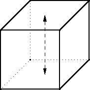
The 180° rotations have four orbits. A 180° rotation around the axis shown above puts the top and bottom faces into private orbits, as the 90° rotation did, but instead of putting the four middle faces into a single orbit, the front and back faces go in one orbit and the left and right into another. Since there are three axes, there are three motions of the cube that each leave N4 colorings unchanged.
- Finally, there's the "motion" that moves nothing. This motion
leaves every face in a separate orbit, and leaves all
N6 colorings unchanged.
- 8N2 from the vertex rotations
- 6N3 from the edge rotations
- 6N3 from the 90° face rotations
- 3N4 from the 180° face rotations
- N6 from the "do nothing" motion
Unfortunately, the Pólya-Burnside technique does not tell you what the ten colorings actually are; for that you have to do some more work. But at least the P-B lemma tells you when you have finished doing the work! If you set about to enumerate ways of painting the faces of the cube, and you end up with 9, you know you must have missed one. And it tells you how much toil to expect if you do try to work out the colorings. 10 is not so many, so let's give it a shot:
- 6 black and 0 white faces: one cube
- 5 black and 1 white face: one cube
- 4 black and 2 white faces: the white faces could be on opposite sides of the cube, or touching at an edge
- 3 black and 3 white faces: the white faces could include a pair of opposite faces and one face in between, or they could be the three faces that surround a single vertex.
- 2 black and 4 white faces: the black faces could be on opposite sides of the cube, or touching at an edge
- 1 black and 5 white faces: one cube
- 0 black and 6 white faces: one cube
Care to try it out? There are 4 ways to color the sides of a triangle with two colors, 10 ways if you use three colors, and N(N+1)(N+2)/6 if you use N colors.
There are 140 different ways to color a the
squares of a 3×3 square array, counting reflections as
different. If reflected colorings are not counted separately, there
are only 102 colorings. (This means that 38 of the colorings have
some reflective symmetry.) If the two colors are considered
interchangeable (so for example  and
and  are considered the same) there are
51 colorings.
are considered the same) there are
51 colorings.
You might think it is obvious that allowing an exchange of the two colors cuts the number of colorings in half from 102 to 51, but it is not so for 2×2 squares. There are 6 ways to color a 2×2 array, whether or not you count reflections as different; if you consider the two colors interchangeable then there are 4 colorings, not 3. Why the difference?
[Other articles in category /math] permanent link
Fri, 21 Apr 2006 Richard P. Feynman says:
When I was in high school, I'd see water running out of a faucet growing narrower, and wonder if I could figure out what determines that curve. I found it was rather easy to do.I puzzled over that one for years; I didn't know how to start. I kept supposing that it had something to do with surface tension and the tendency of the water surface to seek a minimal configuration, and I couldn't understand how it could be "rather easy to do". That stuff all sounded really hard!
 But one day I realized
in a flash that it really is easy. The water accelerates as it
falls. It's moving faster farther down, so the stream must be
narrower, because the rate at which the water is passing a given point
must be constant over the entire stream. (If water is passing a
higher-up point faster than it passes a low point, then the water is
piling up in between—which we know it doesn't do. And vice versa.)
It's easy to calculate the speed of the water at each point in the
stream. Conservation of mass gets us the rest.
But one day I realized
in a flash that it really is easy. The water accelerates as it
falls. It's moving faster farther down, so the stream must be
narrower, because the rate at which the water is passing a given point
must be constant over the entire stream. (If water is passing a
higher-up point faster than it passes a low point, then the water is
piling up in between—which we know it doesn't do. And vice versa.)
It's easy to calculate the speed of the water at each point in the
stream. Conservation of mass gets us the rest.
So here's the calculation. Let's adopt a coordinate system that puts position 0 at the faucet, with increasing position as we move downward. Let R(p) be the radius of the stream at distance p meters below the faucet. We assume that the water is falling smoothly, so that its horizontal cross-section is a circle.
Let's suppose that the initial velocity of the water leaving the faucet is 0. Anything that falls accelerates at a rate g, which happens to be !!9.8 m/s^2!!, but we'll just call it !!g!! and leave it at that. The velocity of the water, after it has fallen for time !!t!!, is !!v = gt!!. Its position !!p!! is !!\frac12 gt^2!!. Thus !!v = (2gp)^{1/2}!!.
Here's the key step: imagine a very thin horizontal disk of water, at distance p below the faucet. Say the disk has height h. The water in this disk is falling at a velocity of !!(2gp)^{1/2}!!, and the disk itself contains volume !!\pi (R(p))^2h!! of water. The rate at which water is passing position !!p!! is therefore !!\pi (R(p))^2h \cdot (2gp)^{1/2}!! gallons per minute, or liters per fortnight, or whatever you prefer. Because of the law of conservation of water, this quantity must be independent of !!p!!, so we have:
$$\pi(R(p))^2h\cdot (2gp)^{1/2} = A$$Where !!A!! is the rate of flow from the faucet. Solving for !!R(p)!!, which is what we really want:
$$R(p) = \left[\frac A{\pi h(2gp)^{1/2}}\right]^{1/2}$$Or, collecting all the constants (!!A, \pi , h,!! and !!g!!) into one big constant !!k!!:
$$R(p) = kp^{-1/4}$$ There's a picture of that over there on the left side of the blog. Looks just about right, doesn't it? Amazing.So here's the weird thing about the flash of insight. I am not a brilliant-flash-of-insight kind of guy. I'm more of a slow-gradual-dawning-of-comprehension kind of guy. This was one of maybe half a dozen brilliant flashes of insight in my entire life. I got this one at a funny time. It was fairly late at night, and I was in a bar on Ninth Avenue in New York, and I was really, really drunk. I had four straight bourbons that night, which may not sound like much to you, but is a lot for me. I was drunker than I have been at any other time in the past ten years. I was so drunk that night that on the way back to where I was staying, I stopped in the middle of Broadway and puked on my shoes, and then later that night I wet the bed. But on the way to puking on my shoes and pissing in the bed, I got this inspiration about what shape a stream of water is, and I grabbed a bunch of bar napkins and figured out that the width is proportional to !!p^{-1/4}!! as you see there to the left.
This isn't only time this has happened. I can remember at least one other occasion. When I was in college, I was freelancing some piece of software for someone. I alternated between writing a bit of code and drinking a bit of whisky. (At that time, I hadn't yet switched from Irish whisky to bourbon.) Write write, drink, write write, drink... then I encountered some rather tricky design problem, and, after another timely pull at the bottle, a brilliant flash of inspiration for how to solve it. "Oho!" I said to myself, taking another swig out of the bottle. "This is a really clever idea! I am so clever! Ho ho ho! Oh, boy, is this clever!" And then I implemented the clever idea, took one last drink, and crawled off to bed.
The next morning I remembered nothing but that I had had a "clever" inspiration while guzzling whisky from the bottle. "Oh, no," I muttered, "What did I do?" And I went to the computer to see what damage I had wrought. I called up the problematic part of the program, and regarded my alcohol-inspired solution. There was a clear and detailed comment explaining the solution, and as I read the code, my surprise grew. "Hey," I said, astonished, "it really was clever." And then I saw the comment at the very end of the clever section: "Told you so."
I don't know what to conclude from this, except perhaps that I should have spent more of my life drinking whiskey. I did try bringing a flask with me to work every day for a while, about fifteen years ago, but I don't remember any noteworthy outcome. But it certainly wasn't a disaster. Still, a lot of people report major problems with this strategy, so it's hard to know what to make of my experience.
[Other articles in category /physics] permanent link
Thu, 20 Apr 2006
The One Theory to Explain Everything
One of Matt Groening's Life in Hell comics had a list of
the nine teachers to beware of. The one I remember is the teacher who
has "one theory to explain everything". The cartoon depicted this
teacher with wild, staring eyes, and a speech balloon that said "The
nation that controls magnesium controls the world!"
(This theory, of course, is idiotic. They key element, as I mentioned on Saturday, is radioactive potassium. What good is a crazy theory that doesn't involve nuclear energy?)
The big problem with this teacher is that he will expect you to discourse on the One Theory on the final exam. You'll get a final exam question like "explain the significance of magnesium in the 1993 Oslo accords" or "how would the course of World War II been changed if Chile had had access to sufficient supplies of high-grade magnesium ore" or just "Explain how magnesium has been the most important factor in determining the course of history." Or it's phrased the other way round: "what is the most important factor in determining the course of history?" and then if you happened to miss the class in which the professor had his insane rant about magnesium, you're doomed.
But the joke is not as poignant for me as it is for some people, because I've seen its good side. When I was in ninth grade, I took a music history class. When the final exam arrived, the first question was:
What is the single most influential development in the history of music?"Oh, crap," I thought.
I had a vague recollection that Mr. Rosenberg had said something about his theory of the single most important development in the history of music, but it had been way back at the beginning of the semester, and I no longer remembered what he had said. But my exam-taking style has never been to try to remember what the teacher said, so I tried to figure it out.
Trying to figure it out is usually a pretty bad strategy for answering questions on high-school exams, because the exams are designed for regurgitation and parroting of what the teacher said, not for figuring things out. And the question looked up front like one of those magnesium questions, where the answer is totally unguessable if you don't subscribe to the insane theory, where even if you come up with a plausible answer, you lose, unless it happens to be the one answer the teacher was thinking of.
To be a fair question, it must admit only one reasonable answer. And that is true of very few questions of this type. But I think it is true of this one. It isn't an insane theory, and I did figure it out, which I think reflects a lot of credit on Mr. Rosenberg.
The single most influential development in the history of music is the invention of recording, or perhaps radio. Before these things, music was a participant sport, and afterwards, it was a product, something that could be passively consumed. When I thought of recording, I said "aha", and wrote it down in big letters, adding radio as an afterthought. I imagine that Mr. Rosenberg would have accepted either one alone.
Isn't it nice when things turn out to be better than they first appear? Thanks, Mr. Rosenberg.
[Other articles in category ] permanent link
Tue, 18 Apr 2006
It's the radioactive potassium, dude!
A correspondent has informed me that my explanation of the
snow-melting properties of salt is "wrong". I am torn between
paraphrasing the argument, and quoting it verbatim, which may be a
copyright violation and may be impolite. But if I paraphrase, I am
afraid you will inevitably conclude that I have misrepresented his
thinking somehow. Well, here is a brief quotation that summarizes the
heart of the matter:
Anyway the radioactive [isotope of potassium] emits energy (heat) which increases the rate of snow melt.The correspondent informs me that this is taught in the MIT first-year inorganic chemistry class.
So what's going on here? I picture a years-long conspiracy in the MIT chemistry department, sort of a gentle kind of hazing, in which the professors avow with straight faces that the snow-melting properties of rock salt are due to radioactive potassium, and generation after generation of credulous MIT freshmen nod studiously and write it into their notes. I imagine the jokes that the grad students tell about other grad students: "Yeah, Bill here was so green when he first arrived that he still believed the thing about the radioactive potassium!" "I did not! Shut up!" I picture papers, published on April 1 of every year, investigating the phenomenon further, and discoursing on the usefulness of radioactive potassium for smelting ores and frying fish.
Is my correspondent in on the joke, trying to sucker me, so that he can have a laugh about it with his chemistry buddies? Or is he an unwitting participant? Or perhaps there is no such conspiracy, the MIT inorganic chemistry department does not play this trick on their students, and my correspondent misunderstood something. I don't know.
Anyway, I showed this around the office today and got some laughs. It reminds me a little of the passage in Ball Four in which the rules of baseball are going to be amended to increase the height of the pitcher's mound. It is generally agreed that this will give an advantage to the pitcher. But one of the pitchers argues that raising the mound will actually disadvantage him, because it will position him farther from home plate.
You know, the great thing about this theory is that you can get the salt to melt the snow without even taking it out of the bag. When you're done, just pick up the bag again, put it back in the closet. All those people who go to the store to buy extra salt are just a bunch of fools!
Well, it's not enough just to scoff, and sometimes arguments from common sense can be mistaken. So I thought I'd do the calculation. First we need to know how much radioactive potassium is in the rock salt. I don't know what fraction of a bag of rock salt is NaCl and what fraction is KCl, but it must be less than 10% KCl, so let's use that. And it seems that about 0.012% of naturally-occurring potassium is radioactive . So in one kilogram of rock salt, we have about 100g KCl, of which about 0.012g is K40Cl.
Now let's calculate how many K40 atoms there are. KCl has an atomic weight around 75. (40 for the potassium, 35 for the chlorine.) Thus 6.022×10²³ atoms of potassium plus that many atoms of chlorine will weigh around 75g. So there are about 0.012 · 6.022×1023 / 75 = 9.6×10¹⁹ K40-Cl pairs in our 0.012g sample, and about 9.6×10¹⁹ K40 atoms.
Now let's calculate the rate of radioactive decay of K40. It has a half-life of 1.2×10⁹ years. This means that each atom has a (1/2)T probability of still being around after some time interval of length t, where T is t / 1.2×10⁹ years. Let's get an hourly rate of decay by putting t = one hour, which gives T = 9.5×10⁻¹⁴, and the probability of particular K40 atom decaying in any one-hour period is 6.7 × 10⁻¹⁴. Since there are 9.6×10¹⁹ K40 atoms in our 1kg sample, around 64,000 will decay each hour.
Now let's calculate the energy released by the radioactive decay. The disintegration energy of K40 is about 1.5 MeV. Multiplying this by 64,000 gets us an energy output of 86.4 GeV per hour.
How much is 86.4 GeV? It's about 3.4×10⁻⁹ calories. That's for a kilogram of salt, in an hour.
How big is it? Recall that one calorie is the amount of energy required to raise one gram of water one degree Celsius. 3.4×10⁻⁹ calorie is small. Real small.
Note that the energy generated by gravity as the kilogram of rock salt falls one meter to the ground is 9.8 m/s2 · 1000g · 1m = 9.8 joules = 2.3 calories. You get on the order of 750 million times as much energy from dropping the salt as you do from an hour of radioactive decay.
But I think this theory still has some use. For the rest of the month, I'm going to explain all phenomena by reference to radioactive potassium. Why didn't the upgrade of the mail server this morning go well? Because of the radioactive potassium. Why didn't CVS check in my symbolic links correctly? It must have been the radioactive potassium. Why does my article contain arithmetic errors? It's the radioactive potassium, dude!
The nation that controls radioactive potassium controls the world!
[ An earlier version of this article said that the probability of a potassium atom decaying in 1 hour was 6.7 × 10⁻¹² instead of 6.7 × 10⁻¹⁴. Thanks to Przemek Klosowski of the NIST center for neutron research for pointing out this error. ]
[Other articles in category /physics] permanent link
Sat, 15 Apr 2006
Doubling productivity and diminishing returns
I think I have a strange sense of humor. Other people tell me so,
anyway. Here's something I found funny.
Centralisation of the means of communication and transport in the hands of the State.Well, OK. Perhaps in 1848 that looked like a good idea. Sure, it might be a reasonable thing to try. Having tried it, we now know that it is a completely terrible idea. I was planning a series of essays about crackpot ideas, how there are different sorts. Some crackpot ideas are obviously terrible right from the get-go. But other crackpot ideas, like that it would be good for the State to control all communication and transportation, are not truly crackpot; they only seem so in hindsight, after they are tried out and found totally hopeless.
| Buy An Essay Towards a Real Character and a Philosophical Language from Bookshop.org (with kickback) (without kickback) |
To accomplish all this, Wilkins must first taxonomize all the things, actions, and properties in the entire universe. (I mentioned this to the philosopher Bryan Frances a couple of weeks ago, and he said "Gosh! That could take all morning!") The words are then assigned to the concepts according to their place in this taxonomy.
When I mentioned this to my wife, she immediately concluded that he was a crackpot. But I don't think he was. He was a learned bishop, a scientist, and philosopher. None of which are inconsistent with being a crackpot, of course. But Wilkins presented his idea to the Royal Society, and the Royal Society had it printed up as a 450-page quarto book by their printer. Looking back from 2006, it looks like a crackpot idea—of course it was never going to work. But in 1668, it wasn't obvious that it was never going to work. It might even be that the reason we know now that it doesn't work is precisely that Wilkins tried it in 1668. (Roget's Thesaurus, published in 1852, is a similar attempt to taxonomize the universe. Roget must have been aware of Wilkins' work, and I wonder what he thought about it.)
Anyway, I seem to have digressed. The real point of my article is to mention this funny thing from the Rosenfelder article. Here it is:
You can double your workforce participation from 27% to 51% of the population, as Singapore did; you can't double it again.Did you laugh?
The point here is that it's easy for developing nations to get tremendous growth rates. They can do that because their labor forces and resources were so underused before. Just starting using all the stuff you have, and you get a huge increase in productivity and wealth. To get further increases is not so easy.
So why is this funny? Well, if an increase from 27% to 51% qualifies as a doubling of workforce participation, then Singapore could double participation a second time. If the double of 27% is 51%, then the double of 51% is 96.3%.
It's funny because M. Rosenfelder is trying to make an argument from pure mathematics, and doesn't realize that if you do that, you have to get the mathematics right. Sure, once your workforce participation, or anything else, is at 51%, you cannot double it again; it is mathematically impossible. But mathematics has strict rules. It's OK to report your numbers with an error of 5% each, but if you do, then it no longer becomes mathematically impossible to have 102% participation. By rounding off, you run the risk that your mathematical argument will collapse spectacularly, as it did here. (Addendum: I don't think that the conclusion collapses; I think that Rosenfelder is obviously correct.)
OK, so maybe it's not funny. I told you I have a strange sense of humor.
The diminishing returns thing reminds me of the arguments that were current a while back purporting that women's foot race times would surpass those of men. This conclusion was reached by looking at historical rates at which men's and women's times were falling. The women's times were falling faster; ergo, the women's times would eventually become smaller than the men's. Of course, the reason that the women's times were falling faster was that racing for women had been practiced seriously for a much shorter time, and so the sport was not as far past the point of diminishing returns as it was for men. When I first started bowling, my average scores increased by thirty points each week. But I was not foolish enough to think that after 10 weeks I would be able to score a 360.
[Other articles in category /math] permanent link
Facts you should know
The Minneapolis Star Tribune offers an article on Why is the sky
blue? Facts you should know, subtitled "Scientists offer 10 basic
questions to test your knowledge".
[ The original article has been removed; here
is another copy. ]
I had been planning to write for a
while on why the sky is blue, and how the conventional answers are
pretty crappy. (The short answer is "Rayleigh scattering", but that's
another article for another day. Even crappier are the common
explanations of why the sea is blue. You often hear the explanation that
the sea is blue because it reflects the sky. This is obviously
nonsense. The surface of the sea does reflect the sky, perhaps, but
when the sea is blue, it is a deep, beautiful blue all the way
down. The right answer is, again, Rayleigh scattering.)
The author, Andrea L. Gawrylewski, surveyed a number of scientists and educators and asked them "What is one science question every high school graduate should be able to answer?" The questions follow.
- What percentage of the earth is covered by water?
This is the best question that the guy from Woods Hole Oceanographic Institute can come up with?
It's a plain factual question, something you could learn in two seconds. You can know the answer to this question and still have no understanding whatever of biology, meteorology, geology, oceanography, or any other scientific matter of any importance. If I were going to make a list of the ten things that are most broken about science education, it would be that science education emphasizes stupid trivia like this at the expense of substantive matters.
For a replacement question, how about "Why is it important that three-fourths of the Earth's surface is covered with water?" It's easy to recognize a good question. A good question is one that is quick to ask and long to answer. My question requires a long answer. This one does not.
- What sorts of signals does the brain use to communicate
sensations, thoughts and actions?
This one is a little better. But the answer given, "The single cells in the brain communicate through electrical and chemical signals" is still disappointing. It is an answer at the physical level. A more interesting answer would discuss the protocol layers. How does the brain perform error correction? How is the information actually encoded? I may be mistaken, but I think this stuff is all still a Big Mystery.
The question given asks about how the brain communicates thoughts. The answer given completely fails to answer this question. OK, the brain uses electrical and chemical signals. So how does the brain use electricity and chemicals to communicate thoughts, then?
- Did dinosaurs and humans ever exist at the same time?
Here's another factual question, one with even less information content than the one about the water. This one at least has some profound philosophical implications: since the answer is "no", it implies that people haven't always been on the earth. Is this really the one question every high school graduate should be able to answer? Why dinosaurs? Why not, say, trilobites?
I think the author (Andrew C. Revkin of the New York Times) is probably trying to strike a blow against creationism here. But I think a better question would be something like "what is the origin of humanity?"
- What is Darwin's theory of the origin of species?
At last we have a really substantive question. I think it's fair to say that high school graduates should be able to give an account of Darwinian thinking. I would not have picked the theory of the origin of species, specifically, particularly because the origin of species is not yet fully understood. Instead, I would have wanted to ask "What is Darwin's theory of evolution by natural selection?" And in fact the answer given strongly suggests that this is the question that the author thought he was asking.
But I can't complain about the subject matter. The theory of evolution is certainly one of the most important ideas in all of science.
- Why does a year consist of 365 days, and a day of 24 hours?
I got to this question and sighed in relief. "Ah," I said, "at last, something subtle." It is subtle because the two parts of the question appear to be similar, but in fact are quite different. A year is 365 days long because the earth spins on its axis in about 1/365th the time it takes to revolve around the sun. This matter has important implications. For example, why do we need to have leap years and what would happen if we didn't?
The second part of the question, however, is entirely different. It is not astronomical but historical. Days have 24 hours because some Babylonian thought it would be convenient to divide the day and the night into 12 hours each. It could just as easily have been 1000 hours. We are stuck with 365.2422 whether we like it or not.
The answer given appears to be completely oblivious that there is anything interesting going on here. As far as it is concerned, the two things are exactly the same. "A year, 365 days" it says, "is the time it takes for the earth to travel around the sun. A day, 24 hours, is the time it takes for the earth to spin around once on its axis."
- Why is the sky blue?
I have no complaint here with the question, and the answer is all right, I suppose. (Although I still have a fondness for "because it reflects the sea.") But really the issue is rather tricky. It is not enough to just invoke Rayleigh scattering and point out that the high-frequency photons are scattered a lot more than the low-frequency ones. You need to think about the paths taken by the photons: The ones coming from the sky have, of course, come originally from the sun in a totally different direction, hit the atmosphere obliquely, and been scattered downward into your eyes. The sun itself looks slightly redder because the blue photons that were heading directly toward your eyes are scattered away; this effect is quite pronounced when there is more scattering than usual, as when there are particles of soot in the air, or at sunset.
The explanation doesn't end there. Since the violet photons are scattered even more than the blue ones, why isn't the sky violet? I asked several professors of physics this question and never got a good answer. I eventually decided that it was because there aren't very many of them; because of the blackbody radiation law, the intensity of the sun's light falls off quite rapidly as the frequency increases, past a certain point. And I was delighted to see that the Wikipedia article on Rayleigh scattering addresses this exact point and brings up another matter I hadn't considered: your eyes are much more sensitive to blue light than to violet.
The full explanation goes on even further: to explain the blackbody radiation and the Rayleigh scattering itself, you need to use quantum physical theories. In fact, the failure of classical physics to explain blackbody radiation was the impetus that led Max Planck to invent the quantum theory in the first place.
So this question gets an A+ from me: It's a short question with a really long answer.
- What causes a rainbow?
I have no issue with this question. I don't know if I'd want to select it as the "one science question every high school graduate should be able to answer", but it certainly isn't a terrible choice like some of the others.
- What is it that makes diseases caused by viruses and bacteria hard
to treat?
The phrasing of this one puzzled me. Did the author mean to suggest that genetic disorders, geriatric disorders, and prion diseases are not hard to treat? No, I suppose not. But still, the question seems philosophically strange. Why says that diseases are hard to treat? A lot of formerly fatal bacterial diseases are easy to treat: treating cholera is just a matter of giving the patient IV fluids until it goes away by itself; a course of antibiotics and your case of the bubonic plague will clear right up. And even supposing that we agree that these diseases are hard to treat, how can you rule out "answers" like "because we aren't very clever"? I just don't understand what's being asked here.
The answer gives a bit of a hint about what the question means. It begins "influenza viruses and others continually change over time, usually by mutation." If that's what you're looking for, why not just ask why there's no cure for the common cold?
- How old are the oldest fossils on earth?
Oh boy, another stupid question about how much water there is on the surface of the earth. I guessed a billion years; the answer turns out to be about 3.8 billion years. I think this, like the one about the dinosaurs, is a question motivated by a desire to rule out creationism. But I think it's an inept way of doing so, and the question itself is a loser.
- Why do we put salt on sidewalks when it snows?
Gee, why do we do that? Well, the salt depresses the freezing point of the water, so that it melts at a lower temperature, one, we hope, that is lower than the temperature outside, so that the snow melts. And if it doesn't melt, the salt is gritty and provides some traction when we walk on it.
But why does the salt depress the freezing point? I don't know; I've never understood this. The answer given in the article is no damn good:
Adding salt to snow or ice increases the number of molecules on the ground surface and makes it harder for the water to freeze. Salt can lower freezing temperatures on sidewalks to 15 degrees from 32 degrees.
The second sentence really doesn't add anything at all, and the first one is so plainly nonsense I'm not even sure where to start ridiculing it. (If all that is required is an increase in the number of molecules, why won't it work to add more snow?)So let me think. The water molecules are joggling around, bumping into each other, and the snow is a low-energy crystalline state that they would like to fall into. At low temperatures, even when a molecule manages to joggle its way out of the crystal, it's likely to fall back in pretty quickly, and if not there's probably another molecule around that can fall in instead. At lower temperatures, the molecules joggle less, and there's an equilibrium in this in-and-out exchange that results in more ice and less water than at higher temperatures.
When the salt is around, the salt molecules might fall into the holes in the ice crystal instead, get in the way of the water molecules, and prevent the crystal from re-forming, so that's going to shift the equilibrium in favor of water and against ice. So if you want to reach the same equilibrium that's normally reached at zero degrees, you need to subtract some of the joggling energy, to compensate for the interference of the salt, and that's why the freezing temperature goes down.
I think that's right, or close to it,and it certainly sounds pretty good, but my usual physics disclaimer applies: While I know next to nothing about physics, I can spin a line of bullshit that sounds plausible enough to fool people, including myself, into believing it.
(Is there a such a thing as a salt molecule? Or does it really take the form of isolated sodium and chlorine ions? I guess it doesn't matter much in this instance.)
I think this question is a winner.
[ Addendum 20060416: Allan Farrell's blog Bento Box has another explanation of this. It seems to me that M. Farrell knows a lot more about it than I do, but also that my own explanation was essentially correct. But there may be subtle errors in my explanantion that I didn't notice, so you may want to read the other one and compare.]
[ Addendum 20070204: A correspondent at MIT provided an alternative explanantion. ]
The questions overall were a lot better than the answers, which made me wonder if perhaps M. Gawrylewski had written the answers herself.
[Other articles in category /physics] permanent link
Tue, 11 Apr 2006
Diacritics and horseheads
In my recent article about Robert
Recorde's invention of the = sign, I pointed out that Recorde's
1557 book The Whetstone of Witte contained a remarkable
typographic feature: words like "examples" and "alteration" are
rendered as "exãples" and "aleratiõ".
I wrote to Jonathan Hoefler to ask about this. Jonathan Hoefler is one of the principals of the typography firm Hoefler & Frere-Jones, and his mind is a vast storehouse of typographical history and arcana. I was sure M. Hoefler would know about the tildes, and would have something interesting to say about them, and I was not disappointed:
Diacritical marks have been used to abbreviate printed words ever since Gutenberg, and early English printers adopted the same conventions that Gutenberg used for Latin (a trick he picked up from medieval scribes.) As you say, tildes and macrons (and circles and odder things still) were used to mark the elision of letters or entire word parts: the "Rx" ligature that we know from prescriptions (Lat. 'recipe') was also used as shorthand for the "-rum" Latin ending, among other things. The French circumflex is a holdover from the same tradition, as it once the absence of a succeeding 's' ("hôpital" for "hospital", etc.) All of these were compositors' tricks to help in the justification of an entire paragraph, something that was considerably easier in the days before standard spelling and orthography!The surprising diacritical marks don't exhaust the oddities of 16th-century fonts. Hoefler & Frere-Jones have designed a font, English Textura, that is similar to the blackletter font that Recorde's book was printed in; they did this by borrowing characters from actual 16th-century documents. The documents contain all sorts of interesting typographic features that are no longer used; look at the bottom rows of this sample of English Textura for examples:

I should mention, in case it isn't clear, that justification of paragraphs is not merely a cosmetic feature. If you are a printer in 1577, you are laying out metal types into a square frame, and if the frame isn't completely filled, the types will fall out when you turn it over. In particular, you must make each line of each paragraph fully extend from left to right, or it will be unprintable. The Renaissance printers must have to justify the text somehow. One way to do this is by inserting blank spaces of suitable lengths between the words of each line; I asked M. Hoefler why the Renaissance printers didn't just use blank space, and he replied:
They did that as well, but I think the general principle (which endures) is that wordspacing really isn't as flexible as you'd hope -- "rivers" are the effect of adjacent lines being overjustified, and they really interrupt reading. Even with today's very sophisticated H&J [Hyphenation and Justification] algorithms -- some of which can even scale the actual dimensions of letterforms in order to improve copyfit -- the chief ingredient in good H&J controlling the number of letters per line. Contemporary newspapers do this through aggressive hyphenation; their forbears did it through colorful spelling. (Although any headline with the word "Prez" suggests that this tradition lives on.)You'll note that The Whetstone of Witte is also agressively hyphenated:
I think Marshall McLuhan said something about the new media cannibalizing the old, and although I'm not sure what he meant (if he did say that) I don't think it matters much, because the phrase so perfectly encapsulates the way new information technologies tend to adopt the obsolete forms of the technologies they replace. I've been collecting examples of this for a few years. In the early days of the web, there was a web dictionary which would lay out the pages just like a real dictionary, with an unreadably tiny font, page breaks in inconvenient places, and "next page" and "previous page" buttons at the bottom. The tiny font was bad enough, but the "next page" buttons just killed me. I wanted to redesign the application with another button that you could press if you wanted to simulate what happens when you read the dictionary in the bathtub and drop it in the water by mistake.
I call these phenomena "horseheads", after the false horse heads that were mounted on the hoods of old automobiles, which still survive as in vestigial form as hood ornaments. My favorite horsehead is a Citibank ATM design from around 1987 or so. The old ATMs, which the new design was replacing, had green phosphor display, about 20×40 characters, four menu buttons down the side, and a telephone-style keypad with ten digits and # and * signs. The new ATM had no buttons. Instead, it had a color touch-sensitive screen that was used to display a touch-sensitive picture of four menu buttons down the side, and, when appropriate, a telephone-style keypad with ten digits and # and * signs.
[ Addendum 20120611: The
term "skeuomorph" has recently become popular to describe this
phenomenon. ]
[Other articles in category /IT/typo]
permanent link
Convenience foods
The cheddar cheese cost $1.69 per half pound. The rotini cost $1.39
for one pound. Scaling these values to the amounts in the Kraft kit,
we get $.42 for cheese plus $1.05 for pasta, totalling $1.47. The
Kraft kit, however, cost $2.79.
What did my $1.32 get me? Certainly not better quality; the cheese
substance in the Kraft kit is considerably lower quality than even
low-quality cheese. I could substitute high-quality Vermont cheddar
for only about $.80 extra.
Did I get a time or convenience win? The Kraft instructions are: boil
two quarts of water, add pasta, stir, cook for eight to ten minutes,
drain, return to pot, add cheese sauce, stir again. To make macaroni
and cheese "from scratch" requires only one extra step: grate or cube
the cheese. The time savings for the kit is minimal.
If Kraft were going to charge me a 90% premium for thirty-second
ready-to-eat microwave mac-and-cheese, I might consider it a good
deal. As it is, my primary conclusion is that I was suckered.
Secondary conclusion: Fool me once, shame on you. Fool me twice,
shame on me.
[Other articles in category /oops]
permanent link
Robert Recorde invents the equals sign
I once gave a conference talk about how it was a good idea to go dig
up original materials, and why. Someday I may write a blog article
about this. One of the best reasons is that these materials are the
original materials because they are the ones that are so brilliant and
penetrating and incisive that they inspired other people to follow them.
So I thought it might be fun to read Leibnitz's original papers and
see what I might find out that I did not already know. Also, there is
an element of touristry in it: I would like to gaze upon the world's
first use of the integral sign with my own eyes, in the same way that
I would like to gaze on the Grand Canyon with my own eyes. The trip
to the library is a lot more convenient, this month.
Anyway, this sparked a discussion with M. Schoen about original
mathematic manuscripts, and he mentioned to me that he had seen the
page of Robert Recorde's The Whetstone of Witte that
contains the world's first use, in 1557, of the equals sign. He had a
scan of this handy; I have extracted the relevant portion of the page,
and here it is:
Today I bought a box of Kraft "Deluxe" Macaroni and Cheese Dinner. I
also bought a box of San Giorgio rotini and a half pound of cheap
cheddar cheese. The Kraft kit contains 12 ounces of low-quality elbow
macaroni and a foil pouch continaing two ounces of nasty cheese
sauce.
I mentioned recently that
the integral sign  is actually a letter
"S", chosen by Leibnitz because it was the first letter of the word
"sum". Seth David Schoen suggested that Leibnitz probably wrote in
Latin, so that it is actually the first letter of the word "summa",
which means "sum" in Latin. I do not know, but I will see if I can
track down the original paper.
is actually a letter
"S", chosen by Leibnitz because it was the first letter of the word
"sum". Seth David Schoen suggested that Leibnitz probably wrote in
Latin, so that it is actually the first letter of the word "summa",
which means "sum" in Latin. I do not know, but I will see if I can
track down the original paper.
Howbeit, for easie alteration of equations. I will propounde a
fewe exanples, bicause the extraction of their rootes, maie the more
aptly bee wroughte. And to avoide the tediouse repetition of these
woordes : is equalle to : I will sette as I doe often in
woorke use, a pair of paralleles, or Gemowe lines of one lengthe,
thus: =====, bicause noe .2. thynges, can be moare equalle.
If you are still having trouble reading this, try reading it aloud.
The only tricky things are the spelling and the word "Gemowe". Reading
aloud will solve the spelling problem. "Gemowe" means "twin", like in
the astrological sign of Gemini. (I had to look this up in the big dictionary.) Reading
16th-century books takes a little time to get used to, but once you
know the tricks, it is surprisingly easy, given how uncouth they
appear at first look.
I must say, compared with the writing of the Baroque period, which just goes on and on and on, this is extremely concise and to the point. It does not read all that differently from modern technical material.
One reason I like to visit original documents is that I never know what I am going to find. If you visit someone else's account of the documents, you can only learn a subset of whatever that person happened to notice and think was important. This time I learned something surprising.
I knew that the German "umlaut" symbol was originally a small letter "e". A word like schön ("beautiful") was originally spelled schoen, and then was written as schon with a tiny "e" over the "o", and eventually the tiny "e" dwindled away to nothing but two dots. I have a German book printed around 1800 in which the little "e"s are quite distinct.
And I had recently learned that the twiddle in the Spanish ñ character was similarly a letter "n". A word like "año" was originally "anno" (as it is in Latin) and the second "n" was later abbreviated to a diacritic over the first "n". (This makes a nice counterpoint to the fact that the mathematical logical negation symbol $$\sim$$ was selected because of its resemblance to the letter "N".) But I had no idea that anything of the sort was ever done in English.
Recorde's book shows clearly that it was, at least for a time. The short passage illustrated above contains two examples. One is the word "examples" itself, which is written "exãples", with a tilde over the "a". The other is "alteration", which is written "alteratiõ", with a tilde over the "o". More examples abound: "cõpendiousnesse", "nõbers", "denominatiõ", and, I think, "reme~ber". (The print is unclear.)
I had never seen this done before in English. I will investigate further and see what I can find out.
Would I have learned about this if I hadn't returned to the original document? Unlikely.
Here's another interesting fact about this book: It coined the bizarre word "zenzizenzizenzike", which, of all the words in the big dictionary, is the one with the most "z"s. Recorde uses the word "zenzike" to refer to the square of a number, or to a term in an expression with a square power. "Zenzizenzike" is similarly a fourth power, and "zenzizenzizenzike" an eighth power. I uploaded a scan of the relevant pages to Wikipedia, where you can see them; the word appears at the very top of the right-hand page. That page also contains the delightful phrase "zzzz Betokeneth a Square of squares, squaredly squared." Squares, squares, squares, squares, squares, squares, squares, baked beans, squares, squares, squares, and squares!
Addendum 20240524
The entire book is now online at the Internet Archive. The extract above appears on page 238.[Other articles in category /math] permanent link
Thu, 06 Apr 2006
Pick's theorem
In a
recent article, I discussed Hero's formula for the area of a
triangle in terms of its sides, and I said it was an oddity that
didn't seem like any other formula in geometry. Pick's theorem is
another such oddity, although not at all like Hero's.
Pick's theorem concerns the area of so-called "lattice polygons". These are simply polygons whose vertices all lie at points whose coordinates are integers. Such points are called "lattice points". Here it is:
Let P be a lattice polygon. Let b be the number of lattice points that lie on the edges of the polygon, and i be the number of lattice points inside the polygon. Then the area of the polygon is exactly b/2 + i - 1.I think this should be at least a bit surprising. It implies that every lattice polygon has an area that is an integer multiple of ½, which I would not have thought was obvious.
Some examples now. Pick's theorem is obviously true for rectangles:

We can cut the rectangle in half, and it still works:
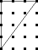
b is now 8 and i is 3, so Pick's theorem predicts an area of 8/2 + 3 - 1 = 6, which is still correct. This works even when the diagonal cuts through some lattice points:

Here b is still 8, but i is only 1, so Pick predicts an area of 8/2 + 1 - 1 = 4.
It works for figures without right angles:

Here b=5 and i=0, for a total area of 3/2. We can check the area manually as follows:

The entire square has area 9. Regions A, B, and C each have area 1, and D has area 4½. That leaves X = 1½ as Pick's theorem says.
It works for more complicated figures too. Here we have b=7 and i=5 for a total area of 7½:
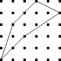
It works for non-convex polygons:

To fix Pick's theorem for non-simply-connected polygons, you need to say that each hole adds an extra -1 to the total area.
The proof of Pick's theorem isn't hard. You start by proving it that it holds for all triangles that have two sides parallel to the x and y axes. Then you prove it for all triangles, using a subtraction argument like the one I used above for triangle X. Finally, you use induction to prove it for more complicated regions, which can be built up from triangles.But the funny thing about Pick's theorem is that you can guess it even without a proof. Suppose someone told you that there was a formula for the size of a polygon in terms of the number of lattice points on the boundary and in the interior. Well, each interior point is surrounded by a square of area 1, which is typically inside the polygon:
So each such point should contribute about 1 to the area. Of course, not all do; some will contribute a little less:
But there will also be parts of the polygon that are not near any interior points:
The points outside the polygon whose squares are partly inside (which count less than they should) will tend to balance out the contributions of the points inside whose squares are partly outside (which count more than they should.)
The squares around a point on the edge (but not the vertex) of the polygon will always be half inside, half outside, so that such a point will contribute exactly half of a square to the total:
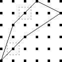
The vertices are a little funny. They also contribute about ½, for the same reason that the edge points do. But convex vertices contribute rather less than ½:
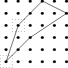
While concave vertices contribute a bit more:
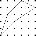
I made the diagrams for this article with a picture-drawing tool, originally designed at Bell Labs, called pic. The source code files for the illustrations were all named things like pick.pic, and the command to compile them to PostScript was pic pick.pic. This was really confusing.
[Other articles in category /math] permanent link
Wed, 05 Apr 2006
TeX and the long S
It just occurs to me, reading today's article, that the final
sentence is one of the strangest I've written in quite a while. It
says:
stock TeX does not have any way to make a long medial s.This is a strange thing to say because TeX was principally designed as a mathematical typesetting system, and one of the most common of all mathematical notations is the integral sign:
$$\int_a^b f'(x) dx = f(b) - f(a)$$
And the integral sign $$\int$$ is nothing more than an old-style long s; the 's' is for 'sum'.Strange or not, the substance of my remark is correct, since standard TeX's fonts do not provide a long s in a size suitable for use in running text in place of a regular s.
[Other articles in category /lang] permanent link
On baroque long S
Jokes about the long medial 's' are easy to make. Stan Freberg's
album Stan Freberg Presents: The United States of America,
Volume I: The Early Years has a scene in which John Adams or
Benjamin Franklin or one of those guys is reading Thomas Jefferson's draft
of the Declaration of Independence: "'Life, liberty, and the purfuit
of happinefs'? Tom, all your s's look like f's!"
A story by Frances Warfield, appropriately titled "Fpafm", gets probably as much juice out of the joke as there is to be got. I believe the copyright has expired, so here it is, in its entirety:
Well, fo much for that.FPAFM
by Frances Warfield
I ordered ham and eggs, as I always do on the diner, and then, as I always do, looked around for pamphlets. There was one handy, "Echoes of Colonial Days," it was called, "being a little fouvenir iffued from time to time, for the benefit of the guefts of The Baltimore & Ohio Railroad Company as a reminder of the pleafant moments fpent..." Involuntarily, my lips began to move. I reached for a pencil. But the man across from me already had his pencil out. He had written:"Oh, fay can you fee?"
I said, "Fing Fomething Fimple."
"Filly, ifn't it?" he said, and kept on writing.
I wrote: "Fing a Fong of Fixpence."
"Oh, ftop the fongs," he said, "Too eafy." He wrote: "The Courtfhip of Miles Fandifh," "I fee a fquirrel," "I undereftimate ftatefmanfhip," "My fifter feems fuperfenfitive," and, seeing that I did not appreciate the last one, which he evidently thought very fine, he wrote: "Forry to fee you fo ftupid."
I ate my lunch grouchily. How could I help it if he was in practice and I was not? He had probably taken this train before.
"Pafs the falt," I said.
"Pleafe pafs the falt," he triumphed.
I paid no attention. "Waiter!" I said. The waiter did not budge.
"You muft fpeak the language," said the man opposite me. "Fay, Fteward!"
The waiter jumped to attention. "Fir?" he said.
"Pleafe fill the faltcellar."
"The faltcellar fhall be replenifhed inftantly," replied the waiter, with a superior gleam in his eyes.
I smiled and my companion unbent a little. "Let's try for hard ones," he invited.
"Farcafm," he said.
"Fubftance."
"Fubfiftence," he scored.
"Fcythe."
"S's inside now," he ruled.
Perfuafive," I said instantly.
"Lanfguifh."
"Bafilifk."
"Quiefcent."
"Nonfenfe," I finished. "Fon of a fpeckled fea monfter."
"Ftep-fon of a poifonous fnake!" he cried.
"You don't fay fo!" I retorted.
"I do fay fo," he replied, getting up and leaving the diner.
"Fool!" I called after him, fniffiling.
Reading Baroque scientific papers, you see a lot of long-medial-s. Opening to a random page of the Philosophical Experiments and Observations of Robert Hooke, for example, we have:
The ſecond Experiment, was made, to ſhew a Way, how to find the true and comparative Expanſion of any metal, when melted, and ſo to compare it both with the Expanſion of the ſame metal, when ſolid, and likewiſe with the Expanſion of any other, either fluid or ſolid Body.As I read more of this sort of thing, I went through several phases. At first it I just found it confusing. Then later I started to get good at reading the words with f's instead of s's and it became funny. ("Fhew! Folid! Hee hee!") Then it stopped being funny, although I still noticed it and found it quaint and charming. Also a constant reminder of how learned and scholarly I am, to be reading this old stuff. (Yes, I really do think this way. Pathetic, isn't it? And you are an enabler of this pathetic behavior.) Then eventually I didn't notice it any more, except in a few startling cases, such as when Dr. Hooke wrote on the tendency of ice to incorporate air bubbles while freezing, and said "...at the ſame time it may not be ſaid to ſuck it in".
What hasn't happened, however: it hasn't become completely transparent. The long s really does look a lot like an f, so much so that I can find it confusing when the context doesn't help me out. The fact that these books are always facsimiles and that the originals were printed on coarse paper and the ink has smudged, does not make it any easier to tell when one is looking at an s and when at an f. So far, the most difficult instance I have encountered involved a reference to "the Learned Dr. Voſſius". Or was it Voffius? Or Vofſius? Or was it Voſfius? Well, I found out later it was indeed Vossius; this is Dr. Gerhard Johann Voss (1577-1649), Latinized to "Vossius". But I was only able to be sure because I encountered the name somewhere else with the short s's.
This typographic detail raises a question of scholarly ethics that I don't know how to answer. In an earlier article, I needed to show how 17th-century writers referred to dates early in the year, which in common nomenclature occurred during one year, but which legally were part of the preceding year. Simply quoting one of these writers wasn't enough, because the date was disambiguated typographically, with the digit for the legal year directly above the digit for the conventional year. So I programmed TeX to demonstrate the typography:

- Most permissible is to replace the original 17th-century font with
a modern one.
- Slightly less permissible would be to reduce the heavy
17th-century usage of italic face, in Royal Society for
example, replacing it with roman typefaces.
- Slightly less permissible still would be to replace the
17th-century capitalization conventions with 20th-century conventions.
For example, in C20 we would not capitalize "Remark".
- Then can I replace obsolete 17th-century contractions such as
"consider'd" with 20th-century equivalents such as "considered"? If
that is acceptable, then what about "'tis"? Can I replace "3dly"
with "thirdly"?
- Can I replace obsolete Baroque spellings such as "plaister",
"fatt", and "it self" with "plaster", "fat", and "itself"?
- Can I replace obsolete Baroquisms such as "strow'd" in "strow'd on
Ice" with "strewn", or "stopple" with "stopper"?
- At the bottom of the list, I could just rewrite the whole thing in a modern style and pass it off as what Derham actually wrote.
[Other articles in category /lang] permanent link
Tue, 04 Apr 2006
Hero's formula
On of my favorite search engine queries of last month was:
        this mathematician's best known work is the formula for the
        area of a triangle in terms of the lengths of it's sides. who
        is this and when did they live?
This is the kind of question that always trips me up in Jeopardy.
(And doesn't that first sentence sounds just like a Jeopardy question?
"I'll take triangles for $600, Alex. . .") The ears hear
"mathematician", "triangle", "formula", and the mouth says "Who was
Pythagoras!" without any conscious intervention. But the answer here
is almost certainly Hero of Alexandria.Hero's formula, or Heron's formula, has always seemed to me like something of an oddity. It doesn't look like any other formula in geometry. Usually to get anything useful from a triangle you need to involve the angles, and express the results in terms of trigonometric functions. This will be obvious if you pause to remember what the phrase "trigonometric function" means. The few rare cases in which you can avoid trigonometry (there's that word again) usually involve special cases, such as right triangles.
But Hero's formula expresses the area of a triangle in terms of the lengths of its sides, with no angles and no trigonometric functions. If we were trying to discover such a formula, we might proceed trigonometrically, and then hope we could somehow eliminate the trigonometry by the end. So we might proceed as follows:
The magnitude of the cross product a×b is the area of the parallelogram with sides a and b, so the area of the triangle is half that. And |a × b| = |a||b| sin θ, where θ is the angle between the two vectors. So if a and b are sides of a triangle and the included angle is θ, the area A is ab/2 · sin θ.
Now we want θ is in terms of the third side c. The law of cosines generalizes the Pythagorean theorem to non-right triangles: c2 = a2 + b2 - 2ab cos θ, where θ is the included angle between sides a and b. (In a right triangle, θ = 90°, and the cosine term drops out.) So we have cos θ = (a2 + b2 - c2) / 2ab. But we want sine instead of cosine, so convert cosine to sine using sin θ = √(1-cos2θ), which yields:
$$\sin\theta = {1\over 2ab}\sqrt{4a^2b^2 - {(a^2 + b^2 - c^2)}^2}$$
Expanding out the right-hand side, and remembering that what we really want is A = ab/2 sin θ. we get:
$$A = {1\over4}\sqrt{2a^2b^2 + 2a^2c^2 + 2b^2c^2 - a^4 - b^4 - c^4}$$.
Now, that might satisfy anyone, but Hero's answer is better. Hero says: Let p be the "semiperimeter" of the triangle; that is, p = (a+b+c)/2. Then the area of the triangle is just √(p(p-a)(p-b)(p-c)). This is "Hero's formula".Hero's formula is simple and easy to remember, which (2a2b2 + 2a2c2 + 2b2c2 - a4 - b4- c4)/16 is not. If you expand out Hero's formula, you find that that the two formulas are the same, as of course they must be. But if you have only the complicated fourth-degree polynomial, how would you get the idea that putting it in terms of p will simplify it? There is some technique or insight here that I am missing.
Even though such technique is the indispensable tool of the working mathematician, mathematical writing customarily scorns such technique,and has numerous phrases for disparaging it or kicking it under the carpet. For example, having gotten the fourth-degree polynomial, we might say "obviously, this is equivalent to Hero's formula", or "it is left to the student to prove that the two formulations are equivalent." Or we could just skip direct from the polynomial to Hero's formula, and say what Wikipedia says in the same situation: "Here the simple algebra in the last step was omitted."
Indeed, if you are trying to prove that Hero's formula is true, it's tedious but straightforward to grovel over the algebra and grind out that the two formulations are the same. But all this ignores the real problem, which is that nobody looking at the trigonometric formulation would know to guess Hero's formula if they had not seen it before. A proof serves two purposes. it is supposed to persuade you that the theorem is true. But more importantly, it is supposed to help you understand why it is true, and to give you some insight that may help you solve similar problems. The proof-by-handwaving-away-complex-and-unexpected-algebra technique serves the first purpose, but not the second. And Hero did not discover the formula using this approach anyway, since he did not take a trig class when he was in high school.
Another way to proceed is to drop a perpendicular from the vertex opposite side c. If the length of the perpendicular is h, the area of the triangle is hc/2. But if the foot of the perpendicular divides c into x + y, we also have x2 + h2 = a2 and y2 + h2 = b2. Grovelling over the algebra again yields something equivalent to Hero's formula.
I don't know a good proof of Hero's formula. I haven't seen Hero's, about which MathWorld says:
Heron's proof is ingenious but extremely convoluted, bringing together a sequence of apparently unrelated geometric identities and relying on the properties of cyclic quadrilaterals and right triangles.A "cyclic quadrilateral" is a quadrilateral whose vertices all lie on a circle. Any triangle can be considered a degenerate cyclic quadrilateral, which happens to have two of its vertices in the same place. Indeed, there's a formula, called "Bretschneider's formula", just like Hero's, but for the area of a cyclic quadrilateral: A = √((p-a)(p-b)(p-c)(p-d)), where a, b, c, d are the lengths of the sides and p is the semiperimeter. If you consider that a triangle is just a cyclic quadrilateral one of whose sides has length 0, you put d = 0 in Bretschneider's formula and you get out Hero's formula.
[Other articles in category /math] permanent link
Mon, 03 Apr 2006
Google query roundup
Once again I am going to write up the interesting Google queries that
my blog has attracted this month. The blog is now about eleven weeks
old and has had a meteoric rise. The theme of this month's Google
query roundup will be the idea of authority on the web, and the
attribution of authority by links.
Of the 32 million blogs that Technorati.com knows about, they consider The Universe of Discourse to be the 13th most-authoritative blog on the subject of mathematics. Okay, I can almost buy that, because I do know a fair amount about mathematics, a lot of people know that about me, and I can probably write more clearly and convincingly than most mathematics experts. But their same ranking process says that The Universe of Discourse is tied for 16th place as one of the most-authoritative blogs on the subject of physics. Considering that I know next to nothing about physics, this is rather sad. If I wrote an article explaining how spacetime was curved like an artichoke, and a thousand people linked to it because they enjoyed the spectacle of someone making a fool of himself in public, my blog would move up the list to fourth place.
Google rankings are similarly weird. My whole web site is considered authoritative in general, because of various articles I've written and projects I've hosted over the years. The way Google works is that each page has an absolute pagerank, and then you get the pages with greatest pagerank that contain your search terms. So if my relatively high-ranking pages happen to contain your search terms, that's what you get, even if that doesn't really make sense.
For example, a Google search for "baroque writing" turns up my blog post about it as hit #5, because my site has high pagerank, and the sites that are really about baroque writing have low pagerank. But the high pagerank of my pages is primarily because I also host a long-established and popular website about Perl, and lots of people have linked to it over the years. So Google recommends my thoughts about Baroque writing because I'm an authority on the Perl programming language. This is not obviously a good reason to recommend a page about Baroque writing.
Of course one can argue that it's unreasonable to expect Google to judge whether I know what I'm talking about or not. But there is a way that they could do it, at least in principle, that would make more sense. Instead of computing pageranks globally, and saying "well, Dominus's pages are generally well thought-of, so we'll recommend those pages whenever they might be relevant to the query", one could compute pageranks per subject. So suppose you first considered only those pages that mention Baroque writing, and discard all the others. Then you do the pagerank calculation to see which of these pages link to which others. You would find a much better pagerank for searches about Baroque writing. My page would have low rank, because it is linked to by few pages about Baroque writing, rather than the high rank it does have because it is linked to by many pages about Perl.
Strange authority
All of which is intended to introduce the fact that my blog now comes up 12th in a search for the Indiana Pacers cheerleaders, and I got several queries this month about it:
           1 ashley indiana pacemate
           4 "lindsay" indiana pacemate
           1 pacemate lindsay
Not-so-strange authority
Sometimes this attribution of authority is less bemusing. As I think I mentioned before, I am pleased to have my pages come up at the top of a list of those about the abridgement of the Doctor Dolittle books. Other topics on which Google rightly considers me an important reference are the abridgement of the "Doctor Dolittle" books (4), the puzzle that ends with "how long is the banana?" (19), the puzzle where you take the first digit off of some integer and append it to the end (5), enumeration of strings of balanced parentheses (7) and, my favorite, the difference between "farther" and "further" (2), and vitamin A poisoning (13).Sometimes there are weird side effects. My authority on the puzzle about the banana and the rope and the monkey's mother also pulls in people looking for stuff that sounds similar, but probably isn't:
           1 "monkey rope" joke
           1 monkey & banana game source code
           1 monkeys holding up the moon
           1 steps on how to draw a monkey holding a banana
           1 how to draw a banana
           1 picture of a monkey holding a banana
Other matters
In the "you got the right answer even though you asked the wrong question" department, we have:
           2 smallest positive value with no leading zeros such that
             rotating it is the same as multiplying it by p/q + puzzle
This is weird, because the answer is obviously 1. Oh, you wanted the smallest value with at least two digits? That's obviously 10.
Oh, you wanted the resulting number to have no leading zeroes either? Then it's obviously 11.
Oh, you wanted the resulting number to be different from the original one? Then it's obviously 12, because when you rotate it, you get 21, which the same as multiplying it by 21/12.
In fact, for any number, rotating it has the same effect as multiplying it by p/q for some p and q. Maybe the author wanted p and q specified in advance.
Islamic history and Arabic etymology
Several visitors arrived at my site because they were looking for "qamara":
	   1 qamara
	  11 qamara
	   1 qamara arabic
	   2 qamara camera
	   3 qamara camera obscura
	   2 camera obscura qamara
	   1 ibn haitham qamara
The word seems to have several meanings. The reason I mentioned it was because of Paul Vallely's stupid article which asserts that English "camera" is derived from Arabic "qamara". Which is nonsense. At least some of the searchers were investigating this.
There might have been some other queries of a similar nature. For example, this one probably is:
1 arabic saqqAs is this:
1 saqqAnd these might have been related or not:
	   3 etymology cheque
	   1 cheque + etymology
And these searches turn up my pages refuting Paul Vallely's stupid claims about the influence of Muslim science and technology. There are plenty of non-stupid claims to make on this topic, of course, some of which I have written about in the past.
Vallely may have gotten his misinformation from the execrable 1001 Inventions web site, which is a mountain of misinformation on this topic. I expect to write at more length about this in the future. In the meantime, here is my summary of the web site:
Did you know that the belt was invented by Muslim tailor al-Qurashi in the year 1274, and was not widely adopted in Europe until the 14th century? Before that, Europeans had to walk around holding up their trousers with their hands, and had nothing from which to hang their wallets! The word 'belt' is from the Arabic 'balq', which means 'look down!'There is plenty more to say about this web site. Its mendacious boasts offend many thoughtful Muslims and many thoughtful non-Muslims, as the comments in the "blog" section demonstrate.
[Other articles in category /google-roundup] permanent link
Sun, 02 Apr 2006
Addenda to recent articles 200603
Here are some notes on posts from the last
month that I couldn't find better places for.
- In my close attention
to the most embarrassing moments of the Indiana Pacemates, I
completely missed the fact that Pacemate Nikki,
the only one who admitted to farting in public, also reports that she
was born with twelve fingers.
- Regarding the
manufacture of spherical objects, I omitted several kinds of
spherical objects that are not manufactured in any of the ways I
discussed.
 One is the gumball. It's turned out to be surprisingly difficult to
get definitive information about how gumballs are manufactured. My
present understanding is that the gum is first extruded in a sort of
hollow pipe shape, and then clipped off into balls with a pinching
device something like the Civil-War-era bullet mold pictured at right.
The gumballs are then sprayed with a hard, shiny coating, which tends
to even out any irregularities.
One is the gumball. It's turned out to be surprisingly difficult to
get definitive information about how gumballs are manufactured. My
present understanding is that the gum is first extruded in a sort of
hollow pipe shape, and then clipped off into balls with a pinching
device something like the Civil-War-era bullet mold pictured at right.
The gumballs are then sprayed with a hard, shiny coating, which tends
to even out any irregularities.[ Addendum 20070307: the bullet mold at right is probably not used in the way I said. See this addendum for more details. ]
- Glass marbles are made with several processes. One of the most
interesting involves a device invented by Martin Frederick
Christensen. (US Patent #802,495, "Machine For Making Spherical
Bodies Or Balls".) The device has two wheels, each with a deep groove
around the rim. The grooves have a semicircular cross-section. The
wheels rotate in opposite directions on parallel axes, and are aligned
so that the space between the two grooves is exactly circular.
The marble is initially a slug of hot glass cut from the end of a long rod. The slug sits in the two grooves and is rolled into a spherical shape by the rotating wheels. For more details, see the Akron Marbles web site.
Fiberglas is spun from a big vat of melted glass; to promote melting, the glass starts out in the form of marbles. ("Marbles" appears to be the correct jargon term.) I have not been able to find out how they make the marbles to begin with. I found patents for the manufacture of Fiberglas from the marbles, but nothing about how the marbles themselves are made. Presumably they are not made with an apparatus as sophisticated as Christensen's, since it is not important that the marbles be exactly spherical. Wikipedia hints at "rollers".
 The thingies pictured to the right are another kind of
nearly-spherical object I forgot about when I wrote the original
article. They are pellets of taconite ore. Back in the 1950s, the
supply of high-quality iron ore started to run out. Taconite contains
about 30% iron, but the metal is in the form of tiny particles
dispersed throughout very hard inert rock. To extract the iron, you
first crush the taconite to powder, and then magnetically separate the
iron dust from the rock dust.
The thingies pictured to the right are another kind of
nearly-spherical object I forgot about when I wrote the original
article. They are pellets of taconite ore. Back in the 1950s, the
supply of high-quality iron ore started to run out. Taconite contains
about 30% iron, but the metal is in the form of tiny particles
dispersed throughout very hard inert rock. To extract the iron, you
first crush the taconite to powder, and then magnetically separate the
iron dust from the rock dust. But now you have a problem. Iron dust is tremendously inconvenient to handle. The slightest breeze spreads it all over the place. It sticks to things, it blows away. It can't be dumped into the smelting furnace, because it will blow right back out. And iron-refining processes were not equipped for pure iron anyway; they were developed for high-grade ore, which contains about 65% iron.
The solution is to take the iron powder and mix it with some water, then roll it in a drum with wet clay. The iron powder and clay accumulate into pellets about a half-inch in diameter, and the pellets are dried. Pellets are easy to transport and to store. You can dump them into an open rail car, and most of them will still be in the rail car when it arrives at the refinery. (Some of them fall out. If you visit freight rail tracks, you'll find the pellets. I first learned about taconite because I found the pellets on the ground underneath the Conrail freight tracks at 32nd and Chestnut Streets in Philadelphia. Then I wondered for years what they were until one day I happened to run across a picture of them in a book I was reading.)
When the pellets arrive at the smelter, you can dump them in. The pellets have around 65% iron content, which is just what the smelter was designed for.
- Regarding my assertion
that there is no way to include a menu of recent posts in the "head"
part of the Blosxom output, I said:
With stock Blosxom, however, this is impossible. The first problem you encounter is that there is no stories_done callback.
Todd Larason pointed out that this is mistaken, because (as I mentioned in the article) the foot template is called once, just after all the stories are processed, and that is just what I was asking for.My first reaction was "Duh."
My second reaction was to protest that it had never occurred to me to use foot, because that is not what it is for. It is for assembling the footer!
There are two things wrong with this protest. First, it isn't a true statement of history. It never occurred to me to use foot, true, but not for the reason I wanted to claim. The real reason is that I thought of a different solution first, implemented it, and stopped thinking about it. If anything, this is a credit to Blosxom, because it shows that some problems in Blosxom can be solved in multiple ways. This speaks well to the simplicity and openness of Blosxom's architecture.
The other thing wrong with this protest is that it assumes that that is not what foot is for. For all I know, when Blosxom's author was writing Blosxom, he considered adding a stories_done callback, and, after a moment of reflection, concluded that if someone ever wanted that, they could just use foot instead. This would be entirely consistent with the rest of Blosxom's design.
M. Larason also pointed out that even though the head template (where I wanted the menu to go) is filled out and appended to the output before the article titles are gathered, it is not too late to change it. Any plugin can get last licks on the output by modifying the global $blosxom::output variable at the last minute. So (for example) I could have put PUT THE MENU HERE into the head template, and then had my plugin do:
$blosxom::output =~ s/PUT THE MENU HERE/$completed_menu/g;to get the menu into the output, without hacking on the base code.Thank you, M. Larason.
- My article on the 20 most
important tools attracted a lot of attention.
- I briefly considered and rejected the spinning
wheel, on the theory that people have spun plenty of thread with
nothing but their bare fingers and a stick to wind it around.
Brad Murray and I had a long conversation about this, in which he described his experience using and watching others use several kinds of spinning tools, including the spinning wheel, charkha (an Indian spining wheel), drop spindle, and bare fingers, and said "I can't imagine making a whole garment with my output sans tools." It eventually dawned on me that I did not know what a drop spindle was.
A drop spindle is a device for making yarn or thread. The basic process of making yarn or thread is this: you take some kind of natural fiber, such as wool, cotton, or flax fiber, which you have combed out so that the individual fibers are more or less going the same direction. Then you twist some of the fibers into a thread. So you have this big tangled mass of fiber with a twisted thread sticking out of it. You tug on the thread, pulling it out gently, while still twisting, and more fibers start to come away from the mass and get twisted into the thread. You keep tugging and twisting and eventually all the fiber is twisted into a thread. "Spinning" is this tugging-twisting process that turns the mass of combed fibers into yarn.
You can do this entirely by hand, but it's slow. The drop spindle makes it a lot faster. A drop spindle is a stick with a hook stuck into one end and a flywheel (the "whorl") near the other end. You hang the spindle by the hook from the unspun fiber and spin it.
As the spindle revolves, the hook twists the wool into a thread. The spindle is hanging unsupported from the fiber mass, so gravity tends to tug more fibers out of the mass, and you help this along with your fingers. The spindle continues to revolve at a more-or-less constant rate because of the flywheel, producing a thread of more-or-less constant twist. If you feed the growing thread uniformly, you get a thread of uniform thickness.
When you have enough thread (or when the spindle gets too close to the floor) you unhook the thread temporarily, wind the spun thread onto the shaft of the spindle, rehook it, and continue spinning.
A spinning wheel is an elaboration of this basic device. The flywheel is separate from the spindle itself, and drives it via a belt arrangement. (The big wheel you probably picture in your mind when you think of a spinning wheel is the flywheel.) The flywheel keeps the spindle revolving at a uniform rate. The spinning wheel also has a widget to keep the tension constant in the yarn. With the wheel, you can spin a more uniform thread than with a drop spindle and you can spin it faster.
I tried hard to write a coherent explanation of spinning, and although spinning is very simple it's awfully hard to describe for some reason. I read several descriptions on the web that all left me scratching my head; what finally cleared it up for me was the videos of drop spinning at the superb The Joy of Handspinning web site. If my description left you scratching your head, check out the videos; the "spinning" video will make it perfectly clear.
The drop spindle now seems to me like a good contender for one of the twenty most-important tools. My omission of it wasn't an oversight, but just plain old ignorance. I thought that the spinning wheel was an incremental improvement on simpler tools, but I misunderstood what the simpler tools were.
 The charkha, by the way, is an Indian configuration of the spinning
wheel; "charkha" is just Hindi for "wheel". There are several
varieties of the charkha, one of which is the box charkha, a
horizontal spinning wheel in a box. The picture to the right depicts
Gandhi with a box charkha.
The charkha, by the way, is an Indian configuration of the spinning
wheel; "charkha" is just Hindi for "wheel". There are several
varieties of the charkha, one of which is the box charkha, a
horizontal spinning wheel in a box. The picture to the right depicts
Gandhi with a box charkha.
- Doug Orleans asked whether I had considered the key. I hadn't,
but I think it's exempt from consideration for the same kinds of
reasons as those I cited for the remote control: any particular key
serves not a general door-opening function but a specific one. Not
that keys aren't important, but rather, they seem to be outside the
scope of this particular discussion.
- Mike Krell asked why I would list the radio on my third-tier list
and omit the computer. Obviously, the question is not one of
usefulness or of importance, but of whether the "computer" is a "tool"
in the original sense of the list, or whether it is disqualified by
reason of being too general, too abstract, too complex, or something
like that. I made several arguments, most of which I think he
refuted.
My initial answer was that computers are disqualified for the same reason that remote controls are: people do carry calculators, cell phones, personal organizers, handheld GPS devices, and (if they work for FedEx) package tracking gizmos. All of these are tools that incorporate computers, but they don't really seem to be merely different forms of the same thing. Each one is a tool, but "computer" is not, similar to the way that the microscope and the telescope are different tools, and not merely variations of "the lens".
Perhaps so, but then I had a fit of insanity and asserted that people do not walk around toting general-purpose computers in case they happen upon some data that needs processing. M. Krell very gently pointed out that yes, they do exactly that: "I see them every time I fly on an airplane, breaking them out to process some data for work (or play) as soon as the flight attendant says it's OK." Whoops. Quite so.
M. Krell suggested that by restricting the definition of "tool" to devices that perform a single specific function or a few such functions, I have circumscribed the definition of "tool" in an arbitrary way that "does not accurately reflect the realities of our current Information Age". Okay.
- Jon Evans said "Everyone always forgets the hoe." I did indeed
forget the hoe. Not quite a knife, not quite a shovel...
- I briefly considered and rejected the spinning
wheel, on the theory that people have spun plenty of thread with
nothing but their bare fingers and a stick to wind it around.
- Regarding the start of the year prior to 1751, when it
was moved from 25 March to 1 January. You may recall that I had a
series of articles
(1
2
3
4)
in which I was concerned that Benjamin Franklin
might be only 299 years old, not 300, because of confusion about just
what year was meant in discussions of the date "6 January 1706". (The
legal year 1705 ran from 25 March 1705 through 24 March 1706.)
This ambiguity
was confusing at the time as well. It makes little difference to my
life whether Franklin is 300 years old or only 299, but if you were a
person living in 1706, you might like to be sure, when someone said
they would pay you fifty shillings on 6 January 1706, when the payment
would be.
It seems that baroque authors had a convention to disambiguate such dates. Here's a quote from William Derham's 1726 introduction to Robert Hooke's notes on the invention of the barometer:
To this I W.D. shall add another Remark I find in the minutes of the Royal Society, February 20. !!167^8_9!!, viz.…
And similarly, from Richard Waller's summary of The Life of Dr. Robert Hooke:
…they prosecuted their former Inquiries, their first meeting at Arundel house being on the ninth of Jan. !!166^6_7!!.
- * In an
earlier post, I referred to "Ramanujan's approximation to π":
$$ \cfrac{1}{1+ \cfrac{e^{-2\pi}}{1 + \cfrac{e^{-4\pi}}{1 + \cdots}}} = \left( \sqrt{\frac{5+\sqrt5}2} - \frac{\sqrt5-1}2 \right) e^{2\pi/5} $$ But this isn't the formula I was thinking of; I showed the wrong formula! It's obviously not an approximation to π. The approximation formula I was thinking of is no less astonishing:
$${1\over\pi} = {\sqrt8\over9801} \sum_{i=0}^\infty { (4i)! (1103 + 26390i) \over (i!)^4 (396)^{4i} }$$
- Finally, in my article on the
20 most important tools, I said that I didn't think I knew anyone
who had used a gas chromatograph; Geoffrey Young pointed out that he
had used one.
[Other articles in category /addenda] permanent link
Thu, 30 Mar 2006
Blog Posts Escape from Lab
Yesterday I decided to put my blog posts into CVS. As part of doing
that, I copied the blog articles tree. I must have made a mistake,
because not all the files were copied in the way I wanted.
To prevent unfinished articles from getting out before they are ready, I have a Blosxom plugin that suppresses any article whose name is title.blog if it is accompanied by a title.notyet file. I can put the draft of an article in the .notyet file and then move it to .blog when it's ready to appear, or I can put the draft in .blog with an empty or symbolic-link .notyet alongside it, and then remove the .notyet file when the article is ready.
I also use this for articles that will never be ready. For example, a while back I got the idea that it might be funny if I were to poſt ſome articles with long medial letter 'ſ' as one ſees in Baroque printing and writing. To try out what this would look like I copied one of my articles---the one on Baroque writing ſtyle ſeemed appropriate---and changed the filename from baroque-style.blog to baroque-ftyle.blog. Then I created baroque-ftyle.notyet ſo that nobody would ever ſee my ſtrange experiment.
But somehow in the big shakeup last night, some of the notyet files got lost, and so this post and one other escaped from my laboratory into the outside world. As I explained in an earlier post, I can remove these from my web site, but aggregators like Bloglines.com will continue to display my error. it's tempting to blame this on Blosxom, or on CVS, or on the sysadmin, or something like that, but I think the most likely explanation for this one is that I screwed up all by myself.
The other escapee was an article about the optional second argument in Perl's built-in bless function, which in practice is never omitted. This article was so dull that I abandoned it in the middle, and instead addressed the issue in passing in an article on a different subject.
So if your aggregator is displaying an unfinished and boring article about one-argument bless, or a puzzling article that seems like a repeat of an earlier one, but with all the s's replaced with ſ's, that is why.
These errors might be interesting as meta-information about how I work. I had hoped not to discuss any such meta-issues here, but circumstances seem to have forced me to do it at least a little. One thing I think might be interesting is what my draft articles look like. Some people rough out an article first, then go back and fix it it. I don't do that. I write one paragraph, and then when it's ready, I write another paragraph. My rough drafts look almost the same as my finished product, right up to the point at which they stop abruptly, sometimes in the middle of a sentence.
Another thing you might infer from these errors is that I have a lot of junk sitting around that is probably never going to be used for anything. Since I started the blog, I've written about 85,000 words of articles that were released, and about 20,000 words of .notyet. Some of the .notyet stuff will eventually see the light of day, of course. For example, I have about 2500 words of addenda to this month's posts that are scheduled for release tomorrow, 1000 words about this month's Google queries and the nature of "authority" on the Web, 1000 words about the structure of the real numbers, 1300 words about the Grelling-Nelson paradox, and so on.
But I alſo have that 1100-word experiment about what happens to an article when you use long medial s's everywhere. (Can you believe I actually conſidered doing this in every one of my poſts? It's tempting, but just a little too idioſyncratic, even for me.) I have 500 words about why to attend a colloquium, how to convince everyone there that you're a genius, and what's wrong with education in general. I have 350 words that were at the front of my article about the 20 most important tools that explained in detail why most criticism of Forbes' list would be unfair; it wasted a whole page at the beginning of that article, so I chopped it out, but I couldn't bear to throw it away. I have two thirds of a 3000-word article written about why my brain is so unusual and how I've coped with its peculiar limitations. That one won't come out unless I can convince myself that anyone else will find it more than about ten percent as interesting as I find it.
[Other articles in category /oops] permanent link
Tue, 28 Mar 2006
The speed of electricity
For some reason I have needed to know this several times in the past
few years: what is the speed of electricity? And for some reason,
good answers are hard to come by.
(Warning: as with all my articles on physics, readers are cautioned that I do not know what I am talking about, but that I can talk a good game and make up plenty of plausible-sounding bullshit that sounds so convincing that I believe it myself. Beware of bullshit.)
If you do a Google search for "speed of electricity", the top hit is Bill Beaty's long discourse on the subject. In this brilliantly obtuse article, Beaty manages to answer just about every question you might have about everything except the speed of electricity, and does so in a way that piles confusion on confusion.
Here's the funny thing about electricity. To have electricity, you need moving electrons in the wire, but the electrons are not themselves the electricity. It's the motion, not the electrons. It's like that joke about the two rabbinical students who are arguing about what makes tea sweet. "It's the sugar," says the first one. "No," disagrees the other, "it's the stirring." With electricity, it really is the stirring.
We can understand this a little better with an analogy. Actually, several analogies, each of which, I think, illuminates the others. They will get progressively closer to the real truth of the matter, but readers are cautioned that these are just analogies, and so may be misleading, particularly if overextended. Also, even the best one is not really very good. I am introducing them primarily to explain why I think M. Beaty's answer is obtuse.
- Consider a
garden hose a hundred feet long. Suppose the hose is already full of
water. You turn on the hose at one end, and water starts coming out
the other end. Then you turn off the hose, and the water stops coming
out. How long does it take for the water to stop coming out? It
probably happens pretty darn fast, almost instantaneously.
This shows that the "signal" travels from one end of the hose to the other at a high speed—and here's the key idea—at a much higher speed than the speed of the water itself. If the hose is one square inch in cross-section, its total volume is about 5.2 gallons. So if you're getting two gallons per minute out of it, that means that water that enters the hose at the faucet end doesn't come out the nozzle end until 156 seconds later, which is pretty darn slow. But it certainly isn't the case that you have to wait 156 seconds for the water to stop coming out after you turn off the faucet. That's just how long it would take to empty the hose. And similarly, you don't have to wait that long for water to start coming out when you turn the faucet on, unless the hose was empty to begin with.
The water is like the electrons in the wire, and electricity is like that signal that travels from the faucet to the nozzle when you turn off the water. The electrons might be travelling pretty slowly, but the signal travels a lot faster.
- You're waiting in the check-in line at the airport. One of the
clerks calls "Can I help who's next?" and the lady at the front of the
line steps up to the counter. Then the next guy in line steps up to
the front of the line. Then the next person steps up. Eventually,
the last person in line steps up. You can imagine that there's a
"hole" that opens up at the front of the line, and the hole travels
backwards through the line to the back end.
How fast does the hole travel? Well, it depends. But one thing is sure: the speed at which the hole moves backward is not the same as the speed at which the people move forward. It might take the clerks another hour to process the sixty people in line. That does not mean that when they call "next", it will take an hour for the hole to move all the way to the back. In fact, the rate at which the hole moves is to a large extent independent of how fast the people in the line are moving forward.
The people in the line are like electrons. The place at which the people are actually moving—the hole—is the electricity itself.
- In the ocean, the waves start far out from shore, and then roll in
toward the shore. But if you look at a cork bobbing on the waves, you
see right away that even though the waves move toward the shore, the
water is staying in pretty much the same place. The cork is
not moving toward the shore; it's bobbing up and down, and it might
well stay in the same place all day, bobbing up and down. It should
be pretty clear that the speed with which the water and the cork are
moving up and down is only distantly related to the speed with which
the waves are coming in to shore. The water is like the electrons,
and the wave is like the electricity.
- A bomb explodes on a hill, and sometime later Ike on the next hill
over hears the bang. This is because the exploding bomb compresses
the air nearby, and then the compressed air expands, compressing the
air a little way away again, and the compressed air expands and
compresses the air a little way farther still, and so there's a wave
of compression that spreads out from the bomb until eventually the air
on the next hill is compressed and presses on Ike's eardrums. It's
important to realize that no individual air molecule has traveled from
hill A to hill B. Each air molecule stays in pretty much the same
place, moving back and forth a bit, like the water in the water waves
or the people in the airport queue. Each person in the airport line
stays in pretty much the same place, even though the "hole" moves all
the way from the front of the line to the back. Similarly, the air
molecules all stay in pretty much the same place even as the
compression wave goes from hill A to hill B. When you speak to
someone across the room, the sound travels to them at a speed of 680
miles per hour, but they are not bowled over by hurricane-force winds.
(Thanks to Aristotle Pagaltzis for suggesting that I point this out.)
Here the air molecules are like the electrons in the wire, and the
sound is like the electricity.
I believe that when someone asks for the speed of electricity, what they are typically after is something like: When I flip the switch on the wall, how long before the light goes on? Or: the ALU in my computer emits some bits. How long before those bits get to the output bus? Or again: I send a telegraph message from Nova Scotia to Ireland on an undersea cable. How long before the message arrives in Ireland? Or again: computers A and B are on the same branch of an ethernet, 10 meters apart. How long before a packet emitted by A's ethernet hardware gets to B's ethernet hardware?
M. Beaty's answer about the speed of the electrons is totally useless as an answer to this kind of question. It's a really detailed, interesting answer to a question to which hardly anyone was interested in the answer.
Here the analogy with the speed of sound really makes clear what is wrong with M. Beaty's answer. I set off a bomb on one hill. How long before Ike on the other hill a mile away hears the bang? Or, in short, "what is the speed of sound?" M. Beaty doesn't know what the speed of sound is, but he is glad to tell you about the speed at which the individual air molecules are moving back and forth, although this actually has very little to do with the speed of sound. He isn't going to tell you how long before the tsunami comes and sweeps away your village, but he has plenty to say about how fast the cork is bobbing up and down on the water.
That's all fine, but I don't think it's what people are looking for when they want the speed of electricity. So the individual charges in the wire are moving at 2.3 mm/s; who cares? As M. Beaty was at some pains to point out, the moving charges are not themselves the electricity, so why bring it up?
I wanted to end this article with a correct and pertinent answer to the question. For a while, I was afraid I was going to have to give up. At first, I just tried looking it up on the web. Many people said that the electricity travels at the speed of light, c. This seemed rather implausible to me, for various reasons. (That's another essay for another day.) And there was widespread disagreement about how fast it really was. For example:
But then I found this page on the characteristic impedance of coaxial cables and other wires, which seems rather more to the point than most of the pages I have found that purport to discuss the "speed of electricity" directly.
From this page, we learn that the thing I have been referring to as the "speed of electricity" is called, in electrical engineering jargon, the "velocity factor" of the wire. And it is a simple function of the "dielectric constant" not of the wire material itself, but of the insulation between the two current-carrying parts of the wire! (In typical physics fashion, the dielectric "constant" is anything but; it depends on the material of which the insulation is made, the temperature, and who knows what other stuff they aren't telling me. Dielectric constants in the rest of the article are for substances at room temperature.) The function is simply:
$$V = {c\over\sqrt{\varepsilon_r}}$$
where V is the velocity of electricity in the wire, and εr is the dielectric constant of the insulating material, relative to that of vacuum. Amazingly, the shape, material, and configuration of the wire doesn't come into it; for example it doesn't matter if the wire is coaxial or twin parallel wires. (Remember the warning from the top of the page: I don't know what I am talking about.) Dielectric constants range from 1 up to infinity, so velocity ranges from c down to zero, as one would expect. This explains why we find so many inconsistent answers about the speed of electricity: it depends on a specific physical property of the wire. But we can consider some common examples.Wikipedia says that the dielectric constant of rubber is about 7 (and this website specifies 6.7 for neoprene) so we would expect the speed of electricity in rubber-insulated wire to be about 0.38c. This is not quite accurate, because the wires are also insulated by air and by the rest of the universe. But it might be close to that. (Remember that warning!)
The dielectric constant of air is very small—Wikipedia says 1.0005, and the other site gives 1.0548 for air at 100 atmospheres pressure—so if the wires are insulated only by air, the speed of electricity in the wires should be very close to the speed of light.
We can also work the calculation the other way: this web page says that signal propagation in an ethernet cable is about 0.66c, so we infer that the dielectric constant for the insulator is around 1/0.662 = 2.3. We look up this number in a a table of dielectric constants and guess from that that the insulator might be polyethylene or something like it. (This inference would be correct.)
What's the lower limit on signal propagation in wires? I found a reference to a material with a dielectric constant of 2880. Such a material, used as an insulator between two wires, would result in a velocity of about 2% of c, which is still 5600 km/s. this page mentions cement pastes with "effective dielectric constants" up around 90,000, yielding an effective velocity of 1/300 c, or 1000 km/s.
Finally, I should add that the formula above only applies for direct currents. For varying currents, such as are typical in AC power lines, the dielectric constant apparently varies with time (some constant!) and the analysis is more complicated.
[ Addendum 20180904: Paul Martin suggests that I link to this useful page about dielectric constants. It includes an extensive table of the εr for various polymers. Mostly they are between 2 and 3. ]
[Other articles in category /physics] permanent link
Sun, 26 Mar 2006
Approximations and the big hammer
In today's
article about rational approximations to √3, I said that "basic
algebra tells us that √(1-ε) ≈ 1 - ε/2 when
ε is small".
A lot of people I know would be tempted to invoke calculus for this, or might even think that calculus was required. They see the phrase "when ε is small" or that the statement is one about limits, and that immediately says calculus.
Calculus is a powerful tool for producing all sorts of results like that one, but for that one in particular, it is a much bigger, heavier hammer than one needs. I think it's important to remember how much can be accomplished with more elementary methods.
The thing about √(1-ε) is simple. First-year algebra tells us that (1 - ε/2)2 = 1 - ε + ε2/4. If ε is small, then ε2/4 is really small, so we won't lose much accuracy by disregarding it.
This gives us (1 - ε/2)2 ≈ 1 - ε, or, equivalently, 1 - ε/2 ≈ √(1 - ε). Wasn't that simple?
[Other articles in category /math] permanent link
Sat, 25 Mar 2006
Achimedes and the square root of 3
In my recent
discussion of why π might be about 3, I mentioned in passing
that Archimedes, calculating the approximate value of π used 265/153
as a rational approximation to √3. The sudden appearance of the
fraction 265/153 is likely to make almost anyone say "huh"? Certainly
it made me say that. And even Dr. Chuck Lindsey, who wrote up the
detailed explanation of Archimedes' work from which I learned
about the 265/153 in the first place, says:
Throughout this proof, Archimedes uses several rational approximations to various square roots. Nowhere does he say how he got those approximations—they are simply stated without any explanation—so how he came up with some of these is anybody's guess.It's a bit strange that Dr. Lindsey seems to find this mysterious, because I think there's only one way to do it, and it's really easy to find, so long as you ask the question "how would Archimedes go about calculating rational approximations to √3", rather than "where the heck did 265/153 come from?" It's like one of those pencil mazes they print in the Sunday kids' section of the newspaper: it looks complicated, but if you work it in the right direction, it's trivial.
Suppose you are a mathematician and you do not have a pocket calculator. You are sure to need some rational approximations to √3 somewhere along the line. So you should invest some time and effort into calculating some that you can store in the cupboard for when you need them. How can you do that?
You want to find pairs of integers a and b with a/b ≈ √3. Or, equivalently, you want a and b with a2 ≈ 3b2. But such pairs are easy to find: Simply make a list of perfect squares 1 4 9 16 25 36 49..., and their triples 3 12 27 48 75 108 147..., and look for numbers in one list that are close to numbers in the other list. 22 is close to 3·12, so √3 ≈ 2/1. 72 is close to 3·42, so √3 ≈ 7/4. 192 is close to 3·112, so √3 ≈ 19/11. 972 is close to 3·562, so √3 ≈ 97/56.
Even without the benefits of Hindu-Arabic numerals, this is not a very difficult or time-consuming calculation. You can carry out the tabulation to a couple of hundred entries in a few hours, and if you do you will find that 2652 = 70225, and 3·1532 is 70227, so that √3 ≈ 265/153.
Once you understand this, it's clear why Archimedes did not explain himself. By saying that √3 was approximately 265/153, had had exhausted the topic. By saying so, you are asserting no more and no less than that 3·1532 ≈ 2652; if the reader is puzzled, all they have to do is spend a minute carrying out the multiplication to see that you are right. The only interesting point that remains is how you found those two integers in the first place, but that's not part of Archimedes' topic, and it's pretty obvious anyway.
[ Addendum 20090122: Dr. Lindsey was far from the only person to have been puzzled by this. More here. ]
In my article about the peculiarity of π, I briefly mentioned continued fractions, saying that if you truncate the continued fraction representation of a number, you get a rational number that is, in a certain sense, one of the best possible rational approximations to the original number. I'll eventually explain this in detail; in the meantime, I just want to point out that 265/153 is one of these best-possible approximations; the mathematics jargon is that 265/153 is one of the "convergents" of √3.
The approximation of √n by rationals leads one naturally to the so-called "Pell's equation", which asks for integer solutions to ax2 - by2 = ±1; these turn out to be closely related to the convergents of √(a/b). So even if you know nothing about continued fractions or convergents, you can find good approximations to surds.
Here's a method that I learned long ago from Patrick X. Gallagher of Columbia University. For concreteness, let's suppose we want an approximation to √3. We start by finding a solution of Pell's equation. As noted above, we can do this just by tabulating the squares. Deeper theory (involving the continued fractions again) guarantees that there is a solution. Pick one; let's say we have settled on 7 and 4, for which 72 ≈ 3·42.
Then write √3 = √(48/16) = √(49/16·48/49) = 7/4·√(48/49). 48/49 is close to 1, and basic algebra tells us that √(1-ε) ≈ 1 - ε/2 when ε is small. So √3 ≈ 7/4 · (1 - 1/98). 7/4 is 1.75, but since we are multiplying by (1 - 1/98), the true approximation is about 1% less than this, or 1.7325. Which is very close—off by only about one part in 4000. Considering the very small amount of work we put in, this is pretty darn good. For a better approximation, choose a larger solution to Pell's equation.
More generally, Gallagher's method for approximating √n is: Find integers a and b for which a2 ±1 = nb2; such integers are guaranteed to exist unless n is a perfect square. Then write √n = √(nb2 / b2) = √((a2 ± 1) / b2) = √(a2/b2 · (a2 ± 1)/a2) = a / b · √((a2 ± 1) / a2) = a/b · √(1 ± 1/a2) ≈ a/b · (1 ± 1 / 2a2).
Who was Pell? Pell was nobody in particular, and "Pell's equation" is a complete misnomer. The problem was (in Europe) first studied and solved by Lord William Brouncker, who, among other things, was the founder and the first president of the Royal Society. The name "Pell's equation" was attached to the problem by Leonhard Euler, who got Pell and Brouncker confused—Pell wrote up and published an account of the work of Brouncker and John Wallis on the problem.
G.H. Hardy says that even in mathematics, fame and history are sometimes capricious, and gives the example of Rolle, who "figures in the textbooks of elementary calculus as if he had been a mathematician like Newton." Other examples abound: Kuratowski published the theorem that is now known as Zorn's Lemma in 1923, Zorn published different (although related) theorem in 1935. Abel's theorem was published by Ruffini in 1799, by Abel in 1824. Pell's equation itself was first solved by the Indian mathematician Brahmagupta around 628. But Zorn did discover, prove and publish Zorn's lemma, Abel did discover, prove and publish Abel's theorem, and Brouncker did discover, prove and publish his solution to Pell's equation. Their only failings are to have been independently anticipated in their work. Pell, in contrast, discovered nothing about the equation that carries his name. Hardy might have mentioned Brouncker, whose significant contribution to number theory was attributed to someone else, entirely in error. I know of no more striking mathematical example of the capriciousness of fame and history.
[Other articles in category /math] permanent link
Mon, 20 Mar 2006
The 20 most important tools
Forbes magazine recently ran an article on The
20 Most Important Tools. I always groan when I hear that some big
magazine has done something like that, because I know what kind of
dumbass mistake they are going to make: they are going to put Post-It
notes at #14. The Forbes folks did not make this
mistake. None of their 20 items were complete losers.
In fact, I think they did a pretty good job. They assembled a panel of experts, including Don Norman and Henry Petroski; they also polled their readers and their senior editors. The final list isn't the one I would have written, but I don't claim that it's worse than one I would have written.
Criticizing such a list is easy—too easy. To make the rules fair, it's not enough to identify items that I think should have been included. I must identify items that I think nearly everyone would agree should have been included.
Unfortunately, I think there are several of these.
First, to the good points of the list. It doesn't contain any major clinkers. And it does cover many vitally important tools. It provokes thought, which is never a bad thing. It was assembled thoughtfully, so one is not tempted to dismiss any item without first carefully considering why it is in there.
Here's the Forbes list:
- The Knife
- The Abacus
- The Compass
- The Pencil
- The Harness
- The Scythe
- The Rifle
- The Sword
- Eyeglasses
- The Saw
- The Watch
- The Lathe
- The Needle
- The Candle
- The Scale
- The Pot
- The Telescope
- The Level
- The Fish Hook
- The Chisel
Categories
The Forbes items are also allowed to stand for categories. For example, "the Rifle" really stands for portable firearms, including muskets and such. "The pencil" includes pens and writing brushes. (Why put "the pencil" and not "the pen"? I imagine Henry Petroski arguing about it until everyone else got tired and gave up.) The spoon, had they included it, would have stood for eating utensils in general.But here is my first quibble: it's not really clear why some items stood for whole groups, and others didn't. The explanatory material points out that five other items on the list are special cases of the knife: the scythe, lathe, saw, chisel, and sword. The inclusion of the knife as #1 on the list is, I think, completely inarguable. The power and the antiquity of the knife would put it in the top twenty already.
Consider its unmatched versatility as well and you just push it up into first place, and beyond. Make a big knife, and you have a machete; bigger still, and you have a sword. Put a knife on the end of a stick and you have an axe; put it on a longer stick and you have a spear. Bend a knife into a circle and you have a sickle; make a bigger sickle and you have a scythe. Put two knives on a hinge or a spring and you have shears. Any of these could be argued to be in the top twenty. When you consider that all these tools are minor variations on the same device, you inevitably come to the conclusion that the knife is a tool that, like Babe Ruth among baseball players, is ridiculously overqualified even for inclusion with the greatest.
But Forbes people gave the sword a separate listing (#8), and a sword is just a big knife. It serves the same function as a knife and it serves it in the same mechanical way. So it's hard to understand why the Forbes people listed them separately. If you're going to list the sword separately, how can you omit the axe or the spear? Grouping the items is a good idea, because otherwise the list starts to look like the twenty most important ways to use a knife. But I would have argued for listing the sword, axe, chisel, and scythe under the heading of "knife".
I find the other knifelike devices less objectionable. The saw is fundamentally different from a knife, because it is made and used differently, and operates in a different way: it is many tiny knives all working in the same direction. And the lathe is not a special case of the knife, because the essential feature of the lathe is not the sharp part but the spinning part. (I wouldn't consider the lathe a small, portable implement, but more about that below.)
Pounding
I said that I was required to identify items that everyone would agree are major omissions. I have two such criticisms. One is that the list has room for six cutting tools, but no pounding tools. Where is the club? Where is the hammer? I could write a whole article about the absurdity of omitting the hammer. It's like leaving Abraham Lincoln off of a list of the twenty greatest U.S. presidents. It's like leaving Albert Einstein off of a list of the twenty greatest scientists. It's like leaving Honus Wagner off of a list of the twenty greatest baseball players.No, I take it back. It's not like any of those things. Those things should all be described as analogous to leaving the hammer of the list of the twenty most important tools, not the other way around.
Was the hammer omitted because it's not a simple, portable physical implement? Clearly not.
Was the hammer omitted because it's an abstract fundamental machine, like the lever? Is a hammer really just a lever? Not unless a knife is just a wedge.
Is the hammer subsumed in one of the other items? I can't see any candidates. None of the other items is for pounding.
Did the Forbes panel just forget about it? That would have been weird enough. Two thousand Forbes readers, ten editors, and Henry Petroski all forgot about the hammer? Impossible. If you stop someone on the street and ask them to name a tool, odds are that they will say "hammer". And how can you make a list of the twenty most important tools, include the chisel as #20, and omit the hammer, without which the chisel is completely useless?
The article says:
We eventually came up with a list of more than 100 candidate tools. There was a great deal of overlap, so we collapsed similar items into a single category, and chose one tool to represent them. That left us with a final list of 33 items, each one a part of a particular class or style of tool; for instance, the spoon is representative of all eating utensils.Perhaps the hammer was one of the 13 classes of tools that didn't make the cut? The writer of the article, David M. Ewalt, kindly provided me with a complete list of the 33 classes, including the also-rans. The hammer was not with the also-rans; I'm not sure if I find that more or less disturbing.
Also-rans
Well, enough about hammers. The 13 classes that did not make the cut were:
- spoon
- longbow
- broom
- paper clip
- computer mouse
- floppy disk
- syringe
- toothbrush
- barometer
- corkscrew
- gas chromatograph
- condom
- remote control
"Gas chromatograph" seems to be someone's attempt to steer the list away from ancient inventions and to include some modern tools on the list. This is a worthy purpose. But I wish that they had thought of a better representative than the gas chromatograph. It seems to me that most tools of modern invention serve only very specialized purposes. The gas chromatograph is not an exception. I've never used a gas chromatograph. I don't think I know anyone who has. I've never seen a gas chromatograph. I might well go to the grave without using one. How is it possible that the gas chromatograph is one of the 33 most important tools of all time, beating out the hammer?
With "syringe", I imagine the authors were thinking of the hypodermic needle, but maybe they really were thinking of the syringe in general, which would include the meat syringe, the vacuum pipette, and other similar devices. If the latter, I have no serious complaint; I just wanted to point out the possible misunderstanding.
"Paper clip" is just the kind of thing I was afraid would appear. The paper clip isn't one of the top hundred most important tools, perhaps not even one of the top thousand. If the hammer were annihilated, civilization would collapse within twenty-four hours. If the paper clip were annihilated, we would shrug, we would go back to using pins, staples, and ribbons to bind our papers, and life would go on. If the pin isn't qualified for the list, the paper clip isn't even close.
I was speechless at the inclusion of the corkscrew in a list of essential tools that omits both bottles and corks, reduced to incoherent spluttering. The best I could do was mutter "insane".
I don't know exactly what was intended by "remote control", but it doesn't satisfy the criteria. The idea of remote control is certainly important, but this is not a list of important ideas or important functions but important tools. If there were a truly universal remote control that I could carry around with me everywhere and use to open doors, extinguish lights, summon vehicles, and so on, I might agree. But each particular remote control is too specialized to be of any major value.
Putting the computer mouse on the list of the twenty (or even 33) most important tools is like putting the pastrami on rye on the list of the twenty most important foods. Tasty, yes. Important? Surely not. In the same class as the soybean? Absurd.
The floppy disk is already obsolete.
Other comparisons
The telescope
Returning to the main list, eyeglasses and telescopes are both special cases of the lens, but their fundamentally different uses seem to me to clearly qualify them for separate listing; fair enough. I'm not sure I would have included the telescope, though. Is the telescope the most useful and important object of its type? Maybe I'm missing something, but it seems to me that most of the uses of the telescope are either scientific or military. The military value of the telescope is not in the same class as the value of the sword or the rifle. The scientific value of the telescope, however, is enormous. So it's on it scientific credentials that the telescope goes into the list, if at all.But the telescope has a cousin, the microscope. Is the telescope's scientific value comparable to that of the microscope? I would argue that it is not. Certainly the microscope is much more widely used, in almost any branch of science you could name except astronomy. The telescope enabled the discovery that the earth is not the center of the universe, a discovery of vast philosophical importance. Did the microscope lead to fundamental discoveries of equal importance? I would argue that the discovery of microorganisms was at least as important in every way.
Arguing that "X is in the list, so Y should be too" is a slippery slope that leads to a really fat list in which each mistaken inclusion justifies a dozen more. I won't make that argument in this article. But the reverse argument, that "Y isn't in the list so X shouldn't be either", is much safer. If the microscope isn't important enough to make the list, then neither is the telescope.
The level
This is the only tool on the list that I thought was a serious mistake, not quite on the order of the Post-It note, but silly in the same way, if to a much lesser degree. It is another item of the type exemplified by the telescope, an item that is on the list, but whose more useful and important cousin is omitted. Why the level and not the plumb line? The plumb line does everything a level does, and more. The level tells you when things are horizontal; the plumb line tells you when they are horizontal or vertical, depending on what you need. The plumb line is simpler and older. The plumb line finds the point or surface B that is directly below point A; the level does nothing of the kind.I'm boggled; I don't know what the level is doing there. But the fact that my most serious complaint about any particular item is with item #18 shows how well-done I think the list is overall.
Sewing
The needle made the list at #13, but thread did not. A lot of sewing things missed out. Most of these, I think, are not serious omissions. The spinning wheel, for example: hand-spinning works adequately, although more slowly. The thimble? Definitely not in the top twenty. The button, with frogs and other clasps included? Maybe, maybe not. But one omission is serious, and must be considered seriously: the loom. I suppose it was eliminated for being too big; there can be no other excuse. But the lathe is #12, and the lathe is not normally small or portable.There are small, portable lathes. But there are also small, portable looms, hand looms, and so on. I think the loom has a better claim to being a tool in this sense than a lathe does. Cloth is surely one of the ten most important technological inventions of all time, up there with the knife, the gun, and the pot. Cloth does not belong on the Forbes list, because it is not a tool. But omission of the loom surprises me.
Grinding
 Similarly, the omission of the windmill is quite
understandable. But what about the quern? Flour is surely a
technology of the first importance., Grain can be ground into flour
without a windmill, and in many places was or still is. This morning
I planned to write that it must have been omitted because it is
hardly used any more, but then I thought a little harder and realized
that I own not one but two devices that are essentially querns. (One
for grinding coffee beans, the other for peppercorns.) I wouldn't want to argue that the quern is on the top twenty, but I think
it's worth considering.
Similarly, the omission of the windmill is quite
understandable. But what about the quern? Flour is surely a
technology of the first importance., Grain can be ground into flour
without a windmill, and in many places was or still is. This morning
I planned to write that it must have been omitted because it is
hardly used any more, but then I thought a little harder and realized
that I own not one but two devices that are essentially querns. (One
for grinding coffee beans, the other for peppercorns.) I wouldn't want to argue that the quern is on the top twenty, but I think
it's worth considering.
Male bias?
In fact, the list seems to omit a lot of important handicraft and home items that have fallen into disfavor. Male bias, perhaps? I briefly considered writing this article with the male-bias angle as the main point, but it's not my style. The authors might learn something from consideration of this question anyway.The pot made the list, but not the potter's wheel. An important omission, perhaps? I think not, that a good argument could be made that the potter's wheel was only an incremental improvement, not suitable for the top twenty.
I do wonder what happened to rope; here I could only imagine that they decided it wasn't a "tool". (M. Ewalt says that he is at a loss to explain the omission of rope.) And where's the basket? Here I can't imagine what the argument was.
Carrying
With the mention of baskets, I can't put off any longer my biggest grievance about the list: Where is the bag?The bag! Where is the bag?
I will say it again: Where is the bag?
Is the bag a small, portable implement? Yes, almost by definition. "Stop for a minute and think about what you've done today--every job you've accomplished, every task you've completed." begins the Forbes article. Did I have my bag with me? I did indeed. I started the day by opening up a bag of grapes to eat for breakfast. Then I made my lunch and put it in a bag, which I put into another, larger bag with my pens and work papers. Then I carried it all to work on my bicycle. Without the bag, I couldn't have carried these things to work. Could I have gotten that stuff to work without a bag? No, I would not have had my hands free to steer the bicycle. What if I had walked, instead of riding? Still probably not; I would have dropped all the stuff.
The bag, guys!. Which of you comes to work in the morning without a bag? I just polled the folks in my office; thirteen of fourteen brought bags to work today. Which of you carries your groceries home from the store without a bag? Paleolithic people carried their food in bags too. Did you use a lathe today? No? A telescope? No? A level? A fish hook? A candle? Did you use a bag today? I bet you did. Where is the bag?
The only container on the Forbes list is the pot. Could the bag be considered to be included under the pot? M. Ewalt says that it was, and it was omitted for that reason. I believe this is a serious error. The bag is fundamentally different from the pot. I can sum up the difference in one sentence: the pot is for storage; the bag is for transportation.
Each one has several advantages not possessed by the other. Unlike the pot, the bag is lightweight and easy to carry; pots are bulky. You can sling the bag over your shoulder. The bag is much more accommodating of funny-shaped objects: It's much easier to put a hacked-up animal or a heterogeneous bunch of random stuff into a bag than into a pot. My bag today contains some pads of paper, a package of crackers, another bag of pens, a toy octopus, and a bag of potato chips. None of this stuff would fit well into a pot. The bag collapses when it's empty; the pot doesn't.
The pot has several big advantages over the bag:
- The pot is rigid. It tends
to protect its contents more than a bag would, both from thumping and
banging, and from rodents, which can gnaw through bags but not through
pots.
- The pot is impermeable. This means that it is easy to clean,
which is an
important health and safety issue. Solids, such as grain or beans,
are protected from damp when stored in pots, but not in bags. And the
pot, being impermeable, can be used to store liquids such as food
and lighting oils; making a bag for
storing liquids is possible but nontrivial. (Sometimes permeability
is an advantage; we store dirty laundry in bags and baskets, never pots.)
- The pot is
fireproof, and so can be used for cooking. Being both fireproof
and impermeable, the pot enables the preparation of soup, which
increases the supply of available food and the energy that can be
extracted from the food.
I have no objection to Forbes' inclusion of the pot on their list, none at all. In fact, I think that it should be put higher than #16. But the bag needs to be listed too.
Other possible omissions
After the hammer, the bag, and rope, I have no more items that I think are so inarguable that they are sure substitutes for items in Forbes' list. There are items I think are probably better choices, but I think it is arguable, and, as I explained at the beginning of the article, I don't want to take cheap shots. Any list of the 20 most important tools will leave out a lot of important tools; switching around which tools are omitted is no guarantee of an objectively better list. For discussion purposes only, I'll mention tongs (including pliers), baskets, and shovels. Of the items on Forbes' near-miss list that I would want to consider are the bow, the broom and the spoon.
Revised list
Here, then, is my revised list. It's still not the list I would have made up from scratch, but I wanted to try to retain as much of the Forbes list as I could, because I think the items at the bottom are judgement calls, and there is plenty of room for reasonable disagreement about any of them.Linguists found a while ago that if you ask subjects to judge whether certain utterances are grammatically correct or not, they have some difficulty doing it, and their answers do not show a lot of agreement with other subjects'. But if you allow them an "I'm not sure" category, they have a lot less difficulty, and you do see a lot of agreement about which utterances people are unsure about. I think a similar method may be warranted here. Instead of the tools that are in or out of the list, I'm going to make two lists: tools that I'm sure are in the list, and tools that I'm not sure are out of the list.
The Big Eight, tools that I think you'd have to be crazy to omit, are:
- Knife (includes sword, axe, scythe, chisel, spear, shears, scissors)
- Hammer (includes club, mace, sledgehammer, mallet)
- Bag (includes wineskin, water skin, leather bottle, purse)
- Pot (includes plate, bowl, pitcher, rigid bottle, mortar)
- Rope (includes string and thread)
- Harness (includes collar and yoke)
- Pen (includes pencil, writing brush, etc.)
- Gun (includes rifle and musket, but not cannon)
- Compass
- Plumb line (includes level)
- Sewing needle
- Candle (includes lamp, lantern, torch)
- Ladder
- Eyeglasses (includes contact lenses)
- Saw
- Balance
- Fishhook
- Lathe
- Abacus (includes counting board)
- Microscope
The other adjustments are minor: The pot got a big promotion, from #16 to #4. The pencil is represented by the pen, instead of the other way around. The rifle is teamed with the musket as "the gun". The telescope is replaced with the microscope. The level is replaced with the plumb line. The scale is replaced by the balance, which is more a terminological difference than anything else.
The omission of mine that worries me the most is the basket. I left it out because although it didn't seem very much like either the pot or the bag, it did seem too much like both of them. I worry about omitting the pin, but I'm not sure it qualifies as a "tool".
If I were to get another 13 slots, I might include:
- Basket
- Broom
- Horn
- Pry bar
- Quern
- Radio (Walkie-talkies)
- Scraper
- Shovel
- Spoon
- Tape
- Tongs
- Touchstone
- Welding torch
[ Addendum 20190610: Miles Gould points out that the bag may in fact have been essential to the evolution of human culture. This blog post by Scott Alexander, reviewing The Secret Of Our Success (Joseph Henrich, Princeton University Press, 2015) says, in part:
Humans are persistence hunters: they cannot run as fast as gazelles, but they can keep running for longer than gazelles (or almost anything else). Why did we evolve into that niche? The secret is our ability to carry water. Every hunter-gatherer culture has invented its own water-carrying techniques, usually some kind of waterskin. This allowed humans to switch to perspiration-based cooling systems, which allowed them to run as long as they want.]
[Other articles in category /tech] permanent link
Blosxom sucks
Several people were upset at my recent
discussion of Blosxom. Specifically, I said that it sucked.
Strange to say, I meant this primarily as a compliment. I am going to
explain myself here.
Before I start, I want to set your expectations appropriately. Bill James tells a story about how he answered the question "What is Sparky Anderson's strongest point as a [baseball team] manager?" with "His won-lost record". James was surprised to discover that when people read this with the preconceived idea that he disliked Anderson's management, they took "his record" as a disparagement, when he meant it as a compliment.
I hope that doesn't happen here. This article is a long compliment to Blosxom. It contains no disparagement of Blosxom whatsoever. I have technical criticisms of Blosxom; I left them out of this article to avoid confusion. So if I seem at any point to be saying something negative about Blosxom, please read it again, because that's not the way I meant it.
As I said in the original article, I made some effort to seek out the smallest, simplest, lightest-weight blogging software I could. I found Blosxom. It far surpassed my expectations. The manual is about three pages long. It was completely trivial to set up. Before I started looking, I hypothesized that someone must have written blog software where all you do is drop a text file in a directory somewhere and it magically shows up on the blog. That was exactly what Blosxom turned out to be. When I said it was a smashing success, I was not being sarcastic. It was a smashing success.
The success doesn't end there. As I anticipated, I wasn't satisfied for long with Blosxom's basic feature set. Its plugin interface let me add several features without tinkering with the base code. Most of these have to do with generating a staging area where I could view posts before they were generally available to the rest of the world. The first of these simply suppressed all articles whose filenames contained test. This required about six lines of code, and took about fifteen minutes to implement, most of which was time spent reading the plugin manual. My instance of Blosxom is now running nine plugins, of which I wrote eight; the ninth generates the atom-format syndication file.
The success of Blosxom continued. As I anticipated, I eventually reached a point at which the plugin interface was insufficient for what I wanted, and I had to start hacking on the base code. The base code is under 300 lines. Hacking on something that small is easy and rewarding.
I fully expect that the success of Blosxom will continue. Back in January, when I set it up, I foresaw that I would start with the basic features, that later I would need to write some plugins, and still later I would need to start hacking on the core. I also foresaw that the next stage would be that I would need to throw the whole thing away and rewrite it from scratch to work the way I wanted to. I'm almost at that final stage. And when I get there, I won't have to throw away my plugins. Blosxom is so small and simple that I'll be able to write a Blosxom-compatible replacement for Blosxom. Even in death, the glory of Blosxom will live on.
So what did I mean by saying that Blosxom sucks? I will explain.
Following Richard Gabriel, I think there are essentially two ways to do a software design:
- You can try to do the Right Thing, where the Right Thing is very complex, subtle, and feature-complete.
- You can take the "Worse-is-Better" approach, and try to cover most of the main features, more or less, while keeping the implementation as simple as possible.
Worse, because the Right Thing is very difficult to achieve, and very complex and subtle, it is rarely achieved. Instead, you get a complex and subtle system that is complexly and subtly screwed up. Often, the designer shoots for something complex, subtle, and correct, and instead ends up with a big pile of crap. I could cite examples here, but I think I've offended enough people for one day.
In contrast, with the "Worse-is-Better" approach, you do not try to do the Right Thing. You try to do the Good Enough Thing. You bang out something short and simple that seems like it might do the job, run it up the flagpole, and see if it flies. If not, you bang on it some more.
Whereas the Right Thing approach is hard to get correct, the Worse-is-Better approach is impossible to get correct. But it is very often a win, because it is much easier to achieve "good enough" than it is to achieve the Right Thing. You expend less effort in doing so, and the resulting system is often simple and easy to manage.
If you screw up with the Worse-is-Better approach, the end user might be able to fix the problem, because the system you have built is small and simple. It is hard to screw it up so badly that you end with nothing but a pile of crap. But even if you do, it will be a much smaller pile of crap than if you had tried to construct the Right Thing. I would very much prefer to clean up a small pile of crap than a big one.
Richard Gabriel isn't sure whether Worse-is-Better is better or worse than The Right Thing. As a philosophical question, I'm not sure either. But when I write software, I nearly always go for Worse is Better, for the usual reasons, which you might infer from the preceding discussion. And when I go looking for other people's software, I look for Worse is Better, because so very few people can carry out the Right Thing, and when they try, they usually end up with a big pile of crap.
When I went looking for blog software back in January, I was conscious that I was looking for the Worse-is-Better software to an even greater degree than usual. In addition to all the reasons I have given above, I was acutely conscious of the fact that I didn't really know what I wanted the software to do. And if you don't know what you want, the Right Thing is the Wrong Thing, because you are not going to understand why it is the Right Thing. You need some experience to see the point of all the complexity and subtlety of the Right Thing, and that was experience I knew I did not have. If you are as ignorant as I was, your best bet is to get some experience with the simplest possible thing, and re-evaluate your requirements later on.
When I found Blosxom, I was delighted, because it seemed clear to me that it was Worse-is-Better through and through. And my experience has confirmed that. Blosxom is a triumph of Worse-is-Better. I think it could serve as a textbook example.
Here is an example of a way in which Blosxom subscribes to the Worse-is-Better philosophy. A program that handles plugins seems to need some way to let the plugins negotiate amongst themselves about which ones will run and in what order. Consider Blosxom's filter callback. What if one plugin wants to force Blosxom to run its filter callback before the other plugins'? What if one plugin wants to stop all the subsequent plugins from applying their filters? What if one plugin filters out an article, but a later plugin wants to rescue it from the trash heap? All these are interesting and complex questions. The Apache module interface is an interesting and complex answer to some of these questions, an attempt to do The Right Thing. (A largely successful attempt, I should add.)
Faced with these interesting and complex questions, Blosxom sticks its head in the sand, and I say that without any intent to disparage Blosxom. The Blosxom answer is:
- Plugins run in alphabetic order.
- Each one gets its crack at a data structure that contains the articles.
- When all the plugins have run, Blosxom displays whatever's left in the data structure.
So Blosxom is a masterpiece of Worse-is-Better. I am a Worse-is-Better kind of guy anyway, and Worse-is-Better was exactly what I was looking for in this case, so I was very pleased with Blosxom, and I still am. I got more and better Worse-is-Better for my software dollar than usual.
When I stuck a "BLOSXOM SUX" icon on my blog pages, I was trying to express (in 80×15 pixels) my evaluation of Blosxom as a tremendously successful Worse-is-Better design. Because it might be the Wrong Thing instead of the Right Thing, but it was the Right Wrong Thing, and I'd sure rather have the Right Wrong Thing than the Wrong Right Thing.
And when I said that "Blosxom really sucks... in the best possible way", that's what I meant. In a world full of bloated, grossly over-featurized software that still doesn't do quite what you want, Blosxom is a spectacular counterexample. It's a slim, compact piece of software that doesn't do quite what you want---but because it is slim and compact, you can scratch your head over it for couple of minutes, take out the hammer and tongs, and get it adjusted the way you want.
Thanks, Rael. I think you did a hell of a job. I am truly sorry that was not clear from my earlier article.
[Other articles in category /oops] permanent link
Sat, 18 Mar 2006
Mysteries of color perception
Color perception is incredibly complicated, and almost the only
generalization of it that can be made is "everything you think you
know is probably wrong." The color wheel, for example, is totally
going to flummox the aliens, when they arrive. "What the heck do you
mean, 'violet is a mixture of red and blue'? Violet is nothing
like red. Violet is less like red than any other color except
ultraviolet! Red is even less like violet than it is like blue, for
heaven's sake. What is wrong with you people?"
Well, what is wrong with us is that, because of an engineering oddity in our color sensation system, we think red and violet look somewhat similar, and more alike than red and green.
But anyway, my real point was to note that the colors in  look a lot different against
a gray background than they do against the blue background in the bar
on the left. People who read this blog through an aggregator are just
going to have to click through the link for once.
look a lot different against
a gray background than they do against the blue background in the bar
on the left. People who read this blog through an aggregator are just
going to have to click through the link for once.
[Other articles in category /aliens] permanent link
Who farted?
The software that generates these web pages from my blog entries is Blosxom. When I decided I wanted
to try blogging, I did a web search for something like "simplest
possible blogging software", and found a page that discussed Bryar.
So I located the Bryar manual. The first sentence in the Bryar manual
says "Bryar is a piece of blog production software, similar in style
to (but considerably more complex than) Rael Dornfest's
blosxom." So I dropped Bryar and got Blosxom. This was a
smashing success: It was running within ten minutes. Now, two months
later, I'm thinking about moving everything to Bryar, because Blosxom
really sucks. .
But for me it was a huge success, and I probably wouldn't have started
a blog if I hadn't found it. It sucks in the best possible way:
because it's drastically under-designed and excessively lightweight.
That is much better than sucking because it is drastically
over-designed and excessively heavyweight. It also sucks in some
less ambivalent ways, but I'm not here (today) to criticize Blosxom,
so let's move on.
Until the big move to Bryar, I've been writing plugins for Blosxom. When I was shopping for blog software, one of my requirements that that the thing be small and simple enough to be hackable, since I was sure I would inevitably want to do something that couldn't be accomplished any other way. With Blosxom, that happened a lot sooner than it should have (the plugin interface is inadequate), but the fallback position of hacking the base code worked quite well, because it is fairly small and fairly simple.
Most recently, I had to hack the Blosxom core to get the menu you can see on the left side of the page, with the titles of the recent posts. This should have been possible with a plugin. You need a callback (story) in the plugin that is invoked once per article, to accumulate a list of title-URL pairs, and then you need another callback (stories_done) that is invoked once after all the articles have been scanned, to generate the menu and set up a template variable for insertion into the template. Then, when Blosxom fills the template, it can insert the menu that was set up by the plugin.
With stock Blosxom, however, this is impossible. The first problem you encounter is that there is no stories_done callback. This is only a minor problem, because you can just have a global variable that holds the complete menu so far at all times; each time story is invoked, it can throw away the incomplete menu that it generated last time and replace it with a revised version. After the final call to story, the complete menu really is complete:
sub story {
my ($pkg, $path, $filename, $story_ref, $title_ref, $body_ref,
$dir, $date) = @_;
return unless $dir eq "" && $date eq "";
return unless $blosxom::flavour eq "html";
my $link = qq{<a href="$blosxom::url$path/$filename.$blosxom::flavour">} .
qq{<span class=menuitem>$$title_ref</span></a>};
push @menu, $link;
$menu = join " / ", @menu;
}
That strategy is wasteful of CPU time, but not enough to notice. You
could also fix it by hacking the base code to add a
stories_done callback, but that strategy is wasteful of
programmer time.But it turns out that this doesn't work, and I don't think there is a reasonable way to get what I wanted without hacking the base code. (Blosxom being what it is, hacking the base code is a reasonable solution.) This is because of a really bad architecture decision inside of Blosxom. The page is made up of three independent components, called the "head", the "body", and the "foot". There are separate templates of each of these. And when Blosxom generates a page, it does so in this sequence:
- Fill "head" template and append result to output
- Process articles
- Fill "body" template and append result to output
- Fill "foot" template and append result to output
So I had to go in and hack the Blosxom core to make it fractionally less spiky:
- Process articles
- Fill "head" template and append result to output
- Fill "body" template and append result to output
- Fill "foot" template and append result to output
- Process articles
- Fill and output templates:
- Fill "head" template and append result to output
- Fill "body" template and append result to output
- Fill "foot" template and append result to output
        #include head
        #include body
        #include foot
But if I were to finish the article with that discussion, then
the first half of the article would have been relevant and to the
point, and as regular readers know, We Don't Do That Here. No, there
must come a point about a third of the way through each article at
which I say "But anyway, the real point of this note is...".Anyway, the real point of this note is to discuss was the debugging technique I used to fix Blosxom after I made this core change, which broke the output. The menu was showing up where I wanted, but now all the date headers (like the "Sat, 18 Mar 2006" one just above) appeared at the very top of the page body, before all the articles.
The way Blosxom generates output is by appending it to a variable $output, which eventually accumulates all the output, and is printed once, right at the very end. I had found the code that generated the "head" part of the output; this code ended with $output .= $head to append the head part to the complete output. I moved this section down, past the (much more complicated) section that scanned the articles themselves, so that the "head" template, when filled, would have access to information (such as menus) accumulated while scanning the articles.
But apparently some other part of the program was inserting the date headers into the output while scanning the articles. I had to find this. The right thing to do would have been just to search the code for $output. This was not sure to work: there might have been dozens of appearances of $output, making it a difficult task to determine which one was the responsible appearance. Also, any of the plugins, not all of which were written by me, could have been modifying $output, so it would not have been enough just to search the base code.
Still, I should have started by searching for $output, under the look-under-the-lamppost principle. (If you lose your wallet in a dark street start by looking under the lamppost. The wallet might not be there, but you will not waste much time on the search.) If I had looked under the lamppost, I would have found the lost wallet:
$curdate ne $date and $curdate = $date and $output .= $date;
That's not what I did. Daunted by the theoretical difficulties, I
got out a big hammer. The hammer is of some technical interest, and
for many problems it is not too big, so there is some value in
presenting it.Perl has a feature called tie that allows a variable to be enchanted so that accesses to it are handled by programmer-defined methods instead of by Perl's usual internal processes. When a tied variable $foo is stored into, a STORE method is called, and passed the value to be stored; it is the responsibility of STORE to put this value somewhere that it can be accessed again later by its counterpart, the FETCH method.
There are a lot of problems with this feature. It has an unusually strong risk of creating incomprehensible code by being misused, since when you see something like $this = $that you have no way to know whether $this and $that are tied, and that what you think is an assignment expression is actually STORE($this, FETCH($that)), and so is invoking two hook functions that could have completely arbitrary effects. Another, related problem is that the compiler can't know that either, which tends to disable the possibility of performing just about any compile-time optimization you could possibly think of. Perhaps you would like to turn this:
for (1 .. 1000000) { $this = $that }
into just this:
$this = $that;
Too bad; they are not the same, because $that might be tied
to a FETCH function that will open the pod bay doors the
142,857th time it is called. The unoptimized code opens the pod bay
doors; the "optimized" code does not.But tie is really useful for certain kinds of debugging. In this case the question is "who was responsible for inserting those date headers into $output?" We can answer the question by tieing $output and supplying a STORE callback that issues a report whenever $output is modified. The code looks like this:
        package who_farted;

        sub TIESCALAR {
          my ($package, $fh) = @_;
          my $value = "";
          bless { value => \$value, fh => $fh } ;
        }
This is the constructor; it manufactures an object to which the
FETCH and STORE methods can be directed. It is the
responsibility of this object to track the value of $output,
because Perl won't be tracking the value in the usual way. So the
object contains a "value" member, holding the value that is stored in
$object. It also contains a filehandle for printing
diagnostics. The FETCH method simply returns the current
stored value:
        sub FETCH {
          my $self = shift;
          ${$self->{value}};
        }
The basic STORE method is simple:
        sub STORE {
          my ($self, $val) = @_;
          my $fh = $self->{fh};
          print $fh "Someone stored '$val' into \$output\n";
          ${$self->{value}} = $val;
        }
It issues a diagnostic message about the new value, and stores the new
value into the object so that FETCH can get it later. But
the diagnostic here is not useful; all it says is that "someone"
stored the value; we need to know who, and where their code is. The
function st() generates a stack trace:
        sub st {
          my @stack;
          my $spack = __PACKAGE__;
          my $N = 1;
          while (my @c = caller($N)) {
            my (undef, $file, $line, $sub) = @c;
            next if $sub =~ /^\Q$spack\E::/o;
            push @stack, "$sub ($file:$line)";
          } continue { $N++ }
          @stack;
        }
Perl's built-in caller() function returns information about
the stack frame N levels up. For clarity, st() omits
information about frames in the who_farted class itself.
(That's the next if... line.)The real STORE dumps the stack trace, and takes some pains to announce whether the value of $output was entirely overwritten or appended to:
        sub STORE {
          my ($self, $val) = @_;
          my $old = $ {$self->{value}};
          my $olen = length($old);
          my ($act, $what) = ("set to", $val);
          if (substr($val, 0, $olen) eq $old) {
            ($act, $what) = ("appended", substr($val, $olen));
          }
          $what =~ tr/\n/ /;
          $what =~ s/\s+$//;
          my $fh = $self->{fh};
          print $fh "var $act '$what'\n";
          print $fh "  $_\n" for st();
          print $fh "\n";
          ${$self->{value}} = $val;
        }
To use this, you just tie $output at the top of the base
code:
        open my($DIAGNOSTIC), ">", "/tmp/who-farted" or die $!;
        tie $output, 'who_farted', $DIAGNOSTIC;
This worked well enough. The stack trace informed me that the
modification of interest was occurring in the
blosxom::generate function at line 290 of
blosxom.cgi. That was the precise location of the lost
wallet. It was, as I said, a big hammer to use to squash a mosquito of
a problem---but the mosquito is dead.A somewhat more useful version of this technique comes in handy in situations where you have some program, say a CGI program, that is generating the wrong output; maybe there is a "1" somewhere in the middle of the output and you don't know what part of the program printed "1" to STDOUT. You can adapt the technique to watch STDOUT instead of a variable. It's simpler in some ways, because STDOUT is written to but never read from, so you can eliminate the FETCH method and the data store:
        package who_farted;

        sub rig_fh {
          my ($handle, $diagnostic) = shift;
          my $mode = shift || "<";
          open my($aux_handle), "$mode&=", $handle or die $!;
          tie *$handle, __PACKAGE__, $aux_handle, $diagnostic;
        }

        sub TIEHANDLE {
          my ($package, $aux_handle, $diagnostic) = @_;
          bless [$aux_handle, $diagnostic] => $package;
        }

        sub PRINT {
          my ($aux_handle, $diagnostic) = @$self;
          print $aux_handle @_;
          my $str = join("", @_);
          print $diagnostic "$str:\n";
          print $diagnostic "  $_\n" for st();
          print $diagnostic "\n";
        }
To use this, you put something like rig_fh(\*STDOUT,
$DIAGNOSTIC, ">") in the main code. The only tricky part is that some
part of the code (rig_fh here) must manufacture a new, untied
handle that points to the same place that STDOUT did before
it was tied, so that the output can actually be printed.Something it might be worth pointing out about the code I showed here is that it uses the very rare one-argument form of bless:
        package who_farted;

        sub TIESCALAR {
          my ($package, $fh) = @_;
          my $value = "";
          bless { value => \$value, fh => $fh } ;
        }
Normally the second argument should be $package, so that the
object is created in the appropriate package; the default is to create
it in package who_farted. Aren't these the same? Yes,
unless someone has tried to subclass who_farted and inherit
the TIESCALAR method. So the only thing I have really gained
here is to render the TIESCALAR method uninheritable.
<sarcasm>Gosh, what a tremendous
benefit</sarcasm>. Why did I do it this way? In
regular OO-style code, writing a method that cannot be inherited is
completely idiotic. You very rarely have a chance to write a
constructor method in a class that you are sure will never be
inherited. This seemed like such a case. I decided to take advantage
of this non-feature of Perl since I didn't know when the opportunity would come by again."Take advantage of" is the wrong phrase here, because, as I said, there is not actually any advantage to doing it this way. And although I was sure that who_farted would never be inherited, I might have been wrong; I have been wrong about such things before. A smart programmer requires only ten years to learn that you should not do things the wrong way, even if you are sure it will not matter. So I violated this rule and potentially sabotaged my future maintenance efforts (on the day when the class is subclassed) and I got nothing, absolutely nothing in return.
Yes. It is completely pointless. A little Dada to brighten your day. Anyone who cannot imagine a lobster-handed train conductor sleeping in a pile of celestial globes is an idiot.
[Other articles in category /oops] permanent link
Fri, 17 Mar 2006
More on Emotions
In yesterday's
long article about emotions, I described the difficulty like
this:
There's another kind of embarrassment that occurs when you see something you shouldn't. For example, you walk into a room and see your mother-in-law putting on her bra. You are likely to feel embarrassed. What's the connection with the embarrassment you feel when you fall off a ledge? I don't know; I'm not even sure they are the same. Perhaps we need a new word.This morning I mentioned to Lorrie that the idea of "embarrassment" seemed to cover two essentially different situations. She told me that our old friend Robin Bernstein had noticed this also, and had suggested that the words "enza" and "zenza" be used respectively for the two feelings of embarrassment for one's self and for embarrassment for other people.
I also thought of another emotion that was not on my list of basic emotions, but seems different from the others. This emotion does not, so far as I know, have a word in English. It is the emotion felt (by most people) when regarding a happy baby, the one that evokes the "Awwww!" response.
 This is a very powerful response in most people, for
evolutionarily obvious reasons. It is so powerful that it is even
activated by baby animals, dolls, koala bears, toy ducks, and, in
general, anything small and round. Even, to a slight extent, ball
bearings. (Don't you find ball bearings at least a little bit cute?
I certainly do.)
This is a very powerful response in most people, for
evolutionarily obvious reasons. It is so powerful that it is even
activated by baby animals, dolls, koala bears, toy ducks, and, in
general, anything small and round. Even, to a slight extent, ball
bearings. (Don't you find ball bearings at least a little bit cute?
I certainly do.)
The aliens might or might not have this emotion. If they are aliens who habitually protect and raise their young, I think it is inevitable. The aliens might be the type to eat their young, in which case they probably will not feel this way, although they might still have that response to their eggs, in which case expect them to feel warmly about ball bearings.
I also gave some more thought to Ashley, the Pacemate who claimed that her most embarrassing moment was crashing into the back of a trash truck and totaling her car. I tried to understand why I found this such a strange response. The conclusion I finally came to was that I had found it inappropriate because I would have expected fear, anger, or guilt to predominate. If Ashley is in a vehicle colision severe enough to ruin her car, I felt, she should experience fear for her own safety or that of others, anger at having wrecked her car, guilt at having carelessly damaged someone else's property or health. But embarrassment suggested to me that her primary concern was for her reputation: now the whole world thinks that Ashley is a bad driver.
 If you don't see what I'm getting at here, the following situational
change might make it clearer:
If you don't see what I'm getting at here, the following situational
change might make it clearer:
Most Embarrassing momentYou almost crippled seventy schoolkids? Gosh, that must have been embarrassing!Ashley (alternate universe version): Crashing into the back of a school bus full of kids and totaling my car!
Having made the analysis explicit for myself, and pinned down what seemed strange to me about Ashley's embarrassment, it no longer seems so strange to me. Here's why: It wasn't a school bus, but a garbage truck. Garbage trucks are big and heavy. The occupants were much less likely to have been injured than was Ashley herself, partly because they were in a truck and also because Ashley struck the back of the truck and not the front. The truck was almost certainly less severely damaged than Ashley's car was, perhaps nearly unscathed. And of course it was impossible that the truck's cargo was damaged. So a large part of the motivation for fear and guilt is erased, simply because the other vehicle in the collision was a garbage truck. I would have been angry that my car was wrecked, but if Ashley isn't, who am I to judge? Probably she's just a better person than I am.
But I still find the reaction odd. I wonder if some of what Ashley takes to be embarrassment isn't actually disgust. But at least I no longer find it completely bizarre.
Finally, thinking about this led me to identify another emotion that I think might belong on the master list: relief.
[Other articles in category /aliens] permanent link
Thu, 16 Mar 2006
Emotions
I was planning to write another article about π, and its appearance
in Coulomb's law, or perhaps an article about how to calculate the volume
of a higher-dimensional analogue of a sphere.
But John Speno says he always skips the math stuff on my blog, and the last couple of days have been unrelievedly mathematical. So instead, John, I have written an article about the comparison of emotions, whether the 18-toed Sirian ghost worms will understand why you are holding your nose, Homer Simpson, the evolutionary justification for disgust, the Indiana Pacers cheerleading squad, Paris Hilton, and maggots. Skip this, I dare you.
My shrink had a little trope that she'd trot out when she asked me how I had felt about something and I wasn't sure. "Mad, sad, glad, scared," she'd say, and that was helpful, because those four do cover an awful lot of situations. And learning to recognize those four is very important.
But one day she pushed the idea too far and asserted that those were the only emotions there are.
That's clearly wrong. Even discounting emotions that might be considered variations on the big four, such as: (anger) rage, annoyance, resentment, frustration, (sadness) grief, disappointment, remorse, loneliness, (happiness) delight, joy, pride, (fear) nervousness, dread, terror, panic, and so on, we still have:
- Boredom
- Disgust
- Envy
- Guilt
- Jealousy
- Lust
- Shame
- Surprise
Some of these may require explanation. People sometimes use the word "disgust" metaphorically to refer to a feeling that is really nine parts anger to one part boredom, as when they say they are disgusted with the state of American politics. But that's not what I mean by it here. The disgust I'm referring to is the feeling you have when you have been on vacation and come back to discover that the power went out while you were away and the meat in the refrigerator has spoiled and slid out onto the kitchen floor where it is now festering with thousands of squirming, white, eyeless maggots, and the instant you see it, your reaction is to (a) turn away, (b) hold your nose, and (c) vomit. I suppose it's possible that some people would have that very reaction to American politics; it's certainly understandable. But I don't think that's what people usually mean when they say that politics disgusts them. Or if they do mean it, they mean it only in a hyperbolic sense.
People often confuse guilt and shame, but they are really orthogonal. You feel guilt when you have done something you believe is ethically or morally wrong. You feel shame when other people observe you doing something that they shouldn't see, whether or not that thing is ethically or morally wrong. The problem is with the observing, not with the thing that is being observed. I think the following example will help clear up the confusion: One might or might not feel guilty about picking one's nose, although I think most people don't feel guilty when they do it. But even someone who picks their nose entirely without guilt, probably feels ashamed if someone else catches them in the act.
The other two that are often confused are envy and jealousy. Here I think the confusion is caused simply because people don't know what the words mean. Envy is what you feel when you want what someone else has; you can envy someone else's car or their lunch or their special relationship with their lover. Jealousy is much more specific. You are jealous when you have a special relationship with a person, and you are afraid that you are going to lose them to a third person. You can envy someone else's possession of a ham sandwich, but jealousy of a ham sandwich is impossible.
I might be willing to believe the proposition these eight, plus the original four (anger, sadness, happiness, and fear) constitute a complete set of "primary colors" for human emotion, and that you can consider the others as being mixtures of various amounts of these twelve. For example, you go up on stage to accept an award, and your trousers fall off, and you feel embarrassed. What is embarrassment? It's maybe five parts shame, two parts fear, and one part surprise. Take away any of these three things, and you no longer have embarrassment, but something else. Add in anger and you have humiliation.
If someone wants to argue that jealousy is compounded from fear, anger, and envy, and should be removed from the list in favor of affection or confusion, I won't complain. The list is necessarily dependent on culture, and even more so on the individual making it. Not every culture will have anything like jealousy; perhaps most won't. Romantic love seems to be a uniquely European invention, dating from around the 13th century.
Another problem with the list is that even within one culture, there may not be agreement on which kinds of feelings qualify as emotions. Does hunger qualify? Or fatigue? It seems to me that some emotions are more rooted in the physical processes of the body, and others less so. Guilt is at the "high" end of that scale: it refers to a feeling you have in your mind when you have done something that you feel you shouldn't have. It is hardly associated with the body at all. A brain in a vat could feel guilt, and probably does. At the "low" end of the scale is disgust, the experience of which is much less about an the social constructions in your mind than it is about your stomach trying to turn itself inside out. I think hunger and fatigue are even farther down the scale of body-vs-mind than disgust; below even those is pain, and at the very bottom are feelings like the one you have in your arm when you open a door, which is purely physical and has no emotional content whatsoever. The counterparts at the top end of the scale are plans, analyses, and the like, which are purely mental and have no emotional content. Emotion is somewhere in between, and I can imagine that someone else could want to exclude disgust or guilt from a list of emotions because they were too far down from the middle of the scale.
An exercise I love to do is to try to consider what we will have in common with the space aliens. For example, do the space aliens consider the P=NP problem interesting? Do the space aliens consider the set of real numbers as a fundamental object, or as an obscure construction only of interest to set theorists? I will probably address these topics in future articles. Meanwhile, this article, believe it or not, started out as a discussion of whether the space aliens, when they arrive, will already know how to play chess. (Well, obviously not. But it is less obvious that they will not already know how to play go. I will write that article sooner or later.)
But now we might ask what kinds of emotions the aliens will have. The question seems at first glance to be completely impossible. But I believe that partial answers are possible.
As emotions get higher up on the body-to-mind scale, it becomes less likely that they will be shared by the aliens; such emotions are not even cross-cultural among humans. Our experience of guilt is very much dependent on our culture, and in particular on our relationship to law and authority, much of which is the result of two thousand years of Christian philosophizing. The converse is that emotions that are low on the body-to-mind scale are much more universal among people. Perhaps not everyone feels guilt. But everyone feels disgust.
Disgust is particularly easy to analyze from the point of view of natural selection. It is to a large extent an aversion to dangerous biohazards: rotten food and carcasses; decay, including mold, and things that look like mold; excrement, vomit, and other body substances that should be inside but that have come out; disembowelment and bodily mutilation; deformity and disease. Rotting meat is extremely poisonous, so an automatic aversion reaction makes evolutionary sense: the people who turned away in disgust lived longer than the people who saw an opportunity for a free lunch. Excrement, and particularly human excrement, harbors bacteria dangerous to humans, so an automatic aversion reaction makes evolutionary sense. Deformity is similar. Perhaps whatever caused it is not contagious—but perhaps it is, and evolution wants to stay on the safe side.
I think it is inevitable that the aliens will have these same kinds of reactions, for the same reasons. Aliens will have a strong aversion reaction if you put them in front of a chunk of rotting alien flesh, or show them an alien with its internal organs on the outside. Why? Because those things are dangerous to aliens, and so all the aliens who didn't have that reaction have died long ago of horrible diseases. I don't think it's a big step to identify this reaction with disgust.
Similarly, aliens might not have eyes, if they come from a place with no ambient short-wavelength electromagnetic radiation; say, the surface of Jupiter. But the aliens will have chemical senses, analogous to smell and taste, because there are chemicals everywhere. Every life form on earth has chemical senses, even down to bacteria. This is because you cannot use the Homer Simpson strategy of ingesting everything you encounter; you would quickly die. (Homer is fictitious, or he would be dead long ago.) You need some way of distinguishing which items are food, so that you can eat the things that are food and ignore the other things. So you need to have a sense of smell and taste.
What happens when you smell or taste something that is really harmful? You had better have some kind of aversion reaction, and you do, because all the 18-toed Sirian ghost worms without those reactions ate stuff that disagreed with them, and died young; you are the product of a long line of ghost worms that do have a sense of smell and feel disgust when they wander into a biohazard zone.
We can push this even further. I conjecture that we can even predict some of the aliens' body language. When presented with something that smells bad—say rotten food—an alien's response will be to hold its nose, if it has an olfactory sense that can be disabled by closing the organ off from the outside world. If the alien asks me what I think of Paris Hilton, and I hold my nose, the alien will understand that Paris Hilton is being insulted, and will understand something of the way in which Paris Hilton is being insulted. Chemical senses, I think, must be so universal that even noseless aliens will understand the gesture, once the structure and function of the human nose is explained to them. "Oh, I see," says the alien. "You have closed off your chemical sense organ so that Ms. Hilton's noxious effluvia cannot penetrate. Yes, I quite understand! Unfortunately, for us it is not possible since our olfactory bulbs are distributed throughout our skins. But I am sure we have all wanted to do something like that at one time or another."
Disgust, being one of the lowest emotions on the mind-body scale, is one of the easiest to attribute to the aliens. Even going a little higher is risky. Will the aliens feel lust? Quite possibly. Even a giant amoeba that reproduces by fission might feel something akin to lust when the time comes, a powerful urge to divide in two. Will the aliens feel anger? Perhaps, but here we're on shaky ground.
Long ago, I had a conversation with Matthew Stone, in which he told me how different cultures have different notions of even apparently simple emotions such as rage. Rage, he said, is characterized by the following situation: you want something, but there is some insurmountable obstacle to your getting it, and so you are frustrated. When you become enraged, your response is to attack the obstacle and try to destroy it.
But, said M. Stone, in Polish, when you want something, and there is an insurmountable obstacle, and you are frustrated, you do not have a fit of rage in which you go nuts and attack the obstacle. Instead, you have a fit of złość, in which you go nuts and attack everything around you at random.
Or, in some other culture that I forget, if you want something to which there is an insurmountable obstacle, and you are frustrated, then you have a fit of some emotion I don't remember the name of, in which you go nuts and kill yourself.
These seem to me to be distinctly different from rage, if not fundamentally so. Variations on jealousy are even easier to invent.
I don't know how much of all this is true, how much was wrong before M. Stone heard it, how much he said that was right but I misunderstood, and how much I understood correctly but got wrong between then and now. It might all be nonsense. But one can still get some mileage out of attributing złost, rather than rage, to the aliens.
 Embarrassment is another one of the more universal emotions. I've
seen my cat act embarrassed, typically when he falls off of a ledge,
or tries to jump from A to B but only makes it partway,
and goes splat.
Embarrassment is another one of the more universal emotions. I've
seen my cat act embarrassed, typically when he falls off of a ledge,
or tries to jump from A to B but only makes it partway,
and goes splat.
There's another kind of embarrassment that occurs when you see something you shouldn't. For example, you walk into a room and see your mother-in-law putting on her bra. You are likely to feel embarrassed. What's the connection with the embarrassment you feel when you fall off a ledge? I don't know; I'm not even sure they are the same. Perhaps we need a new word.
The Indiana Pacers basketball team had a web site on which they listed the "most embarrassing moments" of each of their cheerleaders, the Pacemates. (I keep wanting to call them the "Pacemakers", but even I know that is wrong.)
When I first planned to discuss this, it was because my random sample of responses picked up mostly strange ones, and I was ready to conclude that the Pacemates and I were not of the same species. I planned to complain that none of the Pacemates had apparently ever farted in public. But a more thorough survey revealed that the Pacemates were much less surprising in their embarrassment than I had originally thought. As embarrassing moments go, you would be hard-pressed to find a more typical example than that of falling down in the middle of a carefully-choreographed public dance exhibition, and that is mostly what they said. Both I and my cat can understand the embarrassment of these mishaps:
Lindsay: I usually don't get embarrassed, but one time, I did fall off stage at a national dance competition.I don't know what the trumpet has to do with it, but my cat and I can sympathize with the part about slipping on the ice while trying to board the school bus.Darcy: Last year during Pacers player introductions when the lights were out, Boomer ran into me and knocked me down to the floor!
Amanda: When I was cheering at an IU game, I went back for a back handspring and in the middle of Assembly Hall court, I landed flat on my head.
Kim: When I was in sixth grade, I slipped and fell on the ice trying to get on the school bus. I had on a skirt and dress shoes and was carrying my trumpet!
I find it rather comforting that the Pacemates are embarrassed by the same things that embarrass me or my cat or both. I had been worried that all the embarrassing moments would be strange and puzzling, like this one:
Ashley: Crashing into the back of a trash truck and totaling my car!Items like this had made me wonder if the author and I were using the word in the same way. But for the most part I felt that I could understand and empathize, and when I looked at the complete list, I was delighted to discover just what I had asked for:
Nikki: During speech class of my freshman year of college, I was giving a speech on the health care industry and I...well, let's just say for the rest of the semester, my classmates nicknamed me "Toot-Toot!"There is a crucial scene in Larry Niven's novel World of Ptavvs about embarrassment among aliens. Kzanol is an alien invader. In order to escape from Kzanol's telepathic control, the protagonist, Larry Greenberg, must understand how the aliens shield themselves from each others' commands. He has access to Kzanol's memories, and finds the memory he wants in an episode from Kzanol's childhood in which Kzanol involuntarily defecated in front of his father's houseguests. I'm sure that Pacemate Nikki would sympathize.
[Other articles in category /aliens] permanent link
Wed, 15 Mar 2006
Why pi is 3
At the end of my post about why π is so peculiar, I said:
Simon [Cozens] also asked me why the number came out to be around 3, rather than around 5 or 57, and there I was on much shakier ground. I did not have any clever insights, and all I could do was itemize a bunch of stuff that seemed to bear on the issue. It will probably appear here in a future article.
 1.
The most obviously germane fact I came up with was this:
Inscribe a regular hexagon in the unit circle. Such a hexagon
obviously has a perimeter of 6. The circle goes through the same six
points, but instead of taking direct paths between them, it takes a
circuitous route, so its perimeter is a bit more than 6.
Therefore pi is a bit more than 3.
1.
The most obviously germane fact I came up with was this:
Inscribe a regular hexagon in the unit circle. Such a hexagon
obviously has a perimeter of 6. The circle goes through the same six
points, but instead of taking direct paths between them, it takes a
circuitous route, so its perimeter is a bit more than 6.
Therefore pi is a bit more than 3.Several people have written to me to point this out, and nobody has pointed out anything different, which I think supports my contention that this is the most obviously germane fact available.
Also, as I replied to M. Cozens:
I do not know any way to calculate the perimeter of a circle without considering it as a limiting case of a polygon with a lot of very short sides, so I think any investigation of why pi is 3.14 and not something else will have to start here.If you circumscribe a hexagon around the circle, a little basic geometry reveals an upper bound: π < 2√3. By using polygons with more sides, you get better bounds. With a square, you get only that 2√2 < π < 4, for example; the hexagon improves this to 3 < π < 2√3. About 2200 years ago Archimedes did the calculation for 96-gons and got the value correct to two decimal places: 3 + 10/71 < π < 3 + 1/7.
(This raises an interesting question: with a 96-gon, you would expect the bounds to involve things like √3, like the hexagon does. Where do the weird fractions 10/71 and 1/7 come from? Answer: A bound of the type 2√3 was of limited use to the Greeks, because it replaces the poorly-understood number π with another poorly-understood number √3. So Archimedes replaced surds with rational approximations; for example, early on he replaces √3 with the rational approximation 265/153. (See Dr. Chuck Lindsey's detailed explanation of Archimedes' calculation, and my explanation of where 265/153 comes from.) I'd like to work through this and see what he would have come up with if he had done the exact calculation, but it'll take me some time.)
Anyway, the other items I sent to M. Cozens were:
2. The shortest curve that can enclose a unit area has length 2π. (Or conversely, the largest area that can be enclosed by a unit path is 1/4π.)This is going to depend strongly on the Euclidean metric again. I don't know how to extend a general metric to give an area measure; indeed, I'm not sure yet of a sensible way to ask the question. I have to think about it. (Yes, I'm sure someone has already studied this, and I could simply look it up, but I will get a lot more out of the answer if I think about the question myself for a while before peeking in the back of the book. There is, as they say, no royal road to geometry.)
The "wordless" proof of the Pythagorean theorem shows that I'll have to be very careful in making the extension from length to area in Manhattan:

Independent of the metric, this proof demonstrates that the two small white thingies on the left have the same area as the large white thingy on the right. In Euclidean space, this equality establishes the Pythagorean theorem. It had better not do so in Manhattan, because the Pythagorean theorem is false in Manhattan; in the diagram, c is not equal to √(a2 + b2) but to a + b.
I think I've convinced myself that a square with side s in Manhattan still has area s2. And I'm pretty sure that those two white thingies on the left are squares, and so have areas a2 and b2, respectively.
But this implies that the large white thing on the right has area a2 + b2, and therefore that it is not a square, and does not have area c2 as labeled, because c = a + b, and c2 is not equal to a2 + b2.
Squares in Manhattan are required to have edges that are parallel to the coordinate axes. I think. I don't know where to go next; maybe I'll figure it out on the way home from work today.
 The next item is my second favorite, after the
observation about the inscribed hexagon:
The next item is my second favorite, after the
observation about the inscribed hexagon:
3. If you put a penny on the table, then you can get at most six other pennies to touch it at the same time. This is closely related to the fact that 6 is the largest integer less than 2π. Analogous results hold in higher dimensions. The area of a sphere is 4π, or about 12.5; you can get 12 spheres to touch another sphere at the same time, but not 13.This business of the spheres touching a central sphere is known as the "kissing number problem"; we say that the "kissing number in two dimensions" is 6, and the "kissing number in three dimensions" is 12.
After this item, I was pretty much out of circle-related facts. So I switched tactics and tried to look at things that seemed completely unrelated to circles:
4. &pi satisfies the equation:M. Cozens had observed that you can get π by using integral calculus to calculate the area of a unit circle:x - x3/6 + x5/120 - x7/5040 + ... = 0This was the only thing I could come up with that seemed both fairly elementary, and at the same time a good way to get π out without putting it in to begin with.
So I started trying to come up with ways to get π that seem to have nothing to do with circles. The infinite polynomial was the first thing I came up with.
It can be related to the circles, but not easily, which I think is an advantage. You need to be able to relate it to circles, or else it doesn't tell you anything about why the perimeter of the circle is pi. But it mustn't be too closely related, because I think that items 1-3 probably exhaust what can be gotten directly from the circles.I just know that some smart person out there is itching to point out that the polynomial is just the Maclaurin expansion for sin(π), and of course that is how I came up with it. (What, did you think it was just a lucky guess?) But if you did not know about the Maclaurin series, you might be quite shocked to discover that π was a zero of this expression. The terms are already starting to get small by the time you get to π9/362880, so in spite of the transcendentality of π we have a 9th-degree polynomial of which it is almost a zero, a polynomial that is based on elementary notions, in which there is no obvious circle.
Item 5 was the Buffon's needle problem, but I said that the appearance of π there appeared to be an obvious consequence of its appearing as the perimeter of a unit circle, so let's pass on to the next thing.
6. The probability that two randomly-selected integers are relatively prime is 6/π2. I said:
This gets π out, without putting it in anywhere obvious, but does not seem to me to be elementary. And how you could relate it to the circle, I have no idea.But now, the relationship with circles seems somewhat clearer to me. You can turn this into a geometry problem like this: You are standing at the origin, looking out on an infinite orchard of apple trees. There is a tree at (a, b) for every pair of integers. The trees have zero width, but when one tree is directly behind another tree, it is blocked and you cannot see it. What fraction of the trees are visible?
There is one visible tree for each (rational) direction you can look in. So there's a relationship between the points on a circle and the visible trees.
(Digression: if the trees have positive diameter, only a finite number are visible from the origin. If the diameter is d, let the number of visible trees be v(d). Estimate v. I believe this problem is still open.)
7. The next item I mentioned was that 1 + 1/4 + 1/9 + ... = π2/6. This is probably related to the orchard thing somehow.
It might be that a good understanding of this identity will lead one to a good understanding of why π is a bit more than 3. It might also be that it has some relationship with the circle. But I told M. Cozens that if he wanted someone to make sense out of this, "you really need to be talking to someone with expertise in analytic number theory, instead of to me." I'll stand by that.
8. Finally, I pointed out that π does not appear only in circles; it also appears in spheres. For example, the volume of a unit sphere is 4π/3. By this time I was scraping the barrel. It is pretty obvious that π is going to get into spheres because spheres are just stacks of circles, and π is already in the circles. Adding together a bunch of line segments that have no relation more complicated than a square root is one thing; it is surprising to see π come out of that. But adding together a bunch of circles that all involve π and getting out something that involves π again is no surprise.
As I said, the inscribed hexagon thing sweems the most germane, followed closely by the kissing number.
A couple of people have written to me to point out that π also appears in a number of constants and laws from physics, such as Coulomb's law. I believe that these appearances are invariably derived from the appearance of π as the circumference, and, in many cases, that this is quite obvious. I'll address this in detail in a future article. The inclusion of π in these formulas signals their dependence on Euclidean space, which has some interesting implications, since general relativity claims that real space is non-Euclidean: we shouldn't expect Coulomb's law to hold over large distances, for example. I imagine that this is old news to the astrophysicists, but it might be a surprise to the physics graduate students.
[Other articles in category /math] permanent link
Mon, 13 Mar 2006
Why pi?
Simon Cozens wrote to me yesterday to ask what the heck was up with
π:
what property of a circle makes it . . . an irrational number. . . perhaps about as arbitrary a number as you can get.I thought about this pretty hard, and, to my amazement, I came up with a plausible answer. So here we are.
The one-paragraph summary: My theory is that the association of the very weird and complex number π with a geometric object as simple as a circle is a reflection of the underlying fundamental complexity of Euclidean geometry: specifically, that its metric is a nonlinear function.
First I'm going to spend some time arguing that π does require explanation. I expect that almost everyone will agree that π is weird; if you do agree, feel free to skip this section. Then I'll discuss Euclidean and non-Euclidean geometries. This is important, because the relation between π and circles appears to be a special property of Euclidean geometry, one which does not occur, for example, in spherical geometry. Finally, I'll look at the essential properties of Euclidean geometry, and why I think it is more complex than people usually realize.
π is complex and bizarre
In this section, I'm going to argue that the question is indeed worth asking. π is an extremely peculiar number, even by mathematical standards. You often hear π mentioned in the same breath with e, another constant of fundamental mathematical importance. But e is much more tractable than π is, and much better understood.In fact, the degree to which π is not understood is rather shocking when you consider its ubiquity.
If you don't need to be persuaded that π is unusually weird, even as transcendental numbers go, you may want to skip to the next section. Really, this section is here to address people who think they know more mathematics than they do, who want to argue that π is no more or less complicated than any other number. But I think it is.
It should be fairly clear that, as a representation of real numbers, decimal fractions are not very satisfactory. For example, you might like simple numbers to have simple representations. But the representation of 1/3 is 0.33333...., which isn't even finite. The fact that a complicated number like like 3674/31250 ("0.117568") has a simpler representation than a simple number like 1/3 just demonstrates that the system is defective. 3674/31250 gets a simple representation not because it is a simple number, but because 31250 happens to divide 106.
This being the case, it is perhaps not too surprising that nobody can make head or tail of the representation of π, which is 3.14159265358979... . As far as I know, the state of our current understanding of this representation of π can be summed up as:
None
But that might just be the fault of the representation. The representation is based on the number 10, and it is not clear that π has anything to do with 10, so our failure to find an answer here may just indicate that the question was not worth asking.There are better representations of real numbers; one such is the so-called "continued fraction representation". I don't want to explain this in detail in this article, but I can refer you to a talk I gave on the subject. But an itemization of this representation's desirable properties may be persuasive even if you don't know how it works:
- In
continued fraction notation, a number has a finite representation when,
and only when, it is rational.
- The representation is not inappropriately snuggly with the number
10, or with any other number.
- Simple rationals have simple
representations and more complicated rationals have more complicated
representations. For example, 1/3 is represented as [0; 3] and
3674/31250 is represented as [0; 8, 1, 1, 43, 4, 5].
- Some irrational numbers have simple (although infinite)
representations. For example, in the customary system, √2 is an
incomprehensible soup of digits starting 1.414213562... . In the continued
fraction system, it is [1; 2, 2, 2, 2, ...].
- If you turn an irrational number into a rational one by chopping
off the infinite tail of the continued fraction representation, you
get a very closely-related rational result, one that is numerically as
close as possible to the original number. This is not true of the
decimal fraction. If you chop off √2 after a couple of terms of
decimal fraction, you get 1.41, which is 141/100. If you chop off
√ after a couple of terms of continued fraction, you get [1; 2,
2], which is 7/5. This is slightly less accurate than 141/100, but
the denominator is twenty times smaller. If you chop a little later,
you get [1; 2, 2, 2], which is 17/12, which is a lot more accurate
than 141/100, even though the denominator is only 12.
But it doesn't work for π. The continued fraction representation of π is [3; 7, 15, 1, 292, 1, 1, 1, 2, 1, 3, 1, 14, ...], and as far as I know, the state of our current understanding of this representation of π can be summed up as:
None
So much for continued fractions.We might hope for some understanding about why π is irrational. The proof that √2 is irrational is elementary, and dates back to the Greeks; you can understand it as being related to the fact that 2 is not a perfect square. π was not shown to be irrational until 1761, and the proof is not simple, which means that nobody knows a simple argument about why it should be the complicated thing it is, rather than a simple fraction.
So π is complex and poorly-understood, even compared with other important transcendental numbers like e.
Euclidean geometry
M. Cozens asked:Is pi inherent in our definition of a circle, or our particular geometry, or our planet, or could the ratio be different in different worlds?I think this question is very insightful. π, at least as it relates to circles, is inherent in a particular geometry, namely, Euclidean geometry.
Euclidean geometry takes its name from Euclid, who wrote Elements, an extremely influential treatise on geometry, about 2300 years ago. Most of the Elements is concerned with plane geometry, which takes place in an infinite, flat two-dimensional space. π arises naturally in this kind of space as the perimeter of a circle.
Non-Euclidean geometry
In non-Euclidean spaces, π is geometrically much less important. For example, consider geometry done on a sphere. If we keep the definition of "line" as the path of shortest distance between two points, then our "lines" turn out to be great circles on the sphere—that is, circles whose centers are at the center of the sphere; the equator is an example. The 49th parallel is not a "line" because it's not a path of shortest distance; for any two points on the 49th parallel, there's a path between them over the surface of the sphere that is shorter than the one along the parallel. (This may seem strange, but it's true, and it's why direct flights from New York to Taipei often stop off in Anchorage, Alaska.) In addition to being a line, the equator is also an example of a circle. What's a circle? Circles look pretty much the way you expect them to. A circle is the set of all points that are some fixed distance from a center point. The equator is all the points that are a certain fixed distance from the north pole. The 49th parallel is also a circle; its center is also the north pole.
 The "diameter" of a circle is the longest possible "line" you can draw
from one point on the circle to another. A diameter of a circle has
the property that it always goes through the center of the circle, as
you would hope and expect. For the equator, a diameter goes through
the north pole. The picture to the right shows the equator in red,
its center, the north pole, in yellow, and a diameter of the equator
in blue. The 49th parallel is in green.
The "diameter" of a circle is the longest possible "line" you can draw
from one point on the circle to another. A diameter of a circle has
the property that it always goes through the center of the circle, as
you would hope and expect. For the equator, a diameter goes through
the north pole. The picture to the right shows the equator in red,
its center, the north pole, in yellow, and a diameter of the equator
in blue. The 49th parallel is in green.
Let's say that the circumference of the equator, the red line, is 1. Then the length of the equator's diameter, the blue line, is 1/2. If we were expecting to divide the circumference by the diameter and get π, we are in for a surprise, because we just got 2 instead.
For the 49th parallel, the ratio of circumference to diameter is larger: I calculate about 2.88. For smaller circles, the ratio is larger still. For very small circles, the ratio is very close to π, because a small circle can't tell whether it's on a sphere or in a plane; up close the two things look the same.
So the relation between π and circles is actually a special property of Euclidean geometry. Circles in non-Euclidean spaces have a perimeter-to-diameter ratio that is different from π.
Euclidean metric
The single fundamental property of Euclidean geometry is that the distance between two points, say (x1, y1) and (x2, y2), is ((x2-x1)2 + (y2-y1)2)1/2. (Or, in higher-dimensional spaces, the obvious extension of this formula.) If you change the way you measure distance, you get a different kind of geometry with different kinds of circles that have different perimeter-to-diameter ratios. In an earlier article, I discussed an alternative distance function, called the Manhattan distance, which gives diamond-shaped circles whose perimeter-to-diameter ratio is always 4.The Euclidean distance function is nothing more than the familiar Pythagorean theorem. It is very difficult for me to imagine any reasonable way to do plane geometry without the Pythagorean theorem. It is just too simple. Even the proof is simple:
So the relationship of π (which is complicated) to circles (which appear to be simple) is grounded in the Euclidean distance formula. If you change the distance formula, π is no longer related to circles. So the weirdness must be due, at least in part, to some complexity in the Euclidean distance formula.
But what's complex about the Euclidean distance formula? How could it be simpler?
Actually, I think it only seems simple because it is so familiar. The Euclidean distance formula is, in some ways, deeply weird. I realized this a few months ago, but everyone I mentioned it to acted like I was insane. But now I'm pretty sure. I think the essence of the problem with π is that the Euclidean distance function is nonlinear in the two spatial coordinates x and y.
Nonlinearity of the Euclidean metric
Linear functions are very well-behaved. If F is a linear function, then F(a+b) = F(a) + F(b), which means that you can calculate the contributions of a and b independently of each other. To calculate F of some very complicated argument, you can break the argument into simple components and deal with them all separately. With quadratic functions like the Euclidean distance function, you cannot do this; complex problems are not easily decomposable into simple ones.For the Euclidean metric, it means that the horizontalness and verticalosity are not independent, but are tangled together and cannot be separated.
What do we really mean by the perimeter of a circle? The circle is the set of points (x, y) which are at distance 1 from the point (0,0). The only meaningful way I know to talk about the length of this set is to calculate it as a limit of an approximate polygonal path as the path gets more and more segments. So you are necessarily dragging in an infinite limiting process, and such processes are always complicated.
If the distance function were linear, it wouldn't matter, because then you could treat the horizontal and vertical components separately, and when you did that, you would be dealing with paths in one dimension, which, being straight lines, would be simple. You can see this if you consider the Manhattan distance function: It doesn't matter how you get from (x1, y1) to (x2, y2); whatever path you take, whether you take a lot of steps or only one, the distance is always |x2-x1| + |y2-y1|, because the distance function is linear, and thus there is no interaction between the x parts and the y parts. But with a nonlinear distance function like the Euclidean metric, it does matter what path you take.
I was thinking a few months ago about how peculiar this is. I cannot think of anything else that behaves this way. Suppose you have two jugs and you start filling them with milk. You find that to fill each jug separately requires one quart, but to fill both at once requires only 1.4142 quarts. Wouldn't that freak you out? But space does behave like that. To drive ten miles north takes a gallon of gas. To drive ten miles east takes a gallon of gas. North and east are perpendicular and should be completely independent of each other. To drive ten miles north and ten miles east should require two gallons of gas. But it requires only 1.4142 gallons. How the heck did that happen?
I believe that this strange entanglement between north and east, two things one might have supposed were independent, is the ultimate root of what makes the circumference of a circle such a peculiar number. I was very pleased to have this confirmation that the entanglement between horizontal and vertical is strange and complex, because, as I mentioned before, when I tried to explain to people what I found strange about it, they thought I was nuts.
One-dimensional circles
My theory is that the peculiar length of a circle's perimeter is a result of the peculiar interaction between the otherwise apparently independent spatial dimensions in Euclidean space. If this theory is correct, we should expect that the corresponding perimeter in a one-dimensional space will not be peculiar. A one-dimensional Euclidean space, having only one dimension, has no strange interactions between independent directions. And indeed, this is the case! The perimeter of a one-dimensional circle does not involve π. It's simply 2; the "area" (which is really length) is 2r. You only get difficult numbers in spaces of at least 2 dimensions.
Why 3?
M. Cozens also asked me why the number came out to be around 3, rather than around 5 or 57, and there I was on much shakier ground. I did not have any clever insights, and all I could do was itemize a bunch of stuff that seemed to bear on the issue. It will probably appear here in a future article.[ Addendum: Here it is. ]
[Other articles in category /math] permanent link
Sun, 12 Mar 2006
Naomi Wolf and Big Ethel
Aaron Swartz has done a text search of The Beauty Myth
and concluded that Wolf never intended Big Ethel to serve as an
example of intelligence, contrary to what I asserted in my previous
article. M. Swartz says:
Judging from a search on Amazon, the only time Ethel is mentioned is in the context of noting that an attractive woman is often paired with an unattractive one: "... Veronica and Ethel in Riverdale; ... and so forth. Male culture seems happiest to imagine two women together when they are defined as being one winner and one loser in the beauty myth." (59f)I still question the aptness of the example, since, again, the principal case in which two women are imagined together in Archie comics is not Veronica and Ethel, but Veronica and Betty, both of whom are portrayed as "winners". Betty and Veronica are major characters; Ethel is not. But the error isn't nearly as serious as the one I said Wolf had made.
The most serious error here is mine: I should have considered and discussed the possibility that my friend was misquoting Wolf. That I didn't do this was unfair to Wolf and entirely my fault. Since I haven't read the book myself, I should have realized what shaky ground I was on, and taken pains to point this out. And yet other possibilities are:
- That my friend didn't misquote Wolf at all, and I misunderstood her at the time, or
- that my friend correctly quoted Wolf and I understood her at the time, but my memory of the episode (which occurred around 1993) is faulty.
[Other articles in category /lang/etym] permanent link
On saying too much, or, bad things come in threes
Long ago, I had a conversation with a woman who had recently read
Naomi Wolf's book The Beauty Myth. She was extolling the
book, which I had not read, and mentioned that Wolf had an extensive
discussion of the popular dichotomy between beauty and intelligence.
She told me that Wolf had cited Archie comics as
containing an example of this dichotomy, in the characters of Veronica
and Big Ethel.
I had been nodding and agreeing up to that point. But at the mention of Big Ethel I was quite startled, and said that that spoiled the argument for me, and made me doubt the conclusion. I now had doubts about what had seemed so plausible a moment before.
Veronica is indeed one half of a contrasting pair in Archie comics. But Veronica and Big Ethel? No. Veronica is not complementary to Big Ethel. The counterpart of Veronica is Betty. The contrast is not between beauty and brains but between rich and poor, and between their derived properties, spoiled and sweet. A good point could be made about Veronica and Betty, but it was not the point that Wolf wanted to make; her citation of Veronica and Big Ethel as exemplifying the opposition of beauty and intelligence was just bizarre. Big Ethel, to my knowledge, has never been portrayed as unusually intelligent. She is characterized by homeliness and by her embarrassing and unrequited attraction to Jughead, not by intelligence.
Why would this make me doubt the conclusion of Wolf's argument? Because I had been fully ready to believe the conclusion, that our culture manufactures a division between attractiveness and intelligence for women, and makes them choose one or the other. I had imagined that it would be easy to produce examples demonstrating the point. But the example Wolf chose was completely inept. And, as I said at the time, "Naomi Wolf is very smart, and has studied this closely and thought about it for a long time. If that is the best example that she can come up with, then perhaps I'm wrong, and there really aren't as many examples as I thought there would be." Without the example, I would have agreed with the conclusion. With the example, intended to support the conclusion, I wasn't so sure.
Now, I come to the real point of this note. Paul Vallely has written an article for The Independent on "How Islamic inventors changed the world". He lists twenty of the most influential contributions of the Muslim world, including the discovery of coffee, inoculation, and the fountain pen. I am not so clear on the history of the technology here. Some of it I know is correct; some is plausible; some is extremely dubious. (The crank, not invented before 1206? Please.) But the whole article is spoiled for me, except as a topic of derision, because of three errors.
Item #1 concerns the discovery of the coffee bean. One might expect this to have been discovered in prehistoric times by local Ethiopians, long before the founding of Islam. But I'm in no position to argue with it, and I was ready to give Vallely the benefit of the doubt.
Item #2 on Vallely's list was more worrying. It says "Ibn al-Haitham....set up the first Camera Obscura (from the Arab word qamara for a dark or private room)." It may or may not be true that "qamara" is an "Arab word" (by which I suppose Vallely means an "Arabic word") for "chamber", but it is certainly true that this word, if it exists, is not the source of the English word "camera". I don't know from "qamara", but "camera obscura" is Latin for "dark chamber". "Camera" means "chamber" in Latin and has for thousands of years. The two words, in fact, are etymologically the same, which is why they have almost the same spelling. It is for this reason that the part of a legal hearing held in the judge's private chambers is said to be "in camera".
There might be an Arabic word "qamara", for all I know. If there is, it might be derived from the Latin. (The Latin word is not derived from Arabic, either; it is from Greek καμαρα, which refers to anything with an arched cover.) Two things are sure: The English word "camera" is not derived from Arabic, and Vallely did not bother to pick up a dictionary before he said that it was.
Anyone can make a mistake. But I started to get excited when I read item 3, which is about the game of chess. Vallely says "The word rook comes from the Persian rukh, which means chariot." This is true, sort of, but it is off in a subtle way. The rooks or castles of modern chess did start out as chariots. (Moving castles around never did make much sense.) And "rook" is indeed from Persian rukh. But rukh doesn't exactly mean a chariot. It means a chariot in the game of chess. The Persian word for a chariot outside of chess was different. (I don't remember what it was.) Saying that rukh is the Persian word for chariot is like saying that "rook" is the English word for castle.
I was only on item 3 and had already encountered one serious error of etymology and one other item which although it wasn't exactly an error, was peculiar. I considered that I wouldn't really have enough material for a blog post, unless Vallely made at least one more serious mistake. But there were still 17 of 20 items left. So I read on. Would Vallely escape?
No, or I would not have written this article. Item 17 says "The modern cheque comes from the Arabic saqq, a written vow to pay for goods when they were delivered...". But no. The correct etymology is fascinating and bizarre. "Cheque" is derived from Norman French "exchequer", which was roughly the equivalent of the treasury and internal revenue department in England starting around 1300. Why was the internal revenue department called the exchequer? Because it was named after the chessboard, which was also called "exchequer".
What do chessboards have to do with internal revenue? Ah, I am glad you wondered. Hindu-Arabic numerals had not yet become popular in Europe; numbers were still recorded using Roman numerals. It is extremely difficult to calculate efficiently with Roman numerals. How, then did the internal revenue department calculate taxes owed and amounts payable?
They used an abacus. But it wasn't an abacus like modern Chinese or Japanese abacuses, with beads strung on wires. A medieval European abacus was a table with a raised edge and a grid of squares ruled on it. The columns of squares represented ones, tens, hundreds, and so on. You would put metal counters, called jettons, on the squares to represent numbers. Three jettons on a "hundred" square represented three hundred; four jettons on the square to its right represented forty. Each row of squares recorded a separate numeral. To add two numerals together, just take the jettons from one row, move them to the other row, and then resolve the carrying appropriately: Ten jettons on a square can be removed and replaced with a single jetton on the square to the left.
The internal revenue department, the "exchequer", got its name from these counting-boards covered with ruled squares like chessboards.
(The word "exchequer" meaning a chessboard was derived directly from the name of the game: Old French eschecs, Medieval Latin scacci, and so on, all from shah, which means "king" in Persian. The word "checkered" is also closely related.)
So, in summary: the game is "chess", or eschek in French; the board is therefore exchequer, and since the counting-tables of the treasury department look like chessboards, the treasury department itself becomes known as the exchequer. The treasury department, like all treasury departments, issues notes promising to pay certain sums at certain times, and these notes are called "exchequer notes" or just "exchequers", later shortened (by the English) to "cheques" or (by Americans) to "checks". Arabic saqq, if there is such a word, does not come into it. Once again, it is clear that Vallely's research was shoddy.
While I was writing up this article, yet another serious error came to light. Item 11 says "The windmill was invented in 634 for a Persian caliph...". Now, I am not very knowledgeable about history, and my historical education is very poor. But that was so peculiar that it startled even me. 634 seemed to me much too early for any clever inventions to be attributed to Muslims. Then I looked it up, and so it was. Muhammad himself had only died in 632.
As for the Persian caliph Vallely mentions, he did not exist. The caliphs are the successors of Muhammad, so of course there was one in 634---the first one, in fact. Abu Bakr reigned from the death of the Prophet in 632 until his own death in 634; he was succeeded by `Umar. Neither was Persian. They were both Arabs, as you would expect of Muslim leaders in 634. There were no Persian caliphs in 634.
My own ignorance of Islam and its history is vast and deep, but at least I had a vague idea that 634 was extremely early. Vallely could have looked up the date of the founding of the caliphate as easily as I did. Why didn't he? Well, perhaps it was just a typo, and should have said 834 or 934. In that case it's just poor editing and inattention. But perhaps it was a genuine factual error, in which case Vallely was not only not paying attention, but is apparently even less familiar with Islamic history than I am, difficult as that is to achieve. In which case we have this article about the twenty greatest contributions of Islam written by a guy who literally does not know the first thing about Islam.
And so this article, which I hoped to enjoy, was spoiled by a series of errors. I am very sympathetic to the idea that the brilliant history of Islamic science and engineering has been neglected by European scholarship. One of my very first blog posts was about the Islamic use of algebra to solve complex probate problems. Just last week I was reading about al-Biruni's invention, around 1000 years ago, of an improved method for measuring the size of the earth, a topic that Vallely treats as item 18. But after reading Vallely's article, I worried a bit that the case might have been overstated. Perhaps the contributions of Muslims are not as large as I had thought?
Fortunately, there was an alternative: the conclusion is correct, and the inept support from the author speaks only to the author's ineptness, not to the validity of the conclusion. I did not have that alternative with Naomi Wolf, who is not inept. (Also, see this addendum.)
With only cursory attention, I found three major errors of fact in this one short article. How many more did I miss, I wonder? Did Abbas ibn Firnas really invent a working parachute, as Vallely says? Maybe it was someone else. Maybe there was no parachute. Maybe there was, but it didn't work. Maybe the whole thing is a propaganda invention by someone who wants to promote Islam, and has suckered Vallely into repeating fiction. Maybe all of these. Someone knows the truth, but it isn't me, and I can't trust Vallely.
Were the Turks vaccinating people eighty years before the Europeans, or did Vallely swallow a tall tale? I don't know, and I can't trust Vallely.
People sometimes joke "I am stupider for having read this," but I really believe this was the case here. The article is worse than useless, because it has polluted my brain with a lot of unreliable non-information. I will have to be careful not to think that quilted fabrics were first brought to Europe by the crusaders, who got them from the Muslims. My real fear is that the "fact" will remain in my brain for years, long after I have forgotten how unreliable Vallely is, and that I will bring it out again as real information, which it is not. True or not, it is too unreliable to be information.
The best I can hope for now is that I will forget everything Vallely says, and meet the true parts again somewhere else in the future. In the meantime, I am worse off for having read it.
[ Addendum 20200204: Thirteen years later, it occurred to me to wonder: Why does Arabic chess have chariots anyway? ]
[Other articles in category /lang/etym] permanent link
Sat, 11 Mar 2006
On the manufacture of spherical objects
In an
earlier post, I mentioned shot towers, which were used up into
the 19th century for the manufacture of lead shot. The shot must be
made spherical, or else it won't work properly when it's fired from a
musket barrel; it will get stuck, or the expanding gases will blow
past it and leave it in the barrel, or something of the sort. (Rifle
bullets, in contrast, are very much not spherical. I would
like to write an article about this someday, but at present that one
statement has nearly exhausted my store of information on this
fascinating subject.)
The manufacture of spherical objects is a nontrivial matter; hence the invention of shot towers. Molten lead is poured through a copper sieve at the top of the tower, and the resulting droplets are allowed to plummet to the bottom of the tower. (Incidentally, "plummet" is the most correct possible word here. It is derived from the Latin plumbum = "lead", and means "to fall like lead".) At the bottom, the droplets land in a tub of water. The congealed droplets are recovered from the tub and sorted for size; they are also sorted for roundness by being rolled down a large table. Insufficiently round shot are melted and dropped again.
 This method is obviously only suited to the mass production of
bullets; it makes lots of bullets of different sizes at the same time,
and requires a giant tower. In one of the Laura Ingalls Wilder books,
the author describes her father, Charles Ingalls, making bullets one
at a time by the hearth. He would melt pieces of lead broken off a
big chunk, and pour the melted lead into a spherical bullet mold.
When the lead had cooled the bullet was turned out of the mold, and
the sprue and flash trimmed off with a knife. I don't know for sure,
but I imagine from the description that the mold looked something like
the picture at the right. (All pictures in this article get bigger if
you click them.)
This method is obviously only suited to the mass production of
bullets; it makes lots of bullets of different sizes at the same time,
and requires a giant tower. In one of the Laura Ingalls Wilder books,
the author describes her father, Charles Ingalls, making bullets one
at a time by the hearth. He would melt pieces of lead broken off a
big chunk, and pour the melted lead into a spherical bullet mold.
When the lead had cooled the bullet was turned out of the mold, and
the sprue and flash trimmed off with a knife. I don't know for sure,
but I imagine from the description that the mold looked something like
the picture at the right. (All pictures in this article get bigger if
you click them.)
 Round bullets could also be manufactured by stamping. The picture to
the left shows a Civil-war era bullet mold, shaped like a
scissors. A cold lead wire was put into the end
of the mold and the handles were closed. This cut the end off the
wire and pressed it into a spherical shape.
Round bullets could also be manufactured by stamping. The picture to
the left shows a Civil-war era bullet mold, shaped like a
scissors. A cold lead wire was put into the end
of the mold and the handles were closed. This cut the end off the
wire and pressed it into a spherical shape.
[ Addendum 20070307: the bullet mold at right is probably used for casting bullets, not for stamping them. See this addendum for more details. ]
Simon Cozens inspired this article by writing to inform me that shot towers were also used to manufacture ball bearings. (But what were the bearings made of? I don't know. I imagine that lead ball bearings would deform too easily to be useful. ) Modern ball bearings are manufactured by a casting process, followed by machine polishing to remove the flash and any imperfections.
 When I was in college, my professor brought to my attention the famous stone
spheres of Costa Rica. These spheres range in size up to seven
feet in diameter. He asked me to think about how the spheres might
have been made. It is not clear, by the way, how close to spherical
they actually are. Supposing that they really are nearly spherical, I
have an educated guess, but I'm going to work around to it. In the
meantime, you might like to puzzle about this yourself. The spheres
were probably made sometime between 800 and 2200 years ago, so you are
not allowed to use a CAD system.
When I was in college, my professor brought to my attention the famous stone
spheres of Costa Rica. These spheres range in size up to seven
feet in diameter. He asked me to think about how the spheres might
have been made. It is not clear, by the way, how close to spherical
they actually are. Supposing that they really are nearly spherical, I
have an educated guess, but I'm going to work around to it. In the
meantime, you might like to puzzle about this yourself. The spheres
were probably made sometime between 800 and 2200 years ago, so you are
not allowed to use a CAD system.
 When you make a submarine, it's
very important that the hull be as exactly circular (in cross-section)
as possible, so as to distribute the water pressure evenly. How do
you make sure that your submarine hull is not deviating from the ideal
of circularity? The first thing that was tried was to measure the
distance across the hull in all directions, to make sure that
all the diameters had the same length. Shapes with this property
are said to have constant width. The first submarines the
Germans made using this technique buckled and collapsed when they were
subjected to high pressures. Why? Because they weren't circular!
Circles do have constant width, but there are many other shapes that
also have constant width; the shape to the left, known as a
Reuleaux triangle, is an example. Constant width is no
guarantee of circularity.
When you make a submarine, it's
very important that the hull be as exactly circular (in cross-section)
as possible, so as to distribute the water pressure evenly. How do
you make sure that your submarine hull is not deviating from the ideal
of circularity? The first thing that was tried was to measure the
distance across the hull in all directions, to make sure that
all the diameters had the same length. Shapes with this property
are said to have constant width. The first submarines the
Germans made using this technique buckled and collapsed when they were
subjected to high pressures. Why? Because they weren't circular!
Circles do have constant width, but there are many other shapes that
also have constant width; the shape to the left, known as a
Reuleaux triangle, is an example. Constant width is no
guarantee of circularity.
The Germans eventually solved the problem by making giant wooden forms and comparing the submarine's hull to the wooden form as construction progressed. It's easy to make a two-dimensional wooden form: take a big piece of wood, drive in a nail, tie a string to the nail, and draw a circle around the nail. Then cut out the circle and throw it away, and cut the remaining piece in half; you now have two semicircular forms, as large as you want. If you try to fit the form around the outside of the submarine, you will immediately see whether the hull deviates from circularity. I believe this technique is still used for submarine hulls.
I suspect that the Costa Rica spheres were made similarly. You start with a big lump of rock, a chisel, and a semicircular form of the appropriate size. Then you start chiseling at the rock, checking it for circularity by fitting the form to it, and cutting away the parts that don't match. The only difference from the submarine is that you need to check for circularity in multiple planes. You can do this by rotating the form around the point you are working on. The Costa Ricans can't make their forms out of sheets of plywood, of course, but they should be able to make them out of something.
Baseballs are made spherical by a completely different process. The outside of a baseball is a leather cover, most of a baseball is made of yarn, which is wound around a cork until the baseball is the correct size. The tension in the yarn makes the yarn want to move inward, toward the center of the ball. If part of the ball of yarn is too narrow, then that part is closer to the center and the subsequent yarn will tend to to move there, evening it out. Rubber-band-balls are spherical for similar reasons.
Billiard balls were originally made either from wood or were cut whole from elephants' tusks. I don't know how they were made spherical, although the wooden-form technique seems likely to work. Modern billiard balls are cast in molds and then polished.
[ I discussed some other round objects, including gumballs, marbles, and pellets of taconite ore, in a followup article. ]
[Other articles in category ] permanent link
Fri, 10 Mar 2006
The Wrong Alcott
I went to the library yesterday, and as usual I was wandering in the
stacks hoping for a lucky find. This time I got "The Young Husband"
(subtitle: "Duties of Man in the Marriage Relation") by "Alcott".
This book was written in 1846 by William Andrus Alcott, as a sequel to his 1844 (presumably successful) book "The Young Wife". It is a book of domestic advice for recently-married men. Like many advice books, it is a curious mix of good advice, bad advice, and totally bizarre advice that apparently came from the planet Zorkulon. For example, Alcott advises the young husband to forbid his family all fictional literature. He thinks it's all trash, and time spent reading it is time wasted that could have been spent reading something moral and improving, such as (presumably) Alcott's own series of moral and improving advice books. He says that arguments in favor of any particular novel are akin to arguments in favor of champagne: this particular liquor may seem tasty and harmless, but it's still the demon alcohol in a pretty disguise, sure to lead the imbiber to ruin and despair.
I took the book off the shelf not because I have a specific interest in moral advice for Victorian-age Americans, but because I knew a bit about Louisa May Alcott's family life. Louisa May Alcott, as I am sure you recall, was the author several extremely popular books for children, including, most notably, Little Women, which has been continuously in print since its publication in 1868. I settled down to read her father's advice book intending to savor the delicious irony, because Alcott's father was an amazingly bad husband, and this is visible throughout all of her fiction.
Little Women, for example, concerns the life of the four March sisters and their mother. Where is Mr. March? He's off fighting in the Civil War, not because he was drafted, and not because his family doesn't need him, but as a matter of principle. He barely appears, while the female Marches struggle along without him.
I'm more familiar with Eight Cousins, which is even weirder. The story concerns Rose and her extended family, twenty-one people in all, and among those twenty-one people there is no example of a wholly and happily married couple. Rose, the protagonist, has been orphaned shortly before the story opens. She is sent away into the care of her aunts. The aunts include Aunt Plenty, who is a widow; Aunts Clara and Jessie, whose husbands are away on a trading voyages for the entire book; Aunt Myra, also a widow, and Aunt Peace, whose fiancé died the day of their wedding.
Aunt Jane does have a husband, who is a busy, industrious merchant—except when Jane is around; then he is always asleep. Rose's guardian is Uncle Alex, who is a bachelor.
This theme of the absent or ineffective husband and father runs all through Louisa May Alcott's fiction, and it's easy to guess why: her own father was often absent, and when he was around he was still useless. He made little money, and spent what money he did make on utopian schemes. Lorrie told me a story about how he got the idea that they should eat nothing but apples, and so they did. The only thing that stood between the Alcotts and starvation was the income from Louisa May's writing.
So I was really interested to see what advice Alcott's dad would have to offer on the subject of being a good husband and father, and chuckled whenever he talked insistently about the duties that the husband owes to his family. I quite enjoyed it.
Unfortunately, it was all in vain, because the author, William Andrus Alcott, was not the father of Louisa May Alcott. He was a cousin. Louisa May's father was Amos Bronson Alcott. Whoops.
All of which is presented as a partial explanation of why I have not posted any blog items this week. Sometimes the stuff I'm reading and thinking about is suitable for the blog, sometimes not. I was all excited at the prospect of writing about William Andrus Alcott's advice book, but the humor and irony vanished in a case of mistaken identity.
I could post about what I had for breakfast, but I foreswore such stuff when I decided to start the blog in the first place. If you want that kind of blog, you can't do better than to visit the always engaging blog of Eric Brill.
[Other articles in category /book] permanent link
Sun, 05 Mar 2006
My favorite NP-complete problem
At last
year's open source conference, I gave a talk about fundamental
problems of computer science. I talked about undecidable problems
and NP-complete problems, and some other stuff. It was only a
45-minute talk, but I worked hard to make it as accessible as I
could.
For the NP-completeness section, I discussed the knapsack problem. In this problem, you have a bunch of items you can take on a trip, each of which has a value and a size. Your luggage is of limited size, so the total size of the items you take on the trip must not exceed this limit. Subject to this constraint, you want to take the items whose total value is as large as possible. (Actually, in the talk, I used the decision problem version of this, rather than the optimization problem version, to avoid sticky questions from the know-it-alls in the audience.)
Knapsack is a pretty good example problem. It's simple, easy to understand, and reasonably easy to see why it might be interesting. But after I gave the talk, I thought of a much better example. I deeply regret that I didn't come up with it in time to put it in the talk. Fortunately, I now have a blog. Read on; here's the coolest NP-complete problem ever.
Each episode of Sesame Street now ends with a fifteen-minute segment called Elmo's World, featuring Elmo, a small red monster. Elmo is extremely popular, and the segments have been released on videotape and DVD. Each of these segments has a topic of interest to toddlers, such as:
| Babies | Dancing | Food |
| Bananas | Dogs | Games |
| Baths | Drawing | Hair |
| Bicycles | Ears | Hands |
| Birds | Exercise | |
| Birthdays | Families | Music |
| Books | Farms | Plants |
| Bugs | Feet | Singing |
| Cats | Firefighters | Water |
 When the segments are released
on video, they are bundled in groups of three. Usually, the three
segments will have a common theme. For example, the video Wake
Up With Elmo! (left) gathers together the three segments about
"sleep", "getting dressed", and "tooth brushing". Another video
(right) collects the segments about "food", "water", and
"exercise".
When the segments are released
on video, they are bundled in groups of three. Usually, the three
segments will have a common theme. For example, the video Wake
Up With Elmo! (left) gathers together the three segments about
"sleep", "getting dressed", and "tooth brushing". Another video
(right) collects the segments about "food", "water", and
"exercise".
Your job is to plan the video releases. Sesame Workshop gives you a list of which sets of three segments are considered to be thematically related. Your job is to select items from this list that exhaust the available segments, without using any segment more than once.
Each segment might be part of several different thematically-related groups. For example, the "dancing" segment could be released on a physical-activity-themed video, along with the "bicycle" and "exercise" segments, or it could be released on a party-themed video, along with the "birthday" and "games" segments. If you choose to release the physical activity collection, you foreclose the possibility of releasing the party collection, and you will have to find something else to do with the "birthday" and "games" segments.
This problem is NP-complete. The official computer science jargon name for it is exact cover by 3-sets, or just X3C.
 The Sesame Workshop people were not able to solve the
problem. One of the videos in the series is about flowers, bananas,
and hair.
The Sesame Workshop people were not able to solve the
problem. One of the videos in the series is about flowers, bananas,
and hair.
[ Addendum 20160515: I turned this into a talk for !!Con 2016. Talk materials are on my web site. ]
[Other articles in category /CS] permanent link
Sat, 04 Mar 2006
On risk
Consider the following game: You bet one dollar on the throw of a die.
If the die comes up 6, you get your dollar back plus 25 more dollars.
Otherwise, you lose your dollar. You can play as much as you want to.
This is a great moneymaking proposition, because your expected winnings
are four dollars on each game. Play a hundred times, you can expect to
be about four hundred dollars ahead. Even if you're only allowed to
play once, you would probably choose to play this game.
I pulled some sleight-of-hand in the previous paragraph. I said the game was a good deal "because" the expected winnings were positive. But that's not sufficient. If it were, the following game would also be a good deal: You bet one million dollars on the throw of a die. If the die comes up 6, you get your million back plus 25 million more. Otherwise, you lose your million.
For some people, the second game is a good deal. For most people, including me, it's obviously a very bad idea. To get a million dollars, I'd at least have to mortgage everything I owned. Then I'd be under a crushing debt for the rest of my life, with 83% likelihood. But the expected return of the two games is the same; this shows that a good expected return is not a sufficient condition for a good investment.
The difference, of course, is that the second game is much riskier than the first.
I think most people understand this, but nevertheless you still hear them say a lot of dumb stuff about risk. For example, many people like to say that the lottery is a stupidity tax on people who don't understand basic arithmetic, and that nobody would play the lottery unless they were very stupid, because it's trivial to see that the expected return is very poor.
I used to meet people at parties who said this. I would point out that by this reasoning, fire insurance is also a stupidity tax on people who don't understand basic arithmetic, because it's clear that the expected return on fire insurance is negative. I did get argument from folks from time to time, but it's really not arguable. If fire insurance didn't have an expected negative return for the customer, the insurance company would go out of business. In fact, the insurance company employs a whole department full of mathematicians whose job it is to make sure that the value of the premium you pay exceeds the expected cost of the benefits that the company will pay. So there are only three choices here:
- You're better at simple arithmetic than the insurance company's actuarial department, or
- You should avoid buying insurance, since it's just a sucker bet, or
- The issue of insurance and lotteries is a little more complex than that.
Once again the issue is not so much the expected return as it is risk. You pay the insurance premiums in order to mitigate the risk of a fire. One big fire could wipe you out completely. So you insure your house against fire so that you can't be completely wiped out. In return, you pay small, predictable sums of money regularly.
Another way to look at this is to consider the idea of a utility function. This is just a fancy term for the observation that the usefulness of money is not a linear function of the face value of the money. Once you have a million dollars, the utility of another hundred is much lower than it is to someone who only has ten thousand.
When you calculate expected returns, you need to calculate the expected increase of the utility, not the expected return of the nominal face value of the money. Consider this thought experiment: you may bet one cent on a game that will pay you ten thousand dollars if you win, which it will do one time in two million. Do you play? Well, maybe you do, because if you lose, so what? It's only one cent, and you will never miss it. The utility of one cent is essentially zero. The utility of ten thousand dollars, on the other hand, is very high, much higher than two million times zero. But if you like this game, you're open to the same charge of not understanding simple arithmetic as the lottery people are, because the expected return is very low, about the same as the lottery. The game is the same as the lottery, only the cost and the payoff are each a hundred times smaller.
In the fire insurance scenario, I am betting a small amount of money, with comparatively low utility, against a very large amount with much higher utility. One can view the lottery as analogous. If I buy a lottery ticket for $1, it's not because I misunderstand arithmetic. It's because the utility of $1 is low for me. I could blow $.85 on a candy bar tomorrow at lunch without thinking about it much. But the utility of winning millions is very high. With ten million dollars, I could pay off my mortgage, quit my job, and spend the rest of my life travelling around and writing articles. The value of even a hundred-millionth chance of this happening might well be higher than the value of gobbling one more candy bar that my body didn't need anyway.
Here's an exercise I've been doing lately, trying to estimate the value I ascribe to my own life. I am afraid that this is a trite subject, If so, I apologize. But if not, try it yourself, and you might discover something interesting. Suppose you have the option to play Russian Roulette, in return for which you will receive a fee of x. The gun has one million chambers, one of which holds a bullet. If you get the bullet, you die. Otherwise you collect the fee. What is the minimum value for x that will induce you to play? Would you play if x were one million dollars? I would. It's an almost sure million, and a million is a huge amount of money to me. And I probably take bigger than million-to-one risks every time I cross the street, so why not? So one might say that this demonstrates that my own estimate of the value of my own life is less than 1012 dollars.
Would I play for a thousand dollars? No, probably not. But where's the cutoff? Ten thousand is a maybe, a hundred thousand is a probably. (I rather suspect that the cutoff is on the same order of magnitude as the mortgage on my house. This thought threatens to open a whole can of disturbing philosophical worms.)
Now let's up the risk. I've already agreed to bet my life on a million-to-one chance in return for a million dollars. The expected-value theory says that I should also be willing to bet it on a thousand-to-one chance for a billion dollars. Am I? No way. The utility of a billion dollars is much less than a thousand times the utility of a million, for me. For Donald Trump, it might be different.
As a final exercise in thinking about risk, consider this: Folks at NASA estimate that your chance of being killed by a meteorite are on the order of 1 in 25,000. It's not because you're likely to be hit in the head. Nobody in recorded history has been killed by a meteor. It's because really big meteors do come by every so often, and when (not if, but when) one hits the earth, it'll kill just about everyone.
[ Addendum 20060425: There is a followup article to this one. ]
[ Addendum 20160208: There reports today that a man in Tamil Nadu has been killed by a meteor. ]
[Other articles in category ] permanent link
Structured BASIC
Aristotle Pagaltzis
reminisces about programming microcomputers in BASIC in the
1980s:
That's what I started with, on the Acorn Electron. And I remember being excited about finding and understanding DEF FN. I also remember my disappointment about how limited it was. I remember my frustration whenever BASIC forced me into writing messy code.I remember my frustration with this too. I realized fairly early on that it was important to organize one's code in a modular fashion. My clearest memory of this was in developing an Adventure-style program. Each of the locations in the world was assigned a sequence number. Location #23 was handled by lines 2300--2399 of the program. Lines 2300--2319 would print the description of the location. Line 2320 would set the variables that recorded the player's location, and called the subroutine to print the descriptions of the other objects at that location. Line 2380 would call the subroutine that prompted the user for their next command. Other lines in between would provide the implementation of whatever special effects were required for that location.
All the important utility subroutines were at mnemonic line numbers; the main loop was at line 50000, and the command processing was at 51000. Special handling for objects was in the 40000 range, with one hundred statement numbers reserved for each object.
After each user command was processed, control was dispatched back to the appropriate part of the program, depending on where the player was now. Microsoft BASIC didn't have a computed GOTO, so the dispatch was performed by a jump table. I was unhappy with the jump table, recognizing that it didn't scale well.
Object sizes and descriptions were stored in a table. I don't know why I didn't store the location descriptions in the table in the same way, but I suspect that I tried and found that my microcomputer didn't have enough string memory. I also discovered that the algorithm that mapped statement numbers to code did not scale well to programs with a lot of numbered statements; editing the program grew intolerably slow once the world contained more than about fifty locations.
Still, I was pleased with the outcome. My goal (at the tender age of sixteen, or whatever) had been to adopt conventions that made it easy to extend or modify the world and to add new locations or objects, and I felt at the time that I had achieved that.
M. Pagaltzis says:
I guess I have a natural penchant for structured code. Penchant? Instinct.I think anyone who is really interested in writing programs in BASIC and who reflects on the results of his projects is going to come to the conclusion that BASIC is a very poor tool for the job. These problems force themselves on everyone, and if you are thoughtful you will see the problems and try to come up with some techniques to solve them.
I really wish I could see those old programs again. I'm sure I would learn a lot from them.
I do have some code I wrote in C as long ago as 1987. I remember that shortly after that I got sick of programming and took a vacation from it for a year.
One day the following year I was reading netnews, and I overheard a colleague complaining about his CS homework. He had to write a program in C to count the number of occurrences of each word in its input, using a binary tree to store the words. I said he was complaining about nothing and that I, a math major, could turn out such a program in two hours. I don't know why I said this, since I hadn't done any C programming in a year, and I didn't have any significant experience with C, but I was inspired, and I did finish it quickly, and it worked. I have been programming regularly ever since. I still have the source code for that program.
Here's the funny thing about the programs from that time: when I look at the pre-vacation programs, they look to me as though they were written by someone else. When I look at the tree-sort program or any other program I have written since then, I recognize it as my own code.
I don't know what happened in my brain during my one-year vacation, but my current programming style first emerged in that tree-sort program, and the code from after the break has all been a lot better than the code I wrote before.
I'd like to take another vacation, but I can't now, because I have to earn a living.
[Other articles in category /prog] permanent link
Fri, 03 Mar 2006
John Wilkins invents the meter
| Buy An Essay Towards a Real Character and a Philosophical Language from Bookshop.org (with kickback) (without kickback) |
In skimming over it, I noticed that Wilkins' language contained words for units of measure: "line", "inch", "foot", "standard", "pearch", "furlong", "mile", "league", and "degree". I thought oh, this was another example of a foolish Englishman mistaking his own provincial notions for universals. Wilkins' language has words for Judaism, Christianity, Islam; everything else is under the category of paganism and false gods, and I thought that the introduction of words for inches and feet was another case like that one. But when I read the details, I realized that Wilkins had been smarter than that.
Wilkins recognizes that what is needed is a truly universal measurement standard. He discusses a number of ways of doing this and rejects them. One of these is the idea of basing the standard on the circumference of the earth, but he thinks this is too difficult and inconvenient to be practical.
But he settles on a method that he says was suggested by Christopher Wren, which is to base the length standard on the time standard (as is done today) and let the standard length be the length of a pendulum with a known period. Pendulums are extremely reliable time standards, and their period depends only their length and on the local effect of gravity. Gravity varies only a very little bit over the surface of the earth. So it was a reasonable thing to try.
Wilkins directed that a pendulum be set up with the heaviest, densest possible spherical bob at the end of lightest, most flexible possible cord, and that the length of the cord be adjusted until the period of the pendulum was as close to one second as possible. So far so good. But here is where I am stumped. Wilkins did not simply take the standard length as the length from the fulcrum to the center of the bob. Instead:
...which being done, there are given these two Lengths, viz. of the String, and of the Radius of the Ball, to which a third Proportional must be found out; which must be as the length of the String from the point of Suspension to the Centre of the Ball is to the Radius of the Ball, so must the said Radius be to this third which being so found, let two fifths of this third Proportional be set off from the Centre downwards, and that will give the Measure desired.Wilkins is saying, effectively: let d be the distance from the point of suspension to the center of the bob, and r be the radius of the bob, and let x be such that d/r = r/x. Then d+(0.4)x is the standard unit of measurement.
Huh? Why 0.4? Why does r come into it? Why not just use d? Huh?
These guys weren't stupid, and there must be something going on here that I don't understand. Can any of the physics experts out there help me figure out what is going on here?
Anyway, the main point of this note is to point out an extraordinary coincidence. Wilkins says that if you follow his instructions above, the standard unit of measurement "will prove to be . . . 39 Inches and a quarter". In other words, almost exactly one meter.
I bet someone out there is thinking that this explains the oddity of the 0.4 and the other stuff I don't understand: Wilkins was adjusting his definition to make his standard unit come out to exactly one meter, just as we do today. (The modern meter is defined as the distance traveled by light in 1/299,792,458 of a second. Why 299,792,458? Because that's how long it happens to take light to travel one meter.) But no, that isn't it. Remember, Wilkins is writing this in 1668. The meter wasn't invented for another 110 years.
[ Addendum 20070915: There is a followup article, which explains the mysterious (0.4)x in the formula for the standard length. ]
Having defined the meter, which he called the "Standard", Wilkins then went on to define smaller and larger units, each differing from the standard by a factor that was a power of 10. So when Wilkins puts words for "inch" and "foot" into his universal language, he isn't putting in words for the common inch and foot, but rather the units that are respectively 1/100 and 1/10 the size of the Standard. His "inch" is actually a centimeter, and his "mile" is a kilometer, to within a fraction of a percent.
Wilkins also defined units of volume and weight measure. A cubic Standard was called a "bushel", and he had a "quart" (1/100 bushel, approximately 10 liters) and a "pint" (approximately one liter). For weight he defined the "hundred" as the weight of a bushel of distilled rainwater; this almost precisely the same as the original definition of the gram. A "pound" is then 1/100 hundred, or about ten kilograms. I don't understand why Wilkins' names are all off by a factor of ten; you'd think he would have wanted to make the quart be a millibushel, which would have been very close to a common quart, and the pound be the weight of a cubic foot of water (about a kilogram) instead of ten cubic feet of water (ten kilograms). But I've read this section over several times, and I'm pretty sure I didn't misunderstand.
Wilkins also based a decimal currency on his units of volume: a "talent" of gold or silver was a cubic standard. Talents were then divided by tens into hundreds, pounds, angels, shillings, pennies, and farthings. A silver penny was therefore 10-5 cubic Standard of silver. Once again, his scale seems off. A cubic Standard of silver weighs about 10.4 metric tonnes. Wilkins' silver penny is about is nearly ten cubic centimeters of metal, weighing 104 grams (about 3.5 troy ounces), and his farthing is 10.4 grams. A gold penny is about 191 grams, or more than six ounces of gold. For all its flaws, however, this is the earliest proposal I am aware of for a fully decimal system of weights and measures, predating the metric system, as I said, by about 110 years.
[Other articles in category /physics] permanent link
Wed, 01 Mar 2006
Google query roundup
My blog continues to attract interesting Google queries. I had fun
looking over the queries and writing about them last month, so I
thought I'd try it again.
Sometimes the queries are for very specific information that I can't provide:
	   1  the four type of flowers by aristotle
	   1 c-source code for earth revolving sun
	   1 colleges christian goldbach went to
	   1 moon sky rhode island position feb 01-feb 14
	   1 what is robert hooke' s middle name?
	   1 scientific definition on why fingers get pruney
	   1 source code of unrestricted simplex protocol in c
I thought the reason that the fingers get pruney is that the skin has absorbed water, which makes it get bigger, and since it has nowhere to go, it bunches up. I haven't a clue where Christian Goldbach went to college, and I don't even have a clue why anyone would care, since Goldbach is a nobody. I don't know Robert Hooke's middle name, although there I can see why you might want to know, since Hooke was one of the foremost scientists of the 17th century. Did he even have a middle name?
| Buy An Essay Towards a Real Character and a Philosophical Language from Bookshop.org (with kickback) (without kickback) |
In the "you're asking the wrong question, so all you'll get is the wrong answer" department:
1 books typical copies soldThe only remotely reasonable answer I can imagine here is "zero". There were some related questions that were more sensical:
	   1 "typical royalties"
	   1 total o'reilly books sold
	   1 typical royalties
I don't know how many O'Reilly books have sold, but I bet if you wrote to ask them, they would tell you.
In the "damn, I wish I had the foggiest idea" department:
1 what happens inside the chrysalisDamn, I wish I had the foggiest idea.
Sometimes, the page to which the user is referred is just perfect for their query:
	   1 every natural number is either a fibonacci number or it
  	     can be written as a sum of nonconsecutive fibonacci numbers
This is my favorite of that type:
6 how many people can use an armonica properlyThis query came up last month; apparently the author is trying it over and over. (The 6 indicates that the query was placed six times.) Last month when I saw it, it inspired me to discuss the armonica in some detail; I can only assume that the original author came back and saw my discussion, in which I answered the question.
Contrary to this, however, is this recurring query:
1 linear math system eliminate debtI didn't know what the author was after last month, and I still don't.
Some of the queries are even more depressing. For example:
	   1 which expression represents the number 96 written as a
             product of primes?
This is depressing because, first, it's obviously a case of some kid
typing in his homework questions verbatim, and second, because the
problem is so very easy. It's not as though he was asked for
the expression that represents the number 6,951,541,603 as a product
of primes. Here's another one like that:
1 greatest common factor of 36 and 63The depressing thing here is that the author hasn't figured out that the way to answer this question is to search for greatest common factor and then read and understand the documents you find. Searching for this one specific arithmetic fact is just silly. It's like trying to multiply 17 and 7 by searching for product of 17 and 7, which also doesn't work.
But sometimes searching for the exact question you want answered does work:
 	   1 a rope lying over the top of a fence is the same length
  	     on each side.  it weighs one third of a pound per foot.
  	     on one end hangs a monkey holding a banana, and on the
  	     other end a weight equal to the weight of the monkey. the
  	     banana weighs two ounces per inch.  the rope is as long
  	     (in feet) as the age of the monkey (in years), and the
  	     weight of the monkey (in ounces) is the same as the age
  	     of the monkey's mother.  the combined age of the monkey
  	     and its mother is thirty years.  one half of the weight
  	     of the monkey, plus the weight of the banana, is one
  	     forth as much as the weight of the weight and the weight
  	     of the rope.  the monkey's mother is half as old as the
  	     monkey will be when it is three times as old as its
  	     mother was when she she was half as old as the monkey
  	     will be when when it is as old as its mother will be when
  	     she is four times as old as the monkey was when it was
  	     twice as its mother was when she was one third as old as
  	     the monkey was when it was old as is mother was when she
  	     was three times as old as the monkey was when it was one
  	     fourth as old as it is now.  how long is the banana?
And behold, the answer is here. The question comes from Games for the Superintelligent, by Jim Fixx, although it isn't all that difficult. When it was first posed to me, probably around 1980, I was stumped by the long final statement about the monkey's mother's age. I could turn the rest of the information into algebra, but I couldn't understand that final statement. It didn't occur to me at the time to try looking at simpler versions of the same thing, such as "the monkey's mother is half as old as the monkey is now" or "the monkey's mother is half as old as the monkey will be when it is three times as old as its mother is now". These are pretty clear, and demonstrate the pattern for the rest of the sentence, which is a lot simpler than it first appears.
Speaking of problems that are simpler than they first appear, Jeff Abrahamson told me a good one a few months ago: One-tenth of a sphere is painted red, the rest blue. Show that there must exist eight blue points that lie at the vertices of a cube.
1 how did they invent the chinese symbolsNow this is an interesting question. My recollection from my 1991 visit to the National Palace Museum in Taipei is that the earliest known Chinese writing appears on the so-called "oracle bones". The ancient Chinese would foretell the future by heating the shoulder blades of oxen until the bones cracked. (The oxen were dead and the bones cleaned before this process was employed.) The cracks were then annotated with marks indicating their interpretations.
As for the symbols themselves, there are a number of explanations. Some, such as the symbols for "sun"
 , "moon"
 , and "tree"
  are clearly pictographic. That is, they are stylized pictures of the
sun, the moon, and a tree. Others are compounds; for example, the
character for "man"
are clearly pictographic. That is, they are stylized pictures of the
sun, the moon, and a tree. Others are compounds; for example, the
character for "man"  is a compound of the
characters for "power"
is a compound of the
characters for "power"  and "field"
  ; the character for "east"
  , the direction of the rising sun, depicts the
sun rising behind a tree; the character for "grove"
, the direction of the rising sun, depicts the
sun rising behind a tree; the character for "grove"  is two trees, and "forest"
  is three trees.
Others are phonetically motivated. For example, the word for
"ridgepole"  is a compound of
"wood" and "east" . The tree makes sense, because ridgepoles are
made of wood, but why "east"? It's because the word for
"ridgepole" is pronounced dòng, exactly the same as the word for
"east". Lots of words are dòng, but this is the
wooden dòng. The "east" component tells you how to
pronounce it, and the "wood" component hints at the meaning.
is a compound of
"wood" and "east" . The tree makes sense, because ridgepoles are
made of wood, but why "east"? It's because the word for
"ridgepole" is pronounced dòng, exactly the same as the word for
"east". Lots of words are dòng, but this is the
wooden dòng. The "east" component tells you how to
pronounce it, and the "wood" component hints at the meaning.
Writing Systems, by Geoffrey Sampson, has a chapter about this; I recommend both the chapter and the rest of the book.
1 fundamental theorem of phyllotaxisPhyllotaxis is the tendency of plants to put out leaves in certain directions; I probably mentioned them in connection with Fibonacci numbers. I had no idea there was a fundamental theorem of phyllotaxis. But, amazingly, there is. I think it relates the angle at which successive leaves appear on the stem with the resulting periodic pattern of leaves overall. I may do some further research on this later this month.
Other fundamental theorems include: the fundamental theorem of arithmetic, which says that every positive integer has a unique factorization into primes; the fundamental theorem of algebra, which says that every nth degree polynomial has n roots over the complex numbers; and the fundamental theorem of calculus, which relates the integral and differential calculus by saying that if f' is the derivative function of f, then:
	   1 doctor dolittle racism
	   1 dr dolittle prince bumpo racism
	   1 dr doolittle racism
When I posted my Doctor Dolittle article, I was hoping that it would become The Place to Go for information on that particular topic, since I seem to have done a lot more analysis than anyone else I could find. Now it's Google listing #6.
I think a lot could be said about the presence or absence of racism in the Dolittle books, although I wouldn't expect much agreement on such a hot-button topic. But I imagine there would be more agreement that the changes that were made to the book in the name of greater racial sensitivity are rather weird.
[Other articles in category /google-roundup] permanent link
What is topology?
Popular descriptions of topology tell you that it's like geometry, but
bending and stretching are allowed, so that a sphere is considered the
same as a cube, or a doughnut is the same as a coffee cup. There's
some truth in that, but it really doesn't get across the idea of what
topology is really like or really about.
Over the years I've spent a lot of time thinking about how to briefly explain topology to someone with only an ordinary math background, say one year of college calculus. Usually when I try hard to find good short explanations of things like this, I'm successful. So far, I haven't found any such explanation of topology. I haven't given up, though.
The difficulty is that topology was invented to give mathematicians a better understanding of analysis and the structure of the real numbers. Analysis was invented to give mathematicians a better understanding of calculus and limit processes. Calculus was invented to solve physics problems. So topology is three degrees removed from anything real. Contrast this with, say, graph theory, where the central object of study, the graph, is only one degree removed from something real. If you understand the vertices of a graph as computers and the edges as network connections, you can immediately see the point of graph theory. To understand the point of topology, you need to understand the point of analysis, and to understand the point of analysis, you need to understand the point of calculus. That's a lot of stuff to pack into a short explanation.
On top of that, you have the difficulty that topology has become a field of study in itself, with sub-branches that have nothing to do with the original goal of better understanding of the reals. The structure of the Tychonoff corkscrew (a particularly bizarre and counterintuitive topological object) may illuminate certain facts in set theory, but it has nothing to do with better understanding of the real numbers.
I think I can explain topology clearly, just not briefly. This is the first in what I hope will be a series of articles in which I'll try to do that.
The first thing to know is that mathematicians think of the real numbers as being points in an infinite line, with zero in the middle, and the positive numbers stretching away to the right and negative numbers to the left. Real numbers are points on this line, with a number n to the right of m if n > m . So mathematicians have a visual and spatial conception of numbers as well as a quantitative conception.

One consequence of this view is that a set of numbers is not merely an arithmetic object. It also has geometric properties, such as a length (find the smallest and largest numbers in the set, and subtract the smaller from the larger) and whether the set is a single connected piece or the union of smaller, disconnected components. Another consequence of this view of numbers as points on a line is that mathematicians refer to the numbers as "points" and to the set of numbers as a "space".
One idea that appears over and over again in analysis, and which is the source of the single driving idea of topology, is the notion of an open interval.
An open interval is very simple: it's just the set of all numbers in between two points. The notation (a, b) represents the set of all numbers greater than a and less than b. In the mathematician's mental picture of the real numbers, the interval (1, 5/2) looks like this:

There is a different notation for an interval that does include the endpoints, a so-called closed interval; [a, b] represents the set of all points greater than or equal to a and less than or equal to b. So [a, b] includes all the points of (a, b), and, additionally, a and b themselves:

This matter of the endpoints is crucial. Open and closed intervals have very different behaviors, stemming from the fact that a closed interval contains its boundary points and an open interval does not. A point inside an open interval can be close to the edge, but not at the edge, because the open interval omits the edge. But a closed interval does include the edge.
In a closed interval, the points a and b are clearly special, and quite different from the other points in the interval, in a way that I will make more precise in a moment. But in an open interval, there is a certain sense in which all the points behave the same.
Here's the essential property of an open interval, as identified by topologists. If you choose any point p in the open interval, you can draw a little circle around p so that all the points inside the circle are also in the interval. For example, consider the open interval (1, 5/2) and the point 2, which is inside the interval:
We can do this for any point at all that is in the interval, as long as we make the circle sufficiently small:


This is not true of closed intervals. A circle around the point 1 will include some points outside of the closed interval [1, 5/2], no matter how small we make the circle:


Mathematicians sum up all these properties by saying that a closed interval contains all the points of its boundary, whereas an open interval contains none of them.
This business of the small circle drawn around a particular point p is clearly important, so it's good to have a name for it. The idea is that we're trying to look at what happens "close to" p. But to pin that down, we need a notion of what "close to" means, so we need a way of measuring distances.
In the real numbers, measuring distances is easy. The distance between a and b is just |a - b|. |x| denotes the absolute value of x, which means that if x is negative, you make it positive instead. For |a - b|, it simply means that you should subtract the smaller one from the larger, and not the other way around. This is because you don't want to have negative distances, and you want the distance between 4 and 3 to be the same as the distance between 3 and 4.
Then mathematicians formalize those little circles this way: they say that the "ball" of radius ε around some point p, symbolized as Bε(p), is just the set of all points whose distance from p is less than ε. The use of the odd word "ball" here should tip you off that we're soon going to generalize this from one to three dimensions. In one dimension, balls are actually open intervals, and Bε(p) is precisely the interval (p - ε, p + ε). In two dimensions, the balls are discs, and in three dimensions they are actually ball-shaped.
The balls capture a flexible notion of "closeness": two points are "close" if they are inside the same ball. By making the balls small enough, we can make the notion of "close" as restrictive as we want. In this sense, we can see that no matter how restrictive we make the notion of closeness, there are always some points in an open interval that are close to the end of the interval—but no point is "close" for all possible notions of closeness; there is always some sufficiently restrictive definition under which a particular point is far from the end. Closed sets are different, and contain points that are close to the end for any definition of "close".
Similarly, the sets (1, 2) and (2, 3) are close together, for any definition of "close", although they don't actually intersect, or even touch, since you can't get from one to the other without leaving the sets entirely.
The essential property of open intervals that I mentioned before can be phrased in terms of the balls in this way: a set G is said to be open if, for any point p of G, there is some positive number ε such that Bε(p) is entirely contained in G.
Open intervals are open, but they are are not the only open sets. Let S be set of all points in either (1, 2) or (3, 4). S is open, but it's not an interval. But open sets all look pretty much the same; all open sets are unions of non-overlapping intervals, for example. There are some unbounded open sets, such as the set of all positive numbers, but we can think of that as the interval (0, ∞). Similarly (-∞, 3), the set of all numbers less than 3, is open. And the set of all real numbers is open, since it contains every ball whatsoever, but we can think of that set as (-∞, ∞).
Other concepts can be defined in terms of the balls. For example, a "limit point" of a set S is a point p for which any ball around p must contain some point of S other than p. 5/2 is a limit point of both the open interval (1, 5/2) and the closed interval [1, 5/2] because every ball Bε(5/2) contains points of both intervals other than 5/2 itself. The open interval omits 5/2, but the closed set includes it. One can define a closed set as a set that includes all of its limit points.
With these definitions, plenty of useful stuff follows, such as: Every open set is a union of non-overlapping open intervals. For every closed set C, there is some open set G such that every real number is in either C or in G but not both. The union or intersection of any two open sets is another open set. The union or intersection of any two closed sets is another closed set. Every ball is an open set. Every finite set is closed.
Other geometric notions come out of this too. For example, an "interior point" of a set S is a point p for which there's some Bε(p) is completely contained in S. Then an open set is precisely a set whose points are all interior points. Every point in [1, 5/2] is an interior point except the boundary points 1 and 5/2. We can define the "interior" of a set as the set of all its interior points, a "boundary point" as a point in a set that isn't an interior point, and the "boundary" of a set as the set of all its boundary points.
To generalize these notions to more complex spaces, we can generalize the idea of distance. Consider points in the plane, for example. These points have a well-known distance function, the so-called Pythagorean distance, which says that the distance between (a, b) and (c, d) is, as usual, √((c-a)2 + (d-b)2). If we use this as our definition of distance, and defined balls as before, we find that Bε(p) is just a disc of radius ε centered at p.
The definitions still make sense. Consider the set of points in the plane that are on or inside the circle of radius 1 centered at a particular point p. The boundary of this set, even under the very abstract definitions above, is just what you would expect: the boundary is the circle itself. The interior is the disc that lies inside the circle, including the center but not the edge. Once again, open sets are sets in the plane that omit their boundaries, and closed sets are those sets that include their boundaries. Most theorems still work; for example, the intersection of two open sets is still an open set, and balls are still examples of open sets.
We've started with a very thin, weak-looking base, which was simply the idea of measuring distances. From the simple idea of measurement, we get the balls, and from the balls we get ways to understand geometric notions like boundaries and interiors, and analytic notions like limits.
A metric space is a generalization of the idea of measuring distance. The "space" is now a set of things, which could be anything at all: points, or numbers, or train stations, or whatever. The things are customarily called "points". The "metric" describes how you are planning to measure the distance between two points.
To be a sensible distance function, the metric needs to have a few simple properties. It must never be negative, must be zero when measuring the distance from a point to itself, and must be positive when measuring the distance between two different points. It must be symmetric, which means that the distance from a to b must be the same as the distance from b to a in all cases. And the metric must satisfy the triangle inequality, which just means that the length of a route from a to b that stops off at c in between must be at least as long as the one that goes directly from a to b.
In mathematical notation, we write d(a, b) to represent the distance from a to b. We then want d to have the following properties:
- d(a, b) ≥ 0
- d(a, b) = 0 if and only if a = b
- d(a, b) = d(b, a)
- d(a, b) ≤ d(a, c) + d(c, b)
Once you have the metric, you can define the balls: the ball Bε(p) is still the set of all points q for which d(p, q) < ε. (This ball is sometimes written as Bd,ε(p), because it depends on the metric.) And once you have defined the balls, you can define the open and closed sets.
One thing this gets you is that you can talk about notions of closeness and nearness and limits in spaces that are much less tractable than lines and planes. For example, if you want to do analysis on the surface of a torus (a doughnut shape) this gives you a theoretical basis for treating it as a subset of ordinary three-dimensional space, and helps you understand which theorems of analysis will work on the torus and which ones won't.
Another thing it gets you is the opportunity to consider analogous notions in spaces that are nothing at all like lines or planes. Sometimes this might lead to insights that are useful in analysis. Sometimes it might not. But it does keep mathematicians employed.
Here's one example—I'm not sure whether it's genuinely useful or whether it serves primarily to keep mathematicians employed. Let's consider a plane, but instead of using the usual Pythagorean distance formula, let's say that the distance between (a, b) and (c, d) is |a-c| + |b-d|. This corresponds to a world in which you can only travel due north, south, east, and west; for this reason it is sometimes called the "Manhattan distance". In Manhattan, when you want to go from (a, b) to (c, d), you first walk east or west on b street, for a distance of |a-c|, until you get to c avenue. You then turn ninety degrees and walk north (or south) on c avenue, for a distance of |b-d|, until you reach the intersection with d street. The path is shown below:
But one interesting thing about the Manhattan metric is that it doesn't affect which sets are open or closed. So in a certain way, it doesn't matter whether you measure distance according to the usual function or according to the Manhattan metric.
A metric that is different is the "discrete" metric. In this metric, the distance between points p and q is 1, unless they are the same point, in which case it is 0. You may want to check to make sure that this metric has the requisite properties.
Balls in the discrete metric are even weirder than the diamond-shaped balls of the Manhattan metric. A ball around p either includes p and nothing else (if its radius is less than or equal to 1) or else it includes the entire universe (if its radius is bigger than 1). In a space measured with the discrete metric, nothing is close to anything else. Our typical example of closeness was the interval (1, 5/2) and the point 1, which was not inside the interval, but was close to it, because any Bε(1) overlapped the interval, no matter how small ε was. But in the discrete metric, the point is not close to the interval, because the ball B1/2(1) does not overlap the interval—it contains only the point 1, and nothing else!
In this article, I've tried to give a motivated and historical account of some of the basic notions of topology, and how they are generalizations of ideas of analysis, for the purpose of better understanding analysis. But I should break the news now that topology, when studied on its own, starts from a somewhat more abstract place. Instead of starting with a metric, and getting the balls from the metric, and the open sets from the balls, it starts with the open sets, and formulates the properties directly in terms of the open sets. This allows you to clean away a lot of unnecessary complication involving arithmetic and questions about Pythagorean vs. Manhattan distances and so on. The usual properties, like "interior" and "boundary" and "connected" can be formulated entirely in terms of the open sets.
Now suppose you have two sets, A and B, with two different definitions of open sets. And suppose you know some way to transform A into B and back again, say by rotating it or something, so that open sets in A are transformed into open sets in B, and vice versa on the way back. Then in a certain sense the open sets of A and B are the same, and anything that will be true of A's open sets will be true of B's as well. Since all the properties of interest are defined solely in terms of the open sets, any of these properties possessed by A will also be possessed by B and vice versa, so in terms of topological properties, A and B are the same.
The transformations that preserve the open sets are easy to understand intuitively: You can bend, stretch, or twist the sets any way you want. But you can't add or subtract material, or poke holes in them, or close up holes that were there before, and you can't tear the sets apart unless you glue them back together afterwards. You can crumple the sets, but you can't crush or explode them; points that were different before the transformation must remain different, and vice versa. A circle can be transformed into a square, by straightening out the sides; I hinted at this before when I mentioned that the Pythagorean and the Manhattan metrics yield the same open sets. But the circle can't be transformed into a line (you'd have to rip it apart) or a figure-eight (two formerly different points would have to fuse together at the waist of the 8). Spheres and cubes are topologically the same, but spheres are not the same as discs, or planes, or balls, or coffee cups.
I hope to develop this explanation further in future articles. My plans are to go backwards a little, and write an article about the structure of the real numbers, explaining why the open intervals are so important for calculus and analysis. And I hope to go forward and write an article about point-set topology, which abandons the metrics entirely in favor of dealing directly with the open sets.
[Other articles in category /math] permanent link
Addenda to recent articles 200602
Here are some notes on posts from the last month that I couldn't find
better places for.
- Regarding my
bad solution to the problem of preventing multiple simultaneous SMTP
connections from the same place, Chris Siebenmann suggests that a
better strategy is to centralize all SMTP access through a single
server that can manage the connections in any convenient way, without
IPC, and fork child processes to perform the actual SMTP transactions.
I had ended my post with "duh", but this suggestion requires an even
bigger "duh", because I am already running such a server and
modifying it appropriately would have been even easier than the
modification I did make to the SMTP program. Thank you,
M. Siebenmann. Duh!
- Regarding the 3n+1
domain, I should mention first that my use of the word "domain" is
incorrect here. A domain, properly speaking, is required to have both
addition and multiplication; the 3n+1 system supports only
multiplication. Addition doesn't work because (for example) 1+1 is
undefined in this system, 2 having been omitted.
I may discuss this in more detail in a future post.
- Regarding Perl's
accidental s/.../.../ee feature, John Macdonald remarks that
he thinks it was first discovered by Randal Schwartz, not Tom
Christiansen, as I said. M. Macdonald suggests that
M. Schwartz first used it in the form
s/.../.../eieio in a "Just Another Perl Hacker" signature,
and that M. Christiansen then invented the
s/(\$\w+)/$1/ee form as a way to make real use of it.
-
Regarding Robert Hooke's
mismeasurement of the frequency of G above middle C, I referred to
Benjamin Wardhaugh's suggestion that the error was in the length of
the pendulum he used to mention the time. Carl Witty points out that
this is unlikely, for two reasons. First, Hooke would have been quite
familiar with how to make a pendulum of the correct length to time a
one-second interval; indeed, he probably would have had such pendulums
sitting around, ready to be used. And second, the period of a
pendulum is proportional to the square root of its length, so to get
the error of a factor of √2 in the measurement of the frequency
of the brass wire, Hooke's pendulum would have had to be twice
as long as it should have been.
In reply, I suggested several possible causes of error:
- Perhaps the initial wire was not vibrating at precisely 1 Hz.
Synchronization with the 1 Hz pendulum might have been done by eye.
Any error in the original frequency would have been multiplied by 136
in the final result.
- The halving of the wire might not have been exact.
- If the tension in the wire changed during the halving process, the shortened wire would have a frequency different from twice that of the unshortened wire.
- The note produced by the one-foot wire might not have been
exactly G. it could have varied somewhat from true G without being
detected by the musical observers.
- G in 1664 wasn't 384 Hz anyway. In fact, I haven't finished
finding out just what Hooke meant by it, since pitches weren't fully
standardized; I don't know what Hooke intended for the reader to
understand from his assertion that it was 272 Hz. See Wikipedia's
discussion, for example.
- I don't yet know that the second was accurately measured. You
need a pendulum that strokes exactly 86,400 times per day. They would
have had to calibrate it against sandglasses and such things. How
accurate was that calibration?
- Even if the second was accurately measured, was it the same second
that we use today? I'm not sure. I should be able to find this out
by reading Hooke's lectures on gravitation (which I have handy) and
seeing what he gives as the acceleration due to the earth's gravity.
M. Witty also wondered if the fact that apparent error in the measurement was almost exactly √2 was a coincidence. I imagine so, but I could easily be wrong.
- Perhaps the initial wire was not vibrating at precisely 1 Hz.
Synchronization with the 1 Hz pendulum might have been done by eye.
Any error in the original frequency would have been multiplied by 136
in the final result.
-
Regarding non-oral reading,
I said:
Someone once told me that some famous scholar, I think perhaps Thomas Aquinas, was the only one of his contemporaries to read non-orally, that they were astonished at how the information would just fly from the book into his mind without his having to read it.
Ricardo J. B. Signes has confirmed this, except that it wasn't Aquinas. He says that Augustine wrote of Ambrose that "When he read, his eyes travelled over the page and his heart sought the sense, but voice and tongue were silent." Thanks, Ricardo. -
Regarding John Wilkins' artificial
language,
I said:
. . . a certain bishop John Wilkins had invented a language in which the meaning of each word would be immediately apparent from its spelling.
I have now obtained a copy of this book, and it uses "salmon" as an example. Wilkins' word for "salmon" is "zana". The first two letters always identify one of forty primary classifications for things; animal words begin with "z", and fish with "za". Each major group is divided into nine subgroups; the third letter identifies which of the nine subgroups the thing is in, with "n" denoting the ninth. The ninth subgroup of fish are "squamous river fish". Each subgroup is then divided into (usually) nine species, and the fourth letter identifies which of the nine species the thing is in with "a" denoting the second. The "squamous river fish" are divided as follows:(I don't have an example handy, so I will make one up. All words that begin with "p" are animals. Words beginning with "pa" are birds, those with "pe" are fish, and so forth. Words beginning with "pel" are fish with fins and scales. Words for fin-fish that live in rivers and streams all begin with "pela". "pelam" is a salmon.)
Bigger fish Voracious fish With loose scales With one fin, near the tail; wide mouths, and sharp teeth (1) With two fins Common to both fresh and salt water (2) Common to fresh water only Spotted (3) Not spotted More round (4) More broad or compressed (5) With close, compact scales (6) Not voracious Bigger Those that live in standing waters (7) Those that live in running waters Those that are thick and round (8) Those that are broad and deep (9) Lesser (10) Smallest river fish In the lower parts of the water With one fin on the back (11) With two fins and a broad head (12) In the upper parts of the water (13) - Regarding British
assertions that Americans speak of nothing but dollars, John
Bodoni writes in with the following quotation from Ayn Rand's book
Atlas Shrugged:
"If you ask me to name the proudest distinction of Americans, I would choose--because it contains all the others--the fact that they were the people who created the phrase 'to make money.' No other language or nation had ever used these words before; men had always thought of wealth as a static quantity--to be seized, begged, inherited, shared, looted or obtained as a favor. Americans were the first to understand that wealth has to be created."
I looked this up, and I found that it is not true. The OED has citations back to 1472:- 1472 R. CALLE in Paston Lett. (1976) II. 356, I truste be Ester to make of money..at the leeste l marke.
- 1546 O. JOHNSON in H. Ellis Orig. Lett. Eng. Hist. 2nd Ser. II. 175 Besides the monney that I shal make of the said wares.
- 1583 T. STOCKER tr. Tragicall Hist. Ciuile Warres Lowe Countries II. 64 [They] furnished him with all the money they were able to make.
- 1588 R. PARKE tr. J. G. de Mendoza Hist. China 45 Then may the
husband afterwardes sell his wife for a slave, and make money
of her for the dowrie he gaue her.
[Other articles in category /addenda] permanent link
Fri, 24 Feb 2006
Blog Post Escapes from Lab
My blog pages get regenerated when I run Blosxom. Also, I have a cron
job that runs it every night at 12:10.
Files named something.blog turn into blog posts. While posts are under construction, I name them something.notyet. Then when they're done, I rename them to something.blog and either rerun Blosxom or wait until 12:10.
Sometimes I get a little cocky, and I figure that I'm going to finish the post quickly. Then I name the file something.blog right from the start.
Sometimes I'm mistaken about finishing the post quickly. Then I have to fix the name before 12:10 so that the unfinished post doesn't show up on the blog.
Because if it does show up, I can't really retract it. I can remove it from the main blog pages at plover.com. But bloglines.com won't remove it until another twelve posts have come in, no matter what I do with the syndication files.
And that's why there's a semi-finished post about Simplified Poker on bloglines.com today.
[Other articles in category /oops] permanent link
Mon, 20 Feb 2006 I am browsing through the Right Reverend John Wilkins' book Mercury: The Secret and Swift Messenger, published in 1641, which is a compendium of techniques for cryptography and steganography. (I had supposed that the word "steganography" was of recent coinage, but it turns out it dates back to the year 1500, when Johannes Trithemius wrote a book titled Steganographia. (You can find it online, but it is in Latin.)The following passage appears on page 3:
How strange a thing this art of writing did seem at its first invention, we may guess by the late discovered Americans, who were amazed to see men converse with books, and could scarce make themselves believe that a paper could speak; especially, when after all their attention and listening to any writing . . . they could never perceive any words or sound to proceed from it.I find this plausible, since as far as I know none of the aboriginal peoples in the part of the world colonized by the English had writing, and because writing does seem strange and astonishing to me. Also, it seems that many other people found it so. For example, in The Origin of Consciousness in the Breakdown of the Bicameral Mind (which I am sure will turn up here again) Jaynes quotes examples of letters written by the Assyrians. The standard form of such letters was to address the messenger who delivered them, like this:
To Babu-aha-iddina, governor of Eridu, say thus:This form arose originally because the recipient was unable to read, and the messages were sent orally. A messenger would memorize the message at the source, and recite it from memory at the destination. So the message is written as an instruction to the messenger who would deliver it: "To Babu-aha-iddina, say thus..." and ends with a closing statement, also to be made by the messenger, that "so says Tukulti-Ninurta." But in later times, the form was still followed even when both sender and recipient were literate, and then it becomes an instruction to the letter itself to "say thus".You have not sent me the blueberry pie recipe you promised; why haven't you sent it? . . .
So says Tukulti-Ninurta, high king.
The idea that it is the letter itself that speaks seems to be a natural one. Wilkins tells a story of an Indian who is sent to deliver a letter and a basket of figs to a man in the next village. The messenger ate half the figs on the way, and was surprised to be found out upon his arrival when the quantity of figs he delivered did not match the quantity described in the letter. He responded by cursing the letter as a false and lying witness. On the next trip, he was careful to bury the letter under a rock while he ate the figs, so that it would not be able to accuse him when it was delivered.
Written and spoken language are only a little bit separate. Nearly all written language is a written representation of spoken language. Uninformed people call Chinese characters "ideographs", but this is a misnomer, because it suggests that the characters represent ideas. But they don't; they represent the words of whatever particular variety of spoken Chinese the writer uses. (Examples may be found on p. 149 of Geoffrey Sampson's excellent book Writing Systems, which may appear here in more detail in the future.) Very little writing is actually ideographic. One example is the symbol 3, which does not represent the word three or the sound "three" (nor does it represent the words or sounds "drei" or "sam" or "tres") but rather the abstract notion of three. Many mathematical symbols are similarly ideographic.
Children first learn to read by pronouncing the words aloud and hearing them; when they hear, they understand. Hearing is much easier than reading, and I think this is one reason why people like to attend lecture classes instead of just reading the book. People who "move their lips when they read" are widely ridiculed. But reading aloud is a good strategy for anyone faced with difficult material. When I can't make sense of a difficult paragraph, especially a long and confused one, I always back up and try reading it aloud, and this often resolves the difficulty. Even when I have forgotten the words at the beginning by the time I get to the end, I find that I still retain the sense of them. Reading aloud is also a good exercise for writers. If you read aloud what you wrote, you are much more likely to notice when it doesn't make sense. If you are too self-conscious to read aloud, or if the sign says QUIET PLEASE, try subvocalizing; it is still a big help.
Some kinds of literature should always be read aloud. Poetry, of course. If it is good poetry, it loses a lot of its value when read silently. I find that humor also loses its savor for me when I read it non-orally. When I first read Fear and Loathing in Las Vegas myself, I thought it was just stupid. When I heard James Woodyatt read it aloud, it was riotously funny. Lorrie and I found that Louise Erdrich's stories and novels, which can seem unrelievedly depressing when you read them alone, when read aloud became rich, complex, funny, sometimes bitter, sometimes joyful, and often sad—but never depressing.
Someone once told me that some famous scholar, I think perhaps Thomas Aquinas [ addendum: it was Ambrose; see below ] was the only one of his contemporaries to read non-orally, that they were astonished at how the information would just fly from the book into his mind without his having to read it. Their failure to understand non-oral reading may be surprising today, when everyone is expected to do it. But I can remember making the same mistake myself. I was sitting on the floor, reading (aloud) the Sunday comics pages one evening, and I remarked that grown-ups did not actually read; they only looked at the pictures. My mother told me that they did read, but they did so silently. This was the first time I had encountered this idea, which I immediately adopted. I can't remember a time before I could read, but I do remember that occasion of my first silent reading.
[ Addendum 20120611: It turns out that there is a story collected by the Brothers Grimm, but unpublished, which recounts the lying letter story. It is "The Poor Boy in the Grave": "As he again was so extremely hungry and thirsty, he could not help it, and again ate two grapes. But first he took the letter out of the basket, put it under a stone and seated himself thereon in order that the letter might not see and betray him." ]
[ Addendum 20141202: The story about the famous scholar who astounded his contemporaries by reading silently was not Thomas Aquinas, as I said above, but Ambrose. Augustine, in his Confessions, says:
But when he was reading, his eye glided over the pages, and his heart searched out the sense, but his voice and tongue were at rest.I missed by eight hundred years! ]
[ Addendum 2010406: Keshav Kini directed my attention to chapter 2 of Alberto Manguel's A History of Reading, “The Silent Readers”, which discusses the history of silent reading in some detail, and notes that silent reading greatly facilitated the spread of heresy. The chapter is available online, probably without the appropriate permissions. ]
[Other articles in category /IT] permanent link
Sat, 18 Feb 2006
On the prolixity of Baroque authors
As readers of my blog know, I have lately been reading scientific and
philosophical works of Robert Hooke, the diary of Samuel Pepys,
and various
essays by John Wilkins, all written during the 17th century. I've
also been reading various works of Sir Thomas Browne, also from around
the same time; I'm not sure how I've avoided mentioning him so far.
(Had I been writing the blog back in December, Browne would have been
all over it. I'm sure he will appear here sooner or later.)
As any reader of Gulliver's Travels (another contemporaneous book) will know, the literary style of the time was verbose. The writers had plenty to say, and they said it, with plenty of subordinate clauses, itemization of examples, parallel constructions, allusions to and quotations (sometimes in Latin and Greek) from previous authors, digression, intermediate discussion, parenthetical remarks, and other such. For example, here is a sentence I chose at random from Wilkins' essay That the Earth May Be a Planet:

The reason why that motion which is caused by the earth does appear as if it were in the heavens, is, because the sensus communit in judging of it, does conceive the eye to be itself immoveable (as was said before) there being no sense that does discern the effects of any motion in the body; and therefore it does conclude every thing to move, which it does perceive to change its distance from it: so that the clouds do not seem to move sometimes, when as notwithstanding they are everywhere carried about with our earth, by such a swift revolution; yet this can be no hindrance at all, why we may not judge aright of their other particular motions, for which there is not the same reason.There is a reason why this style is called "Baroque".
Baroque writing suits me just fine. The sentences are long, but always clear, if read with care and attention, and I like being required to read with care and attention. I'm good at it, and most modern writing does not offer the reader much repayment for that talent.
The long discussions full of allusion and quotation make me feel as though I'm part of a community of learned scholars, engaged in a careful and centuries-long analysis of the universe and Man's place in it. That's something I've always wanted, something I think we don't have much of today. In these authors I've at last begun to find it. When Wilkins mentions something that Vossius said on some topic, it doesn't bother me that I've never heard of Vossius. I feel that Wilkins is paying me a compliment by assuming that I will know who he's talking about, and that I might even recognize the quotation, or that even if I don't I will want to find out.
These authors do not patronize the reader or try to amuse him with cheap tricks. They assume that the reader wants to think, and that to be instructed is to be entertained.
But as usual I have wandered from the main point, which is to present a couple of contrasts to the usual 17th-century verbosity.
One is from Robert Hooke, in a review he wrote about John Dee's Book of Spirits. Dee was a mathematician, scholar, and occultist of the previous century. Hooke starts by saying:
Having lately met a book, which . . . I never had the Curiosity to examine further into, than upon opening here and there to read some few Lines, which seeming for the most very extravagant, I neglected any further Inquiry into it. . .Hooke says he eventually decided to read it and see how it was:
Nor was I frighted from this my Purpose, either by the six pretended Conjurers prefixt to the Title. . .; nor by the Title, viz. A true and full Relation of what passed for many Years between Dr. John Dee (a Mathematician of great Fame in Queen Elizabeth and King James, their Reigns) and some spirits, tending (had it succeeded) to a General Alteration of most States and Kingdoms in the World, &c. . . . No, nor thirdly the long and frighting Preface of the Publisher. . .Even Hooke was put off by the long and extravagant title and the "long and frighting Preface". That must have been some preface!
Another contrast is provided by Wilkins again. He is discussing the same point as the sentence I quoted above: what would be the observable effects of the rotation of the earth. In particular, the current point is whether a spinning earth would cause tall buildings to fall down, I suppose because their bottoms would be swept away by the earth while the tops stayed in place. (Yes, Wilkins provides a reference to someone who thinks this.) Wilkins answers at some length:
The motion of the earth is always equal and like itself; not by starts and fits. If a glass of beer may stand firmly enough in a ship, when it moves swiftly upon a smooth stream, much less then will the motion of the earth, which is more natural, an so consequently more equal, cause any danger unto those buildings that are erected upon it.But then he quotes another writer's dissenting view:
But supposing (saith Rosse) that this motion were natural to the earth, yet it is not natural to towns and buildings, for these are artificial.Wilkins' response to this is not at all what I expected. Here it is, complete:
To which I answer: ha, ha, he.Finally, I'm going to add that of all the books I've ever read, the one with the longest and most baroque title was a work on extremal graph theory, published in 1985:
Graphical evolution: An introduction to the theory of random graphs, wherein the most relevant probability models for graphs are described together with certain threshold functions which facilitate the careful study of the structure of a graph as it grows and specifically reveal the mysterious circumstances surrounding the abrupt appearance of the unique giant component which systematically absorbs its neighbors, devouring the larger first and ruthlessly continuing until the last isolated vertices have been swallowed up, whereupon the giant is suddenly brought under control by a spanning cycle. The text is laced with challenging exercises especially designed to instruct, and its accompanied by an appendix stuffed with useful formulas that everyone should know.The rest of the book is similarly eccentric, including, for example, a footnote pointing out that fish do not obey the Poisson distribution.
[Other articles in category /book] permanent link
Fri, 17 Feb 2006
More on the frequency of vibrations in 1666 and other matters
In a series of earlier posts (1
2
3) I
discussed Robert Hooke's measurement of the frequency of G above
middle C: he determined that it was 272 beats per second. There are
two questions here: first, how did he do that, and second, why is his
answer so badly wrong? (Modern definitions make it about 384 hertz;
17th-century definitions differ, and vary among themselves, but not by
so much as that.)
The article Mr. Birchensha's Ear, by Benjamin Wardhaugh, provides the answers. In 1664, Hooke and the Royal Society set up a vibrating brass wire 136 feet long. It could be seen to vibrate once per second. Hooke divided it in half, and it vibrated twice per second. He truncated it to one foot, and the assembled musicians pronounced the sound to be a G below middle C. Since a wire one foot long vibrates 136 times as fast as one 136 feet long, we have the answer.
And the error? Partly just slop in the dividing and the estimation of the original frequency. Wardhaugh says:
In fact, the frequency is badly wrong (G has a frequency of 196 Hz), probably because Hooke was careless about the length of the pendulum that measured the time. In private he is meticulously precise, but maybe the details don't matter so much for Society showpieces.Pepys wasn't there, which is why he had to learn about it from Hooke in 1666.
The rest of the article is well worth reading:
Passers-by jeer at the useless toy: the pointlessness of the Royal Society's activities is already threatening to become proverbial. (Shadwell later wrote a comedy in which 'the Virtuoso' weighed air, swam on dry land and read by the light of a decaying fish. Poor Hooke went to see it and 'people almost pointed'.)The Royal Society is well-known to be the inspiration for the Grand Academy of Laputa in Gulliver's Travels, one of whose members "had been eight years upon a project for extracting sunbeams out of cucumbers...".
Reading the contents of Derham's 1726 collection of Hooke's papers on Wednesday, I was struck by the title "Hooke's Experiments on Floating of Lead". I was gearing up to write a blog post about how no real scientific paper has ever reminded me quite so much of the Grand Academy. But I abandoned the idea when I remembered that there is nothing unusual or surprising about being reminded of the grand Academy by a Royal Society paper. Also, the title only sounds silly until you learn that the paper itself is about the manner in which solid lead floats on molten lead.
 Final note: while searching for the title of the floating-lead paper
(which I left at home today) I learned something else interesting. In
South Philadelphia there is a playground attached to an antique "shot
tower". I had had no idea what a shot tower was, and I had supposed
it was a place for storing shot and gunpowder. But why build a
tower? It turns out it is the place where lead shot is manufactured.
You melt up a cauldron of lead at the top, then dump it through a
copper sieve and let it fall into a tub of water at the bottom. On
the way down, the molten lead turns into round shot. You sort it for
size and roundness, re-melt the ones that aren't round, and you have
your shot.
Final note: while searching for the title of the floating-lead paper
(which I left at home today) I learned something else interesting. In
South Philadelphia there is a playground attached to an antique "shot
tower". I had had no idea what a shot tower was, and I had supposed
it was a place for storing shot and gunpowder. But why build a
tower? It turns out it is the place where lead shot is manufactured.
You melt up a cauldron of lead at the top, then dump it through a
copper sieve and let it fall into a tub of water at the bottom. On
the way down, the molten lead turns into round shot. You sort it for
size and roundness, re-melt the ones that aren't round, and you have
your shot.
[ Addendum: More about this: [1] [2] [3] ]
[Other articles in category /physics] permanent link
Thu, 16 Feb 2006
More low-tech sound recording
In an
earlier post, I wondered how Robert Hooke could have discovered
the frequency of a vibrating string in 1664. I suggested a device
involving a bristle that traced a sinusoid on a smoked glass plate. I
was sure that I head heard about this somewhere before, and wasn't
making it up.
With the Wonders of the Internet, such things are easy to look up. Google for "bristle" and "smoked glass" and there you have it. The device is called a "phonautograph", and was invented in 1857 by Leon Scott. So the idea does work, but was probably not what Hooke used. My search continues.
The phonautograph was one of Alexander Graham Bell's inspirations for the telephone. Bell, whose principal research area was to improve education of deaf persons, built a phonautograph of his own, using—get this—an actual human ear. The bristle was attached to the ossicles. He cut away the stapes bone, and attached a wheat straw to the incus. I wonder whose ear he used?
I've read that a phonautograph recording survives from around 1860 and is the oldest known sound recording, although there was no way to play it back until recently, when the tracing was digitized and given to a computer to synthesize.
There was some talk a few years ago about the possibility that clay pots might retain recordings of the ambient sounds from the time they were created: they are thrown on potters' wheels that revolve at a uniform speed; they have high recording resolution, and are frequently worked with sharp tools that would have left grooves in them much like the grooves of phonograph records. I saw an exhibit of this in a science museum somewhere, but I could not make anything of the sound that they recovered from the pot, even though it had been specially constructed for the purpose. There are obvious, major problems with the idea, but it's nice to think that we might someday be able to listen to sound recordings of Sumerians chatting in the potter's workshop.
Come to think of it, conventional phonography was pretty low-tech itself, until the introduction of magnetic and later digital media.
[ Addendum: More about this: [1] [2] [4] ]
[Other articles in category /physics] permanent link
The rate of a vibrating string in 1666
In an earlier post, I discussed a report by Samuel Pepys, from 1666,
that Robert
Hooke claimed to be able to tell how often a fly beat its wings,
by comparing the pitch of the sound with that of a known source such
as a vibrating string. But I didn't know how he had determined the
rate at which the string vibrated. I guessed a couple of ways of
measuring this with 17th-century technology.
Clinton Pierce wrote to me with a clever and highly plausible suggestion: build a "buzzer". Take a spoked wheel, and spin it at a known rate, and hold some flexible object against the spokes. If the wheel spins, say, four times per second, and has 64 spokes, the buzzing will be a middle C. It should be possible to space the spokes evenly, and to spin the wheel uniformly at the correct speed.
My own idea involved attaching a bristle to the string, and letting it draw a sinusoid on a smoked glass plate that was drawn past it. The more I thought about the bristle, the more I was sure I had really read about it somewhere. This morning as I made breakfast, I asked myself "What is this 'bristle', anyway? Where do you get one?" and the answer came immediately "You pull it out of a hog." I'm sure I am recalling this and not just making it up. But I liked M. Pierce's suggestion much better than the bristle and smoked glass idea, because it seemed to me much more likely to work. What Hooke actually did, I still have no idea.
I did a little research today, and I have not yet been able to find out how Hooke measured the frequency of a vibrating string. But I have been able to get some information.
Hooke died in 1703. Many of his papers were given to Richard Waller, and in 1705 Waller published Posthumous Works of Dr. Robert Hooke. As an introduction, Waller wrote "The Life of Dr. Robert Hooke", an itemization of every important research or contribution made by Hooke. Two of the entries are as follows:
In July 1664. he produc'd an Experement to shew the number of Vibrations of an extended String, made in a determinate time, requisite to make a certain Tone or Note, by which it was found that a Wire making two hundred seventy two vibrations in one Second of Time, founded G Sol Re Ut in the Scale of all Musick.(We would make it 384 vibrations; 272 is only C#. Whether this is due to a change in the definition of G, or experimental error, or both, I do not know. But it does resolve my question of whether Hooke did have a specific number for the rate at which a fly beat its wings, or whether he just identified it as low D and left it at that.)
[ Addendum 20060216: I realized this morning that it might also be caused by a change in the length of the second. ]
[ Addendum 20070917: I realized sometime later that this was a dumb suggestion. One second is 1/86400 of a day, then as it is now, and the length of the day has not changed significantly since 1664. ]
In July [1680] he shew'd a way of making Musical and other Sounds, by the striking of the Teeth of several Brass Wheels, proportionaly cut as to their numbers, and turned very fast round, in which it was observable, that the equal or proprtional stroaks of the Teeth, that is, 2 to 1, 4 to 3, &c. made the Musical Notes, but the unequal stroaks of the Teeth more answer'd the sound of the Voice in speaking.There we have it: He didn't think of the buzzing rotating wheel until 1680, so he must have been doing something else in 1664. What, I do not yet know.
[ Addendum: More about this: [1] [3] [4] ]
[Other articles in category /physics] permanent link
Wed, 15 Feb 2006
Biblical infallibility and pi
Two recent minor themes of the blog have been the value
purportedly given for π in the Bible, and the
value of serendipity and random browsing in the library. Here's a
story about the Library Gods and how they sometimes shower you with
blessings, if you let them.
I went to the Penn library today to see what I could turn up about Robert Hooke's measurement of the vibrational rate of strings. (Incidentally, Clinton Pierce had an excellent suggestion about this, which I will relate sooner or later.) I checked the electronic catalog for collections of essays by Hooke, and found several; I picked a likely one and wrote down its call number. Or so I thought; I actually wrote down the call number of the previous entry by mistake. Upon arriving at the appropriate place in the stacks, or so I thought, I realized my mistake when I found the wrong book instead of the right one.
| Buy Mathematical and Philosophical Works of John Wilkins from Bookshop.org (with kickback) (without kickback) |
(I don't have an example handy, so I will make one up. All words that begin with "p" are animals. Words beginning with "pa" are birds, those with "pe" are fish, and so forth. Words beginning with "pel" are fish with fins and scales. Words for fin-fish that live in rivers and streams all begin with "pela". "pelam" is a salmon.)
| Buy An Essay Towards a Real Character and a Philosophical Language from Bookshop.org (with kickback) (without kickback) |
This discussion appears in Wilkins' book The Discovery of a New World, or, a discourse tending to prove that (it is probable) there may be another habitable world in the moon. This book is divided into two parts, the second of which is on the question of whether the Earth is a planet. There is, as you would expect from a book on the subject written in 1638, an extensive discussion of the Biblical evidence on this question.
Wilkins comes down very strongly against the Bible on this matter. The entire third chapter is devoted to arguing:
That the Holy Ghost, in many places of scripture, does plainly conform his expressions unto the errors of our conceits; and does not speak of divers things as they are in themselves, but as they appear to us.The chapter begins:
There is not any particular by which philosophy hath been more endamaged, than the ignorant superstition of such men: who in stating the controversies of it, do so closely adhere unto the mere words of scripture.(By "philosophy", here and elsewhere, Wilkins means what we would now call "natural science".) Wilkins then quotes an earlier author on the same topic:
"I for my part am persuaded, that these divine treatises were not written by the holy and inspired penmen, for the interpretation of philosophy, because God left such things to be found out by men's labour and industry."And he quotes John Calvin similarly:
It was not the purpose of the Holy Ghost to teach us astronomy: but being to propound a doctrine that concerns the most rude and simple people, he does (both by Moses and the prophets) conform himself unto their phrases and conceits. . .For example, Wilkins cites Psalms 19:6 ("the ends of heaven") and 22:27 ("the ends of the world"), Job 38:4 ("the foundations of the earth"), and says "all of which phrases do plainly allude unto the error of vulgar capacities, which hereby is better instructed, than it would be by more proper expressions."
After much discussion and many examples, Wilkins finally concludes:
From all these scriptures it is clearly manifest that it is a frequent custom of the Holy Ghost to speak of natural things, rather according to their appearance and common opinion, than the truth itself.So much for Biblical inerrancy. The following chapter is devoted to the demonstration "That divers learned men have fallen into great absurdities, whiles they have looked for the sects of philosophy from the words of scripture."
In the course of my (limited and cursory) research into the analysis of the Biblical value of π given in Kings and Chronicles, I learned something that I found shocking: to wit, that this is still considered a serious argument, at least to the extent that the world is filled with knuckleheaded assholes arguing about it. I don't think I can remember encountering any other topic that seemed to attract as many knuckleheaded assholes. The knuckleheaded assholes are on both sides of the argument, too. On the one hand you have the biblical inerrancy idiots, for whom words fail to express my contempt, and on the other hand you have the smug and intellectually lazy atheists, who ought to know better, but who are only too happy to grab any opportunity to ridicule the Bible.
If John Wilkins, who became a bishop, was able to understand in 1638 that it is a stupid argument, and that all the arguing on both sides is pointless and ill-conceived, why haven't we moved on by now? We have the Wonders of the Internet; why are we filling it up with the same old crap? Can't we do any better? Will we ever lay this one to rest? Isn't there something else to argue about yet?
But no, we still have knuckleheaded assholes trying to get special creation and 4,004 B.C. into school curricula. It's almost as though the Enlightenment never happened. It's obvious, of course, that these losers have missed out on the mainstream of twentieth-century thought. But next time you bump into them, remember that they've also missed out on the mainstream of seventeenth-century thought.
And atheists, please try to remember that just because stupid people flock to stupid religions, that it doesn't have to be that way, and remember the example of Bishop John Wilkins, who wrote a whole book to argue that when the Bible conflicts with common sense and physical evidence, you have to keep the evidence and ignore the scripture.
[Other articles in category /math] permanent link
Saguaros
In a
recent post, I discussed an uninteresting travel book I had read
recently, and compared it with Kon-Tiki, which is
an interesting travel book. I'm sure I'll write more about travel
books later; I have at least one post coming up about
Kon-Tiki, and at least one about William Bligh's book
about the mutiny on the H.M.S. Bounty. This latter one may not
sound much like a travel book, but it is, and it's a corker.
But today I realized I'd forgotten to mention one of my favorite travel books of all, Blue Highways, by William Least Heat-Moon. Heat-Moon lost his job and his wife, and decided that it was time to take a long trip. He got in his van and drove around the United States, staying away from big cities and big highways, driving on the little roads, the ones that are marked in blue on the maps. (My grandmother had a Bud Blake cartoon hanging in her kitchen for my whole life. It depicted an annoyed husband, driving a small, 1940's-style car, being crowded almost out of his seat by the large folding roadmap his wife was consulting. The caption said "And then, in about half an inch, you turn onto a tiny blue road...".)

Everywhere he went, Heat-Moon stopped and talked to people: men refurbishing an 18th-century log cabin in Kentucky; a monk in Georgia; hang-gliders in Washington; farmers in New York and fishermen in Maine; old folks and young folks. All of them have interesting things to say, and Heat-Moon has interesting things to say about all of them. You can open up the book anywhere and strike gold.
For example, on page 11, Heat-Moon stops in Shelbyville, Kentucky, for dinner:
Just outside of town and surrounded by cattle and pastures was Claudia Sanders Dinner House, a low building attached to an old brick farmhouse with red roof. I didn't make the connection in names until I was inside and saw a mantel full of coffee mugs of a smiling Harlan Sanders. Claudia was his wife, and the Colonel once worked out of the farmhouse before the great buckets-in-the-sky poured down their golden bounty of extra crispy. The Dinner House specialized in Kentucky ham and country-style vegetables.One of my favorite passages is right at the beginning:
She came back with grape jelly. In a land of quince jelly, apple butter, apricot jam, blueberry preserves, pear conserves, and lemon marmalade, you always get grape jelly.Another is right at the end:
Order Point, Long Island, was a few houses and a collapsed four-story inn built in 1810, so I went to Greenport for gas. At an old-style station, the owner himself came out and pumped the no-lead and actually wiped the windshield. I happened to refer to him as a New Yorker.I really would like to know what would have happened if the East River had been ten miles wide instead of the stream of piss it is. No Brooklyn, for one thing; and that would be a shame."Don't call me a New Yorker. This is Long Island."
"I meant the state, not the city."
"Manhattan's a hundred miles from here. We're closer to Boston than the city. Long Island hangs under Connecticut. Look at the houses here, the old ones. They're New England-style because the people that built them came from Connecticut. Towns out here look like Connecticut. I don't give a damn if the city's turned half the island into a suburb—we should rightfully be Connecticut Yankees. Or we should be the seventh New England state. This island's bigger than Rhode Island any way you measure it. The whole business gets my dander up. We used to berth part of the New England whaling fleet here, and that was a pure Yankee business. They called this part of the island 'the flikes' because Long Island even looks like a whale. But you go down to the wharf now and you'll see city boats and a big windjammer that sells rides to people from Mamaroneck and Scarsdale."
He got himself so exercised he overfilled the tank, but he didn't pipe down. "If the East River had've been ten miles wide, we'da been all right." He jerked the nozzle out and clanked it into the pump. "We needed a bay and we got a bastard river no wider than a stream of piss."
But as usual, what I planned to write about was a completely different passage:
That's pretty interesting all by itself. I wonder if he's right? The arms do need an explanation, not just because they are weird-looking, but also because they would seem to be survival-negative. The big problem that desert plants have is the same one that desert animals have: how to stay out of the sun. Unlike animals, they can't hide in underground burrows during the day, or move to shady spots. So most of them do their best to be as narrow and vertical as possible; hence the barrel cactus and the saguaro. Deviating from this pattern, as the saguaro does, exposes more of the plant to the burning rays of the sun, so the plant wouldn't do it without good reason.The saguaro is ninety percent water, and a big, two-hundred-year-old cactus may hold a ton of it—a two-year supply. With this weight, a plant that begins to lean is soon on the ground; one theory now says that the arms, which begin sprouting only after forty or fifty years when the cactus has some height, are counterweights to keep the plant erect.
I wonder how you'd test something like that? You can't just tip a saguaro over a bit and see where the arms grow out, because those arms can take years and years to grow. (Also, it's not good for the plant, which is an endangered species. There's a reason that biologists like to study fruit flies.) Well, there's another thing on my list of things to look up after I'm granted immortality.
The Monday I drove northeast out of Phoenix, saguaros were in bloom—comparatively small, greenish-white blossoms perched on top of the trunks like undersized Easter bonnets; at night, long-nosed bats came to pollinate them. But by day, cactus wrens, birds of daring aerial skill, put on the show as they made kamikaze dives between toothpick-sized thorns into nest cavities, where they were safe from everything except the incredible ascents over the spines by black racers in search of eggs the snakes would swallow whole.Climbing snakes, wow! One of the legends of my house comes from a nature show that Lorrie and I once saw about alligators. The show depicted a woodpecker that lives in pitchy pine trees and pecks the trees to encourage a flow of the irritating sap down the outside. This deters the corn snakes from climbing the trees to eat the woodpeckers' eggs. This show followed the slow and careful ascent of a corn snake up one of the trees. As it was almost at the nest, it lost its grip and fell twenty feet to the ground. Stunned, it gathered its snaky wits and slithered away, apparently embarrassed, into the water nearby--where it was immediately devoured by a huge gator. A corn snake having the worst day of its life.
But the cosmic balance was preserved, because the cameraman was having the best day of his life.
I can just imagine how Mirza Abu Taleb Khan would have related this same journey:
We saw some large and remarkable plants as we left Phoenix. Mr. Charles Hightower informed me that they are called "cactus". These plants grew in many surprising and diverse shapes.
[Other articles in category /book] permanent link
Tue, 14 Feb 2006 I was leafing through The Diary of Samuel Pepys recently. Pepys, in case you hadn't heard, was an official of the Royal Navy in England in the 17th century. He kept a meticulous diary, in which he recorded all sorts of trivia about what he did, who he saw, what he liked and didn't, what he ate and drank, and so on. It gives a wonderfully clear picture of life in London at the time. (The diary is available online; the version linked to the right is selections only. If you want to buy a paper copy of the complete diary, get it used, or it will be absurdly expensive. I got my copy at a library sale.)The diary is a good book for browsing. Someday I'd like to read a long stretch of it and try to get a sense of the history and continuity of what's going on. But in the meantime, it's still good for browsing. Every few pages you run into something fascinating. Here's what I ran into today:
August 8th, 1666. Discoursed with Mr. Hooke, whom I met in the streete, about the nature of sounds, and he did make me understand the nature of musicall sounds made by strings, mighty prettily; and told me that having come to a certain number of vibrations proper to make any tone, he is able to tell how many strokes a fly makes with her wings (those flies that hum in their flying) by the note that it answers to in musique, during their flying.Mr. Hooke, I hardly need tell you, is Robert Hooke, a groundbreaking scientist, and secretary of the (then newly-formed) Royal Society. (Pepys was later a member of the Society, and, still later, its president.) Hooke is responsible for Hooke's law, which states that the force exerted by a spring is proportional to the distance by which it has been extended or compressed from its natural length. He is also responsible for the use of the word "cell" to describe living cells.
This passage struck me first because it seemed so simple and clever to determine the rate at which a fly's wings beat by comparing the sound with that of a vibrating string. But as I thought about it more, it grew more puzzling. How do you know that a certain string, a middle C, say, is vibrating 256 times per second? How can you measure that with only 17th-century technology?
My first thought was that you can attach a bristle to the string, and then draw a piece of smoked glass under the bristle as the string vibrates; the bristle will leave a track on the glass. I seem to recall having heard of this being done at some time, but I can't remember the details. I'm also not sure that it could be done accurately enough. If you can pull a foot of glass past the bristle in one second, and the string is a middle C, then the bristle will trace a sinusoid whose peaks are about 1/21 inch apart, which is enough to measure. It seems plausible that something like this might be made to work with 17th-century technology. I think the sticking point would be moving the glass at a uniform speed. I don't think they had accurately machined screws yet.
So far the only other thing I have been able to think of is that since the relationship between the mass, tension, length, and pitch of a vibrating string was already known, Hooke measured some slow, massive vibrating rope, and then measured the tension, mass, and length of the string and extrapolated the vibrational rate from that. Perhaps there was a more direct method, but I don't know what it was.
These days you would just hold up a microphone that was plugged into an oscilliscope, or shine an adjustable strobe light on the fly. But you had to be pretty clever to carry out useful physics experiments in 1666.
That's one of the things that always amazes me about historical physics. The equipment was so crappy, it seems almost miraculous that they figured out anything at all. Consider the Greeks, who figured out that the moon shines by the reflected light of the sun. Presumably this idea originated in the observation that the lit side of the moon always faces the sun. But that's not all they did. They observed that the shape of the illuminated area was consistent with the shape you would see if part of a sphere was illuminated from without. Who the heck noticed that? They could presumably make spheres out of clay, but they didn't have any reliable, steady, directed light source. Candles flicker. So who got the idea to look at partially illuminated spherical wads of clay, and then went to the trouble of setting up the light source so they could examine the shape of the illuminated area?
[ Addendum: More about this: [2] [3] [4] ]
[Other articles in category /physics] permanent link
More approximations to pi
In an earlier
post I discussed the purported Biblical approximation to π, and
the verses that supposedly equate it to 3.
Eli Bar-Yahalom wrote in to tell me of a really fascinating related matter. He says that the word for "perimeter" is normally written "QW", but in the original, canonical text of the book of Kings, it is written "QWH", which is a peculiar (mis-)spelling. (M. Bar-Yahalom sent me the Hebrew text itself, in addition to the Romanizations I have shown, but I don't have either a Hebrew terminal or web browser handy, and in any event I don't know how to type these characters. Q here is qoph, W is vav, and H is hay.) M. Bar-Yahalom says that the canonical text also contains a footnote, which explains the peculiar "QWH" by saying that it represents "QW".
The reason this is worth mentioning is that the Hebrews, like the Greeks, made their alphabet do double duty for both words and numerals. The two systems were quite similar. The Greek one went something like this:
| Α | 1 | Κ | 10 | Τ | 100 |
| Β | 2 | Λ | 20 | Υ | 200 |
| Γ | 3 | Μ | 30 | Φ | 300 |
| Δ | 4 | Ν | 40 | Χ | 400 |
| Ε | 5 | Ξ | 50 | Ψ | 500 |
| Ζ | 6 | Ο | 60 | Ω | 600 |
| Η | 7 | Π | 70 | ||
| Θ | 8 | Ρ | 80 | ||
| Ι | 9 | Σ | 90 |
Anyway, the Hebrew system was similar, only using the Hebrew alphabet. So here's the point: "QW" means "circumference", but it also represents the number 106. (Qoph is 100; vav is 6.) And the odd spelling, "QWH", also represents the number 111. (Hay is 5.) So the footnote could be interpreted as saying that the 106 is represented by 111, or something of the sort.
Now it so happens that 111/106 is a highly accurate approximation of π/3. π/3 is 1.04719755 and 111/106 is 1.04716981. And the value cited for the perimeter, 30, is in fact accurate, if you put 111 in place of 106, by multiplying it by 111/106.
It's really hard to know for sure. But if true, I wonder where the Hebrews got hold of such an accurate approximation? Archimedes pushed it as far as he could, by calculating the perimeters of 96-sided polygons that were respectively inscribed within and circumscribed around a unit circle, and so calculated that 223/71 < π < 22/7. Neither of these fractions is as good an approximation as 333/106.
Thanks very much, M. Bar-Yaholom.
[Other articles in category /math] permanent link
Mon, 13 Feb 2006
Accidental Features
Last week I was away in Chicago as part of my Red Flags world
tour, about which more in an upcoming entry. I mentioned before that
I always learn something surprising from giving these classes, and
this time was no exception. I was reviewing a medium-sized piece of
code for a client and I encountered the following astonishing
construction:
        for $i qw(foo bar baz) {
          # do something with $i
        }
If you're not familiar with Perl, you aren't going to see what is
wrong with this. You may not see it for a while even if you
are familiar with Perl.Normally, the syntax for this sort of construction is:
        for $VAR (LIST) {
          ...
        }
where the parentheses around the LIST are not
optional. And the qw(...) construction generates a list. So
it should be:
        for $i (qw(foo bar baz)) {
          # do something with $i
        }
Leave off the outer parentheses, and you should get a syntax error.
So when I saw this code, I said, "Oh, that's a syntax error."Except, of course, it wasn't. The code I was reviewing was in production on the client's web site, and was processing millions of dollars of orders. If it had bee a syntax error, they would have known right away. And indeed, it worked when I tried it.
But it's not documented anywhere, and I have never seen it before. It is certainly little-known. I believe it is an accidental feature.
This is not the first time that someone has discovered an unintended but useful feature in Perl. Another example that comes to mind is the s/.../.../ee trick. Normally, you give s/.../.../ a pattern and a replacement string, and it performs a substitution, locating some string that matches the pattern and replacing it with the replacement. For example, s/\d+/carrots/ locates a a numeral (a sequence of digits) and replaces it with carrots. But you might want to do something tricky; say you want to replace each numeral with its double. Then you can use s/(\d+)/$1 * 2/e. The $1 is replaced with the digits, so that if the digits are 123, you get 123 * 2, and the trailing e means that this is a Perl expression, rather than a literal string, and should be evaluated. Without the e, 123 becomes 123 * 2; with e, it becomes 246. (Other modifiers were permitted: for example, i made the pattern match case-insensitive.)
The implemenation was to scan the modifiers left-to-right, and to call Perl's expression evaluator if an e was seen. The accidental feature was that the implementation therefore allowed one to put two es to force two evaluations. The typical use of this was to write something like s/(\$\w+)/$1/ee, which finds $foo and replaces it with the value of the variable $foo. The first e evaluates $1 to $foo, and the second evaluates $foo to its value. I believe this was discovered by Tom Christiansen. It's rarely used now, since there are more straightforward ways to accomplish the same thing, but it still appears in three different places in the documentation.
I don't think it says anything good about Perl that this sort of accidental feature shows up in the language. I can't think of anything comparable in any other language. (Except APL.) C has the 4[ptr] syntax, but that's not a feature; it's just a joke. The for $i qw(...) { ... } syntax in Perl seems genuinely valuable.
Accordingly, I dropped a note to the Perl development mailing list, asking if anyone had ever noticed this before, and whether people thought we should commit to supporting it in the future. (It works in all versions of Perl that support qw().) I was surprised that there was no reply. So I suppose that the next step is to prepare a documentation patch describing it and some tests in the test suite for it. If everyone is still asleep when I post those, they may go in without comment, and once a feature is put in, it is very difficult to remove it.
[Other articles in category /prs] permanent link
Wed, 08 Feb 2006
Generating strings of balanced parentheses
About a year and a half ago, the Perl Quiz of the Week question was to
write a program which, given an argument n, printed out all the
strings containing n balanced pairs of parentheses. For
example, if the argument was 3, the output was to contain the
lines:
        ()()()
        (())()
        (()())
        ()(())
        ((()))
in some order.Enumerating parentheses is important because the parentheses obviously correspond to all the forms that an infix expression can take, so any attempt to enumerate all possible expressions of some form can be built atop a parenthesis-enumerator. But also, there's a straightforward correspondence between parentheses and tree structures, so by enumerating parentheses you are also enumerating all possible tree structures.
There were quite a few correct solutions posted to the list, and also some wrong ones. The commonest mistake to make was to assume that any string of n+1 pairs of balanced parentheses must have the form S(), ()S, or (S), where S is a string of n pairs of balanced parentheses. But this isn't so; (())(()) doesn't have this form. The commonest strategy that worked correctly was to generate all the strings of the right length of the form (S)S, where S is a shorter balanced string. This can be done recursively as follows:
        sub parens {
          my ($N) = @_;
          return ("") if $N == 0;
          my @result;
          for my $i (0 .. $N-1) {
            for $a (parens($i)) {
              for $b (parens($N-$i-1)) {
                push @result, "($a)$b";
              }
            }
          }
          return @result;
        }

        print join "\n", parens(shift()), "";
Or you can organize the logic differently:
        sub parens {
          my $N = shift;
          $pattern = @_ ? shift : "S";
          if ($N == 0) {
            $pattern =~ tr/S//d;
            return $pattern;
          }
          return unless $pattern =~ /S/;
          my $new_pattern_a = my $new_pattern_b = $pattern;
          $new_pattern_a =~ s/S/S(S)/;
          $new_pattern_b =~ s/S//;
          return parens($N-1, $new_pattern_a), parens($N, $new_pattern_b);
        }

        print join "\n", parens(shift()), "";
A somewhat different approach was to build up the string from left to
right. Here $s tracks the string built so far, $N
counts the number of )'s that are still required, and
$unclosed counts the number of ('s that have been
added without a corresponding ). The function may append a
( to the string, increasing the number of unclosed open
parentheses, if there are fewer than $N such unclosed pairs
total, and it may append a ), decreasing both the number of
required close parentheses and the number of unmatched open
parentheses, as long as at least one open parenthesis remains
unclosed.
        sub parens {
            my ($N, $unclosed, $s) = @_;
            $unclosed ||= 0;
            $s ||= "";
            return $s if $N == 0;
            my @result;
            push @result, parens($N,   $unclosed+1, "$s(")  if $unclosed < $N;
            push @result, parens($N-1, $unclosed-1, "$s)")  if $unclosed > 0 ;
            return @result;
        }

        print join "\n", parens(shift()), "";
I had originally planned to do something like the first of these. But
a couple of days of intermittent tinkering revealed a completely
different and unexpected algorithm:
        #!/usr/bin/perl -l

        print $_ = "()" x shift();
        print while s{^  ( \(+ )  ( \)+ ) \(  }
                     {"()" x (length($2) - 1)
                      . "("  x (length($1) - length($2) + 2)
                      . ")"
                     }xe;
This is understandably mystifying, since in tidying it up (and getting
it to run as fast as possible) I also erased all the clues as to how I
got here to begin with. Folks on the mailing list asked how I came up
with this. What follows is a somewhat edited version of my reply. I
said at the time:
I can explain how I thought it up, although I'm not sure whether the explanation will be helpful or whether it will sound like "I just counted the legs and divided by four."By this I meant that the explanation might leave people even more mystified than the algorithm itself. I'm still not sure it won't sound like that, so I'm going to include the following one-paragraph summary that omits the details:
One of the other list members suggested an alternative representation for the strings that seemed promising, so I tried out some examples. Close examination of those examples reminded me of a technique I had used to solve some other problems, so I tried to apply it in this case with the necesary variations. It worked well enough to continue the investigation, but the alternative representation was getting in the way. So I took what I had learned from applying the technique to the alternative representation and tried to write an algorithm to do the same thing directly to the strings of parentheses. Then I optimized the result for speed and code compactness.The details follow.
I had originally planned to write a recursive solution, but before I started I thought it would be smart to investigate alternative representations. (Someday I'm going to write a long essay about this. I mentioned to Kurt Starsinic last week that the one sure sign of a program written by a novice programmer is that it will represent the data internally in the same format in which it needs to be output, typically as strings.)
One of the representations I looked at was one that had earlier been mentioned by Roger Burton West on the list. In this representation, a string of one "(" followed by n ")"'s becomes the number n, thus:
        ()()()()        1111
        ()()(())        1102
        ()(())()        1021
        ()(()())        1012
        ()((()))        1003
        (())()()        0211
        (())(())        0202
        (()())()        0121
        (()()())        0112
        (()(()))        0103
        ((()))()        0031
        ((())())        0022
        ((()()))        0013
        (((())))        0004
Now if you look at the right-hand column, and at the way the numbers,
change, it will seem awfully familiar. Or at least, it felt familiar
to me. It reminded me very strongly of a counting process. The essence of a counting process is that you find the rightmost column that has a certain property, and then you do a little transformation on it so that it gets a little less of that property and the columns to the right get reset to have more of it.
I realize that if you've never thought of it that way that is going to sound totally bizarre, so here's an example. Let's count base-10 numerals. The magic property in this case is the property of being less than 9. 0 has the largest possible amount of this property, since it is as much less than 9 as any digit can be. 8 has very little of this property, since it is just a little less than 9. 9 itself does not have any of this property, since it is not less than 9.
When you count, you find the rightmost column that is less than 9 and then you do a little transformation on it so that it has a little less of that property, so that it a little closer to 9:
        387
        388
        389
After you have done that a few times, you get to a point where the
rightmost column's less-than-9-ness has been entirely depleted and you
can't change it any more. So you move to the next column to the left
and deplete that one instead, and you reset the rightmost column so
that it is full of less-than-9-ness again:
390
Then you continue:
        391
        392
        ...
        399
and now you have to deplete the less-than-9-ness of the third column,
and reset the two to its right:
400
This may be a weird way to look at counting, but it describes all
sorts of useful processes. To count in base 2, you allow the columns
to hold 0's and 1's, and the property of interest is the property of
being a 0; you find the rightmost column that is a 0, and change it to
a 1, and change the columns to its right back to 0's.Probably the next simplest example is when the property of interest is that the n'th column contains a number less than or equal to n:
        0000
        0010
        0100
        0110
        0200
        0210
        1000
        1010
        1100
        1110
        1200
        1210
        2000
        2010
        ...
        3210
This turns out to be useful if you are trying to
enumerate permutations; I wrote about it on pages 128–135 of
Higher-Order Perl, where I called it the "odometer
method". It's used again in the following section to enumerate DNA
sequences. So it's a pretty fundamental technique, and turns out to
be useful in a wide variety of settings.Another example I was already familiar with is like the base-2 counting example, but with the added restriction that you are not allowed to have two adjacent 1's:
        0000000
        0000001
        0000010
        0000100
        0000101
        0001000
        0001001
        0001010
        0010000
        0010001
        0010010
        0010100
        0010101
        0100000
        ...
We can generate these strings by repeatedly doing this:
s/00((10)*1?)$/"01" . "0" x length $1/e;
(This pattern has close relations to the Fibonacci sequence. For
example, the nth string contains a single 1 exactly
when n is a Fibonacci number. Moreover, every positive integer
has a unique representation as a sum of distinct nonconsecutive
Fibonacci numbers, the so-called "Zeckendorff representation", and
this counting thing tells you what it is. This is analogous to the
way that every positive integer has a unique representation as a sum
of distinct powers of 2, and the binary expansion tells you what it
is.)So anyway, I was already familiar with this idea, and when I saw the parenthesis numbers, it reminded me strongly of one of these counting processes. Here they are again:
        1111
        1102
        1021
        1012
        1003
        0211
        0202
        0121
        0112
        0103
        0031
        0022
        0013
        0004
Here the rule seems to be that you always decrement the rightmost
nonzero digit that isn't in the last column and increment the
following digit—I imagine that the digits are little heaps of
1's, and you are allowed to transfer a 1 from its
heap to the heap on its right. But there are some additional
constraints.Since a number n here represents the string ()))...), with n close parentheses, we have the constraints that the leftmost column may not exceed 1; the sum of the two leftmost columns may not exceed 2, and so on. Under these constraints, 1111 is clearly an extreme case, and no string has the 1's any farther to the left. To go from 1111 to 1102, the rightmost moveable 1, which is in the third column, moves to the right, into the fourth column, which I now imagine contains a heap of two 1's.
Now the rightmost 1 is in the second column. So I reset the columns to the right of that (getting back 1111) and then move the 1 from the second to the third column, yielding 1021. Again, I imagine that the 2 here represents a heap of two 1's. These 1's can move to the right, yielding 1012 and then 1003.
Now I'll need to move the 1 from the first to the second column, so I reset the columns to the right of that (getting back 1111 again) and move the 1 from the first to the second column, yielding 0211. Then the 1 in the third column moves, yielding 0202, and then I reset the third and fourth columns back to 0211 so that I can move a 1 from the second to the third column, yielding 0121.
My first cut at implementing this actually manipulated these digit strings directly, like this:
output while s/([1-9])(0*)([1-9])$/($1-1).($3-length($2)+1).1x length($2)/e;
As a result, it wouldn't work for n > 9. But after I
thought about it some more, I realized I didn't need to deal with the
digit strings; I could directly manipulate the parentheses in the
corresponding way. This was faster, simpler, and got rid of the
n < 10 restriction.Translated back into parentheses, the algorithm might even be simpler to understand. The property we are trying to reduce is appearances of )(, in which ( appears to the right of ). In ()()()...(), the open parentheses are as far to the right as they can be, so this represents the maximal configuration. At each step, we're going to find the rightmost moveable open parenthesis, and we're going to move it one step to the left. That is, we're going to find the rightmost )( and change it to (). If there are other parentheses to the right of the ones that moved, we'll reset them into their minimal configuration. In what follows, the )( that just changed to () is in red, and the parentheses to its right that were reset are in blue. The )( that is about to change to () in the next step is in boldface.
In the initial configuration, the rightmost )( is in positions 6-7:
()()()() 1111
We replace it with ():
()()(()) 1102
Now the rightmost )( is in positions 4 and 5. We replace it
with () and reset the following
parentheses to the minimal configuration:
()(())() 1021
The rightmost )( is on the right again, so we get:
()(()()) 1012
Now the rightmost )( is at positions 5 and 6, so the string
changes to:
()((())) 1003
Now the only )( is far to the left, at positions 2–3, so
when we change it, we need to reset the parentheses to its right:
(())()() 0211
And it continues in the same way:
        (())(())                        0202
        (()())()                        0121
        (()()())                        0112
        (()(()))                        0103
        ((()))()                        0031
        ((())())                        0022
        ((()()))                        0013
        (((())))                        0004
After I had implemented that, I realized there was nothing stopping me
from writing all the strings backward, and doing the substitutions at
the left end of the string instead of at the right end. This is
always much cheaper in perl's regex engine because it doesn't have to
guess where to start matching in the target string. So I reversed the
whole thing. It no longer produced the parentheses in lexicographic
order (unless you read right to left) but it was substantially
faster. Another solution to the problem is "consult Knuth". Volume IV of The Art of Computer Programming will contain an entire section devoted to this problem, and includes the algorithm I described. Volume IV isn't published yet, but the relevant section is. As of this writing, it is also still available from Knuth's web site.
[Other articles in category /CS] permanent link
Mon, 06 Feb 2006 I continue to read Martin Chuzzlewit. I have reached the point in the book at which Dickens realized that sales were poorer than he had hoped, and threw in a plot twist to raise interest: Martin has decamped for America. Dickens is now insulting the Americans as hard as he can. I find that the book has suddenly become substantially less interesting and that Dickens's keen observation and superior characterization are becoming sloppy. Or perhaps I'm just taking it too personally.
(On the bright side, we are getting to see more of Mark Tapley. Mark is kind, astute, thrifty, and above all, cheerful. Born with a naturally jolly disposition, he has chosen it as his life goal to remain jolly under even the most trying circumstances. In pursuit of this goal, he seeks out the most trying circumstances possible, the better to do himself credit by his unfailing jollity. When we first meet him, he is working at the Blue Dragon pub, but is planning to quit:
`What's the use of my stopping at the Dragon? It an't at all the sort of place for me. When I left London (I'm a Kentish man by birth, though), and took that situation here, I quite made up my mind that it was the dullest little out-of-the-way corner in England, and that there would be some credit in being jolly under such circumstances. But, Lord, there's no dullness at the Dragon! Skittles, cricket, quoits, nine-pins, comic songs, choruses, company round the chimney corner every winter's evening. Any man could be jolly at the Dragon. There's no credit in that.'Anyway, that is the end of my digression about Mark Tapley. I started this note not to discuss the delightfully insane Mark Tapley, but to bring up the following passage:`But if common report be true for once, Mark, as I think it is, being able to confirm it by what I know myself,' said Mr. Pinch, `you are the cause of half this merriment, and set it going.'
`There may be something in that, too, sir,' answered Mark. `But that's no consolation.'
Martin thought this an uncomfortable custom, but he kept his opinion to himself for the present, being anxious to hear, and inform himself by, the conversation of the busy gentlemen . . . .This reminded me of something, and it took me a while to dredge it up from my memory. But at last I did, and I present it to you:It was rather barren of interest, to say the truth; and the greater part of it may be summed up in one word. Dollars. All their cares, hopes, joys, affections, virtues, and associations, seemed to be melted down into dollars. Whatever the chance contributions that fell into the slow cauldron of their talk, they made the gruel thick and slab with dollars. Men were weighed by their dollars, measures gauged by their dollars; life was auctioneered, appraised, put up, and knocked down for its dollars. The next respectable thing to dollars was any venture having their attainment for its end. The more of that worthless ballast, honour and fair-dealing, which any man cast overboard from the ship of his Good Name and Good Intent, the more ample stowage-room he had for dollars. Make commerce one huge lie and mighty theft. Deface the banner of the nation for an idle rag; pollute it star by star; and cut out stripe by stripe as from the arm of a degraded soldier. Do anything for dollars! What is a flag to them!
I heard an Englishman, who had been long resident in America, declare that in following, in meeting, or in overtaking, in the street, on the road, or in the field, at the theatre, the coffee-house, or at home, he had never overheard Americans conversing without the word DOLLAR being pronounced between them. Such unity of purpose, such sympathy of feeling, can, I believe, be found nowhere else, except, perhaps, in an ants' nest. The result is exactly what might be anticipated. This sordid object, for ever before their eyes, must inevitably produce a sordid tone of mind, and, worse still, it produces a seared and blunted conscience on all questions of probity.That's from Domestic Manners of the Americans, by Frances Trollope, published 1832. (Thanks to the Wonders of the Internet, it is available online. I have not read this myself; I remembered the quotation from The Book of Insults, edited by Nancy McPhee, and thanks to more Wonders, was able to track down the source for the first time.)
Martin Chuzzlewit was written in 1843-1844. Dickens had travelled in America for the first time in 1842. I wonder how much of what he saw and thought was colored by Trollope's account, which I imagine he had read.
[ Addendum 20160206: I did later read some of the Trollope book. ]
[Other articles in category /book] permanent link
Sat, 04 Feb 2006
Approximations to pi
In an earlier
post I mentioned G.H. Hardy's astonishment when he first
encountered Ramanujan's approximation to π:
I'm planning to write a blog article about Gaussian integers, and in the course of my research I picked up my old, battered copy of G.H. Hardy's Pure Mathematics. I haven't spent as much time reading this book as I should have; it's full of good stuff. There didn't seem to be anything in there about the Gaussian integers (digression: What's next in the sequence 1, 2, 4, 6, 10, 14, 16, 24, 26?) but while scanning the index I noticed there was an entry for Ramanujan, so I checked it out.
The entry concerns approximations to π, and in particular π ≅ (13/25)√146. Hardy says "If R is the earth's radius, the error in supposing AM to be its circumference is less than 11 yards."
Hardy continues, mentioning the well-known approximations 22/7 and 355/113, about which I am sure I will have something to say in the future, in connection with continued fractions. He then says:
A large number of curious approximations will be found in Ramanujan's Collected papers, pp. 23-39. Among the simplest areAll of which, in my usual digressive style, is only an introduction to the main point of this note, which is that Hardy finishes the section by saying:
these are correct to 3, 3, 8, and 9 places respectively.
;

It is stated in the Bible (1 Kings vii. 23, 2 Chron. iv. 2) that π = 3.Let's look at what the Bible actually says:
1 Kings 7:23 And he made a molten sea, ten cubits from the one brim to the other: it was round all about, and his height was five cubits: and a line of thirty cubits did compass it round about.I think there are two arguments that must be made here in defense of the Bible. First, one can infer the supposed value of π only if one assumes that the molten sea was a geometrically exact circle. But the sea is not described as circular; it is described only as "round". It could have been an approximate circle; or it could have been a mathematically exact ellipse; or it could have had many other shapes. Veterans' Stadium in Philadelphia was often described as "round" also, and it was not a circle, but an octorad. Watermelons are round, but are not circular, or spherical.2 Chronicles 4:2 Also he made a molten sea of ten cubits from brim to brim, round in compass, and five cubits the height thereof; and a line of thirty cubits did compass it round about.
The other argument I would make is that it is not at all clear that any attempt was being made to state the sizes with mathematical exactitude. The use of round numbers throughout (no pun intended) supports this. If the Bible had said that the molten sea was thirteen cubits across and thirty-nine cubits around, I might agree that Hardy was right to complain. But if we suppose that the measurements are only being reported to one significant figure, we cannot conclude whether the value of π that was used was 3 or 3.1416—or 2.7 for that matter. If you say that your house is forty feet tall, you would be rightly annoyed to have G.H. Hardy to come and ridicule you for being unable to distinguish between the numbers 40 and 41.37.
Hardy was an atheist, and was very strongly anti-religious. (C.P. Snow says, in the preface to A Mathematician's Apology, that "On a quiet and lovely May evening at Fenner's, round about the same period, the chimes of six o'clock fell across the ground. 'It's rather unfortunate', said Hardy simply, 'that some of the happiest hours of my life should have been spent within sound of a Roman Catholic church.'") He was only too glad to take little potshots at the Bible at any opportunity, even in his pure mathematics textbook—or especially so, since he could get in an additional dig through the implied comparison with Ramanujan. It's certainly true that the ancient Hebrews were not mathematically sophisticated. But this particular potshot, which Hardy is far from the only person to take, seems to me to be unearned.
[Other articles in category /math] permanent link
The Kansas state quarter
In the 1986 Baseball Abstract, sportswriter Bill James, a
Kansas native, included an article titled A History of Being a
Kansas City Baseball Fan. The article begins:
I am, and have been for as long as it is possible to remember, a fan of the Kansas City baseball teams. In my youth this required that I support the Kansas City Athletics, the only team in modern history which has never had a .500 or better season.It goes on from there for about thirty pages, and ends with a detailed account of the Kansas City Royals' victory in the World Series the previous season. My old friend James Kushner once described this article to me as the best piece of sports writing he had ever read. I have not read anywhere near as much sports writing as my friend, but I would also rank it as number one. Like all my favorite writing, it drags in all sorts of fascinating peripheral matters, such as the negative depictions of Kansas in popular culture, and Kansas City's inferiority complex when it compares itself to other cities:
At every insurgence of the national media, Kansas City press packets were handed out repeating a number of overworked boasts about the place. "Kansas City has more fountains than Rome." . . . "Kansas City has more miles of boulevards than Paris." This one always conjures up images of the International Board of Boulevard Certification, walking along saying "No, I'm afraid this one is just an 'Avenue' unless you widen the curb space by four more inches and plant six more trees per half mile." . . . The city's image would improve a lot of they would just accept themselves for what they are, and stop handing out malarkey about how many miles of boulevard they have.Anyway, the Kansas state quarter was minted last year, and it's my favorite state quarter so far.
 It's attractive and clean, and clearly
represents the state. It features sunflowers and a bison. They're
good-looking sunflowers and it's a good-looking bison.
It's attractive and clean, and clearly
represents the state. It features sunflowers and a bison. They're
good-looking sunflowers and it's a good-looking bison.And, unlike most of the other state quarters, it has no extraneous text. No patronizing caption. No vapid mottoes. No "Land of Lincoln" or "Pioneers of Aviation". No cutesy state nickname. No malarkey about how many miles of boulevard. Just "Kansas 1861". The designers let the picture speak for itself. That takes confidence, and I think it paid off.
Good job, Kansans.
[Other articles in category ] permanent link
Thu, 02 Feb 2006
More on multiple SMTP connections
[ The previous
article is here. ]
Two people so far have written in to ask why I didn't just have the SMTP server delete the lock files when it was done with them. Well, more accurately, one person wrote in to ask that, one other person just said that it would solve my problem to do it.
But I thought of that, and I didn't do it; here's why. The lock directory contains up to 16,843,009 directories that cannot, typically, be deleted. Thus deleting the lock files does not solve the problem; at best it postpones it.
John Macdonald had a better suggestion: To lock address a.b.c.d, open file a/b and lock byte 256·c+d. This might work.
But at this point my thinking on the project is that if a thing's not worth doing at all, it's not worth doing well.
[Other articles in category /oops] permanent link
Preventing multiple SMTP connections
As I believe I said somewhere else, I have a lot of ideas, and only
about one in ten turns out really well in the end. About seven-tenths
get abandoned before the development stage, and then of the three that
survive to development, two don't work.
The MIT CS graduate student handbook used to have a piece of advice in it that I think is very wise. It said that two-thirds of all research projects are failures. The people that you (as a grad student at MIT) see at MIT who seem to have one success after another are not actually successful all the time. It's just that they always have at least three projects going on at once, and you don't hear about the ones that are flops. So the secret of success is to always be working on several projects at once. (I wish I could find this document again. It used to be online.)
Anyway, this note is about one of those projects that I carried through to completion, but that was a failure.
The project was based in the observation that spam computers often make multiple simultaneous connections to my SMTP server and use all the connections to send spam at once. It's very rare to get multiple legitimate simultaneous connections from the same place. So rejecting or delaying simultaneous connections may reduce incoming spam and load on the SMTP server.
My present SMTP architecture spawns a separate process for each incoming SMTP connection. So an IPC mechanism is required for the separate processes to communicate with each other to determine that several of them are servicing the same remote IP address. Then all but one of the processes can commit suicide. If the incoming email is legitimate, the remote server will try the other messages later.
The IPC mechanism I chose was this: Whenever an SMTP server starts up, servicing a connection from address a.b.c.d, it creates an empty file named smtplock/a/b/c/d and gets an exclusive file lock on it. It's OK if the file already exists. But if the file is already locked, the server should conclude that some other server is already servicing that address, and commit suicide.
This worked really well for a few weeks. Then one day I came home from work and found my system all tied into knots. The symptoms were similar to those that occurred the time I used up all the space on the root partition, so I checked the disk usage right away. But none of the disks were full. A minute later, I realized what the problem was: creating a file for each unique IP address that sent mail had used up all the inodes, and no new files could be created.
The IPC strategy I had chosen gobbled up about twenty thousand inodes a day. At the time I had implemented it, I had had a few hundred thousand inodes free on the root partition. Whoops.
Compounding this mistake, I had made another. I didn't provide any easy way to shut off the feature! It would have been trivial to do so. All I had to do was predicate its use on the existence of the smtplock directory. Then I could have moved the directory aside and the servers would have instantly stopped consuming inodes. I would then have been able to remove the directory at my convenience. Instead, the servers "gracefully" handle the non-existence of smtplock by reporting a temporary failure back to the remote system and aborting the transmission. To shut off the feature, I had to modify, recompile, and re-install the server software.
Duh.
[ Addendum 20060202: There is a brief followup to this article. ]
[Other articles in category /oops] permanent link
Petard corrections
Eric Cholet has written in to mention that he is familiar with the fried choux
pastry that I mentioned yesterday, but under the name pets de
nonne, not pets de soeurs, as I said. (Nonne, of
course, is "nun". The word soeur is literally "sister", but in
this context means "nun". ) I had cited On Food and
Cooking as mentioning pets de soeurs, but it agrees with
Eric, not with me.
It appears, though, that many people do use the name pets de soeurs to refer to these fritters, and some people also use it to refer to a kind of soda-raised cinnamon roll. Citations to various cookbooks are available through the usual searches.
Eric also points out that petard is the current word for a firecracker, and also now refers to a doobie. I was already aware of this because pictures of those things appeared when I did Google image seach for petard. Thank you, Eric.
[Other articles in category /lang/etym] permanent link
Wed, 01 Feb 2006
The 3n+1 domain
In an earlier
post, I said:
The second proof depends on the (unproved) fact that lowest-term fractions are unique. This is actually a very strong theorem. It is true in the integers, but not in general domains.To fully address this, I need to discuss one of the most fundamental ideas of number theory, the prime factorization. Every positive integer is either a product of two smaller integers, or else is a prime. Primes include 2, 3, 5, and 7. 4 is not prime because it is the product of 2 and 2; 6 is not prime because it is the product of 2 and 3. 221 is the product of 13 and 17; 222 is the product of 6 and 37; 223 is prime. (1 is a special case, and is not considered prime.) This much you probably already know.
The primes were recognized by mathematicians thousands of years ago. Euclid's Elements, written around 2300 years ago, includes a proof that there is no largest prime number. The most important theorem about the positive integers, also known to the Greeks, is that every positive integer has a unique representation as a product of primes. This theorem, fittingly, is known as the "fundamental theorem of arithmetic".
It's quite easy to show that every positive integer can be represented as a product of primes. Suppose that this were not so. Then there would have to be a smallest positive integer n that was not so representable. The number n is either 1, or is prime, or is a product of smaller numbers. If it is 1, it is representable as the "empty product", another special case. If n itself is prime, then it is trivially represented as the product of the single prime n. (Mathematicians customarily allow such things.) Otherwise, n is the product of two smaller numbers, say p and q. But these two numbers are representable as the products of primes, since they are smaller than n, and n is the smallest number not so representable. And then n's representation would be the concatenation of the representations of p and q.
But showing that the representation is unique is trickier. If it seems obvious, you probably haven't thought about it enough. For example, consider the number 24. We can decompose 24 into the product of smaller numbers as 4×6. Then 4 decomposes to 2×2 and 6 to 2×3, so 24 = 2×2×2×3. But what if we had decomposed 24 differently, say as 3×8? Then we decompose 8 as 2×4, and 4 as 2×2, yielding 24 = 3×2×2×2. The two decompositions end up in the same place. But was that guaranteed? What about for a really big number, like 3,628,800? There are a lot of ways to decompose this. Can we be sure that all paths will end at the same place?
For the integers, the answer is yes, they do. But this is a special property of the integers. One can find simple structures, analogous to the integers, where two paths might not end at the same factorization.
The usual example of this is the so-called 3n+1 domain. In this world, we consider only the integers of the form 3n+1. That is, the only numbers of interest are 1, 4, 7, 10, 13, 16, and so on. It's quite easy to show that the product of any collection of these numbers is another one of the form 3n+1. (Briefly, because (3n+1) × (3m+1) = 9mn+3m+3n+1 = 3·(3mn+m+n) + 1. But if you're not convinced by this, just try some examples.)
The 3n+1 domain has its own idea of what is prime and what isn't. 1, as usual, is a special case. 4 is prime, because it is not a product of smaller numbers. (2×2 doesn't work, because the 3n+1 domain has no 2.) 7 is prime, as usual. 10 is prime. (Again, because the 3n+1 domain has neither 2 nor 5.) 13 is prime, as usual. 16 is not prime; it is 4×4, as usual.
The proof that every number has a prime factorization goes through in the 3n+1 domain just as in the regular integers. But the proof that the factorization is unique does not go through, because in fact the 3n+1 domain does not have this property. The smallest example for which it fails is 100, which has not one but two factorizations into primes: 100 = 4 × 25 = 10 × 10.
The failure of the fundamental theorem of arithmetic in the 3n+1 domain triggers the failure of a long series of related results, like the first domino in a series knocking over the others. For example, in the regular integers, if p is prime, and ab is a multiple of p, then either a or b (or both) is a multiple of p. In particular, if the product of two integers is even, then at least one of the two integers must have been even. This does not hold true in the 3n+1 domain. A counterexample is that neither 4 nor 25 is a multiple of the prime 10, but their product is.
Yet another failure is the one with which I opened the article. We say that two integers have a common factor d if they are both multiples of d. (d = 1 is conventionally excluded, since all integers are multiples of 1.) For example, 28 and 18 have a common factor of 2 since they are both multiples of 2; 36 and 63 have a common factor of 9. 14 and 15 have no common factor. When we write fractions, we customarily forbid the numerator and denominator to have a common factor, since the fraction can then be written more simply by canceling the common factor. For example, we never write 36/90; we always cancel the common factor of 18 and write 2/5 instead. When the numerator and denominator have no common factor, we say that the fraction is "in lowest terms".
Each rational number has a unique representation as a lowest-terms fraction, as the quotient of two integers that have no common factor. There is no way to write 2/5 as the quotient of two numbers other than 2 and 5, except by multiplying them by some constant factor, to get something uninteresting like 200/500.
This property also fails in the 3n+1 domain. Some rational numbers have more than one representation. 4/10 = 10/25, but neither 4 and 10 nor 10 and 25 have common factors to cancel, since the 3n+1 domain omits both 2 and 5.
Exercise: Does the analogous 4n+1 domain have unique prime factorizations?
Coming eventually: Gaussian integers and Eisenstein integers.
[Other articles in category /math] permanent link
Tue, 31 Jan 2006
Petard
A petard is a Renaissance-era bomb, basically a big firecracker: a box
or small barrel of gunpowder with a fuse attached. Those hissing
black exploding spheres that you see in Daffy Duck cartoons are
petards. Outside of cartoons, you are most likely to encounter the
petard in the phrase "hoist with his own petard", which is from
Hamlet. Rosencrantz and Guildenstern are being sent to
England with the warrant for Hamlet's death; Hamlet alters the warrant
to contain R&G's names instead of his own. "Hoist", of course,
means "raised", and Hamlet is saying that it is amusing to see someone
screw up his own petard and blow himself sky-high with it.
This morning I read in On Food in Cooking that there's a kind of fried choux pastry called pets de soeurs ("nuns' farts") because they're so light and delicate. That brought to mind Le Pétomane, the world-famous theatrical fartmaster. Then there was a link on reddit titled "Xmas Petard (cool gif video!)" which got me thinking about petards, and it occurred to me that "petard" was probably akin to pets, because it makes a bang like a fart. And hey, I was right; how delightful.
Another fart-related word is "partridge", so named because its call sounds like a fart.
[ Update 20260202: Some corrections ]
[Other articles in category /lang/etym] permanent link
Mon, 30 Jan 2006
Google query roundup
Now that I have a reasonably-sized body of blog posts, my blog is
starting to attract Google queries. It's really exciting when someone
visits one of my pages looking for something incredibly specific and
obscure and I can tell from their query in the referrer log that I
have unknowingly written exactly the document they were hoping to
find. That's one of the wonders of the Internet thingy.
For example:
	   1 monkey rope banana weight
	   1 "how long is the banana"
	   3 monkey's mother problem
	   1 "basil brown" carrot juice
	   1 story about diophantus,how old was diophantus when he got married
(Numbers indicate the number of hits on my pages that were referred by the indicated query.)
And this visitor got rather more than they wanted:
1 what pennsylvanian can we thank for daylight savings timeI imagine a middle-schooler, working on her homework. The middle-schooler is now going to have to go back to her teacher and tell her that she was wrong, and that Franklin did not invent DST, and a lot of other stuff that middle-school teachers usually do not want to be bothereed with. I hope it works out well. Or perhaps the middle-schooler will just write down "Benjamin Franklin" and leave it at that, which would be cynical but effective.
Although you'd think that by now the middle schooler would have figured out that questions that start with "What Pennsylvanian can we thank for..." are about Benjamin Franklin with extremely high probability.
I think this person was probably fairly happy:
3 franklin "restoration of life by sun rays"The referenced page includes the title of a book that contains the relevant essay, with a link to the bookseller. The only way the searcher could be happier is if they found the text of the essay itself.
Similarly, I imagine that this person was pleased:
1 monarch-like butterflyPerhaps they couldn't remember the name of the Viceroy butterfly, and my article reminded them.
Some of the queries are intriguing. I wonder what this person was looking for?
1 spanish armada & monkeyI'd love to know the story of the Monkey and the Spanish Armada. if there isn't one already, someone should invent one.
	   1 there is a cabinet with 12 drawers. each drawer is opened
	     only once. in each drawer are about 30 compartments, with
	     only 7 names.
This one was so weird that I had to do the search myself. It's a puzzle on a page described as "Quick Riddles: Easy puzzles, riddles and brainteasers you can solve on sight"; the question was "what is it?" Presumably it's some sort of calendrical object, containing pills or some other item to be dispensed daily. I looked at the answer on the web page, which is just "the calendar". I have not seen any calendars with drawers and compartments, so I suppose they were meant metaphorically. I think it's a pretty crappy riddle.
Sometimes I know that the searches did not find what they were looking for.
1 eliminate debt using linear mathI don't know what this was, but it reminds me of when I was teaching math at the Johns Hopkins CTY program. One of my fellow instructors told me sadly that he had a student whose uncle had invented a brilliant secret system for making millions of dollars in the stock market. The student had been sent to math camp to learn trigonometry so that he would be able to execute the system for his uncle. Kids get sent to math camp for a lot of bad reasons, but I think that one was the winner.
1 armonica how many people can properly use itThis one is a complete miss. The armonica (or "glass harmonica") is a kind of musical instrument. (Who can guess what Pennsylvanian we have to thank for it?) As all ill-behaved children know, you can make a water glass sing by rubbing its edge with a damp fingertip. The armonica is a souped-up version of this. There is a series of glass bowls in graduated sizes, mounted on a revolving spindle. The operator touches the rims of the revolving bowls with his fingers; this makes them vibrate. The smaller bowls produce higher tones. The sound is very ethereal, not like any other instrument.
I had the good fortune to attend an armonica recital by Dean Shostak as part of the Philadelphia Fringe Festival a few years ago. Mr. Shostak is one of very few living armonica players. (He says that there are seven others.) The armonica is not popular because it is bulky, hard to manufacture, and difficult to play. The bowls must be constructed precisely, by a skilled glassblower, to almost the right pitch, and then carefully filed down until they are exactly right. If you overfile one, it is junk. If a bowl goes out of tune, it must be replaced; this requires that all the other bowls be unmounted from the spindle. The bowls are fragile and break easily.
The operator's hands must be perfectly clean, because the slightest amount of lubrication prevents the operator from setting the glass vibrating. The operator must keep his fingertips damp at all times, continually wetting them from a convenient bowl of water. By the end of a concert, his fingers are all pruney and have been continually rubbed against the rotating bowls; this limits the amount of time the instrument can be played.
Shostak's web site has some samples that you can listen to. Unfortunately, it does not also have any videos of him playing the instrument.
1 want did an wang inventThis one was also a miss; the poor querent found my page about medieval Chinese type management instead.
An Wang invented the magnetic core memory that was the principal high-speed memory for computers through the 1950s and 1960s. In this memory technology, each bit was stored in a little ferrite doughnut, called a "core". If the magnetic field went one way through the doughnut, it represented a 0; the other way was a 1. Thousands of these cores would be strung on wire grids. Each core was on one vertical and one horizontal wire. The computer could modify the value of the bit by sending current on the core's horizontal wire and vertical wire simultaneously. The two currents individually were too small to modify the other bits in the same row and column. If the bit was actually changed, the resulting effect on the current could be detected; this is how bits were read: You'd try to write a 1, and see if that caused a change in the bit value. Then if it turned out to have been a 0, you'd put it back the way it was.
The cores themselves were cheap and easy to manufacture. You mix powdered iron with ceramic, stamp it into the desired shape in a mold, and bake it in a kiln. Stringing cores into grids was more expensive. and was done by hand.
As the technology improved, the cores themselves got smaller and the grids held more and more of them. Cores from the 1950s were about a quarter-inch in diameter; cores from the late 1960s were about one-quarter that size. They were finally obsoleted in the 1970s by integrated circuits.
When I was in high school in New York in the 1980s, it was still possible to obtain ferrite cores by the pound from the surplus-electronics stores on Canal Street. By the 1990s, the cores were gone. You can still buy them online.
An Wang got very rich from the invention and was able to found Wang computers. Around 1980 my mother's employer had a Wang word-processing system. It was a marvel that took up a large space and cost $15,000. ($35,000 in 2006 dollars.) She sometimes brought me in on weekends so that I could play with it. Such systems, the first word processors, were tremendously popular between 1976 and 1981. They invented the form, which, as I recall, was not significantly different from the word processors we have today. Of course, these systems were doomed, replaced by cheap general-purpose machines within a few years.
The undergraduate dormitories at Harvard University are named mostly for Harvard's presidents: Mather House, Dunster House, Eliot House, and so on. One exception was North House. A legend says Harvard refused an immense donation from Wang, whose successful company was based in Cambridge, because it came with the condition that North house be renamed after him. (Similarly, one sometimes hears it said that the Houses are named for all the first presidents of Harvard, except for president number 3, Leonard Hoar, who was skipped. It's not true; numbers 2, 4, and 5 were skipped also.)
[Other articles in category /google-roundup] permanent link
Rotten code in a ProFTPD plugin module
One of my work colleagues asked me to look at a piece of C source code
today. He was tracking down a bug in the FTP server. He thought he
had traced it to this spot, and wanted to know if I concurred and if I
agreed with his suggested change.
Here's the (exceptionally putrid) (relevant portion of the) code:
static int gss_netio_write_cb(pr_netio_stream_t *nstrm, char *buf,size_t buflen) {

    int     count=0;
    int     total_count=0;
    char    *p;

    OM_uint32   maj_stat, min_stat;
    OM_uint32   max_buf_size;

    ...
    /* max_buf_size = maximal input buffer size */
    p=buf;
    while ( buflen > total_count ) {
        /* */
        if ( buflen - total_count > max_buf_size ) {
            if ((count = gss_write(nstrm,p,max_buf_size)) != max_buf_size )
                return -1;
        } else {
            if ((count = gss_write(nstrm,p,buflen-total_count)) != buflen-total_count )
                return -1;
        }
        total_count = buflen - total_count > max_buf_size ? total_count + max_buf_size : buflen;
        p=p+total_count;
    }

    return buflen;
}
(You know there's something wrong when the comment says "maximal input
buffer size", but the buffer is for performing output. I have not
looked at any of the other code in this module, which is 2,800 lines
long, so I do not know if this chunk is typical.)
Mr. Colleague suggested that p=p+total_count was wrong, and
should be replaced with p=p+max_buf_size. I agreed that it
was wrong, and that his change would fix the problem, although I
suggested that p += count would be a better change.
Mr. Colleague's change, although it would no longer manifest the bug,
was still "wrong" in the sense that it would leave p pointing
to a garbage location (and incidentally invokes behavior not defined
by the C language standard) whereas my change would leave p
pointing to the end of the buffer, as one would expect.Since this is a maintenance programming task, I recommended that we not touch anything not directly related to fixing the bug at hand. But I couldn't stop myself from pointing out that the code here is remarkably badly written. Did I say "exceptionally putrid" yet? Oh, I did.
Good. It stinks like a week-old fish.
The first thing to notice is that the expression buflen - total_count appears four times in only nine lines of code—five if you count the buflen > total_count comparison. This strongly suggests that the algorithm would be more clearly expressed in terms of whatever buflen - total_count really is. Since buflen is the total number of characters to be written, and total_count is the number of characters that have been written, buflen - total_count is just the number of characters remaining. Rather than computing the same expression four times, we should rewrite the loop in terms of the number of characters remaining.
    size_t left_to_write = buflen;
    while ( left_to_write > 0 ) {
        /* */
        if ( left_to_write > max_buf_size ) {
            if ((count = gss_write(nstrm,p,max_buf_size)) != max_buf_size )
                return -1;
        } else {
            if ((count = gss_write(nstrm,p,left_to_write)) != left_to_write )
                return -1;
        }
        total_count = left_to_write > max_buf_size ? total_count + max_buf_size : buflen;
        p=p+total_count;
        left_to_write -= count;
    }
Now we should notice that the two calls to gss_write are
almost exactly the same. Duplicated code like this can almost always
be eliminated, and eliminating it almost always produces a favorable
result. In this case, it's just a matter of introducing an auxiliary
variable to record the amount that should be written:
    size_t left_to_write = buflen, write_size;
    while ( left_to_write > 0 ) {
        write_size = left_to_write > max_buf_size ? max_buf_size : left_to_write;
        if ((count = gss_write(nstrm,p,write_size)) != write_size )
                return -1;
        total_count = left_to_write > max_buf_size ? total_count + max_buf_size : buflen;
        p=p+total_count;
        left_to_write -= count;
    }
At this point we can see that write_size is going to be
max_buf_size for every write except possibly the last one, so
we can simplify the logic the maintains it:
    size_t left_to_write = buflen, write_size = max_buf_size;
    while ( left_to_write > 0 ) {
        if (left_to_write < max_buf_size)
            write_size = left_to_write;
        if ((count = gss_write(nstrm,p,write_size)) != write_size )
                return -1;
        total_count = left_to_write > max_buf_size ? total_count + max_buf_size : buflen;
        p=p+total_count;
        left_to_write -= count;
    }
Even if we weren't here to fix a bug, we might notice something fishy:
left_to_write is being decremented by count, but
p, the buffer position, is being incremented by
total_count instead. In fact, this is exactly the bug that
was discovered by Mr. Colleague. Let's fix it:
    size_t left_to_write = buflen, write_size = max_buf_size;
    while ( left_to_write > 0 ) {
        if (left_to_write < max_buf_size)
            write_size = left_to_write;
        if ((count = gss_write(nstrm,p,write_size)) != write_size )
                return -1;
        total_count = left_to_write > max_buf_size ? total_count + max_buf_size : buflen;
        p += count;
        left_to_write -= count;
    }
We could fix up the line the maintains the total_count
variable so that it would be correct, but since total_count
isn't used anywhere else, let's just delete it.
    size_t left_to_write = buflen, write_size = max_buf_size;
    while ( left_to_write > 0 ) {
        if (left_to_write < max_buf_size)
            write_size = left_to_write;
        if ((count = gss_write(nstrm,p,write_size)) != write_size )
                return -1;
        p += count;
        left_to_write -= count;
    }
Finally, if we change the != write_size test to <
0, the function will correctly handle partial writes, should
gss_write be modified in the future to perform them:
    size_t left_to_write = buflen, write_size = max_buf_size;
    while ( left_to_write > 0 ) {
        if (left_to_write < max_buf_size)
            write_size = left_to_write;
        if ((count = gss_write(nstrm,p,write_size)) < 0 )
                return -1;
        p += count;
        left_to_write -= count;
    }
We could trim one more line of code and one more state change by
eliminating the modification of p:
    size_t left_to_write = buflen, write_size = max_buf_size;
    while ( left_to_write > 0 ) {
        if (left_to_write < max_buf_size)
            write_size = left_to_write;
        if ((count = gss_write(nstrm,p+buflen-left_to_write,write_size)) < 0 )
                return -1;
        left_to_write -= count;
    }
I'm not sure I think that is an improvement. (My idea is that if we
do this, it would be better to create a p_end variable up
front, set to p+buflen, and then use p_end -
left_to_write in place of p+buflen-left_to_write. But
that adds back another variable, although it's a constant one, and the
backward logic in the calculation might be more confusing than the
thing we were replacing. Like I said, I'm not sure. What do you
think?)Anyway, I am sure that the final code is a big improvement on the original in every way. It has fewer bugs, both active and latent. It has the same number of variables. It has six lines of logic instead of eight, and they are simpler lines. I suspect that it will be a bit more efficient, since it's doing the same thing in the same way but without the redundant computations, although you never know what the compiler will be able to optimize away.
Right now I'm engaged in writing a book about this sort of cleanup and renovation for Perl programs. I've long suspected that the same sort of processes could be applied to C programs, but this is the first time I've actually done it.
The funny thing about this code is that it's performing a task that I thought every C programmer would already have known how to do: block-writing of a bufferfull of data. Examples of the right way to do this are all over the place. I first saw it done in Marc J. Rochkind's superb book Advanced Unix Programming around 1989. (I learned from the first edition, but the link to the right is for the much-expanded second edition that came out in 2004.) I'm sure it must pop up all over the Stevens books.
But the really exciting thing I've learned about code like this is that it doesn't matter if you don't already know how to do it right, because you can turn the wrong code into the right code, as we did here, by noticing a few common problems, like duplicate tests and repeated subexpressions, and applying a few simple refactorizations to get rid of them. That's what my book will be about.
(I am also very pleased that it has taken me 37 blog entries to work around to discussing any programming-related matters.)
[Other articles in category /prog] permanent link
Sun, 29 Jan 2006
G.H. Hardy on analytic number theory and other matters
| Buy Ramanujan: Twelve Lectures on Subjects Suggested by His Life and Work from Bookshop.org (with kickback) (without kickback) |

But anyway, the main point of this note is to present the following quotation from Hardy. He is discussing analytic number theory:
The fact remains that hardly any of Ramanujan's work in this field had any permanent value. The analytic theory of numbers is one of those exceptional branches of mathematics in which proof really is everything and nothing short of absolute rigour counts. The achievement of the mathematicians who found the Prime Number Theorem was quite a small thing compared with that of those who found the proof. It is not merely that in this theory (as Littlewood's theorem shows) you can never be quite sure of the facts without the proof, though this is important enough. The whole history of the Prime Number Theorem, and the other big theorems of the subject, shows that you cannot reach any real understanding of the structure and meaning of the theory, or have any sound instincts to guide you in further research, until you have mastered the proofs. It is comparatively easy to make clever guesses; indeed there are theorems like "Goldbach's Theorem", which have never been proved and which any fool could have guessed.(G.H. Hardy, Ramanujan.)
Some notes about this:
- Notice that this implies that in most branches of
mathematics, you can get away with less than absolute rigor. I think
that Hardy is quite correct here. (This is a rather arrogant remark,
since Hardy is much more qualified than I am to be telling you what
counts as worthwhile mathematics and what it is like. But this is my
blog.) In most branches of mathematics, the difficult part is
understanding the objects you are studying. If you understand them
well enough to come up with a plausible conjecture, you are doing
well. And in some mathematical pursuits, the proof may even be
secondary. Consider, for example, linear programming problems. The
point of the theory is to come up with good numerical solutions to the
problems. If you can do that, your understanding of the mathematics
is in some sense unimportant. If you invent a good algorithm that
reliably produces good answers reasonably efficiently, proving that
the algorithm is always efficient is of rather less value. In
fact, there is such an algorithm—the "simplex
algorithm"—and it is known to have exponential time in the worst
case, a fact which is of decidedly limited practical interest.
In analytic number theory, however, two facts weigh in favor of rigor. First, the objects you are studying are the positive integers. You already have as much intuitive understanding of them as you are ever going to have; you are not, through years of study and analysis, going to come to a clearer intuition of the number 3. And second, analytic number theory is much more inward-looking than most mathematics. The applications to the rest of mathematics are somewhat limited, and to the wider world even more limited. So a guessed or conjectured theorem is unlikely to have much value; the value is in understanding the theorem itself, and if you don't have a rigorous proof, you don't really understand the theorem.
Hardy's example of the Goldbach conjecture is a good one. In the 18th Century, Christian Goldbach, who was nobody in particular, conjectured that every even number is the sum of two primes. Nobody doubts that this is true. It's certainly true for all small even numbers, and for large ones, you have lots and lots of primes to choose from. No proof, however, is in view. (The primes are all about multiplication. Proving things about their additive properties is swimming upstream.) And nobody particularly cares whether the conjecture is true or not. So what if every even number is the sum of two primes? But a proof would involve startling mathematics, deep understanding of something not even guessed at now, powerful techniques not currently devised. The proof itself would have value, but the result doesn't.
Fermat's theorem (the one about an + bn = cn) is another example of this type. Not that Fermat was in any sense a fool to have conjectured it. But the result itself is of almost no interest. Again, all the value is in the proof, and the techniques that were required to carry it through.
- The Prime Number Theorem that Hardy mentions is the theorem about
the average density of the prime numbers. The Greeks knew that there
were an infinite number of primes. So the next question to ask is
what fraction of integers are prime. Are the primes sparse, like the
squares? Or are they common, like multiples of 7? The answer turns
out to be somewhere in between.
Of the integers 1–10, four (2, 3, 5, 7) are prime, or 40%. Of the integers 1–100, 25% are prime. Of the integers 1–1000, 16.8% are prime. What's the relationship?
The relationship turns out to be amazing: Of the integers 1–n, about 1/log(n) are prime. Here's a graph: the red line is the fraction of the numbers 1–n that are prime; the green line is 1/log(n):
It's not hard to conjecture this, and I think it's not hard to come up with offhand arguments why it should be so. But, as Hardy says, proving it is another matter, and that's where the real value is, because to prove it requires powerful understanding and sophisticated technique, and the understanding and technique will be applicable to other problems.
The theorem of Littlewood that Hardy refers to is a related matter.
A man who sets out to justify his existence and his activities has to distinguish two different questions. The first is whether the work which he does is worth doing; and the second is why he does it, whatever its value may be, The first question is often very difficult, and the answer very discouraging, but most people will find the second easy enough even then. Their answers, if they are honest, will usually take one or another of two forms . . . the first . . . is the only answer which we need consider seriously.And that, ultimately, is why I didn't become a mathematician. I don't have the talent for it. I have no doubt that I could have become a quite competent second-rate mathematician, with a secure appointment at some second-rate college, and a series of second-rate published papers. But as I entered my mid-twenties, it became clear that although I wouldn't ever be a first-rate mathematician, I could be a first-rate computer programmer and teacher of computer programming. I don't think the world is any worse off for the lack of my mediocre mathematical contributions. But by teaching I've been able to give entertainment and skill to a lot of people.(1) 'I do what I do because it is the one and only thing I can do at all well. . . . I agree that it might be better to be a poet or a mathematician, but unfortunately I have no talents for such pursuits.'
I am not suggesting that this is a defence which can be made by most people, since most people can do nothing at all well. But it is impregnable when it can be made without absurdity. . . It is a tiny minority who can do anything really well, and the number of men who can do two things well is negligible. If a man has any genuine talent, he should be ready to make almost any sacrifice in order to cultivate it to the full.
When I teach classes, I sometimes come back from the mid-class break and ask if there are any questions about anything at all. Not infrequently, some wag in the audience asks why the sky is blue, or what the meaning of life is. If you're going to do something as risky as asking for unconstrained questions, you need to be ready with answers. When people ask why the sky is blue, I reply "because it reflects the sea." And the first time I got the question about the meaning of life, I was glad that I had thought about this beforehand and so had an answer ready. "Find out what your work is," I said, "and then do it as well as you can." I am sure that this idea owes a lot to Hardy. I wouldn't want to say that's the meaning of life for everyone, but it seems to me to be a good answer, so if you are looking for a meaning of life, you might try that one and see how you like it.
(Incidentally, I'm not sure it makes sense to buy a copy of this book, since it's really just a long essay. My copy, which is the same as the one I've linked above, ekes it out to book length by setting it in a very large font with very large margins, and by prepending a fifty-page(!) introduction by C.P. Snow.)
[ Addendum 20210727: regarding theorems “which have never been proved and which any fool could have guessed” Vladimir Arnol'd once said something similar: “There is a general principle that a stupid man can ask such questions to which one hundred wise men would not be able to answer.” ]
Addendum 20230810
I was quoting from memory above. Hardy's exact words were:[Formulas] (1.10)–(1.12) defeated me completely; I had never seen anything in the least like them before. A single look at them is enough to show that they could only be written down by a mathematician of the highest class. They must be true because, if they were not true, no one would have had the imagination to invent them. Finally… the writer must be completely honest, because great mathematicians are commoner than thieves or humbugs of such incredible skill.This is from page 9 of Ramanujan: Twelve Lectures on Subjects Suggested by his Life and Work, Cambridge University Press, 1940. The two relevant pages may be downloaded here, and the entire book is available in the Internet Archive.
[Other articles in category /math] permanent link
Sat, 28 Jan 2006
An unusually badly designed bit of software
I am inaugurating this new
section of my blog, which will contain articles detailing things I
have screwed up.
Back on 19 January, I decided that readers might find it convenient if, when I mentioned a book, there was a link to buy the book. I was planning to write a lot about what books I was reading, and perhaps if I was convincing enough about how interesting they were, people would want their own copies.
The obvious way to do this is just to embed the HTML for the book link directly into each entry in the appropriate place. But that is a pain in the butt, and if you want to change the format of the book link, there is no good way to do it. So I decided to write a Blosxom plugin module that would translate some sort of escape code into the appropriate HTML. The escape code would only need to contain one bit of information about the book, say its ISBN, and then the plugin could fetch the other information, such as the title and price, from a database.
The initial implementation allowed me to put <book>1558607013</book> tags into an entry, and the plugin would translate this to the appropriate HTML. (There's an example on the right.
) The 1558607013 was the ISBN. The plugin would look up this key in a Berkeley DB database, where it would find the book title and Barnes and Noble image URL. Then it would replace the <book> element with the appropriate HTML. I did a really bad job with this plugin and had to rewrite it.Since Berkeley DB only maps string keys to single string values, I had stored the title and image URL as a single string, with a colon character in between. That was my first dumb mistake, since book titles frequently include colons. I ran into this right away, with Voyages and Discoveries: Selections from Hakluyt's Principal Navigations.
This, however, was a minor error. I had made two major errors. One was that the <book>1558607013</book> tags were unintelligible. There was no way to look at one and know what book was being linked without consulting the database.
But even this wouldn't have been a disaster without the other big mistake, which was to use Berkeley DB. Berkeley DB is a great package. It provides fast keyed lookup even if you have millions of records. I don't have millions of records. I will never have millions of records. Right now, I have 15 records. In a year, I might have 200.
[ Addendum 20180201: Twelve years later, I have 122. ] The price I paid for fast access to the millions of records I don't have is that the database is not a text file. If it were a text file, I could look up <book>1558607013</book> by using grep. Instead, I need a special tool to dump out the database in text form, and pipe the output through grep. I can't use my text editor to add a record to the database; I had to write a special tool to do that. If I use the wrong ISBN by mistake, I can't just correct it; I have to write a special tool to delete an item from the database and then I have to insert the new record.
When I decided to change the field separator from colon to \x22, I couldn't just M-x replace-string; I had to write a special tool. If I later decided to add another field to the database, I wouldn't be able to enter the new data by hand; I'd have to write a special tool.
On top of all that, for my database, Berkeley DB was probably slower than the flat text file would have been. The Berkeley DB file was 12,288 bytes long. It has an index, which Berkeley DB must consult first, before it can fetch the data. Loading the Berkeley DB module takes time too. The text file is 845 bytes long and can be read entirely into memory. Doing so requires only builtin functions and only a single trip to the disk.
I redid the plugin module to use a flat text file with tab-separated columns:
        HOP	1558607013	Higher-Order Perl	9072008
        DDI	068482471X	Darwin's Dangerous Idea	1363778
        Autobiog	0760768617	Franklin's Autobiography	9101737
        VoyDD	0486434915	The Voyages of Doctor Dolittle	7969205
        Brainstorms	0262540371	Brainstorms	1163594
        Liber Abaci	0387954198	Liber Abaci	6934973
        Perl Medic	0201795264	Perl Medic	7254439
        Perl Debugged	0201700549	Perl Debugged	3942025
        CLTL2	1555580416	Common Lisp: The Language	3851403
        Frege	0631194452	The Frege Reader	8619273
        Ingenious Franklin	0812210670	Ingenious Dr. Franklin	977000
The columns are a nickname ("HOP" for Higher-Order Perl,
for example), the ISBN, the full title, and the image URL. The plugin
will accept either <book>1558607013</book> or
<book>HOP</book> to designate Higher-Order
Perl. I only use the nicknames now, but I let it accept ISBNs
for backward compatibility so I wouldn't have to go around changing
all the <book> elements I had already done.Now I'm going to go off and write "just use a text file, fool!" a hundred times.
[Other articles in category /oops] permanent link
Fri, 27 Jan 2006
Travels of Mirza Abu Taleb Khan
In a
couple of recent posts, I talked about the lucky finds you can
have when you browse at random in strange libraries. Sometimes the
finds don't turn out so well.
I'm an employee of the University of Pennsylvania, and one of the best fringe benefits of the job is that I get unrestricted access to the library and generous borrowing privileges. A few weeks ago I was up there, and found my way somehow into the section with the travel books. I grabbed a bunch, one of which was the source for my discussion of the dot product in 1580. Another was Travels of Mirza Abu Taleb Khan, written around 1806, and translated into English and published in English in 1814.
Travels is the account of a Persian nobleman who fell upon hard times in India and decided to take a leave of absence and travel to Europe. His travels lasted from 1799 through August 1803, and when he got back to Calcutta, he wrote up an account of his journey for popular consumption.

Wow, what a find, I thought, when I discovered it in the library. How could such a book fail to be fascinating? But if you take that as a real question, not as a rhetorical one, an answer comes to mind immediately: Mirza Abu Taleb does not have very much to say!
A large portion of the book drops the names of the many people that Mirza Abu Taleb met with, had dinner with, went riding with, went drinking with, or attended a party at the house of. Opening the book at random, for example, I find:
The Duke of Leinster, the first of the nobles of this kingdom honoured me with an invitation; his house is the most superb of any in Dublin, and contains a very numerous and valuable collection of statues and paintings. His grace is distinguished for the dignity of his manners, and the urbanity of his disposition. He is blessed with several angelic daughters.There you see how to use sixty-two words to communicate nothing. How fascinating it might have been to hear about the superbities of the Duke's house. How marvelous to have seen even one of the numerous and valuable statues. How delightful to meet one of his several angelic daughters. How unfortunate that Abu Taleb's powers of description have been exhausted and that we don't get to do any of those things. "Dude, I saw the awesomest house yesterday! I can't really describe it, but it was really really awesome!"
Here's another:
[In Paris] I also had the pleasure of again meeting my friend Colonel Wombell, from whom I experienced so much civility in Dublin. He was rejoiced to see me, and accompanied me to all the public places. From Mr. and Miss Ogilvy I received the most marked attention.I could quote another fifty paragraphs like those, but I'll spare you.
Even when Abu Taleb has something to say, he usually doesn't say it:
I was much entertained by an exhibition of Horsemanship, by Mr. Astley and his company. They have an established house in London, but come over to Dublin for four or five months in every year, to gratify the Irish, by displaying their skill in this science, which far surpasses any thing I ever saw in India.Oh boy! I can't wait to hear about the surpassing horsemanship. Did they do tricks? How many were in the company? Was it men only, or both men and women? Did they wear glittery costumes? What were the horses like? Was the exhibition indoors or out? Was the crowd pleased? Did anything go wrong?
I don't know. That's all there is about Mr. Astley and his company.
Almost the whole book is like this. Abu Taleb is simply not a good observer. Good writers in any language can make you feel that you were there at the same place and the same time, seeing what they saw and hearing what they heard. Abu Taleb doesn't understand that one good specific story is worth a pound of vague, obscure generalities. This defect spoils nearly every part of the book in one degree or another:
[The Irish] are not so intolerant as the English, neither have they austerity and bigotry of the Scotch. In bravery and determination, hospitality, and prodigality, freedom of speech and open-heartedness, they surpass the English and the Scotch, but are deficient in prudence and sound judgement: they are nevertheless witty, and quick of comprehension.But every once in a while you come upon an anecdote or some other specific. I found the next passage interesting:
Thus my land lady and her children soon comprehended my broken English; and what I could not explain by language, they understood by signs. . . . When I was about to leave them, and proceed on my journey, many of my friends appeared much affected, and said: "With your little knowledge of the language, you will suffer much distress in England; for the people there will not give themselves any trouble to comprehend your meaning, or to make themselves useful to you." In fact, after I had resided for a whole year in England, and could speak the language a hundred times better than on my first arrival, I found much more difficulty in obtaining what I wanted, than I did in Ireland.Aha, so that's what he meant by "quick of comprehension". Thanks, Mirza.
Here's another passage I liked:
In this country and all through Europe, but especially in France and in Italy, statues of stone and marble are held in high estimation, approaching to idolatry. Once in my presence, in London, a figure which had lost its head, arms, and legs, and of which, in short, nothing but the trunk remained, was sold for 40,000 rupees (£5000). It is really astonishing that people possessing so much knowledge and good sense, and who reproach the nobility of Hindoostan with wearing gold and silver ornaments like women, whould be thus tempted by Satan to throw away their money upon useless blocks. There is a great variety of these figures, and they seem to have appropriate statues for every situation. . .Oh no—he isn't going to stop there, is he? No! We're saved!
. . . thus, at the doors or gates, they have huge janitors; in the interior they have figures of women dancing with tambourines and other musical instruments; over the chimney-pieces they place some of the heathen deities of Greece; in the burying grounds they have the statues of the deceased; and in the gardens they put up devils, tigers, or wolves in pursuit of a fox, in hopes that animals, on beholding these figures will be frightened, and not come into the garden.If more of the book were like that, it would be a treasure. But you have to wait a long time between such paragraphs.

| Buy Personal Narrative of a Pilgrimage to Al Madinah and Meccah, Vol. 1  from Bookshop.org (with kickback) (without kickback) |
Another similarly good travel book is Sir Richard Francis Burton's 1853 account of his pilgimage to Mecca. Infidels were not allowed in the holy city of Mecca. Burton disguised himself as an Afghan and snuck in. I expect I'll have something to say about this book in a future article.
[ Addendum 20171024: On rereading this, I discovered that I have since
learned who Mr. Astley was:
he invented the circus, in its modern form, and is quite famous. So
the questions I asked about Mr. Astley's surpassing horsemanship can
at least be answered, despite Mirza Abu Taleb's failure to do
so. ]
[Other articles in category /book] permanent link
Thu, 26 Jan 2006
The octopus and the creation of the cosmos
In
an earlier post, I mentioned the lucky finds you sometimes make
when you're wandering at random in a library. Here's another such.
In 2001 I was in Boston with my wife, who was attending the United
States Figure Skating Championships. Instead of attending the Junior
Dance Compulsories, I went to the Boston Public Library, where I
serendipitously unearthed the following treasure:
Although we have the source of all things from chaos, it is a chaos which is simply the wreck and ruin of an earlier world....The drama of creation, according to The Hawaiian account, is divided into a series of stages, and in the very first of these life springs from the shadowy abyss and dark night...At first the lowly zoophytes and corals come into being, and these are followed by worms and shellfish, each type being declared to conquer and destroy its predecessor, a struggle for existence in which the strongest survive....As type follows type, the accumulating slime of their decay raises land above the waters, in which, as spectator of all, swims the octopus, the lone survivor of an earlier world.(Mythology of All Races, vol. ix ("Oceanic"), R.B. Dixon. Thanks to the wonders of the Internet, you can now read the complete text online.)
Everyone, it seems, recognizes the octopus as a weird alien, unique in our universe.
[Other articles in category /bio/octopus] permanent link
More irrational numbers
Gaal Yahas has written in with a delightfully simple proof that a
particular number is irrational. Let x =
log2 3; that is, such that 2x = 3. If
x is rational, then we have 2a/b = 3
and 2a = 3b, where a and
b are integers. But the left side is even and the right side
is odd, so there are no such integers, and x must be
irrational.
As long as I am on the subject, undergraduates are sometimes asked whether there are irrational numbers a and b such that ab is rational. It's easy to prove that there are. First, consider a = b = √2. If √2√2 is rational, then we are done. Otherwise, take a = √2√2 and b = √2. Both are irrational, but ab = 2.
This is also a standard example of a non-constructive proof: it demonstrates conclusively that the numbers in question exist, but it does not tell you which of the two constructed pairs is actually the one that is wanted. Pinning down the real answer is tricky. The Gelfond-Schneider theorem establishes that it is in fact the second pair, as one would expect.
[Other articles in category /math] permanent link
The square root of 2 is irrational
I heard some story that the Pythagoreans tried to cover this up by
drowning the guy who discovered it, but I don't know if it's true and
probably nobody else does either.
The usual proof goes like this. Suppose that √2 is rational; then there are integers a and b with a / b = √2, where a / b is in lowest terms. Then a2 / b2 = 2, and a2 = 2b2. Since the right-hand side is even, so too must the left-hand side be, and since a2 is even, a must also be even. Then a = 2k for some integer k, and we have 4k2 = 2b2, and so 2k2 = b2. But then since the left-hand side is even, so too must the right-hand side be, and since b2 is even, b must also be even. But since a and b are both even, a / b was not in lowest terms, a contradiction. So no such a and b can exist, and √2 is irrational.
There are some subtle points that are glossed over here, but that's OK; the proof is correct.
A number of years ago, a different proof occurred to me. It goes like this:
Suppose that √2 is rational; then there are integers a and b with a / b = √2, where a / b is in lowest terms. Since a and b have no common factors, nor do a2 and b2, and a2 / b2 = 2 is also in lowest terms. Since the representation of rational numbers by fractions in lowest terms is unique, and a2 / b2 = 2/1, we have a2 = 2. But there is no such integer a, a contradiction. So no such a and b can exist, and √2 is irrational.
This also glosses over some subtle points, but it also seems to be correct.
I've been pondering this off and on for several years now, and it seems to me that it seems simpler in some ways and more complex in others. These are all hidden in the subtle points I alluded to.
For example, consider fact that both proofs should go through just as well for 3 as for 2. They do. And both should fail for 4, since √4 is rational. Where do these failures occur? The first proof concludes that since a2 is even, a must be also. This is simple. And this is the step that fails if you replace 2 with 4: the corresponding deduction is that since a2 is a multiple of 4, a must be also. This is false. Fine.
You would also like the proof to go through successfully for 12, because √12 is irrational. But instead it fails, because the crucial step is that since a2 is divisible by 12, a must be also—and this step is false.
You can fix this, but you have to get tricky. To make it go through for 12, you have to say that a2 is divisible by 3, and so a must be also. To do it in general for √n requires some fussing.
The second proof, however, works whenever it should and fails whenever it shouldn't. The failure for √4 is in the final step, and it is totally transparent: "we have a2 = 4," it says, "but there is no such integer....oops, yes there is." And, unlike the first proof, it works just fine for 12, with no required fussery: "we have a2 = 12. But there is no such integer, a contradiction."
The second proof depends on the (unproved) fact that lowest-term fractions are unique. This is actually a very strong theorem. It is true in the integers, but not in general domains. (More about this in the future, probably.) Is this a defect? I'm not sure. On the one hand, one could be seen as pulling the wool over the readers' eyes, or using a heavy theorem to prove a light one. On the other hand, this is a very interesting connection, and raises the question of whether the corresponding theorems are true in general domains. The first proof also does some wool-pulling, and it's rather more complicated-looking than the second. And whereas the first one appears simple, and is actually more complex than it seems, the point of complexity in the second proof is right out in the open, inviting question.
The really interesting thing here is that you always see the first proof quoted, never the second. When I first discovered the second proof I pulled a few books off the shelf at random to see how the proof went; it was invariably the first one. For a while I wondered if perhaps the second proof had some subtle mistake I was missing, but I'm pretty sure it doesn't.
[ Addendum 20070220: a later article discusses an awesome geometric proof by Tom M. Apostol. Check it out. ]
[Other articles in category /math] permanent link
"Farther" vs. "further"
People mostly use "farther" and "further" interchangeably. What's the
difference?
I looked it up in the dictionary, and it turns out it's simple. "Farther" means "more far". "Further" means "more forward".
"Further" does often connote "farther", because something that is further out is usually farther away, and so in many cases the two are interchangeable. For example, "Hitherto shalt thou come, but no further" (Job 38:11.)
But now when I see people write things like China Steps Further Back From Democracy (The New York Times, 26 November 1995) or, even worse, Big Pension Plans Fall Further Behind (Washington Post, 7 June 2005) it freaks me out.
Google finds 3.2 million citations for "further back", and 9.5 million for "further behind", so common usage is strongly in favor of this. But a quick check of the OED does not reveal much historical confusion between these two. Of the citations there, I can only find one that rings my alarm bell. ("1821 J. BAILLIE Metr. Leg., Wallace lvi, In the further rear.")
[Other articles in category /lang] permanent link
Wed, 25 Jan 2006
Morphogenetic puzzles
In a recent
post, I briefly discussed puzzling issues of morphogenesis: when a
caterpillar pupates, how do its cells know how to reorganize into a
butterfly? When the blastocyst grows inside a mammal, how do its
cells know what shape to take? I said it was all a big mystery.
A reader, who goes by the name of Omar, wrote to remind me of the "Hox" (short for "homeobox") genes discussed by Richard Dawkins in The Ancestor's Tale. (No "buy this" link; I only do that for books I've actually read and recommend.) These genes are certainly part of the story, just not the part I was wondering about.
The Hox genes seem to be the master controls for notifying developing cells of their body locations. The proteins they manufacture bind with DNA and enable or disable other genes, which in turn manufacture proteins that enable still other genes, and so on. A mutation to the Hox genes, therefore, results in a major change to the animal's body plan. Inserting an additional copy of a Hox gene into an invertebrate can cause its offspring to have duplicated body segements; transposing the order of the genes can mix up the segments. One such mutation, occurring in fruit flies, is called antennapedia, and causes the flies' antennae to be replaced by fully-formed legs!
So it's clear that these genes play an important part in the overall body layout.
But the question I'm most interested in right now is how the small details are implemented. That's why I specifically brought up the example of a ring finger.
Or consider that part of the ring finger turns into a fingernail bed and the rest doesn't. The nail bed is distally located, but the most distal part of the finger nevertheless decides not to be a nail bed. And the ventral part of the finger at the same distance also decides not to be a nail bed.
Meanwhile, the ear is growing into a very complicated but specific shape with a helix and an antihelix and a tragus and an antitragus. How does that happen? How do the growing parts communicate between each other so as to produce that exact shape? (Sometimes, of course, they get confused; look up accessory tragus for example.)
In computer science there are a series of related problems called "firing squad problems". In the basic problem, you have a line of soldiers. You can communicate with the guy at one end, and other than that each soldier can only communicate with the two standing next to him. The idea is to give the soldiers a protocol that allows them to synchronize so that they all fire their guns simultaneously.
It seems to me that the embryonic cells have a much more difficult problem of the same type. Now you need the soldiers to get into an extremely elaborate formation, even though each soldier can only see and talk to the soldiers next to him.
Omar suggested that the Hox genes contain the answer to how the fetal cells "know" whether to be a finger and not a kneecap. But I think that's the wrong way to look at the problem, and one that glosses over the part I find so interesting. No cell "becomes a finger". There is no such thing as a "finger cell". Some cells turn into hair follicles and some turn into bone and some turn into nail bed and some turn into nerves and some turn into oil glands and some turn into fat, and yet you somehow end up with all the cells in the right places turning into the right things so that you have a finger! And the finger has hair on the first knuckle but not the second. How do the cells know which knuckle they are part of? At the end of the finger, the oil glands are in the grooves and not on the ridges. How do the cells know whether they will be at the ridges or the grooves? And the fat pad is on the underside of the distal knuckle and not all spread around. How do the cells know that they are in the middle of the ventral surface of the distal knuckle, but not too close to the surface?
Somehow the fat pad arises in just the right place, and decides to stop growing when it gets big enough. The hair cells arise only on the dorsal side and the oil glands only on the ventral side.
How do they know all these things? How does the cell decide that it's in the right place to differentiate into an oil gland cell? How does the skin decide to grow in that funny pattern of ridges and grooves? And having decided that, how do the skin cells know whether they're positioned at the appropriate place for a ridge or a groove? Is there a master control that tells all the cells everything at once? I bet not; I imagine that the cells conduct chemical arguments with their neighbors about who will do which job.
One example of this kind of communication is phyllotaxis, the way plants decide how to distribute their leaves around the stem. Under certain simple assumptions, there is an optimal way to do this: you want to go around the stem, putting each leaf about 360°/φ farther than the previous one, where φ is ½(1+√5). (More about this in some future post.) And in fact many plants do grow in just this pattern. How does the plant do such an elaborate calculation? It turns out to be simple: Suppose leafing is controlled by the buildup of some chemical, and a leaf comes out when the chemical concentration is high. But when a leaf comes out, it also depletes the concentration of the chemical in its vicinity, so that the next leaf is more likely to come out somewhere else. Then the plant does in fact get leaves with very close to optimal placement. Each leaf, when it comes out, warns the nearby cells not to turn into a leaf themselves---not until the rest of the stem is full, anyway. I imagine that the shape of the ear is constructed through a more complicated control system of the same sort.
[Other articles in category /bio] permanent link
Red Flags world tour: New York City
My wife came up with a brilliant plan to help me make regular progress
on my current book.
The idea of the book is that I show how to take typical programs and
repair and refurbish them. The result usually has between one-third
and one-half less code, is usually a little faster, and sometimes has
fewer bugs. Lorrie's idea was that I should schedule a series of talks for
Perl Mongers groups. Before each talk, I would solicit groups to
send me code to review; then I'd write up and deliver the talk, and
then afterward I could turn the talk notes into a book chapter. The
talks provide built-in, inflexible deadlines, and I love giving talks,
so the plan will help keep me happy while writing the book.
The first of these talks was on Monday, in my home town of New York.
'It makes no odds whether a man has a thousand pound, or nothing, there. Particular in New York, I'm told, where Ned landed.'(Charles Dickens, Martin Chuzzlewit, about which more in some future entry, perhaps.)'New York, was it?' asked Martin, thoughtfully.
'Yes,' said Bill. 'New York. I know that, because he sent word home that it brought Old York to his mind, quite wivid, in consequence of being so exactly unlike it in every respect.'
The New Yorkers gave me a wonderful welcome, and generously paid my expenses afterward. The only major hitch was that I accidentally wrote my talk about a submission that had come from London. Oops! I must be more careful in the future.
Each time I look at a new program it teaches me something new. Some people, perhaps, seem to be able to reason from general principles to specifics: if you tell them that common code in both branches of a conditional can be factored out, they will immediately see what you mean. Or so they would have you believe; I have my doubts. Anyway, whether they are telling the truth or not, I have almost none of that ability myself. I frequently tell people that I have very little capacity for abstract thought. They sometimes think I'm joking, but I'm not. What I mean is that I can't identify, remember, or understand general principles except as generalizations of specific examples. Whenever I want to study some problem, my approach is always to select a few typical-seeming examples and study them minutely to try to understand what they might have in common. Some people seem to be able to go from abstract properties to conclusions; I can only go from examples.
So my approach to understanding how to improve programs is to collect a bunch of programs, repair them, take notes, and see what sorts of repairs come up frequently, what techniques seem to apply to multiple programs, what techniques work on one program and fail on another, and why, and so on. Probably someone smarter than me would come up with a brilliant general theory about what makes bad programs bad, but that's not how my brain works. My brain is good at coming up with a body of technique. It's a limitation, but it's not all bad.
The goal of generalization had become so fashionable that a generation of mathematicians had become unable to relish beauty in the particular, to enjoy the challenge of solving quantitative problems, or to appreciate the value of technique.(Ronald L. Graham, Donald E. Knuth, Oren Patashnik, Concrete Mathematics.)
So anyway, here's something I learned from this program. I have this idea now that you should generally avoid the Perl . (string concatenation) operator, because there's almost always a better alternative. The typical use of the . operator looks like this:
$html = "<a href='".$url."'>".$hot_text."</a>";
It's hard to see here what is code and what is data. You
pretty much have to run the Perl lexer algorithm in your head. But
Perl has another notation for concatenating strings: "$a$b"
concatenates strings $a and $b. If you use this
interpolation notation to rewrite the example above, it gets much
easier to read:
$html = "<a href='$url'>$hot_text</a>";
So when I do these classes, I always suggest that whenever you're
going to use the . operator, you try writing it as an
interpolation too and see which you like better.This frequently brings on a question about what to do in cases like this:
$tmpfilealrt = "alert_$daynum" . "_$day" . "_$mon.log" ;
Here you can't eliminate the . operators in this way, because
you would get:
$tmpfilealrt = "alert_$daynum_$day_$mon.log" ;
This fails because it wants to interpolate $daynum_ and
$day_, rather than $daynum and $day. Perl
has an escape hatch for this situation:
$tmpfilealrt = "alert_${daynum}_${day}_$mon.log" ;
But it's not clear to me that that is an improvement on the version
that used the . operator. The punctuation is only slightly
reduced, and you've used an obscure notation that a lot of people
won't recognize and that is visually similar to, but entirely
unconnected with, hash notation.Anyway, when this question would come up, I'd discuss it, and say that yeah, in that case it didn't seem to me that the . operator was inferior to the alternatives. But since my review of the program I talked about in New York on Monday, I know a better alternative. The author of that program wrote it like this:
$tmpfilealrt = "alert_$daynum\_$day\_$mon.log" ;
When I saw it, I said "Duh! Why didn't I think of that?"
[Other articles in category /prs] permanent link
In an earlier post I remarked that "The liver of arctic animals . . . has a toxically high concentration of vitamin D". Dennis Taylor has pointed out that this is mistaken; I meant to say "vitamin A". Thanks, Dennis.B and C vitamins are not toxic in large doses; they are water-soluble so that excess quantities are easily excreted. Vitamins A and D are not water-soluble, so excess quantities are harder to get rid of. Apparently, though, the liver is capable of storing very large quantities of vitamin D, so that vitamin D poisoning is extremely rare.
The only cases of vitamin A poisoning I've heard of concerned either people who ate the livers of polar bears, walruses, sled dogs, or other arctic animals, or else health food nuts who consumed enormous quantities of pure vitamin A in a misguided effort to prove how healthy it is. In On Food and Cooking, Harold McGee writes:
In the space of 10 days in February of 1974, an English health food enthusiast named Basil Brown took about 10,000 times the recommended requirement of vitamin A, and drank about 10 gallons of carrot juice, whose pigment is a precursor of vitamin A. At the end of those ten days, he was dead of severe liver damage. His skin was bright yellow.(First edition, p. 536.)
There was a period in my life in which I was eating very large quantities of carrots. (Not for any policy reason; just because I like carrots.) I started to worry that I might hurt myself, so I did a little research. The carrots themselves don't contain vitamin A; they contain beta-carotene, which the body converts internally to vitamin A. The beta-carotene itself is harmless, and excess is easily eliminated. So eat all the carrots you want! You might turn orange, but it probably won't kill you.
[Other articles in category /bio] permanent link
Tue, 24 Jan 2006
Butterflies
Yesterday I visited the American Museum of Natural History in New York
City, for the first time in many years. They have a special exhibit
of butterflies. They get pupae shipped in from farms, and pin the
pupae to wooden racks; when the adults emerge, they get to flutter
around in a heated room that is furnished with plants, ponds of
nectar, and cut fruit.
The really interesting thing I learned was that chrysalises are not featureless lumps. You can see something of the shape of the animal in them. (See, for example, this Wikipedia illustration.) The caterpillar has an exoskeleton, which it molts several times as it grows. When time comes to pupate, the chrysalis is in fact the final exoskeleton, part of the animal itself. This is in contrast to a cocoon, which is different. A cocoon is a case made of silk or leaves that is not part of the animal; the animal builds it and lives inside. When you think of a featureless round lump, you're thinking of a cocoon.
Until recently, I had the idea that the larva's legs get longer, wings sprout, and so forth, but it's not like that at all. Instead, inside the chrysalis, almost the entire animal breaks down into a liquid! The metamorphosis then reorganizes this soup into an adult. I asked the explainer at the Museum if the individual cells retained their identities, or if they were broken down into component chemicals. She didn't know, unfortunately. I hope to find this out in coming weeks.
How does the animal reorganize itself during metamorphosis? How does its body know what new shape to grow into? It's all a big mystery. It's nice that we still have big mysteries. Not all mysteries have survived the scientific revolution. What makes the rain fall and the lightning strike? Solved problems. What happens to the food we eat, and why do we breathe? Well-understood. How does the butterfly reorganize itself from caterpillar soup? It's a big puzzle.
A related puzzle is how a single cell turns into a human baby during gestation. For a while, the thing doubles, then doubles again, and again, becoming roughly spherical, as you'd expect. But then stuff starts to happen: it dimples, and folds over; three layers form, a miracle occurs, and eventually you get a small but perfectly-formed human being. How do the cells in the fingers decide to turn into fingers? How does the cells in the fourth finger know they're one finger from one side of the hand and three fingers from the other side? Maybe the formation of the adult insect inside the chrysalis uses a similar mechanism. Or maybe it's completely different. Both possibilities are mind-boggling.
This is nowhere near being the biggest pending mystery; I think we at least have some idea of where to start looking for the answer. Contrast this with the question of how it is we are conscious, where nobody even has a good idea of what the question is.
Other caterpillar news: chrysalides are so named because they often have a bright golden sheen, or golden features. (Greek "khrusos" is "gold".) The Wikipedia picture of this is excellent too. The "gold" is a yellow pigmented area covered with a shiny coating. The explainer said that some people speculate that it helps break up the outlines of the pupa and camouflage it.
I asked if the chrysalis of the viceroy butterfly, which, as an adult, resembles the poisonous monarch butterfly, also resembled the monarch's chrysalis. The answer: no, they look completely different. Isn't that interesting? You'd think that the pupa would get at least as much benefit from mimicry as the adult. One possible explanation why not: most pupae don't make it to adulthood anyway, so the marginal benefit to the species from mimicry in the pupal stage is small compared with the benefit in the adult stage. Another: the pupa's main defense, which is not available to the adult, is to be difficult to see; beyond that it doesn't matter much what happens if it is seen. Which is correct? I don't know.
For a long time folks thought that the monarch was poisonous and the viceroy was not, and that the viceroy's monarch-like coloring tricked predators into avoiding it unnecessarily. It's now believed that both speciies are poisonous and bad-tasting, and that their similar coloring therefore protects both species. A predator who eats one will avoid both in the future. The former kind of mimicry is called Batesian; the latter, Müllerian.
The monarch butterfly does not manufacture its toxic and bad-tasting chemicals itself. It is poisonous because it ingests poisonous chemicals in its food, which I think is milkweed plants. Plant chemistry is very weird. Think of all the poisonous foods you've ever heard of. Very few of them are animals. (The only poisonous meat I can think of offhand is the liver of arctic animals, which has a toxically high concentration of vitamin D.) If you're stuck on a desert island, you're a lot safer eating strange animals than you are eating strange berries.
[Other articles in category /bio] permanent link
Franklin and Daylight Saving Time
You often hear it asserted that Benjamin Franklin was the inventor of
daylight saving time. But it's really not true.
The essential feature of DST is that there is an official change to the civil calendar to move back all the real times by one hour. Events that were scheduled to occur at noon now occur at 11 AM, because all the clocks say noon when it's really 11 AM.
The proposal by Franklin that's cited as evidence that he invented DST doesn't propose any such thing. It's a letter to the editors of The Journal of Paris, originally sent in 1784. There are two things you should know about this letter: First, it's obviously a joke. And second, what it actually proposes is just that people should get up earlier!
I went home, and to bed, three or four hours after midnight. . . . An accidental sudden noise waked me about six in the morning, when I was surprised to find my room filled with light. . . I got up and looked out to see what might be the occasion of it, when I saw the sun just rising above the horizon, from whence he poured his rays plentifully into my chamber. . .Franklin then follows with a calculation of the number of candles that would be saved if everyone in Paris got up at six in the morning instead of at noon, and how much money would be saved thereby. He then proposes four measures to encourage this: that windows be taxed if they have shutters; that "guards be placed in the shops of the wax and tallow chandlers, and no family be permitted to be supplied with more than one pound of candles per week", that travelling by coach after sundown be forbidden, and that church bells be rung and cannon fired in the street every day at dawn.. . . still thinking it something extraordinary that the sun should rise so early, I looked into the almanac, where I found it to be the hour given for his rising on that day. . . . Your readers, who with me have never seen any signs of sunshine before noon, and seldom regard the astronomical part of the almanac, will be as much astonished as I was, when they hear of his rising so early; and especially when I assure them, that he gives light as soon as he rises. I am convinced of this. I am certain of my fact. One cannot be more certain of any fact. I saw it with my own eyes. And, having repeated this observation the three following mornings, I found always precisely the same result.
I considered that, if I had not been awakened so early in the morning, I should have slept six hours longer by the light of the sun, and in exchange have lived six hours the following night by candle-light; and, the latter being a much more expensive light than the former, my love of economy induced me to muster up what little arithmetic I was master of, and to make some calculations. . .
Franklin finishes by offering his brilliant insight to the world free of charge or reward:
I expect only to have the honour of it. And yet I know there are little, envious minds, who will, as usual, deny me this and say, that my invention was known to the ancients, and perhaps they may bring passages out of the old books in proof of it. I will not dispute with these people, that the ancients knew not the sun would rise at certain hours; they possibly had, as we have, almanacs that predicted it; but it does not follow thence, that they knew he gave light as soon as he rose. This is what I claim as my discovery.As usual, the complete text is available online.
OK, I'm not done yet. I think the story of how I happened to find this out might be instructive.
I used to live at 9th and Pine streets, across from Pennsylvania Hospital. (It's the oldest hospital in the U.S.) Sometimes I would get tired of working at home and would go across the street to the hospital to read or think. Hospitals in general are good for that: they are well-equipped with lounges, waiting rooms, comfortable chairs, sofas, coffee carts, cafeterias, and bathrooms. They are open around the clock. The staff do not check at the door to make sure that you actually have business there. Most of the people who work in the hospital are too busy to notice if you have been hanging around for hours on end, and if they do notice they will not think it is unusual; people do that all the time. A hospital is a great place to work unmolested.
Pennsylvania Hospital is an unusually pleasant hospital. The original building is still standing, and you can go see the cornerstone that was laid in 1755 by Franklin himself. It has a beautful flower garden, with azaleas and wisteria, and a medicinal herb garden. Inside, the building is decorated with exhibits of art and urban archaeology, including a fire engine that the hospital acquired in 1780, and a massive painting of Christ healing the sick, originally painted by Benjamin West so that the hospital could raise funds by charging people a fee to come look at it. You can visit the 19th-century surgical amphitheatre, with its observation gallery. Even the food in the cafeteria is way above average. (I realize that that is not saying much, since it is, after all, a hospital cafeteria. But it was sufficiently palatable to induce me to eat lunch there from time to time.)
Having found so many reasons to like Pennsylvania Hospital, I went to visit their web site to see what else I could find out. I discovered that the hospital's clinical library, adjacent to the surgical amphitheatre, was open to the public. So I went to visit a few times and browsed the stacks.
Mostly, as you would expect, they had a lot of medical texts. But on one of these visits I happened to notice a copy of Ingenious Dr. Franklin: Selected Scientific Letters of Benjamin Franklin on the shelf. This caught my interest, so I sat down with it. It contained all sorts of good stuff, including Franklin's letter on "Daylight Saving". Here is the table of contents:
PrefaceI'm sure that anyone who bothers to read my blog would find at least some of those items appealing. I certainly did.
The Ingenious Dr. Franklin
Daylight Saving
Treatment for Gout
Cold Air Bath
Electrical Treatment for Paralysis
Lead Poisoning
Rules of Health and Long Life
The Art of Procuring Pleasant Dreams
Learning to Swim
On Swimming
Choosing Eye-Glasses
Bifocals
Lightning Rods
Advantage of Pointed Conductors
Pennsylvanian Fireplaces
Slaughtering by Electricity
Canal Transportation
Indian Corn
The Armonica
First Hydrogen Balloon
A Hot-Air Balloon
First Aerial Voyage by Man
Second Aerial Voyage by Man
A Prophecy on Aerial Navigation
Magic Squares
Early Electrical Experiments
Electrical Experiments
The Kite
The Course and Effect of Lightning
Character of Clouds
Musical Sounds
Locating the Gulf Stream
Charting the Gulf Stream
Depth of Water and Speed of Boats
Distillation of Salt Water
Behavior of Oil on Water
Earliest Account of Marsh Gas
Smallpox and Cancer
Restoration of Life by Sun Rays
Cause of Colds
Definition of a Cold
Heat and Cold
Cold by Evaporation
On Springs
Tides and Rivers
Direction of Rivers
Salt and Salt Water
Origin of Northeast Storms
Effect of Oil on Water
Spouts and Whirlwinds
Sun Spots
Conductors and Non-Conductors
Queries on Electricity
Magnetism and the Theory of the Earth
Nature of Lightning
Sound
Prehistoric Animals of the Ohio
Toads Found in Stone
Checklist of Letters and Papers
List of Correspondents
List of a Few Additional Letters
Anyway, the moral of the story, as I see it, is: If you make your way into strange libraries and browse through the stacks, sometimes you find some good stuff, so go do that once in a while.
[ Addendum 20181026: The Franklin Institute agrees. ]
[Other articles in category /calendar] permanent link
Mon, 23 Jan 2006
The Bowdlerization of Dr. Dolittle
The 1988 reprinting contains an afterword by Christopher Lofting, the son of Hugh Lofting, and explains why the changes were made:
When it was decided to reissue the Doctor Dolittle books, we were faced with a challenging opportunity and decision. In some of the books there were certain incidents depicted that, in light of today's sensitivities, were considered by some to be disrespectful to ethnic minorities and, therefore, perhaps inappropriate for today's young reader. In these centenary editions, this issue is addressed.This note will summarize some of the changes to The Voyages of Doctor Dolittle. I have not examined the text exhaustively. I worked from memory, reading the Centenary Edition, and when I thought I noticed a change, I crosschecked the text against the Project Gutenberg version of the original text. So this does not purport to be a complete listing of all the changes that were made. But I do think it is comprehensive enough to give a sense of what was changed.. . . After much soul-searching the consensus was that changes should be made. The deciding factor was the strong belief that the author himself would have immediately approved of making the alterations. Hugh Lofting would have been appalled at the suggestion that any part of his work could give offense and would have been the first to have made the changes himself. In any case, the alterations are minor enough not to interfere with the style and spirit of the original.
Many of the changes concern Prince Bumpo, a character who first appeared in The Story of Doctor Dolittle. Bumpo is a black African prince, who, at the beginning of Voyages, is in England, attending school at Oxford. Bumpo is a highly sympathetic character, but also a comic one. In Voyages his speech is sprinkled with inappropriate "Oxford" words: he refers to "the college quadrilateral", and later says "I feel I am about to weep from sediment", for example. Studying algebra makes his head hurt, but he says "I think Cicero's fine—so simultaneous. By the way, they tell me his son is rowing for our college next year—charming fellow." None of this humor at Bumpo's expense has been removed from the Centenary Edition.
Bumpo's first appearance in the book, however, has been substantially cut:
The Doctor had no sooner gone below to stow away his note-books than another visitor appeared upon the gang-plank. This was a most extraordinary-looking black man. The only other negroes I had seen had been in circuses, where they wore feathers and bone necklaces and things like that. But this one was dressed in a fashionable frock coat with an enormous bright red cravat. On his head was a straw hat with a gay band; and over this he held a large green umbrella. He was very smart in every respect except his feet. He wore no shoes or socks.In the revised edition, this is abridged to:
The Doctor had no sooner gone below to stow away his note-books than another visitor appeared upon the gang-plank. This was a black man, very fashionably dressed. (p. 128)I think it's interesting that they excised the part about Bumpo being barefooted, because the explanation of his now unmentioned barefootedness still appears on the following page. (The shoes hurt his feet, and he threw them over the wall of "the college quadrilateral" earlier that morning.) Bumpo's feet make another appearance later on:
I very soon grew to be quite fond of our funny black friend Bumpo, with his grand way of speaking and his enormous feet which some one was always stepping on or falling over.The only change to this in the revised version is the omission of the word 'black'. (p.139)
This is typical. Most of the changes are excisions of rather ordinary references to the skin color of the characters. For example, the original:
It is quite possible we shall be the first white men to land there. But I daresay we shall have some difficulty in finding it first."The bowdlerized version omits 'white men'. (p.120.)
Another typical cut:
"Great Red-Skin," he said in the fierce screams and short grunts that the big birds use, "never have I been so glad in all my life as I am to-day to find you still alive."(Long Arrow has been buried alive for several months in a cave.) The revised edition replaces "Great Red-Skin" with "Great Long Arrow", and "Mighty White Man" with "Mighty Friend". (p.223)In a flash Long Arrow's stony face lit up with a smile of understanding; and back came the answer in eagle-tongue.
"Mighty White Man, I owe my life to you. For the remainder of my days I am your servant to command."
Another, larger change of this type, where apparently value-neutral references to skin color have been excised, is in the poem "The Song of the Terrible Three" at the end of part V, chapter 5. The complete poem is:
THE SONG OF THE TERRIBLE THREEThe ten lines in boldface have been excised in the revised version. Also in this vicinity, the phrase "the strength and weight of those three men of different lands and colors" has been changed to omit "and colors". (pp. 242-243)
Oh hear ye the Song of the Terrible Three
And the fight that they fought by the edge of the sea.
Down from the mountains, the rocks and the crags,
Swarming like wasps, came the Bag-jagderags.
Surrounding our village, our walls they broke down.
Oh, sad was the plight of our men and our town!
But Heaven determined our land to set free
And sent us the help of the Terrible Three.
One was a Black—he was dark as the night;
One was a Red-skin, a mountain of height;
But the chief was a White Man, round like a bee;
And all in a row stood the Terrible Three.
Shoulder to shoulder, they hammered and hit.
Like demons of fury they kicked and they bit.
Like a wall of destruction they stood in a row,
Flattening enemies, six at a blow.
Oh, strong was the Red-skin fierce was the Black.
Bag-jagderags trembled and tried to turn back.
But 'twas of the White Man they shouted, "Beware!
He throws men in handfuls, straight up in the air!"
Long shall they frighten bad children at night
With tales of the Red and the Black and the White.
And long shall we sing of the Terrible Three
And the fight that they fought by the edge of the sea.
Here's an interesting change:
Long Arrow said they were apologizing and trying to tell the Doctor how sorry they were that they had seemed unfriendly to him at the beach. They had never seen a white man before and had really been afraid of him—especially when they saw him conversing with the porpoises. They had thought he was the Devil, they said.The revised edition changes 'a white man' to 'a man like him' (which seems rather vague) and makes 'devil' lower-case.
In some cases the changes seem completely bizarre. When I first heard that the books had been purged of racism I immediately thought of this passage, in which the protagonists discover that a sailor has stowed away on their boat and eaten all their salt beef (p. 142):
"I don't know what the mischief we're going to do now," I heard her whisper to Bumpo. "We've no money to buy any more; and that salt beef was the most important part of the stores."I was expecting major changes to this passage, or its complete removal. I would never have guessed the changes that were actually made. Here is the revised version of the passage, with the changed part marked in boldface:"Would it not be good political economy," Bumpo whispered back, "if we salted the able seaman and ate him instead? I should judge that he would weigh more than a hundred and twenty pounds."
"How often must I tell you that we are not in Jolliginki," snapped Polynesia. "Those things are not done on white men's ships—Still," she murmured after a moment's thought, "it's an awfully bright idea. I don't suppose anybody saw him come on to the ship—Oh, but Heavens! we haven't got enough salt. Besides, he'd be sure to taste of tobacco."
"I don't know what the mischief we're going to do now," I heard her whisper to Bumpo. "We've no money to buy any more; and that salt beef was the most important part of the stores."The reference to 'white men' has been removed, but rest of passage, which I would consider to be among the most potentially offensive of the entire book, with its association of Bumpo with cannibalism, is otherwise unchanged. I was amazed. It is interesting to notice that the references to cannibalism have been excised from a passage on page 30:"Would it not be good political economy," Bumpo whispered back, "if we salted the able seaman and ate him instead? I should judge that he would weigh more than a hundred and twenty pounds."
"Don't be silly," snapped Polynesia. "Those things are not done anymore.—Still," she murmured after a moment's thought, "it's an awfully bright idea. I don't suppose anybody saw him come on to the ship—Oh, but Heavens! we haven't got enough salt. Besides, he'd be sure to taste of tobacco."
"There were great doings in Jolliginki when he left. He was scared to death to come. He was the first man from that country to go abroad. He thought he was going to be eaten by white cannibals or something.The revised edition cuts the sentence about white cannibals. The rest of the paragraph continues:
"You know what those niggers are—that ignorant! Well!—But his father made him come. He said that all the black kings were sending their sons to Oxford now. It was the fashion, and he would have to go. Bumpo wanted to bring his six wives with him. But the king wouldn't let him do that either. Poor Bumpo went off in tears—and everybody in the palace was crying too. You never heard such a hullabaloo."The revised version reads:
"But his father made him come. He said that all the African kings were sending their sons to Oxford now. It was the fashion, and he would have to go. Poor Bumpo went off in tears—and everybody in the palace was crying too. You never heard such a hullabaloo."The six paragraphs that follow this, which refer to the Sleeping Beauty subplot from the previous book, The Story of Doctor Dolittle, have been excised. (More about this later.)
There are some apparently trivial changes:
"Listen," said Polynesia, "I've been breaking my head trying to think up some way we can get money to buy those stores with; and at last I've got it."The revised edition omits 'stupid'. (p.155) On page 230:"The money?" said Bumpo.
"No, stupid. The idea—to make the money with."
"Poor perishing heathens!" muttered Bumpo. "No wonder the old chief died of cold!"becomes
"No wonder the old chief died of cold!" muttered Bumpo.I gather from other people's remarks that the changes to The Story of Doctor Dolittle were much more extensive. In Story (in which Bumpo first appears) there is a subplot that concerns Bumpo wanting to be made into a white prince. The doctor agrees to do this in return for help escaping from jail.
When I found out this had been excised, I thought it was unfortunate. It seems to me that it was easy to view the original plot as a commentary on the cultural appropriation and racism that accompanies colonialism. (Bumpo wants to be a white prince because he has become obsessed with European fairy tales, Sleeping Beauty in particular.) Perhaps had the book been left intact it might have sparked discussion of these issues. I'm told that this subplot was replaced with one in which Bumpo wants the Doctor to turn him into a lion.
[Other articles in category /book] permanent link
Fri, 20 Jan 2006
Franklin is indeed 300 years old
I can now happily report that
my
determination that Benjamin Franklin is only 299 years
old this year was mistaken. To my relief, Franklin is really 300
years old after all.
After hearing an alternative analysis from Corprew Reed, I double-checked with Daniel K. Richter, a Professor of History at the University of Pennsylvania, and director of the new McNeil Center for Early American Studies.
Richter confirms Reed's analysis: By the 18th century, nearly everyone was reckoning years to start on 1 January except certain official legal documents. The official change of New Year's day was only to bring the legal documents into conformance with what everyone was already doing. So when Franklin's birthdate is reported as 6 January 1706, it means 1706 according to modern reckoning (that is, January 300 years ago) and not 1706 in the "official" reckoning (which would have been only 299 years ago).
Deke Kassabian also wrote in with a helpful reference, referring me to an article that appeared Wednesday in Slate. The relevant part says:
. . . according to documents from Boston's city registrar, he actually came into the world on the old-style Jan. 6, 1705. So, this year's tricentennial is right on time.So the matter is cleared up, and in the best possible way. Many thanks to Deke, Corprew, and Professor Richter.
[Other articles in category /calendar] permanent link
Thu, 19 Jan 2006
Franklin is probably 300 years old after all
In a
recent post, I surmised that Benjamin Franklin is only 299 years
old this year, not 300, because of rejiggering of the start of the
calendar year in England and its colonies in 1751/1752.
However, Corprew Reed writes to suggest that I am mistaken. Reed points out that although the legal start of the year prior to 1752 was 25 March, the common usage was to cite 1 January as the start of the year. The the British Calendar Act of 1751 even says as much:
WHEREAS the legal Supputation of the Year . . . according to which the Year beginneth on the 25th Day of March, hath been found by Experience to be attended with divers Inconveniencies, . . . as it differs . . . from the common Usage throughout the whole Kingdom. . .So Reed suggests that when Franklin (and others) report his birthdate as being 6 January 1706, they are referring to "common usage", the winter of the official, legal year 1705, and thus that Franklin really was born exactly 300 years ago as of Tuesday.
If so, this would be a great relief to me. It was really bothering me that everyone might be celebrating Franklin's 300th birthday a year early without realizing it.
I'm going to try to see who here at Penn I can bother about it to find out for sure one way or the other. Thanks for the suggestion, Corprew!
[ Addendum: Yes. ]
[Other articles in category /calendar] permanent link
Benjamin Franklin and the Quakers
In one story, the firefighting company was considering contributing money to the drive to buy guns for the defense of Philadelphia against the English. A majority of board members was required, but twenty-two of the thirty board members were Quakers, who would presumably oppose such an outlay. But when the meeting time came, twenty-one of the Quakers were mysteriously absent from the meeting! Franklin and his friends agreed to wait a while to see if any more would arrive, but instead, a waiter came to report to him that eight of the Quakers were awaiting in a nearby tavern, willing to come vote in favor of the guns if necessary, but that they would prefer to remain absent if it wouldn't affect the vote, "as their voting for such a measure might embroil them with their elders and friends."
Franklin follows this story with a long discourse on the subterfuges used by Quakers to pretend that they were not violating their pacifist principles:
And a similar story, about a request to the Pennsylvania Assembly for money to buy gunpowder:My being many years in the Assembly. . . gave me frequent opportunities of seeing the embarrassment given them by their principle against war, whenever application was made to them, by order of the crown, to grant aids for military purposes. . . . The common mode at last was, to grant money under the phrase of its being "for the king's use," and never to inquire how it was applied.
And Franklin repeats an anecdote about William Penn himself:. . . they could not grant money to buy powder, because that was an ingredient of war; but they voted an aid to New England of three thousand pounds, to he put into the hands of the governor, and appropriated it for the purchasing of bread, flour, wheat, or other grain. Some of the council, desirous of giving the House still further embarrassment, advis'd the governor not to accept provision, as not being the thing he had demanded; but he reply'd, "I shall take the money, for I understand very well their meaning; other grain is gunpowder," which he accordingly bought, and they never objected to it.
The honorable and learned Mr. Logan, who had always been of that sect . . . told me the following anecdote of his old master, William Penn, respecting defense. It was war-time, and their ship was chas'd by an armed vessel, suppos'd to be an enemy. Their captain prepar'd for defense; but told William Penn and his company of Quakers, that he did not expect their assistance, and they might retire into the cabin, which they did, except James Logan, who chose to stay upon deck, and was quarter'd to a gun. The suppos'd enemy prov'd a friend, so there was no fighting; but when [Logan] went down to communicate the intelligence, William Penn rebuk'd him severely for staying upon deck, and undertaking to assist in defending the vessel, contrary to the principles of Friends, especially as it had not been required by the captain. This reproof, being before all the company, piqu'd [Mr. Logan], who answer'd, "I being thy servant, why did thee not order me to come down? But thee was willing enough that I should stay and help to fight the ship when thee thought there was danger."
[Other articles in category /religion] permanent link
Wed, 18 Jan 2006
Why 3–13 September?
In an
earlier post about the British adjustment from the Julian to the
Gregorian calendar, I pointed out that the calendar dates were
synchronized with those in use in the rest of Europe by the deletion
of 3 September through 13 September, so that Wednesday, 2 September
1752 was followed immediately by Thursday, 14 September 1752. I asked:
Why September 3-13? I don't know, although I would love to find out.Clinton Pierce has provided information which, if true, is probably the answer:
The reason for deleting the 3rd - 13th of September is that in that span there are no significant Holy Days on the Anglican calendar (at least that I can tell). September 8th's "Birth of the Blessed Virgin Mary" is actually an alternate to August 14th. It's also one of the few places on the 1752 calendar where this empty span occurs beginning at midweek.If I have time, I will try to dig up an authoritative ecclesiastical calendar for 1752. The ones I have found online show several other similar gaps; for example, it seems that 12 January could have been followed by 24 January, or 14 June followed by 26 June. But these calendars may not be historically accurate — that is, they may simply be anachronistically projecting the current practices back to 1752.This would also allow the autumnal equinox (one of the significant events mentioned in the Act) to fall properly on the 21st of September whereas doing the adjustment in October (the other late 1752 span of no Holy Days) wouldn't permit that.
[Other articles in category /calendar] permanent link
Daniel Dennett is a philosopher of mind and consciousness. The first work of his that came to my attention was his essay "Why You Can't Build a Computer That Can Feel Pain". This is just the sort of topic that college sophomores love to argue about at midnight in the dorm lounge, the kind of argument that drives me away, screaming "Shut up! Shut up! Shut up!"But to my lasting surprise, this essay really had something to say. Dennett marshaled an impressive amount of factual evidence for his point of view, and found arguments that I wouldn't have thought of. At the end, I felt as though I really knew something about this topic, whereas before I read the essay, I wouldn't have imagined that there was anything to know about it. Since then, I've tried hard to read everything I can find that Dennett has written.
A teleological explanation is one the explains the existence or occurrence of something by citing a goal or purpose that is served by the thing. Artifacts are the most obvious cases; the goal or purpose of an artifact is the function it was designed to serve by its creator. There is no controversy about the telos of a hammer: it is for hammering in and pulling out nails. The telos of more complicated artifacts, such as camcorders or tow trucks or CT scanners, is if anything more obvious. But even in simple cases, a problem can be seen to loom in the background:(Darwin's Dangerous Idea, pp. 24–25.)
"Why are you sawing that board?"
"To make a door."
"And what is the door for?"
"To secure my house."
"And why do you want a secure house?"
"So I can sleep nights."
"And why do you want to sleep nights?"
"Go run along and stop asking such silly questions."This exchange reveals one of the troubles with teleology: where does it all stop? What final cause can be cited to bring this hierarchy of reasons to a close? Aristotle had an answer: God, the Prime Mover, the for-which to end all for-whiches. The idea, which is taken up by the Christian, Jewish, and Islamic traditions, is that all our purposes are ultimately God's purposes. . . . But what are God's purposes? That is something of a mystery.
. . . One of Darwin's fundamental contributions is showing us a new way to make sense of "why" questions. Like it or not, Darwin's idea offers one way—a clear, cogent, surprisingly versatile way—of dissolving these old conundrums. It takes some getting used to, and is often misapplied, even by its staunchest friends. Gradually exposing and clarifying this way of thinking is a central project of the present book. Darwinian thinking must be carefully distinguished from some oversimplified and all-too-popular impostors, and this will take us into some technicalities, but it is worth it. The prize is, for the first time, a stable system of explanation that does not go round and round in circles or spiral off in an infinite regress of mysteries. Some people would very much prefer the infinite regress of mysteries, apparently, but in this day and age the cost is prohibitive: you have to get yourself deceived. You can either deceive yourself or let others do the dirty work, but there is no intellectually defensible way of rebuilding the mighty barriers to comprehension that Darwin smashed.
Anyway, there's one place in this otherwise excellent book where Dennett really blew it. First he quotes from a 1988 Boston Globe article by Chet Raymo, "Mysterious Sleep":
University of Chicago sleep researcher Allan Rechtshaffen asks "how could natural selection with its irrevocable logic have 'permitted' the animal kingdom to pay the price of sleep for no good reason? Sleep is so apparently maladaptive that it is hard to understand why some other condition did not evolve to satisfy whatever need it is that sleep satisfies.And then Dennett argues:
But why does sleep need a "clear biological function" at all? It is being awake that needs an explanation, and presumably its explanation is obvious. Animals—unlike plants—need to be awake at least part of the time in order to search for food and procreate, as Raymo notes. But once you've headed down this path of leading an active existence, the cost-benefit analysis of the options that arise is far from obvious. Being awake is relatively costly, compared with lying dormant. So presumably Mother Nature economizes where she can. . . . But surely we animals are at greater risk from predators while we sleep? Not necessarily. Leaving the den is risky, too, and if we're going to minimize that risky phase, we might as well keep the metabolism idling while we bide our time, conserving energy for the main business of replicating.(Darwin's Dangerous Idea, pp. 339–340, or see index under "Sleep, function of".)
This is a terrible argument, because Dennett has apparently missed the really interesting question here. The question isn't why we sleep; it's why we need to sleep. Let's consider another important function, eating. There's no question about why we eat. We eat because we need to eat, and there's no question about why we need to eat either. Sure, eating might be maladaptive: you have to leave the den and expose yourself to danger. It would be very convenient not to have to eat. But just as clearly, not eating won't work, because you need to eat. You have to get energy from somewhere; you simply cannot run your physiology without eating something once in a while. Fine.
But suppose you are in your den, and you are hungry, and need to go out to find food. But there is a predator sniffing around the door, waiting for you. You have a choice: you can stay in and go hungry, using up the reserves that were stored either in your body or in your den. When you run out of food, you can still go without, even though the consequences to your health of this choice may be terrible. In the final extremity, you have the option of starving to death, and that might, under certain circumstances, be a better strategy than going out to be immediately mauled by the predator.
With sleep, you have no such options. If you're treed by a panther, and you need to stay awake to balance on your branch, you have no options. You cannot use up your stored reserves of sleep. You do not have the option to go without sleep in the hope that the panther will get bored and depart. You cannot postpone sleep and suffer the physical consequences. You cannot choose to die from lack of sleep rather than give up and fall out of the tree. Sooner or later you will sleep, whether you choose to or not, and when you sleep you will fall out of the tree and die.
People can and do go on hunger strikes, refuse to eat, and starve to death. Nobody goes on sleep strikes. They can't. Why not? Because they can't. But why can't they? I don't think anyone knows.
The question isn't about the maladaptivity of sleeping itself; it's about the maladaptivity of being unable to prevent or even to delay sleep. Sleep is not merely a strategy to keep us conveniently out of trouble. If that were all it was, we would need to sleep only when it was safe, and we would be able to forgo it when we were in trouble. Sleep, even more than food, must serve some vital physiological role. The role must be so essential that it is impossible to run a mammalian physiology without it, even for as long as three days. Otherwise, there would be adaptive value in being able to postpone sleep for three days, rather than to fall asleep involuntarily and be at the mercy of one's enemies.
Given that, it is indeed a puzzle that we have not been able to identify the vital physiological role of sleep, and Rechtshaffen's puzzlement above makes sense.
[Other articles in category /bio] permanent link
Tue, 17 Jan 2006
An adjustment to Franklin's birthday
Thanks to the wonders of the Internet, the
text of the British Calendar Act of 1751 is available. (Should
you read the Act, it may be helpful to know that the obscure word
"supputation" just means "calculation".) This is the act that
adjusted the calendar from Julian to Gregorian and fixed the 11-day
discrepancy that had accumulated since the Nicean Council in 325 CE,
by deleting September 3-13, so that the month of September 1752 had
only 19 days:
| September 1752 | ||||||
| Sun | Mon | Tue | Wed | Thu | Fri | Sat |
| 1 | 2 | 14 | 15 | 16 | ||
| 17 | 18 | 19 | 20 | 21 | 22 | 23 |
| 24 | 25 | 26 | 27 | 28 | 29 | 30 |
And why September? Had I been writing the Act, I think I would have preferred to delete a chunk of February; nobody likes February anyway.
Anyway, the effect of this was to make the year 1752 only 355 days long, instead of the usual 366.
I hadn't remembered, however, that this act was also the one that moved the beginning of the year from 25 March to 1 January. Since 1752 was the first civil year to begin on 1 January, that meant that 1751 was only 282 days long, running from 25 March through 31 December. I used to think that the authors of the Unix cal program were very clever for getting September 1752 correct:
        % cal 1752

                                       1752

               January               February                 March
        Su Mo Tu We Th Fr Sa   Su Mo Tu We Th Fr Sa   Su Mo Tu We Th Fr Sa
                  1  2  3  4                      1    1  2  3  4  5  6  7
         5  6  7  8  9 10 11    2  3  4  5  6  7  8    8  9 10 11 12 13 14
        12 13 14 15 16 17 18    9 10 11 12 13 14 15   15 16 17 18 19 20 21
        19 20 21 22 23 24 25   16 17 18 19 20 21 22   22 23 24 25 26 27 28
        26 27 28 29 30 31      23 24 25 26 27 28 29   29 30 31

                April                   May                   June
        Su Mo Tu We Th Fr Sa   Su Mo Tu We Th Fr Sa   Su Mo Tu We Th Fr Sa
                  1  2  3  4                   1  2       1  2  3  4  5  6
         5  6  7  8  9 10 11    3  4  5  6  7  8  9    7  8  9 10 11 12 13
        12 13 14 15 16 17 18   10 11 12 13 14 15 16   14 15 16 17 18 19 20
        19 20 21 22 23 24 25   17 18 19 20 21 22 23   21 22 23 24 25 26 27
        26 27 28 29 30         24 25 26 27 28 29 30   28 29 30
                               31
                July                  August                September
        Su Mo Tu We Th Fr Sa   Su Mo Tu We Th Fr Sa   Su Mo Tu We Th Fr Sa
                  1  2  3  4                      1          1  2 14 15 16
         5  6  7  8  9 10 11    2  3  4  5  6  7  8   17 18 19 20 21 22 23
        12 13 14 15 16 17 18    9 10 11 12 13 14 15   24 25 26 27 28 29 30
        19 20 21 22 23 24 25   16 17 18 19 20 21 22
        26 27 28 29 30 31      23 24 25 26 27 28 29
                               30 31
               October               November               December
        Su Mo Tu We Th Fr Sa   Su Mo Tu We Th Fr Sa   Su Mo Tu We Th Fr Sa
         1  2  3  4  5  6  7             1  2  3  4                   1  2
         8  9 10 11 12 13 14    5  6  7  8  9 10 11    3  4  5  6  7  8  9
        15 16 17 18 19 20 21   12 13 14 15 16 17 18   10 11 12 13 14 15 16
        22 23 24 25 26 27 28   19 20 21 22 23 24 25   17 18 19 20 21 22 23
        29 30 31               26 27 28 29 30         24 25 26 27 28 29 30
                                                      31
But now I realize that they weren't clever enough to get 1751
right too:
        % cal 1751
                                       1751

               January               February                 March
        Su Mo Tu We Th Fr Sa   Su Mo Tu We Th Fr Sa   Su Mo Tu We Th Fr Sa
               1  2  3  4  5                   1  2                   1  2
         6  7  8  9 10 11 12    3  4  5  6  7  8  9    3  4  5  6  7  8  9
        13 14 15 16 17 18 19   10 11 12 13 14 15 16   10 11 12 13 14 15 16
        20 21 22 23 24 25 26   17 18 19 20 21 22 23   17 18 19 20 21 22 23
        27 28 29 30 31         24 25 26 27 28         24 25 26 27 28 29 30
                                                      31
                April                   May                   June
        Su Mo Tu We Th Fr Sa   Su Mo Tu We Th Fr Sa   Su Mo Tu We Th Fr Sa
            1  2  3  4  5  6             1  2  3  4                      1
         7  8  9 10 11 12 13    5  6  7  8  9 10 11    2  3  4  5  6  7  8
        14 15 16 17 18 19 20   12 13 14 15 16 17 18    9 10 11 12 13 14 15
        21 22 23 24 25 26 27   19 20 21 22 23 24 25   16 17 18 19 20 21 22
        28 29 30               26 27 28 29 30 31      23 24 25 26 27 28 29
                                                      30
                July                  August                September
        Su Mo Tu We Th Fr Sa   Su Mo Tu We Th Fr Sa   Su Mo Tu We Th Fr Sa
            1  2  3  4  5  6                1  2  3    1  2  3  4  5  6  7
         7  8  9 10 11 12 13    4  5  6  7  8  9 10    8  9 10 11 12 13 14
        14 15 16 17 18 19 20   11 12 13 14 15 16 17   15 16 17 18 19 20 21
        21 22 23 24 25 26 27   18 19 20 21 22 23 24   22 23 24 25 26 27 28
        28 29 30 31            25 26 27 28 29 30 31   29 30

               October               November               December
        Su Mo Tu We Th Fr Sa   Su Mo Tu We Th Fr Sa   Su Mo Tu We Th Fr Sa
               1  2  3  4  5                   1  2    1  2  3  4  5  6  7
         6  7  8  9 10 11 12    3  4  5  6  7  8  9    8  9 10 11 12 13 14
        13 14 15 16 17 18 19   10 11 12 13 14 15 16   15 16 17 18 19 20 21
        20 21 22 23 24 25 26   17 18 19 20 21 22 23   22 23 24 25 26 27 28
        27 28 29 30 31         24 25 26 27 28 29 30   29 30 31
This is quite wrong, since 1751 started on March 25, and there was no
such thing as January 1751 or February 1751. When you excise eleven days from the calendar, you have a lot of puzzles. For any event that was previously scheduled to occur on or after 14 September, 1752, you now need to ask the question: should you leave its nominal date unchanged, so that the event actually occurs 11 days sooner than it would have, or do you advance its nominal date 11 days forward? The Calendar Act deals with this in some detail. Certain court dates and ecclesiastical feasts, including corporate elections, are moved forward by 11 real days, so that their nominal dates remain the same; other events are adjusted so that the occur at the same real times as they would have without the tamperings of the calendar act. Private functions are not addressed; I suppose the details were left up to the convenience of the participants.
Historians of that period have to suffer all sorts of annoyances in dealing with the dates, since, for example, you find English accounts of the Battle of Gravelines occurring on 28 July, but Spanish accounts that their Armada wasn't even in sight of Cornwall until 29 July. Sometimes the histories will use a notation like "11/21 July" to mean that it was the day known as 11 July in England and 21 July in Spain. I find this clear, but the historians mostly seem to hate this notation. ("Fractions! If I wanted to deal in fractions, I would have become a grocer, not a historian!")
You sometimes hear that there were riots by tenants, angry to be paying a full month's rent for only 19 days of tenancy in September 1752. I think this is a myth. The act says quite clearly:
. . . nothing in this present Act contained shall extend, or be construed to extend, to accelerate or anticipate the Time of Payment of any Rent or Rents, Annuity or Annuities, or Sum or Sums of Money whatsoever. . . or the Time of doing any Matter or Thing directed or required by any such Act or Acts of Parliament to be done in relation thereto; or to accelerate the Payment of, or increase the Interest of, any such Sum of Money which shall become payable as aforesaid; or to accelerate the Time of the Delivery of any Goods, Chattles, Wares, Merchandize or other Things whatsoever . . .It goes on in that vein for quite a while, and in particular, it says that "all and every such Rent and Rents. . . shall remain and continue to be due and payable; at and upon the same respective natural Days and Times, as the same should and ought to have been payable or made, or would have happened, in case this Act had not been made. . . ". It also specifies that interest payments are to be reckoned according to the natural number of days elapsed, not according to the calendar dates. There is also a special clause asserting that no person shall be deemed to have reached the age of twenty-one years until they are actually twenty-one years old, calendrical trickery notwithstanding.
I first brought this up in connection with Benjamin Franklin's 300th birthday, saying that although Franklin had been born on 6 January, 1706, his birthday had been moved up 11 days by the Act. But things seem less clear to me now that I have reread the act. I thought there was a clause that specifically moved birthdays forward, but there isn't. There is the clause that says that Franklin cannot be said to be 300 years old until 17 January, and it also says that dates of delivery of merchandise should remain on the same real days. If you had contracted for flowers and cake to be delivered to a birthday party to be held on 6 January 2006, the date of delivery is advanced so that the florist and the baker have the same real amount of time to make delivery, and are now required to deliver on 17 January 2006.
But there is the additional confusion I had forgotten, which is that Franklin was born on 6 January 1706, and there was no 6 January 1751. What would have been 6 January 1751 was renominated to be 6 January 1752 instead, and then the old 6 January 1752 was renominated as 17 January 1753.
To make the problem more explicit, consider John Smith, born 1 January 1750. The previous day was 31 December 1750, not 1749, because 1749 ended nine months earlier, on March 24. Similarly, 1751 will not begin until 25 March, when John is 84 days old. 1751 is an oddity, and ends on December 31, when John is 364 days old. The following day is 1 January 1752, and John is now one year old. Did you catch that? John was born on 1 January 1750, but he is one year old on 1 January 1752. Similarly, he is two years old on 1 January 1753.
The same thing happens with Benjamin Franklin. Franklin was born on 6 January 1706, so he will be 300 years old (that is, 365 × 300 + 73 = 109573 days old) on 17 January 2007.
So I conclude that the cake and flowers for Franklin's 300th birthday celebration are being delivered a year early!
[ Addendum: Why it was 3–13 September. ] [ Addendum: 2006 is the correct year for Franklin's 300th birthday. [1] [2] ]
[Other articles in category /calendar] permanent link
Happy Birthday Benjamin Franklin!
Today is Benjamin Franklin's 300th birthday.
Franklin was born on 6 January, 1706. When they switched to the Gregorian calendar in 1752, everyone had their birthday moved forward eleven days, so Franklin's moved up to 17 January. (You need to do this so that, for example, someone who is entitled to receive a trust fund when he is thirty years old does not get access to it eleven days before he should. This adjustment is also why George Washington's birthday is on 22 February even though he was born 11 February 1732.)
(You sometimes hear claims that there were riots when the calendar was changed, from tenants who were angry at paying a month's rent for only 19 days of tenancy. It's not true. The English weren't stupid. The law that adjusted the calendar specified that monthly rents and such like would be pro-rated for the actual number of days.)
Since I live in Philadelphia, Franklin is often in my thoughts. In the 18th century, Franklin was Philadelphia's most important citizen. (When I first moved here, my girlfriend of the time sourly observed that he was still Philadelphia's most important citizen. Philadelphia's importance has faded since the 18th century, leaving it with a forlorn nostalgia for Colonial days.) When you read Franklin's Autobiography, you hear him discussing places in the city that are still there:
So not considering or knowing the difference of money, and the greater cheapness nor the names of his bread, I made him give me three-penny worth of any sort. He gave me, accordingly, three great puffy rolls. I was surpriz'd at the quantity, but took it, and, having no room in my pockets, walk'd off with a roll under each arm, and eating the other.
Thus I went up Market-street as far as Fourth-street, passing by the door of Mr. Read, my future wife's father; when she, standing at the door, saw me, and thought I made, as I certainly did, a most awkward, ridiculous appearance.
Heck, I was down at Fourth and Market just last month.
Franklin's personality comes across so clearly in his Autobiography and other writings that it's easy to imagine what he might have been like to talk to. I sometimes like to pretend that Franklin and I are walking around Philadelphia together. Wouldn't he be surprised at what Philadelphia looks like, 250 years on! What questions does Franklin have? I spend a lot of time explaining to Franklin how the technology works. (People who pass me in the street probably think I'm insane, or else that I'm on the phone.) Some of the explaining is easy, some less so. Explaining how cars work is easy. Explaining how cell phones work is much harder.
Here's my favorite quotation from Franklin:
I believe I have omitted mentioning that, in my first voyage from Boston, being becalm'd off Block Island, our people set about catching cod, and hauled up a great many. Hitherto I had stuck to my resolution of not eating animal food, and on this occasion consider'd, with my master Tryon, the taking every fish as a kind of unprovoked murder, since none of them had, or ever could do us any injury that might justify the slaughter. All this seemed very reasonable. But I had formerly been a great lover of fish, and, when this came hot out of the frying-pan, it smelt admirably well. I balanc'd some time between principle and inclination, till I recollected that, when the fish were opened, I saw smaller fish taken out of their stomachs; then thought I, "If you eat one another, I don't see why we mayn't eat you." So I din'd upon cod very heartily, and continued to eat with other people, returning only now and then occasionally to a vegetable diet. So convenient a thing it is to be a reasonable creature, since it enables one to find or make a reason for everything one has a mind to do.
Happy birthday, Dr. Franklin.
[Other articles in category /anniversary] permanent link
Mon, 16 Jan 2006It's with some trepidation that I'm starting this section of my blog, because I really don't understand physics very well. Most of it, I suspect, will be about how little I understand. But I'm going to give it a whirl.
Sometime this summer it occurred to me that the phenomenon of transparency is more more complex than one might initially think, and more so than most people realize. I went around asking people with more physics education than I had if they could explain to me why things like glass and water are transparent, and it seemed to me that not only did they not understand it any better than I did, but they didn't realize that they didn't understand it.
A common response, for example, was that media like glass and water are transparent because the light passes through them unimpeded. This is clearly wrong. We can see that it's wrong because both glass and water have a tendency to refract incident light. Unimpeded photons always travel in straight lines. If light is refracted by a medium, it is because the photons couple with electrons in the medium, are absorbed, and then new photons are emitted later, going in a different direction. So the photons are being absorbed; they are not passing through the water unimpeded. (Similarly, light passes more slowly though glass and water than it does through vacuum, because of the time taken up by the interactions between the photons and the electrons. If the photons were unimpeded by electromagnetic effects, they would pass through with speed c.)
Sometimes the physics students tell me that some of the photons interact, but the rest pass through unimpeded. This is not the case either. If some of the photons were unimpeded when passing through water or glass, then you would see two images of the other side: one refracted, and one not. But you don't; you see only one image. (Some photons are reflected completely, so you do see two images: a reflected one, and a transmitted one. But if photons were refracted internally as well as being transmitted unimpeded, there would be two transmitted images.) This demonstrates that all the photons are interacting with the medium.
The no-interference explanation is correct for a vacuum, of course. Vacuum is transparent because the photons pass through it with no interaction. So there are actually two separate phenomena that both go by the name of "transparency". The way in which vacuum is transparent is physically different from the way in which glass is transparent. I don't know which of these phenomena is responsible for the transparency of air.
Now, here is the thing that was really puzzling me about glass and water. For transparency, you need the photons to come out of the medium going in the same direction as they went in. If photons are scattered in all different directions, you get a translucent or opaque medium. Transparency is only achieved when the photons that come out have the same velocity and frequency as those going in, or at least when the outgoing velocity depends in some simple fashion on the incoming velocity, as with a lens.
Since the photon that comes out of glass is going in the exact same direction as the photon that went in, something very interesting is happening inside the glass. The photon reaches the glass and is immediately absorbed by an electron. Sometime later, the electron emits a new photon. The new photon is travelling in exactly the same direction as the old photon. The new photon is absorbed by the next electron, which later emits another photon, again travelling in the exact same direction. This process repeats billions of times until the final photon is ejected on the other side of the glass, still in the exact same direction, and goes on its way.
Even a tiny amount of random scattering of the photons would disrupt the transparency completely. So, I thought, I would expect to find transparency in media that have a very rigid crystalline structure, so that the electromagnetic interactions would be exactly the same at each step. But in fact we find transparency not in crystalline substances, such as metals, but rather in amorphous ones, like glass and water! This was the big puzzle for me. How can it be that the photon always comes out in the same direction that it went in, even though it was wandering about inside of glass or water, which have random internal structures?
Nobody has been able to give me a convincing explanation of this. After much pondering, I have decided that it is probably due to conservation of relativistic momentum. Because of quantum constraints, the electron can only emit a new photon of the same energy as the incoming photon. Because the electron is bound in an atom, its own momentum cannot change, so conservation of momentum requires that the outgoing photon have the same velocity as the incoming one.
I would like to have this confirmed by someone who really understands physics. So far, though, I haven't met anyone like that! I'm thinking that I should start attending physics colloquia at the University of Pennsylvania and see if I can buttonhole a couple of solid-state physics professors. Even if I don't buttonhole anyone, going to the colloquia might be useful and interesting. I should write a blog post about why it's easier to learn stuff from a colloquium than from a book.
[ Update 20231128: Jez Humble posted (in 2007) [an answer to this](https://jezhumble.net/2007/01/07/the-nature-of-transparency.html). If I understand it correctly, the answer is, in fact, because of the conservation of momentum as I guessed above. See the next-to-last paragraph of M. Humble's explanation. ][Other articles in category /physics] permanent link
Sat, 14 Jan 2006
Happy Birthday Universe of Discourse
Today is the 12th anniversary of my web site. Early attractions
included a CGI
version of the venerable "Guess-the-Animal" game and what I
believe was the first "guestbook" application on the web.
It's been a wild ride! I hope the next twelve years are as much fun.
[Other articles in category /anniversary] permanent link
Thu, 12 Jan 2006
Medieval Chinese typesetting technique
One of my longtime fantasies has been to write a book called
Quipus and Abacuses: Digital Information Processing Before
1946. The point being that digital information processing did
exist well before 1946, when large-scale general-purpose electronic
digital computers first appeared. (Abacuses you already know about,
and a future blog posting may discuss the use of abacuses in Roman
times and in medieval Europe. Quipus are bunches of knotted cords
used in Peru to record numbers.)
There are all sorts of interesting questions to be answered. For
instance, who first invented alphabetization? (Answer: the scribes at
the Great Library in Alexandria, around 200 CE.) And how did they do
it? (Answer to come in a future blog posting.) How were secret
messages sent? (Answer: lots of steganography.) How did people do
simple arithmetic with crappy Roman numerals? (Answer: abacuses.)
How were large quantities of records kept, indexed, and searched? How
were receipts made when the recipients were illiterate?
Here's a nice example. You may have heard that the Koreans and the Chinese had printing presses with movable type before Gutenberg invented it in Europe. How did they organize the types?
In Europe, there is no problem to solve. You have 26 different types for capital letters and 26 for small letters, so you make two type cases, each divided into 26 compartments. You put the capital letter types in the upper case and the small letter types in the lower case. (Hence the names "uppercase letter" and "lowercase letter".) You put some extra compartments into the cases for digits, punctuation symbols, and blank spaces. When you break down a page, you sort the types into the appropriate compartments. There are only about 100 different types, so whatever you do will be pretty easy.
However, if you are typesetting Chinese, you have a much bigger problem on your hands. You need to prepare several thousand types just for the common characters. You need to store them somehow, and when you are making up a page to be printed you need to find the required types efficiently. The page may require some rare characters, and you either need to have up to 30,000 rarely-used types made up in advance or some way to quickly make new types as needed. And you need a way to sort out the types and put them away in order when the page is complete.
(I'm sure some reader is itching to point out that Korean is written with a phonetic alphabet, hangul, which avoids the problem by having only 28 letters. But in fact that is wrong for two reasons. First, the layout of Korean writing requires that a type be made for each two- or three-letter syllable. And second, perhaps more to the point, moveable type presses were used in Korea before the invention of hangul, before Korean even had a written form. Movable type was invented in Korea around 1234 CE; hangul was first promulgated by Sejong the Great in 1443 or 1444. The first Korean moveable type presses were used to typeset documents in Chinese, which was the language of scholarship and culture in Korea until the 19th century.)
In fact, several different solutions were adopted. The earliest movable types in China were made of clay mixed with glue. These had the benefit of being cheap. Copper types were made later, but had two serious disadvantages. First, they were very expensive. And second, since much of their value could be recovered by melting them down, the government was always tempted to destroy them to recover the copper, which did indeed happen.
Wang Chen (王禎), in 1313, writes that the types were organized as follows: There were two circular bamboo tables, each seven feet across and with one leg in the middle; the tabletops were mounted on the legs so that they could rotate. One table was for common types and the other for the rare, one-off types. The top of each table was divided into eight sections, and in each section, types were arranged in their numerical order according to their listing in the Book of Rhymes, an early Chinese dictionary that organized the characters by their sounds.
To set the type for a page, the compositors would go through the proof and number each character with a code indicating its code number from the Book of Rhymes. One compositor would then read from the list of numbers while the other, perched on a seat between the two rotating tables, would select the types from the tables. Wang doesn't say, but one supposes that the compositors would first put the code numbers into increasing order before starting the search for the right types. This would have two benefits: First, it would enable a single pass to be made over the two tables, and second, if a certain character appeared multiple times on the page, it would allow all the types needed for that character to be picked up at once.
The types would then be inserted into the composition frame. If a character was needed for which there was no type, one was made on the spot. Wang Chen's types were made of wood. The character was carefully written on very thin paper, which was then pasted upside-down onto a blank type slug. A wood carver with a delicate chisel would then cut around the character into the wood.
(Source: Invention of printing in China and its spread westward. Thomas Francis Carter, 1925.)
In 1776 a great printing project was overseen by Jian Jin (Chin Ch'ien), also using wooden types. Jin left detailed instructions about how the whole thing was accomplished. By this time the Book of Rhymes had been superseded.
The Imperial K'ang Hsi Dictionary (K'ang-hsi tzu-tien or Kāngxī Zìdiǎn, 康熙字典), written between 1710 and 1716, was the gold standard for Chinese dictionaries at the time, and to some extent, still is, since it set the pattern for the organization of Chinese characters that is still followed today. If you go into a store and buy a Chinese dictionary (or a Chinese-English dictionary) that was published last week, its organization will be essentially the same as that of the Imperial K'ang Hsi Dictionary. Since readers may be unfamiliar with the organization of Chinese dictionaries, I will try to explain.
Characters are organized primarily by a "classifier", more usually called a "radical" today. The typical Chinese character incorporates some subcharacters. For example, the character for "bright" is clearly made up of the characters for "sun" and "moon"; the character for "sweat" is made up of "water" and "shield". (The "shield" part is not because of anything relating to a shield, but because it sounds like the word for "shield".) Part of each character is designated its radical. For "sweat", the radical is "water"; for "bright" it is "sun". How do you know that the radical for "bright" is "sun" and not "moon"? You just have to know.
What about characters that are not so clearly divisible? They have radicals too, some of which were arbitrarily designated long ago, and some of which were designated based on incorrect theories of etymology. So some of it is arbitrary. But all ordering of words is arbitrary to some extent or another. Why does "D" come before "N"? No reason; you just have to know. And if you have ever seen a first-grader trying to look up "scissors" in the dictionary, you know how difficult it can be. How do you know it has a "c"? You just have to know.
Anyway, a character has a radical, which you can usually guess in at most two or three tries if you don't already know it. There are probably a couple of hundred radicals in all, and they are ordered first by number of strokes, and then in an arbitrary but standard order among the ones with the same number of strokes. The characters in the dictionary are listed in order by their radical. Then, among all the characters with a particular radical, the characters are ordered by the number of strokes used in writing them, from least to most. This you can tell just by looking at the characters. Finally, among characters with the same number of strokes and the same radical, the order is arbitrary. But it is still standardized, because it is the order used by the Imperial K'ang Hsi Dictionary.
So if you want to look up some character like "sweat", you first identify the radical, which is "water", and has four strokes. You look in the radical index among the four-stroke radicals, of which there are no more than a couple dozen, until you find "water", and this refers you to the section of the dictionary where all the characters with the "water" radical are listed. You turn to this section, and look through it for the subsection for characters that have seven strokes. Among these characters, you search until you find the one you want.
This is the solution to the problem of devising an ordering for the characters in the dictionary. Since this ordering was (and is) well-known, Jin used it to organize his type cases. He writes:
Label and arrange twelve wooden cabinets according to the names of the twelve divisions of the Imperial K'ang Hsi Dictionary. The cabinets are 5'7" high, 5'1" wide, 2'2" deep with legs 1'5" high. Before each one place a wooden bench of the same height as the cabinet's legs; they are convenient to stand on when selecting type. Each case has 200 sliding drawers, and each drawer is divided into eight large and eight small compartments, each containing four large or four small type. Write the characters, with their classifiers and number of strokes, on labels on the front of each drawer.(Source: A Chinese Printing Manual, 1776. Translated by Richard C. Rudolph, 1954.)When selecting type, first examine the make-up of the character for its corresponding classifier, and then you will know in which case it is stored. Next, count the number of strokes, and then you will know in which drawer it is. If one is experienced in this method, the hand will not err in its movements.
There are some rare characters that are seldom used, and for which few type will have been prepared. Arrange small separate cabinets for them, according to the twelve divisions mentioned above, and place them on top of each type case where they may be seen at a glance.
The size measurements here are misleading. The translator says that the "inch" used here is the Chinese inch of the time, which is about 32.5 mm, not the 25.4 mm of the modern inch. He does not say what is meant by "foot"; I assume 12 inches. That means that the type cases are actually 7'2" high, 6'6" wide, 2'9" deep, (218 cm × 198 cm × 84 cm) with legs 1'10" high (55 cm), in modern units.
(Addendum 20060116: The quote doesn't say, but the illustration in Jin's book shows that the cabinets have 20 rows of 10 drawers each.)
One puzzle I have not resolved is that there do not appear to be enough type drawers. Jin writes that there are twelve cabinets with 200 drawers each; each drawer contains 16 compartments, and each compartment four type. This is enough space for 153,600 types (remember that you need multiples of the common characters), but Jin reports that 250,000 types were cut for his project. Still, it seems clear that the technique is feasible.
Another puzzle is that I still don't know what the "twelve divisions" of the Imperial K'ang Hsi Dictionary are. I examined a copy in the library and I didn't see any twelve divisions. Perhaps some reader can enlighten me.
As in Wang's project, one compositor would first go over the proof page, making a list of which types needed to be selected, and how many; new types were cut from wood as needed. Then compositors would visit the appropriate cases to select the types as necessary; another compositor would set the type, and then the page would be printed, and the type broken down. These activities were always going on in parallel, so that page n was being printed while page n+1 was being typeset, the types for page n+2 were being selected, and page n-1 was being broken down and its types returned to the cabinet.
[Other articles in category /IT] permanent link
Wed, 11 Jan 2006Since I mentioned the book Liber Abaci, written in 1202 by Leonardo Pisano (better known as Fibonacci) in an earlier post, I may as well quote you its most famous passage:
A certain man had one pair of rabbits together in a certain enclosed place, and one wishes to know how many are created from the pair in one year when it is the nature of them in a single month to bear another pair, and in the second month those born to bear also.This passage is the reason that the Fibonacci numbers are so called.Because the abovewritten pair in the first month bore, you will double it; there will be two pairs in one month. One of these, namely the first, bears in the second month, and thus there are in the second month 3 pairs; of these in on month two are pregnant, and in the third month 2 pairs of rabbits are born, and thus there are 5 pairs in the month...
You can indeed see in the margin how we operated, namely that we added the first number to the second, namely the 1 to the 2, and the second to the third, and the third to the fourth, and the fourth to the fifth, and thus one after another until we added the tenth to the eleventh, namely the 144 to the 233, and we had the abovewritten sum of rabbits, namely 377, and thus you can in order find it for an unending number of months.
Much of Liber Abaci is incredibly dull, with pages and pages of stuff of the form "Then because three from five is two, you put a two under the three, and then because eight is less than six you take the four that is next to the six and make forty-six, and take eight from forty-six and that is thirty-eight, so you put the eight from the thirty-eight under the six...". And oh, gosh, it's just deadly. I had hoped I might learn something interesting about the way people did arithmetic in 1202, but it turns out it's almost exactly the same as the way we do it today.
But there's some fun stuff too. In the section just before the one about the famous rabbits, he presents (without proof) the formula 2n-1 · (2n -1) for perfect numbers. Euler proved in the 18th century that all even perfect numbers have this form. It's still unknown whether there are any odd perfect numbers.
Elsewhere, Leonardo considers a problem in which seven men are going to Rome, and each has seven sacks, each of which contains seven loaves of bread, each of which is pierced with seven knives, each of which has seven scabbards, and asks for the total amount of stuff going to Rome.
Negative numbers weren't widely used in Europe until the 16th century, but Liber Abaci does consider several problems whose solution requires the use of negative numbers, and Leonardo seems to fully appreciate their behavior.
Some sources say that Leonardo was only able to understand negative numbers as a financial loss; for example Dr. Math says:
Fibonacci, about 1200, allowed negative solutions in financial problems where they could be interpreted as a loss rather than a gain.
This, however, is untrue. Understanding a negative number as a loss; that is, as a relative decrease from one value to another over time, is a much less subtle idea than to understand a negative number as an absolute quantity in itself, and it is in the latter way that Leonardo seems to have understood negative numbers.
In Liber Abaci, Leonardo considers the solution of the following system of simultaneous equations:
A + P = 2(B + C)
B + P = 3(C + D)
C + P = 4(D + A)
D + P = 5(A + B)
(Note that although there are only four equations for the five unknowns, the four equations do determine the relative proportions of the five unknowns, and so the problem makes sense because all the solutions are equivalent under a change of units.)
Leonardo presents the problem as follows:
Also there are four men; the first with the purse has double the second and third, the second with the purse has triple the third and fourth; the third with the purse has quadruple the fourth and first. The fourth similarly with the purse has quintuple the first and second;
and then asserts (correctly) that the problem cannot be solved with positive numbers only:
this problem is not solvable unless it is conceded that the first man can have a debit,
and then presents the solution:
and thus in smallest numbers the second has 4, the third 1, the fourth 4, and the purse 11, and the debit of the first man is 1;
That is, the solution has B=4, C=1, D=4, P=11, and A= -1.
Leonardo also demonstrates understanding of how negative numbers participate in arithmetic operations:
and thus the first with the purse has 10, namely double the second and third;
That is, -1 + 11 = 2 · (1 + 4);
also the second with the purse has 15, namely triple the third and fourth; and the third with the purse has quadruple the fourth and the first, because if from the 4 that the fourth man has is subtracted the debit of the first, then there will remain 3, and this many is said to be had between the fourth and first men.
The explanation of the problem goes on at considerable length, at least two full pages in the original, including such observations as:
Therefore the second's denari and the fourth's denari are the sum of the denari of the four men; this is inconsistent unless one of the others, namely the first or third has a debit which will be equal to the capital of the other, because their capital is added to the second and fourth's denari; and from this sum is subtracted the debit of the other, undoubtedly there will remain the sum of the second and fourth's denari, that is the sum of the denari of the four men."
That is, he reasons that A + B + C + D = B + D, and so therefore A = -C.
Quotations are from Fibonacci's Liber Abaci: A Translation into Modern English of Leonardo Pisano's Book of Calculation, L. E. Sigler. Springer, 2002. pp. 484-486.
[Other articles in category /math] permanent link
Tue, 10 Jan 2006
Typographic conventions in computer books
At OSCON this summer I was talking to Peter Scott (author of Perl Debugged, Perl Medic, and other books I wanted to write but didn't), and he observed that the preface of HOP did not contain a section that explained that the prose text was on proportional font and the code was all in monospaced font.
I don't remember what (if any) conclusion Peter drew from this, but I was struck by it, because I had been thinking about that myself for a couple of days. Really, what is this section for? Does anyone really need it? Here, for example, is the corresponding section from Mastering Algorithms with Perl, because it is the first book I pulled off my shelf:
Conventions Used in This Book
- Italic
- Used for filenames, directory names, URLs, and occasional emphasis.
- Constant width
- Used for elements of programming languages, text manipulated by programs, code examples, and output.
- Constant width bold
- Used for use input and for emphasis in code
- Constant width italic
- Used for replaceable values
Several questions came to my mind as I transcribed that, even though it was 4 AM.
First, does anyone really read this section and pay attention to it, making a careful note that italic font is used for filenames, directory names, URLs, and occasional emphasis? Does anyone, reading the book, and encountering italic text, say to themselves "I wonder what the funny font is about? Oh! I remember that note in the preface that italic font would be used for filenames, directory names, URLs, and occasional emphasis. I guess this must be one of those."
Second, does anyone really need such an explanation? Wouldn't absolutely everyone be able to identify filenames, directory names, URLs, and occasonal emphasis, since these are in italics, without the explicit directions?
I wonder, if anyone really needed these instructions, wouldn't they be confused by the reference to "constant-width italic", which isn't italic at all? (It's slanted, not italic.)
Even if someone needs to be told that constant-width fonts are used for code, do they really need to be told that constant-width bold fonts are used for emphasis in code? If so, shouldn't they also be told that bold roman fonts are used for emphasis in running text?
Some books, like Common Lisp: The Language, have extensive introductions explaining their complex notational conventions. For example, pages 4--11 include the following notices:
The symbol "⇒" is used in examples to indicate evaluation. For example,
(+ 4 5) ⇒ 9means "the result of evaluating the code (+ 4 5) is (or would be, or would have been) 9."The symbol "→" is used in examples to indicate macro expansions. ...
Explanation of this sort of unusual notation does seem to me to be
valuable. But really the explanations in most computer books make me
think of long-playing record albums that have a recorded voice at the
end of the first side that instructs the listener "Now turn the record
over and listen to the other side."
I don't think omitted this section from HOP on purpose; it simply never occurred to me to put one in. Had MK asked me about it, I don't know what I would have said; they didn't ask.
HOP does have at least one unusual typographic convention: when two versions of the same code are shown, the code in the second version that was modified or changed has been set in boldface. I had been wondering for a couple of weeks before OSCON if I had actually explained that; after running into Peter I finally remembed to check. The answer: no, there is no explanation. And I don't think it's a common convention.
But of all the people who have seen it, including a bunch of official technical reviewers, a few hundred casual readers on the mailing list, and now a few thousand customers, nobody suggested than an explanation was needed, and nobody has reported being puzzled. People seem to understand it right away.
I don't know what to conclude from this yet, although I suspect it will be something like:
(a) the typographic conventions in typical computer books are sufficiently well-established, sufficiently obvious, or both, that you don't have to bother explaining them unles they're really bizarre,
or:
(b) readers are smarter and more resilient than a lot of people give them credit for.
Explanation (b) reminds me of a related topic, which is that conference tutorial attendees are smarter and more resilient than a lot of conference tutorial speakers give them credit for. I suppose that is a topic for a future blog entry.
(Consensus on my mailing list, where this was originally posted, was that the ubiquitous explanations of typographic conventions are not useful. Of course, people for whom they would have been useful were unlikely to be subscribers to my mailing list, so I'm not sure we can conclude anything useful from this.)
[Other articles in category /book] permanent link
Foundations of Mathematics in the early 20th Century
Last fall I read a bunch of books on logic and foundations of mathematics that had been written around the end of the 19th and beginning of the 20th centuries. I also read some later commentary on this work, by people like W. V. O. Quine. What follows are some notes I wrote up afterwards.
The following are only my vague and uninformed impressions. They should not be construed as statements of fact. They are also poorly edited.
1. Frege and Peano were the pioneers of modern mathematical logic. All the work before Peano has a distinctly medieval flavor. Even transitionary figures like Boole seem to belong more to the old traditions than to the new. The notation we use today was all invented by Frege and Peano. Frege and Peano were the first to recognize that one must distinguish between x and {x}.
(Added later: I finally realized today what this reminds me of. In physics, there is a fairly sharp demarcation between classical physics (pre-1900, approximately) and modern physics (post-1900). There was a series of major advances in physics around this time, in which the old ideas, old outlooks, and old approaches were swept away and replaced with the new quantum theories of Planck and Einstein, leaving the field completely different than it was before. Peano and Frege are the Planck and Einstein of mathematical logic.)
2. Russell's paradox has become trite, but I think we may have forgotten how shocked and horrified everyone was when it first appeared. Some of the stories about it are hair-raising. For example, Frege had published volume I of his Grundgesetze der Arithmetik ("Basic Laws of Arithmetic"). Russell sent him a letter as volume II was in press, pointing out that Frege's axioms were inconsistent. Frege was able to add an appendix to volume II, including a heartbreaking note:
"Hardly anything more unwelcome can befall a scientific writer than that one of the foundations of his edifice be shaken after the work is finished. I have been placed in this position by a letter of Mr Bertrand Russell just as the printing of the second volume was nearing completion..."
I hope nothing like this ever happens to any of my dear readers.
The struggle to figure out Russell's paradox took years. It's so tempting to think that the paradox is just a fluke or a wart. Frege, for example, first tried to fix his axioms by simply forbidding (x ∈ x). This, of course, is insufficient, and the Russell paradox runs extremely deep, infecting not just set theory, but any system that attempts to deal with properties and descriptions of things. (Expect a future blog post about this.)
3. Straightening out Russell's paradox went in several different directions. Russell, famously, invented the so-called "Theory of Types", presented as an appendix to Principia Mathematica. The theory of types is noted for being complicated and obscure, and there were several later simplifications. Another direction was Zermelo's, which suffers from different defects: all of Zermelo's classes are small, there aren't very many of them, and they aren't very interesting. A third direction is von Neumann's: any sets that would cause paradoxes are blackballed and forbidden from being elements of other sets.
To someone like me, who grew up on Zermelo-Fraenkel, a term like "(z = complement({w}))" is weird and slightly uncanny.
(Addendum 20060110: Quine's "New Foundations" program is yet another technique, sort of a simplified and streamlined version of the theory of types. Yet another technique, quite different from the others, is to forbid the use of the ∼ ("not") operator in set comprehensions. This last is very unusual.)
4. Notation seems to have undergone several revisions since the first half of the 20th Century. Principia Mathematica and other works use a "dots" notation instead of or in additional to using parentheses for grouping. For example, instead of writing "((a + b) × c) + ((e + f) × g)", one would write "a + b .× c :+: e + f .× g". (This notation was invented by—guess who?—Peano.) This takes some getting used to when you have not seen it before. The dot notation seems to have fallen completely out of use. Last week, I thought it had technical advantages over parentheses; now I am not sure.
The upside-down-A (∀) symbol meaning "for each" is of more recent invention than is the upside-down-E (∃) symbol meaning "there exists". Early C20 would write "∃z:P(z)" as "(∃z)P(z)" but would write "∀z: P(z)" as simply "(z)P(z)".
The turnstile symbol $$\vdash$$ is Russell and Whitehead's abbreviation of the elaborate notation of Frege's Begriffschrift. The Begriffschrift notation was essentially annotated abstract syntax trees. The root of the tree was decorated with a vertical bar to indicate that the statement was asserted to be true. When you throw away the tree, leaving only the root with its bar, you get a turnstile symbol.
The ∨ symbol is used for disjunction, but its conjunctive counterpart, the ∧, is not used. Early C20 logicians use a dot for conjunction. I have been told that the ∨ was chosen by Russell and Whitehead as an abbreviation for the Latin vel = "or". Quine says that the $$\sim$$ denotes logical negation because of its resemblance to the letter "N" (for "not"). Incidentally, Quine also says that the ↓ that is sometimes used to mean logical nor is simply the ∨ with a vertical slash through it, analogous to ≠.
An ι is prepended to an expression x to denote the set that we would write today as {x}. The set { u : P(u) } of all u such that P(u) is true is written as ûP. Peter Norvig says (in Paradigms of Artificial Intelligence Programming) that this circumflex is the ultimate source of the use of "lambda" for function abstraction in Lisp and elsewhere.
5. (Addendum 20060110: Everyone always talks about Russell and Whitehead's Principia Mathematica, but it isn't; it's Whitehead and Russell's. Addendum 20070913: In a later article, I asked how and when Whitehead lost top billing in casual citation; my conclusion was that it occurred on 10 December, 1950.)
6. (Addendum 20060116: The ¬ symbol is probably an abbreviated version of Frege's notation for logical negation, which is to attach a little stem to the underside of the branch of the abstract syntax tree that is to be negated. The universal quantifier notation current in Principia Mathematica, to write (x)P(x) to mean that P(x) is true for all x, may also be an adaptation of Frege's notation, which is to put a little cup in the branch of the tree to the left of P(x) and write x in the cup.
[Other articles in category /math] permanent link
Mon, 09 Jan 2006[I sent this out to my book discussion mailing list back in November, but it seems like it might be of general interest, so I'm reposting it. - MJD]
People I talk to often don't understand how authors get paid. It's interesting, so I thought I'd send out a note about it.
Basically, the deal is that you get a percentage of the publisher's net revenues. This percentage is called "royalties". So you're getting a percentage of every book sold. Typical royalties seem to be around 15%. O'Reilly's are usually closer to 10%. If there are multiple authors, they split the royalty between them.
Every three or six months your publisher will send you a statement that says how many copies sold and at what price, and what your royalties are. If the publisher owes you money, the statement will be accompanied by a check.
The 15% royalty is a percentage of the net receipts. The publisher never sees a lot of the money you pay for the book in a store. Say you buy a book for $60 in a bookstore. About half of that goes to the store and the book distributor. The publisher gets the other half. So the publisher has sold the book to the distributor for $30, and the distributor sold it to the store for perhaps $45. This is why companies like Amazon can offer such a large discount: there's no store and no distributor.
So let's apply this information to a practical example and snoop into someone else's finances. Perl Cookbook sells for $50. Of that $50, O'Reilly probably sees about $25. Of that $25, about $2.50 is authors' royalties. Assuming that Tom and Nat split the royalties evenly (which perhaps they didn't; Tom was more important than Nat) each of them gets about $1.25 per copy sold. Since O'Reilly claims to have sold 150,000 copies of this book, we can guess that Tom has made around $187,500 from this book. Maybe. It might be more (if Tom got more than 50%) and it might be less (that 150,000 might include foreign sales, for which the royalty might be different, or bulk sales, for which the publisher might discount the cover price; also, a lot of those 150,000 copies were the first edition, and I forget the price of that.) But we can figure that Tom and Nat did pretty well from this book. On the other hand, if $187,500 sounds like a lot, recall that that's the total for 8 years, averaging about $23,500 per year, and also recall that, as Nat says, writing a book involves staring at the blank page until blood starts to ooze from your pores.
Here's a more complicated example. The book Best of The Perl Journal vol. 1 is a collection of articles by many people. The deal these people were offered was that if they contributed less than X amount, they would get a flat $150, and if they contributed more than X amount, they would get royalties in proportion to the number of pages they contributed. (I forget what X was.) I was by far the contributor of the largest number of pages, about 14% of the entire book. The book has a cover price of $40, so O'Reilly's net revenues are about $20 per copy and the royalties are about $2 per copy. Of that $2, I get about 14%, or $0.28 per copy. But for Best of the Perl Journal, vol. 2, I contributed only one article and got the flat $150. Which one was worth more for me? I think it was probably volume 1, but it's closer than you might think. There was a biggish check of a hundred and some dollars when the book was first published, and then a smaller check, and by now the checks are coming in amounts like $20.55 and $12.83.
The author only gets the 15% on the publisher's net receipts. If the books in the stores aren't selling, the bookstore gets to return them to the publisher for a credit. The publisher subtracts these copies from the number of copies sold to arrive at the royalty. If more copies come back than are sold, the author ends up owing the publisher money! Sometimes when the book is a mass-market paperback, the publisher doesn't want the returned copies; in this case the store is supposed to destroy the books, tear off the covers, and send the covers back to the publisher to prove that the copies didn't sell. This saves on postage and trouble. Sometimes you see these coverless books appear for sale anyway.
When you sign the contract to write the book, you usually get an "advance". This is a chunk of money that the publisher pays you in advance to help support you while you're writing. When you hear about authors like Stephen King getting a one-million-dollar advance, this is what they are talking about. But the advance is really a loan; you pay it back out of your royalties, and until the advance is repaid, you don't see any royalty checks. If you write the book and then it doesn't sell, you don't get any royalties, but you still get to keep the advance. But if you don't write the book, you usually have to return the advance, or most of the advance. I've known authors who declined to take an advance, but it seems to me that there is no downside to getting as big an advance as possible. In the worst case, the book doesn't sell, and then you have more money than you would have gotten from the royalties. If the book does sell, you have the same amount of money, but you have it sooner. I got a big advance for HOP. My advance will be paid back after 4,836 copies are sold. Exercise: estimate the size of my advance. (Actually, the 4,836 is not quite correct, because of variations in revenues from overseas sales, discounted copies, and such like. When the publisher sells a copy of the book from their web site, it costs the buyer $51 instead of $60, but the publisher gets the whole $51, and pays royalties on the full amount.)
If the publisher manages to exploit the book in other ways, the author gets various percentages. If Morgan Kaufmann produces a Chinese translation of HOP, I get 5% of the revenues for each copy; if instead they sell to a Chinese publisher the rights to produce and sell a Chinese translation, I get 50% of whatever the Chinese publisher paid them. If Universal pictures were to pay my publisher a million dollars for the rights to make HOP into a movie starring Kevin Bacon, I would get $50,000 of that. (Wouldn't it be cool to live in that universe? I hear that 119 is a prime number over there.)
If you find this kind of thing interesting, O'Reilly has an annotated version of their standard publishing contract online.
[ Addendum 20060109: I was inspired to repost this by the arrival in the mail today of my O'Reilly quarterly royalty statement. I thought I'd share the numbers. Since the last statement, 31 copies of Computer Science & Perl Programming were sold: 16 copies domestically and 15 foreign. The cover price is $39.95, so we would expect that O'Reilly's revenues would be close to $619.22; in fact, they reported revenues of $602.89. My royalty is 1.704 percent. The statement was therefore accompanied by a check for $10.27. Who says writing doesn't pay? ]
[ Addendum 20140428: The original source of Nat's remark about writing is from Gene Fowler, who said “Writing is easy. All you do is stare at a blank sheet of paper until drops of blood form on your forehead.” ]
[Other articles in category /book] permanent link
Mixed fractions in Liber Abaci
Leonardo Pisano has an interesting notation for fractions. He often uses mixed-base systems. In general, he writes:

where a, b, c, p, q, r, x are integers. This represents the number:
which may seem odd at first. But the notation is a good one, and here's why. Suppose your currency is pounds, and there are 20 soldi in a pound and 12 denari in a soldo. This is the ancient Roman system, used throughout Europe in the middle ages, and in England up through the 1970s. You have 6 pounds, 7 soldi, and 4 denari. To convert this to pounds requires no arithmetic whatsooever; the answer is simply

And in general, L pounds, S soldi and D denari can be written
Now similarly you have a distance of 3 miles, 6 furlongs, 42 yards, 2 feet, and 7 inches. You want to calculate something having to do with miles, so you need to know how many miles that is. No problem; it's just
We tend to do this sort of thing either in decimals (which is inconvenient unless all the units are powers of 10) or else we reduce everything to a single denominator, in which case the numbers get quite large. If you have many mixed units, as medieval merchants did, Leonardo's notation is very convenient.
One operation that comes up all the time is as follows. Suppose you have

and you wish that the denominator were s instead of b. It is easy to convert. You calculate the quotient q and remainder r of dividing a·s by b. Then the equivalent fraction with denominator s is just:

(Here we have replaced c + a/b with c + q/s + r/bs, which we can do since q and r were chosen so that qb + r = as.)
Why would you want to convert a denominator in this way? Here is a typical example. Suppose you have 24 pounds and you want to split it 11 ways. Well, clearly each share is worth

pounds; we can get that far without medieval arithmetic tricks. But how much is 2/11 pounds? Now you want to convert the 2/11 to soldi; there are 20 soldi in a pound. So you multiply 2/11 by 20 and get 40/11; the quotient is 3 and the remainder 7, so that each share is really worth

pounds. That is, each share is worth 2 pounds, plus 3 and 7/11 soldi.
But maybe you want to convert the 7/11 soldi to denari; there are 12 denari in a soldo. So you multiply 7/11 by 12 and get 84/11; the quotient is 7 and the remainder 7 also, so that each share is
so each share is worth precisely 2 pounds, 3 soldi, and 7 7/11 denari.
Note that this system subsumes the usual decimal system, since you can always write something like
when you mean the number 7.639. And in fact Leanardo does do exactly this when it makes sense in problems concerning decimal currencies and other decimal matters. For example, in Chapter 12 of Liber Abaci, Leonardo says that there is a man with 100 bezants, who travels through 12 cities, giving away 1/10 of his money in each city. (A bezant was a medieval coin minted in Constantinople. Unlike the European money, it was a decimal currency, divided into 10 parts.) The problem is clearly to calculate (9/10)12 × 100, and Leonardo indeed gives the answer as
He then asks how much money was given away, subtracting the previous compound fraction from 100, getting
(Leonardo's extensive discussion of this problem appears on pp. 439–443 of L. E. Sigler Fibonacci's Liber Abaci: A Translation into Modern English of Leonardo Pisano's Book of Calculation.)
The flexibility of the notation appears in many places. In a problem "On a Soldier Receiving Three Hundred Bezants for His Fief" (p. 392) Leonardo must consider the fraction
(That is, 1/534) which he multiplies by 2050601250 to get the final answer in beautiful base-53 decimals:
Post scriptum: The Roman names for pound, soldo, and denaro are librum ("pound"), solidus, and denarius. The names survived into Renaissance French (livre, sou, denier) and almost survived into modern English. Until the currency was decimalized, British money amounts were written in the form "£3 4s. 2d." even though the English names of the units are "pound", "shilling", "penny", because "£" stands for "libra", "s" for "solidi", and "d" for "denarii". In small amounts one would write simply "10/6" instead of "10s. 6d.", and thus the "/" symbol came to be known as a "solidus", and still is.
The Spanish word for money, dinero, means denarii. The Arabic word dinar, which is the name of the currency in Algeria, Bahrain, Iraq, Jordan, Kuwait, Libya, Sudan, and Tunisia, means denarii.
Soldiers are so called after the solidi with which they were paid.
[Other articles in category /math] permanent link
Sun, 08 Jan 2006
Mark Dominus:
One of the types of problems that al-Khwarizmi treats extensively in his book is the problem of computing inheritances under Islamic law.Well, these examples are getting sillier and sillier, but
... but maybe they're not silly enough:
A rope over the top of a fence has the same length on each side and weighs one-third of a pound per foot. On one end of the rope hangs a monkey holding a banana, and on the other end a weight equal to the weight of the monkey. The banana weighs 2 ounces per inch. The length of the rope in feet is the same as the age of the monkey, and the weight of the monkey in ounces is as much as the age of the monkey's mother. The combined ages of the monkey and its mother is 30 years. One-half the weight of the monkey plus the weight of the banana is one-fourth the sum of the weights of the rope and the weight. The monkey's mother is one-half as old as the monkey will be when it is three times as old as its mother was when she was one-half as old as the monkey will be when it is as old as its mother will be when she is four times as old as the monkey was when it was twice as old as its mother was when she was one-third as old as the monkey was when it was as old as its mother was when she was three times as old as the monkey was when it was one-fourth as old as its is now. How long is the banana?
(Spoiler solution using, guess what, Linogram....)
        define object {
          param number density;
          number length, weight;
          constraints { density * length = weight; }
          draw { &dump_all; }
        }

        object banana(density = 24/16), rope(density = 1/3);
        number monkey_age, mother_age;
        number monkey_weight, weight_weight;

        constraints {
          monkey_weight * 16 = mother_age;
          monkey_age + mother_age = 30;
          rope.length = monkey_age;
          monkey_weight / 2 + banana.weight  =
                1/4 * (rope.weight + weight_weight);
          mother_age = 1/2 * 3 * 1/2 * 4 * 2 * 1/3 * 3 * 1/4 * monkey_age;
          monkey_weight = weight_weight;
        }

        draw { banana; }

        __END__

        use Data::Dumper;
        sub dump_all {
          my $h = shift;
          print Dumper($h);
        #  for my $var (sort keys %$h) {
        #    print "$var = $h->{$var}\n";
        #  }
        }
OK, seriously, how often do you get to write a program that includes the directive draw { banana; }?
The output is:
        $VAR1 = bless( {
                         'length' => '0.479166666666667',
                         'weight' => '0.71875',
                         'density' => '1.5'
                       }, 'Environment' );
So the length of the banana is 0.479166666666667 feet, which is 5.75 inches.
[Other articles in category /linogram] permanent link
| Buy Voyages and Discoveries: Selections from Hakluyt's Principal Navigations from Bookshop.org (with kickback) (without kickback) |
The Principal Navigations, Voyages, Traffiques, & Discoveries of the English Nation was published in 1589, a collection of essays, letters, and journals written mostly by English persons about their experiences in the great sea voyages of discovery of the latter half of the 16th century.
One important concern of the English at this time was to find an alternate route to Asia and the spice islands, since the Portuguese monopolized the sea route around the coast of Africa. So many of the selections concern the search for a Northwest or Northeast passage, routes around North America or Siberia, respectively. Other items concern military battles, including the defeat of the Spanish Armada; proper outfitting of whaling ships, and an account of a sailor who was shipwrecked in the West Indies and made his way home at last sixteen years later.
One item, titled "Experiences and reasons of the Sphere, to proove all partes of the worlde habitable, and thereby to confute the position of the five Zones," contains the following sentence:
First you are to understand that the Sunne doeth worke his more or lesse heat in these lower parts by two meanes, the one is by the kinde of Angle that the Sunne beames doe make with the earth, as in all Torrida Zona it maketh perpendicularly right Angles in some place or other at noone, and towards the two Poles very oblique and uneven Angles.
This explanation is quite correct. (The second explanation, which I omitted, is that the sun might spend more or less time above the horizon, and is also correct.) This was the point at which I happened to set down the book before I went to sleep.
But over the next couple of days I realized that there was something deeply puzzling about it: This explanation should not be accessible to an Englishman of 1580, when this item was written.
In 2006, I would explain that the sun's rays are a directed radiant energy field in direction E, and that the energy received by a surface S is the dot product of the energy vector E and the surface normal vector n. If E and n are parallel, you get the greatest amount of energy; as E and n become perpendicular, less and less energy is incident on S.
Englishmen in 1580 do not have a notion of the dot product of two vectors, or of vectors themselves for that matter. Analytic geometry will not be invented until 1637. You can explain the weakness of oblique rays without invoking vectors, by appeal to the law of conservation of energy, but the Englishmen do not have the idea of an energy field, or of conservation of energy, or of energy at all. They do not have any notion of the amount of radiant energy per unit area. Galileo's idea of mathematical expression of physical law will not be published until 1638.
So how do they have the idea that perpendicular sun is more intense than oblique? How did they think this up? And what is their argument for it?
(Try to guess before you read the answer.)
In fact, the author is completely wrong about the reason. Here's what he says the answer is:
... the perpendicular beames reflect and reverberate in themselves, so that the heat is doubled, every beam striking twice, & by uniting are multiplied, and continued strong in forme of a Columne. But in our Latitude of 50. and 60. degrees, the Sunne beames descend oblique and slanting wise, and so strike but once and depart, and therefore our heat is the lesse for any effect that the Angle of the Sunne beames make.
Did you get that? Perpendicular sun is warmer because the beams get you twice, once on the way down and once on the way back up. But oblique beams "strike but once and depart."
[Other articles in category /math] permanent link
Tue, 03 Jan 2006
Islamic inheritance law
Since Linogram
incorporates a generic linear equation solver, it can be used to solve
problems that have nothing to do with geometry. I don't claim that
the following problem is a "practical application" of
Linogram or of the techniques of HOP. But I did find it
interesting.
An early and extremely influential book on algebra was Kitab al-jabr wa l-muqabala ("Book of Restoring and Balancing"), written around 850 by Muhammad ibn Musa al-Khwarizmi. In fact, this book was so influential in Europe that it gave us the word "algebra", from the "al-jabr" in the title. The word "algorithm" itself is a corrupted version of "al-Khwarizmi".
One of the types of problems that al-Khwarizmi treats extensively in his book is the problem of computing inheritances under Islamic law. Here's a simple example:
A woman dies, leaving her husband, a son, and three daughters.
Under the law of the time, the husband is entitled to 1/4 of the woman's estate, daughters to equal shares of the remainder, and sons to shares that are twice the daughters'. So a little arithmetic will find that the son receives 30%, and the three daughters 15% each. No algebra is required for this simple problem.
Here's another simple example, one I made up:
A man dies, leaving two sons. His estate consists of ten dirhams of ready cash and ten dirhams as a claim against one of the sons, to whom he has loaned the money.
There is more than one way to look at this, depending on the prevailing law and customs. For example, you might say that the death cancels the debt, and the two sons each get half of the cash, or 5 dirhams. But this is not the solution chosen by al-Khwarismi's society. (Nor by ours.)
Instead, the estate is considered to have 20 dirhams in assets, which are split evenly between the sons. Son #1 gets half, or 10 dirhams, in cash; son #2, who owes the debt, gets 10 dirhams, which cancels his debt and leaves him at zero.
This is the fairest method of allocation because it is the only one that gives the debtor son neither an incentive nor a disincentive to pay back the money. He won't be withholding cash from his dying father in hopes that dad will die and leave him free; nor will he be out borrowing from his friends in a desparate last-minute push to pay back the debt before dad kicks the bucket.
However, here is a more complicated example:
A man dies, leaving two sons and bequeathing one-third of his estate to a stranger. His estate consists of ten dirhams of ready cash and ten dirhams as a claim against one of the sons, to whom he has loaned the money.
According to the Islamic law of the time, if son #2's share of the estate is not large enough to enable him to pay back the debt completely, the remainder is written off as uncollectable. But the stranger gets to collect his legacy before the shares of the rest of the estate is computed.
We need to know son #2's share to calculate the writeoff. But we need to know the writeoff to calculate the value of the estate, we need the value of the estate to calculate the bequest to the stranger, and the need to know the size of the bequest to calculate the size of the shares. So this is a problem in algebra.
In Linogram, we write:
number estate, writeoff, share, stranger, cash = 10, debt = 10;
Then the laws introduce the following constraints: The total estate is the cash on hand, plus the collectible part of the debt:
        constraints {
          estate = cash + (debt - writeoff);
Son #2 pays back part of his debt with his share of the estate; the rest of the debt is written off:
debt - share = writeoff;
The stranger gets 1/3 of the total estate:
stranger = estate / 3;
Each son gets a share consisting of half of the value of the estate after the stranger is paid off:
          share = (estate - stranger) / 2;
        }
Linogram will solve the equations and try to "draw" the result. We'll tell Linogram that the way to "draw" this "picture" is just to print out the solutions of the equations:
        draw { &dump_all; }
        __END__
        use Data::Dumper;
        sub dump_all {
          my $h = shift;
          print Dumper($h);
        }
And now we can get the answer by running Linogram on this file:
        % perl linogram.pl inherit1
        $VAR1 = bless( {
                 'estate' => 15,
                 'debt' => 10,
                 'share' => '5',
                 'writeoff' => 5,
                 'stranger' => 5,
                 'cash' => 10
               }, 'Environment' );
Here's the solution found by Linogram: Of the 10 dirham debt owed by son #2, 5 dirhams are written off. The estate then consists of 10 dirhams in cash and the 5 dirham debt, totalling 15. The stranger gets one-third, or 5. The two sons each get half of the remainder, or 5 each. That means that the rest of the cash, 5 dirhams, goes to son #1, and son #2's inheritance is to have the other half of his debt cancelled.
OK, that was a simple example. Suppose the stranger was only supposed to get 1/4 of the estate instead of 1/3? Then the algebra works out differently:
        $VAR1 = bless( {
                         'estate' => 16,
                         'debt' => 10,
                         'share' => 6,
                         'writeoff' => 4,
                         'stranger' => 4,
                         'cash' => 10
                       }, 'Environment' );
Here only 4 dirhams of son #2's debt is forgiven. This leaves an estate of 16 dirhams. 1/4 of the estate, or 4 dirhams, is given to the stranger, leaving 12. Son #1 receives 6 dirhams cash; son #2's 6 dirham debt is cancelled.
(Notice that the rules always cancel the debt; they never leave anyone owing money to either their family or to strangers after the original creditor is dead.)
These examples are both quite simple, and you can solve them in your head with a little tinkering, once you understand the rules. But here is one that al-Khwarizmi treats that I could not do in my head; this is the one that inspired me to pull out Linogram. It is as before, but this time the bequest to the stranger is 1/5 of the estate plus one extra dirham. The Linogram specification is:
        number estate, writeoff, share, stranger, cash = 10, debt = 10;

        constraints {
            estate = cash + debt - writeoff;
            debt = share + writeoff;
            stranger = estate / 5 + 1;
            share = (estate - stranger)/2;
        }

        draw { &dump_all; }

        __END__

        use Data::Dumper;
        sub dump_all {
          my $h = shift;
          print Dumper($h);
        }
The solution:
        $VAR1 = bless( {
                         'estate' => '15.8333333333333',
                         'debt' => 10,
                         'share' => '5.83333333333333',
                         'writeoff' => '4.16666666666667',
                         'stranger' => '4.16666666666667',
                         'cash' => 10
                       }, 'Environment' );
Son #2 has 4 1/6 dirhams of his debt forgiven. He now owes the estate 5 5/6 dirhams. This amount, plus the cash, makes 15 5/6 dirhams. The stranger receives 1/5 of this, or 3 1/6 dirhams, plus 1. This leaves 11 2/3 dirhams to divide equally between the two sons. Son #1 gets the remaining 5 5/6 dirhams cash; son #2's remaining 5 5/6 dirham debt is cancelled.
(Examples in this message, except the one I made up, were taken from Episodes in the Mathematics of Medieval Islam, by J.L. Berggren (Springer, 1983). Thanks to Walt Mankowski for lending this to me.
[Other articles in category /linogram] permanent link
Mark Dominus:
One of the types of problems that al-Khwarizmi treats extensively in his book is the problem of computing inheritances under Islamic law.
Well, these examples are getting sillier and sillier, but I still think they're kind of fun. I was thinking about the Islamic estate law stuff, and I remembered that there's a famous problem, perhaps invented about 1500 years ago, that says of the Greek mathematician Diophantus:
He was a boy for one-sixth of his life. After one-twelfth more, he acquired a beard. After another one-seventh, he married. In the fifth year after his marriage his son was born. The son lived half as many as his father. Diophantus died 4 years after his son. How old was Diophantus when he died?
So let's haul out Linogram again:
    number birth, eo_boyhood, beard, marriage, son, son_dies, death, life;

    constraints {
       eo_boyhood - birth = life / 6;
       beard = eo_boyhood + life / 12;
       marriage = beard + life / 7;
       son = marriage + 5;
       (son_dies - son) = life / 2;
       death = son_dies + 4;
       life = death - birth;
    }

    draw { &dump_all; }

    __END__

    use Data::Dumper;
    sub dump_all {
      my $h = shift;
      print Dumper($h);
    }
And the output is:
        $VAR1 = bless( {
                         'life' => '83.9999999999999'
                       }, 'Environment' );
84 years is indeed the correct solution. (That is a really annoying roundoff error. Gosh, how I hate floating-point numbers! The next version of Linogram is going to use rationals everywhere.)
Note that because all the variables except for "life" are absolute dates rather than durations, they are all indeterminate. If we add the equation "birth = 211" for example, then we get an output that lists the years in which all the other events occurred.
[Other articles in category /linogram] permanent link