Mark Dominus (陶敏修)
mjd@pobox.com

Archive:
| 2026: | JFMAMJ |
| 2025: | JFMAMJ |
| JASOND | |
| 2024: | JFMAMJ |
| JASOND | |
| 2023: | JFMAMJ |
| JASOND | |
| 2022: | JFMAMJ |
| JASOND | |
| 2021: | JFMAMJ |
| JASOND | |
| 2020: | JFMAMJ |
| JASOND | |
| 2019: | JFMAMJ |
| JASOND | |
| 2018: | JFMAMJ |
| JASOND | |
| 2017: | JFMAMJ |
| JASOND | |
| 2016: | JFMAMJ |
| JASOND | |
| 2015: | JFMAMJ |
| JASOND | |
| 2014: | JFMAMJ |
| JASOND | |
| 2013: | JFMAMJ |
| JASOND | |
| 2012: | JFMAMJ |
| JASOND | |
| 2011: | JFMAMJ |
| JASOND | |
| 2010: | JFMAMJ |
| JASOND | |
| 2009: | JFMAMJ |
| JASOND | |
| 2008: | JFMAMJ |
| JASOND | |
| 2007: | JFMAMJ |
| JASOND | |
| 2006: | JFMAMJ |
| JASOND | |
| 2005: | OND |
In this section:
| Composition of utility pole ID tags |
| Philadelphia sports fans behaving badly |
| Shitpost roundup, 2018-01 |
| The many faces of the Petersen graph |
| Utility poles |
| Weighted Reservoir Sampling |
Subtopics:
| Mathematics | 250 |
| Programming | 102 |
| Language | 97 |
| Miscellaneous | 75 |
| Book | 50 |
| Tech | 49 |
| Etymology | 36 |
| Haskell | 33 |
| Oops | 30 |
| Unix | 27 |
| Cosmic Call | 25 |
| Math SE | 25 |
| Law | 23 |
| Physics | 21 |
| Perl | 17 |
| Biology | 16 |
| Brain | 15 |
| Calendar | 15 |
| Food | 15 |


Comments disabled
Mon, 19 Feb 2018
Composition of utility pole ID tags
In a recent article discussing utility poles, and the metal ID plates they carry, I wondered what the plates were made of:
Steel would rust; and I thought even stainless steel wouldn't last as long as these tags need to. Aluminum is expensive. Tin degrades at low temperatures. … I will go test the tags with a magnet to see if they are ferrous.
They are not ferrous. Probably they are aluminum. My idea that aluminum is too expensive to use for the plates was ridiculous. The pole itself costs a lot of money. The sophisticated electrical equipment on the pole costs thousands of dollars. The insulated wire strung from the pole is made of copper. Compared with all this, a ten-centimeter oval of stamped aluminum is not a big deal.
1.8mm aluminum sheet costs $100 per square meter even if you don't buy it in great quantity. Those aluminum tags probably cost no more than fifty cents each.
[Other articles in category /oops] permanent link
Wed, 14 Feb 2018I am almost always interested in utility infrastructure. I see it every day, and often don't think about it. The electric power distribution grid is a gigantic machine, one of the biggest devices ever built, and people spend their whole lives becoming experts on just one part of it. What is it all for, how does it work? What goes wrong, and how do you fix it? Who makes the parts, and how much do they cost? Every day I go outside and see things like these big cylinders:
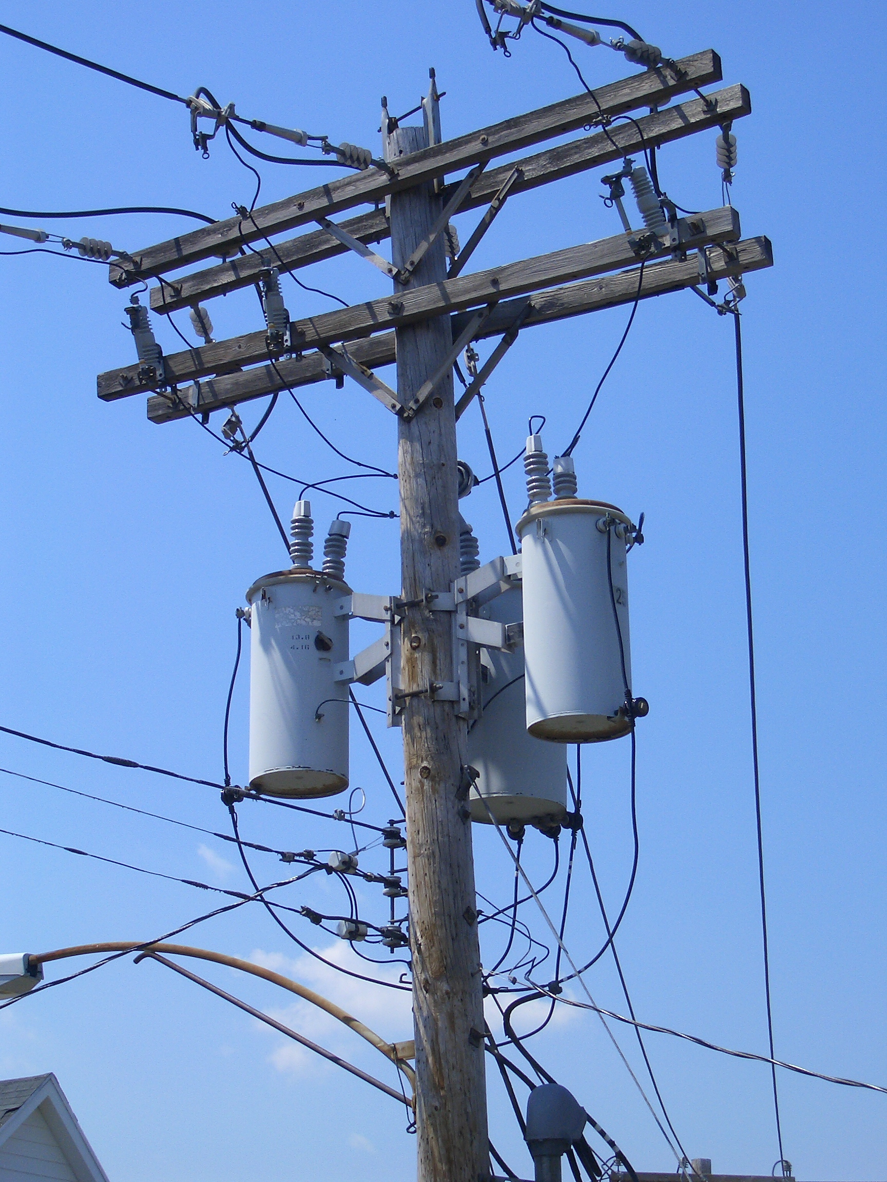
and I wonder what they are. In this case from clues in the environment I was able to guess they were electrical power transformers. Power is distributed on these poles at about seven thousand volts, which is called “medium voltage”. But you do not want 7000-volt power in your house because it would come squirting out of the electric outlets in awesome lightnings and burn everything up. Also most household uses do not want three-phase power, they want single-phase power. So between the pole and the house there is a transformer to change the shape of the electricity to 120V, and that's what these things are. They turn out to be called “distribution transformers” and they are manufactured by — guess who? — General Electric, and they cost a few thousand bucks each. And because of the Wonders of the Internet, I can find out quite a lot about them. The cans are full of mineral oil, or sometimes vegetable oil! (Why are they full of oil? I don't know; I guess for insulation. But I could probably find out.) There are three because that is one way to change the three-phase power to single-phase, something I wish I understood better. Truly, we live in an age of marvels.
Anyway, I was having dinner with a friend recently and for some reason we got to talking about the ID plates on utility poles. The poles around here all carry ID numbers, and I imagine that back at the electric company there are giant books listing, for each pole ID number, where the pole is. Probably they computerized this back in the seventies, and the books are moldering in a closet somewhere.
As I discussed recently, some of those poles are a hundred years old, and the style of the ID tags has changed over that time:

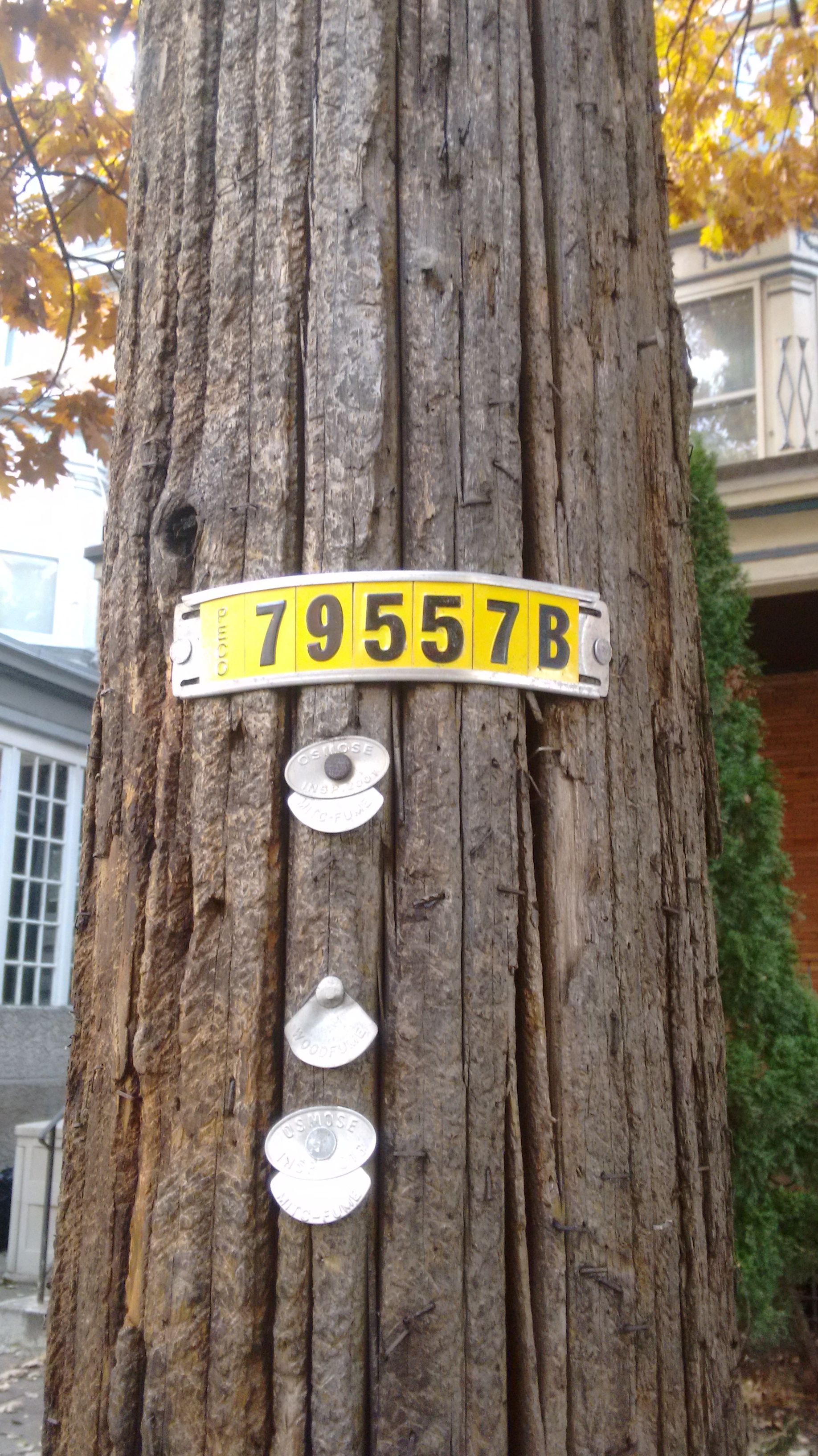
It looks to me like the original style was those oval plates that you see on the left, and that at some point some of the plates started to wear out and were replaced by the yellow digit tags in the middle picture. The most recent poles don't have tags: the identifier is burnt into the pole.
Poles in my neighborhood tend to have consecutive numbers. I don't think this was carefully planned. I guess how this happened is: when they sent the poles out on the truck to be installed, they also sent out a bunch of ID plates, perhaps already attached to the poles, or perhaps to be attached onsite. The plates would already have the numbers on them, and when you grab a bunch of them out of the stack they will naturally tend to have consecutive numbers, as in the pictures above, because that's how they were manufactured. So the poles in a vicinity will tend to have numbers that are close together, until they don't, because at that point the truck had to go back for more poles. So although you might find poles 79518–79604 in my neighborhood, poles 79605–79923 might be in a completely different part of the city.
Later on someone was inspecting pole 79557 (middle picture) and noticed that the number plate was wearing out. So they pried it off and replaced it with the yellow digit tag, which is much newer than the pole itself. The inspector will have a bunch of empty frames and a box full of digits, so they put up a new tag with the old ID number.
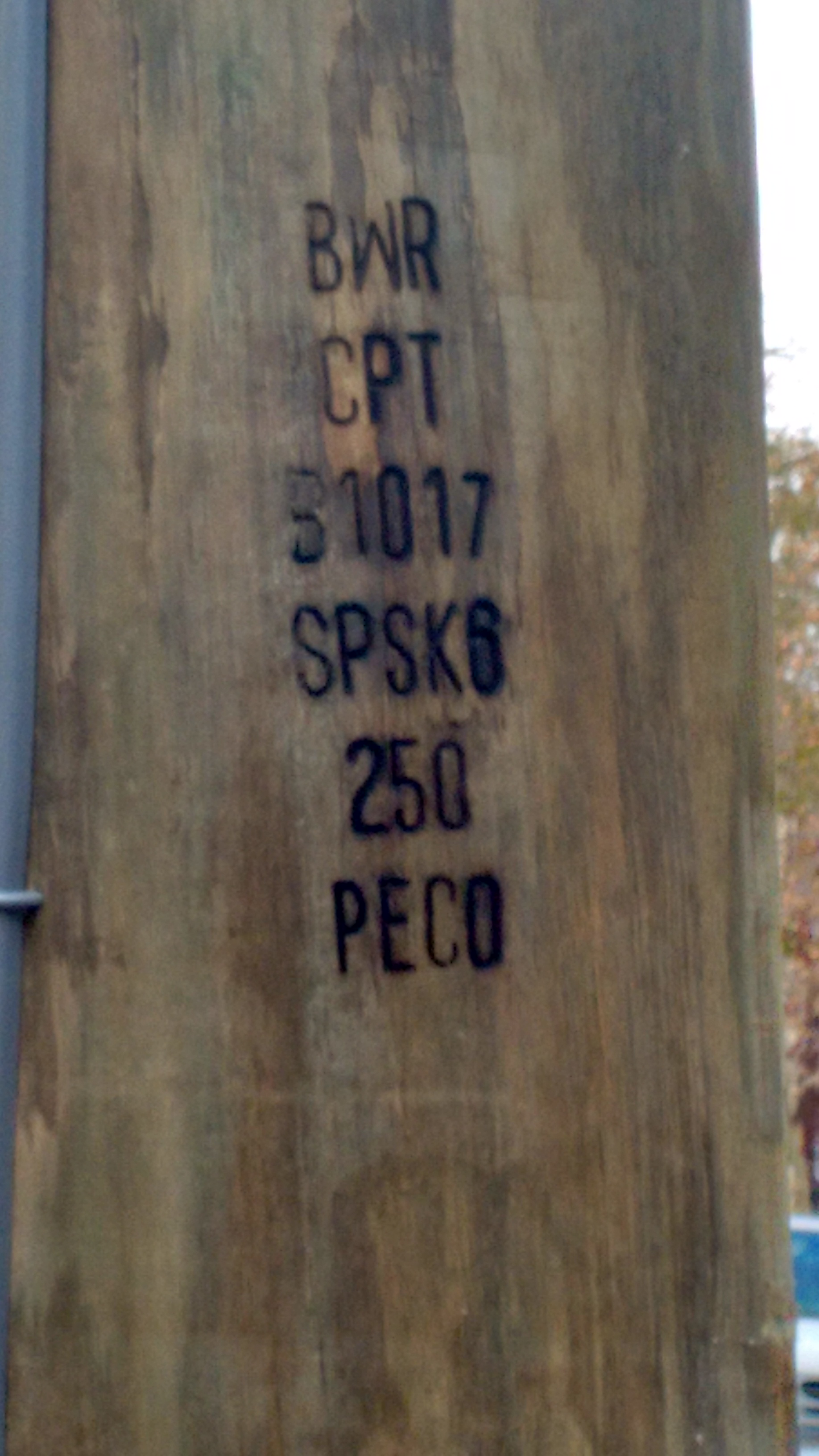
But sometime more recently they switched to these new-style poles with numbers burnt into them at the factory, in a different format than before. I have tried to imagine what the number-burning device looks like, but I'm not at all sure. Is it like a heated printing press, or perhaps a sort of configurable branding iron? Or is it more like a big soldering iron that is on a computer-controlled axis and writes the numbers on like a pen?
I wonder what the old plates are made of. They have to last a long time. For a while I was puzzled. Steel would rust; and I thought even stainless steel wouldn't last as long as these tags need to. Aluminum is expensive. Tin degrades at low temperatures. But thanks to the Wonders of the Internet, I have learned that, properly made, stainless steel tags can indeed last long enough; the web site of the British Stainless Steel Association advises me that even in rough conditions, stainless steel with the right composition can last 85 years outdoors. I will do what I should have done in the first place, and go test the tags with a magnet to see if they are ferrous.
Here's where some knucklehead in the Streets Department decided to nail a No Parking sign right over the ID tag:

Another thing you can see on these poles is inspection tags:
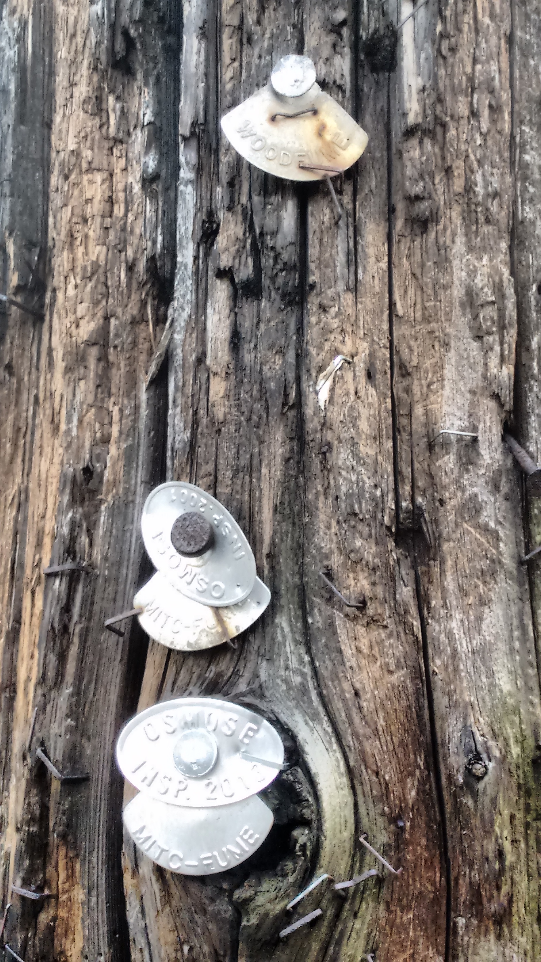
Without the Internet I would just have to wonder what these were and what OSMOSE meant. It is the name of the company that PECO has hired to inspect and maintain the poles. They specialize in this kind of work. This old pole was inspected in 2001 and again in 2013. The dated inspection tag from the previous inspection is lost but we can see a pie-shaped tag that says WOODFUME. You may recall from my previous article that the main killer of wood poles is fungal infection. Woodfume is an inexpensive fumigant that retards pole decay. It propagates into the pole and decomposes into MITC (methyl isothiocyanate). By 2001 PECO had switched to using MITC-FUME, which impregnates the pole directly with MITC. Osmose will be glad to tell you all about it.
(Warning: Probably at least 30% of the surmise in this article is wrong.)
Addendum 20250306
After they cut out those little metal rectangles with the numbers on them, what do they do with the leftover bit?
They nail it to the bottom of the pole to make it easier to see.
[Other articles in category /tech] permanent link
Tue, 13 Feb 2018(If you already know about reservoir sampling, just skip to the good part.)
The basic reservoir sampling algorithm asks us to select a random item from a list, easy peasy, except:
- Each item must be selected with equal probability
- We don't know ahead of time how big the list is
- We may only make one pass over the list
- We may use only constant memory
Maybe the items are being read from a pipe or some other lazy data structure. There might be zillions of them, so we can't simply load them into an array. Obviously something like this doesn't work:
# Python
from random import random
selected = inputs.next()
for item in inputs:
    if random() < 0.5:
        selected = item
because it doesn't select the items with equal probability. Far from it! The last item is selected as often as all the preceding items put together.
The requirements may seem at first impossible to satisfy, but it can be done and it's not even difficult:
from random import random
n = 0
selected = None

for item in inputs:
    n += 1
    if random() < 1/n:
        selected = item
The inputs here is some sort of generator that presents the list of
items, one at a time. After the loop completes, the selected item is
in selected. A proof that this selects each item equiprobably is
left as an easy exercise, or see this math StackExchange
post. A variation
for selecting !!k!! items instead of only one is quite easy.
The good part
Last week I thought of a different simple variation. Suppose each item !!s_i!! is presented along with an arbitrary non-negative weight !!w_i!!, measuring the relative likelihood of its being selected for the output. For example, an item with weight 6 should be selected twice as often as an item with weight 3, and three times as often as an item with weight 2.
The total weight is !!W = \sum w_i!! and at the end, whenever that is, we want to have selected each item !!s_i!! with probability !!\frac{w_i}{W}!!:
total_weight = 0
selected = None

for item, weight in inputs:
    if weight == 0: continue
    total += weight
    if random() < weight/total:
        selected = item
The correctness proof is almost the same. Clearly this reduces to the standard algorithm when all the weights are equal.
This isn't a major change, but it seems useful and I hadn't seen it before.
[Other articles in category /prog] permanent link
Mon, 12 Feb 2018
Philadelphia sports fans behaving badly
Philadelphia sports fans have a bad reputation. For example, we are famous for booing Santa Claus and hitting him with snowballs. I wasn't around for that; it happened in 1968. When the Santa died in 2015, he got an obituary in the Phildelphia Inquirer:
Frank Olivo, the Santa Claus who got pelted with snowballs at the Eagles game that winter day in 1968, died Thursday, April 30…
The most famous story of this type is about Ed Rendell (after he was Philadelphia District Attorney, but before he was Mayor) betting a Eagles fan that they could not throw snowballs all the way from their upper-deck seat onto the field. This was originally reported in 1989 by Steve Lopez in the Inquirer.
(Lopez's story is a blast. He called up Rendell, who denied the claim, and referred Lopez to a friend who had been there with him. Lopez left a message for the friend. Then Rendell called back to confess. Later Rendell's friend called back to deny the story. Lopez wrote:
Was former D.A. Ed Rendell's worst mistake to (A) bet a drunken hooligan he couldn't reach the field, (B) lie about it, (C) confess, or (D) take his friend down with him?
My vote is C. Too honest. Why do you think he can't win an election?
A few years later Rendell was elected Mayor of Philadelphia, and later, Governor of Pennsylvania. Anyway, I digress.)
I don't attend football games, and baseball games are not held in snowy weather, so we have to find other things to throw on the field. I am too young to remember Bat Day, where each attending ticket-holder was presented with a miniature souvenir baseball bat; that was eliminated long ago because too many bats were thrown at the visiting players. (I do remember when those bats stopped being sold at the concession stands, for the same reason.) Over the years, all the larger and harder premiums were eliminated, one by one, but we are an adaptable people and once, to protest a bad call by the umpire, we delayed the game by wadding up our free promotional sport socks and throwing them onto the field. That was the end of Sock Day.
On one memorable occasion, two very fat gentlemen down by the third-base line ran out of patience during an excessively long rain delay and climbed over the fence, ran out and belly-flopped onto the infield, sliding on the wet tarpaulin all the way to the first-base side. Confronted there by security, they evaded capture by turning around and sliding back. These heroes were eventually run down, but only after livening up what had been a very trying evening.
The main point of this note is to shore up a less well-known story of this type. I have seen it reported that Phillies fans once booed Miss Pennsylvania, and I have also seen people suggest that this never really happened. On my honor, it did happen. We not only booed Miss Pennsylvania, we booed her for singing the national anthem. I was at that game, in 1993. The Star-Spangled Banner has a lot of problems that the singer must solve one way or another, and there are a lot of ways to interpret it. But it has a melody, and the singer's interpretation is not permitted to stray so far from the standard that they are singing a different song that happens to have the same words. I booed too, and I'm not ashamed to admit it.
[Other articles in category /games] permanent link
Wed, 07 Feb 2018
The many faces of the Petersen graph
(Actually the Petersen graph cannot really be said to have faces, as it is nonplanar. HA! HA! I MAKE JOKE!!1!)
This article was going to be about how GraphViz renders the Petersen graph, but instead it turned out to be about how GraphViz doesn't render the Petersen graph. The GraphViz stuff will be along later.
Here we have the Petersen graph, which, according to Donald Knuth, “serves as a counterexample to many optimistic predictions about what might be true for graphs in general.” It is not that the Petersen graph is stubborn! But it marches to the beat of a different drummer. If you have not met it before, prepare to be delighted.

This is the basic structure: a blue 5-cycle, and a red 5-cycle. Corresponding vertices in the two cycles are connected by five purple edges. But there is a twist! Notice that the vertices in the red cycle are connected in the order 1–3–5–2–4.
There are different ways to lay out the Petersen graph that showcase its many interesting properties. For example, the standard presentation, above, demonstrates that the Petersen graph is nonplanar, since it obviously contracts to !!K_5!!. The presentation below obscures this, but it is good for seeing that the graph has diameter only 2:

Wait, what? Where did the pentagons go?
Try this instead:

Again the red vertices are connected in the order 1–3–5–2–4.
Okay, that is indeed the Petersen graph, but how does it help us see that the graph has diameter 2? Color the nodes by how far down they are from the root:

Obviously, the root node (black) has distance at most 2 to every other node, because the tree has only depth 2.
Each of the three second-level nodes (red) is distance 2 from the other two, via a path through the root.
The six third-level nodes (blue) are linked in a 6-cycle (dotted lines), so that each third-level node is at most two steps away along the cycle from the others, except for the one furthest away, but that is its sibling in the tree, and it has a path of length 2 through their common parent.
And since each third-level node (say, the one with the red ring) is connected by a dotted edge (orange) to cousins in both of the other branches of the tree, it's only distance 2 from both of its red uncle nodes.
Looking at the pentagonal version, you would not suspect the Petersen graph of also having a sixfold symmetry, but it does. We'll get there in two steps. Again, here's a version where it's not so easy to see that it's actually the Petersen graph, but whatever it is, it is at least clear that it has an automorphism of order six (give it a one-sixth turn):

The  represents three vertices, one
in each color. In the picture they are superimposed, but in the actual
graph, no pair of the three is connected by an edge. Instead, each
of the three is connected not to the others but to a tenth vertex that
I omitted from the diagram entirely.
represents three vertices, one
in each color. In the picture they are superimposed, but in the actual
graph, no pair of the three is connected by an edge. Instead, each
of the three is connected not to the others but to a tenth vertex that
I omitted from the diagram entirely.
Let's pull apart the three vertices


 and reveal the hidden tenth vertex
and its three edges:
and reveal the hidden tenth vertex
and its three edges:

Here is the same drawing, recolored to match the tree diagram from before; the outer hexagon is just the 6-cycle formed by the six blue leaf nodes:

|
|
But maybe it's easier to see if we look for red and blue pentagons. There are a couple of ways to do that:

| 
|
As always, the red vertices are connected in the order 1–3–5–2–4.
Finally, here's a presentation you don't often see. It demonstrates that the Petersen graph also has fourfold symmetry:

Again,  and
and  represent single vertices stretched out
into dumbbell shapes. The diagram only shows 14 of the 15 edges; the
fifteenth connects the two dumbbells.
represent single vertices stretched out
into dumbbell shapes. The diagram only shows 14 of the 15 edges; the
fifteenth connects the two dumbbells.
The pentagons are deeply hidden here. Can you find them? (Spoiler)
Even though this article was supposed to be about GraphViz, I found it impossible to get it to render the diagrams I wanted it to, and I had to fall back on Inkscape. Fortunately Inkscape is a ton of fun.
[Other articles in category /math] permanent link
Thu, 01 Feb 2018As I may have mentioned, I have started another
blog, called Content-type:
text/shitpost.
Last month I said:
The shitposts have been suffering quality creep and I am making an effort to lower my standards. I will keep you posted about how this develops.
I think I am doing better. I will continue my efforts to emphasize quantity over quality, with a multi-pronged approach:
- Faster production with lower production standards
- Less filtering of possible topics for relevance, general interest, or almost anything else
- Promote insufficiently shitty posts to The Universe of Discourse
It will be a struggle, but I resolve to do my best!
Here is a list of January's shitposts. Boldface indicates the articles that may (may) be of more general interest (ha). There are fewer of these than last month because I promoted several of the better ones, so you have seen them already.
- Cartesian Demon
- Ukulele scams
- Vacation in Florida
- The statistics package
- Dysphonia
- Sourtoe brand expansion
- Great Falls
- Software Archaeology
- More shuffling commands
- Disaster narrowly averted
- How to seed a pomegranate
- Google Docs detects a spelling error!
- Software vendor pomegranate video
- Equatorial countries
- Computers suck: episode 17817 of 31279
- Scientists who died young
- Mozart the prodigy
- The Seebeck effect
- Abort
- ABEND
- Coincidence? Or Conspiracy?
- More life goals
- The Carrot Cake Man
- No, it's fine!
- Public Service Announcment: Fuchsia
- Morea vuvuzela fail
- The most Santa Monica thing ever
- My world is turned upside down
- A little algebraic thingy
- Pork stew
- The Liver of Piacenza
- Pouring piss out of a boot
- I'm so old…: [1] [2] [3]
- James Macpherson and Samuel Johnson
- Trump and the golden toilet
- I am a mathematician
- My blog and Planet Haskell
- An atheist reads the Bible
- The universal remote
- Marvels of modern technology
- The cobbler at court
- Differing philosophies of Python and PHP
- Plant pest survey
- Grayeeuts
[Other articles in category /meta/shitpost] permanent link