Mark Dominus (陶敏修)
mjd@pobox.com

Archive:
| 2026: | JFMAMJ |
| 2025: | JFMAMJ |
| JASOND | |
| 2024: | JFMAMJ |
| JASOND | |
| 2023: | JFMAMJ |
| JASOND | |
| 2022: | JFMAMJ |
| JASOND | |
| 2021: | JFMAMJ |
| JASOND | |
| 2020: | JFMAMJ |
| JASOND | |
| 2019: | JFMAMJ |
| JASOND | |
| 2018: | JFMAMJ |
| JASOND | |
| 2017: | JFMAMJ |
| JASOND | |
| 2016: | JFMAMJ |
| JASOND | |
| 2015: | JFMAMJ |
| JASOND | |
| 2014: | JFMAMJ |
| JASOND | |
| 2013: | JFMAMJ |
| JASOND | |
| 2012: | JFMAMJ |
| JASOND | |
| 2011: | JFMAMJ |
| JASOND | |
| 2010: | JFMAMJ |
| JASOND | |
| 2009: | JFMAMJ |
| JASOND | |
| 2008: | JFMAMJ |
| JASOND | |
| 2007: | JFMAMJ |
| JASOND | |
| 2006: | JFMAMJ |
| JASOND | |
| 2005: | OND |
In this section:
Subtopics:
| Mathematics | 250 |
| Programming | 102 |
| Language | 97 |
| Miscellaneous | 75 |
| Book | 50 |
| Tech | 49 |
| Etymology | 36 |
| Haskell | 33 |
| Oops | 30 |
| Unix | 27 |
| Cosmic Call | 25 |
| Math SE | 25 |
| Law | 23 |
| Physics | 21 |
| Perl | 17 |
| Biology | 16 |
| Brain | 15 |
| Calendar | 15 |
| Food | 15 |


Comments disabled
Thu, 30 Nov 2006
Trivial calculations
Back in September, I wrote about how I
tend to plunge ahead with straightforward calculations whenever
possible, grinding through the algebra, ignoring the clever shortcut.
I'll go back and look for the shortcut, but only if the
hog-slaughtering approach doesn't get me what I want. This is often
an advantage in computer programming, and often a disadvantage in
mathematics.
This occasionally puts me in the position of feeling like a complete ass, because I will grind through some big calculation to reach a simple answer which, in hindsight, is completely obvious.
One early instance of this that I remember occurred more than twenty years ago when a friend of mine asked me how many spins of a slot machine would be required before you could expect to hit the jackpot; assume that the machine has three wheels, each of which displays one of twenty symbols, so the chance of hitting the jackpot on any particular spin is 1/8,000. The easy argument goes like this: since the expected number of jackpots per spin is 1/8,000, and expectations are additive, 8,000 spins are required to get the expected number of jackpots to 1, and this is in fact the answer.
But as a young teenager, I did the calculation the long way. The chance of getting a jackpot in one spin is 1/8000. The chance of getting one in exactly two spins is (1 - 1/8000)·(1/8000). The chance of getting one in exactly three spins is (1 - 1/8000)2·(1/8000). And so on; so you sum the infinite series:
$$\sum_{i=1}^\infty {i{\left({k-1\over k}\right)^{i-1}} {1\over k}}$$
And if you do it right, you do indeed get exactly k. Well, I was young, and I didn't know any better.I'd like to be able say I never forgot this. I wish it were true. I did remember it a lot of the time. But I can think of a couple of times when I forgot, and then felt like an ass when I did the problem the long way.
One time was in 1996. There is a statistic in baseball called the on-base percentage or "OBP"—please don't all go to sleep at once. This statistic measures, for each player, the fraction of his plate appearances in which he is safe on base, typically by getting a hit, or by being walked. It is typically around 1/3; exceptional players have an OBP as high as 2/5 or even higher. You can also talk about the OBP of a team as a whole.
A high OBP is a very important determiner of the number of runs a baseball team will score, and therefore of how many games it will win. Players with a higher OBP are more likely to reach base, and when a batter reaches base, another batter comes to the plate. Teams with a high overall OBP therefore tend to bring more batters to the plate and so have more chances to score runs, and so do tend to score runs, than teams with a low overall OBP.
I wanted to calculate the relationship between team OBP and the expected number of batters coming to the plate each inning. I made the simplifying assumption that every batter on the team had an OBP of p, and calculated the expected number of batters per inning. After a lot of algebra, I had the answer: 3/(1-p). Which makes perfect sense: There are only two possible outcomes for a batter in each plate appearance: he can reach base, or he can be put out; these are exclusive. A batter who reaches base p of the time is put out 1-p of the time, consuming, on average, 1-p of an out. A team gets three outs in an inning; the three outs are therefore consumed after 3/(1-p) batters. Duh.
This isn't the only baseball-related mistake I've made. I once took a whole season's statistics and wrote a program to calculate the average number of innings each pitcher pitched. Okay, no problem yet. But then I realized that the average was being depressed by short relievers; I really wanted the average only for starting pitchers. But how to distinguish starting pitchers from relievers? Simple: the statistics record the number of starts for each pitcher, and relievers never start games. But then I got too clever. I decided to weight each pitcher's contribution to the average by his number of starts. Since relievers never start, this ignores relievers; it allows pitchers who do start a lot of games to influence the result more than those who only pitched a few times. I reworked the program to calculate the average number of innings pitched per start.
The answer was 9. (Not exactly, but very close.)
It was obviously 9. There was no other possible answer. There is exactly one start per game, and there are 9 innings per game,1 and some pitcher pitches in every inning, so the number of innings pitched per start is 9. Duh.
Anyway, the real point of this article is to describe a more sophisticated mistake of the same general sort that I made a couple of weeks ago. I was tinkering around with a problem in pharmacology. Suppose Joe has some snakeoleum pills, and is supposed to take one capsule every day. He would like to increase the dosage to 1.5 pills every day, but he cannot divide the capsules. On what schedule should he take the pills to get an effect as close as possible to the effect of 1.5 pills daily?
I assumed that we could model the amount of snakeoleum in Joe's body as a function f(t), which normally decayed exponentially, following f(t) = ae-kt for some constant k that expresses the rate at which Joe's body metabolizes and excretes the snakeoleum. Every so often, Joe takes a pill, and at these times d0, d1, etc., the function f is discontinuous, jumping up by 1. The value a here is the amount of snakeoleum in Joe's body at time t=0. If Joe takes one pill every day, the (maximum) amount of snakeoleum in his body will tend toward 1/(1-e-k) over time, as in the graph below:
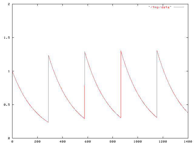
I wanted to compare this with what happens when Joe takes the pill on various other schedules. For some reason I decided it would be a good idea to add up the total amount of pill-minutes for a particular dosage schedule, by integrating f. That is, I was calculating !!\int_a^b f(t) dt!! for various a and b; for want of better values, I calculated the total amount !!\int_0^\infty f(t) dt!!.
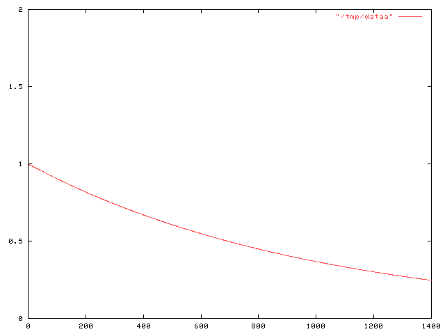
Doing this for the case in which Joe takes a single pill at time 0 is simple; it's just !!\int_0^\infty e^{-kt} dt!!, which is simply 1/k.
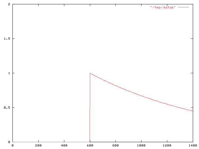
But then I wanted to calculate what happens when Joe takes a second pill, say at time M. At time M, the amount of snakeoleum left in Joe's body from the first pill is e-kM, so the function f has f(t) = e-kt for 0 ≤ t ≤ M and f(t) = (e-kM+1)e-k(t-M) for M ≤ t < ∞. The graph looks like this:
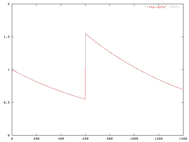
$$\halign{ \hfil$#$ & $= # \hfil $ & $+ #\hfil$ \cr \int_0^\infty f(t) dt & \int_0^M f(t) dt & \int_M^\infty f(t) dt \cr & \int_0^M e^{-kt} dt & \int_M^\infty (e^{-kM} + 1)e^{-k(t-M)} dt \cr & {1 \over k }(1-e^{-kM}) & {1\over k}(e^{-kM} + 1)\cr & \ldots & \omit \cr }$$.
Well, you get the idea. The answer was 2/k.In retrospect, this is completely obvious.
This is because of the way I modeled the pills. When the decay of f(t) is exponential, as it is here, that means that the rate at which the snakeoleum is metabolized is proportional to the amount: twice as much snakeoleum means that the decay is twice as fast. or, looked at another way, each pill decays independently of the rest. Put two pills in, and an hour later you'll find that you have twice as much left as if you had only put one pill in.
Since the two pills are acting independently, you can calculate their effect independently. That is, f(t) can be decomposed into f1(t) + f2(t), where f1 is the contribution from the first pill:
Anyway, I think what I really want is to find !!\int_0^\infty {\left(f_1(t) - f_{1.5}(t, d)\right)}^2 dt!!, where f1 is the function that describes the amount of snakeoleum when Joe takes one pill a day, and f1.5 is the function that describes the amount when Joe takes 1.5 pills every d days. But if there's one thing I think you should learn from a dumbass mistake like this, it's that it's time to step back and try to consider the larger picture for a while, so I've decided to do that before I go on.
1[ Addendum 20070124: There is a brief explanation of why the average baseball game has almost exactly 9 innings. ]
[Other articles in category /oops] permanent link
Wed, 29 Nov 2006
Legal status of corpses in 1911 England
As you might expect from someone who browses at random in the library
stacks, I own several encyclopedias, which I also browse in from time
to time. You never know what you are going to find when you do
this.
I got rid of one recently. It was a 1962 Grolier's. Obviously, it was out of date, but I was using it for general reference anyway, conscious of its shortcomings. But one day I picked it up to read its article on Thurgood Marshall. It said that Marshall was an up-and-coming young lawyer, definitely someone to watch in the future. That was too much, and I gave it away.
But anyway, my main point is to talk about the legal status of corpses. One of the encyclopedias I have is a Twelfth Edition Encyclopaedia Britannica. This contains the complete text of the famous 1911 Eleventh Edition, plus three fat supplementary volumes that were released in 1920. The Britannica folks had originally planned the Twelfth Edition for around 1930, but so much big stuff happened between 1911 and 1920 that they had to do a new edition much earlier.
The Britannica is not as much fun as I hoped it would be. But there are still happy finds. Here is one such:
CORPSE (Lat. corpus, the body), a dead human body. By the common law of England a corpse is not the subject of property nor capable of holding property. It is not therefore larceny to steal a corpse, but any removal of the coffin or grave-cloths is otherwise, such remaining the property of the persons who buried the body. It is a misdemeanour to expose a naked corpse to public view. . .
(The complete article is available online.)
[ Addendum 20191213: it is a felony in California to sexually penetrate or to have sexual contact with human remains, except as authorized by law. ]
[Other articles in category /law] permanent link
Tue, 28 Nov 2006
favicon.ico Results
A couple of days ago I asked for
suggestions for a favicon icon to represent the blog in
people's shortcut menus. There were only two responses, but they were
both very helpful, and solved the problem.
My first thought was, of course, to use an octopus, but I immediately
rejected this idea since I didn't think I would be able to draw a
recognizable octopus in 16×16 pixels. Neil Kandalgaonkar was
braver than I was:  .
.
However, the concept I decided to go with was suggested by David
Eppstein, who provided this attractive interpretation:
 . To explain this, I need to
explain my domain name, which I haven't done here before.
. To explain this, I need to
explain my domain name, which I haven't done here before.
For nine years I was an independent consultant, working under the name Plover Systems. Why Plover? Many people assume that it is an abbreviation for "Perl lover"; this is not the case. The plover domain predates my involvement with Perl. (Some people have also interpreted it as "piss lover", a veiled statement of a fetishistic attraction to urination. It is not.)
A plover is a small bird. Typically, they make their nests on the seashore. The Egyptian plover is the little bird that is reputed to snatch food scraps from between the teeth of the crocodile. The American golden plover migrates all the way from Alaska to South America, and sometimes across the ocean to Europe.
Immediately prior to my becoming an independent consultant and setting up Plover Systems and the plover.com domain, I was employed as the senior systems engineer for Pathfinder, the Time Warner web site. I did not like this job very much. After I quit, I joked that my company had grown too big, so I downsized most of the management and employees, divested the magazine business, and cut the organization's mission back to core competences. Time Warner, the subsidiary I spun off to publish the magazines, was very large. I named my new, lean, trim company "Plover" because the plover is small and agile.
There is another reason for "Plover". For about thirty years, I have been a devoted fan of the old computer game Adventure. When time came to choose a domain name, I wanted to choose something with an Adventure connection. Here the obvious choices are xyzzy, which was already taken, and plugh, which is ugly. Both of these are magic words which, uttered at the correct spot, will teleport the player to another location. The game has a third such magic word, which is "plover"; from the right place, it transports the player to the "Plover room":
You're in a small chamber lit by an eerie green light. An extremely narrow tunnel exits to the west. A dark corridor leads NE.This room, with its green light and narrow tunnel, is depicted in David Eppstein's icon.
The Plover room is so-called because it contains "an emerald the size of a plover's egg". A plover's egg is not very big, as eggs go, because the plover is not a very large bird, as birds go. But an emerald the size of a plover's egg is enormous, as emeralds go. The description is a reference to an off-color joke that was current in the early 1970's when Adventure was written: a teenage girl, upon hearing that the human testicle is the size of a plover's egg, remarks "Oh, so that's how big a plover's egg is." I think this was somewhat more risqué in 1974 than it is today.
For his contribution, M. Eppstein has won a free two-year subscription to The Universe of Discourse. Neil Kandalgaonkar gets the runner-up prize of two free six-month subscriptions, to run concurrently. Thank you both!
[Other articles in category /meta] permanent link
Mon, 27 Nov 2006
Baseball team nicknames, again
Some addenda to my recent
article about baseball team nicknames.
Several people wrote to complain that I mismatched the cities and the nicknames in this sentence:
The American League [has] the Boston Royals, the Kansas City Tigers, the Detroit Indians, the Oakland Orioles...
My apologies for the error. It should have been the Boston Tigers, the Kansas City Indians, the Detroit Orioles, and the Oakland Royals.
Phil Varner reminded me that the Chicago Bulls are in fact a "local color" name; they are named in honor of the Chicago stockyards.
This raises a larger point, brought up by Dave Vasilevsky: My classification of names into two categories conflates some issues. Some names are purely generic, like the Boston Red Sox, and can be transplanted anywhere. Other names are immovable, like the Philadelphia Phillies. In between, we have a category of names, like the Bulls, which, although easily transportable, are in fact local references.
The Milwaukee Brewers are a good baseball example. The Brewers were named in honor of the local German culture and after Milwaukee's renown as a world center of brewing. Nobody would deny that this is a "local color" type name. But the fact remains that many cities have breweries, and the name "Brewers" would work well in many places. The Philadelphia Brewers wouldn't be a silly name, for example. The only place in the U.S. that I can think of offhand that fails as a home for the Brewers is Utah; the Utah Brewers would be a bad joke. (This brings us full circle to the observation about the Utah Jazz that inspired the original article.)
The Baltimore Orioles are another example. I cited them as an example of a generic and easily transportable name. But the Baltimore Oriole is in fact a "local color" type name; the Baltimore Oriole is named after Lord Baltimore, and is the state bird of Maryland. (Thanks again to Dave Vasilevsky and to Phil Gregory for pointing this out.)
 Or consider the Seattle Mariners. The name is supposed to suggest the
great port of Seattle, and was apparently chosen for that reason. (I
have confirmed that the earlier Seattle team, the Seattle Pilots, was
so-called for the same reason.) But the name is transportable to many
other places: it's easy to imagine alternate universes with the New
York Mariners, the Brooklyn Mariners, the San Francisco Mariners, or
the Boston Mariners. Or even all five.
Or consider the Seattle Mariners. The name is supposed to suggest the
great port of Seattle, and was apparently chosen for that reason. (I
have confirmed that the earlier Seattle team, the Seattle Pilots, was
so-called for the same reason.) But the name is transportable to many
other places: it's easy to imagine alternate universes with the New
York Mariners, the Brooklyn Mariners, the San Francisco Mariners, or
the Boston Mariners. Or even all five.
And similarly, although in the previous article I classed the New York
Yankees with the "local color" names, based on the absurdity of the
Selma or the Charleston Yankees, the truth is that the Boston Yankees
only sounds strange because it didn't actually happen that way.
I thought about getting into a tremendous cross-check of all 870 name-city combinations, but decided it was too much work. Then I thought about just classing the names into three groups, and decided that the issue is too complex to do that. For example, consider the Florida Marlins. Local color, certainly. But immovable? Well, almost. The Toronto Marlins or the Kansas City Marlins would be jokes, but the Tampa Bay Marlins certainly wouldn't be. And how far afield should I look? I want to class the Braves as completely generic, but consideration of the well-known class AA Bavarian League Munich Braves makes it clear that "Braves" is not completely generic.
So in ranking by genericity, I think I'd separate the names into the following tiers:
- Pirates, Cubs, Reds, Cardinals, Giants, Red Sox, Blue Jays, White Sox, Tigers, Royals, Athletics
- Braves, Mets, Dodgers, Orioles, Yankees, Indians, Angels, Mariners, Nationals, Brewers
- Marlins, Astros, Diamondbacks, Rockies, Padres, Devil Rays, Twins
- Phillies, Rangers
 Readers shouldn't take this classification as an endorsement of the
Phillies' nickname, which I think is silly. I would have preferred
the Philadelphia Brewers. Or even the Philadelphia Cheese Steaks.
Maybe they didn't need the extra fat, but wouldn't it have been great
if the 1993 Phillies had been the 1993 Cheese Steaks instead? Doesn't
John Kruk belong on a team called the Cheese Steaks?
Readers shouldn't take this classification as an endorsement of the
Phillies' nickname, which I think is silly. I would have preferred
the Philadelphia Brewers. Or even the Philadelphia Cheese Steaks.
Maybe they didn't need the extra fat, but wouldn't it have been great
if the 1993 Phillies had been the 1993 Cheese Steaks instead? Doesn't
John Kruk belong on a team called the Cheese Steaks?
Another oddity, although not from baseball: In a certain sense, the
Montreal Canadiens have an extremely generic name. And yet it's
clearly not generic at all!
[Other articles in category /lang] permanent link
Fri, 24 Nov 2006
Etymological oddity
Sometimes you find words that seem like they must be related, and then
it turns out to be a complete coincidence.
Consider pen and pencil.
Pen is from French penne, a long feather or quill pen, akin to Italian penne (the hollow, ribbed pasta), and ultimately to the word feather itself.
Pencil is from French pincel, a paintbrush, from Latin peniculus, also a brush, from penis, a tail, which is also the source of the English word penis.
A couple of weeks ago someone edited the Wikipedia article on "false cognates" to point out that day and diary are not cognate. "No way," I said, "it's some dumbass putting dumbassery into Wikipedia again." But when I checked the big dictionary, I found that it was true. They are totally unrelated. Diary is akin to Spanish dia, Latin dies, and other similar words, as one would expect. Day, however, is "In no way related to L. dies..." and is akin to Sanskrit dah = "to burn", Lithuania sagas = "hot season", and so forth.
[Other articles in category /lang/etym] permanent link
Thu, 23 Nov 2006
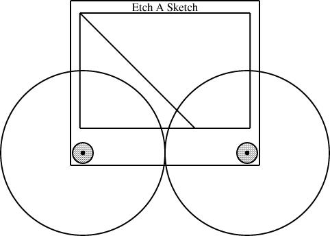
Linogram: The EaS as a component
In an earlier article, I
discussed the definition of an Etch-a-Sketch picture as a component in the linogram
drawing system. I then digressed for a day to rant
about the differences between specification-based and WYSIWYG
systems. I now return to the main topic.
Having defined the EAS component, I can use it in several diagrams. The typical diagram looks like this:
        require "eas";

        number WIDTH = 2;

        EAS the_eas(w = WIDTH);

        gear3 gears(width=WIDTH, r1=1/4, r3=1/12);

        constraints {
            the_eas.left = gears.g1.c;
            the_eas.right = gears.g3.c;
        }
The eas.lino file defines the EAS component and also
the gear3 component, which describes what the three gears
should look like. The diagram itself just chooses a global width and
communicates it to the EAS component and the gear3
component. It also communicates two of the three selected gear sizes
to the gear3, which generates the three gears and their
axles. Finally, the specification constrains the left
reference point of the Etch-a-Sketch to lie at the center of gear 1, and the
right reference point to lie at the center of gear 3.This sort of thing was exactly what I was hoping for when I started designing linogram. I wanted it to be easy to define a new component type, like EAS or gear3, and to use it as if it were a built-in type. (Indeed, as noted before, even linogram's "built-in" types are not actually built in! Everything from point on up is defined by a .lino file just like the one above, and if the user wants to redefine point or line, they are free to do so.)
(It may not be clear redefining point or line is actually a useful thing to do. But it could be. Consider, for example, what would happen if you were to change the definition of point to contain a z coordinate, in addition to the x and y coordinates it normally has. The line and box definitions would inherit this change, and become three-dimensional objects. If provided with a suitably enhanced rendering component, linogram would then become a three-dimensional diagram-drawing program. Eventually I will add this enhancement to linogram.)
I am a long-time user of the AT&T Unix tool pic, which wants to allow you to define and use compound objects in this way, but gets it badly wrong, so that it's painful and impractical. Every time I suffered through pic's ineptitude, I would think about how it might be done properly. I think linogram gets it right; pic was a major inspiration.
Slanty lines
Partway through drawing the Etch-a-Sketch diagrams, I had a happy idea. Since I was describing Etch-a-Sketch configurations that would draw lines with various slopes, why not include examples?
line L(slope=..., start=..., ...);
In general, though, this is too hard to handle. The resulting equations are quadratic, or worse, trigonometric, and linogram does not know how to solve those kinds of equations.
But if the slope is required to be constant, then the quadratic equations become linear, and there is no problem. And in this case, I only needed constant slopes. Once I realized this, it was easy to define a constant-slope line type:
        require "line";

        define sline extends line {
          param number slope;
          constraints {
            end.y - start.y = slope * (end.x - start.x);
          }
        }
An sline is just like a line, but it has an
additional parameter, slope (which must be constant, and
specified at compile time, not inferred from other values) and one
extra constraint that uses it. Normally, all four of start.x,
end.x, start.y, and end.y are independent.
The constraint removes some of the independence, so that any three,
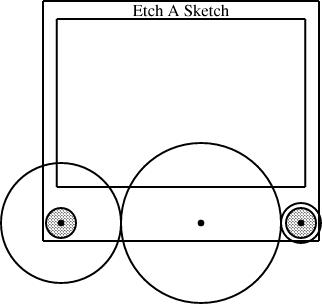
plus the slope, are sufficient to determine the fourth.The diagram above was generated from this specification:
require "eas";
require "sline";
number WIDTH = 2;
EAS the_eas(w = WIDTH);
gear3 gears(width=WIDTH, r1=1/4, r3=1/12);
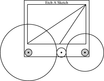
sline L1(slope=1/3, start=the_eas.screen.ne);
sline L2(slope=3, start=the_eas.screen.ne);
constraints {
the_eas.left = gears.g1.c;
the_eas.right = gears.g3.c;
L1.end.x = the_eas.screen.w.x;
L2.end.y = the_eas.screen.s.y;
}
The additions here are the sline items, named L1 and L2. Both lines start at the northeast corner of the screen. Line L1 has slope 1/3, and its other endpoint is constrained to lie somewhere on the west edge of the screen. The y-coordinate of that endpoint is not specified, but is implicitly determined by the other constraints. To locate it, linogram must solve some linear equations. The complete set of constraints no the line is:
| L1.start.x = the_eas.screen.ne.x |
| L1.start.y = the_eas.screen.ne.y |
| L1.end.x = the_eas.screen.w.x |
| L1.end.y - L1.start.y = L1.slope × (L1.end.x - L1.start.x); |
| L1.end.y - L1.start.y = 1/3 × (L1.end.x - L1.start.x); |
The other line, L2, with slope 3, is handled similarly; its endpoint is constrained to lie somewhere on the south side of the screen.
Surprise features
When I first planned linogram, I was hardly thinking of slopes at all, except to dismiss them as being intractable, along with a bunch of other things like angles and lengths. But it turned out that they are a little bit tractable, enough that linogram can get a bit of a handle on them, thanks to the param feature that allows them to be excluded from the linear equation solving.One of the signs that you have designed a system well is that it comes out to be more powerful than you expected when you designed it, and lends itself to unexpected uses. The slines are an example of that. When it occurred to me to try doing them, my first thought was "but that won't work, will it?" But it does work.
Here's another technique I hadn't specifically planned for, that is already be supported by linogram. Suppose Fred Flooney wants to use the eas library, but doesn't like the names of the reference points in the EAS component. Fred is quite free to define his own replacement, with whatever names for whatever reference points he likes
        require "eas";

        define freds_EAS {
          EAS it;
          point middle = it.screen.c;
          point bernard = (it.body.e + 2*it.body.se)/3;
          line diag(start=it.body.nw, end=it.body.se);
          draw { it; }
        }
The freds_EAS component is essentially the same as the
EAS component defined by eas.lino. It contains a
single Etch-a-Sketch, called it, and a few extra items that Fred is
interested in. If E is a freds_EAS, then
E.middle refers to the point at the center of E's
screen; E.bernard is a point two-thirds of the way between
the middle and the bottom corner of its outer edge, and
E.diag is an invisible line running diagonally across the
entire body, equipped with the usual E.diag.start,
E.diag.center, and the like. All the standard items are
still available, as E.it.vknob,
E.it.screen.left.center, and so on.
The draw section tells linogram that only the component named it—that is, the Etch-a-Sketch itself—should be drawn; this suppresses the diag line. which would otherwise have been rendered also.
If Fred inherits some other diagram or component that includes an Etch-a-Sketch, he can still use his own aliases to refer to the parts of the Etch-a-Sketch, without modifying the diagram he inherited. For example, suppose Fred gets handed my specification for the diagram above, and wants to augment it or incorporate it in a larger diagram. The diagram above is defined by a file called "eas4-3-12.lino", which in turn requires EAS.lino. Fred does not need to modify eas4-3-12.lino; he can do:
        require "eas4-3-12.lino";
        require "freds_eas";

        freds_EAS freds_eas(it = the_eas);

        constraints {
          freds_eas.middle = ...;
          freds_eas.bernard = ...;
        }
        ...
Fred has created one of his extended Etch-a-Sketch components, and identified
the Etch-a-Sketch part of it with the_eas, which is the Etch-a-Sketch part of my
original diagram. Fred can then apply constraints to the
middle and bernard sub-parts of his
freds_eas, and these constraints will be propagated to the
corresponding parts the the_eas in my original diagram. Fred
can now specify relations in terms of his own peronal middle
and bernard items, and they will automatically be related to
the appropriate parts of my diagram, even though I have never heard of
Fred and have no idea what bernard is supposed to represent.Why Fred wants these names for these components, I don't know; it's just a contrived example. But the important point is that if he does want them, he can have them, with no trouble.
What next?
There are still a few things missing from linogram. The last major missing feature is arrays. The gear3 construction I used above is clumsy. It contains a series of constraints that look like:
  g1.e = g2.w;
  g2.e = g3.w;
The same file also has an analogous gear2 definition, for diagrams with only two gears. Having both gear2 and gear3, almost the same, is silly and wasteful. What I really want is to be able to write:
  define gears[n] open {
    gear[n] g;
    constraints {
      g[i].e = g[i+1].w;
    }
  }
and this would automatically imply components like gear2 and
gear3, with 2 and 3 gears, but denoted gear[2] and gear[3],
respectively; it would also imply gear[17] and
gear[253] with the analogous constraints.For gear[3], two constraints are generated: g[0].e = g[1].w, and g[1].e = g[2].w. Normally, arrays are cyclic, and a third constraint, g[2].e = g[0].w, would be generated as well. The open keyword suppresses this additional constraint.
This feature is under development now. I originally planned it to support splines, which can have any number of control points. But once again, I found that the array feature was going to be useful for many other purposes.
When the array feature is finished, the next step will be to create a spline type: spline[4] will be a spline with 4 control points; spline[7] will be a spline with 7 control points, and so on. PostScript will take care of drawing the splines for me, so that will be easy. I will also define a regular polygon type at that time:
        define polygon[n] closed {
          param number rotation = 0;
          number radius;
          point v[n], center;
          line  e[n];
          constraints {
            v[i] = center + radius * cis(rotation + i * 360/n);
            e[i].start = v[i];
            e[i].end   = v[i+1];
          }
        }
polygon[3] will then be a rightward-pointing equilateral
triangle; constraining any two of its vertices will determine the
position of the third, which will be positioned automatically. Note
the closed keyword, which tells linogram to include the constraint
e[2].end =
v[0], which would have been omitted had open been
used instead. More complete information about linogram is available in Chapter 9 of Higher-Order Perl; complete source code is available from the linogram web site.

[Other articles in category /linogram] permanent link
Damning with faint praise
If you have used evaporated milk, you may have noticed that the label
says something like:
By adding one part water to one part of the contents of this can, a resulting milk product will be obtained which will not be below the legal standard for whole milk.
This sounds ghastly, doesn't it? "Will not be below the legal standard...". Shudder.
The purpose of this note is to let you know that:
- I have done this,
- more than once, and
- it not only wasn't as ghastly as it sounds,
- it wasn't ghastly at all.
From the warning on the label, you would expect maybe a 30% resemblance to milk; in truth, the resemblance is more like 85%. That's close enough to drink plain, if you're not too fussy, and it's certainly close enough to pour over your cereal without noticing the difference.
The wording of the label scares people off, but it works quite well, well enough that it is probably worth keeping a couple of cans in the closet for emergencies, like when you run out of milk for your cereal at 2 AM after the store is closed.
This has been a public service announcement of the Universe of Discourse. Happy Thanksgiving, everyone!
[Other articles in category /food] permanent link
Wed, 22 Nov 2006
Baseball team nicknames
Lorrie and I were in the car, and she noticed another car with a
Detroit Pistons sticker. She remarked that "Pistons" was a good name
for a basketball team, and particularly for one from Detroit. I
agreed. But then she mentioned the Utah Jazz, a terrible mismatch,
and asked me how that happened to be. Even if you don't know, you can
probably guess: They used to be the New Orleans Jazz, and the team
moved to Utah. They should have changed the name to the Teetotalers
or the Salt Flats or something, but they didn't, so now we have the
Utah Jazz. I hear that next month they're playing the Miami Fightin'
Irish.
That got us thinking about how some sports team names travel, and others don't. Jazz didn't. The Miami Heat could trade cities or names with the Phoenix Suns and nobody would notice. But consider the Chicago Bulls. They could pick up and move anywhere, anywhere at all, and the name would still be fine, just fine. Kansas City Bulls? Fine. Honolulu Bulls? Fine. Marsaxlokk Bulls? Fine.
We can distinguish two categories of names: the "generic" names, like "Bulls", and the "local color" names, like "Pistons". But I know more about baseball, so I spent more time thinking about baseball team names.
In the National League, we have the generic Braves, Cardinals, Cubs, Giants, Pirates, and Reds, who could be based anywhere, and in some cases were. The Braves moved from Boston to Milwaukee to Atlanta, although to escape from Boston they first had to change their name from the Beaneaters. The New York Giants didn't need to change their name when they moved to San Francisco, and they won't need to change their name when they move to Jyväskylä next year. (I hear that the Jyväskylä city council offered them a domed stadium and they couldn't bear to say no.)
On the other hand, the Florida Marlins, Arizona Diamondbacks, and Colorado Rockies are clearly named after features of local importance. If the Marlins were to move to Wyoming, or the Rockies to Nebraska, they would have to change their names, or turn into bad jokes. Then again, the Jazz didn't change their name when they moved to Utah.
The New York Mets are actually the "Metropolitans", so that has at least an attempt at a local connection. The Washington Nationals ditto, although the old name of the Washington Senators was better. At least in that one way. Who could root for a team called the Washington Senators? (From what I gather, not many people could.)
The Nationals replaced the hapless Montreal Expos, whose name wasn't very good, but was locally related: they were named for the 1967 Montreal World's Fair. Advice: If you're naming a baseball team, don't choose an event that will close after a year, and especially don't choose one that has already closed.
The Houston Astros, and their Astrodome filled with Astroturf, are named to recall the NASA manned space center, which opened there in 1961. The Philadelphia club is called the Phillies, which is not very clever, but is completely immovable. Boston Phillies, anyone? Pittsburgh Phillies? New York Phillies? No? I didn't think so.
I don't know why the San Diego Padres are named that, but there is plenty of Spanish religious history in the San Diego area, so I am confident in putting them in the "local color" column. Milwaukee is indeed full of Brewers; there are a lot of Germans up there, brewing up lager. (Are they back in the National League again? They seem to switch leagues every thirty years.)
That leaves just the Los Angeles Dodgers, who are a bit of an odd case. The team, as you know, was originally the Brooklyn Dodgers. The "Dodgers" nickname, as you probably didn't know, is short for "Trolley Dodgers". The Los Angeles Trolley Dodgers is almost as bad a joke as the Nebraska Rockies. Fortunately, the "Trolley" part was lost a long time ago, and we can now imagine that the team is the Los Angeles Traffic Dodgers. So much for the National League; we have six generic names out of 16, counting the Traffic Dodgers in the "local color" group, and ignoring the defunct Expos.
The American League does not do so well. They have the Boston Royals, the Kansas City Tigers, the Detroit Indians, the Oakland Orioles, and three teams that are named after sox: the Red, the White, and the Athletics.
Then there are the Blue Jays. They were originally owned by Labatt, a Canadian brewer of beer, and were so-named to remind visitors to the park of their flagship brand, Labatt's Blue. I might have a harder time deciding which group to put them in, if it weren't for the (1944-1945) Philadelphia Blue Jays. If the name is generic enough to be transplanted from Toronto to Philadelphia, it is generic. I have no idea what name the Toronto club could choose if they wanted to avail themselves of the "local color" option rather than the "generic" option; it's tempting to make a cruel joke and suggest that the name most evocative of Toronto would be the Toronto Generics. But no, that's unfair. They could always call their baseball club the Toronto Hockey Fans.
Anyway, moving on, we have the New York Yankees, which is not the least generic possible name, but clearly qualifies as "local color" once you pause to think about the Charleston Yankees, the Shreveport Yankees, and the Selma Yankees. The Tampa Bay Devil Rays are clearly "local color". The Minnesota Twins play in the Twin Cities of Minneapolis and St. Paul. The California, Anaheim, or Los Angeles Angels, whatever they're called this week, are evidently named for the city of Los Angeles. I would ridicule the Los Angeles Angels for having a redundant name, but as an adherent of the Philadelphia Phillies, I am living in a glass house.
The Texas Rangers are named for the famous Texas Rangers. I don't know exactly why the Seattle club is named Mariners; I wouldn't have considered Seattle to be an unusually maritime city, but their previous team was the Seattle Pilots, so the folks in Seattle must think of themselves so, and I'm willing to go along with it.
The tally for the American League is therefore eight generic, six local color. The total for Major League Baseball as a whole is 14 generic names out of 30.
This is a lot better than the Japanese Baseball League, which has a bunch of teams with names like the Lions, Tigers, Dragons, Giants, and Fighters. They make up for this somewhat in the names of the teams' corporate sponsors, so, for example, the Nippon Ham Fighters. They are sponsored by Nippon Ham, which does not make it any less funny. And the Yakult Swallows, which, if you interpret it as a noun phrase, sounds just a little bit like a gay porn flick set in Uzbekistan.
Incidentally, my favorite team name is the Wilmington Blue Rocks. The Blue Rocks' mascot is, alas, not a rock but a moose. Sometimes I dream of a team from Lansing, Michigan, called the Lansing Boils, but I know it will remain an unfulfilled fantasy.
[ Warning for non-Americans: Almost, but not quite everything in this article is the truth. Marsaxlokk does not actually have a Major League baseball club yet; however, they do have a class-A affiliate in the Mediterranean league, called the Marsaxlokk Moghzaskops. Also, the Giants are not scheduled to move to Jyväskylä until after the 2008 season. ]
[ Addendum 20061127: There is a followup article to this one. ]
[ Addendum 20230425: I can't believe it took me this long to realize it, but the Los Angeles Lakers is just as strange a mismatch as the Utah Jazz. There are no lakes near Los Angeles. That name itself tells you what happened: the team was originally located in Minneapolis. ]
[Other articles in category /lang] permanent link
Linogram: Declarative drawing
As we saw in yesterday's
article, The definition of the EAS component is twenty
lines of strange, mostly mathematical notation. I could have drawn
the Etch-a-Sketch in a WYSIWYG diagram-drawing system like xfig. It might have
been less trouble. Many people will prefer this. Why invent linogram?
Some of the arguments should be familiar to you. The world is full of operating systems with GUIs. Why use the Unix command line? The world is full of WYSIWYG word processors. Why use TeX?
Text descriptions of processes can be automatically generated, copied, and automatically modified. Common parts can be abstracted out. This is a powerful paradigm.
Collectively, the diagrams contained 19 "gears". Partway through, I decided that the black dot that represented the gear axle was too small, and made it bigger. Had I been using a WYSIWYG system, I would have had the pleasure of editing 19 black dots in 10 separate files. Then, if I didn't like the result, I would have had the pleasure of putting them back the way they were. With linogram, all that was required was to change the 0.02 to an 0.05 in eas.lino:
        define axle {
          param number r = 0.05;
          circle a(fill=1, r=r);
        }
The Etch-a-Sketch article contained seven similar diagrams with slight differences. Each one contained a require "eas"; directive to obtain the same definition of the EAS component. Partway through the process, I decided to alter the aspect ratio of the Etch-a-Sketch body. Had I been drawing these with a WYSIWYG system, that would have meant editing each of the seven diagrams in the same way. With linogram, it meant making a single trivial change to eas.lino.
A linogram diagram has a structure: it is made up of component parts with well-defined relationships. A line in a WYSIWYG diagram might be 4.6 inches long. A line in a linogram diagram might also be 4.6 inches long, but that is probably not all there is to it. The south edge of the body box in my diagrams is 4.6 inches long, but only because it has been inferred (from other relationships) to be 1.15 w, and because w was specified to be 4 inches. Change w, and everything else changes automatically to match. Each part moves appropriately, to maintain the specified relationships. The distance from the knob centers to the edge remains 3/40 of the distance between the knobs. The screen remains 70% as tall as the body. A WYSIWYG system might be able to scale everything down by 50%, but all it can do is to scale down everything by 50%; it doesn't know enough about the relationships between the elements to do any better. What will happen if I reduce the width but not the height by 50%? The gears are circles; will the WYSIWYG system keep them as circles? Will they shrink appropriately? Will their widths be adjusted to fit between the two knobs? Maybe, or maybe not. In linogram, the required relationships are all explicit. For example, I specified the size of the black axle dots in absolute numbers, so they do not grow or shrink when the rest of the diagram is scaled.
Finally, because the diagrams are mathematically specified, I can leave the definitions of some of the components implicit in the mathematics, and let linogram figure them out for me. For example, consider this diagram:

gear3 gears(width=WIDTH, r1=1/4, r3=1/12);
I specified r1, the radius of the left gear, and r3, the radius of the right gear. Where is the middle gear? It's implicit in the definition of the gear3 type. The definition knows that the three gears must all touch, so it calculates the radius of the middle gear accordingly:
define gear3 {
  ...
  number r2 = (1 - r1 - r3) / 2;
  ...
}
linogram gives me the option of omitting r2 and having it be calculated for me from this formula, or of specifying r2 anyway, in which case linogram will check it against this formula and raise an error if the values don't match.
Tomorrow: The Etch-a-Sketch as a component.
More complete information about linogram is available in Chapter 9 of Higher-Order Perl; complete source code is available from the linogram web site.
[Other articles in category /linogram] permanent link
Tue, 21 Nov 2006
Linogram: The EaS component
In yesterday's article I
talked about the basic facilities provided by linogram. What about the
Etch-a-Sketch diagrams?
The core of these diagrams was a specification I wrote for an Etch-a-Sketch itself, in a file called eas.lino. The specification is complicated, because an Etch-a-Sketch has many parts, but it is conceptually just like the definitions above: it defines a diagram component called an EAS that looks like an Etch-a-Sketch:
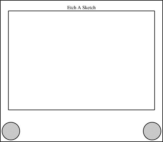
        define EAS {
          param number w;
          number knobrad = w * 1/16;
          circle hknob(r=knobrad, fill=0.25), vknob(r=knobrad, fill=0.25);
          point left = hknob.c, right = vknob.c;
          number margin = 3/40 * w;
          box body(sw = left + (-margin, -margin), se = right + (margin,  -margin),
                   ht = w * 1);
          box screen(wd = body.wd * 0.9,
                     n = body.n + (0, -margin),
                     ht = body.ht * 0.7);

          number nudge = body.ht * 0.025;
          label Brand(text="Etch A Sketch") = (body.n + screen.n)/2 + (0, -nudge);

          constraints { left + (w, 0) = right;
                        left.y = right.y = 0;
                        left.x = 0;
                      }
        }
I didn't, of course, write this all in one fell swoop. I built it up a bit at a time. Each time I changed the definition in the eas.lino file, the changes were inherited by all the files that contained require "eas".
The two main parts of the Etch-a-Sketch are the body (large outer rectangle) and screen (smaller inner rectangle), which are defined to be boxes:
        box body(...);
        box screen(...);
But most of the positions are ultimately referred to the centers of the two knobs. The knobs themselves are hknob and vknob, and their centers, hknob.c and vknob.c, are given the convenience names left and right:
point left = hknob.c, right = vknob.c;
Down in the constraints section is a crucial constraint:
left + (w, 0) = right;
This constrains the right point (and, by extension, vknob.c and the circle vknob of which it is the center, and, by further extension, anything else that depends on vknob) to lie exactly w units east and 0 units south of the left point. The number w ("width") is declared as a "param", and is special: it must be specified by the calling context, to tell the Etch-a-Sketch component how wide it is to be; if it is omitted, compilation of the diagram fails. By varying w, we can have linogram draw Etch-a-Sketch components in different sizes. The diagram above had w=4; this one has w=2:

number knobrad = w * 1/16;
So if you make w twice as big, the knobs get twice as big also.
The quantity margin is the amount of space between knobs and the edge of the body box, defined to be 3/40 of w:
number margin = 3/40 * w;
Since the margin is 0.075 w, and the knobs have size 0.0625 w, there is a bit of extra space between the knobs and the edge of the body. Had I wanted to state this explicitly, I could have defined margin = knobrad * 1.15 or something of the sort.
The southwest and southeast corners of the body box are defined as offsets from the left and right reference points, which are at the centers of the knobs:
          box body(sw = left + (-margin, -margin),
                   se = right + (margin, -margin),
                   ht = w * 1);
(The body(sw = ..., se = ..., ht = ...) notation is
equivalent to just including body.sw = ...; body.se =
...; body.ht = ... in the constraints section.)This implicitly specifies the width of the body box, since linogram can deduce it from the positions of the two bottom corners. The height of the body box is defined as being equal to w, making the height of the body equal to the distance between the to knobs. This is not realistic, since a real Etch-a-Sketch is not so nearly a square, but I liked the way it looked. Earlier drafts of the diagram had ht = w * 2/3, to make the Etch-a-Sketch more rectangular. Changing this one number causes linogram to adjust everything else in the entire diagram correspondingly; everything else moves around to match.
The smaller box, the screen, is defined in terms of the larger box, the body:
          box screen(wd = body.wd * 0.9,
                     n = body.n + (0, -margin),
                     ht = body.ht * 0.7);
It is 9/10 as wide as the body and 7/10 as tall. Its "north" point
(the middle of the top side) is due south of the north point of the
body, by a distance equal to margin, the distance between the
center of a knob and the bottom edge of the body. This is enough
information for linogram to figure out everything it needs to know about the
screen.The only other features are the label and the fill property of the knobs. A label is defined by linogram's standard library. It is like a point, but with an associated string:
        require "point";

        define label extends point {
                param string text;
                draw { &put_string; }
        }
Unlike an ordinary point, which is not drawn at all, a
label is drawn by placing the specified string at the
x and y coordinates of the point.
All the magic here is in the put_string() function, which is
responsible for generating the required PostScript output.
          number nudge = body.ht * 0.025;
          label Brand(text="Etch A Sketch") =
                (body.n + screen.n)/2 + (0, -nudge);
The text="..." supplies the text parameter, which is handed off directly to put_string(). The rest of the constraint says that the text should be positioned halfway between the north points of the body and the screen boxes, but nudged southwards a bit. The nudge value is a fudge factor that I put in because I haven't yet gotten the PostScript drawing component to position the text at the exact right location. Indeed, I'm not entirely sure about the best way to specify text positioning, so I left that part of the program to do later, when I have more experience with text.
The fill parameter of the knobs is handled similarly to the text parameter of a label: it's an opaque piece of information that is passed to the drawing component for handling:
circle hknob(r=knobrad, fill=0.25), vknob(r=knobrad, fill=0.25);
The PostScript drawing component then uses this when drawing the circles, eventually generating something like gsave 0.75 setgray fill grestore. The default value is 0, indicating white fill; here we use 0.25, which is light gray. (The PostScript drawing component turns this into 0.75, which is PostScript for light gray. PostScript has white=1 and black=0, but linogram has white=0 and black=1. I may reverse this before the final release, or make it a per-diagram configuration option.)
Tomorrow: Advantages of declarative drawing.
More complete information about linogram is available in Chapter 9 of Higher-Order Perl; complete source code is available from the linogram web site.
[Other articles in category /linogram] permanent link
Mon, 20 Nov 2006
favicon.ico
I'm getting hundreds of failed requests for favicon.ico. I
need to come up with a good-looking icon for the blog. Since the blog
isn't about Higher-Order
Perl, I don't want to use the HOP cover or the HOP quilt
block icon  .
.
I have not had any good ideas. So I am asking LazyNet.
The best suggestion will win a free one-year subscription to The Universe of Discourse blog. If the winner supplies an icon that I can actually use, the prize will be increased to a free two-year subscription.
Any suggestions?
[ Addendum 20061120: David Eppstein responded immediately with  , which I will explain in a future article that
summarizes the suggestions. M. Eppstein's suggestion is good
enough that I am comfortable installing it right away. But don't let
that stop you from coming up with your own suggestion. ]
, which I will explain in a future article that
summarizes the suggestions. M. Eppstein's suggestion is good
enough that I am comfortable installing it right away. But don't let
that stop you from coming up with your own suggestion. ]
[ Addendum 20061120: Neil Kandalgaonkar has contributed
 . Thank you, Neil! ]
[Other articles in category /meta] permanent link
Sun, 19 Nov 2006
A series of articles about Linogram
Every six months or so I do a little work on linogram, which for about
18 months now has been about one week of hard work short of version
1.0. Every time I try to use it, I am surprised by how pleased I am
with it, how easy I find it to use, and how flexible the (rather
spare) basic feature set is—all properties of a well-designed
system.
I was planning to write a short note about this, but, as always happens when I write about linogram, it turned into a very long note that included a tutorial about how linogram works, a rant about why it is a good idea, and a lot of technical examples. So I decided to break the 4,000-word article into smaller pieces, which I will serialize.
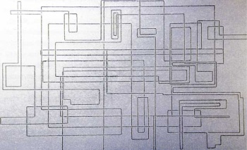
Most recently I used linogram to do schematic diagrams of an Etch-a-Sketch for some recent blog articles ([1] [2]). In case you have forgotten, here is an example:

Basic ideas of linogram
There are two basic concepts that provide the underpinnings of linogram. One is that most interesting features of a line drawing can be described by giving a series of linear equations that relate the positions of the components. For example, to say that line B starts at the same place that line A ends, one provides the two extremely simple linear equations:
        B.start.x = A.end.x;
        B.start.y = A.end.y;
which one can (and normally would) abbreviate to:
B.start = A.end;
The computer is very good at solving systems of linear equations, and can figure out all the things the equations imply. For example, consider two boxes, X and Y:
        X.ht = 2;     # height of box X
        Y.ht = 3;     # height of box Y
        X.s = Y.n;    # 's' is 'south'; 'n' is 'north'
From this, the program can deduce that the south edge of box Y
is 5 units south of the north edge of box X, even though
neither was mentioned explicitly.These simple examples are not very impressive, but please bear with me.
The other fundamental idea in linogram is the idea of elements of a diagram as components that can be composed into more complicated elements. The linogram libraries have a definition for a box, but it is not a primitive. In fact, linogram has one, and only one primitive type of element: the number. A point is composed of two numbers, called x and y, and is defined by the point.lino file in the library:
        define point {
          number x, y;
        }
A line can then be defined as an object that contains two points, the
start and end points:
        require "point";

        define line {
          point start, end;
        }
Actually the real definition of line is somewhat more
complicated, because the center point is defined as well, for the
user's convenience:
        require "point";

        define line {
          point start, end, center;
          constraints {
            center = (start + end) / 2;
          }
        }
The equation
center = (start + end) / 2 is actually shorthand
for two equations, one involving x and the other involving
y:
| center.x = (start.x + end.x) / 2 |
| center.y = (start.y + end.y) / 2 |
From the specification above, the program can deduce the location of the center point given the two endpoints. But it can also deduce the location of either endpoint given the locations of the center and the other endpoint. The treatment of equations is completely symmetrical. In fact, the line is really, at the bottom, an agglomeration of six numbers (start.x, center.y, and so forth) and from any specification of two x coordinates and two y coordinates, the program can deduce the missing values.
The linogram standard library defines hline and vline as being like ordinary lines, but constrained to be horizontal and vertical, and the then box.lino defines a box as being two hlines and two vlines, constrained so that they line up in a box shape:
        require "hline";
        require "vline";

        define box {
          vline left, right;
          hline top, bottom;
          constraints {
            left.start  = top.start;
            right.start = top.end;
            left.end    = bottom.start;
            right.end   = bottom.end;
          }
        }
I have abridged this definition for easy reading; the actual definition in the file has more to it. Here it is, complete:
        require "hline";
        require "vline";
        require "point";

        define box {
          vline left, right;
          hline top, bottom;
          point nw, n, ne, e, se, s, sw, w, c;
          number ht, wd;
          constraints {
            nw = left.start  = top.start;
            ne = right.start = top.end;
            sw = left.end    = bottom.start;
            se = right.end   = bottom.end;

            n = (nw + ne)/2;
            s = (sw + se)/2;
            w = (nw + sw)/2;
            e = (ne + se)/2;

            c = (n + s)/2;

            ht = left.length;
            wd = top.length;
          }
        }
The additional components, like sw, make it easy to refer to the corners and edges of the box; you can refer to the southwest corner of a box B as B.sw. Even without this convenience, it would not have been too hard: B.bottom.start and B.left.end are names for the same place, as you can see in the constraints section.
Tomorrow: The Etch-a-Sketch component.
More complete information about linogram is available in Chapter 9 of Higher-Order Perl; complete source code is available from the linogram web site.
[Other articles in category /linogram] permanent link
Thu, 16 Nov 2006
Etch-a-Sketch blue-skying, corrected
In my last article I
discussed a scheme for improving the Etch-a-Sketch which contained a serious
mechanical error. I was discussing attaching gears to the two knobs
of the Etch-a-Sketch to force them to turn at the exact same rate. Supposing
that the distance between the knobs is 1 unit, I said, then we can
gear the two knobs together by attaching a gear of radius 1/2 to each
knob; the two gears will mesh, and the knobs will then turn at the same
rate, in opposite directions. This was fine.
Then I went astray, and suggested adding an axle peg midway between the two knobs, and putting gears of radius 1/3 on the peg and on the two knobs. This won't work.
The one person who wrote to me to ask about the problem is a very bright person, but been seriously confused about how I was planning to set up the gears, so I evidently I didn't explain it very well. It needed a picture. So this time I'm going to try to get it right, with pictures. Here is an Etch-a-Sketch:

Here are some gears, which happen to have radii 1/3, 1/4, and 1/6:
Here's a picture of an Etch-a-Sketch with a radius-1/2 gear mounted on each knob:
Here the knobs have been fitted with different-sized gears, one with radius 1/3 and the other with radius 2/3:
Then I suggested that you could drill a little hole in between the two knobs, and use it to mount a third axle and a third gear. If all three gears are the same size, the two knobs are forced to turn at the same rate, this time in the same direction, and you get a line with slope 1, from southeast to northwest:
This wrecks the rest of the details of my other article. Since we were already including gears of size 1/2 and 1/3, I reasoned, we can throw in a gear of size 1/6 and get some new behaviors from the 1/2 + 1/3 + 1/6 combination. The corresponding combination for 1/2 and 1/4 is 1/8:
So what next? The calculations are a bit less obvious than they were back in the happy days when I thought that installing two gears of size p and q left space for one of size 1-(p+q). It's tempting to consider a radius-1/3 gear next, since it's the simplest size I haven't yet installed. But to mount it on the knobs along with a size-1/2 gear, we need to include a size-1/12 gear to go in between:
Once we have the size-1/12 gear, we can mount it with the size-1/4 and size-1/3 that we already had:

[Other articles in category /games] permanent link
Sun, 12 Nov 2006
Etch-a-Sketch
I've always felt that the Etch-a-Sketch is a superb example of a toy
that doesn't do as much as it could.
An Etch-a-Sketch is a drawing toy invented in 1959 by Arthur Granjean and marketed by the Ohio Art company since shortly afterward. It looks superficially like a flat-screen television with two knobs.
It is very easy to draw horizontal and vertical lines, but very difficult to draw diagonal lines. (Wikipedia says "Creating a straight diagonal line or smoothly curved line with an Etch A Sketch is notoriously difficult and a true test of coordination.") So although extremely complex drawings can be made with an Etch-a-Sketch:
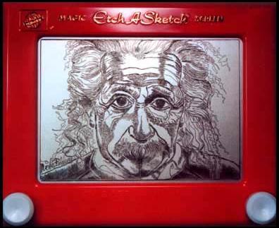
(Etch-a-Sketch drawing of
Albert Einstein by Nicole
Falzone)
But it needn't be so. The most frustrating thing about the Etch-a-Sketch, I think, is that its potential has not yet begun to be unlocked.
Consider a forty-five degree line. To draw such a line, one must turn both the horizontal and the vertical knobs at the same time, at exactly the same rate. Suppose, for concreteness, that we're drawing a line from the upper left to the lower right. If you turn the horizontal knob a little too quickly, the diagonal line will bend rightward; if you turn it a little too slowly the diagonal line will bend downward. So in contrast to the mathematically exact vertical and horizontal lines that are easy to draw, it's next to impossible to draw a diagonal line that doesn't wiggle. And when you screw up, you can't fix the mistake without erasing the whole thing and starting over.
But the solution is obvious: If you can link the two knobs somehow, so that they can only turn simultaneously, you can easily draw a diagonal line. As a child, I experimented with rubber bands, trying to get one knob to drive the other. This wasn't successful. Clearly, a better solution is to use gears.
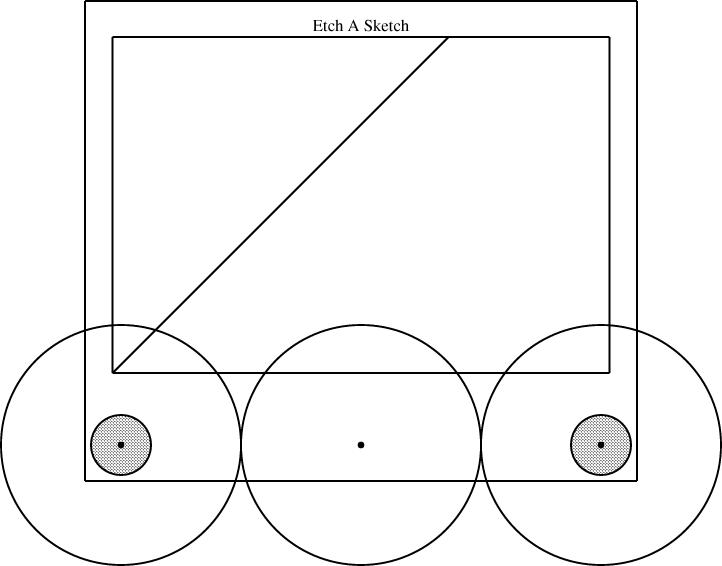
There are plenty of examples of toys that have good-quality cast-plastic gears. (Spirograph is one such.) The knobs on the Etch-a-Sketch could be geared together. If the gears are the same size, the knobs will rotate at the same rate, and the result will be a perfect 45° line.
If you gear the two knobs together directly, they will rotate in opposite directions, so that you can only draw lines with slope -1 (northwest to southeast), not with slope 1 (northeast to southwest). To fix this problem, we need to introduce more gears. There can be an axle peg sticking up from the case of the Etch-a-Sketch, in between the two knobs. Mounting three equal-sized gears on the two knobs and the axle peg gears will force the knobs to rotate in the same direction, at the same rate.
[ The remainder of this article contains a number of very dumb arithmetic errors. For example, you cannot fit three gears of size 1/3 on the knobs and pegs; you need to use three gears of size 1/4 instead. I will correct this on Monday, and provide an illustration to make it clearer what I mean. —MJD ]
[ Addendum 20061116: I have posted the correction, with illustrations. ]
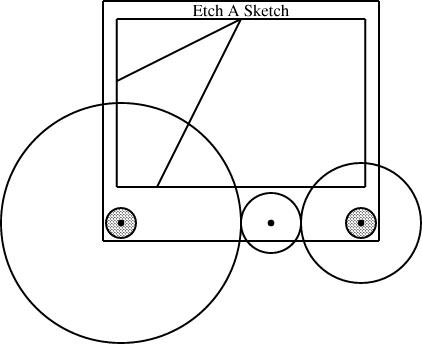
Let's say that the distance between the centers of the two knobs is 1. We can get a line of slope -1 by mounting two gears, each with radius 1/2, on the two knobs; we can get a line of slope +1 by mounting three gears, each with radius 1/3, on the two knobs and on the axle peg. If we want to do both, we had better make the axle peg removable, or else it will interfere with the size-1/2 gears. This is no problem. It can mount into a socket on the front of the Etch-a-Sketch, and be pulled out when not needed.
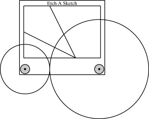
But why have only one socket? We're including five gears already (two of size 1/2 and three of size 1/3) so we may as well put them to some more use. Throw in a size 1/6 gear, and add another socket for the axle peg, this time 1/3 of the way between the two knobs. Now you can mount a size 1/2 gear on the left knob, a size 1/6 gear on the axle peg, and a size 1/3 gear on the right knob. If the left knob turns at rate r, the middle gear turns at rate -3r and the right knob turns at rate 3r/2. This produces a line with slope 3/2, which is about a 56-degree angle.
Or put in another socket for the axle peg, 1/6 of the way between the knobs, and then mount size 1/2, size 1/3, and size 1/6 gears, in that order. The knobs are now producing a line with slope 3, a 72-degree angle. If you want a line with slope 1/3 (18°) instead, just reverse the order of the gears. (That is, exchange the large and the small ones.)
At this point adding a few more gears expands the repertoire significantly. Add a radius-2/3 gear and another radius-1/6 gear and you can mount [2/3, 1/3] to get lines with slope -1/2, [1/3, 2/3] to get slope -2, [2/3, 1/6, 1/6] to get slope 4, [1/6, 1/6, /23] to get slope 1/4.
Clearly, you can carry this onwards, limited only by the space for the axle holes and the expense of adding in more gears. Spirograph used to deliver fifteen or twenty plastic gears for a reasonable price, so it's clearly not implausible that Ohio Art could have done something like this.
Sometimes I even dare to think that they might have provided cams or elliptical gears. Properly designed cams could gear together the knobs to produce mathematically exact curved lines, squiggles, maybe even circles.
But no, as far as I can tell, it's never been done. Why not?
[Other articles in category /games] permanent link