Mark Dominus (陶敏修)
mjd@pobox.com

Archive:
| 2026: | JFMAMJ |
| 2025: | JFMAMJ |
| JASOND | |
| 2024: | JFMAMJ |
| JASOND | |
| 2023: | JFMAMJ |
| JASOND | |
| 2022: | JFMAMJ |
| JASOND | |
| 2021: | JFMAMJ |
| JASOND | |
| 2020: | JFMAMJ |
| JASOND | |
| 2019: | JFMAMJ |
| JASOND | |
| 2018: | JFMAMJ |
| JASOND | |
| 2017: | JFMAMJ |
| JASOND | |
| 2016: | JFMAMJ |
| JASOND | |
| 2015: | JFMAMJ |
| JASOND | |
| 2014: | JFMAMJ |
| JASOND | |
| 2013: | JFMAMJ |
| JASOND | |
| 2012: | JFMAMJ |
| JASOND | |
| 2011: | JFMAMJ |
| JASOND | |
| 2010: | JFMAMJ |
| JASOND | |
| 2009: | JFMAMJ |
| JASOND | |
| 2008: | JFMAMJ |
| JASOND | |
| 2007: | JFMAMJ |
| JASOND | |
| 2006: | JFMAMJ |
| JASOND | |
| 2005: | OND |
Subtopics:
| Mathematics | 250 |
| Programming | 102 |
| Language | 97 |
| Miscellaneous | 75 |
| Book | 50 |
| Tech | 49 |
| Etymology | 36 |
| Haskell | 33 |
| Oops | 30 |
| Unix | 27 |
| Cosmic Call | 25 |
| Math SE | 25 |
| Law | 23 |
| Physics | 21 |
| Perl | 17 |
| Biology | 16 |
| Brain | 15 |
| Calendar | 15 |
| Food | 15 |


Comments disabled
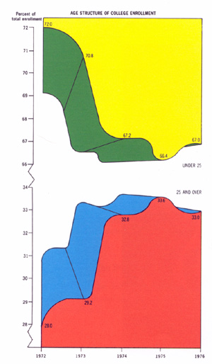
Tue, 05 Oct 2010 In his awesome classic The Visual Display of Quantitative Information, Edward Tufte presents this infographic:
Unfortunately the standards of the Internet can be even lower than those of print, as exhibited by this infographic, produced by Pingdom:
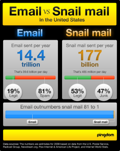
Chapter 6 of Tufte's book, "Data-Ink Maximization and Graphical Design", explores the exercise of erasing all the ink from an infographic that does not perform the function of communicating data. If we were to take this a little farther, and replace the original 80,265-byte graphic file with the 32 bytes of numeric data that it was designed to communicate, we might conclude that the image contained an astounding 99.96% chartjunk.
[Other articles in category /IT] permanent link