Mark Dominus (陶敏修)
mjd@pobox.com

Archive:
| 2026: | JFMAMJ |
| 2025: | JFMAMJ |
| JASOND | |
| 2024: | JFMAMJ |
| JASOND | |
| 2023: | JFMAMJ |
| JASOND | |
| 2022: | JFMAMJ |
| JASOND | |
| 2021: | JFMAMJ |
| JASOND | |
| 2020: | JFMAMJ |
| JASOND | |
| 2019: | JFMAMJ |
| JASOND | |
| 2018: | JFMAMJ |
| JASOND | |
| 2017: | JFMAMJ |
| JASOND | |
| 2016: | JFMAMJ |
| JASOND | |
| 2015: | JFMAMJ |
| JASOND | |
| 2014: | JFMAMJ |
| JASOND | |
| 2013: | JFMAMJ |
| JASOND | |
| 2012: | JFMAMJ |
| JASOND | |
| 2011: | JFMAMJ |
| JASOND | |
| 2010: | JFMAMJ |
| JASOND | |
| 2009: | JFMAMJ |
| JASOND | |
| 2008: | JFMAMJ |
| JASOND | |
| 2007: | JFMAMJ |
| JASOND | |
| 2006: | JFMAMJ |
| JASOND | |
| 2005: | OND |
Subtopics:
| Mathematics | 250 |
| Programming | 102 |
| Language | 97 |
| Miscellaneous | 75 |
| Book | 50 |
| Tech | 49 |
| Etymology | 36 |
| Haskell | 33 |
| Oops | 30 |
| Unix | 27 |
| Cosmic Call | 25 |
| Math SE | 25 |
| Law | 23 |
| Physics | 21 |
| Perl | 17 |
| Biology | 16 |
| Brain | 15 |
| Calendar | 15 |
| Food | 15 |


Comments disabled
Wed, 30 Sep 2015
A message to the aliens, part 16/23 (vital statistics)
Earlier articles: Introduction Common features Page 1 (numerals) Page 2 (arithmetic) Page 3 (exponents) Page 4 (algebra) Page 5 (geometry) Page 6 (chemistry) Page 7 (mass) Page 8 (time and space) Page 9 (physical units) Page 10 (temperature) Page 11 (solar system) Page 12 (Earth-Moon system) Page 13 (days, months, and years) Page 14 (terrain) Page 15 (human anatomy)
This is page 16 of the Cosmic Call message. An explanation follows.
The 10 digits are:
 0 |  1 |  2 |  3 |  4 |  5 |  6 |  7 |  8 |  9 |
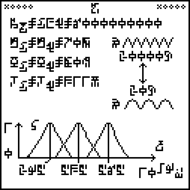
This page, about human vital statistics and senses, is in three
sections. The text in the top left explains the population of the
Earth: around 6,000,000,000 people at the time the message was sent.
The three following lines give the life expectancy (70 years), mass
(80 kg), and body temperature (311K) of humans. In each case it is
stated explicitly that the value for men and for women is the same,
which is not really true.
The glyph used for life expectancy  is the same one used
to denote the age of the Earth back on page 13 even though the
two notions are not really the same.
And why 311K when the commonly-accepted value is 310K?
is the same one used
to denote the age of the Earth back on page 13 even though the
two notions are not really the same.
And why 311K when the commonly-accepted value is 310K?
The diagram at right attempts to explain the human sense of hearing,
showing a high-frequency wave at top and a low frequency one at
bottom, annotated with the glyph for frequency  and the upper
and lower frequency limits of human hearing, 20,000 Hz and 20 Hz
respectively. I found this extremely puzzling the first time I
deciphered the message, so much so that it was one of the few parts of
the document that left me completely mystified, even with the advantage
of knowing already what humans are like. A significant part of the
problem here is that the illustration is just flat out wrong. It
depicts transverse waves:
and the upper
and lower frequency limits of human hearing, 20,000 Hz and 20 Hz
respectively. I found this extremely puzzling the first time I
deciphered the message, so much so that it was one of the few parts of
the document that left me completely mystified, even with the advantage
of knowing already what humans are like. A significant part of the
problem here is that the illustration is just flat out wrong. It
depicts transverse waves:
![]()
but sound waves are not transverse, they are compression waves. The aliens are going to think we don't understand compression waves. (To see the difference, think of water waves, which are transverse: the water molecules move up and down—think of a bobbing cork—but the wave itself travels in a perpendicular direction, not vertically but toward the shore, where it eventually crashes on the beach. Sound waves are not like this. The air molecules move back and forth, parallel to the direction the sound is moving.)
I'm not sure what would be better; I tried generating some random compression waves to fit in the same space. (I also tried doing a cartoon of a non-random, neatly periodic compression wave, but I couldn't get anything I thought looked good.) I think the compression waves are better in some ways, but perhaps very confusing:
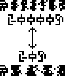
On the one hand, I think they express the intended meaning more
clearly; on the other hand, I think they're too easy to confuse with
glyphs, since they happen to be on almost the same scale. I think
the message might be clearer if a little more space were allotted for
them. Also, they could be annotated with the glyph for pressure  , maybe something like this:
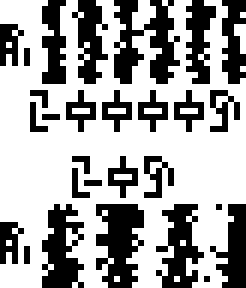
This also gets rid of the meaningless double-headed arrow. I'm not sure I buy the argument that the aliens won't know about arrows; they may not have arrows but it's hard to imagine they don't know about any sort of pointy projectile, and of course the whole purpose of a pointy projectile (the whole point, one might say) is that the point is on the front end. But the arrows here don't communicate motion or direction or anything like that; even as a human I'm not sure what they are supposed to communicate.
The bottom third of the diagram is more sensible. It is a diagram
showing the wavelengths of light  to which the human
visual system is most sensitive. The x-axis is labeled with
“wavelength”
to which the human
visual system is most sensitive. The x-axis is labeled with
“wavelength”  and the
y-axis with a range from 0 to 1. The three peaks have their centers
at 295 nm (blue), 535 nm (green), and 565 nm (often called “red”, but
actually yellow). These correspond to the three types of cone cells
in the retina, and the existence of three different types is why we
perceive the color space as being three-dimensional. (I discussed
this at greater
length a few
years ago.) Isn't it interesting that the “red” and green
sensitivities are so close together? This is why we have red-green
color blindness.
and the
y-axis with a range from 0 to 1. The three peaks have their centers
at 295 nm (blue), 535 nm (green), and 565 nm (often called “red”, but
actually yellow). These correspond to the three types of cone cells
in the retina, and the existence of three different types is why we
perceive the color space as being three-dimensional. (I discussed
this at greater
length a few
years ago.) Isn't it interesting that the “red” and green
sensitivities are so close together? This is why we have red-green
color blindness.
[Other articles in category /aliens/dd] permanent link