Mark Dominus (陶敏修)
mjd@pobox.com

Archive:
| 2026: | JFM |
| 2025: | JFMAMJ |
| JASOND | |
| 2024: | JFMAMJ |
| JASOND | |
| 2023: | JFMAMJ |
| JASOND | |
| 2022: | JFMAMJ |
| JASOND | |
| 2021: | JFMAMJ |
| JASOND | |
| 2020: | JFMAMJ |
| JASOND | |
| 2019: | JFMAMJ |
| JASOND | |
| 2018: | JFMAMJ |
| JASOND | |
| 2017: | JFMAMJ |
| JASOND | |
| 2016: | JFMAMJ |
| JASOND | |
| 2015: | JFMAMJ |
| JASOND | |
| 2014: | JFMAMJ |
| JASOND | |
| 2013: | JFMAMJ |
| JASOND | |
| 2012: | JFMAMJ |
| JASOND | |
| 2011: | JFMAMJ |
| JASOND | |
| 2010: | JFMAMJ |
| JASOND | |
| 2009: | JFMAMJ |
| JASOND | |
| 2008: | JFMAMJ |
| JASOND | |
| 2007: | JFMAMJ |
| JASOND | |
| 2006: | JFMAMJ |
| JASOND | |
| 2005: | OND |
In this section:
Subtopics:
| Mathematics | 246 |
| Programming | 100 |
| Language | 95 |
| Miscellaneous | 75 |
| Book | 50 |
| Tech | 49 |
| Etymology | 36 |
| Haskell | 33 |
| Oops | 30 |
| Unix | 27 |
| Cosmic Call | 25 |
| Math SE | 25 |
| Law | 23 |
| Physics | 21 |
| Perl | 17 |
| Biology | 16 |
| Brain | 15 |
| Calendar | 15 |
| Food | 15 |


Comments disabled
Sat, 15 Mar 2025
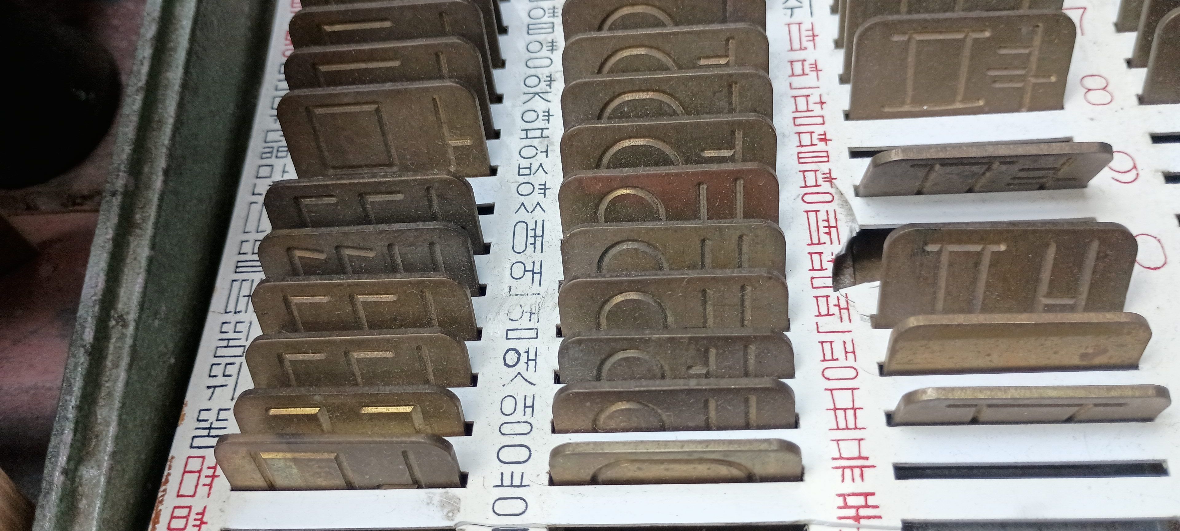
Hangeul sign-engraving machine
Last summer I was privileged to visit the glorious Letterpress Museum in Paju Book City, where I spent several hours and took a collection of photos that are probably not of interest to anyone but letterpress geeks, and perhaps not even to them.
Looking back at the photos it's not always clear to me why I took each one. But some of them I can remember. For example, this one:
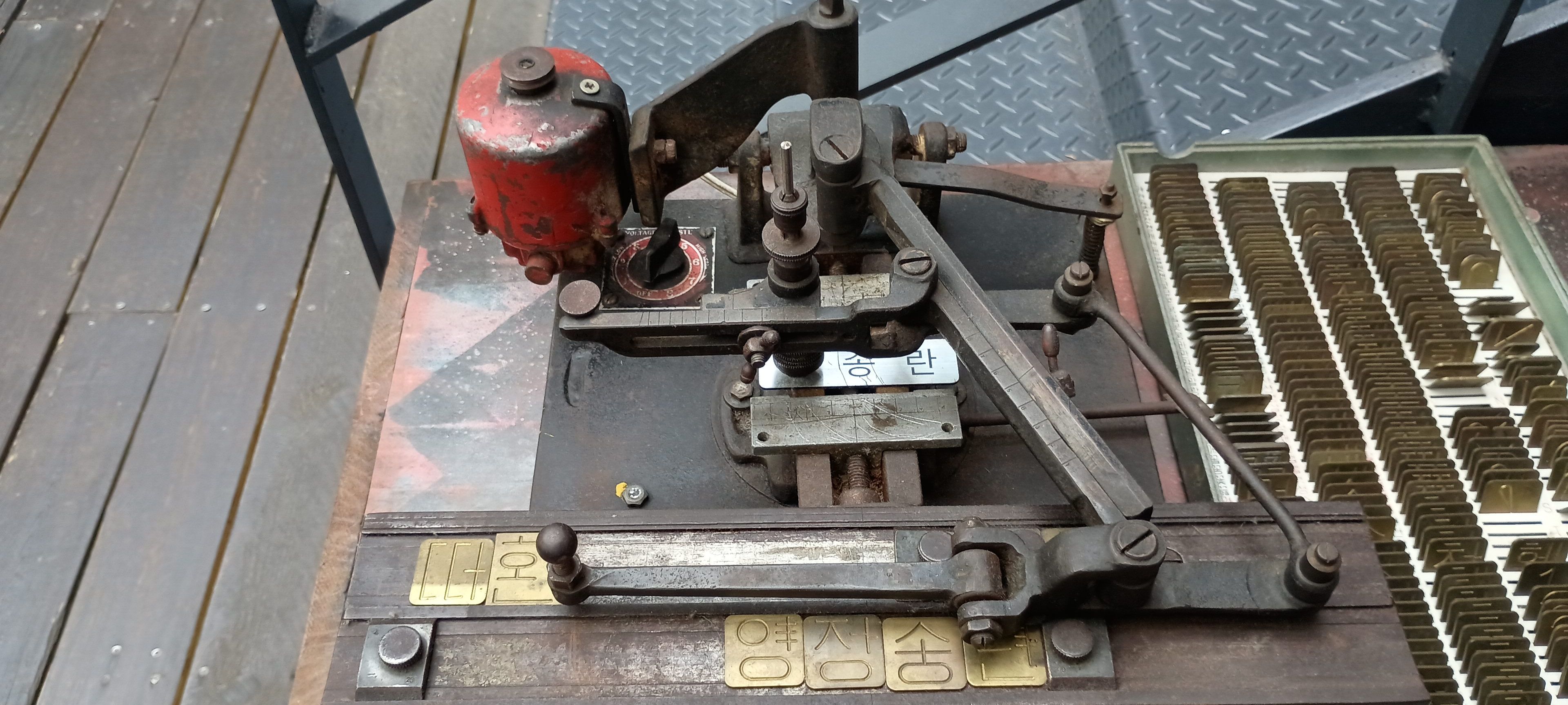
This is not exactly letterpress. It is a device for engraving lettered signs on thin strips of metal or perhaps plastic. Happily I don't have to spend too much time explaining this because Marcin Wichary has just published an extensively-illustrated article about the Latin-script version. The only thing different about this one is the fonts, which are for writing Korean in Hangeul script rather than English in Latin script.
(Here's my real-quick summary. There is no ink. A stylus goes into the grooves of those brass templates. The stylus is attached with a pantograph to a router bit that rests on the object that the operator wants to engrave. When operator moves the stylus in the template grooves, the router bit follows their motions and engraves matching grooves in the target object. By adjusting the pantograph, one can engrave letters that are larger or smaller than the templates.)
Hangeul has an alphabet of 24 letters, but there's a difficulty in adapting this engraving technique for written Hangeul: The letters aren't written in a simple horizontal row as European languages are. Instead, they are grouped into syllables of two or three letters. For example, consider the consider the Korean word “문어”, pronounced (roughly) "moon-aw". which means “octopus”. This is made up of five letters ㅁㅜㄴㅇㅓ, but as you see they are arranged in two syllables 문 ("moon") and 어 ("aw"). So instead of twenty-four kinds of templates, one for each letter, the Korean set needs one for every possible syllable, and there are thousands of possible syllables.
Unicode gets around this by… sorry, Unicode doesn't get around it, they just allocate eleven thousand codepoints, one for each possible syllable. But for this engraving device, it would be prohibitively expensive to make eleven thousand little templates, then another eleven thousand spares, and impractical to sort and manage them in the shop. Instead there is a clever solution.
Take a look at just one of these templates:

This is not a Hangeul syllable. Rather, it is five.
The upper-right letter in the syllable is the vowel, and the template allows the operator to engrave any of the five vowels
ㅣㅓㅏㅕㅑ
to produce the syllables
잉 엉 앙 영 양
pronounced respectively "ing", "ông", "ang", "yông", and "yang".
Similarly this one can produce six different syllables:
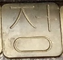
The upper-left part can be used to engrave either of the consonants ㅅ or ㅈ and the upper-right part can be used to engrave any of the vowels ㅣㅓㅏ, to produce the combined set 싱 성 상 징 정 장. I'm not sure why this template doesn't also enable vowels ㅕㅑ as the other one did.
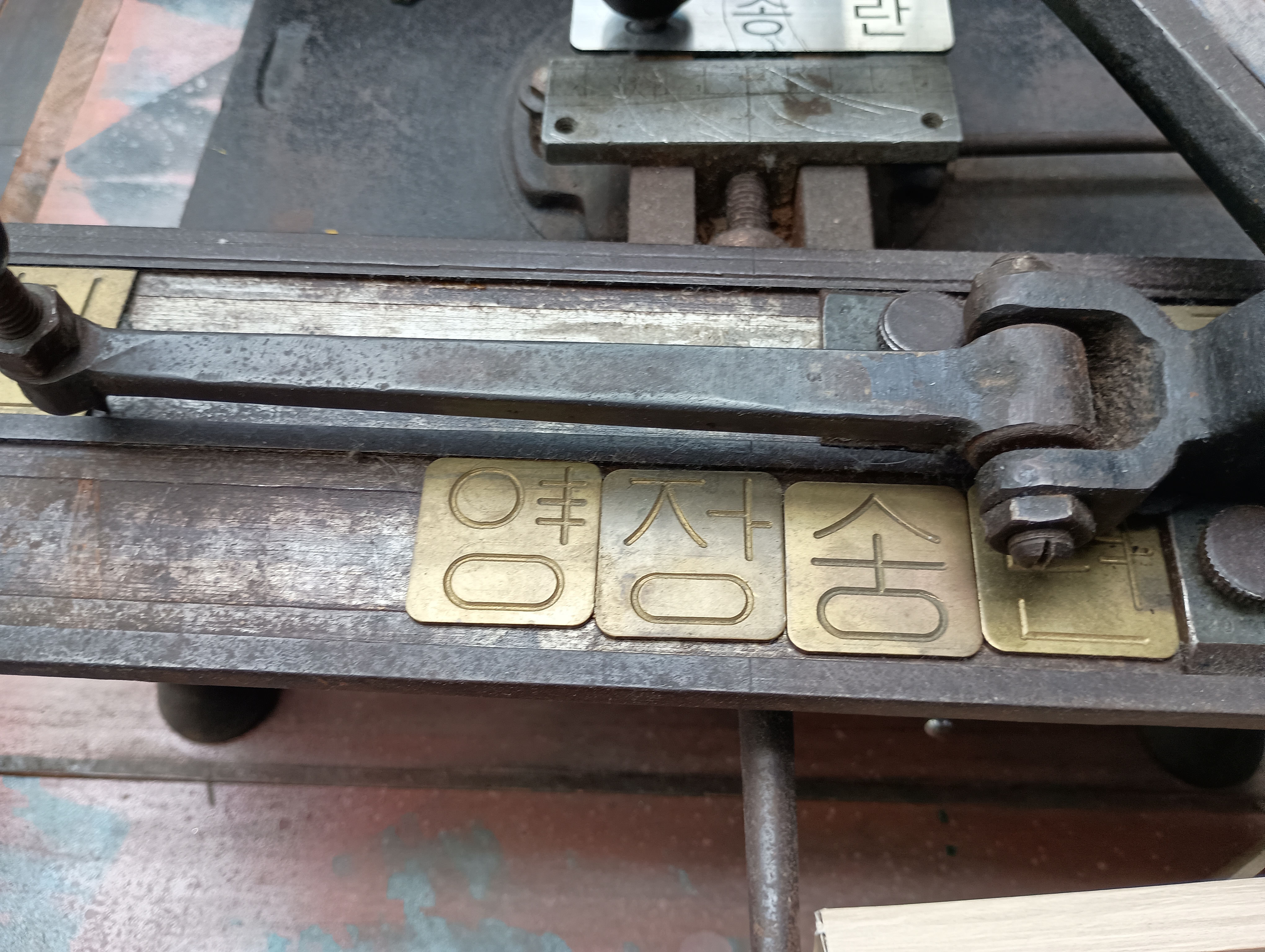
In the picture at top you can see that while the third template 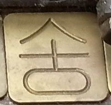 can be used to engrave any of the
three syllables 송 승 숭 the operator has actually used it
to engrave the first of these.
can be used to engrave any of the
three syllables 송 승 숭 the operator has actually used it
to engrave the first of these.
This ingenious mechanism cuts down the required number of templates by perhaps a factor of five, from ten boxes to two.
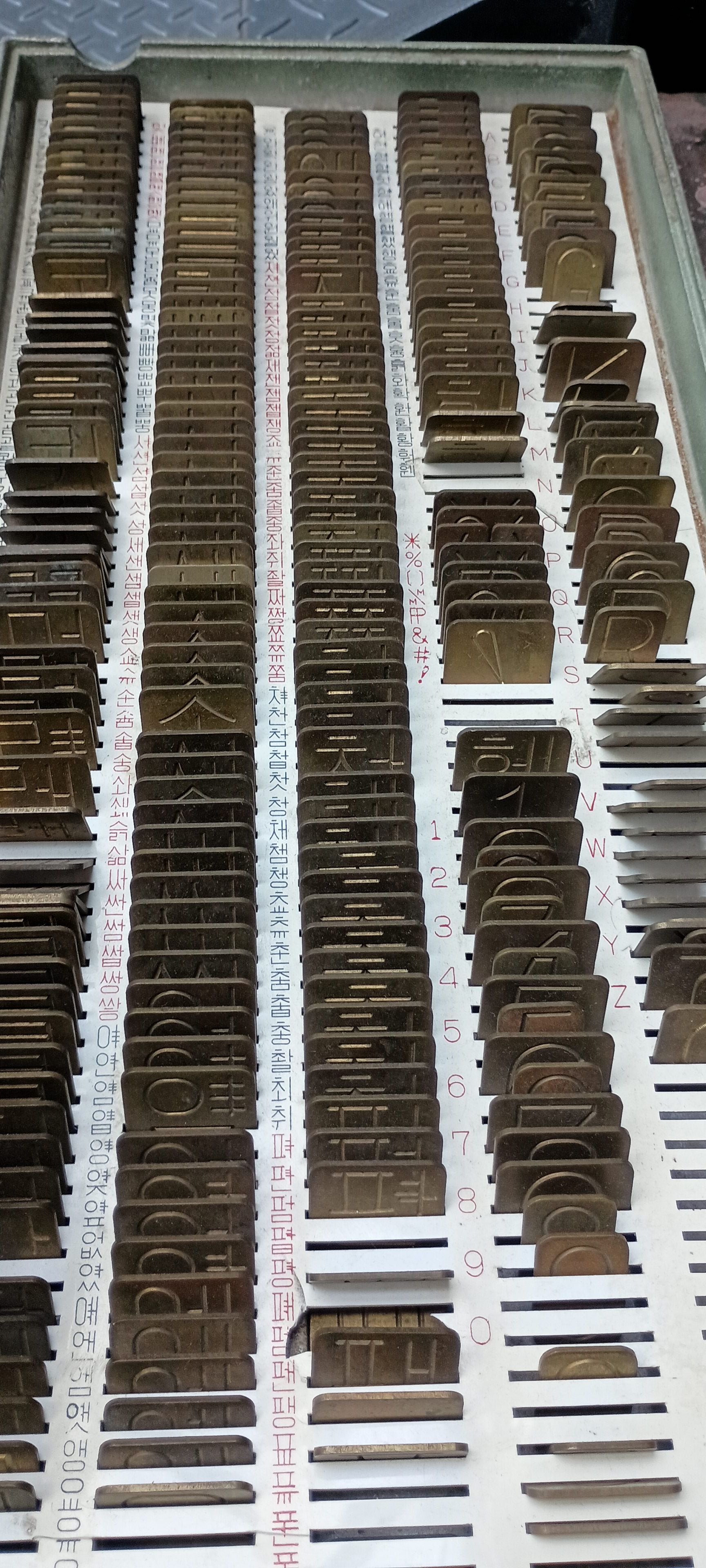
Addendum 20250325
A great many of the 11,000 Unicode codepoints are for seldom-used syllables that contain four or even five letters, such as 둻. I studied Korean for a while and I think I learned only one with with more than three letters in a syllable: 닭 means “chicken”.
I don't see templates for these syllables in any of my photographs, which probaby accounts for much of the great reduction in templates from the 11,000 possible syllables. But there must have been some way to engrave the syllables with the machine.
Maybe there was a template that had a small four small ㄷsymbols, one in each of the four corners of the template, and another with four ㄹ symbols, and so on? Then the operator could have composed 닭out of bits from four different templates.
[Other articles in category /IT] permanent link
Wed, 10 Jun 2020
Middle English fonts and orthography
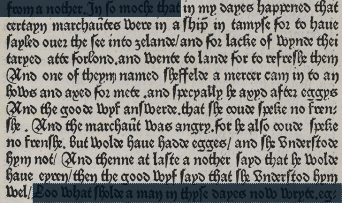
In case you're interested, here's what the Caxton “eggys” anecdote looked like originally:
2
3
4
5
6
7
8
9
10
11
12
In my dayes happened that
certain marchaȗtes were in a ship in tamyse for to haue
sayled ouer the see into zelande / and for lacke of wynde thei
taryed atte forlond. and wente to lande for to refreshe them
And one of theym named Sheffelde a mercer cam in to an
hows and axed for mete. and specyally he axyd after eggys
And the goode wyf answerde.that she coude speke no fren-
she. And the marchaȗt was angry. For he also coude speke
no frenshe. But wolde haue hadde egges / and she understode
hym not/ And thenne at laste a nother sayd he wolde
haue eyren/ then the good wyf sayd that she understod hym
wel/
It takes a while to get used to the dense black-letter font, and I think it will help to know the following:
Except at the end of a word, the letter ‘s’ is always written as the “long s”
 , ‘ſ’, which is easy
to confuse with ‘f’
, ‘ſ’, which is easy
to confuse with ‘f’  .
.Compare the ‘f’ and ‘s’ in “frenshe”
 (line 9) or “wyf sayd”
 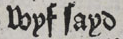 (line 11).
Some of the ‘r’s are the “rounded r”, ‘ꝛ’,
 . which looks like a ‘2’. But it
is not a ‘2’, it is an ‘r’.
. which looks like a ‘2’. But it
is not a ‘2’, it is an ‘r’.Examples include “for”
 (line 2) and “after”
 (line 6).
In “marchaȗtes”
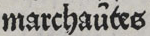 (line 2), the mark above the ‘ȗ’ is an abbreviation for letter ‘n’ (it's
actually a tiny ‘n’), so this word is actually “marchauntes”.
Similarly “marchaȗt” in line 8 is an abbreviation for “marchaunt”.
I have written about this kind of abbreviation before:
Abbreviations in medieval manuscripts.
(line 2), the mark above the ‘ȗ’ is an abbreviation for letter ‘n’ (it's
actually a tiny ‘n’), so this word is actually “marchauntes”.
Similarly “marchaȗt” in line 8 is an abbreviation for “marchaunt”.
I have written about this kind of abbreviation before:
Abbreviations in medieval manuscripts.
[Other articles in category /IT/typo] permanent link
Thu, 03 Oct 2019I recently mentioned a citation listing on one of the pages of the United States Code at LII. It said:
(Pub. L. 85–767, Aug. 27, 1958, 72 Stat. 904; Pub. L. 86–342, title I, § 106, Sept. 21, 1959, 73 Stat. 612; Pub. L. 87–61, title I, § 106, June 29, 1961, 75 Stat. 123; Pub. L. 88–157, § 5, Oct. 24, 1963, 77 Stat. 277; Pub. L. 89–285, title I, § 101, Oct. 22, 1965, 79 Stat. 1028; Pub. L. 89–574, § 8(a), Sept. 13, 1966, 80 Stat. 768; Pub. L. 90–495, § 6(a)–(d), Aug. 23, 1968, 82 Stat. 817; Pub. L. 91–605, title I, § 122(a), Dec. 31, 1970, 84 Stat. 1726; Pub. L. 93–643, § 109, Jan. 4, 1975, 88 Stat. 2284; Pub. L. 94–280, title I, § 122, May 5, 1976, 90 Stat. 438; Pub. L. 95–599, title I, §§ 121, 122, Nov. 6, 1978, 92 Stat. 2700, 2701; Pub. L. 96–106, § 6, Nov. 9, 1979, 93 Stat. 797; Pub. L. 102–240, title I, § 1046(a)–(c), Dec. 18, 1991, 105 Stat. 1995, 1996; Pub. L. 102–302, § 104, June 22, 1992, 106 Stat. 253; Pub. L. 104–59, title III, § 314, Nov. 28, 1995, 109 Stat. 586; Pub. L. 105–178, title I, § 1212(a)(2)(A), June 9, 1998, 112 Stat. 193; Pub. L. 112–141, div. A, title I, §§ 1519(c)(6), formerly 1519(c)(7), 1539(b), July 6, 2012, 126 Stat. 576, 587, renumbered § 1519(c)(6), Pub. L. 114–94, div. A, title I, § 1446(d)(5)(B), Dec. 4, 2015, 129 Stat. 1438.)
My comment was “Whew”.
But this wouldn't have been so awful if LII had made even a minimal effort to clean it up:
- Pub. L. 85–767, Aug. 27, 1958, 72 Stat. 904
- Pub. L. 86–342, title I, § 106, Sept. 21, 1959, 73 Stat. 612
- Pub. L. 87–61, title I, § 106, June 29, 1961, 75 Stat. 123
- Pub. L. 88–157, § 5, Oct. 24, 1963, 77 Stat. 277
- Pub. L. 89–285, title I, § 101, Oct. 22, 1965, 79 Stat. 1028
- Pub. L. 89–574, § 8(a), Sept. 13, 1966, 80 Stat. 768
- Pub. L. 90–495, § 6(a)–(d), Aug. 23, 1968, 82 Stat. 817
- Pub. L. 91–605, title I, § 122(a), Dec. 31, 1970, 84 Stat. 1726
- Pub. L. 93–643, § 109, Jan. 4, 1975, 88 Stat. 2284
- Pub. L. 94–280, title I, § 122, May 5, 1976, 90 Stat. 438
- Pub. L. 95–599, title I, §§ 121, 122, Nov. 6, 1978, 92 Stat. 2700, 2701
- Pub. L. 96–106, § 6, Nov. 9, 1979, 93 Stat. 797
- Pub. L. 102–240, title I, § 1046(a)–(c), Dec. 18, 1991, 105 Stat. 1995, 1996
- Pub. L. 102–302, § 104, June 22, 1992, 106 Stat. 253
- Pub. L. 104–59, title III, § 314, Nov. 28, 1995, 109 Stat. 586
- Pub. L. 105–178, title I, § 1212(a)(2)(A), June 9, 1998, 112 Stat. 193
- Pub. L. 112–141, div. A, title I, §§ 1519(c)(6), formerly 1519(c)(7), 1539(b), July 6, 2012, 126 Stat. 576, 587, renumbered § 1519(c)(6), Pub. L. 114–94, div. A, title I, § 1446(d)(5)(B), Dec. 4, 2015, 129 Stat. 1438.
That's the result of s/; /<li>/g, nothing more.
(I wonder if that long citation at the end is actually two citations.)
[Other articles in category /IT] permanent link
Fri, 27 Sep 2019
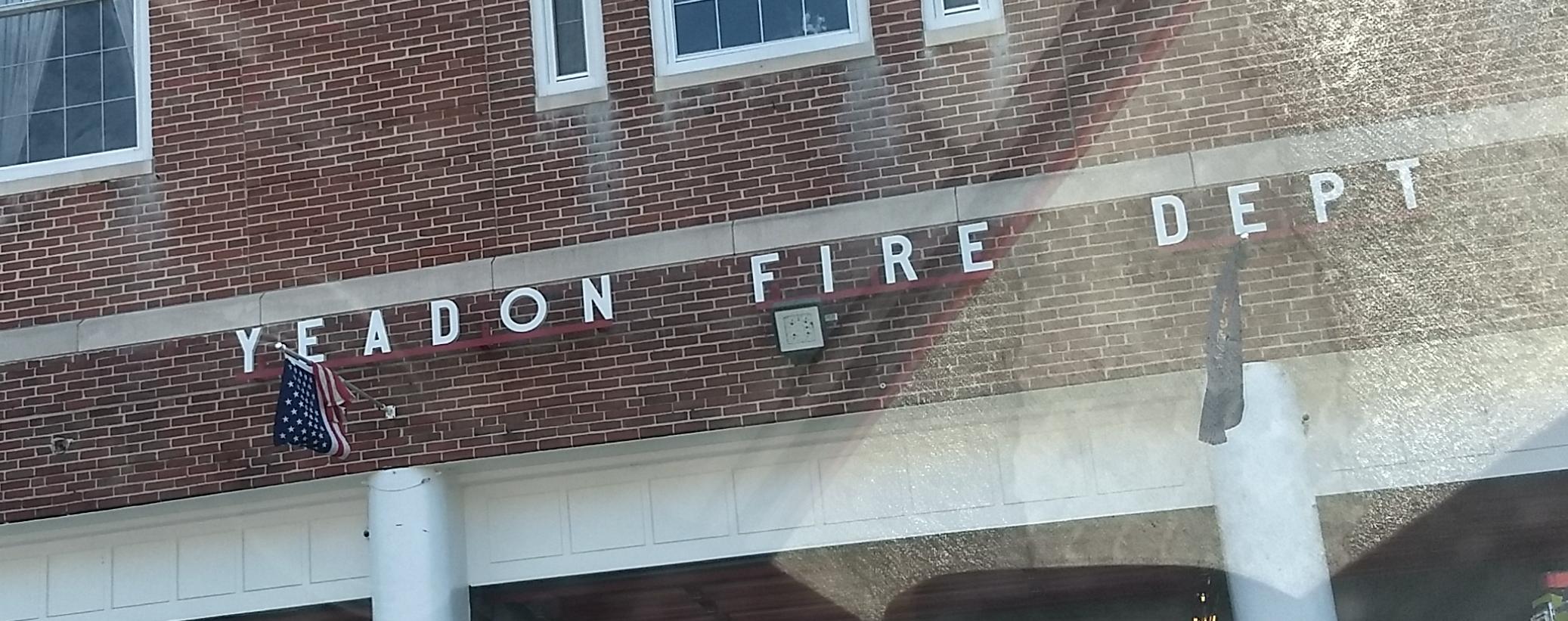
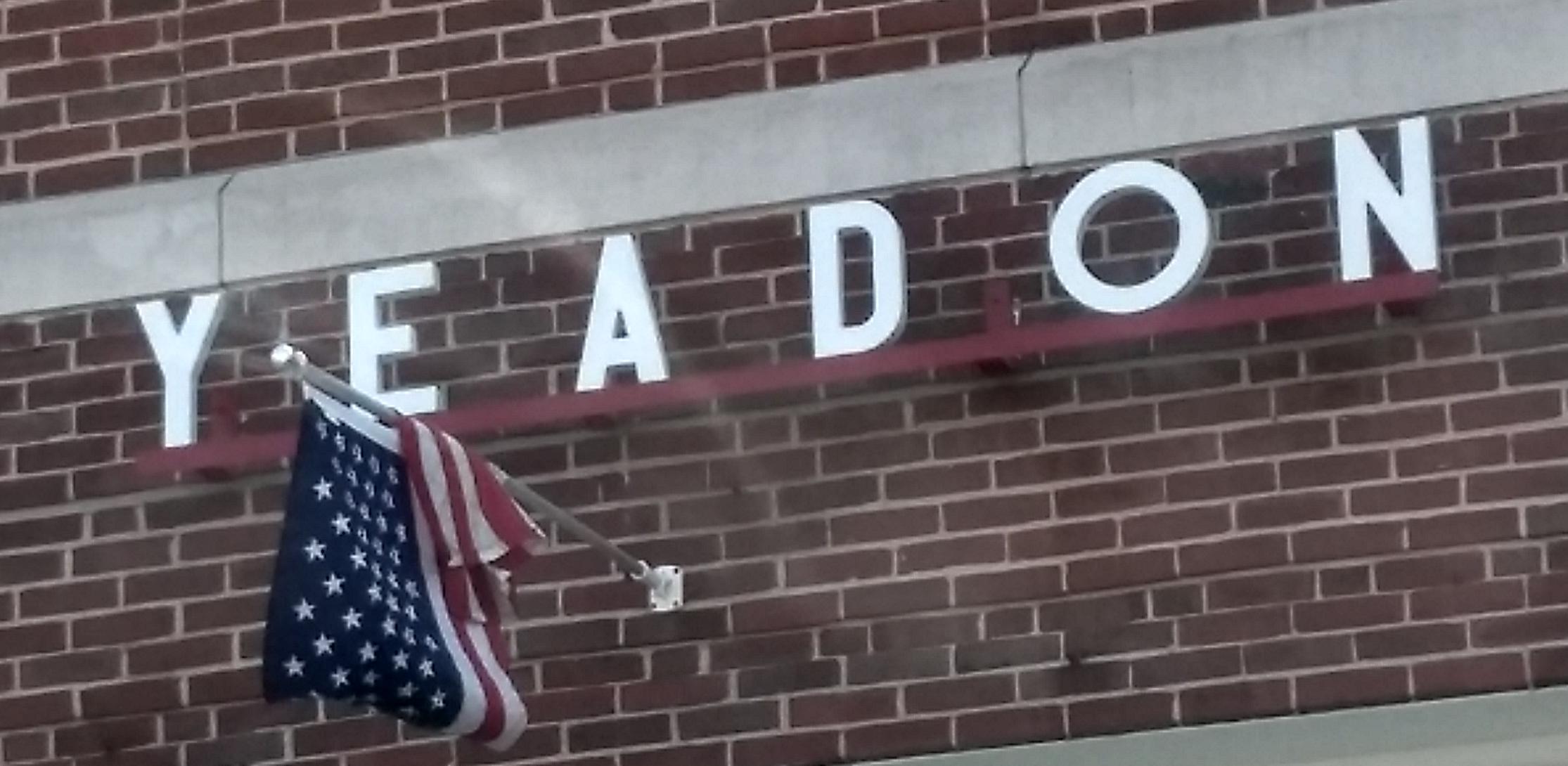
Typographical mysteries of Yeadon
Here are some pictures I took of the firehouse in Yeadon, PA.
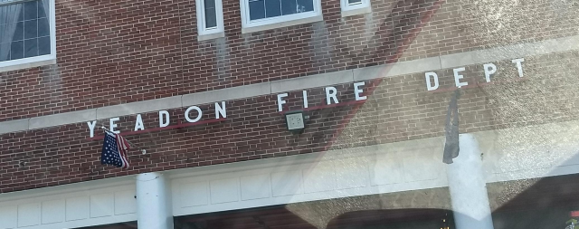
Every time I drive past this, I wonder: is that the original letter “O”? Or was there originally a narrow “O” that was lost or damaged, and which couldn't be replaced with a matching letter?
Here's the Google Street View version, from November 2016. The letters are painted green, but the “O” is still the circular one.
Addenda
20191004
20260226
Google now has a picture from 2012. The ‘O’ is still wrong-sorted.
If you enjoyed this article, you'll wet your pants when you read H-Bomb: A Frank Lloyd Wright Typographic Mystery which tracks down the 120-year history of an upside-down ‘H’ over the entrance of the Unity Temple in Oak Park, Illinois.
[Other articles in category /IT/typo] permanent link
Tue, 16 Oct 2018
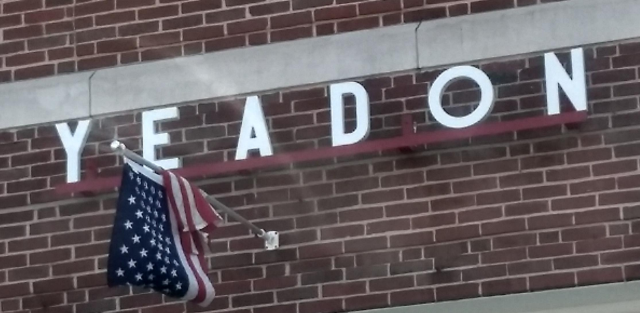
I redesign the LA Times’ Hurricane Maria chart
This could have been a great chart, but I think it has a big problem:
It appears that the death toll started increasing in early August, even though the hurricane didn't hit until 20 September. According to this chart, the hurricane was shortly followed by a drastic decrease in the death rate.
What's actually going on is that the August value is a total for all of August and is typically low, the September value is a total for all of September and is atypically high, and the chart designer has drawn a straight line between the August and September values, implying a linear increase over the course of August. The data for August is at the mark “A” on the chart, which seems reasonable, except that one has to understand that “A” as marking the end of August instead of the beginning, which is the opposite of the usual convention.
I think a bar chart would have been a better choice here. The lines imply continuous streams of data, but the reality is that each line represents only twelve data points. Maybe something like this instead?
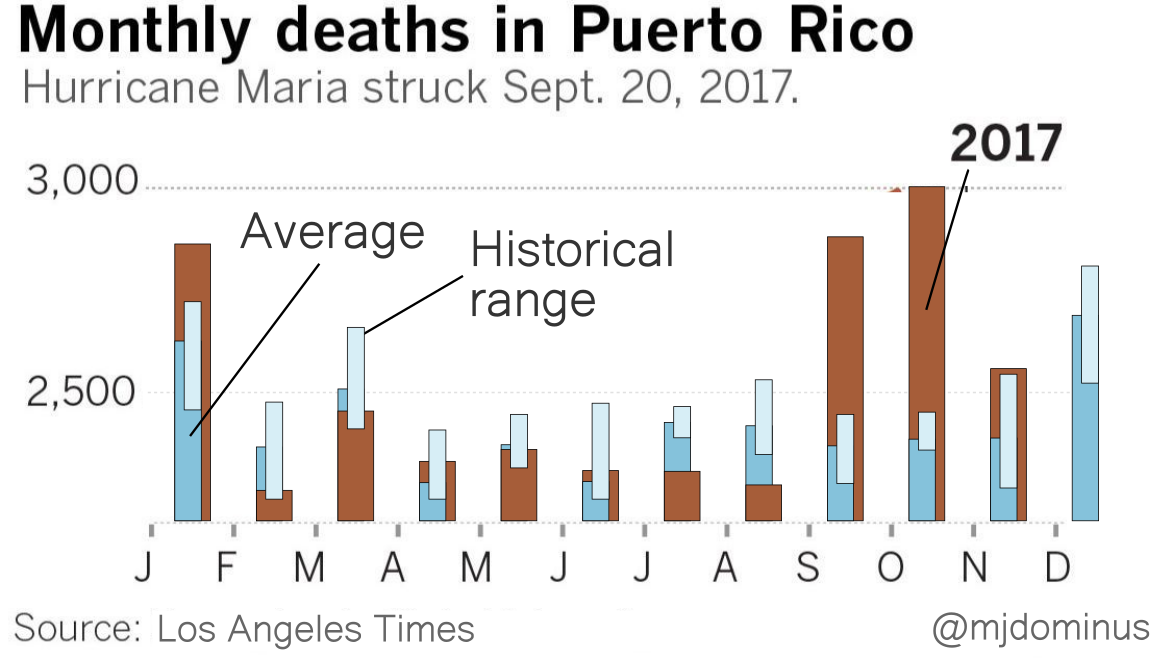
I'm not sure the historical range bars are really adding much.
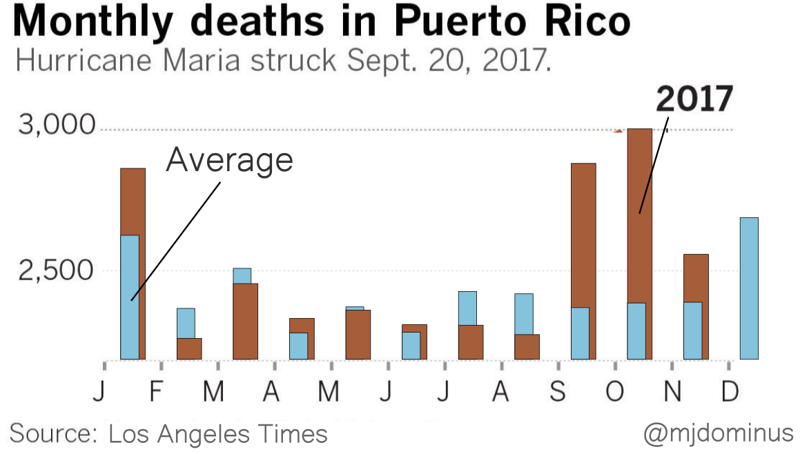
If I were designing this from scratch I think I might replace the blue bars with brackets (although maybe the LA Times knows that their readership finds those confusing?). Or maybe plot the difference between the 2017 data and ths historical average. But I think you get the point.
[Other articles in category /IT] permanent link
Thu, 23 Jul 2015
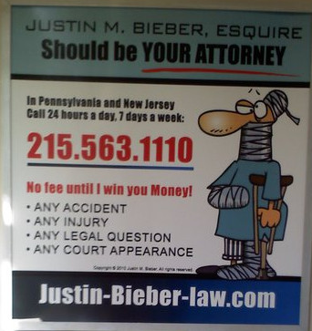
Mystery of the misaligned lowercase ‘p’

I've seen this ad on the subway at least a hundred times, but I never noticed this oddity before:
Specifically, check out the vertical alignment of those ‘p’s:

Notice that it is not simply an unusual font. The height of the ‘p’ matches the other lowercase letters exactly. Here's how it ought to look:

At first I thought the designer was going for a playful, informal logotype. Some of the other lawyers who advertise in the subway go for a playful, informal look. But it seemed odd in the context of the rest of the sign.
As I wondered what happened here, a whole story unfolded in my mind. Here's how I imagine it went down:
The ‘p’, in proper position, collided with the edge of the light-colored box, or overlapped it entirely, causing the serif to disappear into the black area.
The designer (Spivack's nephew) suggested enlarging the box, but there was not enough room. The sign must fit a standard subway car frame, so its size is prescribed.
The designer then suggested eliminating “LAW OFFICES OF”, or eliminating some of the following copy, or reducing its size, but Spivack refused to cede even a single line. “Millions for defense,” cried Spivack, “but not one cent for tribute!”
Spivack found the obvious solution: “Just move the up the ‘p’ so it doesn't bump into the edge, stupid!” Spivack's nephew complied. “Looks great!” said Spivack. “Print it!”
I have no real reason to believe that most of this is true, but I find it all so very plausible.
[ Addendum: Noted typographic expert Jonathan Hoefler says “I'm certain you are correct.” ]
[Other articles in category /IT/typo] permanent link
Tue, 14 Apr 2015This week I introduced myself to Recurse Center, where I will be in residence later this month, and mentioned:
I have worked as a professional programmer for a long time so I sometimes know strange historical stuff because I lived through it.
Ms. Nikki Bee said she wanted to hear more. Once I got started I had trouble stopping.
I got interested in programming from watching my mom do it. I first programmed before video terminals were common. I still remember the smell of the greasy paper and the terminal's lubricating oil. When you typed control-G, the ASCII BEL character, a little metal hammer hit an actual metal bell that went "ding!".
I remember when there was a dedicated computer just for word processing; that's all it did. I remember when hard disks were the size of washing machines. I remember when you could buy magnetic cores on Canal Street, not far from where Recurse Center is now. Computer memory is still sometimes called “core”, and on Unix your program still dumps a core file if it segfaults. I've worked with programmers who were debugging core dumps printed on greenbar paper, although I've never had to do it myself.
I frequented dialup
BBSes before
there was an Internet. I remember when the domain name system was
rolled out. Until then email addresses looked like yuri@kremvax,
with no dots; you didn't need dots because each mail host had a unique
name. I read the GNU
Manifesto in its
original publication in Dr. Dobb's. I remember the day the Morris
Worm hit.
I complained to Laurence Canter after he and his wife perpetrated the first large scale commercial spamming of the Internet. He replied:
People in your group are interested. Why do you wish to deprive them of what they consider to be important information??
which is the same excuse used by every spammer since.
I know the secret history of the Java compiler, why Java 5.0 had generics even though Sun didn't want them, and why they couldn't get rid of them. I remember when the inventors of LiveScript changed its name to JavaScript in a craven attempt to borrow some of Java's buzz.
I once worked with Ted Nelson.
I remember when Sun decided they would start charging extra to ship C compilers with their hardware, and how the whole Internet got together to fund an improved version of the GNU C compiler that would be be free and much better than the old Sun compiler ever was.
I remember when NCSA had a web page, updated daily, called “What's New on the World Wide Web”. I think I was the first person to have a guest book page on the Web. I remember the great land rush of 1996 when every company woke up at the same time and realized it needed a web site.
I remember when if you were going to speak at a conference, you would mail a paper copy of your slides to the conference people a month before so they could print it into books to hand out to the attendees. Then you would photocopy the slides onto plastic sheets so you could display them on the projector when you got there. God help you if you spilled the stack of plastic right before the talk.
tl;dr i've been around a while.
However, I have never programmed in COBOL.
[ Addendum 20150609: I'm so old, I once attended a meeting at which Adobe was pitching their new portable document format. ]
(I'm not actually very old, but I got started very young.)
[Other articles in category /IT] permanent link
Sat, 08 Feb 2014I wrote some time ago about Moonpig's use of GUIDs: every significant object was given a unique ID. I said that this was a useful strategy I had only learned from Rik, and I was surprised to see how many previously tricky programming problems became simpler once the GUIDs were available. Some of these tricky problems are artifacts of Perl's somewhat limited implementation of hashes; hash keys must be strings, and the GUID gives you an instantaneous answer to any question about what the keys should be.
But it reminds me of a similar maxim which I was thinking about just yesterday: Every table in a relational database should have a record ID field. It often happens that I am designing some table and there is no obvious need for such a field. I now always put one in anyway, having long ago learned that I will inevitably want it for something.
Most recently I was building a table to record which web pages were being currently visited by which users. A record in the table is naturally identified by the pair of user ID and page URL; it is not clear that it needs any further keys.
But I put in a record ID anyway, because my practice is to always put in a record ID, and sure enough, within a few hours I was glad it was there. The program I was writing has not yet needed to use the record IDs. But to test the program I needed to insert and manipulate some test records, and it was much easier to write this:
update table set ... where record_id = 113;
than this:
update table set ... where user_id = 97531 and url = 'http://hostname:port/long/path/that/is/hard/to/type';
If you ever end up with two objects in the program that represesent record sets and you need to merge or intersect them synthetically, having the record ID numbers automatically attached to the records makes this quite trivial, whereas if you don't have them it is a pain in the butt. You should never be in such a situation, perhaps, but stranger things have happened. Just yesterday I found myself writing
    function relativize (pathPat) {
      var dummyA = document.createElement('a');
      dummyA.href = document.URL;
      return "http://" + dummyA.host + pathPat;
    }
which nobody should have to do either, and yet there I was. Sometimes programming can be a dirty business.
During the bootstrapping of the user-url table project some records
with bad URLs were inserted by buggy code, and I needed to remove
them. The URLs all ended in % signs, and there's probably some easy
way to delete all the records where the URL ends in a % sign. But I
couldn't remember the syntax offhand, and looking up the escape
sequence for LIKE clauses would have taken a lot longer than what I
did do, which was:
delete from table where record_id in (43, 47, 49)
So the rule is: giving things ID numbers should be the default, because they are generally useful, like handles you can use to pick things up with. You need a good reason to omit them.
[Other articles in category /IT] permanent link
Tue, 05 Oct 2010 In his awesome classic The Visual Display of Quantitative Information, Edward Tufte presents this infographic:
Unfortunately the standards of the Internet can be even lower than those of print, as exhibited by this infographic, produced by Pingdom:
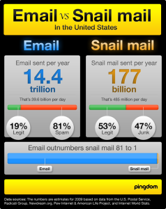
Chapter 6 of Tufte's book, "Data-Ink Maximization and Graphical Design", explores the exercise of erasing all the ink from an infographic that does not perform the function of communicating data. If we were to take this a little farther, and replace the original 80,265-byte graphic file with the 32 bytes of numeric data that it was designed to communicate, we might conclude that the image contained an astounding 99.96% chartjunk.
[Other articles in category /IT] permanent link
Tue, 05 Feb 2008
Steganography in 1665: correction
(A correction to this.)
Phil Rodgers has pointed out that a "physique" is not an emetic, as I thought, but a laxative.
Are there any among you who doubt that Bruce Schneier can shoot sluggbullets out of his ass? Let the unbelievers beware!
[Other articles in category /IT] permanent link
Steganography in 1665
Today's entry in Samuel Pepys'
diary says:
He told us a very handsome passage of the King's sending him his message ... in a sluggbullet, being writ in cypher, and wrapped up in lead and swallowed. So the messenger come to my Lord and told him he had a message from the King, but it was yet in his belly; so they did give him some physique, and out it come.Sure, Bruce Schneier can mount chosen-ciphertext attacks without even choosing a ciphertext. But dare he swallow a "sluggbullet" and bring it up again to be read?
Silly me. Bruce Schneier can probably cough up a sluggbullet without swallowing one beforehand.
[ Addendum 20080205: A correction. ]
[Other articles in category /IT] permanent link
Sat, 29 Apr 2006
Abbreviations in medieval manuscripts
In an earlier article I
discussed my surprise at finding "examples" and "alteration"
abbreviated to "exãples" and "alteratiõ" in Robert
Recorde's 1557 book The Whetstone of Witte. Then later
I quoted Jonathan
Hoefler, an expert in typographical matters:
Diacritical marks have been used to abbreviate printed words ever since Gutenberg, and early English printers adopted the same conventions that Gutenberg used for Latin (a trick he picked up from medieval scribes.)Shortly afterward I realized that I have some reproductions of illuminated manuscripts — they're hanging in the bathroom, so I see them every day — and could actually see this for myself. This one is my favorite:
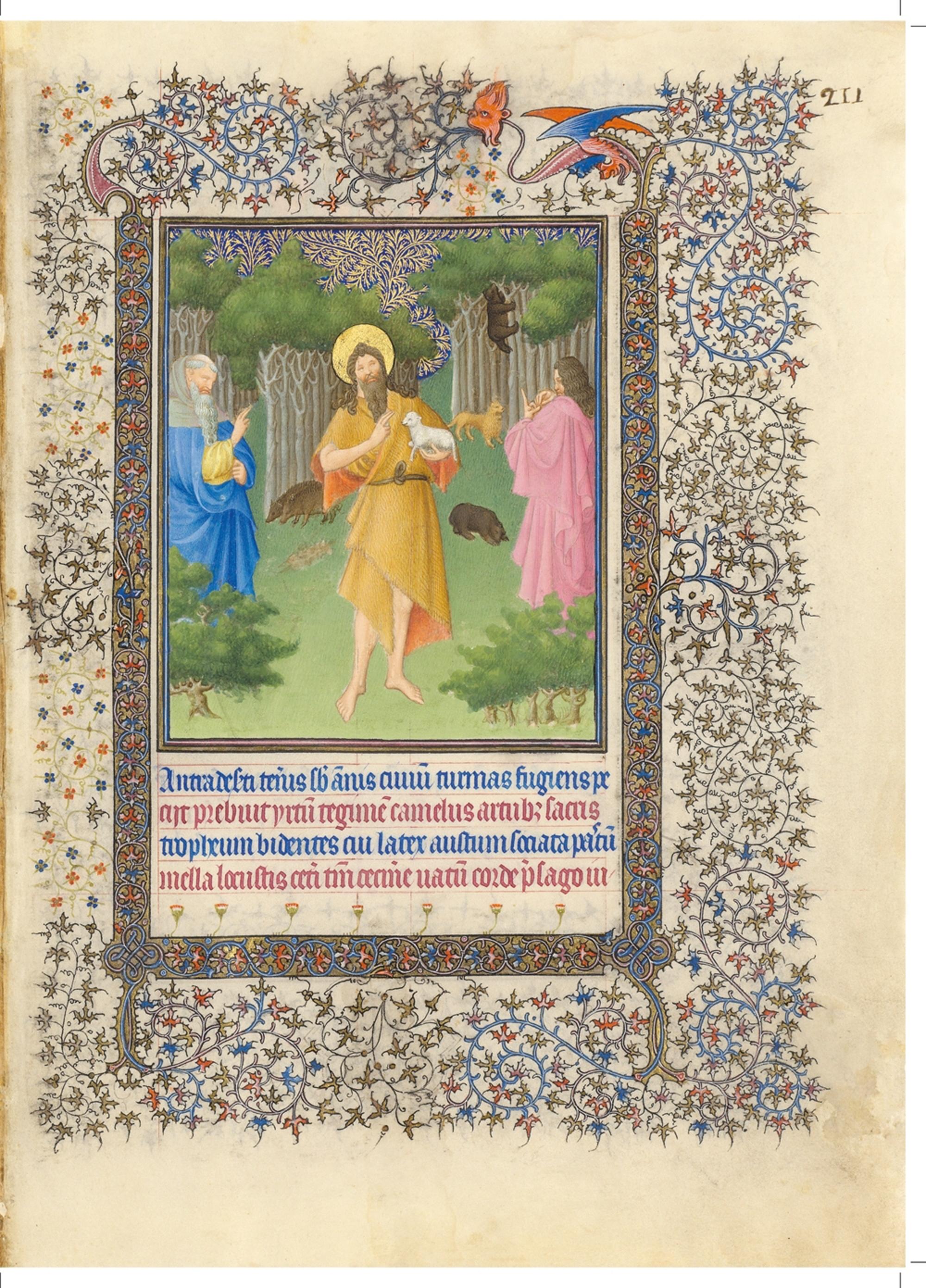
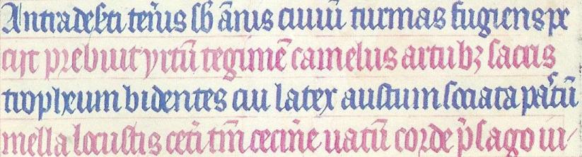
- I can't make head or tail of most of it, but
- the fourth line begins mella locustis.
Eventually I did what I should have done in the first place and plugged mella locustis into Google. The result was quite conclusive. The words here are from a very famous hymn about John the Baptist, attributed to Paulus Diaconus (c. 720 -799). The hymn is in three parts, and this is the beginning of the second part. The words here are:
Antra deserti teneris sub annisI've colored the text here to match the text in the manuscript. Stuff in gray in the first verse is omitted from the manuscript; I do not know why. A copying error, perhaps? Or a change in the words?
civium turmas fugiens, petisti,
n levi saltim maculare vitam
famine posses.
Praebuit hirtum tegimen camelus,
artubus sacris strofium bidentis,
cui latex haustum, sociata pastum
mella locustis.
Caeteri tantum cecinere vatum
corde praesago iubar adfuturum;
...
The amount of abbreviation here is just amazing. In the first line, deserti is abbreviated deseti, and the s and the e are all squashed together, sub is abbreviated sb, annus is abbreviated ãnis, civium is abbreviated civiû and is illegible anyway, because the letters all look alike, as in Russian cursive. (I have a similar problem with cui on the third line.)
On the second line, artubus is written artub3; Hoefler had already pointed out to me that the 3 was a common notation in 16th-century printing. On the third line, pastum is written pa'tû, where the wiggly mark between the a and the t denotes an elided s. Or perhaps the scribe left it out by mistake and then went back to squeeze it in later.
Probably the most amazing abbreviations in the whole thing are in the fourth line. (I wonder if perhaps the scribe realized he was running out of room and wanted to squeeze in as much as possible.) The word caeteri is abbreviated to ceti, tantum to tm, and praesago to p'sago. (Also note uatû, which is an abbreviation for vatum; I had been wondering for some time what Uatu had to do with it.)
There are a number of other typographical features of interest. The third word in the second line is apparently hirtum. The hi in the manuscript is written as a sort of a V-shape. The r in corde on the fourth line (and elsewhere) is a form that was once common, but is now obsolete.
This hymn, by the way, is the one that gives us the names do, re, mi, fa, so, la, si for the notes of the major scale. The first part of the hymn begins:
Ut queant laxis resonare fibris"Ut" was later changed to "do" because "do" is open while "ut" is closed. Scholars speculate that the name "si" was chosen because it is the initials of the words in the final line.
mira gestorum famuli tuorum,
solve polluti labii reatum,
sancte Iohannes!
The thing about the locusts and wild honey reminds me of something else. I was once on a business trip to Ottawa and found that there was a French Bible in my hotel room. And I discovered that, although I cannot read French, I could read the Bible in French, because I already knew what it was going to say. So I lay in bed and read the French Bible and enjoyed the rather strange sensation of being able to pretend to myself to be able to read French.
Two points struck me at the time. One was that when I read "Dieu dit: Que la lumière soit!" ("God said, 'Let there be light'") my instant reaction was to laugh at how absurd it was to suggest that God had spoken French when He created the universe. It's like that Reader's Digest joke about the guy who thinks the Spanish-speaking folks are silly for talking to the squirrels in the park in Spanish, because squirrels don't speak Spanish. I didn't know I had that in me, but there I was, laughing at the silly idea of God saying "Que la lumière soit!" You know, I still find it silly.
The other memorable occurrence was a little less embarrassing. The part in Matthew (excuse me; "Matthieu") about John the Baptist eating locusts and wild honey was "Il se nourrissait de sauterelles et de miel sauvage." I was impressed at how tasty it sounded, in French. It is not hard to imagine going into an expensive restaurant and ordering sauterelles et de miel sauvage off the menu. I concluded that food always sounds better in French, at least to an anglophone like me.
Addenda
20200706
Many years later, I learned where this illustration was from: it is Duc de Berry's Book of Hours, created between 1412 and 1416. I found this out in a happy way: the Metropolitan Museum of Art's was in the habit of tweeting pictures of objects from their collection, and one day they tweeted either the page above or one sufficiently similar to it that I was able to recognize it.
20240817
Duc de Berry had at least two books of hours. This is not from the Très Riches Heurs as I wrote above, but rather the Belles Heures. It is in the Cloisters collection of the Metropolitan Museum of Art, which has a superb website with many scans. The page above is folio 211r.
20240911
The Metropolitan Museum of Art has published a beautiful book, The Art of Illumination: The Limbourg Brothers and the Belles Heures if Jean de France, Duc de Berry with full details about the illustration and text. This plate is described on pages 252–253. The figure in the foreground is indeed John the Baptist, wearing his camel-hair coat and carrying the Lamb of God.According to the book, the text below is:
Antra deserti teneris sub annis turmas fugiens, peciit, prebuit yrtum tegimen camelus, artubut sacris tropheum bidentes, cui later austum, sociata pastum mella locustis. Ceteri tantum cecinere vatum corde presago ju-
which they translate as:
Even as a youth, fleeing from the crowds, he sought the caves of the desert. The camel provided him with a hair coat, and the lambs a belt for his sacred limbs, his drink was water, and his meals of honey and of locusts. The rest of the prophets sand with knowing hards about the…
[Other articles in category /IT/typo] permanent link
Tue, 11 Apr 2006
Diacritics and horseheads
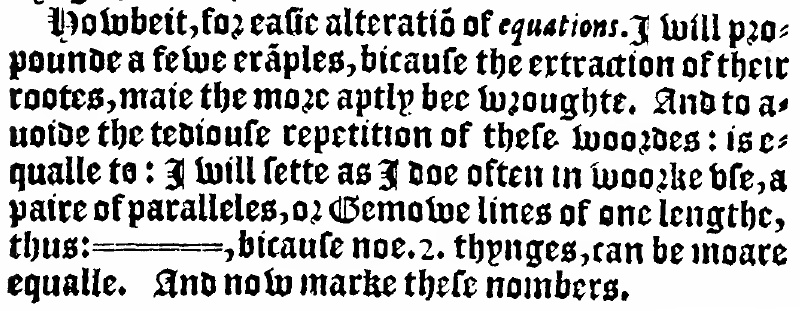
In my recent article about Robert
Recorde's invention of the = sign, I pointed out that Recorde's
1557 book The Whetstone of Witte contained a remarkable
typographic feature: words like "examples" and "alteration" are
rendered as "exãples" and "aleratiõ".
I wrote to Jonathan Hoefler to ask about this. Jonathan Hoefler is one of the principals of the typography firm Hoefler & Frere-Jones, and his mind is a vast storehouse of typographical history and arcana. I was sure M. Hoefler would know about the tildes, and would have something interesting to say about them, and I was not disappointed:
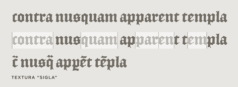
Diacritical marks have been used to abbreviate printed words ever since Gutenberg, and early English printers adopted the same conventions that Gutenberg used for Latin (a trick he picked up from medieval scribes.) As you say, tildes and macrons (and circles and odder things still) were used to mark the elision of letters or entire word parts: the "Rx" ligature that we know from prescriptions (Lat. 'recipe') was also used as shorthand for the "-rum" Latin ending, among other things. The French circumflex is a holdover from the same tradition, as it once the absence of a succeeding 's' ("hôpital" for "hospital", etc.) All of these were compositors' tricks to help in the justification of an entire paragraph, something that was considerably easier in the days before standard spelling and orthography!The surprising diacritical marks don't exhaust the oddities of 16th-century fonts. Hoefler & Frere-Jones have designed a font, English Textura, that is similar to the blackletter font that Recorde's book was printed in; they did this by borrowing characters from actual 16th-century documents. The documents contain all sorts of interesting typographic features that are no longer used; look at the bottom rows of this sample of English Textura for examples:
I should mention, in case it isn't clear, that justification of paragraphs is not merely a cosmetic feature. If you are a printer in 1577, you are laying out metal types into a square frame, and if the frame isn't completely filled, the types will fall out when you turn it over. In particular, you must make each line of each paragraph fully extend from left to right, or it will be unprintable. The Renaissance printers must have to justify the text somehow. One way to do this is by inserting blank spaces of suitable lengths between the words of each line; I asked M. Hoefler why the Renaissance printers didn't just use blank space, and he replied:
They did that as well, but I think the general principle (which endures) is that wordspacing really isn't as flexible as you'd hope -- "rivers" are the effect of adjacent lines being overjustified, and they really interrupt reading. Even with today's very sophisticated H&J [Hyphenation and Justification] algorithms -- some of which can even scale the actual dimensions of letterforms in order to improve copyfit -- the chief ingredient in good H&J controlling the number of letters per line. Contemporary newspapers do this through aggressive hyphenation; their forbears did it through colorful spelling. (Although any headline with the word "Prez" suggests that this tradition lives on.)You'll note that The Whetstone of Witte is also agressively hyphenated:

I think Marshall McLuhan said something about the new media cannibalizing the old, and although I'm not sure what he meant (if he did say that) I don't think it matters much, because the phrase so perfectly encapsulates the way new information technologies tend to adopt the obsolete forms of the technologies they replace. I've been collecting examples of this for a few years. In the early days of the web, there was a web dictionary which would lay out the pages just like a real dictionary, with an unreadably tiny font, page breaks in inconvenient places, and "next page" and "previous page" buttons at the bottom. The tiny font was bad enough, but the "next page" buttons just killed me. I wanted to redesign the application with another button that you could press if you wanted to simulate what happens when you read the dictionary in the bathtub and drop it in the water by mistake.
I call these phenomena "horseheads", after the false horse heads that were mounted on the hoods of old automobiles, which still survive as in vestigial form as hood ornaments. My favorite horsehead is a Citibank ATM design from around 1987 or so. The old ATMs, which the new design was replacing, had green phosphor display, about 20×40 characters, four menu buttons down the side, and a telephone-style keypad with ten digits and # and * signs. The new ATM had no buttons. Instead, it had a color touch-sensitive screen that was used to display a touch-sensitive picture of four menu buttons down the side, and, when appropriate, a telephone-style keypad with ten digits and # and * signs.
[ Addendum 20120611: The
term "skeuomorph" has recently become popular to describe this
phenomenon. ]
[Other articles in category /IT/typo]
permanent link
The following passage appears on page 3:
How strange a thing this art of writing did seem at its first invention, we may guess by the late discovered Americans, who were amazed to see men converse with books, and could scarce make themselves believe that a paper could speak; especially, when after all their attention and listening to any writing . . . they could never perceive any words or sound to proceed from it.I find this plausible, since as far as I know none of the aboriginal peoples in the part of the world colonized by the English had writing, and because writing does seem strange and astonishing to me. Also, it seems that many other people found it so. For example, in The Origin of Consciousness in the Breakdown of the Bicameral Mind (which I am sure will turn up here again) Jaynes quotes examples of letters written by the Assyrians. The standard form of such letters was to address the messenger who delivered them, like this:
To Babu-aha-iddina, governor of Eridu, say thus:This form arose originally because the recipient was unable to read, and the messages were sent orally. A messenger would memorize the message at the source, and recite it from memory at the destination. So the message is written as an instruction to the messenger who would deliver it: "To Babu-aha-iddina, say thus..." and ends with a closing statement, also to be made by the messenger, that "so says Tukulti-Ninurta." But in later times, the form was still followed even when both sender and recipient were literate, and then it becomes an instruction to the letter itself to "say thus".You have not sent me the blueberry pie recipe you promised; why haven't you sent it? . . .
So says Tukulti-Ninurta, high king.
The idea that it is the letter itself that speaks seems to be a natural one. Wilkins tells a story of an Indian who is sent to deliver a letter and a basket of figs to a man in the next village. The messenger ate half the figs on the way, and was surprised to be found out upon his arrival when the quantity of figs he delivered did not match the quantity described in the letter. He responded by cursing the letter as a false and lying witness. On the next trip, he was careful to bury the letter under a rock while he ate the figs, so that it would not be able to accuse him when it was delivered.
Written and spoken language are only a little bit separate. Nearly all written language is a written representation of spoken language. Uninformed people call Chinese characters "ideographs", but this is a misnomer, because it suggests that the characters represent ideas. But they don't; they represent the words of whatever particular variety of spoken Chinese the writer uses. (Examples may be found on p. 149 of Geoffrey Sampson's excellent book Writing Systems, which may appear here in more detail in the future.) Very little writing is actually ideographic. One example is the symbol 3, which does not represent the word three or the sound "three" (nor does it represent the words or sounds "drei" or "sam" or "tres") but rather the abstract notion of three. Many mathematical symbols are similarly ideographic.
Children first learn to read by pronouncing the words aloud and hearing them; when they hear, they understand. Hearing is much easier than reading, and I think this is one reason why people like to attend lecture classes instead of just reading the book. People who "move their lips when they read" are widely ridiculed. But reading aloud is a good strategy for anyone faced with difficult material. When I can't make sense of a difficult paragraph, especially a long and confused one, I always back up and try reading it aloud, and this often resolves the difficulty. Even when I have forgotten the words at the beginning by the time I get to the end, I find that I still retain the sense of them. Reading aloud is also a good exercise for writers. If you read aloud what you wrote, you are much more likely to notice when it doesn't make sense. If you are too self-conscious to read aloud, or if the sign says QUIET PLEASE, try subvocalizing; it is still a big help.
Some kinds of literature should always be read aloud. Poetry, of course. If it is good poetry, it loses a lot of its value when read silently. I find that humor also loses its savor for me when I read it non-orally. When I first read Fear and Loathing in Las Vegas myself, I thought it was just stupid. When I heard James Woodyatt read it aloud, it was riotously funny. Lorrie and I found that Louise Erdrich's stories and novels, which can seem unrelievedly depressing when you read them alone, when read aloud became rich, complex, funny, sometimes bitter, sometimes joyful, and often sad—but never depressing.
Someone once told me that some famous scholar, I think perhaps Thomas Aquinas [ addendum: it was Ambrose; see below ] was the only one of his contemporaries to read non-orally, that they were astonished at how the information would just fly from the book into his mind without his having to read it. Their failure to understand non-oral reading may be surprising today, when everyone is expected to do it. But I can remember making the same mistake myself. I was sitting on the floor, reading (aloud) the Sunday comics pages one evening, and I remarked that grown-ups did not actually read; they only looked at the pictures. My mother told me that they did read, but they did so silently. This was the first time I had encountered this idea, which I immediately adopted. I can't remember a time before I could read, but I do remember that occasion of my first silent reading.
[ Addendum 20120611: It turns out that there is a story collected by the Brothers Grimm, but unpublished, which recounts the lying letter story. It is "The Poor Boy in the Grave": "As he again was so extremely hungry and thirsty, he could not help it, and again ate two grapes. But first he took the letter out of the basket, put it under a stone and seated himself thereon in order that the letter might not see and betray him." ]
[ Addendum 20141202: The story about the famous scholar who astounded his contemporaries by reading silently was not Thomas Aquinas, as I said above, but Ambrose. Augustine, in his Confessions, says:
But when he was reading, his eye glided over the pages, and his heart searched out the sense, but his voice and tongue were at rest.I missed by eight hundred years! ]
[ Addendum 2010406: Keshav Kini directed my attention to chapter 2 of Alberto Manguel's A History of Reading, “The Silent Readers”, which discusses the history of silent reading in some detail, and notes that silent reading greatly facilitated the spread of heresy. The chapter is available online, probably without the appropriate permissions. ]
[Other articles in category /IT] permanent link
Thu, 12 Jan 2006
Medieval Chinese typesetting technique
One of my longtime fantasies has been to write a book called
Quipus and Abacuses: Digital Information Processing Before
1946. The point being that digital information processing did
exist well before 1946, when large-scale general-purpose electronic
digital computers first appeared. (Abacuses you already know about,
and a future blog posting may discuss the use of abacuses in Roman
times and in medieval Europe. Quipus are bunches of knotted cords
used in Peru to record numbers.)
There are all sorts of interesting questions to be answered. For
instance, who first invented alphabetization? (Answer: the scribes at
the Great Library in Alexandria, around 200 CE.) And how did they do
it? (Answer to come in a future blog posting.) How were secret
messages sent? (Answer: lots of steganography.) How did people do
simple arithmetic with crappy Roman numerals? (Answer: abacuses.)
How were large quantities of records kept, indexed, and searched? How
were receipts made when the recipients were illiterate?
Here's a nice example. You may have heard that the Koreans and the Chinese had printing presses with movable type before Gutenberg invented it in Europe. How did they organize the types?
In Europe, there is no problem to solve. You have 26 different types for capital letters and 26 for small letters, so you make two type cases, each divided into 26 compartments. You put the capital letter types in the upper case and the small letter types in the lower case. (Hence the names "uppercase letter" and "lowercase letter".) You put some extra compartments into the cases for digits, punctuation symbols, and blank spaces. When you break down a page, you sort the types into the appropriate compartments. There are only about 100 different types, so whatever you do will be pretty easy.
However, if you are typesetting Chinese, you have a much bigger problem on your hands. You need to prepare several thousand types just for the common characters. You need to store them somehow, and when you are making up a page to be printed you need to find the required types efficiently. The page may require some rare characters, and you either need to have up to 30,000 rarely-used types made up in advance or some way to quickly make new types as needed. And you need a way to sort out the types and put them away in order when the page is complete.
(I'm sure some reader is itching to point out that Korean is written with a phonetic alphabet, hangul, which avoids the problem by having only 28 letters. But in fact that is wrong for two reasons. First, the layout of Korean writing requires that a type be made for each two- or three-letter syllable. And second, perhaps more to the point, moveable type presses were used in Korea before the invention of hangul, before Korean even had a written form. Movable type was invented in Korea around 1234 CE; hangul was first promulgated by Sejong the Great in 1443 or 1444. The first Korean moveable type presses were used to typeset documents in Chinese, which was the language of scholarship and culture in Korea until the 19th century.)
In fact, several different solutions were adopted. The earliest movable types in China were made of clay mixed with glue. These had the benefit of being cheap. Copper types were made later, but had two serious disadvantages. First, they were very expensive. And second, since much of their value could be recovered by melting them down, the government was always tempted to destroy them to recover the copper, which did indeed happen.
Wang Chen (王禎), in 1313, writes that the types were organized as follows: There were two circular bamboo tables, each seven feet across and with one leg in the middle; the tabletops were mounted on the legs so that they could rotate. One table was for common types and the other for the rare, one-off types. The top of each table was divided into eight sections, and in each section, types were arranged in their numerical order according to their listing in the Book of Rhymes, an early Chinese dictionary that organized the characters by their sounds.
To set the type for a page, the compositors would go through the proof and number each character with a code indicating its code number from the Book of Rhymes. One compositor would then read from the list of numbers while the other, perched on a seat between the two rotating tables, would select the types from the tables. Wang doesn't say, but one supposes that the compositors would first put the code numbers into increasing order before starting the search for the right types. This would have two benefits: First, it would enable a single pass to be made over the two tables, and second, if a certain character appeared multiple times on the page, it would allow all the types needed for that character to be picked up at once.
The types would then be inserted into the composition frame. If a character was needed for which there was no type, one was made on the spot. Wang Chen's types were made of wood. The character was carefully written on very thin paper, which was then pasted upside-down onto a blank type slug. A wood carver with a delicate chisel would then cut around the character into the wood.
(Source: Invention of printing in China and its spread westward. Thomas Francis Carter, 1925.)
In 1776 a great printing project was overseen by Jian Jin (Chin Ch'ien), also using wooden types. Jin left detailed instructions about how the whole thing was accomplished. By this time the Book of Rhymes had been superseded.
The Imperial K'ang Hsi Dictionary (K'ang-hsi tzu-tien or Kāngxī Zìdiǎn, 康熙字典), written between 1710 and 1716, was the gold standard for Chinese dictionaries at the time, and to some extent, still is, since it set the pattern for the organization of Chinese characters that is still followed today. If you go into a store and buy a Chinese dictionary (or a Chinese-English dictionary) that was published last week, its organization will be essentially the same as that of the Imperial K'ang Hsi Dictionary. Since readers may be unfamiliar with the organization of Chinese dictionaries, I will try to explain.
Characters are organized primarily by a "classifier", more usually called a "radical" today. The typical Chinese character incorporates some subcharacters. For example, the character for "bright" is clearly made up of the characters for "sun" and "moon"; the character for "sweat" is made up of "water" and "shield". (The "shield" part is not because of anything relating to a shield, but because it sounds like the word for "shield".) Part of each character is designated its radical. For "sweat", the radical is "water"; for "bright" it is "sun". How do you know that the radical for "bright" is "sun" and not "moon"? You just have to know.
What about characters that are not so clearly divisible? They have radicals too, some of which were arbitrarily designated long ago, and some of which were designated based on incorrect theories of etymology. So some of it is arbitrary. But all ordering of words is arbitrary to some extent or another. Why does "D" come before "N"? No reason; you just have to know. And if you have ever seen a first-grader trying to look up "scissors" in the dictionary, you know how difficult it can be. How do you know it has a "c"? You just have to know.
Anyway, a character has a radical, which you can usually guess in at most two or three tries if you don't already know it. There are probably a couple of hundred radicals in all, and they are ordered first by number of strokes, and then in an arbitrary but standard order among the ones with the same number of strokes. The characters in the dictionary are listed in order by their radical. Then, among all the characters with a particular radical, the characters are ordered by the number of strokes used in writing them, from least to most. This you can tell just by looking at the characters. Finally, among characters with the same number of strokes and the same radical, the order is arbitrary. But it is still standardized, because it is the order used by the Imperial K'ang Hsi Dictionary.
So if you want to look up some character like "sweat", you first identify the radical, which is "water", and has four strokes. You look in the radical index among the four-stroke radicals, of which there are no more than a couple dozen, until you find "water", and this refers you to the section of the dictionary where all the characters with the "water" radical are listed. You turn to this section, and look through it for the subsection for characters that have seven strokes. Among these characters, you search until you find the one you want.
This is the solution to the problem of devising an ordering for the characters in the dictionary. Since this ordering was (and is) well-known, Jin used it to organize his type cases. He writes:
Label and arrange twelve wooden cabinets according to the names of the twelve divisions of the Imperial K'ang Hsi Dictionary. The cabinets are 5'7" high, 5'1" wide, 2'2" deep with legs 1'5" high. Before each one place a wooden bench of the same height as the cabinet's legs; they are convenient to stand on when selecting type. Each case has 200 sliding drawers, and each drawer is divided into eight large and eight small compartments, each containing four large or four small type. Write the characters, with their classifiers and number of strokes, on labels on the front of each drawer.(Source: A Chinese Printing Manual, 1776. Translated by Richard C. Rudolph, 1954.)When selecting type, first examine the make-up of the character for its corresponding classifier, and then you will know in which case it is stored. Next, count the number of strokes, and then you will know in which drawer it is. If one is experienced in this method, the hand will not err in its movements.
There are some rare characters that are seldom used, and for which few type will have been prepared. Arrange small separate cabinets for them, according to the twelve divisions mentioned above, and place them on top of each type case where they may be seen at a glance.
The size measurements here are misleading. The translator says that the "inch" used here is the Chinese inch of the time, which is about 32.5 mm, not the 25.4 mm of the modern inch. He does not say what is meant by "foot"; I assume 12 inches. That means that the type cases are actually 7'2" high, 6'6" wide, 2'9" deep, (218 cm × 198 cm × 84 cm) with legs 1'10" high (55 cm), in modern units.
(Addendum 20060116: The quote doesn't say, but the illustration in Jin's book shows that the cabinets have 20 rows of 10 drawers each.)
One puzzle I have not resolved is that there do not appear to be enough type drawers. Jin writes that there are twelve cabinets with 200 drawers each; each drawer contains 16 compartments, and each compartment four type. This is enough space for 153,600 types (remember that you need multiples of the common characters), but Jin reports that 250,000 types were cut for his project. Still, it seems clear that the technique is feasible.
Another puzzle is that I still don't know what the "twelve divisions" of the Imperial K'ang Hsi Dictionary are. I examined a copy in the library and I didn't see any twelve divisions. Perhaps some reader can enlighten me.
As in Wang's project, one compositor would first go over the proof page, making a list of which types needed to be selected, and how many; new types were cut from wood as needed. Then compositors would visit the appropriate cases to select the types as necessary; another compositor would set the type, and then the page would be printed, and the type broken down. These activities were always going on in parallel, so that page n was being printed while page n+1 was being typeset, the types for page n+2 were being selected, and page n-1 was being broken down and its types returned to the cabinet.
[Other articles in category /IT] permanent link