Mark Dominus (陶敏修)
mjd@pobox.com

Archive:
| 2026: | JFM |
| 2025: | JFMAMJ |
| JASOND | |
| 2024: | JFMAMJ |
| JASOND | |
| 2023: | JFMAMJ |
| JASOND | |
| 2022: | JFMAMJ |
| JASOND | |
| 2021: | JFMAMJ |
| JASOND | |
| 2020: | JFMAMJ |
| JASOND | |
| 2019: | JFMAMJ |
| JASOND | |
| 2018: | JFMAMJ |
| JASOND | |
| 2017: | JFMAMJ |
| JASOND | |
| 2016: | JFMAMJ |
| JASOND | |
| 2015: | JFMAMJ |
| JASOND | |
| 2014: | JFMAMJ |
| JASOND | |
| 2013: | JFMAMJ |
| JASOND | |
| 2012: | JFMAMJ |
| JASOND | |
| 2011: | JFMAMJ |
| JASOND | |
| 2010: | JFMAMJ |
| JASOND | |
| 2009: | JFMAMJ |
| JASOND | |
| 2008: | JFMAMJ |
| JASOND | |
| 2007: | JFMAMJ |
| JASOND | |
| 2006: | JFMAMJ |
| JASOND | |
| 2005: | OND |
Subtopics:
| Mathematics | 246 |
| Programming | 100 |
| Language | 95 |
| Miscellaneous | 75 |
| Book | 50 |
| Tech | 49 |
| Etymology | 36 |
| Haskell | 33 |
| Oops | 30 |
| Unix | 27 |
| Cosmic Call | 25 |
| Math SE | 25 |
| Law | 23 |
| Physics | 21 |
| Perl | 17 |
| Biology | 16 |
| Brain | 15 |
| Calendar | 15 |
| Food | 15 |


Comments disabled
Tue, 16 Oct 2018
I redesign the LA Times’ Hurricane Maria chart
This could have been a great chart, but I think it has a big problem:
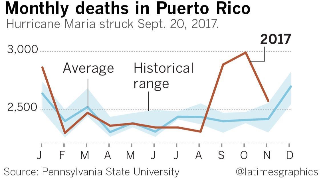
It appears that the death toll started increasing in early August, even though the hurricane didn't hit until 20 September. According to this chart, the hurricane was shortly followed by a drastic decrease in the death rate.
What's actually going on is that the August value is a total for all of August and is typically low, the September value is a total for all of September and is atypically high, and the chart designer has drawn a straight line between the August and September values, implying a linear increase over the course of August. The data for August is at the mark “A” on the chart, which seems reasonable, except that one has to understand that “A” as marking the end of August instead of the beginning, which is the opposite of the usual convention.
I think a bar chart would have been a better choice here. The lines imply continuous streams of data, but the reality is that each line represents only twelve data points. Maybe something like this instead?
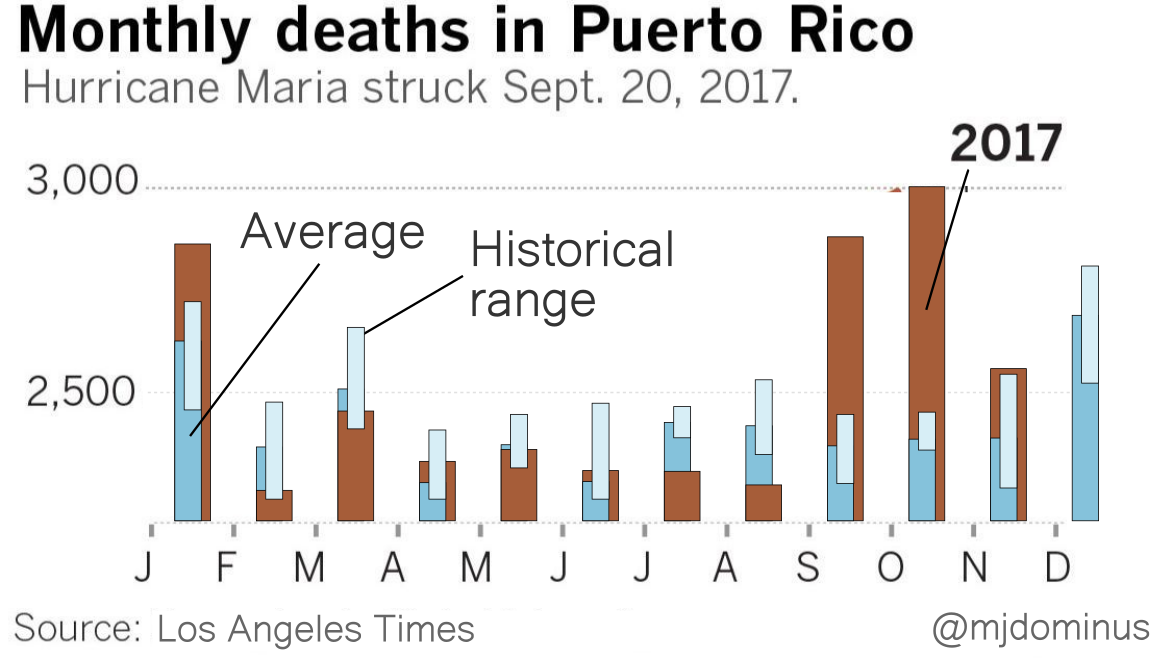
I'm not sure the historical range bars are really adding much.
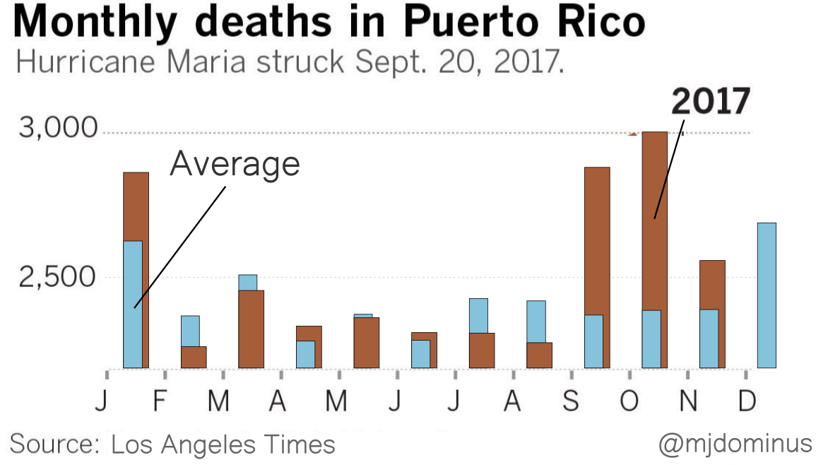
If I were designing this from scratch I think I might replace the blue bars with brackets (although maybe the LA Times knows that their readership finds those confusing?). Or maybe plot the difference between the 2017 data and ths historical average. But I think you get the point.
[Other articles in category /IT] permanent link