Mark Dominus (陶敏修)
mjd@pobox.com

Archive:
| 2025: | JFM |
| 2024: | JFMAMJ |
| JASOND | |
| 2023: | JFMAMJ |
| JASOND | |
| 2022: | JFMAMJ |
| JASOND | |
| 2021: | JFMAMJ |
| JASOND | |
| 2020: | JFMAMJ |
| JASOND | |
| 2019: | JFMAMJ |
| JASOND | |
| 2018: | JFMAMJ |
| JASOND | |
| 2017: | JFMAMJ |
| JASOND | |
| 2016: | JFMAMJ |
| JASOND | |
| 2015: | JFMAMJ |
| JASOND | |
| 2014: | JFMAMJ |
| JASOND | |
| 2013: | JFMAMJ |
| JASOND | |
| 2012: | JFMAMJ |
| JASOND | |
| 2011: | JFMAMJ |
| JASOND | |
| 2010: | JFMAMJ |
| JASOND | |
| 2009: | JFMAMJ |
| JASOND | |
| 2008: | JFMAMJ |
| JASOND | |
| 2007: | JFMAMJ |
| JASOND | |
| 2006: | JFMAMJ |
| JASOND | |
| 2005: | OND |
Subtopics:
| Mathematics | 242 |
| Programming | 99 |
| Language | 95 |
| Miscellaneous | 72 |
| Book | 50 |
| Tech | 49 |
| Etymology | 35 |
| Haskell | 33 |
| Oops | 30 |
| Unix | 27 |
| Cosmic Call | 25 |
| Math SE | 25 |
| Physics | 21 |
| Law | 21 |
| Perl | 17 |
| Biology | 15 |
| Brain | 15 |
| Calendar | 15 |
| Food | 15 |


Comments disabled
Mon, 01 Mar 2021
More fuckin' user interface design
Yesterday I complained that Google couldn't find a UI designer who wouldn't do this:

Today I'm going to complain about the gmail button icons. Maybe they were designed by the same person?
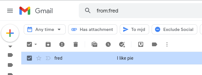
Check out the two buttons I have circled.
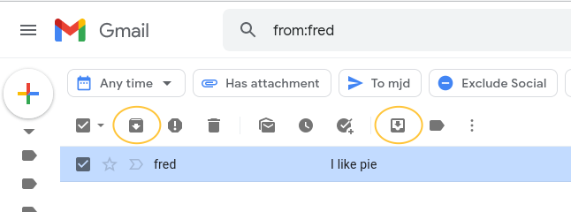
One of these "archives" the messages, which means that it moves the messages out of the Inbox.
The other button moves the messages into the Inbox.
I don't know the right way to express this, but I know the wrong way
when I see it, and the wrong way is  and
and  .
.
How about, ummm, maybe make the arrows go in opposite directions? How about, put the two buttons next to one another so that the user at least is likely to notice that both of them exist? Maybe come up with some sort of symbol for an archive, like a safe or a cellar or something, and use the same symbol in both icons, once with an arrow going in and once with an arrow coming out? Or did Google test this and they found that the best user experience was when one button was black and one was white? (“Oh, shit!" says the confused Google engineer, “I was holding the survey results upside-down.”)
I explained in the last article that I consider myself an incompetent
designer. But I don't think I'm incompetent enough to have let and
into production.
Hey, Google, would you like to hire me? Someone once said that genius is the ability to do effortlessly what most people can't do at all, and it appears that compared with Google UI engineers, I'm a design genius. For an adequately generous salary, I will be happy to whack your other designers on their heads with a rolled-up newspaper until they learn to stop this bullshit.
[Other articles in category /tech] permanent link