Mark Dominus (陶敏修)
mjd@pobox.com

Archive:
| 2026: | JFM |
| 2025: | JFMAMJ |
| JASOND | |
| 2024: | JFMAMJ |
| JASOND | |
| 2023: | JFMAMJ |
| JASOND | |
| 2022: | JFMAMJ |
| JASOND | |
| 2021: | JFMAMJ |
| JASOND | |
| 2020: | JFMAMJ |
| JASOND | |
| 2019: | JFMAMJ |
| JASOND | |
| 2018: | JFMAMJ |
| JASOND | |
| 2017: | JFMAMJ |
| JASOND | |
| 2016: | JFMAMJ |
| JASOND | |
| 2015: | JFMAMJ |
| JASOND | |
| 2014: | JFMAMJ |
| JASOND | |
| 2013: | JFMAMJ |
| JASOND | |
| 2012: | JFMAMJ |
| JASOND | |
| 2011: | JFMAMJ |
| JASOND | |
| 2010: | JFMAMJ |
| JASOND | |
| 2009: | JFMAMJ |
| JASOND | |
| 2008: | JFMAMJ |
| JASOND | |
| 2007: | JFMAMJ |
| JASOND | |
| 2006: | JFMAMJ |
| JASOND | |
| 2005: | OND |
Subtopics:
| Mathematics | 246 |
| Programming | 100 |
| Language | 95 |
| Miscellaneous | 75 |
| Book | 50 |
| Tech | 49 |
| Etymology | 36 |
| Haskell | 33 |
| Oops | 30 |
| Unix | 27 |
| Cosmic Call | 25 |
| Math SE | 25 |
| Law | 23 |
| Physics | 21 |
| Perl | 17 |
| Biology | 16 |
| Brain | 15 |
| Calendar | 15 |
| Food | 15 |


Comments disabled
Sun, 31 Dec 2006
Daylight chart
My wife is always sad this time of the year because the days are so
short and dark. I made a chart like this one a couple of years ago
so that she could see the daily progress from dark to light as the
winter wore on to spring and then summer.
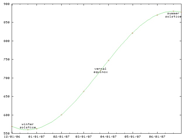
This chart only works for Philadelphia and other places at the same latitude, such as Boulder, Colorado. For higher latitutdes, the y axis must be stretched. For lower latitudes, it must be squished. In the southern hemisphere, the whole chart must be flipped upside-down.
(The chart will work for places inside the Arctic or Antarctic circles, if you use the correct interpretations for y values greater than 1440 minutes and less than 0 minutes.)
This time of year, the length of the day is only increasing by about thirty seconds per day. (Decreasing, if you are in the southern hemishphere.) On the equinox, the change is fastest, about 165 seconds per day. (At latitudes 40°N and 40°S.) After that, the rate of increase slows, until it reaches zero on the summer solstice; then the days start getting shorter again.
As with all articles in the physics section of my blog, readers are cautioned that I do not know what I am talking about, although I can spin a plausible-sounding line of bullshit. For this article, readers are additionally cautioned that I failed observational astronomy twice in college.
[Other articles in category /physics] permanent link