Mark Dominus (陶敏修)
mjd@pobox.com

Archive:
| 2026: | JFM |
| 2025: | JFMAMJ |
| JASOND | |
| 2024: | JFMAMJ |
| JASOND | |
| 2023: | JFMAMJ |
| JASOND | |
| 2022: | JFMAMJ |
| JASOND | |
| 2021: | JFMAMJ |
| JASOND | |
| 2020: | JFMAMJ |
| JASOND | |
| 2019: | JFMAMJ |
| JASOND | |
| 2018: | JFMAMJ |
| JASOND | |
| 2017: | JFMAMJ |
| JASOND | |
| 2016: | JFMAMJ |
| JASOND | |
| 2015: | JFMAMJ |
| JASOND | |
| 2014: | JFMAMJ |
| JASOND | |
| 2013: | JFMAMJ |
| JASOND | |
| 2012: | JFMAMJ |
| JASOND | |
| 2011: | JFMAMJ |
| JASOND | |
| 2010: | JFMAMJ |
| JASOND | |
| 2009: | JFMAMJ |
| JASOND | |
| 2008: | JFMAMJ |
| JASOND | |
| 2007: | JFMAMJ |
| JASOND | |
| 2006: | JFMAMJ |
| JASOND | |
| 2005: | OND |
In this section:
Subtopics:
| Mathematics | 246 |
| Programming | 100 |
| Language | 95 |
| Miscellaneous | 75 |
| Book | 50 |
| Tech | 49 |
| Etymology | 36 |
| Haskell | 33 |
| Oops | 30 |
| Unix | 27 |
| Cosmic Call | 25 |
| Math SE | 25 |
| Law | 23 |
| Physics | 21 |
| Perl | 17 |
| Biology | 16 |
| Brain | 15 |
| Calendar | 15 |
| Food | 15 |


Comments disabled
Sat, 29 Apr 2006
Abbreviations in medieval manuscripts
In an earlier article I
discussed my surprise at finding "examples" and "alteration"
abbreviated to "exãples" and "alteratiõ" in Robert
Recorde's 1557 book The Whetstone of Witte. Then later
I quoted Jonathan
Hoefler, an expert in typographical matters:
Diacritical marks have been used to abbreviate printed words ever since Gutenberg, and early English printers adopted the same conventions that Gutenberg used for Latin (a trick he picked up from medieval scribes.)Shortly afterward I realized that I have some reproductions of illuminated manuscripts — they're hanging in the bathroom, so I see them every day — and could actually see this for myself. This one is my favorite:
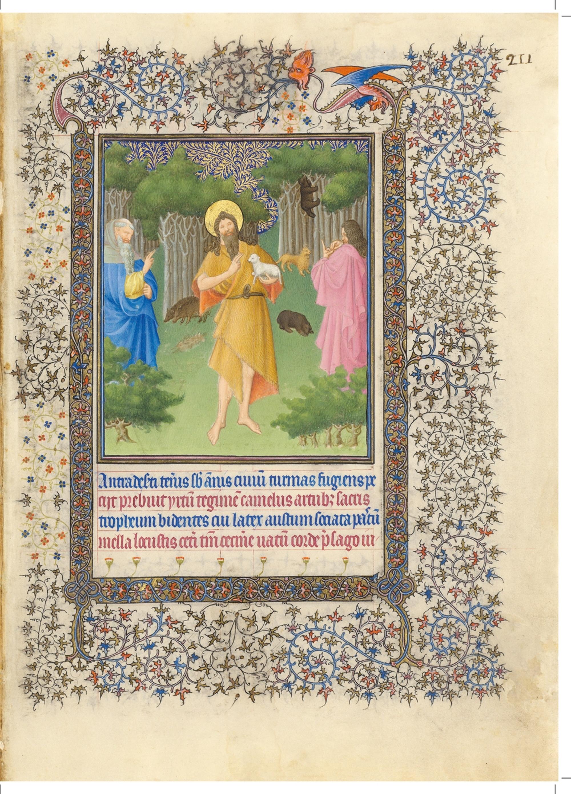
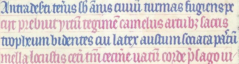
- I can't make head or tail of most of it, but
- the fourth line begins mella locustis.
Eventually I did what I should have done in the first place and plugged mella locustis into Google. The result was quite conclusive. The words here are from a very famous hymn about John the Baptist, attributed to Paulus Diaconus (c. 720 -799). The hymn is in three parts, and this is the beginning of the second part. The words here are:
Antra deserti teneris sub annisI've colored the text here to match the text in the manuscript. Stuff in gray in the first verse is omitted from the manuscript; I do not know why. A copying error, perhaps? Or a change in the words?
civium turmas fugiens, petisti,
n levi saltim maculare vitam
famine posses.
Praebuit hirtum tegimen camelus,
artubus sacris strofium bidentis,
cui latex haustum, sociata pastum
mella locustis.
Caeteri tantum cecinere vatum
corde praesago iubar adfuturum;
...
The amount of abbreviation here is just amazing. In the first line, deserti is abbreviated deseti, and the s and the e are all squashed together, sub is abbreviated sb, annus is abbreviated ãnis, civium is abbreviated civiû and is illegible anyway, because the letters all look alike, as in Russian cursive. (I have a similar problem with cui on the third line.)
On the second line, artubus is written artub3; Hoefler had already pointed out to me that the 3 was a common notation in 16th-century printing. On the third line, pastum is written pa'tû, where the wiggly mark between the a and the t denotes an elided s. Or perhaps the scribe left it out by mistake and then went back to squeeze it in later.
Probably the most amazing abbreviations in the whole thing are in the fourth line. (I wonder if perhaps the scribe realized he was running out of room and wanted to squeeze in as much as possible.) The word caeteri is abbreviated to ceti, tantum to tm, and praesago to p'sago. (Also note uatû, which is an abbreviation for vatum; I had been wondering for some time what Uatu had to do with it.)
There are a number of other typographical features of interest. The third word in the second line is apparently hirtum. The hi in the manuscript is written as a sort of a V-shape. The r in corde on the fourth line (and elsewhere) is a form that was once common, but is now obsolete.
This hymn, by the way, is the one that gives us the names do, re, mi, fa, so, la, si for the notes of the major scale. The first part of the hymn begins:
Ut queant laxis resonare fibris"Ut" was later changed to "do" because "do" is open while "ut" is closed. Scholars speculate that the name "si" was chosen because it is the initials of the words in the final line.
mira gestorum famuli tuorum,
solve polluti labii reatum,
sancte Iohannes!
The thing about the locusts and wild honey reminds me of something else. I was once on a business trip to Ottawa and found that there was a French Bible in my hotel room. And I discovered that, although I cannot read French, I could read the Bible in French, because I already knew what it was going to say. So I lay in bed and read the French Bible and enjoyed the rather strange sensation of being able to pretend to myself to be able to read French.
Two points struck me at the time. One was that when I read "Dieu dit: Que la lumière soit!" ("God said, 'Let there be light'") my instant reaction was to laugh at how absurd it was to suggest that God had spoken French when He created the universe. It's like that Reader's Digest joke about the guy who thinks the Spanish-speaking folks are silly for talking to the squirrels in the park in Spanish, because squirrels don't speak Spanish. I didn't know I had that in me, but there I was, laughing at the silly idea of God saying "Que la lumière soit!" You know, I still find it silly.
The other memorable occurrence was a little less embarrassing. The part in Matthew (excuse me; "Matthieu") about John the Baptist eating locusts and wild honey was "Il se nourrissait de sauterelles et de miel sauvage." I was impressed at how tasty it sounded, in French. It is not hard to imagine going into an expensive restaurant and ordering sauterelles et de miel sauvage off the menu. I concluded that food always sounds better in French, at least to an anglophone like me.
Addenda
20200706
Many years later, I learned where this illustration was from: it is Duc de Berry's Book of Hours, created between 1412 and 1416. I found this out in a happy way: the Metropolitan Museum of Art's was in the habit of tweeting pictures of objects from their collection, and one day they tweeted either the page above or one sufficiently similar to it that I was able to recognize it.
20240817
Duc de Berry had at least two books of hours. This is not from the Très Riches Heurs as I wrote above, but rather the Belles Heures. It is in the Cloisters collection of the Metropolitan Museum of Art, which has a superb website with many scans. The page above is folio 211r.
20240911
The Metropolitan Museum of Art has published a beautiful book, The Art of Illumination: The Limbourg Brothers and the Belles Heures if Jean de France, Duc de Berry with full details about the illustration and text. This plate is described on pages 252–253. The figure in the foreground is indeed John the Baptist, wearing his camel-hair coat and carrying the Lamb of God.According to the book, the text below is:
Antra deserti teneris sub annis turmas fugiens, peciit, prebuit yrtum tegimen camelus, artubut sacris tropheum bidentes, cui later austum, sociata pastum mella locustis. Ceteri tantum cecinere vatum corde presago ju-
which they translate as:
Even as a youth, fleeing from the crowds, he sought the caves of the desert. The camel provided him with a hair coat, and the lambs a belt for his sacred limbs, his drink was water, and his meals of honey and of locusts. The rest of the prophets sand with knowing hards about the…
[Other articles in category /IT/typo] permanent link
Thu, 27 Apr 2006
Yellow
Most of the academic part of high school is mercifully gone from my
memory, dissolved together into a uniform blur of dullness. I wrote recently about one
question I remember fondly from one final exam. I only remember a few
specific exam questions, and probably that is the only one I remember
because it was such a good question.
The one exam question that sticks most clearly in my mind was from my eighth-grade science class: What color do you see if you look at a yellow light through a monochromatic red filter?
I said it would look red, and was marked wrong. I argued my answer with the teacher, Mr. Goodman, but he would not give me credit. I puzzled over this for a long time, and eventually understood what had happened.
The word "yellow" is not a designation of physics alone; it refers to a certain experience, and is a perceptual phenomenon, not a purely physical one. It's possible to phrase the question to avoid this, but the question was not phrased in that way; it was expressly phrased in perceptual terms. A person who was achromatopsic might see a yellow light through a monochomatic red filter in a very unusual way.
To bring up the possibility of achromatopsia in the context of an exam is just nitpicking; I mention it only to point out that the question, as posed, must involve a consideration of human perception. And the objection I raised at the time is certainly not just nitpicking, because there are two entirely different physical phenomena that both go by the name of "yellow". The confusion of these two things occurs in the human retina.
The perception of color is a very complicated business, and I can't explain it in complete detail today. Partly this is because it isn't understood in complete detail, partly because I don't know everything that is understood, and partly it is because this article is about something else, and I want to try to come to the point eventually. So all my assertions about color perception in this article should be taken as metaphors for what is really happening. Although they give a correct general idea of a perceptual process that is something like what actually occurs, they are not accurate and are not intended to be accurate.
With that warning in place, I will now explain human color perception. Color is sensed by special "cone cells" in the retina. Different cone cells are sensitive to different frequencies of photons. Cone cells come in three types, which we will call "red", "green", and "blue", although all three of these are misnomers to one degree or another. The "red" cone cells are sensitive to red and yellow photons; the "green" cone cells to yellow and green photons. We will ignore the blue cones.
Photons with a wavelength of around 570 nanometers stimulate both the red and the green cone cells, and this stimulation is eventually perceived as the color yellow. But you can stimulate the cone cells the same way without using any light with a frequency around 570 nm. If you bombard the retina with photons of 650 nm, you stimulate only the red cones, and the light looks red; if you bombard the retina with photons of 520 nm, you stimulate only the green cones, and the light looks green. If you bombard the retina with both kinds of photons at once, both the red and green cones are stimulated, just as they were by the 570 nm photons. They have no way to know that they are being stimulated by two different groups of photons instead of by the same group, so the perception is the same.
This is why your computer monitor and your television can display the color yellow, despite having no source of yellow light. The monitor has little red phosphors and little green phosphors. When it activates both of them at once, the red and green photons stream out and get into your eye, where they stimulate the red and green cones, and you perceive the color yellow.
But from a purely physical point of view, this "yellow" phenomenon is not at all like the one that occurs when you look at a lemon or at a sodium vapor street light. The photons coming off the lemon are all of about the same frequency, around 570 nm. The photons coming off the computer monitor picture of the lemon are two different frequencies, some around 520 nm, and some around 650 nm. Your eye is not equipped to tell the difference.
Now, suppose you are looking at "yellow light" through a monochromatic red filter that passes only 650 nm photons. What do you see?
Well, if it was monochomatic yellow light, say from a lemon, then you see nothing, because the filter stops the 570 nm photons. This was Mr. Goodman's exam answer.
But if it was the yellow light that comes from a television picture of a lemon, then it contains some 520 nm photons, which are stopped by the filter, and some 650 nm photons, which are not stopped. You would see a red lemon. This was my exam answer.
The perception of mixed red and green light as yellow was part of the curriculum that year---we had had a classroom demonstration of it---and so it was fair game for the exam. Mr. Goodman's exam question, as posed, was genuinely ambiguous. There are two physical phenomena that are both described as "yellow", and he could have meant either one.
This confusion of two distinct physical phenomena by the retina is something we take for granted, but it is by no means inevitable. I often imagine our meeting with the aliens, and their surprise when they learn that all of us, every human on earth, are color-blind. They will find this out quickly, as soon as they see a television or a computer monitor. "Your monitor is broken," Zxaxgr will say.
"It looks all right to me," replies Flash Gordon.
"Is there something wrong with your eyes? The color adjustment for yellow is completely off. It is coming out as redgreen instead of as yellow."
"I see nothing wrong with the color adjustment for yellow," replies Flash.
"There must be something wrong with your eyes."
And yes, Zxaxgr is right. There is something wrong with our eyes. There is an intrinsic design flaw in our computer monitors, none of which can display yellow, and we don't care, because none of us can tell the difference between redgreen and yellow.
To empathize with Zxaxgr's puzzlement, imagine how strange it would be to learn that the alien televisions cannot display green; they display purple instead: purple trees, purple broccoli, purple frogs, purple flags of Saudi Arabia. And the aliens have never noticed the problem. You want to ask them about it, but your English-to-Alien dictionary doesn't have an entry for "purple". When you ask them about it, they say you're nuts, everything looks green, as it should. You learn that they have no word for purple; they just call it green, and eventually you find out that it's because they can't tell the difference between purple and green.
Whatever you're thinking now, that's what Zxaxgr is going to think.
[Other articles in category /aliens] permanent link
Tue, 25 Apr 2006
More on risk
My article on risk was one of the
more popular articles so far; it went to the top of Reddit, and was
widely commented on. It wasn't the best article I've written. I
confused a bunch of important things. But now I find I have more to
say on the topic, so I'm back to screw up again.
One big problem with the Reddit posting is that the guy who posted it there titled the post on risk, or why poor people might not be stupid to play the lottery. So a lot of the Reddit comments complained that I had failed to prove that poor people must not be stupid to play the lottery, or that I was wrong on that point. They argued that the dollar cost of a lottery ticket is more valuable to a poor person than to a rich one, and so on. But I didn't say anything about poor people. People read this into the article based on the title someone else had attached to it, and they couldn't get rid of this association even after I pointed out that the article had nothing to say about poor people.
Something I do a lot, in this blog, and in life, is point out fallacious arguments. You get some argument that X is true, because of P and Q and therefore R, and then I'll come along point out that P is false and Q is irrelevant, and anyway they don't imply R, and even if they did, you can't conclude X from R, because if you could, then you could also conclude Y and Z which are obviously false. For example, in a recent article I addressed the argument that:
You can double your workforce participation from 27% to 51% of the population, as Singapore did; you can't double it again.The argument being that you can't double a participation of 51% because you can't possibly have 102% workforce participation. (Peter Norvig pointed out that he made the same argument in a different context back in 1999.) But the argument here fails, for reasons I won't go into again. This doesn't mean that I believe that Singapore's workforce participation will double again. Just because I point out that an argument for X is fallacious doesn't mean that I believe X is false.
The "risk" article was one of those. I wanted to refute one specific argument, which is that (a) the expected return on a lottery ticket is negative, so therefore (b) it's stupid to buy lottery tickets. My counter-argument was to point out that (a) the expected return on fire insurance is negative, but that you can't conclude that therefore (b) it's stupid to buy fire insurance. It might be stupid to buy lottery tickets, but if it is, it's not because the expected return is negative. Or at least it's not only because the expected return is negative. There must be more to it than that.
I really like that pattern of argument, and I use it a lot: A can't imply B, because if it did, then it would also imply B', and B' is false, or at least B' is a belief held only by dumbasses.
None of this addresses the question of whether or not I think it's stupid to buy lottery tickets. I have not weighed in on that matter. My only argument is that the argument from expected value is insufficient to prove the point.
People have a lot of trouble with second-order arguments like this, though. If I argue "that argument against B is no good," they are likely to hear it as an argument in favor of B. Several of the Reddit people made this mistake. The converse mistake is to interpret "that argument against B is no good, because it can be converted into an argument against B'" as an argument against B'! Some of the Reddit people made this mistake too, and disdainfully explained to me why buying fire insurance is not stupid.
Another problem with the article was that it followed my usual pattern of meandering digression. Although the main point of the article was to refute the argument from expected value, I threw in a bunch of marginally related stuff that I thought was fun and interesting: the stuff about estimating the value one ascribes to one's own life; the stuff about the surprisingly high chance of being killed by a meteor strike. Email correspondents and Reddit commenters mistook both of these for arguments about the lottery, and tried to refute them as such. Well, I have nobody to blame but myself for that. If you present a muddled, miscellaneous article, you can't complain when other people are confused by it.
If I were going to do the article again, one thing I'd try to fix is the discussion of utility. I think my biggest screwup was to confuse two things that are not the same. One is the utility, which decreases for larger amounts of money; your second million dollars has less value than your first million. But another issue, which I didn't separate in my mind, was the administration cost of money. There must be a jargon term for this, but I don't know what it is.
Economists like to pretend that money is perfectly fungible, and this is a reasonable simplifying assumption in most cases. But it's easy to prove that money isn't perfectly fungible. Imagine you've just won a prize. You can have one thousand dollars paid in hundred-dollar bills, or you can have a thousand and one dollars, paid in pennies. Anyone who really believes that money is perfectly fungible will take the pennies, even though they weigh six hundred pounds, because that way they get the one-dollar bonus.
Money has a physical manifestation, even when it's just numerals written in a ledger somewhere, and managing the physical manifestation of money has an associated cost. The cost of managing a penny is a significant fraction of the value of the penny, to the point that many people throw away pennies or dump them in jars just to avoid the cost of dealing with them. In some circumstances, like the lottery ticket purchase, the non-fungibility of money is important. Blowing one dollar on a lottery that pays a thousand dollars is not the same as blowing a thousand dollars on a lottery that pays a million dollars, and it's not the same as blowing your whole paycheck on a big stack of lottery tickets. Partly it's the risk issue, and partly it's this other issue, that I don't know the name of, that a single dollar is worth less than one one-thousandth of a thousand dollars, because the cost to administer and manage it is proportionately higher. I didn't make this clear in the original article because it wasn't clear in my mind. Oh well, I'm not yet a perfect sage.
One last point that has come up is that a couple of people have written to me to say that they would not take the Russian roulette bet for any amount of money at any odds. (Here's a blog post to that effect, for example.) One person even suggested that I only assumed he would take the bet at some odds because I'm an American, and I can't conceive of anyone refusing a big pot of money.
Well, maybe that's true, but I don't think that's why I assumed that everyone would take the bet for some amount of money. I assumed it because that is what I have observed people to do. I now know there are people who say that they would not play Russian roulette at any odds for any payoff. And I think those people are fooling themselves.
If you think you're one of those people, I have this question for you: Do you own a bicycle helmet? And if you do, did you buy the very top-of-the-line helmet? Or did you buy a mid-price model that might offer less protection? What, just to save money? I offered you a million dollars at million-to-one odds. Do you think that fifty dollars you saved on your bicycle helmet is paying you off for less risk than my million-to-one Russian roulette bet?
Well, maybe you don't own a bicycle, so you think you have no need of a helmet. But if the people who wrote to me were as risk-averse as some of them said they were, the lack of a bicycle wouldn't stop them from wearing helmets all the time anyway—another reason I think they are fooling themselves. I've met some of these people, and they don't go around in helmets and padded armor all the time.
Or maybe you do own the very safest helmet money can buy, since you have only one head, after all. But I bet you can find some other example? Have you ever flown in a plane? Did you refuse to fly anywhere not served by Qantas, like Raymond in Rain Man, because every other airline has had a crash? If you had a choice to pay double to fly with Qantas, would you take it? Or would you take the cheap flight and ignore the risk?
One comment that replies to the blog I cited above really hits the nail on the head, I think. It says: "you don't get paid a million dollars to get in your car and drive somewhere, but what are the chances you'll be killed in an auto accident?" My Russian roulette game is a much better deal than driving your car.
I'm going to end this article, as I did the last one, with an amusing anecdote about risk. My great-uncle Robert E. Machol was for a time the chief scientist of the Federal Aviation Administration. The regulations for infant travel were (and still are) that an infant may make an air trip on its parent's lap; parents do not need to buy a separate ticket and a seat for the infant.
In one air disaster, an infant that was being held on its parent's lap was thrown loose, hurtled to the end of the corridor, and died. The FAA was considering changing the rules for infants to require that they purchase a separate ticket, entitling them to their own seat, into which would be installed an FAA-approved safety car seat. Infants in their own restraint seats would be much safer than those held on their parents' laps.
Dr. Machol argued against this rule change, on the following grounds: If parents are required to buy separate tickets for their infants, air travel will be more expensive for them. As a result, some families will opt to take car trips instead of plane trips. Car trips are much more dangerous than plane trips; the fatalities per passenger per mile are something like twenty times higher. More babies can be expected to be killed in the resulting auto crashes than can be expected to be saved by the restraint seat requirement.
As before, this is not intended as an argument for or against anything in particular, except perhaps that the idea of risk is complex and hard to understand. Probably people will try to interpret it as an argument about the fungibility of money, or whatever the next Reddit person decides to put in the article title. You'd think I would have learned my lesson by now, but, as I said, I'm not yet a perfect sage.
[Other articles in category ] permanent link
Sat, 22 Apr 2006
Counting squares
Let's take a bunch of squares, and put a big "X" in each one, dividing
each square into four triangular wedges. Then let's take three
colors of ink, say red, blue, and black, and ink in the wedges. How
many different ways are there of inking up the squares?
Well, that's easy. There are four wedges, and each one can be one
of three colors, so the answer is 34 = 81. No, wait,
that's not right, because the two squares below are really the
same:
 |
 |
|
|
 |
 |

 What about turning the squares over? Are the two squares to the right
"the same"?
Let's say that the squares are inked
on only one side, so that those two would not considered the
same, even if we decided to allow squares with green wedges. Later on
we will make the decision the other way and see how things change.
What about turning the squares over? Are the two squares to the right
"the same"?
Let's say that the squares are inked
on only one side, so that those two would not considered the
same, even if we decided to allow squares with green wedges. Later on
we will make the decision the other way and see how things change.


 OK, so let's see. All four wedges might be the same color, and
there are 3 colors, so there are 3 ways to do that, shown at right.
OK, so let's see. All four wedges might be the same color, and
there are 3 colors, so there are 3 ways to do that, shown at right.


 Or there might only be two colors. In
that case, there might be three wedges of one color and one of
another, there are 6 ways to do that, depending on how we pick the
colors; these six are shown at right.
Or there might only be two colors. In
that case, there might be three wedges of one color and one of
another, there are 6 ways to do that, depending on how we pick the
colors; these six are shown at right.
Or it might be two-and-two.
There are three ways to choose the colors (red-blue, red-black, and
blue-black) and two ways to arrange them: same-colored wedges opposite
each other:


or abutting:


so that's another 2·3 = 6 ways.


 If we use all three colors, then two wedges are in one of the colors,
and one wedge in each of the other two colors. The two wedges of the
same color might be adjacent to each other or opposite. In either case, we have three choices for the color of the two wedges that are
the same, after which the colors of the other two wedges are forced.
So that's 3 colorings with two adjacent wedges the same color:
If we use all three colors, then two wedges are in one of the colors,
and one wedge in each of the other two colors. The two wedges of the
same color might be adjacent to each other or opposite. In either case, we have three choices for the color of the two wedges that are
the same, after which the colors of the other two wedges are forced.
So that's 3 colorings with two adjacent wedges the same color:

 And 3 colorings with two opposite wedges the same color:
So that's a total of 21. Unless I left some out. Actually I
did leave some
out, just to see if you were paying attention. There are really 24,
not 21. (You
can see the full set, including the three I left out.) What a
pain in the ass. Now let's do the same count for four colors. Whee,
fun!
But there is a better way. It's called the Pólya-Burnside counting lemma. (It's named after George Pólya and William Burnside. The full Pólya counting theorem is more complex and more powerful. The limited version in this article is more often known just as the Burnside lemma. But Burnside doesn't deserve the credit; it was known much earlier to other mathematicians.)
Let's take a slightly simpler example, and count the squares that have two colors, say blue and black only. We can easily pick them out from the list above:
|
 |
|
 |
|
|
Remember way back at the beginning where we decided that
and
 and
and
 were the same because differences
of a simple rotation didn't count? Well, the first thing you do is
you make a list of all the kinds of motions that "don't
count". In this case, there are four motions:
were the same because differences
of a simple rotation didn't count? Well, the first thing you do is
you make a list of all the kinds of motions that "don't
count". In this case, there are four motions:
- Rotation clockwise by 90°
- Rotation by 180°
- Rotation counterclockwise by 90°
- Rotation by 0°
Now we temporarily forget about the complication that says that some
squares are essentially the same as other squares. All squares are
now different. and are now different because they are
colored differently. This is a much simpler point of view. There are
clearly 24 such squares, shown below:
|


|


|
 |
|
Which of these 16 squares is left unchanged by motion #3, a counterclockwise quarter-turn? All four wedges would have to be the same color. Of the 16 possible colorings, only the all-black and all-blue ones are left entirely unchanged by motion #3. Motion #1, the clockwise quarter-turn, works the same way; only the 2 solid-colored squares are left unchanged.
4 colorings are left unchanged by
a 180° rotation. The top wedge and the bottom wedges switch
places, so they must be the same color, and the left and right wedges
change places, so they must be the same color. But the top-and-bottom
wedges need not be the same color as the left-and-right wedges. We
have two independent choices of how to color a square so that it will
remain unchanged by a 180° rotation, and there are 22 =
4 colorings that are left unchanged by a 180° rotation. These are
shown at right.
So we have counted the number of squares left unchanged by each motion:
| Motion | # squares unchanged |
typical example | |
|---|---|---|---|
| 1 | Clockwise quarter turn | 2 | |
| 2 | Half turn | 4 | |
| 3 | Counterclockwise quarter turn | 2 | |
| 4 | No motion | 16 | |
Next we take the counts for each motion, add them up, and average them. That's 2 + 4 + 2 + 16 = 24, and divide by 4 motions, the average is 6.
So now what? Oh, now we're done. The average is the answer. 6, remember? There are 6 distinguishable squares. And our peculiar calculation gave us 6. Waaa! Surely that is a coincidence? No, it's not a coincidence; that is why we have the theorem.
Let's try that again with three colors, which gave us so much trouble before. We hope it will say 24. There are now 34 basic squares to consider.
For motions #1 and #3, only completely solid colorings are left unchanged, and there are 3 solid colorings, one in each color. For motion 2, there are 32 colorings that are left unchanged, because we can color the top-and-bottom wedges in any color and then the left-and-right wedges in any color, so that's 3·3 = 9. And of course all 34 colorings are left unchanged by motion #4, because it does nothing.
| Motion | # squares unchanged |
typical example | |
|---|---|---|---|
| 1 | Clockwise quarter turn | 3 | |
| 2 | Half turn | 9 | |
| 3 | Counterclockwise quarter turn | 3 | |
| 4 | No motion | 81 |  |
The average is (3 + 9 + 3 + 81) / 4 = 96 / 4 = 24. Which is right. Hey, how about that?
That was so easy, let's skip doing four colors and jump right to the general case of N colors:
| Motion | # squares unchanged |
typical example | |
|---|---|---|---|
| 1 | Clockwise quarter turn | N |  |
| 2 | Half turn | N2 |  |
| 3 | Counterclockwise quarter turn | N | |
| 4 | No motion | N4 |  |
Add them up and divide by 4, and you get (N4 + N2 + 2N)/4. So if we allow four colors, we should expect to have 70 different squares. I'm glad we didn't try to count them by hand!
(Digression: Since the number of different colorings must be an integer, this furnishes a proof that N4 + N2 + 2N is always a multiple of 4. It's a pretty heavy proof if it were what we were really after, but as a freebie it's not too bad.)
One important thing to notice is that each motion of the square divides the wedges into groups called orbits, which are groups of wedges that change places only with other wedges in the same orbit. For example, the 180° rotation divided the wedges into two orbits of two wedges each: the top and bottom wedges changed places with each other, so they were in one orbit; the left and right wedges changed places, so they were in another orbit. The "do nothing" motion induces four orbits; each wedge is in its own private orbit. Motions 1 and 3 put all the wedges into a single orbit; there are no smaller private cliques.
For a motion to leave a square unchanged, all the wedges in each orbit must be the same color. For example, the 180° rotation leaves a square unchanged only when the two wedges in the top-bottom orbit are colored the same and the two wedges in the left-right orbit are colored the same. Wedges in different orbits can be different colors, but wedges in the same orbit must be the same color.
Suppose a motion divides the wedges into k orbits. Since there are Nk ways to color the orbits (N colors for each of the k orbits), there are Nk colorings that are left unchanged by the motion.
Let's try a slightly trickier problem. Let's go back to using 3
colors, and see what happens if we are allowed to flip over the
squares, so that
and are now considered the same.
In addition to the four rotary motions we had before, there are now four new kinds of motions that don't count:
| Motion | # squares unchanged |
typical example | |
|---|---|---|---|
| 5 | Northwest-southeast diagonal reflection | 9 |  |
| 6 | Northeast-southwest diagonal reflection | 9 | |
| 7 | Horizontal reflection | 27 |  |
| 8 | Vertical reflection | 27 | |
The diagonal reflections each have two orbits, and so leave 9 of the
81 squares unchanged. The horizontal and vertical reflections each
have three orbits, and so leave 27 of the 81 squares unchanged. So
the eight magic numbers are 3, 3, 9, and 81, from before, and now the
numbers for the reflections, 9, 9, 27, and 27. The average of these
eight numbers is 168/8 = 21. This is correct. It's almost the
same as the 24 we got earlier, but instead of allowing both
representatives of each pair like
 , we allow only one, since they are
now considered "the same". There are three such pairs, so this
reduces our count by exactly 3.
, we allow only one, since they are
now considered "the same". There are three such pairs, so this
reduces our count by exactly 3.
Okay, enough squares. Lets do, um, cubes! How many different ways are there to color the faces of a cube with N colors? Well, this is a pain in the ass even with the Pólya-Burnside lemma, because there are 24 motions of the cube. (48 if you allow reflections, but we won't.) But it's less of a pain in the ass than if one tried to do it by hand.
This is a pain for two reasons. First, you have to figure out what the 24 motions of the cube are. Once you know that, you then have to calculate the number of orbits of each one. If you are a combinatorics expert, you have already solved the first part and committed the solution to memory. The rest of the world might have to track down someone who has already done this—but that is not as hard as it sounds, since here I am, ready to assist.
Fortunately the 24 motions of the cube are not all entirely different from each other. They are of only four or five types:
- Rotations around an axis that goes through one corner to the
opposite corner.
There are 4 such pairs of vertices, and for each pair, you can turn the cube either 120° clockwise or 120° counterclockwise. That makes 8 rotations of this type in total. Each of these motions has 2 orbits. For the example axis above, one orbit contains the top, front, and left faces and the other contains the back, bottom, and right faces. So each of these 8 rotations leaves N2 colorings of the cube unchanged.
- Rotations by 180° around an axis that goes through the middle
of one edge of the cube and out the middle of the opposite edge.
There are 6 such pairs of edges, so 6 such rotations. Each rotation divides the six faces into three orbits of two faces each. The one above exchanges the front and bottom, top and back, and left and right faces; these three pairs are the three orbits. To be left unchanged by this rotation, the two faces in each orbit must be the same color. So N3 colorings of the cube are left fixed by each of these 6 rotations.
- Rotations around an axis that goes through the center
of a face and comes out the center of the opposite face.
There are three such axes. The rotation can be 90° clockwise, 90 ° counterclockwise, or 180°. The 90° rotations have three orbits. The one shown above puts the top face into an orbit by itself, the bottom face into another orbit, and the four faces around the middle into a third orbit. So six of these nine rotations leave N3 colorings unchanged.
The 180° rotations have four orbits. A 180° rotation around the axis shown above puts the top and bottom faces into private orbits, as the 90° rotation did, but instead of putting the four middle faces into a single orbit, the front and back faces go in one orbit and the left and right into another. Since there are three axes, there are three motions of the cube that each leave N4 colorings unchanged.
- Finally, there's the "motion" that moves nothing. This motion
leaves every face in a separate orbit, and leaves all
N6 colorings unchanged.
- 8N2 from the vertex rotations
- 6N3 from the edge rotations
- 6N3 from the 90° face rotations
- 3N4 from the 180° face rotations
- N6 from the "do nothing" motion
Unfortunately, the Pólya-Burnside technique does not tell you what the ten colorings actually are; for that you have to do some more work. But at least the P-B lemma tells you when you have finished doing the work! If you set about to enumerate ways of painting the faces of the cube, and you end up with 9, you know you must have missed one. And it tells you how much toil to expect if you do try to work out the colorings. 10 is not so many, so let's give it a shot:
- 6 black and 0 white faces: one cube
- 5 black and 1 white face: one cube
- 4 black and 2 white faces: the white faces could be on opposite sides of the cube, or touching at an edge
- 3 black and 3 white faces: the white faces could include a pair of opposite faces and one face in between, or they could be the three faces that surround a single vertex.
- 2 black and 4 white faces: the black faces could be on opposite sides of the cube, or touching at an edge
- 1 black and 5 white faces: one cube
- 0 black and 6 white faces: one cube
Care to try it out? There are 4 ways to color the sides of a triangle with two colors, 10 ways if you use three colors, and N(N+1)(N+2)/6 if you use N colors.
There are 140 different ways to color a the
squares of a 3×3 square array, counting reflections as
different. If reflected colorings are not counted separately, there
are only 102 colorings. (This means that 38 of the colorings have
some reflective symmetry.) If the two colors are considered
interchangeable (so for example  and
and  are considered the same) there are
51 colorings.
are considered the same) there are
51 colorings.
You might think it is obvious that allowing an exchange of the two colors cuts the number of colorings in half from 102 to 51, but it is not so for 2×2 squares. There are 6 ways to color a 2×2 array, whether or not you count reflections as different; if you consider the two colors interchangeable then there are 4 colorings, not 3. Why the difference?
[Other articles in category /math] permanent link
Fri, 21 Apr 2006 Richard P. Feynman says:
When I was in high school, I'd see water running out of a faucet growing narrower, and wonder if I could figure out what determines that curve. I found it was rather easy to do.I puzzled over that one for years; I didn't know how to start. I kept supposing that it had something to do with surface tension and the tendency of the water surface to seek a minimal configuration, and I couldn't understand how it could be "rather easy to do". That stuff all sounded really hard!
 But one day I realized
in a flash that it really is easy. The water accelerates as it
falls. It's moving faster farther down, so the stream must be
narrower, because the rate at which the water is passing a given point
must be constant over the entire stream. (If water is passing a
higher-up point faster than it passes a low point, then the water is
piling up in between—which we know it doesn't do. And vice versa.)
It's easy to calculate the speed of the water at each point in the
stream. Conservation of mass gets us the rest.
But one day I realized
in a flash that it really is easy. The water accelerates as it
falls. It's moving faster farther down, so the stream must be
narrower, because the rate at which the water is passing a given point
must be constant over the entire stream. (If water is passing a
higher-up point faster than it passes a low point, then the water is
piling up in between—which we know it doesn't do. And vice versa.)
It's easy to calculate the speed of the water at each point in the
stream. Conservation of mass gets us the rest.
So here's the calculation. Let's adopt a coordinate system that puts position 0 at the faucet, with increasing position as we move downward. Let R(p) be the radius of the stream at distance p meters below the faucet. We assume that the water is falling smoothly, so that its horizontal cross-section is a circle.
Let's suppose that the initial velocity of the water leaving the faucet is 0. Anything that falls accelerates at a rate g, which happens to be !!9.8 m/s^2!!, but we'll just call it !!g!! and leave it at that. The velocity of the water, after it has fallen for time !!t!!, is !!v = gt!!. Its position !!p!! is !!\frac12 gt^2!!. Thus !!v = (2gp)^{1/2}!!.
Here's the key step: imagine a very thin horizontal disk of water, at distance p below the faucet. Say the disk has height h. The water in this disk is falling at a velocity of !!(2gp)^{1/2}!!, and the disk itself contains volume !!\pi (R(p))^2h!! of water. The rate at which water is passing position !!p!! is therefore !!\pi (R(p))^2h \cdot (2gp)^{1/2}!! gallons per minute, or liters per fortnight, or whatever you prefer. Because of the law of conservation of water, this quantity must be independent of !!p!!, so we have:
$$\pi(R(p))^2h\cdot (2gp)^{1/2} = A$$Where !!A!! is the rate of flow from the faucet. Solving for !!R(p)!!, which is what we really want:
$$R(p) = \left[\frac A{\pi h(2gp)^{1/2}}\right]^{1/2}$$Or, collecting all the constants (!!A, \pi , h,!! and !!g!!) into one big constant !!k!!:
$$R(p) = kp^{-1/4}$$ There's a picture of that over there on the left side of the blog. Looks just about right, doesn't it? Amazing.So here's the weird thing about the flash of insight. I am not a brilliant-flash-of-insight kind of guy. I'm more of a slow-gradual-dawning-of-comprehension kind of guy. This was one of maybe half a dozen brilliant flashes of insight in my entire life. I got this one at a funny time. It was fairly late at night, and I was in a bar on Ninth Avenue in New York, and I was really, really drunk. I had four straight bourbons that night, which may not sound like much to you, but is a lot for me. I was drunker than I have been at any other time in the past ten years. I was so drunk that night that on the way back to where I was staying, I stopped in the middle of Broadway and puked on my shoes, and then later that night I wet the bed. But on the way to puking on my shoes and pissing in the bed, I got this inspiration about what shape a stream of water is, and I grabbed a bunch of bar napkins and figured out that the width is proportional to !!p^{-1/4}!! as you see there to the left.
This isn't only time this has happened. I can remember at least one other occasion. When I was in college, I was freelancing some piece of software for someone. I alternated between writing a bit of code and drinking a bit of whisky. (At that time, I hadn't yet switched from Irish whisky to bourbon.) Write write, drink, write write, drink... then I encountered some rather tricky design problem, and, after another timely pull at the bottle, a brilliant flash of inspiration for how to solve it. "Oho!" I said to myself, taking another swig out of the bottle. "This is a really clever idea! I am so clever! Ho ho ho! Oh, boy, is this clever!" And then I implemented the clever idea, took one last drink, and crawled off to bed.
The next morning I remembered nothing but that I had had a "clever" inspiration while guzzling whisky from the bottle. "Oh, no," I muttered, "What did I do?" And I went to the computer to see what damage I had wrought. I called up the problematic part of the program, and regarded my alcohol-inspired solution. There was a clear and detailed comment explaining the solution, and as I read the code, my surprise grew. "Hey," I said, astonished, "it really was clever." And then I saw the comment at the very end of the clever section: "Told you so."
I don't know what to conclude from this, except perhaps that I should have spent more of my life drinking whiskey. I did try bringing a flask with me to work every day for a while, about fifteen years ago, but I don't remember any noteworthy outcome. But it certainly wasn't a disaster. Still, a lot of people report major problems with this strategy, so it's hard to know what to make of my experience.
[Other articles in category /physics] permanent link
Thu, 20 Apr 2006
The One Theory to Explain Everything
One of Matt Groening's Life in Hell comics had a list of
the nine teachers to beware of. The one I remember is the teacher who
has "one theory to explain everything". The cartoon depicted this
teacher with wild, staring eyes, and a speech balloon that said "The
nation that controls magnesium controls the world!"
(This theory, of course, is idiotic. They key element, as I mentioned on Saturday, is radioactive potassium. What good is a crazy theory that doesn't involve nuclear energy?)
The big problem with this teacher is that he will expect you to discourse on the One Theory on the final exam. You'll get a final exam question like "explain the significance of magnesium in the 1993 Oslo accords" or "how would the course of World War II been changed if Chile had had access to sufficient supplies of high-grade magnesium ore" or just "Explain how magnesium has been the most important factor in determining the course of history." Or it's phrased the other way round: "what is the most important factor in determining the course of history?" and then if you happened to miss the class in which the professor had his insane rant about magnesium, you're doomed.
But the joke is not as poignant for me as it is for some people, because I've seen its good side. When I was in ninth grade, I took a music history class. When the final exam arrived, the first question was:
What is the single most influential development in the history of music?"Oh, crap," I thought.
I had a vague recollection that Mr. Rosenberg had said something about his theory of the single most important development in the history of music, but it had been way back at the beginning of the semester, and I no longer remembered what he had said. But my exam-taking style has never been to try to remember what the teacher said, so I tried to figure it out.
Trying to figure it out is usually a pretty bad strategy for answering questions on high-school exams, because the exams are designed for regurgitation and parroting of what the teacher said, not for figuring things out. And the question looked up front like one of those magnesium questions, where the answer is totally unguessable if you don't subscribe to the insane theory, where even if you come up with a plausible answer, you lose, unless it happens to be the one answer the teacher was thinking of.
To be a fair question, it must admit only one reasonable answer. And that is true of very few questions of this type. But I think it is true of this one. It isn't an insane theory, and I did figure it out, which I think reflects a lot of credit on Mr. Rosenberg.
The single most influential development in the history of music is the invention of recording, or perhaps radio. Before these things, music was a participant sport, and afterwards, it was a product, something that could be passively consumed. When I thought of recording, I said "aha", and wrote it down in big letters, adding radio as an afterthought. I imagine that Mr. Rosenberg would have accepted either one alone.
Isn't it nice when things turn out to be better than they first appear? Thanks, Mr. Rosenberg.
[Other articles in category ] permanent link
Tue, 18 Apr 2006
It's the radioactive potassium, dude!
A correspondent has informed me that my explanation of the
snow-melting properties of salt is "wrong". I am torn between
paraphrasing the argument, and quoting it verbatim, which may be a
copyright violation and may be impolite. But if I paraphrase, I am
afraid you will inevitably conclude that I have misrepresented his
thinking somehow. Well, here is a brief quotation that summarizes the
heart of the matter:
Anyway the radioactive [isotope of potassium] emits energy (heat) which increases the rate of snow melt.The correspondent informs me that this is taught in the MIT first-year inorganic chemistry class.
So what's going on here? I picture a years-long conspiracy in the MIT chemistry department, sort of a gentle kind of hazing, in which the professors avow with straight faces that the snow-melting properties of rock salt are due to radioactive potassium, and generation after generation of credulous MIT freshmen nod studiously and write it into their notes. I imagine the jokes that the grad students tell about other grad students: "Yeah, Bill here was so green when he first arrived that he still believed the thing about the radioactive potassium!" "I did not! Shut up!" I picture papers, published on April 1 of every year, investigating the phenomenon further, and discoursing on the usefulness of radioactive potassium for smelting ores and frying fish.
Is my correspondent in on the joke, trying to sucker me, so that he can have a laugh about it with his chemistry buddies? Or is he an unwitting participant? Or perhaps there is no such conspiracy, the MIT inorganic chemistry department does not play this trick on their students, and my correspondent misunderstood something. I don't know.
Anyway, I showed this around the office today and got some laughs. It reminds me a little of the passage in Ball Four in which the rules of baseball are going to be amended to increase the height of the pitcher's mound. It is generally agreed that this will give an advantage to the pitcher. But one of the pitchers argues that raising the mound will actually disadvantage him, because it will position him farther from home plate.
You know, the great thing about this theory is that you can get the salt to melt the snow without even taking it out of the bag. When you're done, just pick up the bag again, put it back in the closet. All those people who go to the store to buy extra salt are just a bunch of fools!
Well, it's not enough just to scoff, and sometimes arguments from common sense can be mistaken. So I thought I'd do the calculation. First we need to know how much radioactive potassium is in the rock salt. I don't know what fraction of a bag of rock salt is NaCl and what fraction is KCl, but it must be less than 10% KCl, so let's use that. And it seems that about 0.012% of naturally-occurring potassium is radioactive . So in one kilogram of rock salt, we have about 100g KCl, of which about 0.012g is K40Cl.
Now let's calculate how many K40 atoms there are. KCl has an atomic weight around 75. (40 for the potassium, 35 for the chlorine.) Thus 6.022×10²³ atoms of potassium plus that many atoms of chlorine will weigh around 75g. So there are about 0.012 · 6.022×1023 / 75 = 9.6×10¹⁹ K40-Cl pairs in our 0.012g sample, and about 9.6×10¹⁹ K40 atoms.
Now let's calculate the rate of radioactive decay of K40. It has a half-life of 1.2×10⁹ years. This means that each atom has a (1/2)T probability of still being around after some time interval of length t, where T is t / 1.2×10⁹ years. Let's get an hourly rate of decay by putting t = one hour, which gives T = 9.5×10⁻¹⁴, and the probability of particular K40 atom decaying in any one-hour period is 6.7 × 10⁻¹⁴. Since there are 9.6×10¹⁹ K40 atoms in our 1kg sample, around 64,000 will decay each hour.
Now let's calculate the energy released by the radioactive decay. The disintegration energy of K40 is about 1.5 MeV. Multiplying this by 64,000 gets us an energy output of 86.4 GeV per hour.
How much is 86.4 GeV? It's about 3.4×10⁻⁹ calories. That's for a kilogram of salt, in an hour.
How big is it? Recall that one calorie is the amount of energy required to raise one gram of water one degree Celsius. 3.4×10⁻⁹ calorie is small. Real small.
Note that the energy generated by gravity as the kilogram of rock salt falls one meter to the ground is 9.8 m/s2 · 1000g · 1m = 9.8 joules = 2.3 calories. You get on the order of 750 million times as much energy from dropping the salt as you do from an hour of radioactive decay.
But I think this theory still has some use. For the rest of the month, I'm going to explain all phenomena by reference to radioactive potassium. Why didn't the upgrade of the mail server this morning go well? Because of the radioactive potassium. Why didn't CVS check in my symbolic links correctly? It must have been the radioactive potassium. Why does my article contain arithmetic errors? It's the radioactive potassium, dude!
The nation that controls radioactive potassium controls the world!
[ An earlier version of this article said that the probability of a potassium atom decaying in 1 hour was 6.7 × 10⁻¹² instead of 6.7 × 10⁻¹⁴. Thanks to Przemek Klosowski of the NIST center for neutron research for pointing out this error. ]
[Other articles in category /physics] permanent link
Sat, 15 Apr 2006
Doubling productivity and diminishing returns
I think I have a strange sense of humor. Other people tell me so,
anyway. Here's something I found funny.
Centralisation of the means of communication and transport in the hands of the State.Well, OK. Perhaps in 1848 that looked like a good idea. Sure, it might be a reasonable thing to try. Having tried it, we now know that it is a completely terrible idea. I was planning a series of essays about crackpot ideas, how there are different sorts. Some crackpot ideas are obviously terrible right from the get-go. But other crackpot ideas, like that it would be good for the State to control all communication and transportation, are not truly crackpot; they only seem so in hindsight, after they are tried out and found totally hopeless.
| Buy An Essay Towards a Real Character and a Philosophical Language from Bookshop.org (with kickback) (without kickback) |
To accomplish all this, Wilkins must first taxonomize all the things, actions, and properties in the entire universe. (I mentioned this to the philosopher Bryan Frances a couple of weeks ago, and he said "Gosh! That could take all morning!") The words are then assigned to the concepts according to their place in this taxonomy.
When I mentioned this to my wife, she immediately concluded that he was a crackpot. But I don't think he was. He was a learned bishop, a scientist, and philosopher. None of which are inconsistent with being a crackpot, of course. But Wilkins presented his idea to the Royal Society, and the Royal Society had it printed up as a 450-page quarto book by their printer. Looking back from 2006, it looks like a crackpot idea—of course it was never going to work. But in 1668, it wasn't obvious that it was never going to work. It might even be that the reason we know now that it doesn't work is precisely that Wilkins tried it in 1668. (Roget's Thesaurus, published in 1852, is a similar attempt to taxonomize the universe. Roget must have been aware of Wilkins' work, and I wonder what he thought about it.)
Anyway, I seem to have digressed. The real point of my article is to mention this funny thing from the Rosenfelder article. Here it is:
You can double your workforce participation from 27% to 51% of the population, as Singapore did; you can't double it again.Did you laugh?
The point here is that it's easy for developing nations to get tremendous growth rates. They can do that because their labor forces and resources were so underused before. Just starting using all the stuff you have, and you get a huge increase in productivity and wealth. To get further increases is not so easy.
So why is this funny? Well, if an increase from 27% to 51% qualifies as a doubling of workforce participation, then Singapore could double participation a second time. If the double of 27% is 51%, then the double of 51% is 96.3%.
It's funny because M. Rosenfelder is trying to make an argument from pure mathematics, and doesn't realize that if you do that, you have to get the mathematics right. Sure, once your workforce participation, or anything else, is at 51%, you cannot double it again; it is mathematically impossible. But mathematics has strict rules. It's OK to report your numbers with an error of 5% each, but if you do, then it no longer becomes mathematically impossible to have 102% participation. By rounding off, you run the risk that your mathematical argument will collapse spectacularly, as it did here. (Addendum: I don't think that the conclusion collapses; I think that Rosenfelder is obviously correct.)
OK, so maybe it's not funny. I told you I have a strange sense of humor.
The diminishing returns thing reminds me of the arguments that were current a while back purporting that women's foot race times would surpass those of men. This conclusion was reached by looking at historical rates at which men's and women's times were falling. The women's times were falling faster; ergo, the women's times would eventually become smaller than the men's. Of course, the reason that the women's times were falling faster was that racing for women had been practiced seriously for a much shorter time, and so the sport was not as far past the point of diminishing returns as it was for men. When I first started bowling, my average scores increased by thirty points each week. But I was not foolish enough to think that after 10 weeks I would be able to score a 360.
[Other articles in category /math] permanent link
Facts you should know
The Minneapolis Star Tribune offers an article on Why is the sky
blue? Facts you should know, subtitled "Scientists offer 10 basic
questions to test your knowledge".
[ The original article has been removed; here
is another copy. ]
I had been planning to write for a
while on why the sky is blue, and how the conventional answers are
pretty crappy. (The short answer is "Rayleigh scattering", but that's
another article for another day. Even crappier are the common
explanations of why the sea is blue. You often hear the explanation that
the sea is blue because it reflects the sky. This is obviously
nonsense. The surface of the sea does reflect the sky, perhaps, but
when the sea is blue, it is a deep, beautiful blue all the way
down. The right answer is, again, Rayleigh scattering.)
The author, Andrea L. Gawrylewski, surveyed a number of scientists and educators and asked them "What is one science question every high school graduate should be able to answer?" The questions follow.
- What percentage of the earth is covered by water?
This is the best question that the guy from Woods Hole Oceanographic Institute can come up with?
It's a plain factual question, something you could learn in two seconds. You can know the answer to this question and still have no understanding whatever of biology, meteorology, geology, oceanography, or any other scientific matter of any importance. If I were going to make a list of the ten things that are most broken about science education, it would be that science education emphasizes stupid trivia like this at the expense of substantive matters.
For a replacement question, how about "Why is it important that three-fourths of the Earth's surface is covered with water?" It's easy to recognize a good question. A good question is one that is quick to ask and long to answer. My question requires a long answer. This one does not.
- What sorts of signals does the brain use to communicate
sensations, thoughts and actions?
This one is a little better. But the answer given, "The single cells in the brain communicate through electrical and chemical signals" is still disappointing. It is an answer at the physical level. A more interesting answer would discuss the protocol layers. How does the brain perform error correction? How is the information actually encoded? I may be mistaken, but I think this stuff is all still a Big Mystery.
The question given asks about how the brain communicates thoughts. The answer given completely fails to answer this question. OK, the brain uses electrical and chemical signals. So how does the brain use electricity and chemicals to communicate thoughts, then?
- Did dinosaurs and humans ever exist at the same time?
Here's another factual question, one with even less information content than the one about the water. This one at least has some profound philosophical implications: since the answer is "no", it implies that people haven't always been on the earth. Is this really the one question every high school graduate should be able to answer? Why dinosaurs? Why not, say, trilobites?
I think the author (Andrew C. Revkin of the New York Times) is probably trying to strike a blow against creationism here. But I think a better question would be something like "what is the origin of humanity?"
- What is Darwin's theory of the origin of species?
At last we have a really substantive question. I think it's fair to say that high school graduates should be able to give an account of Darwinian thinking. I would not have picked the theory of the origin of species, specifically, particularly because the origin of species is not yet fully understood. Instead, I would have wanted to ask "What is Darwin's theory of evolution by natural selection?" And in fact the answer given strongly suggests that this is the question that the author thought he was asking.
But I can't complain about the subject matter. The theory of evolution is certainly one of the most important ideas in all of science.
- Why does a year consist of 365 days, and a day of 24 hours?
I got to this question and sighed in relief. "Ah," I said, "at last, something subtle." It is subtle because the two parts of the question appear to be similar, but in fact are quite different. A year is 365 days long because the earth spins on its axis in about 1/365th the time it takes to revolve around the sun. This matter has important implications. For example, why do we need to have leap years and what would happen if we didn't?
The second part of the question, however, is entirely different. It is not astronomical but historical. Days have 24 hours because some Babylonian thought it would be convenient to divide the day and the night into 12 hours each. It could just as easily have been 1000 hours. We are stuck with 365.2422 whether we like it or not.
The answer given appears to be completely oblivious that there is anything interesting going on here. As far as it is concerned, the two things are exactly the same. "A year, 365 days" it says, "is the time it takes for the earth to travel around the sun. A day, 24 hours, is the time it takes for the earth to spin around once on its axis."
- Why is the sky blue?
I have no complaint here with the question, and the answer is all right, I suppose. (Although I still have a fondness for "because it reflects the sea.") But really the issue is rather tricky. It is not enough to just invoke Rayleigh scattering and point out that the high-frequency photons are scattered a lot more than the low-frequency ones. You need to think about the paths taken by the photons: The ones coming from the sky have, of course, come originally from the sun in a totally different direction, hit the atmosphere obliquely, and been scattered downward into your eyes. The sun itself looks slightly redder because the blue photons that were heading directly toward your eyes are scattered away; this effect is quite pronounced when there is more scattering than usual, as when there are particles of soot in the air, or at sunset.
The explanation doesn't end there. Since the violet photons are scattered even more than the blue ones, why isn't the sky violet? I asked several professors of physics this question and never got a good answer. I eventually decided that it was because there aren't very many of them; because of the blackbody radiation law, the intensity of the sun's light falls off quite rapidly as the frequency increases, past a certain point. And I was delighted to see that the Wikipedia article on Rayleigh scattering addresses this exact point and brings up another matter I hadn't considered: your eyes are much more sensitive to blue light than to violet.
The full explanation goes on even further: to explain the blackbody radiation and the Rayleigh scattering itself, you need to use quantum physical theories. In fact, the failure of classical physics to explain blackbody radiation was the impetus that led Max Planck to invent the quantum theory in the first place.
So this question gets an A+ from me: It's a short question with a really long answer.
- What causes a rainbow?
I have no issue with this question. I don't know if I'd want to select it as the "one science question every high school graduate should be able to answer", but it certainly isn't a terrible choice like some of the others.
- What is it that makes diseases caused by viruses and bacteria hard
to treat?
The phrasing of this one puzzled me. Did the author mean to suggest that genetic disorders, geriatric disorders, and prion diseases are not hard to treat? No, I suppose not. But still, the question seems philosophically strange. Why says that diseases are hard to treat? A lot of formerly fatal bacterial diseases are easy to treat: treating cholera is just a matter of giving the patient IV fluids until it goes away by itself; a course of antibiotics and your case of the bubonic plague will clear right up. And even supposing that we agree that these diseases are hard to treat, how can you rule out "answers" like "because we aren't very clever"? I just don't understand what's being asked here.
The answer gives a bit of a hint about what the question means. It begins "influenza viruses and others continually change over time, usually by mutation." If that's what you're looking for, why not just ask why there's no cure for the common cold?
- How old are the oldest fossils on earth?
Oh boy, another stupid question about how much water there is on the surface of the earth. I guessed a billion years; the answer turns out to be about 3.8 billion years. I think this, like the one about the dinosaurs, is a question motivated by a desire to rule out creationism. But I think it's an inept way of doing so, and the question itself is a loser.
- Why do we put salt on sidewalks when it snows?
Gee, why do we do that? Well, the salt depresses the freezing point of the water, so that it melts at a lower temperature, one, we hope, that is lower than the temperature outside, so that the snow melts. And if it doesn't melt, the salt is gritty and provides some traction when we walk on it.
But why does the salt depress the freezing point? I don't know; I've never understood this. The answer given in the article is no damn good:
Adding salt to snow or ice increases the number of molecules on the ground surface and makes it harder for the water to freeze. Salt can lower freezing temperatures on sidewalks to 15 degrees from 32 degrees.
The second sentence really doesn't add anything at all, and the first one is so plainly nonsense I'm not even sure where to start ridiculing it. (If all that is required is an increase in the number of molecules, why won't it work to add more snow?)So let me think. The water molecules are joggling around, bumping into each other, and the snow is a low-energy crystalline state that they would like to fall into. At low temperatures, even when a molecule manages to joggle its way out of the crystal, it's likely to fall back in pretty quickly, and if not there's probably another molecule around that can fall in instead. At lower temperatures, the molecules joggle less, and there's an equilibrium in this in-and-out exchange that results in more ice and less water than at higher temperatures.
When the salt is around, the salt molecules might fall into the holes in the ice crystal instead, get in the way of the water molecules, and prevent the crystal from re-forming, so that's going to shift the equilibrium in favor of water and against ice. So if you want to reach the same equilibrium that's normally reached at zero degrees, you need to subtract some of the joggling energy, to compensate for the interference of the salt, and that's why the freezing temperature goes down.
I think that's right, or close to it,and it certainly sounds pretty good, but my usual physics disclaimer applies: While I know next to nothing about physics, I can spin a line of bullshit that sounds plausible enough to fool people, including myself, into believing it.
(Is there a such a thing as a salt molecule? Or does it really take the form of isolated sodium and chlorine ions? I guess it doesn't matter much in this instance.)
I think this question is a winner.
[ Addendum 20060416: Allan Farrell's blog Bento Box has another explanation of this. It seems to me that M. Farrell knows a lot more about it than I do, but also that my own explanation was essentially correct. But there may be subtle errors in my explanantion that I didn't notice, so you may want to read the other one and compare.]
[ Addendum 20070204: A correspondent at MIT provided an alternative explanantion. ]
The questions overall were a lot better than the answers, which made me wonder if perhaps M. Gawrylewski had written the answers herself.
[Other articles in category /physics] permanent link
Tue, 11 Apr 2006
Diacritics and horseheads
In my recent article about Robert
Recorde's invention of the = sign, I pointed out that Recorde's
1557 book The Whetstone of Witte contained a remarkable
typographic feature: words like "examples" and "alteration" are
rendered as "exãples" and "aleratiõ".
I wrote to Jonathan Hoefler to ask about this. Jonathan Hoefler is one of the principals of the typography firm Hoefler & Frere-Jones, and his mind is a vast storehouse of typographical history and arcana. I was sure M. Hoefler would know about the tildes, and would have something interesting to say about them, and I was not disappointed:
Diacritical marks have been used to abbreviate printed words ever since Gutenberg, and early English printers adopted the same conventions that Gutenberg used for Latin (a trick he picked up from medieval scribes.) As you say, tildes and macrons (and circles and odder things still) were used to mark the elision of letters or entire word parts: the "Rx" ligature that we know from prescriptions (Lat. 'recipe') was also used as shorthand for the "-rum" Latin ending, among other things. The French circumflex is a holdover from the same tradition, as it once the absence of a succeeding 's' ("hôpital" for "hospital", etc.) All of these were compositors' tricks to help in the justification of an entire paragraph, something that was considerably easier in the days before standard spelling and orthography!The surprising diacritical marks don't exhaust the oddities of 16th-century fonts. Hoefler & Frere-Jones have designed a font, English Textura, that is similar to the blackletter font that Recorde's book was printed in; they did this by borrowing characters from actual 16th-century documents. The documents contain all sorts of interesting typographic features that are no longer used; look at the bottom rows of this sample of English Textura for examples:

I should mention, in case it isn't clear, that justification of paragraphs is not merely a cosmetic feature. If you are a printer in 1577, you are laying out metal types into a square frame, and if the frame isn't completely filled, the types will fall out when you turn it over. In particular, you must make each line of each paragraph fully extend from left to right, or it will be unprintable. The Renaissance printers must have to justify the text somehow. One way to do this is by inserting blank spaces of suitable lengths between the words of each line; I asked M. Hoefler why the Renaissance printers didn't just use blank space, and he replied:
They did that as well, but I think the general principle (which endures) is that wordspacing really isn't as flexible as you'd hope -- "rivers" are the effect of adjacent lines being overjustified, and they really interrupt reading. Even with today's very sophisticated H&J [Hyphenation and Justification] algorithms -- some of which can even scale the actual dimensions of letterforms in order to improve copyfit -- the chief ingredient in good H&J controlling the number of letters per line. Contemporary newspapers do this through aggressive hyphenation; their forbears did it through colorful spelling. (Although any headline with the word "Prez" suggests that this tradition lives on.)You'll note that The Whetstone of Witte is also agressively hyphenated:

I think Marshall McLuhan said something about the new media cannibalizing the old, and although I'm not sure what he meant (if he did say that) I don't think it matters much, because the phrase so perfectly encapsulates the way new information technologies tend to adopt the obsolete forms of the technologies they replace. I've been collecting examples of this for a few years. In the early days of the web, there was a web dictionary which would lay out the pages just like a real dictionary, with an unreadably tiny font, page breaks in inconvenient places, and "next page" and "previous page" buttons at the bottom. The tiny font was bad enough, but the "next page" buttons just killed me. I wanted to redesign the application with another button that you could press if you wanted to simulate what happens when you read the dictionary in the bathtub and drop it in the water by mistake.
I call these phenomena "horseheads", after the false horse heads that were mounted on the hoods of old automobiles, which still survive as in vestigial form as hood ornaments. My favorite horsehead is a Citibank ATM design from around 1987 or so. The old ATMs, which the new design was replacing, had green phosphor display, about 20×40 characters, four menu buttons down the side, and a telephone-style keypad with ten digits and # and * signs. The new ATM had no buttons. Instead, it had a color touch-sensitive screen that was used to display a touch-sensitive picture of four menu buttons down the side, and, when appropriate, a telephone-style keypad with ten digits and # and * signs.
[ Addendum 20120611: The
term "skeuomorph" has recently become popular to describe this
phenomenon. ]
[Other articles in category /IT/typo]
permanent link
Convenience foods
The cheddar cheese cost $1.69 per half pound. The rotini cost $1.39
for one pound. Scaling these values to the amounts in the Kraft kit,
we get $.42 for cheese plus $1.05 for pasta, totalling $1.47. The
Kraft kit, however, cost $2.79.
What did my $1.32 get me? Certainly not better quality; the cheese
substance in the Kraft kit is considerably lower quality than even
low-quality cheese. I could substitute high-quality Vermont cheddar
for only about $.80 extra.
Did I get a time or convenience win? The Kraft instructions are: boil
two quarts of water, add pasta, stir, cook for eight to ten minutes,
drain, return to pot, add cheese sauce, stir again. To make macaroni
and cheese "from scratch" requires only one extra step: grate or cube
the cheese. The time savings for the kit is minimal.
If Kraft were going to charge me a 90% premium for thirty-second
ready-to-eat microwave mac-and-cheese, I might consider it a good
deal. As it is, my primary conclusion is that I was suckered.
Secondary conclusion: Fool me once, shame on you. Fool me twice,
shame on me.
[Other articles in category /oops]
permanent link
Robert Recorde invents the equals sign
I once gave a conference talk about how it was a good idea to go dig
up original materials, and why. Someday I may write a blog article
about this. One of the best reasons is that these materials are the
original materials because they are the ones that are so brilliant and
penetrating and incisive that they inspired other people to follow them.
So I thought it might be fun to read Leibnitz's original papers and
see what I might find out that I did not already know. Also, there is
an element of touristry in it: I would like to gaze upon the world's
first use of the integral sign with my own eyes, in the same way that
I would like to gaze on the Grand Canyon with my own eyes. The trip
to the library is a lot more convenient, this month.
Anyway, this sparked a discussion with M. Schoen about original
mathematic manuscripts, and he mentioned to me that he had seen the
page of Robert Recorde's The Whetstone of Witte that
contains the world's first use, in 1557, of the equals sign. He had a
scan of this handy; I have extracted the relevant portion of the page,
and here it is:
Today I bought a box of Kraft "Deluxe" Macaroni and Cheese Dinner. I
also bought a box of San Giorgio rotini and a half pound of cheap
cheddar cheese. The Kraft kit contains 12 ounces of low-quality elbow
macaroni and a foil pouch continaing two ounces of nasty cheese
sauce.
I mentioned recently that
the integral sign  is actually a letter
"S", chosen by Leibnitz because it was the first letter of the word
"sum". Seth David Schoen suggested that Leibnitz probably wrote in
Latin, so that it is actually the first letter of the word "summa",
which means "sum" in Latin. I do not know, but I will see if I can
track down the original paper.
is actually a letter
"S", chosen by Leibnitz because it was the first letter of the word
"sum". Seth David Schoen suggested that Leibnitz probably wrote in
Latin, so that it is actually the first letter of the word "summa",
which means "sum" in Latin. I do not know, but I will see if I can
track down the original paper.
Howbeit, for easie alteration of equations. I will propounde a
fewe exanples, bicause the extraction of their rootes, maie the more
aptly bee wroughte. And to avoide the tediouse repetition of these
woordes : is equalle to : I will sette as I doe often in
woorke use, a pair of paralleles, or Gemowe lines of one lengthe,
thus: =====, bicause noe .2. thynges, can be moare equalle.
If you are still having trouble reading this, try reading it aloud.
The only tricky things are the spelling and the word "Gemowe". Reading
aloud will solve the spelling problem. "Gemowe" means "twin", like in
the astrological sign of Gemini. (I had to look this up in the big dictionary.) Reading
16th-century books takes a little time to get used to, but once you
know the tricks, it is surprisingly easy, given how uncouth they
appear at first look.
I must say, compared with the writing of the Baroque period, which just goes on and on and on, this is extremely concise and to the point. It does not read all that differently from modern technical material.
One reason I like to visit original documents is that I never know what I am going to find. If you visit someone else's account of the documents, you can only learn a subset of whatever that person happened to notice and think was important. This time I learned something surprising.
I knew that the German "umlaut" symbol was originally a small letter "e". A word like schön ("beautiful") was originally spelled schoen, and then was written as schon with a tiny "e" over the "o", and eventually the tiny "e" dwindled away to nothing but two dots. I have a German book printed around 1800 in which the little "e"s are quite distinct.
And I had recently learned that the twiddle in the Spanish ñ character was similarly a letter "n". A word like "año" was originally "anno" (as it is in Latin) and the second "n" was later abbreviated to a diacritic over the first "n". (This makes a nice counterpoint to the fact that the mathematical logical negation symbol $$\sim$$ was selected because of its resemblance to the letter "N".) But I had no idea that anything of the sort was ever done in English.
Recorde's book shows clearly that it was, at least for a time. The short passage illustrated above contains two examples. One is the word "examples" itself, which is written "exãples", with a tilde over the "a". The other is "alteration", which is written "alteratiõ", with a tilde over the "o". More examples abound: "cõpendiousnesse", "nõbers", "denominatiõ", and, I think, "reme~ber". (The print is unclear.)
I had never seen this done before in English. I will investigate further and see what I can find out.
Would I have learned about this if I hadn't returned to the original document? Unlikely.
Here's another interesting fact about this book: It coined the bizarre word "zenzizenzizenzike", which, of all the words in the big dictionary, is the one with the most "z"s. Recorde uses the word "zenzike" to refer to the square of a number, or to a term in an expression with a square power. "Zenzizenzike" is similarly a fourth power, and "zenzizenzizenzike" an eighth power. I uploaded a scan of the relevant pages to Wikipedia, where you can see them; the word appears at the very top of the right-hand page. That page also contains the delightful phrase "zzzz Betokeneth a Square of squares, squaredly squared." Squares, squares, squares, squares, squares, squares, squares, baked beans, squares, squares, squares, and squares!
Addendum 20240524
The entire book is now online at the Internet Archive. The extract above appears on page 238.[Other articles in category /math] permanent link
Thu, 06 Apr 2006
Pick's theorem
In a
recent article, I discussed Hero's formula for the area of a
triangle in terms of its sides, and I said it was an oddity that
didn't seem like any other formula in geometry. Pick's theorem is
another such oddity, although not at all like Hero's.
Pick's theorem concerns the area of so-called "lattice polygons". These are simply polygons whose vertices all lie at points whose coordinates are integers. Such points are called "lattice points". Here it is:
Let P be a lattice polygon. Let b be the number of lattice points that lie on the edges of the polygon, and i be the number of lattice points inside the polygon. Then the area of the polygon is exactly b/2 + i - 1.I think this should be at least a bit surprising. It implies that every lattice polygon has an area that is an integer multiple of ½, which I would not have thought was obvious.
Some examples now. Pick's theorem is obviously true for rectangles:

We can cut the rectangle in half, and it still works:
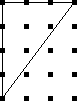
b is now 8 and i is 3, so Pick's theorem predicts an area of 8/2 + 3 - 1 = 6, which is still correct. This works even when the diagonal cuts through some lattice points:
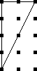
Here b is still 8, but i is only 1, so Pick predicts an area of 8/2 + 1 - 1 = 4.
It works for figures without right angles:

Here b=5 and i=0, for a total area of 3/2. We can check the area manually as follows:

The entire square has area 9. Regions A, B, and C each have area 1, and D has area 4½. That leaves X = 1½ as Pick's theorem says.
It works for more complicated figures too. Here we have b=7 and i=5 for a total area of 7½:
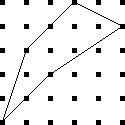
It works for non-convex polygons:

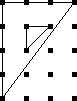
To fix Pick's theorem for non-simply-connected polygons, you need to say that each hole adds an extra -1 to the total area.
The proof of Pick's theorem isn't hard. You start by proving it that it holds for all triangles that have two sides parallel to the x and y axes. Then you prove it for all triangles, using a subtraction argument like the one I used above for triangle X. Finally, you use induction to prove it for more complicated regions, which can be built up from triangles.But the funny thing about Pick's theorem is that you can guess it even without a proof. Suppose someone told you that there was a formula for the size of a polygon in terms of the number of lattice points on the boundary and in the interior. Well, each interior point is surrounded by a square of area 1, which is typically inside the polygon:
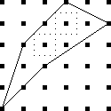
So each such point should contribute about 1 to the area. Of course, not all do; some will contribute a little less:
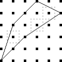
But there will also be parts of the polygon that are not near any interior points:
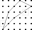
The points outside the polygon whose squares are partly inside (which count less than they should) will tend to balance out the contributions of the points inside whose squares are partly outside (which count more than they should.)
The squares around a point on the edge (but not the vertex) of the polygon will always be half inside, half outside, so that such a point will contribute exactly half of a square to the total:
The vertices are a little funny. They also contribute about ½, for the same reason that the edge points do. But convex vertices contribute rather less than ½:
While concave vertices contribute a bit more:
I made the diagrams for this article with a picture-drawing tool, originally designed at Bell Labs, called pic. The source code files for the illustrations were all named things like pick.pic, and the command to compile them to PostScript was pic pick.pic. This was really confusing.
[Other articles in category /math] permanent link
Wed, 05 Apr 2006
TeX and the long S
It just occurs to me, reading today's article, that the final
sentence is one of the strangest I've written in quite a while. It
says:
stock TeX does not have any way to make a long medial s.This is a strange thing to say because TeX was principally designed as a mathematical typesetting system, and one of the most common of all mathematical notations is the integral sign:
$$\int_a^b f'(x) dx = f(b) - f(a)$$
And the integral sign $$\int$$ is nothing more than an old-style long s; the 's' is for 'sum'.Strange or not, the substance of my remark is correct, since standard TeX's fonts do not provide a long s in a size suitable for use in running text in place of a regular s.
[Other articles in category /lang] permanent link
On baroque long S
Jokes about the long medial 's' are easy to make. Stan Freberg's
album Stan Freberg Presents: The United States of America,
Volume I: The Early Years has a scene in which John Adams or
Benjamin Franklin or one of those guys is reading Thomas Jefferson's draft
of the Declaration of Independence: "'Life, liberty, and the purfuit
of happinefs'? Tom, all your s's look like f's!"
A story by Frances Warfield, appropriately titled "Fpafm", gets probably as much juice out of the joke as there is to be got. I believe the copyright has expired, so here it is, in its entirety:
Well, fo much for that.FPAFM
by Frances Warfield
I ordered ham and eggs, as I always do on the diner, and then, as I always do, looked around for pamphlets. There was one handy, "Echoes of Colonial Days," it was called, "being a little fouvenir iffued from time to time, for the benefit of the guefts of The Baltimore & Ohio Railroad Company as a reminder of the pleafant moments fpent..." Involuntarily, my lips began to move. I reached for a pencil. But the man across from me already had his pencil out. He had written:"Oh, fay can you fee?"
I said, "Fing Fomething Fimple."
"Filly, ifn't it?" he said, and kept on writing.
I wrote: "Fing a Fong of Fixpence."
"Oh, ftop the fongs," he said, "Too eafy." He wrote: "The Courtfhip of Miles Fandifh," "I fee a fquirrel," "I undereftimate ftatefmanfhip," "My fifter feems fuperfenfitive," and, seeing that I did not appreciate the last one, which he evidently thought very fine, he wrote: "Forry to fee you fo ftupid."
I ate my lunch grouchily. How could I help it if he was in practice and I was not? He had probably taken this train before.
"Pafs the falt," I said.
"Pleafe pafs the falt," he triumphed.
I paid no attention. "Waiter!" I said. The waiter did not budge.
"You muft fpeak the language," said the man opposite me. "Fay, Fteward!"
The waiter jumped to attention. "Fir?" he said.
"Pleafe fill the faltcellar."
"The faltcellar fhall be replenifhed inftantly," replied the waiter, with a superior gleam in his eyes.
I smiled and my companion unbent a little. "Let's try for hard ones," he invited.
"Farcafm," he said.
"Fubftance."
"Fubfiftence," he scored.
"Fcythe."
"S's inside now," he ruled.
Perfuafive," I said instantly.
"Lanfguifh."
"Bafilifk."
"Quiefcent."
"Nonfenfe," I finished. "Fon of a fpeckled fea monfter."
"Ftep-fon of a poifonous fnake!" he cried.
"You don't fay fo!" I retorted.
"I do fay fo," he replied, getting up and leaving the diner.
"Fool!" I called after him, fniffiling.
Reading Baroque scientific papers, you see a lot of long-medial-s. Opening to a random page of the Philosophical Experiments and Observations of Robert Hooke, for example, we have:
The ſecond Experiment, was made, to ſhew a Way, how to find the true and comparative Expanſion of any metal, when melted, and ſo to compare it both with the Expanſion of the ſame metal, when ſolid, and likewiſe with the Expanſion of any other, either fluid or ſolid Body.As I read more of this sort of thing, I went through several phases. At first it I just found it confusing. Then later I started to get good at reading the words with f's instead of s's and it became funny. ("Fhew! Folid! Hee hee!") Then it stopped being funny, although I still noticed it and found it quaint and charming. Also a constant reminder of how learned and scholarly I am, to be reading this old stuff. (Yes, I really do think this way. Pathetic, isn't it? And you are an enabler of this pathetic behavior.) Then eventually I didn't notice it any more, except in a few startling cases, such as when Dr. Hooke wrote on the tendency of ice to incorporate air bubbles while freezing, and said "...at the ſame time it may not be ſaid to ſuck it in".
What hasn't happened, however: it hasn't become completely transparent. The long s really does look a lot like an f, so much so that I can find it confusing when the context doesn't help me out. The fact that these books are always facsimiles and that the originals were printed on coarse paper and the ink has smudged, does not make it any easier to tell when one is looking at an s and when at an f. So far, the most difficult instance I have encountered involved a reference to "the Learned Dr. Voſſius". Or was it Voffius? Or Vofſius? Or was it Voſfius? Well, I found out later it was indeed Vossius; this is Dr. Gerhard Johann Voss (1577-1649), Latinized to "Vossius". But I was only able to be sure because I encountered the name somewhere else with the short s's.
This typographic detail raises a question of scholarly ethics that I don't know how to answer. In an earlier article, I needed to show how 17th-century writers referred to dates early in the year, which in common nomenclature occurred during one year, but which legally were part of the preceding year. Simply quoting one of these writers wasn't enough, because the date was disambiguated typographically, with the digit for the legal year directly above the digit for the conventional year. So I programmed TeX to demonstrate the typography:

- Most permissible is to replace the original 17th-century font with
a modern one.
- Slightly less permissible would be to reduce the heavy
17th-century usage of italic face, in Royal Society for
example, replacing it with roman typefaces.
- Slightly less permissible still would be to replace the
17th-century capitalization conventions with 20th-century conventions.
For example, in C20 we would not capitalize "Remark".
- Then can I replace obsolete 17th-century contractions such as
"consider'd" with 20th-century equivalents such as "considered"? If
that is acceptable, then what about "'tis"? Can I replace "3dly"
with "thirdly"?
- Can I replace obsolete Baroque spellings such as "plaister",
"fatt", and "it self" with "plaster", "fat", and "itself"?
- Can I replace obsolete Baroquisms such as "strow'd" in "strow'd on
Ice" with "strewn", or "stopple" with "stopper"?
- At the bottom of the list, I could just rewrite the whole thing in a modern style and pass it off as what Derham actually wrote.
[Other articles in category /lang] permanent link
Tue, 04 Apr 2006
Hero's formula
On of my favorite search engine queries of last month was:
        this mathematician's best known work is the formula for the
        area of a triangle in terms of the lengths of it's sides. who
        is this and when did they live?
This is the kind of question that always trips me up in Jeopardy.
(And doesn't that first sentence sounds just like a Jeopardy question?
"I'll take triangles for $600, Alex. . .") The ears hear
"mathematician", "triangle", "formula", and the mouth says "Who was
Pythagoras!" without any conscious intervention. But the answer here
is almost certainly Hero of Alexandria.Hero's formula, or Heron's formula, has always seemed to me like something of an oddity. It doesn't look like any other formula in geometry. Usually to get anything useful from a triangle you need to involve the angles, and express the results in terms of trigonometric functions. This will be obvious if you pause to remember what the phrase "trigonometric function" means. The few rare cases in which you can avoid trigonometry (there's that word again) usually involve special cases, such as right triangles.
But Hero's formula expresses the area of a triangle in terms of the lengths of its sides, with no angles and no trigonometric functions. If we were trying to discover such a formula, we might proceed trigonometrically, and then hope we could somehow eliminate the trigonometry by the end. So we might proceed as follows:
The magnitude of the cross product a×b is the area of the parallelogram with sides a and b, so the area of the triangle is half that. And |a × b| = |a||b| sin θ, where θ is the angle between the two vectors. So if a and b are sides of a triangle and the included angle is θ, the area A is ab/2 · sin θ.
Now we want θ is in terms of the third side c. The law of cosines generalizes the Pythagorean theorem to non-right triangles: c2 = a2 + b2 - 2ab cos θ, where θ is the included angle between sides a and b. (In a right triangle, θ = 90°, and the cosine term drops out.) So we have cos θ = (a2 + b2 - c2) / 2ab. But we want sine instead of cosine, so convert cosine to sine using sin θ = √(1-cos2θ), which yields:
$$\sin\theta = {1\over 2ab}\sqrt{4a^2b^2 - {(a^2 + b^2 - c^2)}^2}$$
Expanding out the right-hand side, and remembering that what we really want is A = ab/2 sin θ. we get:
$$A = {1\over4}\sqrt{2a^2b^2 + 2a^2c^2 + 2b^2c^2 - a^4 - b^4 - c^4}$$.
Now, that might satisfy anyone, but Hero's answer is better. Hero says: Let p be the "semiperimeter" of the triangle; that is, p = (a+b+c)/2. Then the area of the triangle is just √(p(p-a)(p-b)(p-c)). This is "Hero's formula".Hero's formula is simple and easy to remember, which (2a2b2 + 2a2c2 + 2b2c2 - a4 - b4- c4)/16 is not. If you expand out Hero's formula, you find that that the two formulas are the same, as of course they must be. But if you have only the complicated fourth-degree polynomial, how would you get the idea that putting it in terms of p will simplify it? There is some technique or insight here that I am missing.
Even though such technique is the indispensable tool of the working mathematician, mathematical writing customarily scorns such technique,and has numerous phrases for disparaging it or kicking it under the carpet. For example, having gotten the fourth-degree polynomial, we might say "obviously, this is equivalent to Hero's formula", or "it is left to the student to prove that the two formulations are equivalent." Or we could just skip direct from the polynomial to Hero's formula, and say what Wikipedia says in the same situation: "Here the simple algebra in the last step was omitted."
Indeed, if you are trying to prove that Hero's formula is true, it's tedious but straightforward to grovel over the algebra and grind out that the two formulations are the same. But all this ignores the real problem, which is that nobody looking at the trigonometric formulation would know to guess Hero's formula if they had not seen it before. A proof serves two purposes. it is supposed to persuade you that the theorem is true. But more importantly, it is supposed to help you understand why it is true, and to give you some insight that may help you solve similar problems. The proof-by-handwaving-away-complex-and-unexpected-algebra technique serves the first purpose, but not the second. And Hero did not discover the formula using this approach anyway, since he did not take a trig class when he was in high school.
Another way to proceed is to drop a perpendicular from the vertex opposite side c. If the length of the perpendicular is h, the area of the triangle is hc/2. But if the foot of the perpendicular divides c into x + y, we also have x2 + h2 = a2 and y2 + h2 = b2. Grovelling over the algebra again yields something equivalent to Hero's formula.
I don't know a good proof of Hero's formula. I haven't seen Hero's, about which MathWorld says:
Heron's proof is ingenious but extremely convoluted, bringing together a sequence of apparently unrelated geometric identities and relying on the properties of cyclic quadrilaterals and right triangles.A "cyclic quadrilateral" is a quadrilateral whose vertices all lie on a circle. Any triangle can be considered a degenerate cyclic quadrilateral, which happens to have two of its vertices in the same place. Indeed, there's a formula, called "Bretschneider's formula", just like Hero's, but for the area of a cyclic quadrilateral: A = √((p-a)(p-b)(p-c)(p-d)), where a, b, c, d are the lengths of the sides and p is the semiperimeter. If you consider that a triangle is just a cyclic quadrilateral one of whose sides has length 0, you put d = 0 in Bretschneider's formula and you get out Hero's formula.
[Other articles in category /math] permanent link
Mon, 03 Apr 2006
Google query roundup
Once again I am going to write up the interesting Google queries that
my blog has attracted this month. The blog is now about eleven weeks
old and has had a meteoric rise. The theme of this month's Google
query roundup will be the idea of authority on the web, and the
attribution of authority by links.
Of the 32 million blogs that Technorati.com knows about, they consider The Universe of Discourse to be the 13th most-authoritative blog on the subject of mathematics. Okay, I can almost buy that, because I do know a fair amount about mathematics, a lot of people know that about me, and I can probably write more clearly and convincingly than most mathematics experts. But their same ranking process says that The Universe of Discourse is tied for 16th place as one of the most-authoritative blogs on the subject of physics. Considering that I know next to nothing about physics, this is rather sad. If I wrote an article explaining how spacetime was curved like an artichoke, and a thousand people linked to it because they enjoyed the spectacle of someone making a fool of himself in public, my blog would move up the list to fourth place.
Google rankings are similarly weird. My whole web site is considered authoritative in general, because of various articles I've written and projects I've hosted over the years. The way Google works is that each page has an absolute pagerank, and then you get the pages with greatest pagerank that contain your search terms. So if my relatively high-ranking pages happen to contain your search terms, that's what you get, even if that doesn't really make sense.
For example, a Google search for "baroque writing" turns up my blog post about it as hit #5, because my site has high pagerank, and the sites that are really about baroque writing have low pagerank. But the high pagerank of my pages is primarily because I also host a long-established and popular website about Perl, and lots of people have linked to it over the years. So Google recommends my thoughts about Baroque writing because I'm an authority on the Perl programming language. This is not obviously a good reason to recommend a page about Baroque writing.
Of course one can argue that it's unreasonable to expect Google to judge whether I know what I'm talking about or not. But there is a way that they could do it, at least in principle, that would make more sense. Instead of computing pageranks globally, and saying "well, Dominus's pages are generally well thought-of, so we'll recommend those pages whenever they might be relevant to the query", one could compute pageranks per subject. So suppose you first considered only those pages that mention Baroque writing, and discard all the others. Then you do the pagerank calculation to see which of these pages link to which others. You would find a much better pagerank for searches about Baroque writing. My page would have low rank, because it is linked to by few pages about Baroque writing, rather than the high rank it does have because it is linked to by many pages about Perl.
Strange authority
All of which is intended to introduce the fact that my blog now comes up 12th in a search for the Indiana Pacers cheerleaders, and I got several queries this month about it:
           1 ashley indiana pacemate
           4 "lindsay" indiana pacemate
           1 pacemate lindsay
Not-so-strange authority
Sometimes this attribution of authority is less bemusing. As I think I mentioned before, I am pleased to have my pages come up at the top of a list of those about the abridgement of the Doctor Dolittle books. Other topics on which Google rightly considers me an important reference are the abridgement of the "Doctor Dolittle" books (4), the puzzle that ends with "how long is the banana?" (19), the puzzle where you take the first digit off of some integer and append it to the end (5), enumeration of strings of balanced parentheses (7) and, my favorite, the difference between "farther" and "further" (2), and vitamin A poisoning (13).Sometimes there are weird side effects. My authority on the puzzle about the banana and the rope and the monkey's mother also pulls in people looking for stuff that sounds similar, but probably isn't:
           1 "monkey rope" joke
           1 monkey & banana game source code
           1 monkeys holding up the moon
           1 steps on how to draw a monkey holding a banana
           1 how to draw a banana
           1 picture of a monkey holding a banana
Other matters
In the "you got the right answer even though you asked the wrong question" department, we have:
           2 smallest positive value with no leading zeros such that
             rotating it is the same as multiplying it by p/q + puzzle
This is weird, because the answer is obviously 1. Oh, you wanted the smallest value with at least two digits? That's obviously 10.
Oh, you wanted the resulting number to have no leading zeroes either? Then it's obviously 11.
Oh, you wanted the resulting number to be different from the original one? Then it's obviously 12, because when you rotate it, you get 21, which the same as multiplying it by 21/12.
In fact, for any number, rotating it has the same effect as multiplying it by p/q for some p and q. Maybe the author wanted p and q specified in advance.
Islamic history and Arabic etymology
Several visitors arrived at my site because they were looking for "qamara":
	   1 qamara
	  11 qamara
	   1 qamara arabic
	   2 qamara camera
	   3 qamara camera obscura
	   2 camera obscura qamara
	   1 ibn haitham qamara
The word seems to have several meanings. The reason I mentioned it was because of Paul Vallely's stupid article which asserts that English "camera" is derived from Arabic "qamara". Which is nonsense. At least some of the searchers were investigating this.
There might have been some other queries of a similar nature. For example, this one probably is:
1 arabic saqqAs is this:
1 saqqAnd these might have been related or not:
	   3 etymology cheque
	   1 cheque + etymology
And these searches turn up my pages refuting Paul Vallely's stupid claims about the influence of Muslim science and technology. There are plenty of non-stupid claims to make on this topic, of course, some of which I have written about in the past.
Vallely may have gotten his misinformation from the execrable 1001 Inventions web site, which is a mountain of misinformation on this topic. I expect to write at more length about this in the future. In the meantime, here is my summary of the web site:
Did you know that the belt was invented by Muslim tailor al-Qurashi in the year 1274, and was not widely adopted in Europe until the 14th century? Before that, Europeans had to walk around holding up their trousers with their hands, and had nothing from which to hang their wallets! The word 'belt' is from the Arabic 'balq', which means 'look down!'There is plenty more to say about this web site. Its mendacious boasts offend many thoughtful Muslims and many thoughtful non-Muslims, as the comments in the "blog" section demonstrate.
[Other articles in category /google-roundup] permanent link
Sun, 02 Apr 2006
Addenda to recent articles 200603
Here are some notes on posts from the last
month that I couldn't find better places for.
- In my close attention
to the most embarrassing moments of the Indiana Pacemates, I
completely missed the fact that Pacemate Nikki,
the only one who admitted to farting in public, also reports that she
was born with twelve fingers.
- Regarding the
manufacture of spherical objects, I omitted several kinds of
spherical objects that are not manufactured in any of the ways I
discussed.
 One is the gumball. It's turned out to be surprisingly difficult to
get definitive information about how gumballs are manufactured. My
present understanding is that the gum is first extruded in a sort of
hollow pipe shape, and then clipped off into balls with a pinching
device something like the Civil-War-era bullet mold pictured at right.
The gumballs are then sprayed with a hard, shiny coating, which tends
to even out any irregularities.
One is the gumball. It's turned out to be surprisingly difficult to
get definitive information about how gumballs are manufactured. My
present understanding is that the gum is first extruded in a sort of
hollow pipe shape, and then clipped off into balls with a pinching
device something like the Civil-War-era bullet mold pictured at right.
The gumballs are then sprayed with a hard, shiny coating, which tends
to even out any irregularities.[ Addendum 20070307: the bullet mold at right is probably not used in the way I said. See this addendum for more details. ]
- Glass marbles are made with several processes. One of the most
interesting involves a device invented by Martin Frederick
Christensen. (US Patent #802,495, "Machine For Making Spherical
Bodies Or Balls".) The device has two wheels, each with a deep groove
around the rim. The grooves have a semicircular cross-section. The
wheels rotate in opposite directions on parallel axes, and are aligned
so that the space between the two grooves is exactly circular.
The marble is initially a slug of hot glass cut from the end of a long rod. The slug sits in the two grooves and is rolled into a spherical shape by the rotating wheels. For more details, see the Akron Marbles web site.
Fiberglas is spun from a big vat of melted glass; to promote melting, the glass starts out in the form of marbles. ("Marbles" appears to be the correct jargon term.) I have not been able to find out how they make the marbles to begin with. I found patents for the manufacture of Fiberglas from the marbles, but nothing about how the marbles themselves are made. Presumably they are not made with an apparatus as sophisticated as Christensen's, since it is not important that the marbles be exactly spherical. Wikipedia hints at "rollers".
 The thingies pictured to the right are another kind of
nearly-spherical object I forgot about when I wrote the original
article. They are pellets of taconite ore. Back in the 1950s, the
supply of high-quality iron ore started to run out. Taconite contains
about 30% iron, but the metal is in the form of tiny particles
dispersed throughout very hard inert rock. To extract the iron, you
first crush the taconite to powder, and then magnetically separate the
iron dust from the rock dust.
The thingies pictured to the right are another kind of
nearly-spherical object I forgot about when I wrote the original
article. They are pellets of taconite ore. Back in the 1950s, the
supply of high-quality iron ore started to run out. Taconite contains
about 30% iron, but the metal is in the form of tiny particles
dispersed throughout very hard inert rock. To extract the iron, you
first crush the taconite to powder, and then magnetically separate the
iron dust from the rock dust. But now you have a problem. Iron dust is tremendously inconvenient to handle. The slightest breeze spreads it all over the place. It sticks to things, it blows away. It can't be dumped into the smelting furnace, because it will blow right back out. And iron-refining processes were not equipped for pure iron anyway; they were developed for high-grade ore, which contains about 65% iron.
The solution is to take the iron powder and mix it with some water, then roll it in a drum with wet clay. The iron powder and clay accumulate into pellets about a half-inch in diameter, and the pellets are dried. Pellets are easy to transport and to store. You can dump them into an open rail car, and most of them will still be in the rail car when it arrives at the refinery. (Some of them fall out. If you visit freight rail tracks, you'll find the pellets. I first learned about taconite because I found the pellets on the ground underneath the Conrail freight tracks at 32nd and Chestnut Streets in Philadelphia. Then I wondered for years what they were until one day I happened to run across a picture of them in a book I was reading.)
When the pellets arrive at the smelter, you can dump them in. The pellets have around 65% iron content, which is just what the smelter was designed for.
- Regarding my assertion
that there is no way to include a menu of recent posts in the "head"
part of the Blosxom output, I said:
With stock Blosxom, however, this is impossible. The first problem you encounter is that there is no stories_done callback.
Todd Larason pointed out that this is mistaken, because (as I mentioned in the article) the foot template is called once, just after all the stories are processed, and that is just what I was asking for.My first reaction was "Duh."
My second reaction was to protest that it had never occurred to me to use foot, because that is not what it is for. It is for assembling the footer!
There are two things wrong with this protest. First, it isn't a true statement of history. It never occurred to me to use foot, true, but not for the reason I wanted to claim. The real reason is that I thought of a different solution first, implemented it, and stopped thinking about it. If anything, this is a credit to Blosxom, because it shows that some problems in Blosxom can be solved in multiple ways. This speaks well to the simplicity and openness of Blosxom's architecture.
The other thing wrong with this protest is that it assumes that that is not what foot is for. For all I know, when Blosxom's author was writing Blosxom, he considered adding a stories_done callback, and, after a moment of reflection, concluded that if someone ever wanted that, they could just use foot instead. This would be entirely consistent with the rest of Blosxom's design.
M. Larason also pointed out that even though the head template (where I wanted the menu to go) is filled out and appended to the output before the article titles are gathered, it is not too late to change it. Any plugin can get last licks on the output by modifying the global $blosxom::output variable at the last minute. So (for example) I could have put PUT THE MENU HERE into the head template, and then had my plugin do:
$blosxom::output =~ s/PUT THE MENU HERE/$completed_menu/g;to get the menu into the output, without hacking on the base code.Thank you, M. Larason.
- My article on the 20 most
important tools attracted a lot of attention.
- I briefly considered and rejected the spinning
wheel, on the theory that people have spun plenty of thread with
nothing but their bare fingers and a stick to wind it around.
Brad Murray and I had a long conversation about this, in which he described his experience using and watching others use several kinds of spinning tools, including the spinning wheel, charkha (an Indian spining wheel), drop spindle, and bare fingers, and said "I can't imagine making a whole garment with my output sans tools." It eventually dawned on me that I did not know what a drop spindle was.
A drop spindle is a device for making yarn or thread. The basic process of making yarn or thread is this: you take some kind of natural fiber, such as wool, cotton, or flax fiber, which you have combed out so that the individual fibers are more or less going the same direction. Then you twist some of the fibers into a thread. So you have this big tangled mass of fiber with a twisted thread sticking out of it. You tug on the thread, pulling it out gently, while still twisting, and more fibers start to come away from the mass and get twisted into the thread. You keep tugging and twisting and eventually all the fiber is twisted into a thread. "Spinning" is this tugging-twisting process that turns the mass of combed fibers into yarn.
You can do this entirely by hand, but it's slow. The drop spindle makes it a lot faster. A drop spindle is a stick with a hook stuck into one end and a flywheel (the "whorl") near the other end. You hang the spindle by the hook from the unspun fiber and spin it.
As the spindle revolves, the hook twists the wool into a thread. The spindle is hanging unsupported from the fiber mass, so gravity tends to tug more fibers out of the mass, and you help this along with your fingers. The spindle continues to revolve at a more-or-less constant rate because of the flywheel, producing a thread of more-or-less constant twist. If you feed the growing thread uniformly, you get a thread of uniform thickness.
When you have enough thread (or when the spindle gets too close to the floor) you unhook the thread temporarily, wind the spun thread onto the shaft of the spindle, rehook it, and continue spinning.
A spinning wheel is an elaboration of this basic device. The flywheel is separate from the spindle itself, and drives it via a belt arrangement. (The big wheel you probably picture in your mind when you think of a spinning wheel is the flywheel.) The flywheel keeps the spindle revolving at a uniform rate. The spinning wheel also has a widget to keep the tension constant in the yarn. With the wheel, you can spin a more uniform thread than with a drop spindle and you can spin it faster.
I tried hard to write a coherent explanation of spinning, and although spinning is very simple it's awfully hard to describe for some reason. I read several descriptions on the web that all left me scratching my head; what finally cleared it up for me was the videos of drop spinning at the superb The Joy of Handspinning web site. If my description left you scratching your head, check out the videos; the "spinning" video will make it perfectly clear.
The drop spindle now seems to me like a good contender for one of the twenty most-important tools. My omission of it wasn't an oversight, but just plain old ignorance. I thought that the spinning wheel was an incremental improvement on simpler tools, but I misunderstood what the simpler tools were.
 The charkha, by the way, is an Indian configuration of the spinning
wheel; "charkha" is just Hindi for "wheel". There are several
varieties of the charkha, one of which is the box charkha, a
horizontal spinning wheel in a box. The picture to the right depicts
Gandhi with a box charkha.
The charkha, by the way, is an Indian configuration of the spinning
wheel; "charkha" is just Hindi for "wheel". There are several
varieties of the charkha, one of which is the box charkha, a
horizontal spinning wheel in a box. The picture to the right depicts
Gandhi with a box charkha.
- Doug Orleans asked whether I had considered the key. I hadn't,
but I think it's exempt from consideration for the same kinds of
reasons as those I cited for the remote control: any particular key
serves not a general door-opening function but a specific one. Not
that keys aren't important, but rather, they seem to be outside the
scope of this particular discussion.
- Mike Krell asked why I would list the radio on my third-tier list
and omit the computer. Obviously, the question is not one of
usefulness or of importance, but of whether the "computer" is a "tool"
in the original sense of the list, or whether it is disqualified by
reason of being too general, too abstract, too complex, or something
like that. I made several arguments, most of which I think he
refuted.
My initial answer was that computers are disqualified for the same reason that remote controls are: people do carry calculators, cell phones, personal organizers, handheld GPS devices, and (if they work for FedEx) package tracking gizmos. All of these are tools that incorporate computers, but they don't really seem to be merely different forms of the same thing. Each one is a tool, but "computer" is not, similar to the way that the microscope and the telescope are different tools, and not merely variations of "the lens".
Perhaps so, but then I had a fit of insanity and asserted that people do not walk around toting general-purpose computers in case they happen upon some data that needs processing. M. Krell very gently pointed out that yes, they do exactly that: "I see them every time I fly on an airplane, breaking them out to process some data for work (or play) as soon as the flight attendant says it's OK." Whoops. Quite so.
M. Krell suggested that by restricting the definition of "tool" to devices that perform a single specific function or a few such functions, I have circumscribed the definition of "tool" in an arbitrary way that "does not accurately reflect the realities of our current Information Age". Okay.
- Jon Evans said "Everyone always forgets the hoe." I did indeed
forget the hoe. Not quite a knife, not quite a shovel...
- I briefly considered and rejected the spinning
wheel, on the theory that people have spun plenty of thread with
nothing but their bare fingers and a stick to wind it around.
- Regarding the start of the year prior to 1751, when it
was moved from 25 March to 1 January. You may recall that I had a
series of articles
(1
2
3
4)
in which I was concerned that Benjamin Franklin
might be only 299 years old, not 300, because of confusion about just
what year was meant in discussions of the date "6 January 1706". (The
legal year 1705 ran from 25 March 1705 through 24 March 1706.)
This ambiguity
was confusing at the time as well. It makes little difference to my
life whether Franklin is 300 years old or only 299, but if you were a
person living in 1706, you might like to be sure, when someone said
they would pay you fifty shillings on 6 January 1706, when the payment
would be.
It seems that baroque authors had a convention to disambiguate such dates. Here's a quote from William Derham's 1726 introduction to Robert Hooke's notes on the invention of the barometer:
To this I W.D. shall add another Remark I find in the minutes of the Royal Society, February 20. !!167^8_9!!, viz.…
And similarly, from Richard Waller's summary of The Life of Dr. Robert Hooke:
…they prosecuted their former Inquiries, their first meeting at Arundel house being on the ninth of Jan. !!166^6_7!!.
- * In an
earlier post, I referred to "Ramanujan's approximation to π":
$$ \cfrac{1}{1+ \cfrac{e^{-2\pi}}{1 + \cfrac{e^{-4\pi}}{1 + \cdots}}} = \left( \sqrt{\frac{5+\sqrt5}2} - \frac{\sqrt5-1}2 \right) e^{2\pi/5} $$ But this isn't the formula I was thinking of; I showed the wrong formula! It's obviously not an approximation to π. The approximation formula I was thinking of is no less astonishing:
$${1\over\pi} = {\sqrt8\over9801} \sum_{i=0}^\infty { (4i)! (1103 + 26390i) \over (i!)^4 (396)^{4i} }$$
- Finally, in my article on the
20 most important tools, I said that I didn't think I knew anyone
who had used a gas chromatograph; Geoffrey Young pointed out that he
had used one.
[Other articles in category /addenda] permanent link