Mark Dominus (陶敏修)
mjd@pobox.com

Archive:
| 2024: | JFMA |
| 2023: | JFMAMJ |
| JASOND | |
| 2022: | JFMAMJ |
| JASOND | |
| 2021: | JFMAMJ |
| JASOND | |
| 2020: | JFMAMJ |
| JASOND | |
| 2019: | JFMAMJ |
| JASOND | |
| 2018: | JFMAMJ |
| JASOND | |
| 2017: | JFMAMJ |
| JASOND | |
| 2016: | JFMAMJ |
| JASOND | |
| 2015: | JFMAMJ |
| JASOND | |
| 2014: | JFMAMJ |
| JASOND | |
| 2013: | JFMAMJ |
| JASOND | |
| 2012: | JFMAMJ |
| JASOND | |
| 2011: | JFMAMJ |
| JASOND | |
| 2010: | JFMAMJ |
| JASOND | |
| 2009: | JFMAMJ |
| JASOND | |
| 2008: | JFMAMJ |
| JASOND | |
| 2007: | JFMAMJ |
| JASOND | |
| 2006: | JFMAMJ |
| JASOND | |
| 2005: | OND |
In this section:
| Abbreviations in medieval manuscripts |
| Diacritics and horseheads |
| Middle English fonts and orthography |
| Mystery of the misaligned lowercase ‘p’ |
| Typographical mysteries of Yeadon |
Subtopics:
| Mathematics | 238 |
| Programming | 99 |
| Language | 92 |
| Miscellaneous | 67 |
| Book | 49 |
| Tech | 48 |
| Etymology | 34 |
| Haskell | 33 |
| Oops | 30 |
| Unix | 27 |
| Cosmic Call | 25 |
| Math SE | 23 |
| Physics | 21 |
| Law | 21 |
| Perl | 17 |
| Biology | 15 |


Comments disabled
Wed, 10 Jun 2020
Middle English fonts and orthography
In case you're interested, here's what the Caxton “eggys” anecdote looked like originally:
2
3
4
5
6
7
8
9
10
11
12
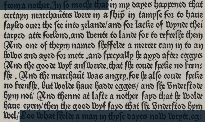
In my dayes happened that
certain marchaȗtes were in a ship in tamyse for to haue
sayled ouer the see into zelande / and for lacke of wynde thei
taryed atte forlond. and wente to lande for to refreshe them
And one of theym named Sheffelde a mercer cam in to an
hows and axed for mete. and specyally he axyd after eggys
And the goode wyf answerde.that she coude speke no fren-
she. And the marchaȗt was angry. For he also coude speke
no frenshe. But wolde haue hadde egges / and she understode
hym not/ And thenne at laste a nother sayd he wolde
haue eyren/ then the good wyf sayd that she understod hym
wel/
It takes a while to get used to the dense black-letter font, and I think it will help to know the following:
Except at the end of a word, the letter ‘s’ is always written as the “long s”
 , ‘ſ’, which is easy
to confuse with ‘f’
, ‘ſ’, which is easy
to confuse with ‘f’  .
.Compare the ‘f’ and ‘s’ in “frenshe”
 (line 9) or “wyf sayd”
 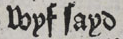 (line 11).
Some of the ‘r’s are the “rounded r”, ‘ꝛ’,
 . which looks like a ‘2’. But it
is not a ‘2’, it is an ‘r’.
. which looks like a ‘2’. But it
is not a ‘2’, it is an ‘r’.Examples include “for”
 (line 2) and “after”
 (line 6).
In “marchaȗtes”
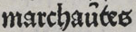 (line 2), the mark above the ‘ȗ’ is an abbreviation for letter ‘n’ (it's
actually a tiny ‘n’), so this word is actually “marchauntes”.
Similarly “marchaȗt” in line 8 is an abbreviation for “marchaunt”.
I have written about this kind of abbreviation before:
Abbreviations in medieval manuscripts.
(line 2), the mark above the ‘ȗ’ is an abbreviation for letter ‘n’ (it's
actually a tiny ‘n’), so this word is actually “marchauntes”.
Similarly “marchaȗt” in line 8 is an abbreviation for “marchaunt”.
I have written about this kind of abbreviation before:
Abbreviations in medieval manuscripts.
[Other articles in category /IT/typo] permanent link
Fri, 27 Sep 2019
Typographical mysteries of Yeadon
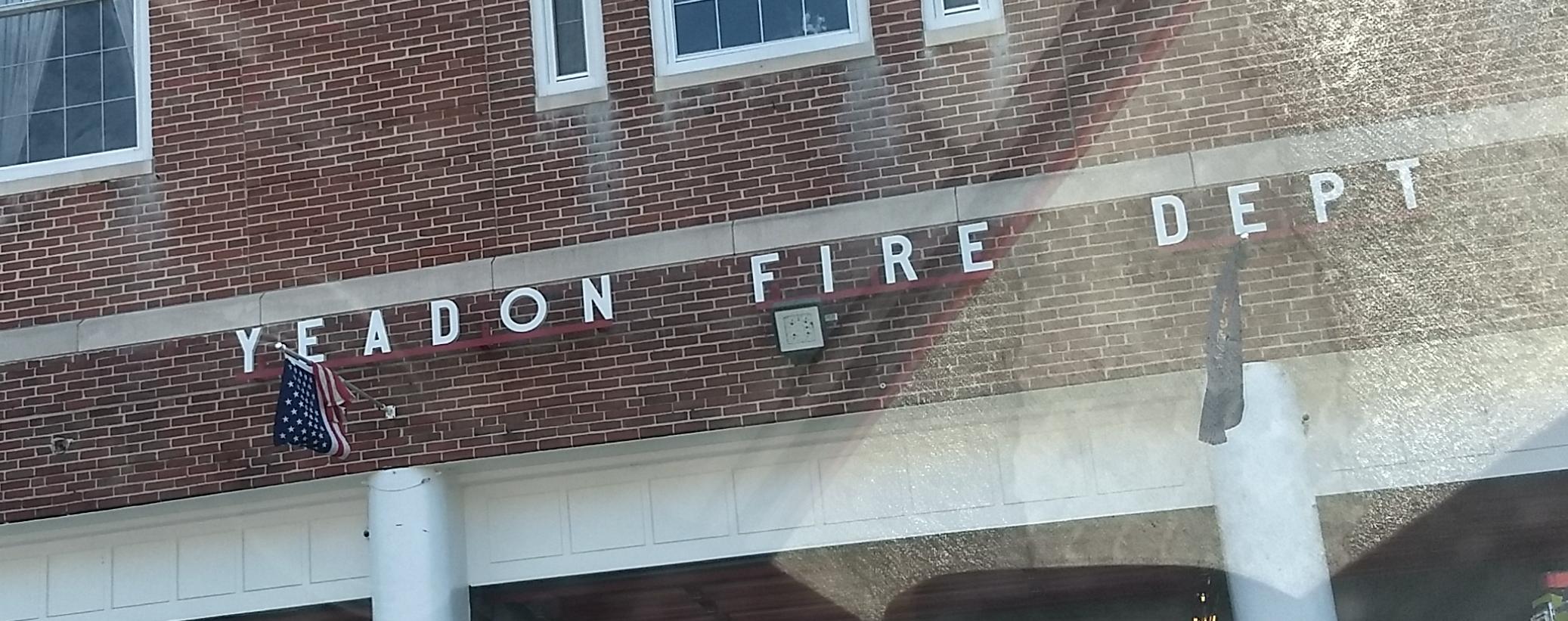
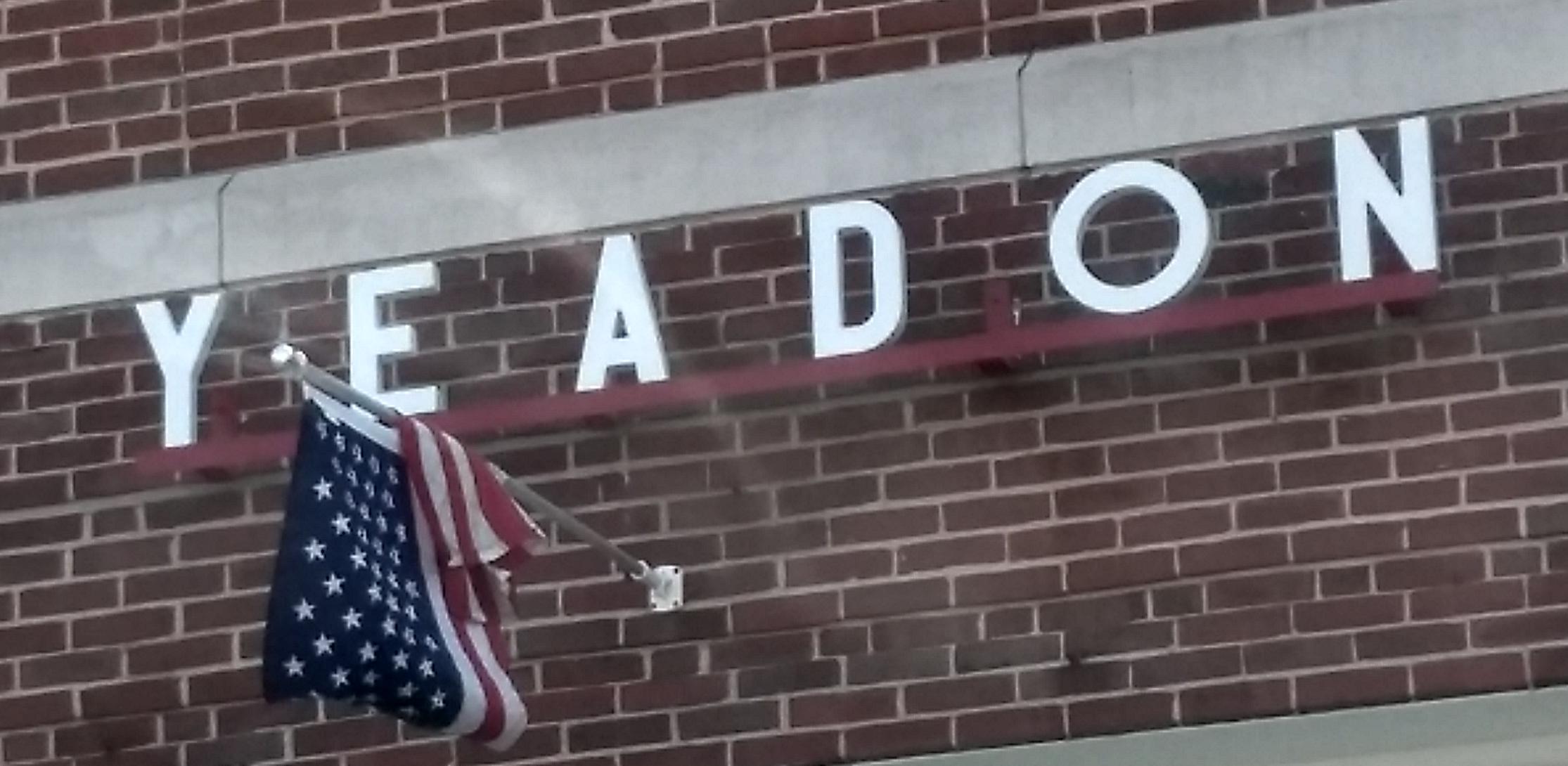
Here are some pictures I took of the firehouse in Yeadon, PA.
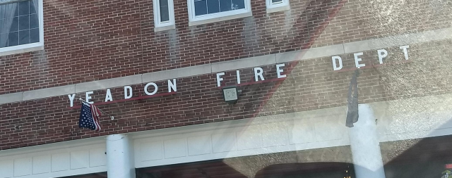
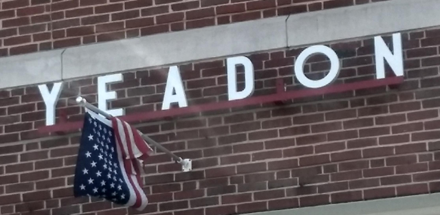
Every time I drive past this, I wonder: is that the original letter “O”? Or was there originally a narrow “O” that was lost or damaged, and which couldn't be replaced with a matching letter?
Here's the Google Street View version, from November 2016. The letters are painted green, but the “O” is still the circular one.
[ Addendum 20191004: More about this ]
[Other articles in category /IT/typo] permanent link
Thu, 23 Jul 2015
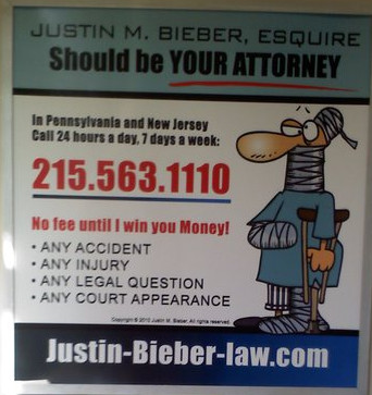
Mystery of the misaligned lowercase ‘p’

I've seen this ad on the subway at least a hundred times, but I never noticed this oddity before:
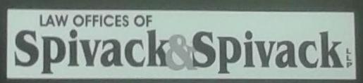
Specifically, check out the vertical alignment of those ‘p’s:

Notice that it is not simply an unusual font. The height of the ‘p’ matches the other lowercase letters exactly. Here's how it ought to look:

At first I thought the designer was going for a playful, informal logotype. Some of the other lawyers who advertise in the subway go for a playful, informal look. But it seemed odd in the context of the rest of the sign.
As I wondered what happened here, a whole story unfolded in my mind. Here's how I imagine it went down:
The ‘p’, in proper position, collided with the edge of the light-colored box, or overlapped it entirely, causing the serif to disappear into the black area.
The designer (Spivack's nephew) suggested enlarging the box, but there was not enough room. The sign must fit a standard subway car frame, so its size is prescribed.
The designer then suggested eliminating “LAW OFFICES OF”, or eliminating some of the following copy, or reducing its size, but Spivack refused to cede even a single line. “Millions for defense,” cried Spivack, “but not one cent for tribute!”
Spivack found the obvious solution: “Just move the up the ‘p’ so it doesn't bump into the edge, stupid!” Spivack's nephew complied. “Looks great!” said Spivack. “Print it!”
I have no real reason to believe that most of this is true, but I find it all so very plausible.
[ Addendum: Noted typographic expert Jonathan Hoefler says “I'm certain you are correct.” ]
[Other articles in category /IT/typo] permanent link
Sat, 29 Apr 2006
Abbreviations in medieval manuscripts
In an earlier article I
discussed my surprise at finding "examples" and "alteration"
abbreviated to "exãples" and "alteratiõ" in Robert
Recorde's 1557 book The Whetstone of Witte. Then later
I quoted Jonathan
Hoefler, an expert in typographical matters:
Diacritical marks have been used to abbreviate printed words ever since Gutenberg, and early English printers adopted the same conventions that Gutenberg used for Latin (a trick he picked up from medieval scribes.)Shortly afterward I realized that I have some reproductions of illuminated manuscripts — they're hanging in the bathroom, so I see them every day — and could actually see this for myself. This one is my favorite:
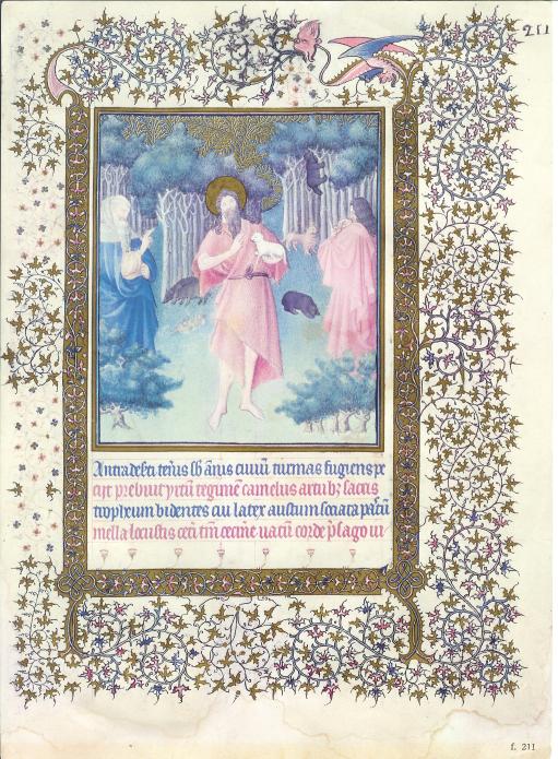
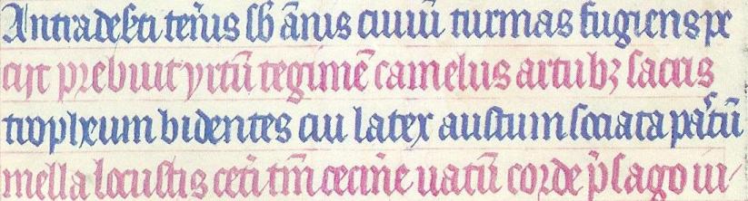
- I can't make head or tail of most of it, but
- the fourth line begins mella locustis.
Eventually I did what I should have done in the first place and plugged mella locustis into Google. The result was quite conclusive. The words here are from a very famous hymn about John the Baptist, attributed to Paulus Diaconus (c. 720 -799). The hymn is in three parts, and this is the beginning of the second part. The words here are:
Antra deserti teneris sub annisI've colored the text here to match the text in the manuscript. Stuff in gray in the first verse is omitted from the manuscript; I do not know why. A copying error, perhaps? Or a change in the words?
civium turmas fugiens, petisti,
n levi saltim maculare vitam
famine posses.
Praebuit hirtum tegimen camelus,
artubus sacris strofium bidentis,
cui latex haustum, sociata pastum
mella locustis.
Caeteri tantum cecinere vatum
corde praesago iubar adfuturum;
...
The amount of abbreviation here is just amazing. In the first line, deserti is abbreviated deseti, and the s and the e are all squashed together, sub is abbreviated sb, annus is abbreviated ãnis, civium is abbreviated civiû and is illegible anyway, because the letters all look alike, as in Russian cursive. (I have a similar problem with cui on the third line.)
On the second line, artubus is written artub3; Hoefler had already pointed out to me that the 3 was a common notation in 16th-century printing. On the third line, pastum is written pa'tû, where the wiggly mark between the a and the t denotes an elided s. Or perhaps the scribe left it out by mistake and then went back to squeeze it in later.
Probably the most amazing abbreviations in the whole thing are in the fourth line. (I wonder if perhaps the scribe realized he was running out of room and wanted to squeeze in as much as possible.) The word caeteri is abbreviated to ceti, tantum to tm, and praesago to p'sago. (Also note uatû, which is an abbreviation for vatum; I had been wondering for some time what Uatu had to do with it.)
There are a number of other typographical features of interest. The third word in the second line is apparently hirtum. The hi in the manuscript is written as a sort of a V-shape. The r in corde on the fourth line (and elsewhere) is a form that was once common, but is now obsolete.
This hymn, by the way, is the one that gives us the names do, re, mi, fa, so, la, si for the notes of the major scale. The first part of the hymn begins:
Ut queant laxis resonare fibris"Ut" was later changed to "do" because "do" is open while "ut" is closed. Scholars speculate that the name "si" was chosen because it is the initials of the words in the final line.
mira gestorum famuli tuorum,
solve polluti labii reatum,
sancte Iohannes!
The thing about the locusts and wild honey reminds me of something else. I was once on a business trip to Ottawa and found that there was a French Bible in my hotel room. And I discovered that, although I cannot read French, I could read the Bible in French, because I already knew what it was going to say. So I lay in bed and read the French Bible and enjoyed the rather strange sensation of being able to pretend to myself to be able to read French.
Two points struck me at the time. One was that when I read "Dieu dit: Que la lumière soit!" ("God said, 'Let there be light'") my instant reaction was to laugh at how absurd it was to suggest that God had spoken French when He created the universe. It's like that Reader's Digest joke about the guy who thinks the Spanish-speaking folks are silly for talking to the squirrels in the park in Spanish, because squirrels don't speak Spanish. I didn't know I had that in me, but there I was, laughing at the silly idea of God saying "Que la lumière soit!" You know, I still find it silly.
The other memorable occurrence was a little less embarrassing. The part in Matthew (excuse me; "Matthieu") about John the Baptist eating locusts and wild honey was "Il se nourrissait de sauterelles et de miel sauvage." I was impressed at how tasty it sounded, in French. It is not hard to imagine going into an expensive restaurant and ordering sauterelles et de miel sauvage off the menu. I concluded that food always sounds better in French, at least to an anglophone like me.
[ Addendum 20200706: Many years later, I learned where this illustration was from: it is Duc de Berry's Book of Hours, created between 1412 and 1416. I found this out in a happy way: the Metropolitan Museum of Art's was in the habit of tweeting pictures of objects from their collection, and one day they tweeted either the page above or one sufficiently similar to it that I was able to recognize it. ]
[Other articles in category /IT/typo] permanent link
Tue, 11 Apr 2006
Diacritics and horseheads
In my recent article about Robert
Recorde's invention of the = sign, I pointed out that Recorde's
1557 book The Whetstone of Witte contained a remarkable
typographic feature: words like "examples" and "alteration" are
rendered as "exãples" and "aleratiõ".
I wrote to Jonathan Hoefler to ask about this. Jonathan Hoefler is one of the principals of the typography firm Hoefler & Frere-Jones, and his mind is a vast storehouse of typographical history and arcana. I was sure M. Hoefler would know about the tildes, and would have something interesting to say about them, and I was not disappointed:
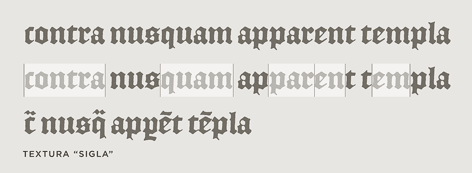
Diacritical marks have been used to abbreviate printed words ever since Gutenberg, and early English printers adopted the same conventions that Gutenberg used for Latin (a trick he picked up from medieval scribes.) As you say, tildes and macrons (and circles and odder things still) were used to mark the elision of letters or entire word parts: the "Rx" ligature that we know from prescriptions (Lat. 'recipe') was also used as shorthand for the "-rum" Latin ending, among other things. The French circumflex is a holdover from the same tradition, as it once the absence of a succeeding 's' ("hôpital" for "hospital", etc.) All of these were compositors' tricks to help in the justification of an entire paragraph, something that was considerably easier in the days before standard spelling and orthography!The surprising diacritical marks don't exhaust the oddities of 16th-century fonts. Hoefler & Frere-Jones have designed a font, English Textura, that is similar to the blackletter font that Recorde's book was printed in; they did this by borrowing characters from actual 16th-century documents. The documents contain all sorts of interesting typographic features that are no longer used; look at the bottom rows of this sample of English Textura for examples:
I should mention, in case it isn't clear, that justification of paragraphs is not merely a cosmetic feature. If you are a printer in 1577, you are laying out metal types into a square frame, and if the frame isn't completely filled, the types will fall out when you turn it over. In particular, you must make each line of each paragraph fully extend from left to right, or it will be unprintable. The Renaissance printers must have to justify the text somehow. One way to do this is by inserting blank spaces of suitable lengths between the words of each line; I asked M. Hoefler why the Renaissance printers didn't just use blank space, and he replied:
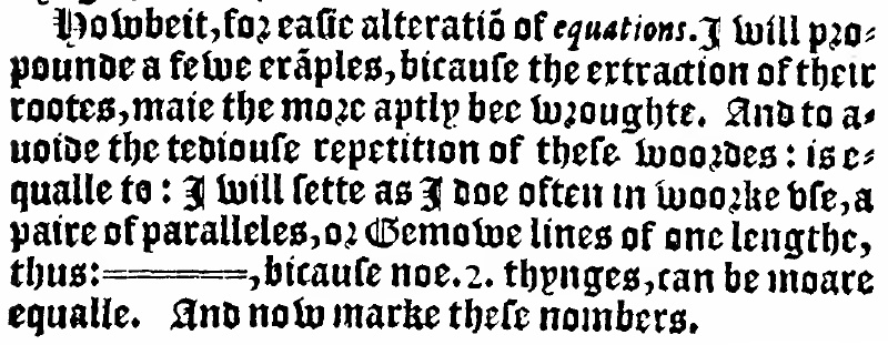
They did that as well, but I think the general principle (which endures) is that wordspacing really isn't as flexible as you'd hope -- "rivers" are the effect of adjacent lines being overjustified, and they really interrupt reading. Even with today's very sophisticated H&J [Hyphenation and Justification] algorithms -- some of which can even scale the actual dimensions of letterforms in order to improve copyfit -- the chief ingredient in good H&J controlling the number of letters per line. Contemporary newspapers do this through aggressive hyphenation; their forbears did it through colorful spelling. (Although any headline with the word "Prez" suggests that this tradition lives on.)You'll note that The Whetstone of Witte is also agressively hyphenated:

I think Marshall McLuhan said something about the new media cannibalizing the old, and although I'm not sure what he meant (if he did say that) I don't think it matters much, because the phrase so perfectly encapsulates the way new information technologies tend to adopt the obsolete forms of the technologies they replace. I've been collecting examples of this for a few years. In the early days of the web, there was a web dictionary which would lay out the pages just like a real dictionary, with an unreadably tiny font, page breaks in inconvenient places, and "next page" and "previous page" buttons at the bottom. The tiny font was bad enough, but the "next page" buttons just killed me. I wanted to redesign the application with another button that you could press if you wanted to simulate what happens when you read the dictionary in the bathtub and drop it in the water by mistake.
I call these phenomena "horseheads", after the false horse heads that were mounted on the hoods of old automobiles, which still survive as in vestigial form as hood ornaments. My favorite horsehead is a Citibank ATM design from around 1987 or so. The old ATMs, which the new design was replacing, had green phosphor display, about 20×40 characters, four menu buttons down the side, and a telephone-style keypad with ten digits and # and * signs. The new ATM had no buttons. Instead, it had a color touch-sensitive screen that was used to display a touch-sensitive picture of four menu buttons down the side, and, when appropriate, a telephone-style keypad with ten digits and # and * signs.
[ Addendum 20120611: The
term "skeuomorph" has recently become popular to describe this
phenomenon. ]
[Other articles in category /IT/typo]
permanent link