Mark Dominus (陶敏修)
mjd@pobox.com

Archive:
| 2024: | JFMA |
| 2023: | JFMAMJ |
| JASOND | |
| 2022: | JFMAMJ |
| JASOND | |
| 2021: | JFMAMJ |
| JASOND | |
| 2020: | JFMAMJ |
| JASOND | |
| 2019: | JFMAMJ |
| JASOND | |
| 2018: | JFMAMJ |
| JASOND | |
| 2017: | JFMAMJ |
| JASOND | |
| 2016: | JFMAMJ |
| JASOND | |
| 2015: | JFMAMJ |
| JASOND | |
| 2014: | JFMAMJ |
| JASOND | |
| 2013: | JFMAMJ |
| JASOND | |
| 2012: | JFMAMJ |
| JASOND | |
| 2011: | JFMAMJ |
| JASOND | |
| 2010: | JFMAMJ |
| JASOND | |
| 2009: | JFMAMJ |
| JASOND | |
| 2008: | JFMAMJ |
| JASOND | |
| 2007: | JFMAMJ |
| JASOND | |
| 2006: | JFMAMJ |
| JASOND | |
| 2005: | OND |
Subtopics:
| Mathematics | 238 |
| Programming | 99 |
| Language | 92 |
| Miscellaneous | 67 |
| Book | 49 |
| Tech | 48 |
| Etymology | 34 |
| Haskell | 33 |
| Oops | 30 |
| Unix | 27 |
| Cosmic Call | 25 |
| Math SE | 23 |
| Physics | 21 |
| Law | 21 |
| Perl | 17 |
| Biology | 15 |


Comments disabled
Tue, 11 Apr 2006
Diacritics and horseheads
In my recent article about Robert
Recorde's invention of the = sign, I pointed out that Recorde's
1557 book The Whetstone of Witte contained a remarkable
typographic feature: words like "examples" and "alteration" are
rendered as "exãples" and "aleratiõ".
I wrote to Jonathan Hoefler to ask about this. Jonathan Hoefler is one of the principals of the typography firm Hoefler & Frere-Jones, and his mind is a vast storehouse of typographical history and arcana. I was sure M. Hoefler would know about the tildes, and would have something interesting to say about them, and I was not disappointed:
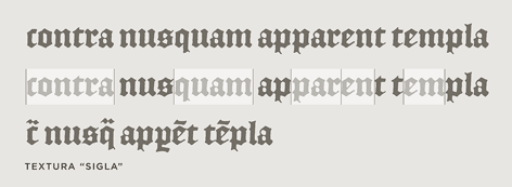
Diacritical marks have been used to abbreviate printed words ever since Gutenberg, and early English printers adopted the same conventions that Gutenberg used for Latin (a trick he picked up from medieval scribes.) As you say, tildes and macrons (and circles and odder things still) were used to mark the elision of letters or entire word parts: the "Rx" ligature that we know from prescriptions (Lat. 'recipe') was also used as shorthand for the "-rum" Latin ending, among other things. The French circumflex is a holdover from the same tradition, as it once the absence of a succeeding 's' ("hôpital" for "hospital", etc.) All of these were compositors' tricks to help in the justification of an entire paragraph, something that was considerably easier in the days before standard spelling and orthography!The surprising diacritical marks don't exhaust the oddities of 16th-century fonts. Hoefler & Frere-Jones have designed a font, English Textura, that is similar to the blackletter font that Recorde's book was printed in; they did this by borrowing characters from actual 16th-century documents. The documents contain all sorts of interesting typographic features that are no longer used; look at the bottom rows of this sample of English Textura for examples:
I should mention, in case it isn't clear, that justification of paragraphs is not merely a cosmetic feature. If you are a printer in 1577, you are laying out metal types into a square frame, and if the frame isn't completely filled, the types will fall out when you turn it over. In particular, you must make each line of each paragraph fully extend from left to right, or it will be unprintable. The Renaissance printers must have to justify the text somehow. One way to do this is by inserting blank spaces of suitable lengths between the words of each line; I asked M. Hoefler why the Renaissance printers didn't just use blank space, and he replied:
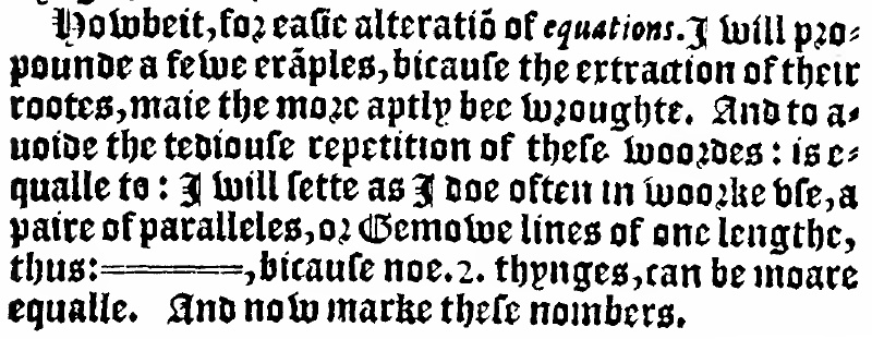
They did that as well, but I think the general principle (which endures) is that wordspacing really isn't as flexible as you'd hope -- "rivers" are the effect of adjacent lines being overjustified, and they really interrupt reading. Even with today's very sophisticated H&J [Hyphenation and Justification] algorithms -- some of which can even scale the actual dimensions of letterforms in order to improve copyfit -- the chief ingredient in good H&J controlling the number of letters per line. Contemporary newspapers do this through aggressive hyphenation; their forbears did it through colorful spelling. (Although any headline with the word "Prez" suggests that this tradition lives on.)You'll note that The Whetstone of Witte is also agressively hyphenated:

I think Marshall McLuhan said something about the new media cannibalizing the old, and although I'm not sure what he meant (if he did say that) I don't think it matters much, because the phrase so perfectly encapsulates the way new information technologies tend to adopt the obsolete forms of the technologies they replace. I've been collecting examples of this for a few years. In the early days of the web, there was a web dictionary which would lay out the pages just like a real dictionary, with an unreadably tiny font, page breaks in inconvenient places, and "next page" and "previous page" buttons at the bottom. The tiny font was bad enough, but the "next page" buttons just killed me. I wanted to redesign the application with another button that you could press if you wanted to simulate what happens when you read the dictionary in the bathtub and drop it in the water by mistake.
I call these phenomena "horseheads", after the false horse heads that were mounted on the hoods of old automobiles, which still survive as in vestigial form as hood ornaments. My favorite horsehead is a Citibank ATM design from around 1987 or so. The old ATMs, which the new design was replacing, had green phosphor display, about 20×40 characters, four menu buttons down the side, and a telephone-style keypad with ten digits and # and * signs. The new ATM had no buttons. Instead, it had a color touch-sensitive screen that was used to display a touch-sensitive picture of four menu buttons down the side, and, when appropriate, a telephone-style keypad with ten digits and # and * signs.
[ Addendum 20120611: The
term "skeuomorph" has recently become popular to describe this
phenomenon. ]
[Other articles in category /IT/typo]
permanent link